


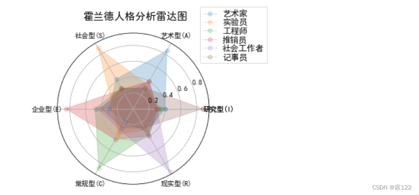
 该代码示例展示了如何用Python的Matplotlib库创建美观的雷达图,用于表示不同职业类型在霍兰德六种人格类型(研究型、艺术型、社会型、企业型、常规型、现实型)上的得分情况。雷达图包含了标题、图例和属性标签,提供了清晰的数据展示。
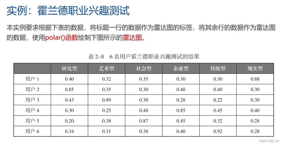
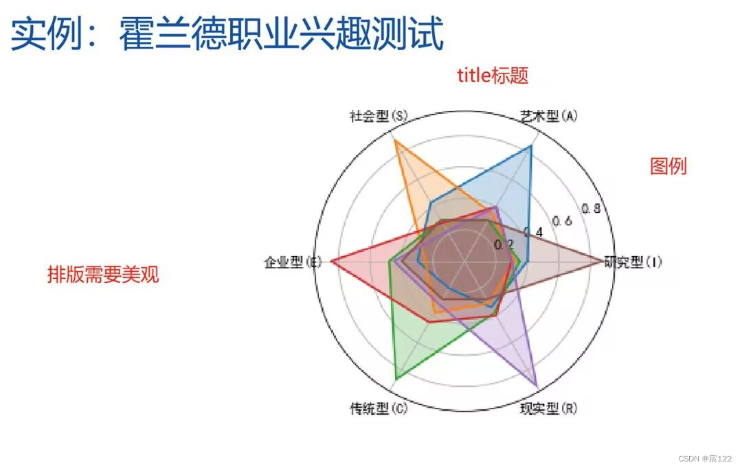
以第一幅图数据为例,做出第二幅雷达图的效果,并且添加标题、图例等要素。在保证效果的美观的基础上可进行一定的自由发挥。
import numpy as np
import matplotlib.pyplot as plt
import matplotlib
matplotlib.rcParams['font.family']='SimHei'
radar_labels = np.array(['研究型(I)','艺术型(A)','社会型(S)',\
                         '企业型(E)','常规型(C)','现实型(R)'])  # 雷达标签
nAttr = 6
data = np.array([[0.40, 0.32, 0.35, 0.30, 0.30, 0.88],
                 [0.85, 0.35, 0.30, 0.40, 0.40, 0.30],
                 [0.43, 0.89, 0.30, 0.28, 0.22, 0.30],
                 [0.30, 0.25, 0.48, 0.85, 0.45, 0.40],
                 [0.20, 0.38, 0.87, 0.45, 0.32, 0.28],
                 [0.34, 0.31, 0.38, 0.40, 0.92, 0.28]])      # 数据值
data_labels = ('艺术家', '实验员', '工程师', '推销员', '社会工作者','记事员')
angles = np.linspace(0, 2*np.pi, nAttr, endpoint=False)     # 将360度平均分为n个部分(有endpoint=False分为6个部分,反之5个部分)
data = np.concatenate((data, [data[0]]))
radar_labels = np.concatenate((radar_labels, [radar_labels[0]]))
angles = np.concatenate((angles, [angles[0]]))

plt.figure(facecolor="white")   # 绘制全局绘图区域
plt.subplot(111, polar=True)    # 绘制一个1行1列极坐标系子图

plt.plot(angles,data,'o-', linewidth=1, alpha=0.2)     # 连线
plt.fill(angles,data, alpha=0.25)                      # 填充
plt.thetagrids(angles*180/np.pi, radar_labels)         # 放置属性(radar_labels)
plt.figtext(0.52, 0.95, '霍兰德人格分析雷达图', ha='center', size=15)         # 放置标题
legend = plt.legend(data_labels, loc=(0.94, 0.80), labelspacing=0.1)   # 放置图例
plt.setp(legend.get_texts(), fontsize='large')
plt.grid(True)          # 打开坐标网格
plt.savefig('gpr.jpg')     # 保存图片
plt.show()              # 显示
运行结果:


 1万+
1万+

 被折叠的 条评论
为什么被折叠?
被折叠的 条评论
为什么被折叠?
 到【灌水乐园】发言


