概要
详细代码展示
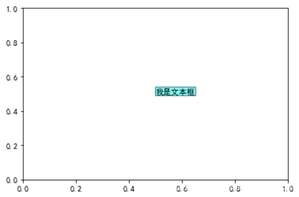
1.添加文本框
为文本添加添加背景框
import matplotlib.pyplot as plt
plt.rcParams['font.sans-serif'] = ['SimHei']
fig=plt.figure()
fig,axe=plt.subplots()
axe.text(0.5,0.5,'我是文本框',bbox={'facecolor':'cyan','alpha':0.5,'pad':0.7})
plt.show()
2.添加指示箭头
import matplotlib.pyplot as plt
import numpy as np
plt.rcParams['axes.unicode_minus'] = False
fig=plt.figure()
fig,axe=plt.subplots()
t=np.arange(0.0,2.0,0.01)
s=np.sin(2*np.pi*t)
axe.plot(t,s,linestyle='-',label='line1')
axe.annotate('我是正弦函数',xy=(1.25,1),xytext=(1.9,1),
                  arrowprops=dict(facecolor='red',shrink=0.2),
                 horizontalalignment='center',verticalalignment='center')
plt.show()

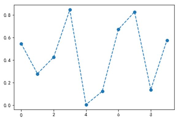
3.改变折线形状
fig,axe=plt.subplots()
np.random.seed(100)
x=np.arange(0, 10, 1)
y1=np.random.rand(10)
axe.plot(x, y1, '--o')
plt.show()
4.柱状图横置
fig,axe=plt.subplots()
data_m=(40, 60, 120, 180, 20, 200)
index = np.arange(6)
width=0.4
axe.barh(index, data_m, width,align='center',alpha=0.8, label='men')
plt.show()

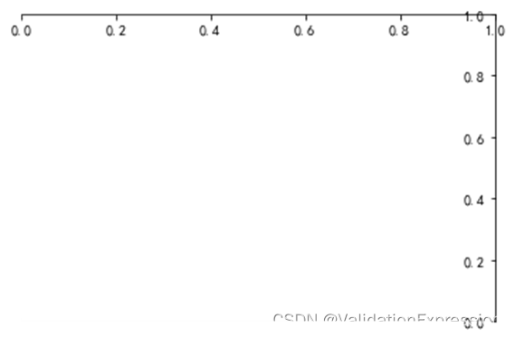
5.移动坐标轴位置
import matplotlib.pyplot as plt
import numpy as np
fig=plt.figure()
fig,axe=plt.subplots()
axe.spines['right'].set_color('none')
axe.spines['top'].set_color('none')
axe.spines['bottom'].set_position(('data',1))
axe.spines['left'].set_position(('data',1))
plt.show()
6.设置坐标轴范围
fig=plt.figure()
fig,axe=plt.subplots()
plt.xlim(0,10)
plt.ylim(0,8000)
plt.show()

7.改变坐标轴颜色
import matplotlib.pyplot as plt
import numpy as np
fig=plt.figure()
fig,axe=plt.subplots()
axe.spines['right'].set_color('yellow')
axe.spines['top'].set_color('red')
plt.show()

8.设置坐标轴刻度
fig=plt.figure()
fig,axe=plt.subplots()
axe.set_xticks([0,1,2,3,4,5])
plt.show()

9.改变刻度
fig=plt.figure()
fig,axe=plt.subplots()
axe.set_xticks([0,1,2,3,4,5])
axe.set_xticklabels(['Taxi','Metro','Walk','Bus','Bicycle','Driving'])
plt.show()

10.坐标倾斜
fig=plt.figure()
fig,axe=plt.subplots()
axe.set_xticks([0,1,2,3,4,5])
axe.set_xticklabels(['Taxi','Metro','Walk','Bus','Bicycle','Driving'],rotation=45)
plt.show()

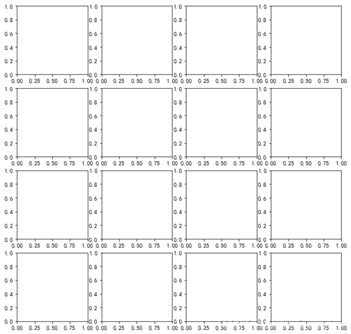
10.绘制子图
fig=plt.figure()
fig,axe=plt.subplots(4,4,figsize=(10,10))
plt.show()
11.加网格线
fig=plt.figure()
fig,axe=plt.subplots()
axe.grid(True)
plt.show()

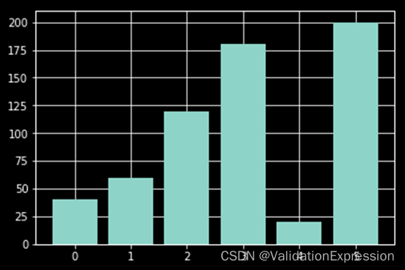
12.改变图形颜色
fig,axe=plt.subplots()
data_m=(40, 60, 120, 180, 20, 200)
index = np.arange(6)
axe.bar(index, data_m,color='y')
plt.show()

13.改变样式
fig,axe=plt.subplots()
data_m=(40, 60, 120, 180, 20, 200)
index = np.arange(6)
axe.bar(index, data_m)
plt.style.use('dark_background')
plt.show()
样式列表:
plt.style.available
['bmh',
 'classic',
 'dark_background',
 'fast',
 'fivethirtyeight',
 'ggplot',
 'grayscale',
 'seaborn-bright',
 'seaborn-colorblind',
 'seaborn-dark-palette',
 'seaborn-dark',
 'seaborn-darkgrid',
 'seaborn-deep',
 'seaborn-muted',
 'seaborn-notebook',
 'seaborn-paper',
 'seaborn-pastel',
 'seaborn-poster',
 'seaborn-talk',
 'seaborn-ticks',
 'seaborn-white',
 'seaborn-whitegrid',
 'seaborn',
 'Solarize_Light2',
 'tableau-colorblind10',
 '_classic_test']
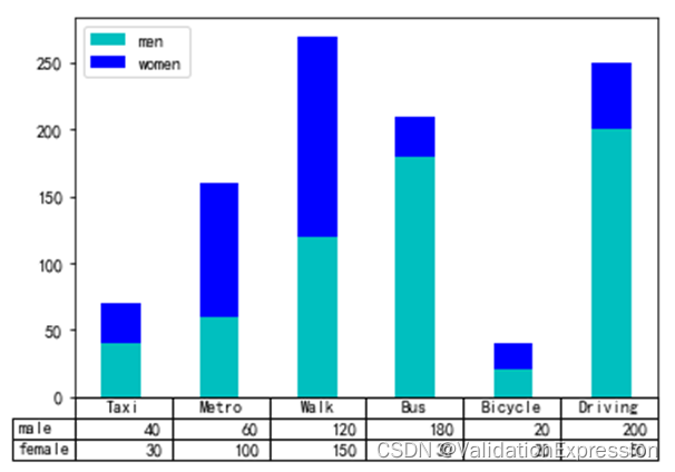
14.添加表格
fig,axe=plt.subplots()
data_m=(40, 60, 120, 180, 20, 200)
data_f=(30, 100, 150, 30, 20, 50)
index = np.arange(6)
width=0.4
axe.bar(index, data_m, width, color='c', label='men')
axe.bar(index, data_f, width, color='b', bottom=data_m, label='women')
axe.set_xticks([])
axe.legend()
data=(data_m,data_f)
rows=('male','female')
columns=('Taxi','Metro','Walk','Bus','Bicycle','Driving')
axe.table(cellText=data, rowLabels=rows, colLabels=columns)
plt.show()
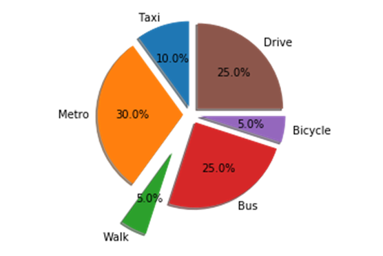
15.饼状图分离
fig, axe = plt.subplots()
labels = 'Taxi', 'Metro', 'Walk', 'Bus','Bicycle','Drive'
sizes = [10, 30, 5, 25, 5, 25]
explode = (0.1, 0.1, 0.5, 0.1, 0.1, 0.1)
axe.pie(sizes, explode=explode, labels=labels, autopct='%1.1f%%',
shadow=True, startangle=90)
axe.axis('equal')
plt.show()
16.保存绘制的图片
fig, axe = plt.subplots()
labels = 'Taxi', 'Metro', 'Walk', 'Bus','Bicycle','Drive'
sizes = [10, 30, 5, 25, 5, 25]
explode = (0.1, 0.1, 0.5, 0.1, 0.1, 0.1)
axe.pie(sizes, explode=explode, labels=labels, autopct='%1.1f%%',
shadow=True, startangle=90)
axe.axis('equal')
plt.savefig('temp.png', dpi=fig.dpi)
小结
使用matlibplot绘制简单图形


 该文通过详细代码展示了如何使用matplotlib库在Python中创建各种图形,包括添加文本框、指示箭头、改变折线形状、制作横置柱状图、移动坐标轴、设置坐标轴范围、改变颜色和刻度、坐标倾斜、绘制子图、添加网格线、改变图形颜色、调整样式、添加表格、绘制分离饼状图以及保存图片等操作。


 被折叠的 条评论
为什么被折叠?
被折叠的 条评论
为什么被折叠?
 到【灌水乐园】发言


