


 本文介绍了如何利用sarima模型对时间序列数据进行建模,详细解析了sarima模型的原理及其在数据科学中的应用。
sarima模型
In this tutorial I will show you how to model a seasonal time series through a SARIMA model.
在本教程中,我将向您展示如何通过SARIMA模型对季节时间序列进行建模。
Here you can download the Jupyter notebook of the code described in this tutorial.
在这里,您可以下载本教程中描述的代码的Jupyter笔记本。
入门 (Getting Started)
将数据集转换为时间序列 (Convert the dataset into a time series)
In this example we will use the number of tourist arrivals to Italy. Data are extracted from the European Statistics: Annual Data on Tourism Industries. Firstly, we import the dataset related to foreign tourists arrivals in Italy from 2012 to 2019 October and then we convert it into a time series.
在此示例中,我们将使用前往意大利的游客人数。 数据摘自《 欧洲统计:旅游业年度数据》 。 首先,我们导入与2012年至2019年10月在意大利入境的外国游客有关的数据集,然后将其转换为时间序列。
In order to perform the conversion to time series, two steps are needed:
为了执行到时间序列的转换,需要两个步骤:
the column containing dates must be converted to datetime. This can be done through the function
to_datetime(), which converts a string into a datetime.包含日期的列必须转换为datetime。 这可以通过函数
to_datetime()完成,该函数将字符串转换为日期时间。set the index of the dataframe to the column containing dates. This can be done through the function
set_index()applied to the dataframe.将数据框的索引设置为包含日期的列。 这可以通过将函数
set_index()应用于数据set_index()来完成。
import pandas as pddf = pd.read_csv('../sources/IT_tourists_arrivals.csv')
df['date'] = pd.to_datetime(df['date'])
df = df[df['date'] > '2012-01-01']
df.set_index('date', inplace=True)
We can get some useful statistics related to the time series through the describe() function.
我们可以通过describe()函数获得一些与时间序列有关的有用统计信息。
df.describe()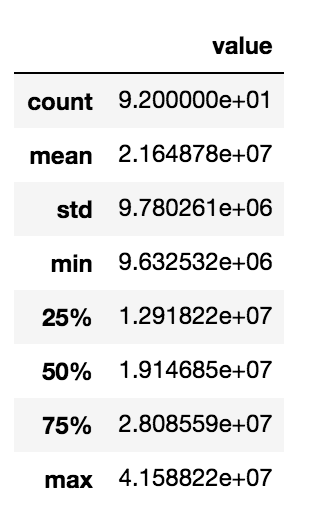
初步分析 (Preliminary analysis)
绘制时间序列以检查季节性 (Plot the time series to check the seasonality)
The preliminary analysis involves a visual analysis of the time series, in order to understand its general trend and behaviour. Firstly, we create the time series and we store it in the variable ts.
初步分析包括对时间序列的可视化分析,以便了解其总体趋势和行为。 首先,我们创建时间序列并将其存储在变量ts 。
ts = df['value']Then, we plot the ts trend. We use the matplotlib library provided by Python.
然后,我们绘制ts趋势。 我们使用Python提供的matplotlib库。
import matplotlib.pylab as plt
plt.plot(ts)
plt.ylabel('Total Number of Tourists Arrivals')
plt.grid()
plt.tight_layout()
plt.savefig('plots/IT_tourists_arrivals.png')
最低0.47元/天 解锁文章


 1万+
1万+

 被折叠的 条评论
为什么被折叠?
被折叠的 条评论
为什么被折叠?
 到【灌水乐园】发言


