


These days is easy to find more and more articles about Jetpack Compose and this is not surprising. Compose is a major change in the way we design UIs on Android. My goal with this is to summarize lessons learned and simplify the access to this toolkit.
这些天很容易找到关于Jetpack Compose的越来越多的文章,这并不奇怪。 撰写是我们在Android上设计UI的方式的重大变化。 我的目标是总结经验教训并简化对该工具包的访问。
If you have already tried, you would find out some pitfalls of learning Jetpack Compose:
如果您已经尝试过,那么您会发现学习Jetpack Compose的一些陷阱:
- The library has undergone many changes with every new version. In recent months and especially with the lately launched alpha version, the library is clearly gaining stability. 该库在每个新版本中都进行了许多更改。 在最近几个月中,尤其是随着最近发布的alpha版本,该库显然正在获得稳定性。
Plenty of articles are outdated because Compose API has been changed quite often, making those articles almost useless.
很多文章已经过时,因为Compose API经常更改,从而使这些文章几乎无用。
为什么写作? (Why Compose?)
Jetpack Compose starts a new philosophy in UI Android development. The whole app can be written in Kotlin, which brings some benefits such as conciseness, reusability, and readability. As you may have read, this way to developing user interfaces is not new (in fact, is trendy) and is inspired by other languages and frameworks like React, Vue, or even Flutter.
Jetpack Compose在UI Android开发中开始了新的哲学。 整个应用程序可以用Kotlin编写,这带来了一些好处,例如简洁,可重用性和可读性。 您可能已经读过,这种开发用户界面的方法并不新颖(实际上是新潮的),并且受到其他语言和框架(例如React,Vue甚至Flutter)的启发。
该项目 (The project)
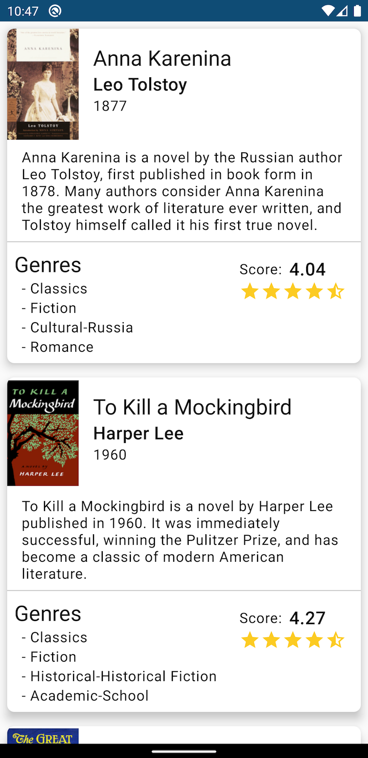
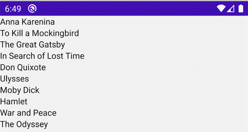
The sample app in the following image retrieves books data from a server and visualize them in a list on UI.
下图中的示例应用程序从服务器检索书籍数据,并在UI列表中将其可视化。
Obviously, this post will focus on the user interface.
显然,本文将重点放在用户界面上。
项目设立 (Project set up)
First of all, we need to use a canary version of Android Studio to have the Compose capabilities. The latest version currently available is 4.2 canary 9.
首先,我们需要使用Canary版本的Android Studio具有Compose功能。 当前可用的最新版本是4.2 canary 9 。
To get started with Compose we need to import the libraries required:
要开始使用Compose,我们需要导入所需的库:
implementation "androidx.compose.runtime:runtime-livedata:$compose_version"
implementation "androidx.compose.foundation:foundation-layout:$compose_version"
implementation "androidx.compose.material:material:$compose_version"
implementation "androidx.ui:ui-tooling:$compose_version"


android {
    ...


    buildFeatures {
        compose true
    }
    composeOptions {
        kotlinCompilerExtensionVersion(compose_version)
    }
}


tasks.withType(org.jetbrains.kotlin.gradle.tasks.KotlinCompile).configureEach {
    kotlinOptions {
        jvmTarget = "1.8"
        freeCompilerArgs += ["-Xallow-jvm-ir-dependencies", "-Xskip-prerelease-check"]
    }
}
All steps are explained in this link:
此链接中说明了所有步骤:
我到处都看到@composable (I see @composable everywhere)
In Jetpack Compose, the main idea is to build interfaces by composing functions. The @composable annotation must be added to the function so the compiler will draw the UI defined by it. This type of function can call other functions inside to create a more complex UI.
在Jetpack Compose中,主要思想是通过组合函数来构建接口。 必须将@composable批注添加到函数中,以便编译器将绘制由其定义的UI。 这种类型的函数可以调用内部的其他函数来创建更复杂的UI。

A @composable function can only be called from another @composable function, but it can also call a normal Kotlin function.
@composable函数只能从另一个@composable函数调用,但是它也可以调用普通的Kotlin函数。
In the following example, the text “Hello world!” will be displayed.
在下面的示例中,文字“ Hello world!” 将显示。
class MainActivity : AppCompatActivity() {
    override fun onCreate(savedInstanceState: Bundle?) {
        super.onCreate(savedInstanceState)


        setContent {
            HelloWorld()
        }
    }


    @Composable
    private fun HelloWorld() {
        Text("Hello World")
    }
}
A @composable function must be called from another @composable function but the first call in the chain (to connect to Activities) must be done from setContent block.
一个@composable函数必须从另一个@composable函数调用 但必须从setContent块完成链中的第一个调用(以连接到Activity)。
Note: The convention for the function naming changes for @composable function as we see in the examples, is to start with Pascal case (the first letter of each word is capitalized).
注意:如我们在示例中看到的, @ composable函数的函数命名更改的约定以Pascal大小写开始(每个单词的第一个字母大写)。
预览或不预览 (Preview or not to preview)
Maybe you are wondering, What about the preview we used to have in the XML editing interface in Android Studio? Don’t worry because this is still available, but in a different way.
也许您在想,我们过去在Android Studio的XML编辑界面中拥有的预览怎么样? 不用担心,因为它仍然可用,但是方式有所不同。

In the code, a preview function has to be added, in our simple example it will look like this:
在代码中,必须添加预览功能,在我们的简单示例中,它看起来像这样:
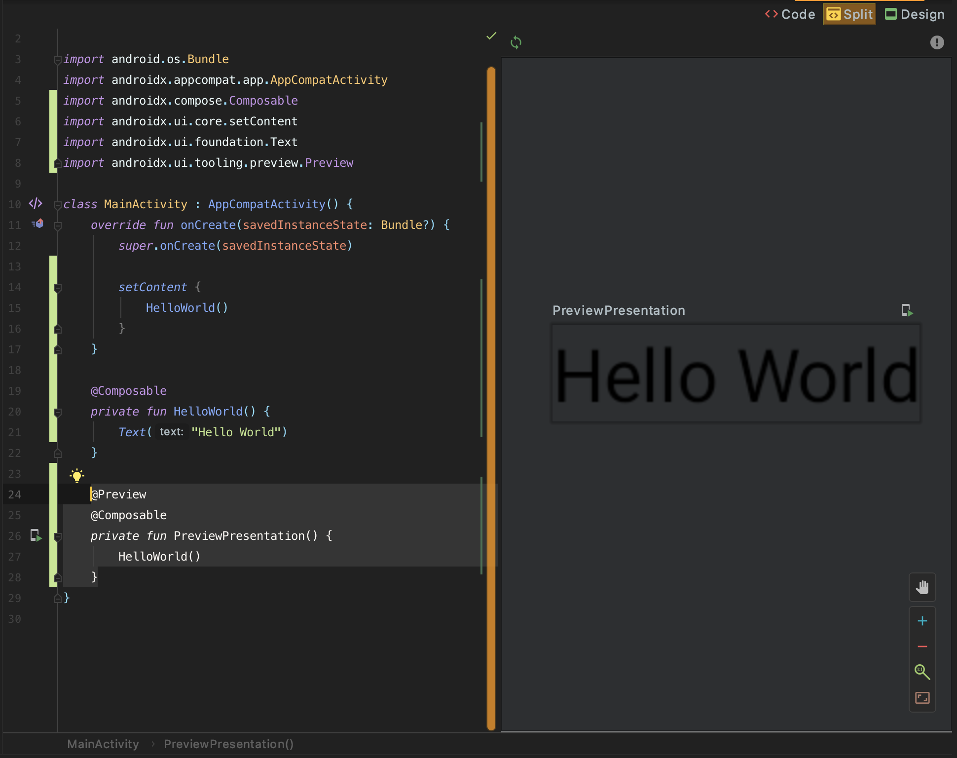
@Preview
@Composable
private fun PreviewPresentation() {
    HelloWorld()
}
When the code is compiled the preview view will be available in the IDE:
编译代码后,IDE中将提供预览视图:
列和行 (Columns and Rows)
The most basic way to group views (@composable functions) is using Columns and Rows. Row groups the view on a horizontal line and Column groups them on a vertical line. Column and Row are, of course, @composable functions. Let’s see an example:
对视图(@composable函数)进行分组的最基本方法是使用Columns和Rows 。 行组上的水平线和列组他们上的垂直线的视图。 列和行当然是@composable函数。 让我们来看一个例子:
@Composable
fun horizontalDistribution() {
//Distribure the content in a row
Row {
Text("Row 1")
Text("Row 2")
}
}
@Composable
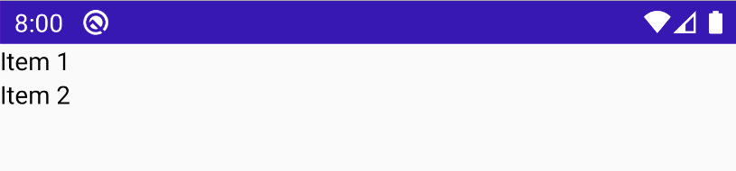
fun verticalDistribution() {
//Distribute the content in a column
Column {
Text("Item 1")
Text("Item 2")
}
}And we will get these output for Row and Column respectively.
我们将分别获得这些输出的Row和Column 。

组成MVVM架构 (Compose in an MVVM architecture)
When we are working on an MVVM architecture, we observe the changes in the ViewModel to modify the UI. Following the normal approach, we would do it as follows:
当我们在MVVM体系结构上工作时,我们会观察ViewModel中的更改以修改UI。 按照常规方法,我们将按以下方式进行操作:
class MainActivity : AppCompatActivity() {


    private val booksViewModel: BooksViewModel by viewModel()


    override fun onCreate(savedInstanceState: Bundle?) {
        super.onCreate(savedInstanceState)


        setContent {
            booksViewModel.books.observe(this, Observer {
                ShowBooks(it)
            })
            booksViewModel.requestBooks()
        }
    }

    @Composable
    private fun ShowBooks(books: List<BookPresentationModel>) {
        Column {
            books.forEach {
                Text(it.title)
            }
        }
    }
}
But WAIT! this code doesn’t compile:
但是, 等等! 该代码无法编译:
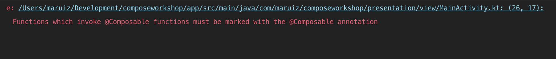
The Observer lambda function is not considered a composable “environment”, even if it is invoked within the setContent block. Jetpack compose provide a better way to do this:
即使在setContent块中调用Observer lambda函数,也不能将其视为可组合的“环境”。 Jetpack compose提供了一种更好的方法:
class MainActivity : AppCompatActivity() {


    private val booksViewModel: BooksViewModel by viewModel()


    override fun onCreate(savedInstanceState: Bundle?) {
        super.onCreate(savedInstanceState)


        setContent {
            val books by booksViewModel.books.observeAsState(initial = emptyList())


            ShowBooks(books)
        }
        booksViewModel.requestBooks()
    }

    @Composable
    private fun ShowBooks(books: List<BookPresentationModel>) {
        Column {
            books.forEach {
                Text(it.title)
            }
        }
    }
}
And this is how it looks in our app:
这就是我们的应用程序中的样子:
我们准备开始 (We are ready to start)
Let’s first extract the GUI implementation to another file. After that, in order to implement the example presented above, the main section which contains the title, subtitle and year will be created:
首先,将GUI实现提取到另一个文件中。 之后,为了实现上述示例,将创建包含标题,副标题和年份的主要部分:

The function PaintMainSection will create this section(notice that the text style is not yet implemented, that will be covered later):
函数PaintMainSection将创建此部分(请注意,文本样式尚未实现,稍后将介绍):
@Composable
private fun PaintMainSection(book: BookPresentationModel) {
    Column {
        Text(book.title)
        Text(book.author)
        Text(book.date)
    }
}
画书清单 (Paint a list of books)
The above code will only paint one book, but the server returns a list of them. To show the “main section” of all books on the list, we just have to call PaintMainSection defined above for each book. To represent those views we could use a Column function again:
上面的代码只会画一本书,但是服务器会返回它们的列表。 要显示列表中所有书籍的“主要部分”,我们只需为每本书调用上面定义的PaintMainSection 。 为了表示这些视图,我们可以再次使用Column函数:
@Composable
fun PaintBooks(books: List<BookPresentationModel>) {
    Column {
        books.forEach {
            PaintMainSection(it)
        }
    }
}
很多书 (A lot of books)
This might be good enough for a small list of books, but in a big amount of books, they can’t fit on the screen without scrolling. We can add a scroll that wraps the book list with a ScrollableColumn container:
这对于一小本书列表可能已经足够了,但是在大量的书中,如果不滚动它们就无法显示在屏幕上。 我们可以添加一个使用ScrollableColumn容器包装书单的滚动 :
@Composable
fun PaintBooks(books: List<BookPresentationModel>) {
    ScrollableColumn {
        books.forEach {
            PaintMainSection(it)
        }
    }
}
This code is not bad, but we are just adding a scroller so in a huge list, the scroll is not smooth and the memory consumed is hight. To improve the rows have to be reused. Basically we need a RecyclerView and the equivalent in Compose is LazyColumFor:
这段代码还不错,但是我们只是添加了一个滚动条,因此在一个巨大的列表中,滚动条不平滑并且占用的内存很高。 为了改善行必须被重用。 基本上,我们需要一个RecyclerView ,而Compose中的等效项是LazyColumFor :
@Composable
private fun BookList(books: List<BookPresentationModel>) {
    LazyColumnFor(items = books) { item ->
        PaintMainSection(item)
    }
}
This implementation is a good improvement because implementing a recyclerView requires a lot of boilerplate.
该实现是一个很好的改进,因为实现recyclerView需要大量样板。
当数据改变时... (When the data changes…)
Fortunately, we don’t have to call the previous functions each time we need to refresh the data. In the code above when the data is loaded from ViewModel’s LiveData, if we inspect what observeAsState() returns:
幸运的是,我们不必在每次需要刷新数据时都调用先前的函数。 在上面的代码中,当从ViewModel的LiveData加载数据时,如果我们检查observeAsState()返回的内容:

The data is wrapped in a State. And this state Interface does the magic of reloading the data when it is being changed, in this case, by this LiveData.
数据包装在状态中。 当状态数据被此LiveData更改时,此状态接口具有重新加载数据的魔力。
If we want to do it “manually” it is possible to wrap the data in a State like we see below:
如果我们想“手动”进行操作,则可以将数据包装在一个State如下所示:
var book: BookPresentationModel by state { BookPresentationModel() }When the book variable is passed to a @composable function, the generated UI will automatically change when the variable changes.
当book变量传递给@ composable函数时,当变量更改时,生成的UI将自动更改。
Another way to do this is by using mutableStateOf on each attribute of the class that contains the state.
另一种方法是在包含状态的类的每个属性上使用mutableStateOf 。
主题化 (Theming)
In Android development, we use themes to introduce design lines into our app and separate the chosen style from the implementation, giving the possibility to change it quickly. Jetpack Compose provides the MaterialTheme function to apply some Material design settings and also can be personalized. To apply it we only have to pass to MaterialThemethe function that we want to customize.
在Android开发中,我们使用主题将设计线引入到我们的应用程序中,并将选定的样式与实现分开,从而有可能快速进行更改。 Jetpack Compose提供MaterialTheme功能以应用某些Material设计设置,并且还可以进行个性化设置。 要应用它,我们只需要将要自定义的功能传递给MaterialTheme 。
@Composable
fun PaintBooks(
    books: List<BookPresentationModel>
) {
    MaterialTheme {
        LazyColumnFor(items = books) { item ->
            PaintMainSection(item)
        }
    }
}
MaterialTheme allows us to customize it by configuring its optional parameters.
MaterialTheme允许我们通过配置其可选参数来自定义它。
private val darkBlue = Color(0xFF3282B8)
private val themeColors = lightColorPalette(
    primary = darkBlue
)


@Composable
fun PaintBooks(
    books: List<BookPresentationModel>
) {
    MaterialTheme(colors = themeColors) {
        LazyColumnFor(items = books) { item ->
            PaintMainSection(item)
        }
    }
}
But themes should usually be reused in the app. So, to facilitate it, we can extract this theme to a function which accepts as a parameter a lamda where the theme will be applied:
但是主题通常应在应用中重用。 因此,为方便起见,我们可以将该主题提取到一个函数中,该函数接受将应用该主题的lamda作为参数:
private val darkBlue = Color(0xFF3282B8)
private val themeColors = lightColorPalette(
    primary = darkBlue
)


@Composable
fun MyAppTheme(children: @Composable() () -> Unit) {
    MaterialTheme(colors = themeColors) {
        children()
    }
}
Now, this theme can be used in our app. Besides this, In the example below, we will use Typography, which is provided by MaterialTheme with some font styles (can be customized if we want):
现在,可以在我们的应用程序中使用此主题。 除此之外,在下面的示例中,我们将使用Typography,它由MaterialTheme提供,并带有一些字体样式(可以根据需要进行定制):
@Composable
fun PaintBooks(
    books: List<BookPresentationModel>
) {
    MyAppTheme {
        val typography = MaterialTheme.typography

       LazyColumnFor(items = books) { item ->
            PaintMainSection(item, typography)
        }
    }
}


@Composable
private fun PaintMainSection(
    book: BookPresentationModel,
    typography: Typography
) {
    Column {
        Text(book.title, style = typography.h5)
        Text(book.author, style = typography.h6)
        Text(book.date, style = typography.body1)
    }
}Thetypography variable is passed to the @composable function which needs to use it. The result of this text styling is this:
typography变量传递给@composable函数 需要使用它。 这种文本样式的结果是:

周围环境 (Ambients)
In the example above, we had to pass the typography variable through the views tree to use where needed. To fix it, the Compose team has created Ambients. Thanks to Ambients, we can use typography without passing it. The variable appTypography is initialized using Providers function. In order to use the parameter, it’s required to call the current attribute in the ambient variable. Let’s see an example:
在上面的示例中,我们必须将版式变量传递给视图树以在需要的地方使用。 为了解决这个问题, Compose团队创建了Ambients。 感谢Ambients,我们可以使用排版而不需要通过排版。 变量appTypography使用Providers函数初始化。 为了使用该参数,需要在环境变量中调用current属性。 让我们来看一个例子:
//Fist the variable containing the font is created
val AppTypography = ambientOf<Typography> { error("Typography not found") }


@Composable
fun PaintBooks(
    books: List<BookPresentationModel>
) {
    MyAppTheme {
        //The variable is initialized using the MaterialTheme.typography
        Providers(AppTypography provides MaterialTheme.typography) {
            BookList(books)
        }
    }
}


@Composable
private fun BookList(books: List<BookPresentationModel>) {
    LazyColumnFor(items = books) { item ->
        PaintMainSection(item)
    }
}


@Composable
private fun PaintMainSection(
    book: BookPresentationModel
) {
    Column {
        //At this point, the typography can be used without having to pass it as a parameter
        Text(book.title, style = AppTypography.current.h5)
        Text(book.author, style = AppTypography.current.h6)
        Text(book.date, style = AppTypography.current.body1)
    }
}
从网络加载图像 (Load images from network)
Currently, typical libraries for loading images from the network don’t work out of the box. Fortunately, we can use Chris Barnes’s library, which adapts Coil library to use it in Compose.
当前,用于从网络加载图像的典型库无法立即使用。 幸运的是,我们可以使用克里斯·巴恩斯(Chris Barnes)的库,该库适用于Coil库以在Compose中使用它。
Let’s see an example of how it works. We are going load the book cover from the network. First of all, we have to add a row to have at the same time the cover and the section with the title, author, and date.
让我们看一个如何工作的例子。 我们将从网络上加载书籍封面。 首先,我们必须添加一行以同时包含封面和带有标题,作者和日期的部分。
@Composable
private fun BookList(books: List<BookPresentationModel>) {
    LazyColumnFor(items = books) { item ->
        //The Modifier.fillMaxWidth() modifier forces the row to take all available space
        Row(modifier = Modifier.fillMaxWidth()) {
            PaintCover(item.image)
            PaintMainSection(item)
        }
    }
}


@Composable
private fun PaintCover(imageUrl: String) {
    //The size is fixed with the modifiers
    CoilImage(data = imageUrl, modifier = Modifier.width(80.dp).height(124.dp))
}
The Modifier used in the above code is used to format the views. This will be explained in deep in the next section.
上面代码中使用的Modifier用于格式化视图。 下一节将对此进行深入说明。
修饰符 (Modifiers)
Modifiers are used to configure different aspects of Compose elements. There are many types of modifiers, let’s see some examples:
修饰符用于配置Compose元素的不同方面。 修饰符的类型很多,让我们看一些示例:
@Composable
private fun PaintCover(imageUrl: String) {
    CoilImage(data = imageUrl, modifier = Modifier.width(80.dp).height(124.dp))
}
In this example, the image is setting up with a width of 80 dp and a height of 124 dp. As you can see the Modifier can be concatenated.
在此示例中,图像的宽度设置为80 dp,高度设置为124 dp。 如您所见,修饰符可以串联在一起。
In this other example, the modifier is used to configure padding:
在另一个示例中,修饰符用于配置填充:
Text(
    synopsis,
    style = Typography.current.body1,
    modifier = Modifier.padding(16.dp, 8.dp, 16.dp, 8.dp)
)
You will discover many types of modifiers as you learn more about Compose.
在了解有关Compose的更多信息后,您会发现许多类型的修饰符。
结论 (Conclusions)
Compose has just reached the alpha version. That means the API is reaching some stability, but it may still have some changes.
Compose刚达到Alpha版本。 这意味着API达到了一定的稳定性,但可能仍会有一些变化。
This is a simple example, in the lastest releases they have included the ConstraintLayout implementation, which provides additional flexibility compared to the current implementation, but it’s better to start from the beginning and keep this, and other functionality, for the next step.
这是一个简单的示例,在最新版本中,它们包括ConstraintLayout实现,该实现 与当前的实现相比,它提供了更多的灵活性,但是最好从头开始,并保留此功能和其他功能以进行下一步。
You can find the full implementation in this Github repository. If you find a bug or any suggestion, feedback is welcome. Please note that the library is not final, so documentation it’s not always easy to find.
您可以在此Github存储库中找到完整的实现。 如果您发现错误或任何建议,欢迎提供反馈。 请注意,该库不是最终库,因此并不总是很容易找到文档。
翻译自: https://medium.com/@maruiz81/hands-on-with-jetpack-compose-51ed1747f3ac


 扫一扫
扫一扫
 3560
3560

 被折叠的 条评论
为什么被折叠?
被折叠的 条评论
为什么被折叠?
 到【灌水乐园】发言


