


Every data tells a story. It’s easier to understand them through visual representations rather than looking at thousands of records.Data Scientists often leverage graphs such as bar charts, line plots, area curves, etc to communicate this story to their stakeholders.Python and R have been preferred language of choice when working with data. There are multiple libraries such as Matplotlib, Seaborn, pyVis, etc through which one creates visualizations inside the Jupyter Notebooks or stand-alone apps using Bokeh, Flask, for example.
每个数据都讲述一个故事。 通过可视化表示比查看成千上万条记录更容易理解数据科学家经常利用条形图,折线图,面积曲线等图形将其故事传达给利益相关者,Python和R是首选语言处理数据时。 有多个库,例如Matplotlib,Seaborn,pyVis等,通过这些库,可以在Jupyter Notebook或使用Bokeh,Flask的独立应用程序内部创建可视化效果。
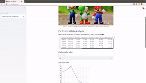
In this article, I will try to introduce you to Streamlit and get familiar with it. At the end of this article, you will be able to create an interactive app based on your data. Let’s take a publicly available data set from Kaggle. In the end, we will be able to create an app like this.
在本文中,我将尝试向您介绍Streamlit并熟悉它。 在本文的结尾,您将能够基于您的数据创建一个交互式应用程序。 让我们从Kaggle获取公开可用的数据集。 最后,我们将能够创建一个这样的应用程序。
The above gif is actually a screen record of the demo app. Streamlit provides you with an easy option to record your app with audio, in case you need for a demo. This is very helpful if you plan to showcase it to an audience.
上面的gif实际上是演示应用程序的屏幕记录。 Streamlit为您提供了一个简单的选项,可以在需要演示的情况下用音频录制应用程序。 如果您打算向观众展示它,这将非常有帮助。
设置Streamlit (Setting up Streamlit)
Before we start with building apps, lets set up streamlit. I am working on a Ubuntu machine. Commands would be mostly the same for all OS.
在开始构建
 最低0.47元/天 解锁文章


 1824
1824

 被折叠的 条评论
为什么被折叠?
被折叠的 条评论
为什么被折叠?
 到【灌水乐园】发言


