


hp-ux
I’ve been lucky so far in my design career to have worked with engineers that seem genuinely interested in learning about design. Perhaps, as mentioned in the title, it’s more about them trying to figure out why it matters so much to us that there is 8 pixels of space between the label and the form field and not 12 pixels. I may never know their true motivation. But one of the ways I’ve found to be most effective in teaching engineers about why we’re so persnickety is going over Gestalt principles with them.
到目前为止,在我的设计生涯中我一直很幸运能与似乎对学习设计感兴趣的工程师一起工作。 也许,正如标题中所提到的,更多的是他们试图弄清为什么它对我们如此重要,以至于标签和表单字段之间有8像素的间距而不是12像素。 我可能永远都不知道他们的真正动机。 但是我发现最有效的方法之一就是教给工程师关于我们为何如此顽强的理由,与他们一起探讨格式塔原理 。
This also allows me to victimize this intolerable (and handsome and smart 🙄) friend of mine by eviscerating his resume design in front of everyone.
这也使我可以通过在所有人面前剔掉他的简历设计来折磨我这个无法忍受的(又英俊又聪明的)朋友。
For me, Gestalt psychology plays an enormous part in the design of information and interactions with that information. I’m going to go over here what I usually go over in my sessions with non-designers, so if you’re a designer reading this, I guess what you can get out of it, if anything, areways to communicate what you already probably know.
对我来说,格式塔心理学在信息设计和与信息的交互中起着巨大的作用。 我要讲的是我通常在与非设计师的会议中讨论的内容,因此,如果您是一位阅读本文的设计师,我想您可以从中学到什么,如果有的话,可以交流您已经拥有的知识大概知道。
格式塔分组原则 (Gestalt Principles of Grouping)
There are 6 principles of grouping as laid out in Gestalt psychology. No wait, 7. Oh shoot, no. There are actually like 12. Or 13. Depending on which article you read about it. And they’re also named differently depending on which one you read. Fun.
格式塔心理学提出了6种分组原则。 不等,7.哦,射击,不。 其实有像12或13取决于其上的文章 您 阅读 关于它。 而且他们根据你读哪一个上也是不同的命名 。 好玩
So I just chose 6 that made sense to me.
所以我只选择了6个对我来说有意义的。
Proximity (which I group with Common Region)
邻近度 (我将其与“ 公共区域”分组)
Similarity
相似
Continuation
延续性
Figure/Ground
图/地
Closure
关闭
Common Fate
共同的命运
The first three are probably the most used in information design/UX. So I save those for last, and start with the less commonly used latter three. Here’s how I break them down.
前三个可能是信息设计/ UX中使用最多的。 因此,我将这些保存到最后,并从不常用的后三个开始。 这是我分解它们的方法。
图/地 (Figure/Ground)
This principle is used more in graphic design than in information design, and when deployed effectively can make for some incredibly clever imagery. “Figure” in this context might be thought of as “foreground” — usually a smaller image on a larger “Ground” (or “background” as we commonly refer to it).
此原则在图形设计中比在信息设计中更多地使用,并且在有效部署时可以生成一些非常聪明的图像。 在这种情况下,“图形”可能被认为是“前景”,通常是在较大的“地面”(或通常称为“背景”)上的较小图像。
Things get interesting when designers create compositions that cause our brains to flip back and forth between what the Figure is and what the Ground is. Here’s a great example from an article on Canva:
当设计师创造出可以使我们的大脑在人物和地面之间来回翻转的构图时,事情变得很有趣。 这是有关Canva的文章中的一个很好的例子:

Another example that threw me for a bit of a loop was the FedEx logo. Do you see the arrow?
另一个让我有些困惑的例子是FedEx徽标。 你看到箭头了吗?

Now you will never be able to unsee it.
现在,您将永远无法看不到它。
关闭 (Closure)
This is another fun one that really gets at the heart of Gestalt psychology: our minds creating something coherent from parts that are objectively incoherent. My favorite example, as an Elder Millennial, is one from my childhood: the Flying V.
这是格式塔心理学真正的另一个乐趣:我们的思想从客观上不连贯的部分中产生出连贯的东西。 作为千禧年长者,我最喜欢的例子是我童年时代的一个例子:飞行V。
Did you ever stop and think about why is this called a “flying V”? I know I didn’t. Because obviously they’re in a V shape, right?
您是否曾经停下来考虑过为什么将其称为“飞行V” ? 我知道我没有 因为显然它们呈V形,对不对?
But really they’re not. They’re a group of five distinct points. Our mind has to fill in the gaps between them to see the “V” emerge. And it does that automatically! Neat.
但实际上不是。 它们是五个不同的点。 我们必须填补它们之间的空白,才能看到“ V”的出现。 它会自动完成! 整齐。

You see this principle at work occasionally in forms. Notice that this box is interrupted by a label. But you still know it’s a box, don’t you?
您偶尔会以表格形式看到此原理。 请注意,此框被标签打断。 但是您仍然知道这是一个盒子,不是吗?

共同的命运 (Common Fate)
I love the emo name of this one. I also love using this kitten gif to explain it. Which of these kittens is not part of the group?
我喜欢这个的emo名称。 我也喜欢用这只小猫gif来解释它。 这些小猫中哪些不属于该组?
Common fate is about directionality. We group things that are headed in the same direction or facing the same direction. That’s how we can tell who’s in which gang when we watch Beat It. Otherwise it’s just a bunch of dudes standing around wearing denim and leather and occasionally having sleeves.
共同的命运与方向性有关。 我们将朝着相同方向或朝着相同方向的事物分组。 这就是我们观看Beat It时可以分辨出谁属于哪个帮派的方法。 否则,只是一群呆呆的家伙,穿着牛仔布和皮革站着,偶尔有袖子。

这样做是为了“有趣”的 (That does it for the “fun” ones)
The rest of the principles I cover are the ones that have more serious repercussions. How these are wielded can make or break a design.
我涵盖的其余原则是那些具有较严重影响的原则。 如何使用它们可以设计或破坏设计。
接近 (Proximity)
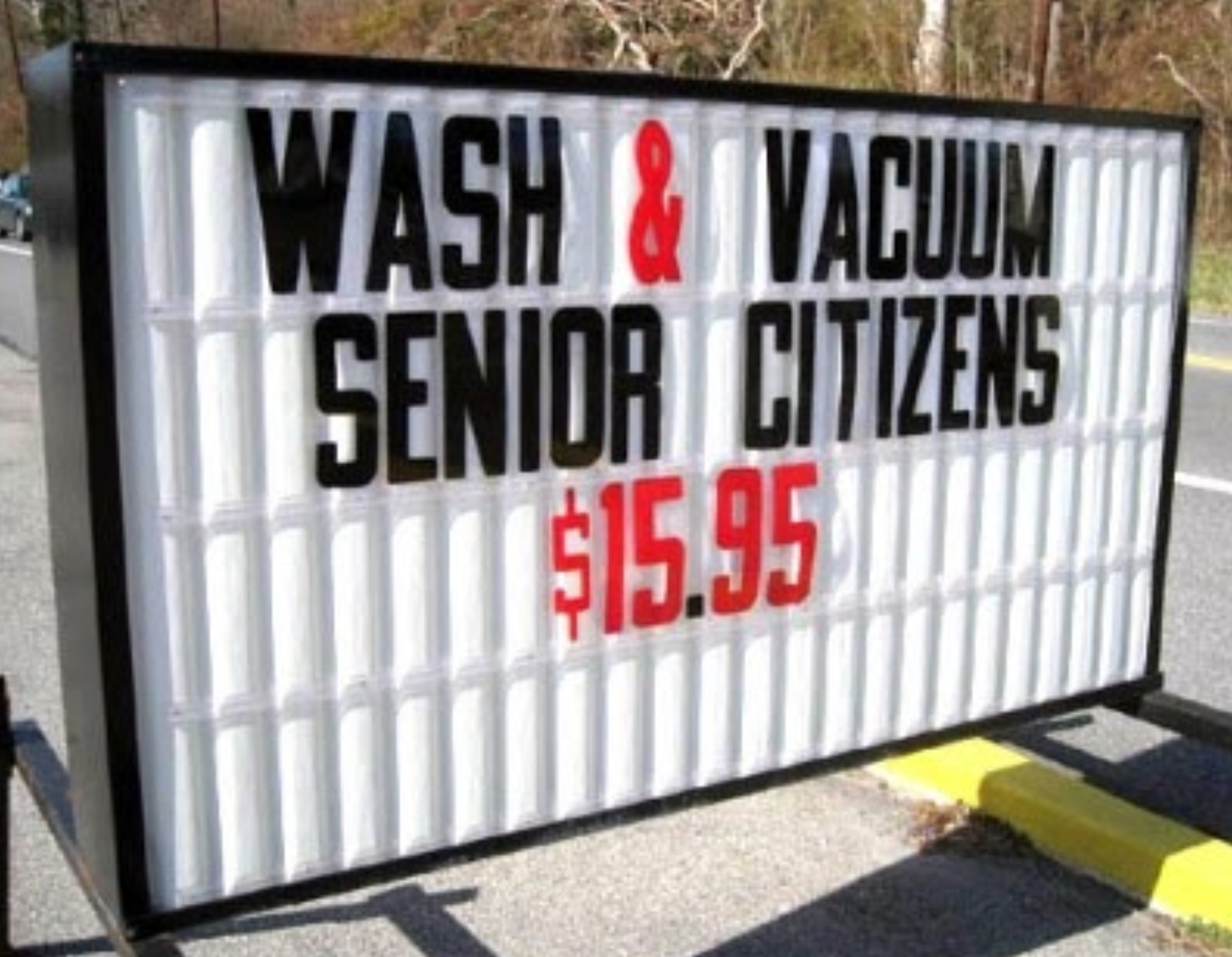
It’s easier to see when it’s not used correctly. Like maybe in this sign, where the lines of text being adjacent to each other will cause an unwanted association.
如果使用不正确,会更容易看到。 就像在此符号中一样,文本行彼此相邻将导致不必要的关联。
Proximity, as a concept, is fairly straightforward. Our brains will group things that are close to each other.
作为一个概念, 接近非常简单。 我们的大脑会将彼此靠近的事物组合在一起。
Almost everyone has seen a form like this.
几乎每个人都看到过这样的形式。
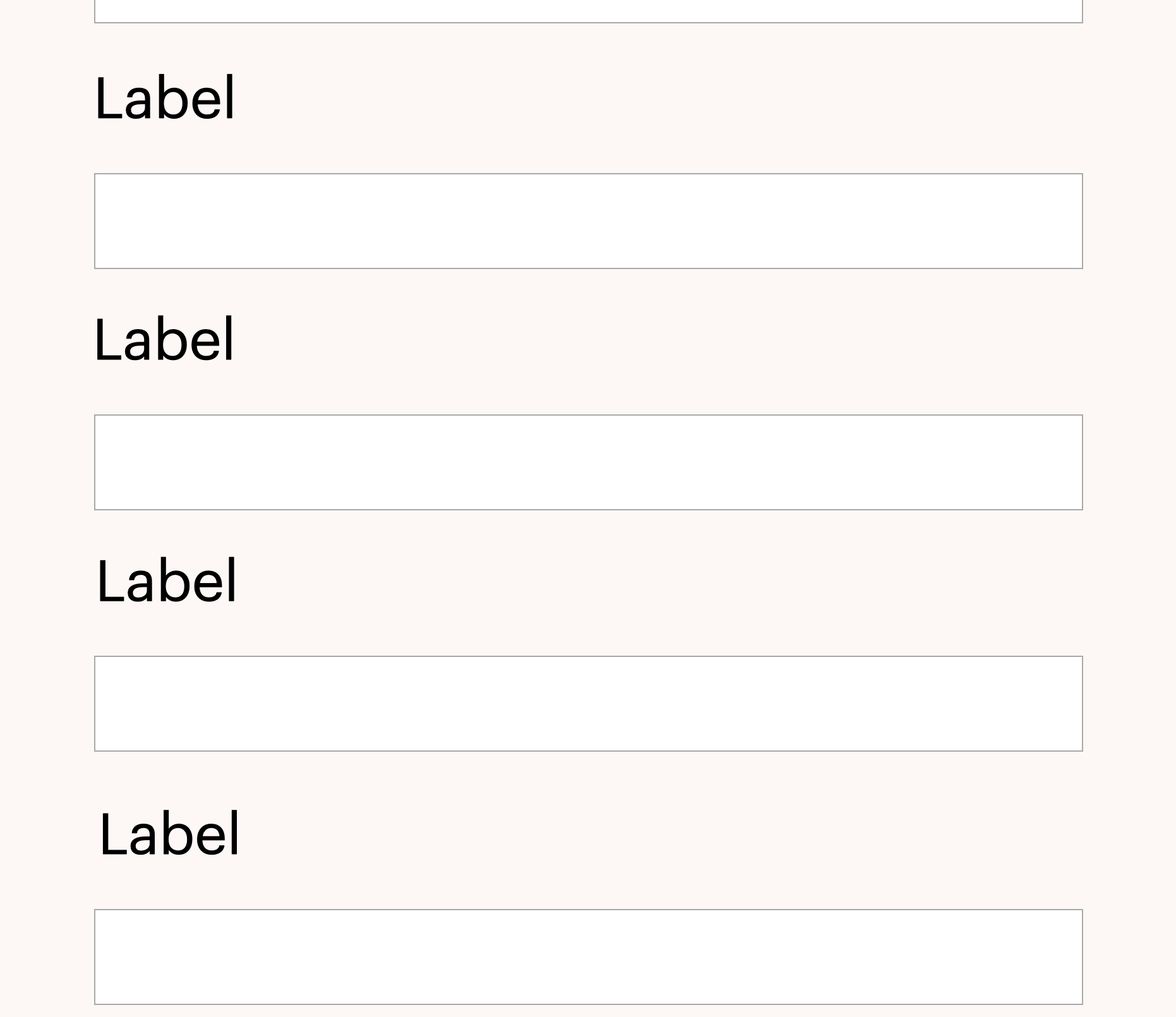
Are the labels labeling the fields below or the fields above? It’s hard to tell. You have to go up to the top and figure out which it is, and that’s unnecessary mental overhead for whoever is filling it out. You don’t want that. People will hate using your product, even if they’re not sure why.
标签是在标记下面的字段还是在上面的字段? 很难说。 您必须爬到顶端并弄清楚它是什么,这对于任何填写它的人都是不必要的。 你不要那样 人们会讨厌使用您的产品,即使他们不确定为什么。
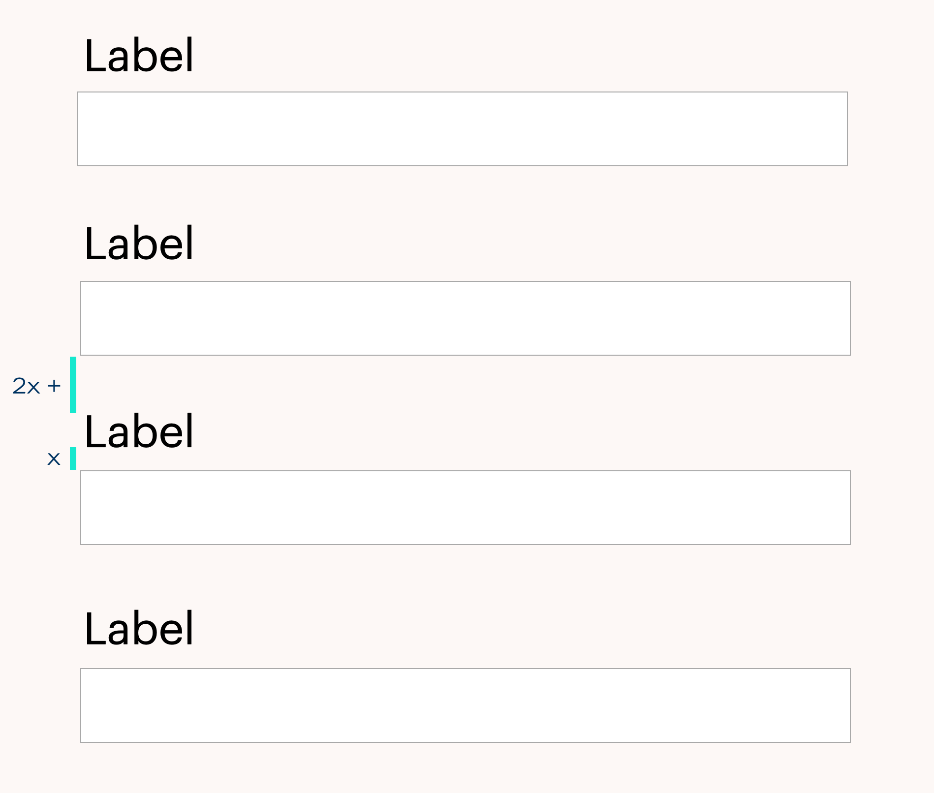
This is why designers get very specific about spacing. Look how much clearer it is in this case. There is zero ambiguity, all because of a few pixels’ shift.
这就是设计师对间距非常具体的原因。 看看在这种情况下它有多清晰。 零歧义是零,这都是由于几个像素的偏移。
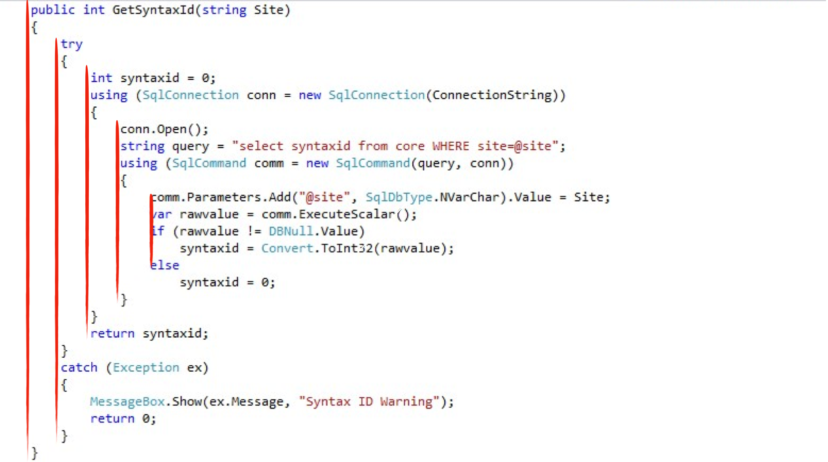
Another arena where you see proximity coming in handy is in code. Quick: which would you rather debug?
在代码中,可以看到方便使用的另一个领域。 快速:您想调试哪个?
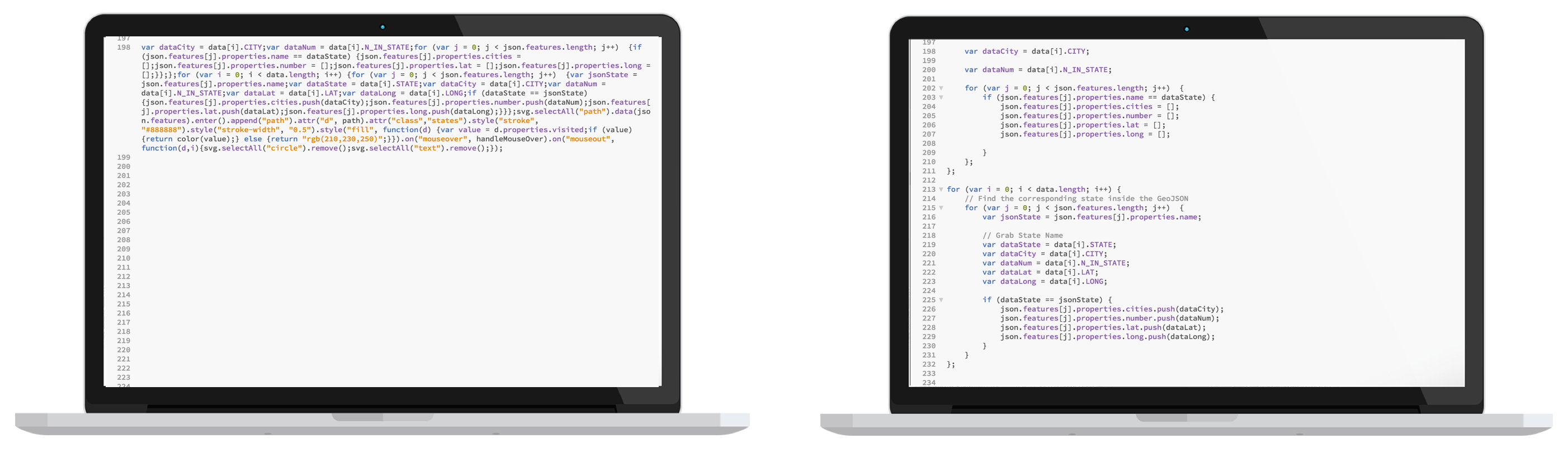
Space between code blocks help humans parse what might otherwise be inscrutable. (There is also some Continuation going on here, which I’ll get to later.)
代码块之间的空间可帮助人们解析本来难以理解的内容。 (这里还有一些延续,我将在以后进行。)
相似 (Similarity)
Look at this completely normal basketball game. How do you tell who’s on what team in all this chaos?
看一下这个完全正常的篮球比赛。 在所有这些混乱情况下,您如何分辨谁在哪个团队中?
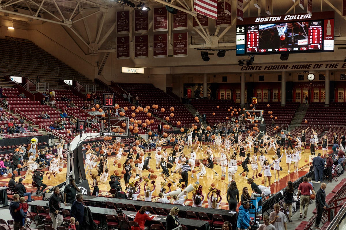
It’s easy. You look at what they’re wearing. We understand intuitively that one team is wearing dark uniforms and one team is wearing white.
这很容易。 你看看他们穿什么。 我们直观地了解到,一支团队穿着深色制服,而另一支团队穿着白色制服。
Similarity, like Proximity, is a fairly easy concept to grasp: our brains group things that are similar in appearance. This principle can be useful (stop signs being easily recognizable as such) or it can be counterproductive (this is pretty much how racism works).
相似度 ,例如接近度,是一个相当容易掌握的概念:我们的大脑将外观相似的事物归为一类。 该原则可能有用(停车标志很容易识别),也可能适得其反(这在很大程度上是种族主义的工作方式)。
In information design, it serves several purposes, but the most important is as an aid to recognize object type. And this can work at a “global” level and a “local” level.
在信息设计中,它有多种用途,但最重要的是作为识别对象类型的辅助工具。 这可以在“全局”级别和“本地”级别上工作。
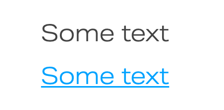
At the global level, designers can take advantage of established conventions. That is, if a piece of text is blue and underlined, most people who’ve used the internet before are going to recognize it as a link.
在全球范围内,设计人员可以利用已建立的约定 。 也就是说,如果一条文本是蓝色的并带有下划线,则大多数以前使用过互联网的人都将其识别为链接。
At a local level, designers can establish patterns within their own product. For example, where I work, our filters currently look something like this. So everywhere a user goes within our walls, they’ll be able to recognize that blue text inside blue bubbles means they can filter on stuff.
在本地级别,设计师可以在自己的产品中建立模式。 例如,在我工作的地方,我们的过滤器当前看起来像这样。 因此,只要有用户进入我们的围墙,他们都将能够识别出蓝色气泡内的蓝色文本,这意味着他们可以过滤东西。

You’ll also notice that one of those filters is not like the others. There are a lot of aspects that are similar (size, shape) but the colors are inverted. This dissimilarity gives people a clue that there is something special about this filter. (In this case, it’s applied.) But it’s similar enough that they can also still tell it’s a filter.
您还会注意到,这些过滤器之一与其他过滤器不同。 许多方面都相似(大小,形状),但颜色却相反。 这种差异为人们提供了一个线索,表明此过滤器有一些特殊之处。 (在这种情况下,它已被应用。)但是它非常相似,他们仍然可以说它是一个过滤器。
Similarity is used offline as well for…similar purposes 😬. Some shades of red, for example, are frequently employed to communicate danger, or warnings, or that some sort of error has happened and you’ll want to back on out of there.
相似度也用于…相似目的offline。 例如,经常使用一些红色阴影来传达危险或警告,或者发生了某种错误,您需要从那里继续。

延续性 (Continuation)
And finally, we come to our last principle: Continuation. Our brains group things that are along a contour. This is perhaps not quite as easy to understand. When faced with this image, most people will conclude that there is a line of dots intersecting another line of dots.
最后,我们得出最后一个原则: Continuation 。 我们的大脑将沿着轮廓的东西组合在一起 。 这也许不太容易理解。 面对此图像,大多数人会得出结论:有一排点与另一排点相交。
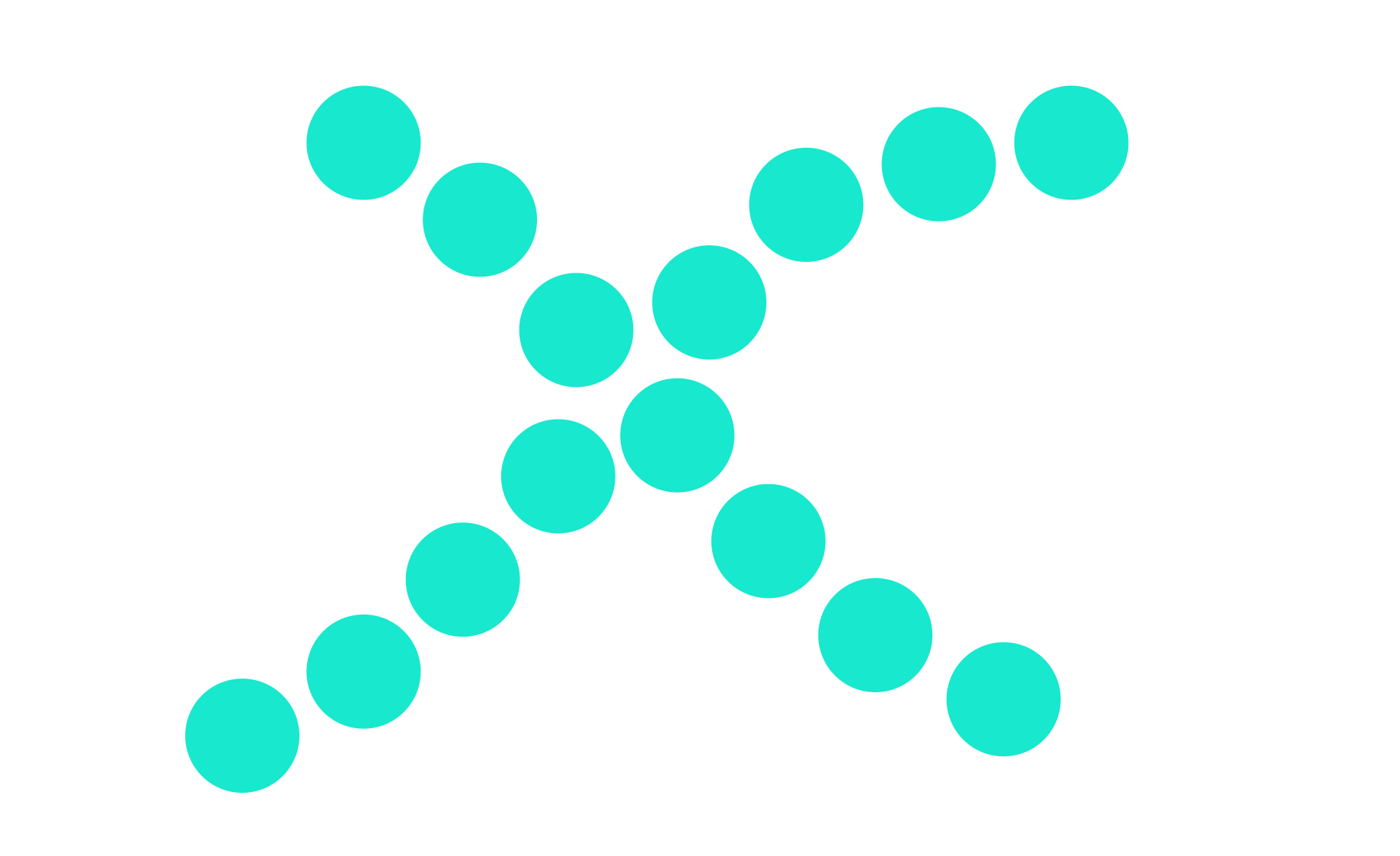
This is Continuation at work. We assume that the groups of dots are along the contours, even when it could also be the case that the dots are more like two caterpillars bumping bellies.
这是工作的延续。 我们假设点组沿着轮廓,即使这也可能是点更像是两个毛毛虫撞击腹部的情况。

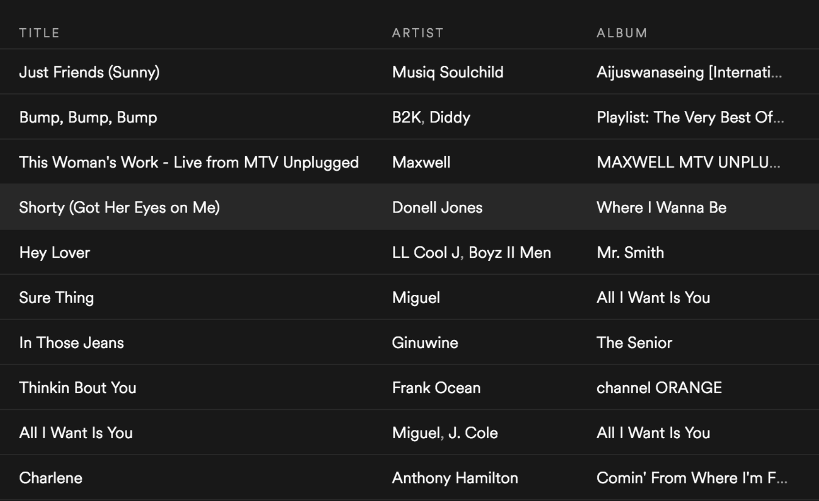
User interfaces apply this principle by keeping related things on the same contours (which are usually straight lines). This is how tables work, for example. We know that all the items on the left are song titles, and we also know that all the items on a row are related. Here, we can see that “Shorty (Got Her Eyes on Me)” is a song performed by Donell Jones, and can be found on the Album “Where I Wanna Be”. Don’t you forget it.
用户界面通过将相关内容保持在相同的轮廓(通常是直线)上来应用此原理。 例如,表就是这样工作的。 我们知道左侧的所有项目都是歌曲标题,而且我们知道一行中的所有项目都是相关的。 在这里,我们可以看到“ Shorty(让她注视我)”是Donell Jones演唱的歌曲,可以在专辑“ Where I Wanna Be”中找到。 你不忘了吗
This principle also often appears in the coding realm. Code often contains nested blocks, and developers will use the Continuation principle to communicate where those nested blocks begin and end.
这个原理也经常出现在编码领域。 代码通常包含嵌套块,开发人员将使用Continuation原理来传达这些嵌套块的开始和结束位置。
在实践中 (In practice)
This is usually where I get to make fun of my friend (we’ll call him Nick), which is my favorite part. However, to protect his privacy, I’ll have to isolate bits of his resume.
通常,这是我取笑我的朋友(我们称他为尼克)的地方,这是我最喜欢的部分。 但是,为了保护他的隐私,我必须隔离他的简历中的一些内容。
Usually the first mistake I point out is the most noticeable one, which has to do with the principle of Proximity.
通常,我指出的第一个错误是最明显的错误,这与邻近性原则有关。
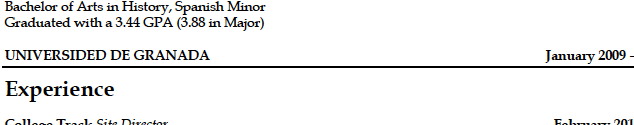
What Nick did here was put his second education listing too close to the divider line, which most people would infer to mean that everything below that line has to do with his experience at that school. With even spacing around that line, it would be correctly read as a divider with no affiliation to the above or below.
尼克在这里所做的就是将他的第二次教育列表过于靠近分界线,大多数人认为这意味着该分界线以下的所有内容都与他在那所学校的经历有关。 如果在该行周围有均匀的间距,则可以正确地将其理解为分隔线,而与上方或下方无关。
His second mistake was a Similarity one. Check out the dates in this snippet.
他的第二个错误是相似性 。 在此代码段中查看日期 。
It’s possible you won’t even see the other two at first. They’re in italics and in parentheses in the middle of a text block, while the one you probably saw first is isolated and in bold, non-italics text in the upper right.
您一开始可能甚至看不到其他两个。 它们用斜体和括号括在一个文本块的中间,而您可能首先看到的是孤立的,并在右上角使用粗体非斜体文本。
Recruiters will often try to get a sense of someone’s timeline when examining their resume, and it helps to be able to recognize dates as dates. The best way to do this is to format them all the same. They should also all be on the same line. Which brings me to the next mistake Nick made: the one with Continuity.
招聘人员在检查自己的简历时通常会尝试了解他们的时间表,这有助于将日期识别为日期。 最好的方法是将它们全部格式化。 它们也都应该在同一条线上。 这使我想到了尼克所犯的下一个错误:具有连续性的错误。
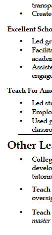
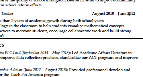
This one is nit-picky, I admit. But the organizations he worked for are listed nicely down the left edge — and even formatted all the same! — until we get to the bottom section, where they are needlessly indented, inhibiting the reader’s ability to scan the resume quickly.
我承认,这是挑剔的。 但是他工作的组织在列表的左下角很好地列出了,甚至格式都一样! —直到我们到达不必要的缩进的底部为止,这限制了读者快速扫描简历的能力。
Perhaps he wanted recruiters to spend some time parsing his resume. Perhaps he was going for the IKEA Effect. The world may never know.
也许他希望招聘人员花一些时间来分析他的简历。 也许他是为了宜家效果 。 世界可能永远不会知道。
Okay I’ll leave Nick alone now. But next time a designer is being annoying about a few pixels’ worth of spacing or some text formatting, remember how bad this resume design was. We want as little of that put out into the world as possible, and that is part of a designer’s job. Please bear with us. 🙏
好吧,我现在让尼克一个人呆着。 但是,下一次设计人员要烦恼几个像素的间距或某些文本格式时,请记住此简历设计有多糟糕。 我们希望尽可能少地将其投放到世界上,这是设计师工作的一部分。 请忍受我们。 🙏
翻译自: https://uxdesign.cc/gestalt-in-ux-or-why-designers-are-so-annoying-about-spacing-a4f06a6e255e
hp-ux


 3671
3671


 被折叠的 条评论
为什么被折叠?
被折叠的 条评论
为什么被折叠?
 到【灌水乐园】发言


