


figma设计
When starting a design project, a fast pace and multiple design iterations can easily lead to a cluttered mess. Taking the time in the beginning to build good organizational habits will save you time later. You’ll thank your past self when you don’t have to rename countless files and do the tidying the day before final handoff.
在开始设计项目时,快速的步伐和多次的设计迭代很容易导致混乱。 花时间开始建立良好的组织习惯将为您节省时间。 当您不必重命名无数文件并整理最后一次交接的前一天时,您将感谢您过去的时光。
Here are five tips that help me keep my files organized and easy to browse. No one likes inheriting a messy design file!
这里有五个提示,可以帮助我使文件井井有条,易于浏览。 没有人喜欢继承凌乱的设计文件!
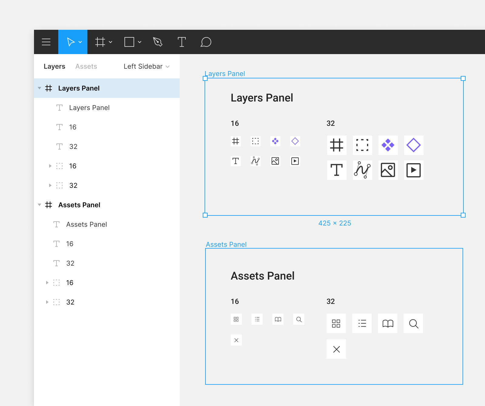
1.为组件和层提供描述性名称 (1. Give Components & Layers Descriptive Names)
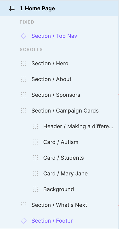
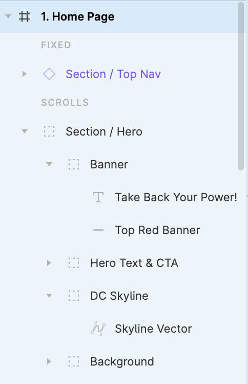
Keep your layer panel neat and ordered! Each frame, group, and component should have a descriptive name that tells you what it is and what it is for. For complex designs, it’s a real pain when you can’t immediately tell the difference between “Vector 21” and “Vector 22”.
保持图层面板整洁有序! 每个框架,组和组件均应具有描述性名称,以告诉您它的含义和用途。 对于复杂的设计,当您无法立即分辨出“ Vector 21”和“ Vector 22”之间的区别时,这确实是一个痛苦。
If you like making a lot of groups, it can be helpful to order those groups in the order that they appear on your frame. For example, for one of my homepage designs, my largest groups represented large sections on the page, starting with the page’s header, and ending with its footer.
如果您喜欢创建许多组,则按照在框架上显示的顺序对这些组进行排序可能会有所帮助。 例如,对于我的一个首页设计,我最大的组代表页面上的大部分,从页面的页眉开始,以页脚结束。
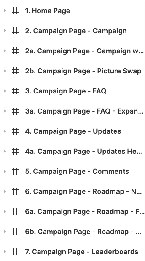
2.订购相框/画板 (2. Order Your Frames/Artboards)
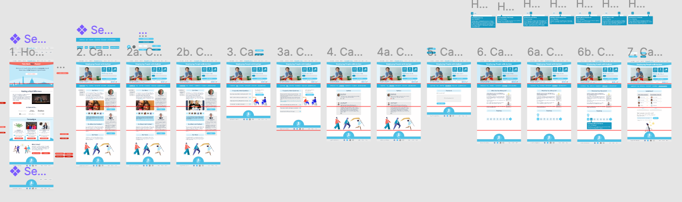
If you’ve spent any time on a project involving multiple pages, you know Figma files can get visually cluttered very quickly! If you are creating a user-flow for a prototype, ensure that your naming and numbering conventions are consistent.
如果您在涉及多个页面的项目上花费了任何时间,就会知道Figma文件很快就会变得视觉混乱! 如果要为原型创建用户流,请确保命名和编号约定一致。
For prototypes with multiple flows, it can be helpful to separate each user-flow into its own group. From there, consistently follow a right-to-left or top-to-bottom ordering convention.
对于具有多个流程的原型,将每个用户流程分成自己的组可能会有帮助。 从那里开始,始终遵循从右到左或从上到下的排序约定。
3.使用页面保持整洁 (3. Use Pages to Keep Things Tidy)

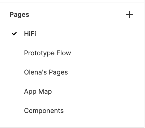
There’s no need to crowd a single page of your Figma file. If you can group user-flows, iteration, or components on separate pages it’s incredibly useful to do so. You can add or duplicate pages via the menus above the layer panel.
无需占用您的Figma文件的单个页面。 如果您可以在单独的页面上对用户流,迭代或组件进行分组,那么这样做非常有用。 您可以通过图层面板上方的菜单添加或复制页面。
4.使用组件/符号 (4. Use Components/Symbols)
If you have any repeatable elements in your design, like icons or buttons, build them out as components first! Rather than painstakingly tweaking every single copy of a design element, using symbols ensures that any change to your original element will be transferred to all copies of it. This is a tremendous time-saver and the organized use of components is crucial for any kind of handoff.
如果设计中有任何可重复的元素(例如图标或按钮),请首先将它们构建为组件! 使用符号可以确保对原始元素的任何更改都将转移到设计元素的所有副本中,而不用费力地调整设计元素的每个副本。 这可以节省大量时间,并且有组织地使用组件对于任何类型的切换都是至关重要的。
5.利用样式 (5. Make Use of Styles)
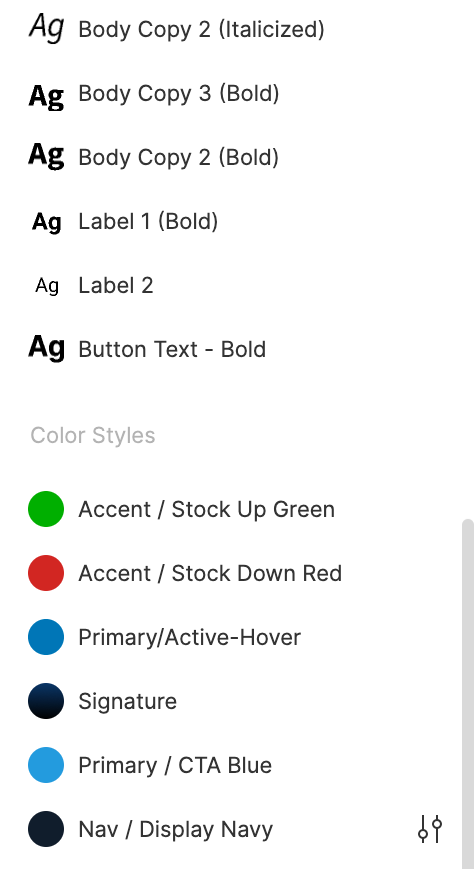
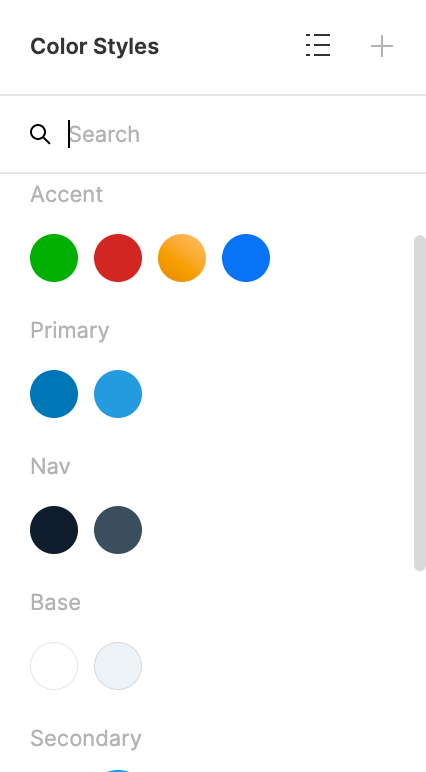
Much like components, text, color, and effect styles are crucial time-savers that are worth every second it takes to set up. Styles are standard configurations for your elements and will save you from having to manually select the details for each element you make.
与组件,文本,颜色和效果样式非常相似,它们是至关重要的节省时间,值得花费每一秒钟来进行设置。 样式是元素的标准配置,它将使您不必手动选择制作的每个元素的详细信息。
What’s also special about styles is that like components, changing the core style will affect all instances of the style. If you need a deeper blue for your pressed button state, changing your “Button Pressed” color style will save you the trouble of manually updating it throughout your whole design.
样式的特殊之处还在于,与组件一样,更改核心样式将影响样式的所有实例。 如果您需要更深的蓝色来表示按下的按钮状态,则更改“ Button Pressed”的颜色样式将避免在整个设计中手动更新它的麻烦。
These are the quickest and most useful tips I’ve learned throughout my time as a designer. Putting in the effort early exponentially saves you time near the end of your project!
这些是我在作为设计师的整个过程中学到的最快,最有用的技巧。 尽早投入大量精力可以节省您接近项目结束的时间!
You can learn more and read more in-depth organizational advice from Figma’s Guides & Practices section on their website.
您可以从Figma网站上的“指南和实践”部分了解更多信息并阅读更多深入的组织建议。
翻译自: https://uxdesign.cc/5-figma-tips-from-a-reformed-messy-designer-95b232bd58d4
figma设计


 1386
1386

 被折叠的 条评论
为什么被折叠?
被折叠的 条评论
为什么被折叠?
 到【灌水乐园】发言


