


快速ui设计
During the last weekend, I decided to start playing with Swift UI and I found a great post by Esra Kadah for building an Instagram like travel app, which I found really awesome, and for the sake of this post I’m going to reuse the same design but with a slightly difference, I’m going to use swift UI.
在上个周末,我决定开始使用Swift UI,我发现Esra Kadah撰写了一篇很棒的文章,内容是建立像旅行应用之类的Instagram ,我发现它真的很棒,为了这篇文章,我将重用相同的设计,但略有不同,我将使用Swift UI。
While working with swift UI I found great advantages like developing and debugging really fast, it’s really easy to learn(even easier if you have an iOS background), having the same standard for building UI elements and the live preview is something from another world. However, we need to be careful while working on the contentViews because while I was working with the first List, after a couple of hours, the number of lines was more than 200. I finished refactoring my view with reusable views and separating it in different and smaller UI elements.
在使用Swift的UI时,我发现了很多优势,例如非常快地进行开发和调试,它的确非常容易学习(如果您具有iOS背景,则更加容易),具有相同的构建UI元素的标准,实时预览是另一个世界。 但是,在处理contentViews时我们需要小心,因为当我使用第一个List时,几个小时后,行数超过了200。我完成了可重用视图的重构,并将其分为不同的视图和较小的UI元素。
GitHub source code
GitHub源代码
The source code can be found: here
可以找到源代码: 这里
To get started, the Sketch designs I used include the 4 screens above (popular posts screen, profile screen, post detail screen, and new posts screen). You can download the Sketch file here.
首先,我使用的Sketch设计包括上面的4个屏幕(热门帖子屏幕,个人资料屏幕,帖子详细信息屏幕和新帖子屏幕)。 您可以在此处下载Sketch文件。
The Gif below shows the whole interaction with the Swift UI app I built which I’m going to describe deeply:
下面的Gif展示了与我构建的Swift UI应用程序的整个交互,我将对其进行深入描述:
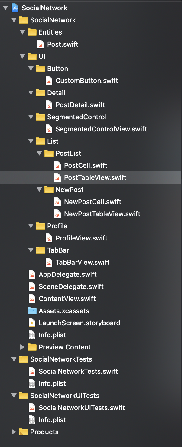
Project Structure
项目结构
The project structure it’s really simple, we have an entities directory including the one and only Entity we need which is the Post.
项目结构非常简单,我们有一个实体目录,其中包含我们唯一需要的一个实体,即Post。
In addition, you can also find a UI directory that contains 6 directories embedded (Button, Detail, SegmentedControl, PostList, NewPost, Profile, and TabBar).
此外,您还可以找到一个UI目录,其中包含嵌入的6个目录(Button,Detail,SegmentedControl,PostList,NewPost,Profile和TabBar)。
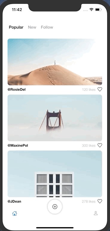
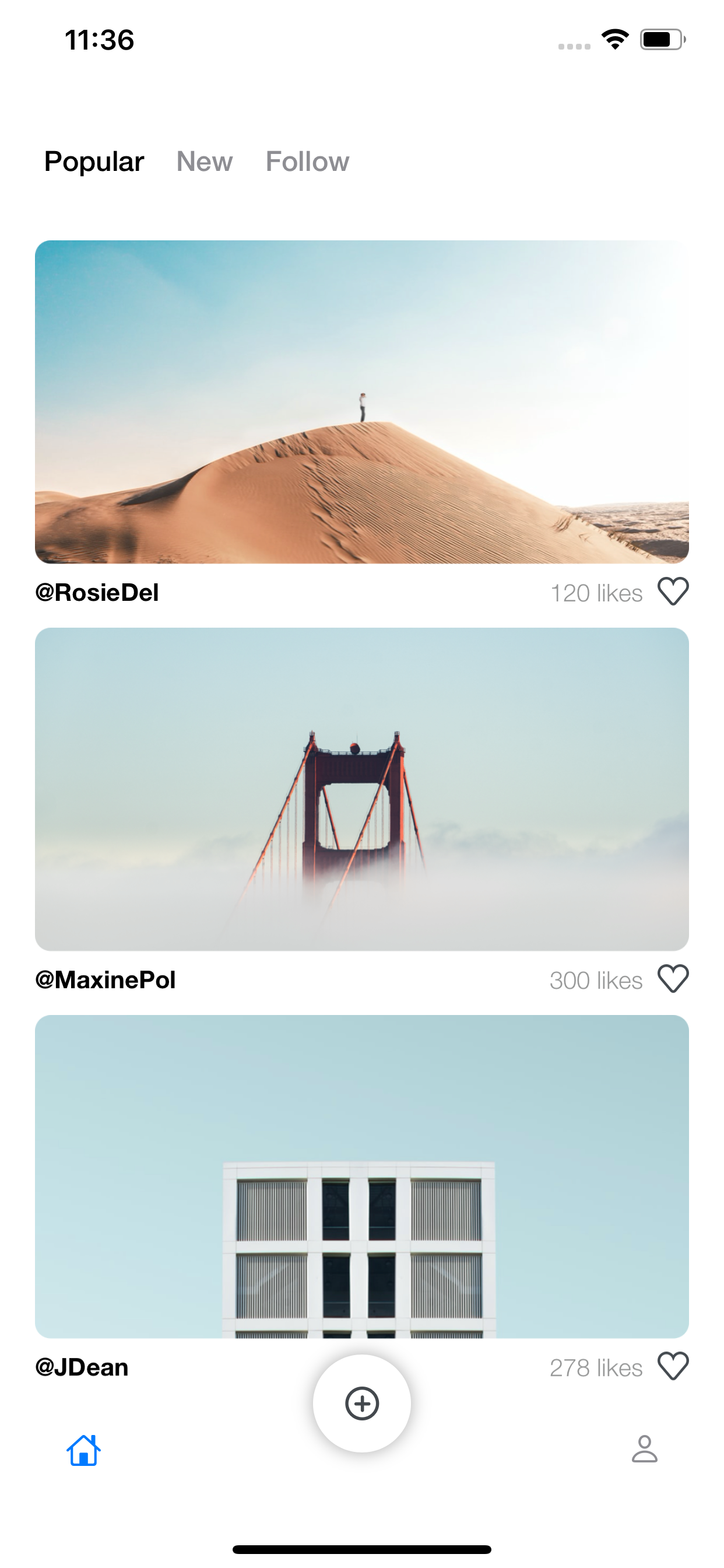
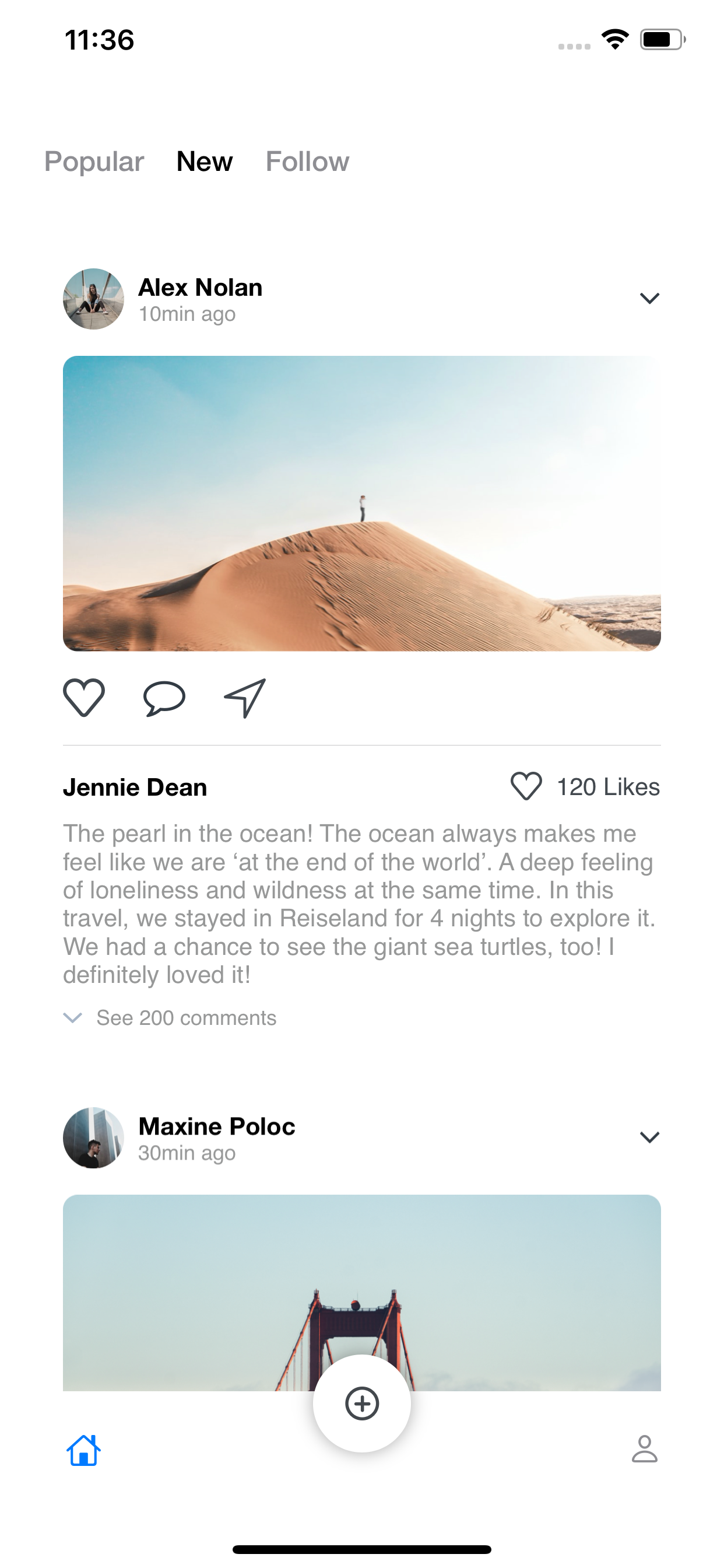
Popular Posts Screen
热门帖子屏幕
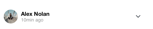
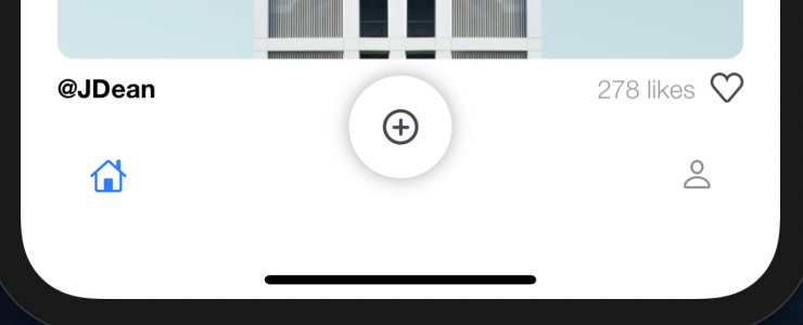
This screen includes at the top a segmented view for selecting 3 options; popular, new and follow, as well as a List view with the image of the post, the user name, and number of likes.
该屏幕在顶部包括用于选择3个选项的分段视图。 热门,新用户和关注者,以及带有帖子图像,用户名和喜欢次数的列表视图。
struct PostList : View {var posts: [Post] = mockedPosts@State var selected = 0var body: some View {List { ForEach(posts) { post in ZStack { PostCell(post: post) NavigationLink(destination: PostDetail(name: post.name, userName: post.userName, imageName: post.imageName, likes: post.likes, description: post.description, views: post.views, downloads: post.downloads)) { EmptyView() }.buttonStyle(PlainButtonStyle()) } }}.onAppear { UITableView.appearance().separatorStyle = .none }}}The code above belongs to PostList, as you can see, it is just a List which is iterating through the mocked posts and for each of the posts a PostCell is created, the buttonStyle(PlainButtonStyle() is used to remove the List disclosure indicator added automatically. The NavigationLink handles the navigation once the List PostCell is tapped using as a destination the PostDetail.
上面的代码属于PostList ,如您所见,它只是一个List,它在模拟的帖子中进行迭代,对于创建PostCell的每个帖子,使用buttonStyle(PlainButtonStyle()来删除添加的List公开指示器自动该NavigationLink处理一旦列表PostCell使用作为目的地的PostDetail抽头导航。
The result for for the PostList is the following:
PostList的结果如下:
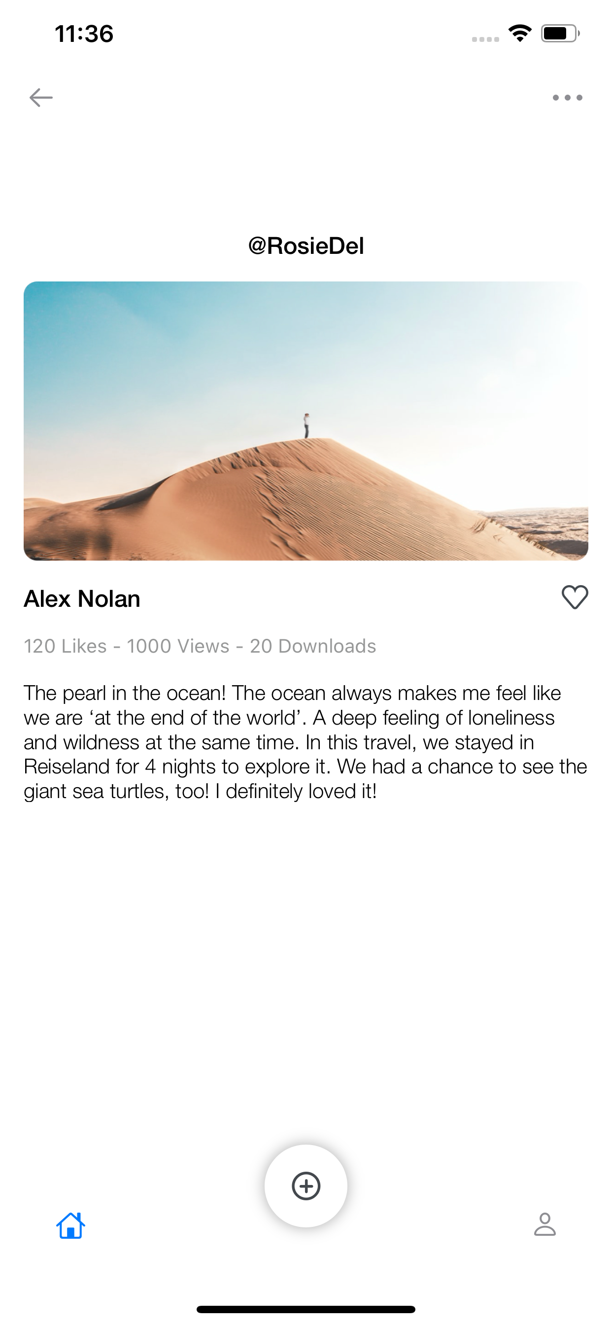
Post Detail Screen
帖子详细信息屏幕
The post detail is one of the most simple screens, it just includes 7 required parameters(name, userName, imageName, likes, etc) which are sent from the selection of the Post. Using the Stacks provided by Swift UI, i built this simple screen, using a VStack which is a vertical stack for distributing all the UI elements needed and a Hstack for placing horizontally the name of the owner of the post and the Heart button for giving it a like. The variable named mode was created to handle the back navigation once the back button is pressed. The navigation items; Back button and Menu, where added using the navigationBarItems.
帖子详细信息是最简单的屏幕之一,它仅包含7个必需的参数(名称,用户名,图像名称,喜欢等),这些参数是通过选择帖子发送的。 使用Swift UI提供的Stacks,我构建了一个简单的屏幕,使用了一个VStack ,它是一个垂直堆栈,用于分发所有需要的UI元素;一个Hstack,用于水平放置帖子所有者的名称,并使用Heart按钮为其提供名称一样。 一旦按下后退按钮,便创建了名为mode的变量来处理后退导航。 导航项; “后退”按钮和“菜单”,其中使用navigationBarItems添加。
struct PostDetail : View {var name: Stringvar userName: Stringvar imageName: Stringvar likes: Intvar description: Stringvar views: Intvar downloads: Int@Environment(\.presentationMode) var mode: Binding<PresentationMode>var body: some View {VStack(spacing: 15.0) {    Text(userName)        .font(.custom("HelveticaNeue-Medium", size: 16))        .foregroundColor(.black)    Image(imageName)        .resizable()        .scaledToFit()    HStack {        Text(name)            .font(.custom("HelveticaNeue-Medium", size: 16))            .foregroundColor(.black)        Spacer()        Button(action: {        }) {            VStack {            CustomButton()            }        }    }    VStack(spacing: 15.0) {        Text(String("\(likes) Likes - \(views) Views - \(downloads)         Downloads"))
        .font(.footnote).frame(maxWidth: .infinity, alignment:  .leading)        .font(.custom("HelveticaNeue-Light", size: 14))        .foregroundColor(Color("LightGrayColor"))        Text(description)            .font(.custom("HelveticaNeue-Light", size: 14))            .multilineTextAlignment(.leading)            .foregroundColor(Color(.black))    }    Spacer()}    .padding()    .navigationBarBackButtonHidden(true)    .navigationBarItems(leading: Button(action : {    self.mode.wrappedValue.dismiss()    }){    Image(systemName: "arrow.left").foregroundColor(.gray)    }, trailing: Button(action : {    }){    Image("Menu").foregroundColor(.gray)    })    }}
here is the result:
结果如下:
New Posts Screen
新帖子屏幕
New posts screen it’s also a simple List including a nice UI style.
“新帖子”屏幕也是一个简单的列表,其中包含漂亮的UI样式。
As you can see in the code below, the NewPostList it’s just a simple List iterating through our mocked posts. For following the same design used in the Sketch file, we don’t need any separator to be displayed, so we use the separatorStyle = .none.
正如您在下面的代码中看到的那样, NewPostList只是一个遍历我们模拟帖子的简单列表。 为了遵循Sketch文件中使用的相同设计,我们不需要显示任何分隔符,因此我们使用了spacerStyle = .none。
struct NewPostList : View {var posts: [Post] = mockedPostsvar body: some View { List { ForEach(posts) { post in NewPostCell(post: post) }}.onAppear { UITableView.appearance().separatorStyle = .none}}The NewPostCell
NewPostCell
This UI element was created using a VStack that embeds all the images, text, and buttons required.
该UI元素是使用VStack创建的,该VStack嵌入了所有所需的图像,文本和按钮。
There is an Hstack for the profile image, a Vstack including the name of the user who owns the post and the time, and finally an arrow.
个人资料图片有一个Hstack,一个Vstack包括拥有帖子和时间的用户的名字,最后是一个箭头。
Moreover, I added the image of the post to the Vstack, and new a Hstack including 3 UIelements (heart, comment, and direct message icons). I also added a Divider() that provides the gray line and a new Hstack for the Name of the User, the heart with the number of likes.
此外,我添加了后到Vstack的形象,新的一Hstack包括3个UI元素(心脏,评论,直接邮件图标)。 我还添加了一个Divider() ,它提供了灰线,并为用户名提供了一个新的Hstack,该用户名带有喜欢的数目。

struct NewPostCell: View {let post: Postvar body: some View { VStack(spacing: 15.0) { HStack { Image(post.profileImageName) VStack { Text(post.name) .font(.custom("HelveticaNeue-Bold", size: 14)) .frame(maxWidth: .infinity, alignment: .leading) Text(String("\(post.time)min ago")) .font(.custom("HelveticaNeue-Regular", size: 12)) .foregroundColor(Color("LightGrayColor")) .frame(maxWidth: .infinity, alignment: .leading) } Spacer() Image("ic_down") }.frame(maxWidth: .infinity, alignment: .leading) Image(post.imageName) .resizable() .scaledToFit() HStack(spacing: 22.0) { Image("HeartBig") Image("Actions") Image("destinationicon") }.frame(maxWidth: .infinity, alignment: .leading) Divider() VStack (spacing: 10.0) { HStack { Text(post.userName) .font(.custom("HelveticaNeue-Bold", size: 14)) Spacer() CustomButton() Text(String("\(post.likes) Likes")) .font(.custom("HelveticaNeue-Regular", size: 14)) .foregroundColor(Color("DarkGrayColor")) }.frame(maxWidth: .infinity, alignment: .leading) Text(post.description) .font(.custom("HelveticaNeue-Regular", size: 14)) .foregroundColor(Color("LightGrayColor")) HStack { Image("ic_downLight") Text(String("See \(post.comments) comments")) .font(.custom("HelveticaNeue-Regular", size: 12)) .foregroundColor(Color("LightGrayColor")) }.frame(maxWidth: .infinity, alignment: .leading) }.frame(maxWidth: .infinity, alignment: .leading) }.padding() }}Result:
结果:
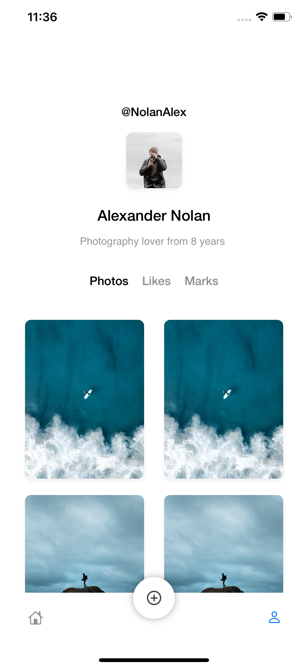
Profile Screen
个人资料屏幕
The most important part from the profile screen it’s the CollectionView, this collection includes the pictures posted by the user arranged into a 2 x n collection. As you can see it is really simple, I’m iterating the mocked information named data and displaying the Images two by two.
概要文件屏幕上最重要的部分是CollectionView,该集合包括用户发布的图片,这些图片排列成2 xn的集合。 如您所见,这真的很简单,我要遍历名为data的模拟信息,并逐两显示Image。
struct CollectionView: View { let data: DataModel var body: some View { VStack { HStack { ForEach(0..<2) { items in Spacer() Image(self.data.imageName) Spacer() } } } }}result:
结果:
Where to go from here?
然后去哪儿?
For my next stories i plan to emphasize on 2 cool components that i created for this social network project named SegmentedControlView and TabBarView
在接下来的故事中,我计划重点介绍为这个名为SegmentedControlView的社交网络项目创建的2个很棒的组件, TabBarView
翻译自: https://medium.com/@ivanchemical/swift-ui-social-network-c27a67078d62
快速ui设计


 3327
3327


 被折叠的 条评论
为什么被折叠?
被折叠的 条评论
为什么被折叠?
 到【灌水乐园】发言


