


 在本篇博客的第二部分,我们深入探讨Kivymd的关键组件,这是构建任何应用程序的基础。重点介绍了如何利用Kivy与Kivymd集成,实现用户界面和逻辑分离,提高代码可读性和管理性。通过KV文件的层次结构,可以方便地定义和管理UI元素。
In the previous part, we discussed
在上一部分中,我们讨论了
- What is Kivy and how to use it 什么是Kivy以及如何使用它
- Why Kiymd is required 为什么需要Kiymd
- And built a basic app displaying “Hello world” 并构建了一个显示“ Hello world”的基本应用
If you haven’t read the previous post then I highly recommend you to have a look at Part-1 so that you are familiar with the terminologies:
如果您还没有阅读上一篇文章,那么我强烈建议您看一下第1部分,以便您熟悉术语:
In this second part, we will look at various key elements of Kivymd which are the building blocks of any app.
在第二部分中,我们将研究Kivymd的各个关键要素,这些要素是任何应用程序的基础。
字符串生成器 (String Builder)
Before we proceed to various components of the app-building, I want to bring out a useful feature of integrating Kivy with Kivymd. Kivy has its own language that is dedicated to describing the user interface and various interactions. It is useful as the UI file can be separated from the logic file making the code more readable and manageable. We should separate these logics as in the .kv file, we don’t have to make any import statements. We need not worry about where the specific element is located in the Kivymd directory, also we don’t need to explicitly bind a widget to its root widget. KV files follow a hierarchical structure where you can define one root widget and whenever you define components below this, they are by default added to the root widget. We will look at this concept once again in MDLabel's example.
在继续进行应用程序构建的各个组成部分之前,我想介绍一下将Kivy与Kivymd集成的有用功能。 Kivy有自己的语言,专用于描述用户界面和各种交互。 由于UI文件可以与逻辑文件分开,因此使代码更易于阅读和管理,因此很有用。 我们应该像.kv文件中那样将这些逻辑分开,我们不必执行任何import语句。 我们不必担心特定元素在Kivymd目录中的位置,也不需要显式地将小部件绑定到其根小部件。 KV文件遵循一种层次结构,您可以在其中定义一个根窗口小部件,并且每当您在其中定义以下组件时,默认情况下会将它们添加到根窗口小部件中。 我们将在MDLabel的示例中再次查看这个概念。
KivyMD的关键元素 (Key Elements of KivyMD)
We have talked enough about the basics, let’s dive-in into the building blocks of app-building:
我们已经充分讨论了基础知识,让我们深入研究应用程序构建的构建块:
屏幕 (Screen)
All the things require a stage. The screen element is the first thing an app will have. All the activities, components are defined on a screen. It is defined simply by calling it in the KV file.
所有的事情都需要一个阶段。 屏幕元素是应用程序的第一件事。 所有活动,组件都在屏幕上定义。 只需在KV文件中调用即可定义。
Screen:
    components
    .
    .
    .
MDLabel (MDLabel)
We have used this component several times during the introduction and demo part. This component makes it possible to display any text on your app screen. We can display any component in many ways:
在介绍和演示部分中,我们多次使用了此组件。 该组件可以在您的应用程序屏幕上显示任何文本。 我们可以通过多种方式显示任何组件:
Or the other way:
或另一种方式:
Both of them returns the same output:
它们都返回相同的输出:

MDLabel has various properties to customize:
MDLabel具有多种可自定义的属性:
font_style: Available options are ‘H1’, ‘H2’, ‘H3’, ‘H4’, ‘H5’, ‘H6’, ‘Subtitle1’, ‘Subtitle2’, ‘Body1’, ‘Body2’, ‘Button’, ‘Caption’, ‘Overline’, ‘Icon’.
font_style:可用选项为“ H1”,“ H2”,“ H3”,“ H4”,“ H5”,“ H6”,“ Subtitle1”,“ Subtitle2”,“ Body1”,“ Body2”,“ Button”,“标题”,“概述”,“图标”。
text: The text you want to display on the app.
文字:您要在应用上显示的文字。
theme_text_color: Available options are ‘Primary’, ‘Secondary’, ‘Hint’, ‘Error’, ‘Custom’, ‘ContrastParentBackground’.
theme_text_color:可用选项为“主要”,“次要”,“提示”,“错误”,“自定义”,“ ContrastParentBackground”。
text_color: Text color is given in RGBA format. The values are given as percentage values and not absolute values. It means that the RGB values you have chosen must be divided by 255 to get the percentage values. Note that while using custom colors, you need to specify theme_text_color to custom. Consider this example:
text_color:文本颜色以RGBA格式给出。 这些值以百分比值而非绝对值给出。 这意味着您选择的RGB值必须除以255才能得到百分比值。 请注意,在使用自定义颜色时,您需要将theme_text_color指定为custom 。 考虑以下示例:
text_color=(1, 0.2, 0.3, 1),
theme_text_color='Custom'
When this is applied to the existing example, you will get this result:
将其应用于现有示例时,将得到以下结果:

5. halign and valign: We can assign the position of the text horizontally and vertically. Available options are auto, left, center, right, and justify.
5. halign和valign:我们可以水平和垂直分配文本的位置。 可用选项包括自动,左移,居中,右移和对齐。
6. markup: We can use the markup language to customize the text. You need to specify markup = True to use the markup options. Check the kivy markup documentation for all the available actions.
6. 标记:我们可以使用标记语言来自定义文本。 您需要指定markup = True才能使用标记选项。 查看kivy标记文档中的所有可用操作 。
All the properties discussed here remain the same for most of the components except the ones that are exclusive for Labels. You can check more options in the official documentation.
除了标签专用的属性外,此处讨论的所有属性对于大多数组件而言都是相同的。 您可以在官方文档中查看更多选项。
按键 (MDButton)
It enables you to make the UI interactive by binding the button action with other widgets. These bindings are performed by referring to each other ids. There are various types of buttons available in Kivymd and you can choose any button which suits your requirements. Available options are:
它使您可以通过将按钮操作与其他窗口小部件绑定来使UI具有交互性。 这些绑定是通过互相引用id来执行的。 Kivymd中提供了各种类型的按钮,您可以选择适合您要求的任何按钮。 可用的选项有:
- MDIconButton MDIconButton
- MDFloatingActionButton MDFloatingActionButton
- MDFlatButton MDFlatButton
- MDRaisedButton MDRaisedButton
- MDRectangleFlatButton MDRectangleFlatButton
- MDRectangleFlatIconButton MDRectangleFlatIconButton
- MDRoundFlatButton MDRoundFlatButton
- MDRoundFlatIconButton MDRoundFlatIconButton
- MDFillRoundFlatButton MDFillRoundFlatButton
- MDFillRoundFlatIconButton MDFillRoundFlatIconButton
- MDTextButton MDTextButton
- MDFloatingActionButtonSpeedDial MDFloatingActionButtonSpeedDial
I have coded an example which covers the most frequent buttons used for better understanding:
我编写了一个示例,其中涵盖了用于更好理解的最常用按钮:
Here I have separated the UI code in a variable and then loading that variable in the builder method. This is also a great approach if you don’t want to make separate files and manage the whole code in one file. The output is:
在这里,我将UI代码分隔为一个变量,然后将该变量加载到builder方法中。 如果您不想创建单独的文件并在一个文件中管理整个代码,那么这也是一种很好的方法。 输出为:
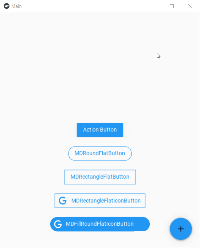
Let’s understand what’s going on:
让我们了解发生了什么:
- Different buttons are displayed on the same screen. 不同的按钮显示在同一屏幕上。
There are various icons that can be included in buttons. Check out the whole list of supported icons here.
- The floating action button is something new here. It is widely used to give relevant social media links, share options, and many more actions depending on your creativity. It is getting the data to be displayed from the backend layer, our python code in the form of a dictionary where the key is the icon name and value is text to be displayed. The app.data searches in the app (the root widget) for the data variable and the Main class of our app hold that variable. It means we should define these variables in the class it belongs to, you will get a better idea when we will build apps with multiple screens. 浮动操作按钮是这里的新功能。 它被广泛用于提供相关的社交媒体链接,共享选项以及更多取决于您的创造力的动作。 它正在从后端层获取要显示的数据,我们的python代码以字典的形式出现,其中键是图标名称,值是要显示的文本。 app.data在应用程序(根窗口小部件)中搜索数据变量,而我们的应用程序的Main类保留该变量。 这意味着我们应该在其所属的类中定义这些变量,当我们构建具有多个屏幕的应用程序时,您会更好地了解。
The action button is also new. The action which I have associated with this button can be done for any button type. Buttons have a lot of properties for every type but most common of them is on_release, on_press, on_close. As the name depicts they are triggered when that specific action occurs. Check the documentation for all the actions.
动作按钮也是新的。 可以针对任何按钮类型执行与此按钮相关联的操作。 按钮的每种类型都有很多属性,但最常见的是on_release,on_press,on_close。 顾名思义,它们是在发生特定操作时触发的。 检查文档以了解所有操作 。
MDTextField (MDTextField)
Now we want to take inputs from the user, process it, and display the results. MDTextField makes it super easy to customize a base text input. It also comes in 3 classes MDTextField, MDTextFieldRound, and MDTextFieldRect. A text field has the input line, some light text (here known as hint text) to indicate what to input, some additional information below the line (here known as helper text), and sometimes an icon too. Let’s take an example:
现在,我们要从用户那里获取输入信息,进行处理并显示结果。 MDTextField使自定义基本文本输入变得非常容易。 它还具有3个类MDTextField,MDTextFieldRound和MDTextFieldRect。 文本字段具有输入行,一些浅色文本(此处称为提示文本)以指示要输入的内容,该行下方的一些其他信息(此处称为帮助程序文本)以及有时也有一个图标。 让我们举个例子:
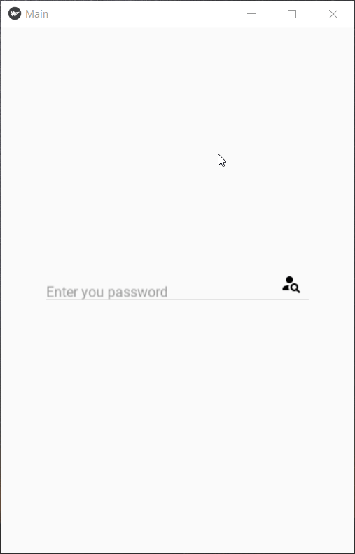
When the user taps on the field, the hint text automatically shifts on the top. Some useful properties of MDTextField are:
当用户点击该字段时,提示文本将自动在顶部移动。 MDTextField的一些有用的属性是:
- The helper text has various modes: “focus”, “persistent” and “error”. In “focus” mode, the helper text only appears when the text field is focused or tapped whereas, in “persistent” mode, the helper text always appears. 助手文本具有多种模式:“聚焦”,“持续”和“错误”。 在“焦点”模式下,仅当文本字段被聚焦或点按时才显示助手文本,而在“持久”模式下,总是显示助手文本。
- We can specify whether the field is required or not using required=True, control the length of text using max_text_length, or make it multi-line input. 我们可以使用required = True指定该字段是否为必填字段,使用max_text_length控制文本的长度,或使其成为多行输入。
- The input can be taken to the python layer by defining an object property in the base class of the app and defining its reference in the KV file which references the id of the text field. See this example: 通过在应用程序的基类中定义对象属性并在引用文本字段ID的KV文件中定义其引用,可以将输入带到python层。 请参阅以下示例:
from kivy.properties import ObjectProperty
#In the KV part add this,
"""
Screen:
    variable_in_class: id_of_text_fieldclass Main(MDApp):
    variable_in_class = ObjectProperty(None)
    .
    .
    .
    # when you want to use that input text use:
    answer = self.root.variable_in_class.text
Check out other properties here.
让我们做一个基本的应用程序! (Let's make a basic app!)
We have covered only a portion of elements but before ending this article let’s combine what we have learned till now into a minimalistic app that takes password as input to display whether we are the root user or not. I would suggest you open up your IDE’s and try to build it yourself and compare it with my code!
我们仅涵盖了一部分元素,但是在结束本文之前,让我们将到目前为止所学的知识组合到一个简约的应用程序中,该应用程序将密码作为输入来显示我们是否是root用户。 我建议您打开IDE并尝试自己构建它,并将其与我的代码进行比较!
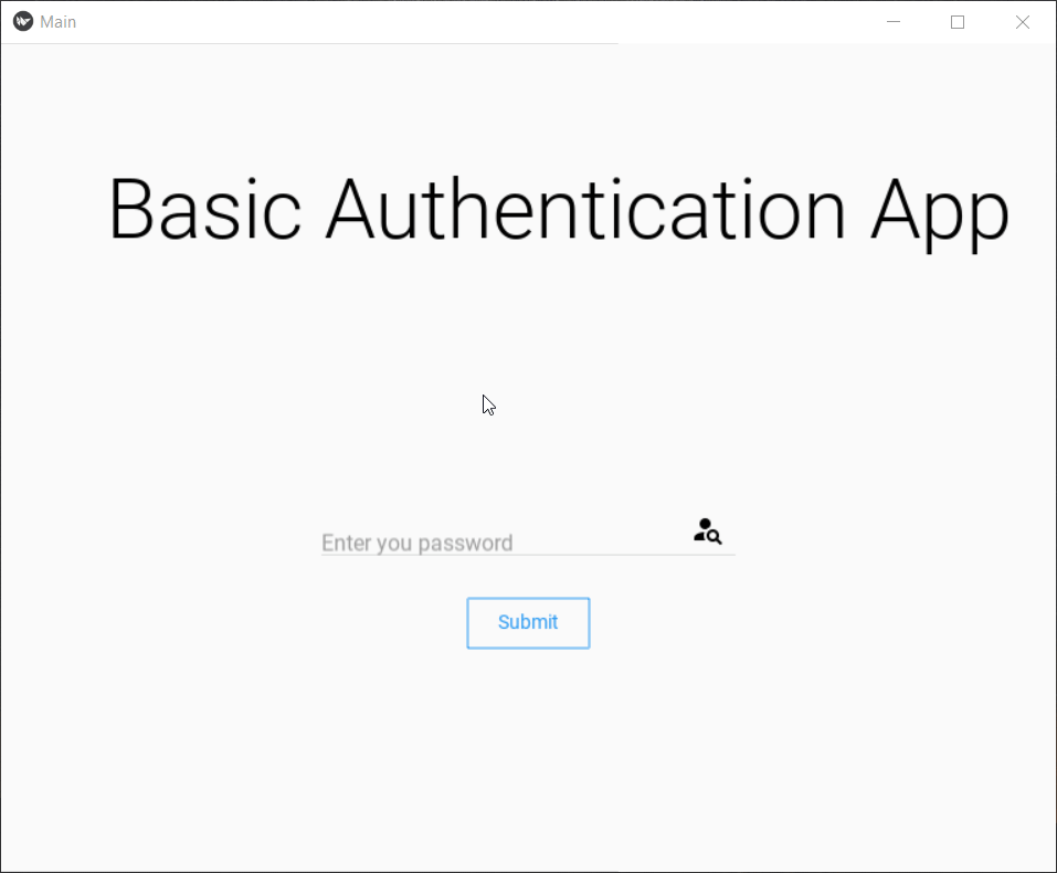
结论和下一步 (Conclusion and what’s next)
In this part, we covered the basic building blocks of Kivymd: Screen, MDLabel, MD Buttons, and MDTextField. In the next article, we will continue our journey and explore other complex and highly used components. If you liked this article, follow me on medium so you receive notifications about upcoming parts. With that said sayonara!
在这一部分中,我们介绍了Kivymd的基本构建块:屏幕,MDLabel,MD按钮和MDTextField。 在下一篇文章中,我们将继续我们的旅程,并探索其他复杂且使用率很高的组件。 如果您喜欢本文,请以中等方式关注我,以便您收到有关即将推出的零件的通知。 说的话说sayonara!
You can find me here:LinkedIn: Link
您可以在这里找到我: LinkedIn: 链接
GitHub: Link
GitHub: 链接
翻译自: https://medium.com/swlh/building-android-apps-with-python-part-2-1d8e78ef9166


 扫一扫
扫一扫
 670
670

 被折叠的 条评论
为什么被折叠?
被折叠的 条评论
为什么被折叠?
 到【灌水乐园】发言


