


点击关注,桓峰基因
桓峰基因公众号推出基于R语言绘图教程并配有视频在线教程,目前整理出来的教程目录如下:
FigDraw 1. SCI 文章的灵魂 之 简约优雅的图表配色
FigDraw 4. SCI 文章绘图之散点图 (Scatter)
FigDraw 5. SCI 文章绘图之柱状图 (Barplot)
FigDraw 6. SCI 文章绘图之箱线图 (Boxplot)
FigDraw 7. SCI 文章绘图之折线图 (Lineplot)
FigDraw 8. SCI 文章绘图之饼图 (Pieplot)
FigDraw 9. SCI 文章绘图之韦恩图 (Vennplot)
FigDraw 10. SCI 文章绘图之直方图 (HistogramPlot)
FigDraw 11. SCI 文章绘图之小提琴图 (ViolinPlot)
FigDraw 12. SCI 文章绘图之相关性矩阵图(Correlation Matrix)
FigDraw 13. SCI 文章绘图之桑葚图及文章复现(Sankey)
FigDraw 14. SCI 文章绘图之和弦图及文章复现(Chord Diagram)
FigDraw 15. SCI 文章绘图之多组学圈图(OmicCircos)
FigDraw 16. SCI 文章绘图之树形图(Dendrogram)
FigDraw 17. SCI 文章绘图之主成分绘图(pca3d)
FigDraw 18. SCI 文章绘图之矩形树状图 (treemap)
FigDraw 19. SCI 文章中绘图之坡度图(Slope Chart)
FigDraw 20. SCI文章中绘图之马赛克图 (mosaic)
FigDraw 21. SCI文章中绘图之三维散点图 (plot3D)
FigDraw 22. SCI文章中绘图之核密度及山峦图 (ggridges)
FigDraw 23. SCI文章中绘图二维散点图与统计图组合
前 言
二维直方图用于二维数据的统计分析,X-Y 轴变量均为数值型。首先将坐标平面分割为许多大小相等的区间,并计算落在每个区间中的观察值数目,然后将观察值映射为矩形的填充色。
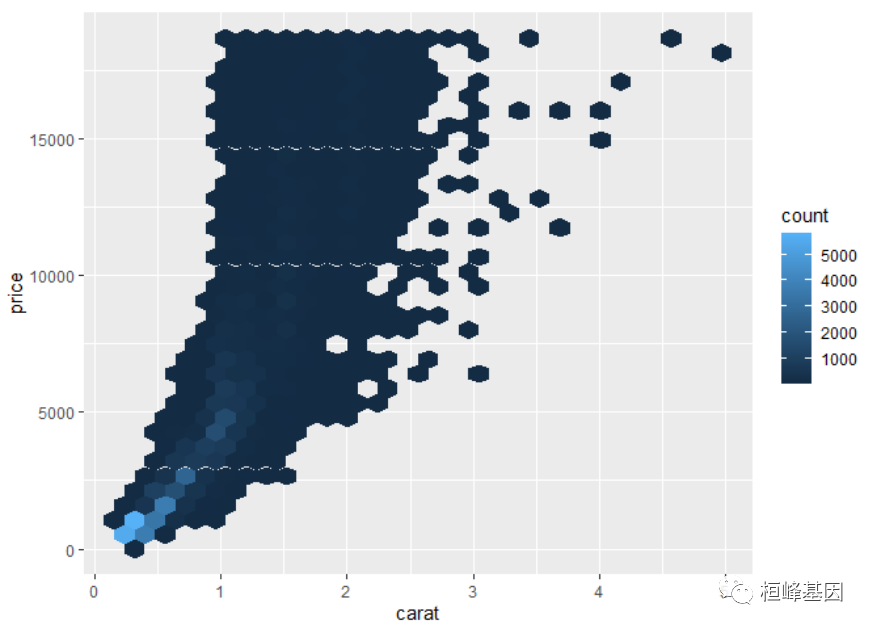
在 ggplot2 中,geom_bin2d 函数的区间形状是矩形,而 geom_hex 函数可以绘制六边形区间。
软件包安装
这里我们利用 ggplot2 软件包里面 geom_bin_2d() 即可实现二维直方图的绘制。
if(!require(ellipse))
  install.packages("ellipse")
例子实操
矩形二维直方图
一般二维直方图
library(ggplot2)
## 二维直方图
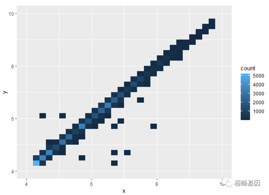
ggplot(diamonds, aes(x, y)) + geom_bin_2d() + xlim(4, 10) + ylim(4, 10)
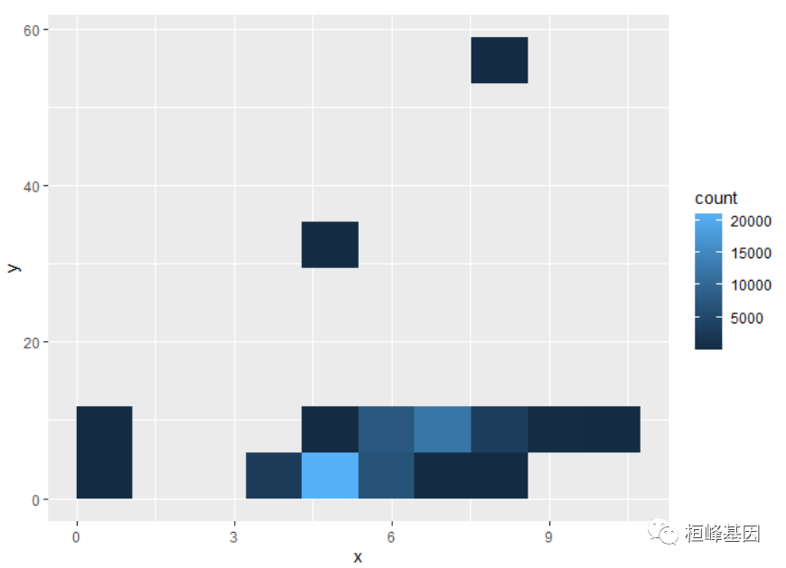
可以通过指定每个方向的bin数量来控制bin的大小:
ggplot(diamonds, aes(x, y)) + geom_bin_2d(bins = 10)
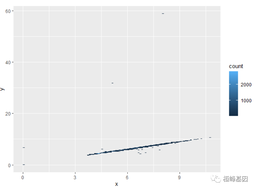
通过指定bin的宽度
ggplot(diamonds, aes(x, y)) + geom_bin_2d(binwidth = c(0.1, 0.1))
六边形二维直方图
ggplot(diamonds, aes(carat, price)) + geom_hex()
不同类型的二维统计直方图
方形统计直方图
library(ggplot2)
library(RColorBrewer)
colormap<- rev(brewer.pal(11,'Spectral'))
# Create normally distributed data for plotting
x1 <- rnorm(mean=1.5, 5000)
y1 <- rnorm(mean=1.6, 5000)
x2 <- rnorm(mean=2.5, 5000)
y2 <- rnorm(mean=2.2, 5000)
x<-c(x1,x2)
y<-c(y1,y2)
df <- data.frame(x,y)
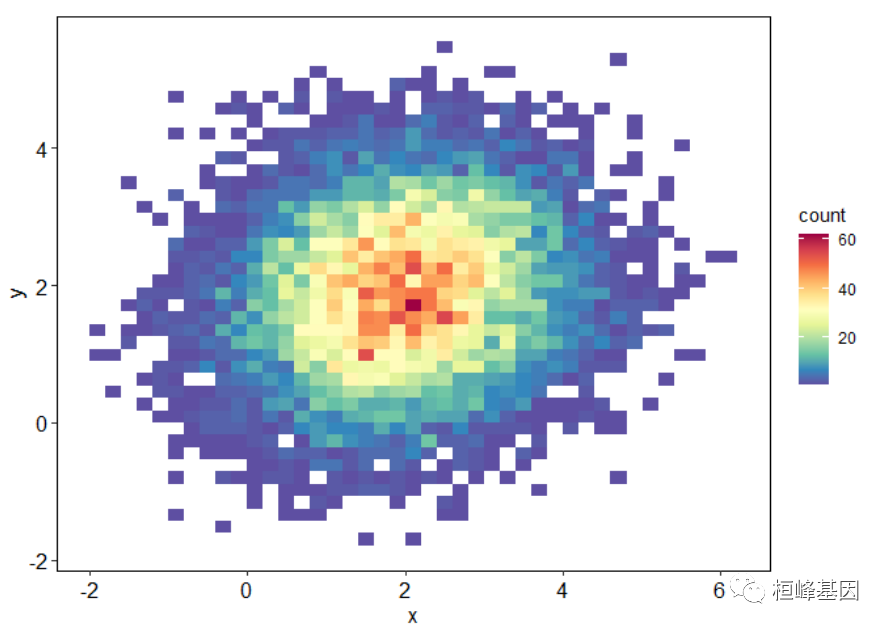
## 不同类型的二维统计直方图
ggplot(df, aes(x,y))+
stat_bin2d(bins=40) + scale_fill_gradientn(colours=colormap)+
theme_classic()+
theme(panel.background=element_rect(fill="white",colour="black",size=0.25),
#panel.grid.major = element_line(colour = "grey60",size=.25,linetype ="dotted" ),
#panel.grid.minor = element_line(colour = "grey60",size=.25,linetype ="dotted" ),
#text=element_text(size=15),
#plot.title=element_text(size=15,family="myfont",hjust=.5),
axis.line=element_line(colour="black",size=0.25),
axis.title=element_text(size=13,face="plain",color="black"),
axis.text = element_text(size=12,face="plain",color="black"),
legend.position="right"
)
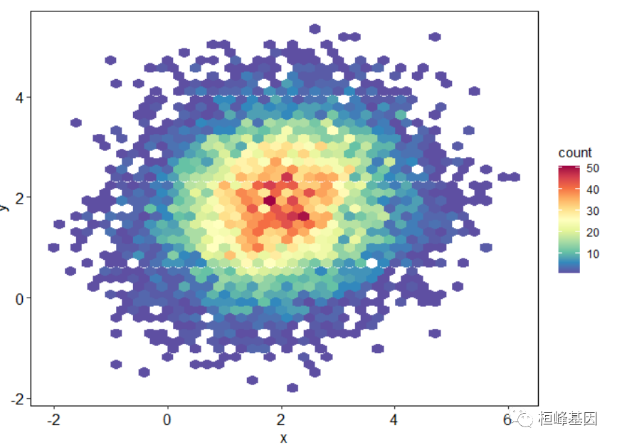
六边形直方图
ggplot(df, aes(x,y))+
  stat_binhex(bins=40) + scale_fill_gradientn(colours=colormap)+
  theme_classic()+
  theme(panel.background=element_rect(fill="white",colour="black",size=0.25),
        #panel.grid.major = element_line(colour = "grey60",size=.25,linetype ="dotted" ),
        #panel.grid.minor = element_line(colour = "grey60",size=.25,linetype ="dotted" ),
        #text=element_text(size=15),
        #plot.title=element_text(size=15,family="myfont",hjust=.5),
        axis.line=element_line(colour="black",size=0.25),
        axis.title=element_text(size=13,face="plain",color="black"),
        axis.text = element_text(size=12,face="plain",color="black"),
        legend.position="right"
  )
二维与一维直方图组合
我们可以通过 gridExtra 软件包继续图形的组合,这个也可以参考上一期FigDraw 23. SCI文章中绘图二维散点图与统计图组合
library(ellipse)
library(gridExtra)
library(plyr)
library(RColorBrewer)

Colormap <- colorRampPalette(rev(brewer.pal(11,'Spectral')))(32)

N<-300
x1 <- rnorm(mean=1.5, N)
y1 <- rnorm(mean=1.6, N)
x2 <- rnorm(mean=2.5, N)
y2 <- rnorm(mean=2.2, N)

data <- data.frame(x=c(x1,x2),y=c(y1,y2))

# 绘制上边的直方图,并将各种标注去除
hist_top <- ggplot()+
  geom_histogram(aes(data$x),colour='black',fill='#5E4FA2',binwidth = 0.3)+
  theme(panel.background=element_blank(),
        axis.title.x=element_blank(),
        axis.title.y=element_blank(),
        axis.text.x=element_blank(),
        axis.text.y=element_blank(),
        axis.ticks=element_blank(),
        axis.line=element_blank())
# 同样绘制右边的直方图
hist_right <- ggplot()+
  geom_histogram(aes(data$y),colour='black',fill='#5E4FA2',binwidth = 0.3)+
  theme(panel.background=element_blank(),
        axis.title.x=element_blank(),
        axis.title.y=element_blank(),
        axis.text.x=element_blank(),
        axis.text.y=element_blank(),
        axis.ticks=element_blank(),
        axis.line=element_blank())+
  coord_flip()

#ggplot(diamonds, aes(carat, price))
scatter<-ggplot(data, aes(x,y)) +
  stat_binhex(bins = 15,na.rm=TRUE,color="black")+#colour="black",
  scale_fill_gradientn(colours=Colormap)+#, trans="log"
  #geom_point(colour="white",size=1,shape=21) +
  theme_classic()+
  theme(panel.background=element_rect(fill="white",colour="black",size=0.25),
        #panel.grid.major = element_line(colour = "grey60",size=.25,linetype ="dotted" ),
        #panel.grid.minor = element_line(colour = "grey60",size=.25,linetype ="dotted" ),
        #text=element_text(size=15),
        #plot.title=element_text(size=15,family="myfont",hjust=.5),
        axis.line=element_line(colour="black",size=0.25),
        axis.title=element_text(size=13,face="plain",color="black"),
        axis.text = element_text(size=12,face="plain",color="black"),
        legend.position=c(0.10,0.80),
        legend.background=element_blank()
  )

empty <- ggplot() +
  theme(panel.background=element_blank(),
        axis.title.x=element_blank(),
        axis.title.y=element_blank(),
        axis.text.x=element_blank(),
        axis.text.y=element_blank(),
        axis.ticks=element_blank())
#最终的组合
grid.arrange(hist_top, empty, scatter, hist_right, ncol=2, nrow=2, widths=c(4,1), heights=c(1,4))
利用cowplot软件包进行组合图形:
library(cowplot)
top_hist <- ggplot(df, aes(x)) + geom_histogram(bins = 35, fill = "#1f78b4", colour = "black") +
    theme_void()

right_hist <- ggplot(df, aes(y)) + geom_histogram(bins = 35, fill = "#1f78b4", colour = "black") +
    coord_flip() + theme_void()

center <- ggplot(df, aes(x, y)) + geom_hex(colour = "black") + scale_fill_gradientn(colours = rainbow(10)) +
    theme(panel.background = element_rect(fill = "white", colour = "black", size = 0.25),
        axis.line = element_line(colour = "black", size = 0.25), axis.title = element_text(size = 13,
            face = "plain", color = "black"), axis.text = element_text(size = 12,
            face = "plain", color = "black"), legend.position = c(0.1, 0.8), legend.background = element_blank())

p1 <- plot_grid(top_hist, center, align = "v", nrow = 2, rel_heights = c(1, 4))

p2 <- plot_grid(NULL, right_hist, align = "v", nrow = 2, rel_heights = c(1, 4))

plot_grid(p1, p2, ncol = 2, rel_widths = c(4, 1))
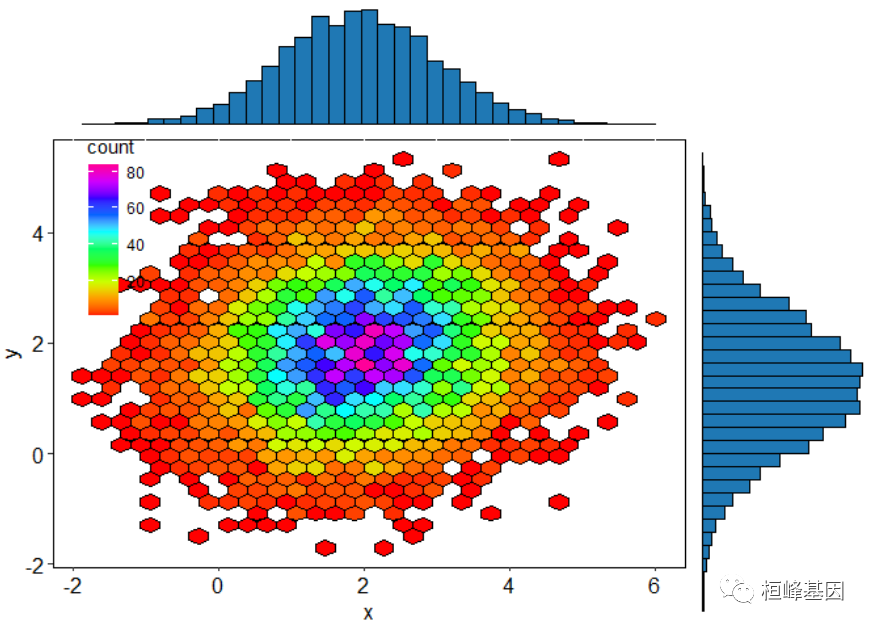
glist <- list(top_hist, center, right_hist)
软件包里面自带的例子,我这里都展示了一遍为了方便大家选择适合自己的图形,另外需要代码的将这期教程转发朋友圈,并配文“学生信,找桓峰基因,铸造成功的你!”即可获得!
桓峰基因,铸造成功的您!
有想进生信交流群的老师可以扫最后一个二维码加微信,备注“单位+姓名+目的”,有些想发广告的就免打扰吧,还得费力气把你踢出去!
References:
1. Azzalini, A., and A. W. Bowman. “A Look at Some Data on the Old Faithful Geyser.” Applied Statistics 39 (1990): 357–65.
2. Brewer, Cynthia A. “Color Use Guidelines for Mapping and Visualization.” In Visualization in Modern Cartography, edited by A. M. MacEachren and D. R. F. Taylor, 123–47. Elsevier Science, 1994.


 314
314


 被折叠的 条评论
为什么被折叠?
被折叠的 条评论
为什么被折叠?
 到【灌水乐园】发言


