


Top 5 Data Visualization Libraries Tutorial

Notebook Content
- Introduction
- Loading Packages
version
Setup
Data Collection - Data Visualization Libraries
- Matplotlib
Scatterplots
Line Plots
Bar Charts
Histograms
Box and Whisker Plots
Heatmaps
Animations
Interactivity
DataFrame.plot - Seaborn
Seaborn Vs Matplotlib
Useful Python Data Visualization Libraries - Plotly
New to Plotly?
Plotly Offline from Command Line - Bokeh
- networkx
- Read more
Courses
Ebooks
Cheat sheet - Conclusion
- References
1- Introduction
If you’ve followed my other kernels so far. You have noticed that for those who are beginners, I’ve introduced a course " 10 Steps to Become a Data Scientist ". In this kernel we will start another step with each other. There are plenty of Kernels that can help you learn Python 's Libraries from scratch but here in Kaggle, I want to Analysis Meta Kaggle a popular Dataset. After reading, you can use it to Analysis other real dataset and use it as a template to deal with ML problems. It is clear that everyone in this community is familiar with Meta Kaggle dataset but if you need to review your information about the datasets please visit meta-kaggle .
I am open to getting your feedback for improving this kernel together.
2- Loading Packages
In this kernel we are using the following packages:
from plotly.offline import download_plotlyjs, init_notebook_mode, plot, iplot
from bokeh.io import push_notebook, show, output_notebook
import mpl_toolkits.axes_grid1.inset_locator as mpl_il
from bokeh.plotting import figure, output_file, show
from bokeh.io import show, output_notebook
import matplotlib.animation as animation
from matplotlib.figure import Figure
from sklearn.cluster import KMeans
import plotly.figure_factory as ff
import matplotlib.pylab as pylab
from ipywidgets import interact
import plotly.graph_objs as go
import plotly.graph_objs as go
import matplotlib.pyplot as plt
from bokeh.plotting import figure
from sklearn  import datasets
import plotly.plotly as py
import plotly.graph_objs as go
from plotly import tools

from sklearn import datasets
import plotly.offline as py
from random import randint
from plotly import tools
import matplotlib as mpl
import seaborn as sns
import pandas as pd
import numpy as np
import matplotlib
import warnings
import string
import numpy
import csv
import os
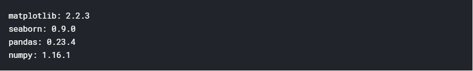
2-1 version
print('matplotlib: {}'.format(matplotlib.__version__))
print('seaborn: {}'.format(sns.__version__))
print('pandas: {}'.format(pd.__version__))
print('numpy: {}'.format(np.__version__))

#print('wordcloud: {}'.format(wordcloud.version))
2-2 Setup
A few tiny adjustments for better code readability
sns.set(style='white', context='notebook', palette='deep')
pylab.rcParams['figure.figsize'] = 12,8
warnings.filterwarnings('ignore')
mpl.style.use('ggplot')
sns.set_style('white')
%matplotlib inline
2-3 Data Collection
Data collection is the process of gathering and measuring data, information or any variables of interest in a standardized and established manner that enables the collector to answer or test hypothesis and evaluate outcomes of the particular collection.[techopedia]

I start Collection Data by the Users and Kernels datasets into Pandas DataFrames
# import kernels and users to play with it (MJ Bahmani)
#command--> 1
users = pd.read_csv("../input/Users.csv")
kernels = pd.read_csv("../input/Kernels.csv")
messages = pd.read_csv("../input/ForumMessages.csv")
#command--> 2
users.sample(1)
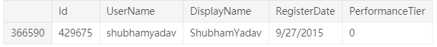
Please replace your username and find your userid
We suppose that userid==authoruserid and use userid for both kernels and users dataset
username="mjbahmani"
userid=int(users[users['UserName']=="mjbahmani"].Id)
userid
1840354
We can just use dropna()(be careful sometimes you should not do this!)
# remove rows that have NA's
print('Before Droping',messages.shape)
#command--> 3
messages = messages.dropna()
print('After Droping',messages.shape)

2-3-1 Features
Features can be from following types:
- numeric
- categorical
- ordinal
- datetime
- coordinates
Find the type of features in Meta Kaggle?!
For getting some information about the dataset you can use info() command
#command--> 4
print(users.info())

2-3-2 Explorer Dataset
-
Dimensions of the dataset.
-
Peek at the data itself.
-
Statistical summary of all attributes.
-
Breakdown of the data by the class variable.
Don’t worry, each look at the data is one command. These are useful commands that you can use again and again on future projects.
# shape
#command--> 5
print(users.shape)

#columns*rows
#command--> 6
users.size

We can get a quick idea of how many instances (rows) and how many attributes (columns) the data contains with the shape property.
You see number of unique item for Species with command below:
#command--> 7
kernels['Medal'].unique()

#command--> 8
kernels["Medal"].value_counts()

To check the first 5 rows of the data set, we can use head(5).
kernels.head(5)

To check out last 5 row of the data set, we use tail() function
#command--> 9
users.tail()

To pop up 5 random rows from the data set, we can use sample(5) function
kernels.sample(5)

To give a statistical summary about the dataset, we can use describe()
kernels.describe()

2-3-5 Find yourself in Users datset
#command--> 12
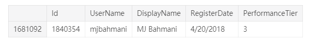
users[users['Id']==userid]
2-3-6 Find your kernels in Kernels dataset
#command--> 13
yourkernels=kernels[kernels['AuthorUserId']==userid]
yourkernels.head(2)

3- Data Visualization Libraries
Before you start learning , I am giving an overview of 10 interdisciplinary Python data visualization libraries, from the well-known to the obscure. based on modeanalytics:
1- matplotlib
matplotlib is the O.G. of Python data visualization libraries. Despite being over a decade old, it’s still the most widely used library for plotting in the Python community. It was designed to closely resemble MATLAB, a proprietary programming language developed in the 1980s.
2- Seaborn
Seaborn harnesses the power of matplotlib to create beautiful charts in a few lines of code. The key difference is Seaborn’s default styles and color palettes, which are designed to be more aesthetically pleasing and modern. Since Seaborn is built on top of matplotlib, you’ll need to know matplotlib to tweak Seaborn’s defaults.
3- ggplot
ggplot is based on ggplot2, an R plotting system, and concepts from The Grammar of Graphics. ggplot operates differently than matplotlib: it lets you layer components to create a complete plot. For instance, you can start with axes, then add points, then a line, a trendline, etc. Although The Grammar of Graphics has been praised as an “intuitive” method for plotting, seasoned matplotlib users might need time to adjust to this new mindset.
4- Bokeh
Like ggplot, Bokeh is based on The Grammar of Graphics, but unlike ggplot, it’s native to Python, not ported over from R. Its strength lies in the ability to create interactive, web-ready plots, which can be easily outputted as JSON objects, HTML documents, or interactive web applications. Bokeh also supports streaming and real-time data.
5- pygal
Like Bokeh and Plotly, pygal offers interactive plots that can be embedded in the web browser. Its prime differentiator is the ability to output charts as SVGs. As long as you’re working with smaller datasets, SVGs will do you just fine. But if you’re making charts with hundreds of thousands of data points, they’ll have trouble rendering and become sluggish.
6- Plotly
You might know Plotly as an online platform for data visualization, but did you also know you can access its capabilities from a Python notebook? Like Bokeh, Plotly’s forte is making interactive plots, but it offers some charts you won’t find in most libraries, like contour plots, dendograms, and 3D charts.
7- geoplotlib
geoplotlib is a toolbox for creating maps and plotting geographical data. You can use it to create a variety of map-types, like choropleths, heatmaps, and dot density maps. You must have Pyglet (an object-oriented programming interface) installed to use geoplotlib. Nonetheless, since most Python data visualization libraries don’t offer maps, it’s nice to have a library dedicated solely to them.
8- Gleam
Gleam is inspired by R’s Shiny package. It allows you to turn analyses into interactive web apps using only Python scripts, so you don’t have to know any other languages like HTML, CSS, or JavaScript. Gleam works with any Python data visualization library. Once you’ve created a plot, you can build fields on top of it so users can filter and sort data.
9- missingno
Dealing with missing data is a pain. missingno allows you to quickly gauge the completeness of a dataset with a visual summary, instead of trudging through a table. You can filter and sort data based on completion or spot correlations with a heatmap or a dendrogram.
10- Leather
Leather’s creator, Christopher Groskopf, puts it best: “Leather is the Python charting library for those who need charts now and don’t care if they’re perfect.” It’s designed to work with all data types and produces charts as SVGs, so you can scale them without losing image quality. Since this library is relatively new, some of the documentation is still in progress. The charts you can make are pretty basic—but that’s the intention.
At the end, nice cheatsheet on how to best visualize your data. I think I will print it out as a good reminder of “best practices”. Check out the link for the complete cheatsheet, also as a PDF.
11- Chartify Chartify is a Python library that makes it easy for data scientists to create charts.
Why use Chartify?
Consistent input data format: Spend less time transforming data to get your charts to work. All plotting functions use a consistent tidy input data format.
Smart default styles: Create pretty charts with very little customization required.
Simple API: We’ve attempted to make to the API as intuitive and easy to learn as possible.
Flexibility: Chartify is built on top of Bokeh, so if you do need more control you can always fall back on Bokeh’s API. Link: https://blog.modeanalytics.com/python-data-visualization-libraries/

4- Matplotlib
This Matplotlib tutorial takes you through the basics Python data visualization:
- the anatomy of a plot
- pyplot
- pylab
- and much more ###### Go to top
You can show matplotlib figures directly in the notebook by using the %matplotlib notebook and %matplotlib inline magic commands.
%matplotlib notebook provides an interactive environment.
We can use html cell magic to display the image.
#import matplotlib.pyplot as plt
plt.plot([1, 2, 3, 4], [10, 20, 25, 30], color='lightblue', linewidth=3)
plt.scatter([0.4, 3.8, 1.2, 2.5], [15, 25, 9, 26], color='darkgreen', marker='o')
plt.xlim(0.5, 4.5)
plt.show()

Simple and powerful visualizations can be generated using the Matplotlib Python Library. More than a decade old, it is the most widely-used library for plotting in the Python community. A wide range of graphs from histograms to heat plots to line plots can be plotted using Matplotlib.
Many other libraries are built on top of Matplotlib and are designed to work in conjunction with analysis, it being the first Python data visualization library. Libraries like pandas and matplotlib are “wrappers” over Matplotlib allowing access to a number of Matplotlib’s methods with less code.[7]
4-1 Scatterplots
x = np.array([1,2,3,4,5,6,7,8])
y = x

plt.figure()
plt.scatter(x, y) # similar to plt.plot(x, y, '.'), but the underlying child objects in the axes are not Line2D


x = np.array([1,2,3,4,5,6,7,8])
y = x

# create a list of colors for each point to have
# ['green', 'green', 'green', 'green', 'green', 'green', 'green', 'red']
colors = ['green']*(len(x)-1)
colors.append('red')

plt.figure()

# plot the point with size 100 and chosen colors
plt.scatter(x, y, s=100, c=colors)


plt.figure()
# plot a data series 'Tall students' in red using the first two elements of x and y
plt.scatter(x[:2], y[:2], s=100, c='red', label='Tall students')
# plot a second data series 'Short students' in blue using the last three elements of x and y
plt.scatter(x[2:], y[2:], s=100, c='blue', label='Short students')


x = np.random.randint(low=1, high=11, size=50)
y = x + np.random.randint(1, 5, size=x.size)
data = np.column_stack((x, y))

fig, (ax1, ax2) = plt.subplots(nrows=1, ncols=2,
                               figsize=(8, 4))

ax1.scatter(x=x, y=y, marker='o', c='r', edgecolor='b')
ax1.set_title('Scatter: $x$ versus $y$')
ax1.set_xlabel('$x$')
ax1.set_ylabel('$y$')

ax2.hist(data, bins=np.arange(data.min(), data.max()),
         label=('x', 'y'))
ax2.legend(loc=(0.65, 0.8))
ax2.set_title('Frequencies of $x$ and $y$')
ax2.yaxis.tick_right()

# Modify the graph above by assigning each species an individual color.
#command--> 19
x=yourkernels["TotalVotes"]
y=yourkernels["TotalViews"]
plt.scatter(x, y)
plt.legend()
plt.show()

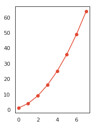
4-2 Line Plots
linear_data = np.array([1,2,3,4,5,6,7,8])
exponential_data = linear_data**2

plt.figure()
# plot the linear data and the exponential data
plt.plot(linear_data, '-o', exponential_data, '-o')


# plot another series with a dashed red line
plt.plot([22,44,55], '--r')


4-3 Bar Charts
plt.figure()
xvals = range(len(linear_data))
plt.bar(xvals, linear_data, width = 0.3)


new_xvals = []

# plot another set of bars, adjusting the new xvals to make up for the first set of bars plotted
for item in xvals:
    new_xvals.append(item+0.3)

plt.bar(new_xvals, exponential_data, width = 0.3 ,color='red')


linear_err = [randint(0,15) for x in range(len(linear_data))]

# This will plot a new set of bars with errorbars using the list of random error values
plt.bar(xvals, linear_data, width = 0.3, yerr=linear_err)


# stacked bar charts are also possible
plt.figure()
xvals = range(len(linear_data))
plt.bar(xvals, linear_data, width = 0.3, color='b')
plt.bar(xvals, exponential_data, width = 0.3, bottom=linear_data, color='r')


# or use barh for horizontal bar charts
plt.figure()
xvals = range(len(linear_data))
plt.barh(xvals, linear_data, height = 0.3, color='b')
plt.barh(xvals, exponential_data, height = 0.3, left=linear_data, color='r')


# Initialize the plot
fig = plt.figure(figsize=(20,10))
ax1 = fig.add_subplot(121)
ax2 = fig.add_subplot(122)

# or replace the three lines of code above by the following line:
#fig, (ax1, ax2) = plt.subplots(1,2, figsize=(20,10))

# Plot the data
ax1.bar([1,2,3],[3,4,5])
ax2.barh([0.5,1,2.5],[0,1,2])

# Show the plot
plt.show()

plt.figure()
# subplot with 1 row, 2 columns, and current axis is 1st subplot axes
plt.subplot(1, 2, 1)

linear_data = np.array([1,2,3,4,5,6,7,8])

plt.plot(linear_data, '-o')

exponential_data = linear_data**2

# subplot with 1 row, 2 columns, and current axis is 2nd subplot axes
plt.subplot(1, 2, 2)
plt.plot(exponential_data, '-o')
# plot exponential data on 1st subplot axes
plt.subplot(1, 2, 1)
plt.plot(exponential_data, '-x')

plt.figure()
ax1 = plt.subplot(1, 2, 1)
plt.plot(linear_data, '-o')
# pass sharey=ax1 to ensure the two subplots share the same y axis
ax2 = plt.subplot(1, 2, 2, sharey=ax1)
plt.plot(exponential_data, '-x')

4-4 Histograms
# create 2x2 grid of axis subplots
fig, ((ax1, ax2), (ax3, ax4)) = plt.subplots(2, 2, sharex=True)
axs = [ax1,ax2,ax3,ax4]

# draw n = 10, 100, 1000, and 10000 samples from the normal distribution and plot corresponding histograms
for n in range(0,len(axs)):
    sample_size = 10**(n+1)
    sample = np.random.normal(loc=0.0, scale=1.0, size=sample_size)
    axs[n].hist(sample)
    axs[n].set_title('n={}'.format(sample_size))

# repeat with number of bins set to 100
fig, ((ax1, ax2), (ax3, ax4)) = plt.subplots(2, 2, sharex=True)
axs = [ax1,ax2,ax3,ax4]

for n in range(0,len(axs)):
    sample_size = 10**(n+1)
    sample = np.random.normal(loc=0.0, scale=1.0, size=sample_size)
    axs[n].hist(sample, bins=100)
    axs[n].set_title('n={}'.format(sample_size))

plt.figure()
Y = np.random.normal(loc=0.0, scale=1.0, size=10000)
X = np.random.random(size=10000)
plt.scatter(X,Y)

It looks like perhaps two of the input variables have a Gaussian distribution. This is useful to note as we can use algorithms that can exploit this assumption.
yourkernels["TotalViews"].hist();

yourkernels["TotalComments"].hist();

sns.factorplot('TotalViews','TotalVotes',data=yourkernels)
plt.show()

4-5 Box and Whisker Plots
In descriptive statistics, a box plot or boxplot is a method for graphically depicting groups of numerical data through their quartiles. Box plots may also have lines extending vertically from the boxes (whiskers) indicating variability outside the upper and lower quartiles, hence the terms box-and-whisker plot and box-and-whisker diagram.[wikipedia]
normal_sample = np.random.normal(loc=0.0, scale=1.0, size=10000)
random_sample = np.random.random(size=10000)
gamma_sample = np.random.gamma(2, size=10000)

df = pd.DataFrame({'normal': normal_sample,
                   'random': random_sample,
                   'gamma': gamma_sample})
plt.figure()
# create a boxplot of the normal data, assign the output to a variable to supress output
_ = plt.boxplot(df['normal'], whis='range')

# clear the current figure
plt.clf()
# plot boxplots for all three of df's columns
_ = plt.boxplot([ df['normal'], df['random'], df['gamma'] ], whis='range')

plt.figure()
_ = plt.hist(df['gamma'], bins=100)

plt.figure()
plt.boxplot([ df['normal'], df['random'], df['gamma'] ], whis='range')
# overlay axis on top of another
ax2 = mpl_il.inset_axes(plt.gca(), width='60%', height='40%', loc=2)
ax2.hist(df['gamma'], bins=100)
ax2.margins(x=0.5)

# switch the y axis ticks for ax2 to the right side
ax2.yaxis.tick_right()
# if `whis` argument isn't passed, boxplot defaults to showing 1.5*interquartile (IQR) whiskers with outliers
plt.figure()
_ = plt.boxplot([ df['normal'], df['random'], df['gamma'] ] )

sns.factorplot('TotalComments','TotalVotes',data=yourkernels)
plt.show()

4-6 Heatmaps
plt.figure()

Y = np.random.normal(loc=0.0, scale=1.0, size=10000)
X = np.random.random(size=10000)
_ = plt.hist2d(X, Y, bins=25)

plt.figure()
_ = plt.hist2d(X, Y, bins=100)

4-7 Animations
n = 100
x = np.random.randn(n)
# create the function that will do the plotting, where curr is the current frame
def update(curr):
    # check if animation is at the last frame, and if so, stop the animation a
    if curr == n:
        a.event_source.stop()
    plt.cla()
    bins = np.arange(-4, 4, 0.5)
    plt.hist(x[:curr], bins=bins)
    plt.axis([-4,4,0,30])
    plt.gca().set_title('Sampling the Normal Distribution')
    plt.gca().set_ylabel('Frequency')
    plt.gca().set_xlabel('Value')
    plt.annotate('n = {}'.format(curr), [3,27])
fig = plt.figure()
a = animation.FuncAnimation(fig, update, interval=100)

4-8 Interactivity
plt.figure()
data = np.random.rand(10)
plt.plot(data)

def onclick(event):
    plt.cla()
    plt.plot(data)
    plt.gca().set_title('Event at pixels {},{} \nand data {},{}'.format(event.x, event.y, event.xdata, event.ydata))

# tell mpl_connect we want to pass a 'button_press_event' into onclick when the event is detected
plt.gcf().canvas.mpl_connect('button_press_event', onclick)


from random import shuffle
origins = ['China', 'Brazil', 'India', 'USA', 'Canada', 'UK', 'Germany', 'Iraq', 'Chile', 'Mexico']

shuffle(origins)

df = pd.DataFrame({'height': np.random.rand(10),
                   'weight': np.random.rand(10),
                   'origin': origins})
df

plt.figure()
# picker=5 means the mouse doesn't have to click directly on an event, but can be up to 5 pixels away
plt.scatter(df['height'], df['weight'], picker=5)
plt.gca().set_ylabel('Weight')
plt.gca().set_xlabel('Height')


def onpick(event):
    origin = df.iloc[event.ind[0]]['origin']
    plt.gca().set_title('Selected item came from {}'.format(origin))

# tell mpl_connect we want to pass a 'pick_event' into onpick when the event is detected
plt.gcf().canvas.mpl_connect('pick_event', onpick)

# use the 'seaborn-colorblind' style
plt.style.use('seaborn-colorblind')
4-9 DataFrame.plot
np.random.seed(123)

df = pd.DataFrame({'A': np.random.randn(365).cumsum(0),
                   'B': np.random.randn(365).cumsum(0) + 20,
                   'C': np.random.randn(365).cumsum(0) - 20},
                  index=pd.date_range('1/1/2017', periods=365))
df.head()


You can also choose the plot kind by using the DataFrame.plot.kind methods instead of providing the kind keyword argument.
kind :
‘line’ : line plot (default)
‘bar’ : vertical bar plot
‘barh’ : horizontal bar plot
‘hist’ : histogram
‘box’ : boxplot
‘kde’ : Kernel Density Estimation plot
‘density’ : same as ‘kde’
‘area’ : area plot
‘pie’ : pie plot
‘scatter’ : scatter plot
‘hexbin’ : hexbin plot ###### Go to top
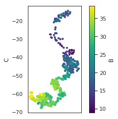
# create a scatter plot of columns 'A' and 'C', with changing color (c) and size (s) based on column 'B'
df.plot.scatter('A', 'C', c='B', s=df['B'], colormap='viridis')


ax = df.plot.scatter('A', 'C', c='B', s=df['B'], colormap='viridis')
ax.set_aspect('equal')
df.plot.box();

df.plot.hist(alpha=0.7);

Kernel density estimation plots are useful for deriving a smooth continuous function from a given sample.
df.plot.kde();

5- Seaborn
Seaborn is an open source, BSD-licensed Python library providing high level API for visualizing the data using Python programming language.[9] tutorialspoint
5-1 Seaborn Vs Matplotlib
It is summarized that if Matplotlib “tries to make easy things easy and hard things possible”, Seaborn tries to make a well defined set of hard things easy too.seaborn_introduction
Seaborn helps resolve the two major problems faced by Matplotlib; the problems are
- Default Matplotlib parameters
- Working with data frames
As Seaborn compliments and extends Matplotlib, the learning curve is quite gradual. If you know Matplotlib, you are already half way through Seaborn.
Important Features of Seaborn Seaborn is built on top of Python’s core visualization library Matplotlib. It is meant to serve as a complement, and not a replacement. However, Seaborn comes with some very important features. Let us see a few of them here. The features help in −
- Built in themes for styling matplotlib graphics
- Visualizing univariate and bivariate data
- Fitting in and visualizing linear regression models
- Plotting statistical time series data
- Seaborn works well with NumPy and Pandas data structures
- It comes with built in themes for styling Matplotlib graphics
In most cases, you will still use Matplotlib for simple plotting. The knowledge of Matplotlib is recommended to tweak Seaborn’s default plots.[9]
def sinplot(flip = 1):
   x = np.linspace(0, 14, 100)
   for i in range(1, 5):
      plt.plot(x, np.sin(x + i * .5) * (7 - i) * flip)
sinplot()
plt.show()

def sinplot(flip = 1):
   x = np.linspace(0, 14, 100)
   for i in range(1, 5):
      plt.plot(x, np.sin(x + i * .5) * (7 - i) * flip)

sns.set()
sinplot()
plt.show()

np.random.seed(1234)

v1 = pd.Series(np.random.normal(0,10,1000), name='v1')
v2 = pd.Series(2*v1 + np.random.normal(60,15,1000), name='v2')
plt.figure()
plt.hist(v1, alpha=0.7, bins=np.arange(-50,150,5), label='v1');
plt.hist(v2, alpha=0.7, bins=np.arange(-50,150,5), label='v2');
plt.legend();

plt.figure()
# we can pass keyword arguments for each individual component of the plot
sns.distplot(v2, hist_kws={'color': 'Teal'}, kde_kws={'color': 'Navy'});

sns.jointplot(v1, v2, alpha=0.4);

grid = sns.jointplot(v1, v2, alpha=0.4);
grid.ax_joint.set_aspect('equal')

sns.jointplot(v1, v2, kind='hex');

# set the seaborn style for all the following plots
sns.set_style('white')

sns.jointplot(v1, v2, kind='kde', space=0);

sns.factorplot('TotalComments','TotalVotes',data=yourkernels)
plt.show()

# violinplots on petal-length for each species
#command--> 24
sns.violinplot(data=yourkernels,x="TotalViews", y="TotalVotes")

# violinplots on petal-length for each species
sns.violinplot(data=yourkernels,x="TotalComments", y="TotalVotes")

sns.violinplot(data=yourkernels,x="Medal", y="TotalVotes")

sns.violinplot(data=yourkernels,x="Medal", y="TotalComments")

How many NA elements in every column.
5-2 kdeplot
# seaborn's kdeplot, plots univariate or bivariate density estimates.
#Size can be changed by tweeking the value used
#command--> 25
sns.FacetGrid(yourkernels, hue="Medal", size=5).map(sns.kdeplot, "TotalComments").add_legend()
plt.show()

sns.FacetGrid(yourkernels, hue="Medal", size=5).map(sns.kdeplot, "TotalVotes").add_legend()
plt.show()

f,ax=plt.subplots(1,3,figsize=(20,8))
sns.distplot(yourkernels[yourkernels['Medal']==1].TotalVotes,ax=ax[0])
ax[0].set_title('TotalVotes in Medal 1')
sns.distplot(yourkernels[yourkernels['Medal']==2].TotalVotes,ax=ax[1])
ax[1].set_title('TotalVotes in Medal 2')
sns.distplot(yourkernels[yourkernels['Medal']==3].TotalVotes,ax=ax[2])
ax[2].set_title('TotalVotes in Medal 3')
plt.show()

5-3 jointplot
# Use seaborn's jointplot to make a hexagonal bin plot
#Set desired size and ratio and choose a color.
#command--> 25
sns.jointplot(x="TotalVotes", y="TotalViews", data=yourkernels, size=10,ratio=10, kind='hex',color='green')
plt.show()

5-4 andrews_curves
# we will use seaborn jointplot shows bivariate scatterplots and univariate histograms with Kernel density
# estimation in the same figure
sns.jointplot(x="TotalVotes", y="TotalViews", data=yourkernels, size=6, kind='kde', color='#800000', space=0)

5-5 Heatmap
#command--> 26
plt.figure(figsize=(10,7))
sns.heatmap(yourkernels.corr(),annot=True,cmap='cubehelix_r') #draws  heatmap with input as the correlation matrix calculted by(iris.corr())
plt.show()

sns.factorplot('TotalComments','TotalVotes',data=yourkernels)
plt.show()

5-6 distplot
sns.distplot(yourkernels['TotalVotes']);

6- Plotly
How to use Plotly offline inside IPython notebooks.
6-1 New to Plotly?
Plotly, also known by its URL, Plot.ly, is a technical computing company headquartered in Montreal, Quebec, that develops online data analytics and visualization tools. Plotly provides online graphing, analytics, and statistics tools for individuals and collaboration, as well as scientific graphing libraries for Python, R, MATLAB, Perl, Julia, Arduino, and REST.
# example for plotly
py.init_notebook_mode(connected=True)
iris = datasets.load_iris()
X = iris.data[:, :2]  # we only take the first two features.
Y = iris.target
x_min, x_max = X[:, 0].min() - .5, X[:, 0].max() + .5
y_min, y_max = X[:, 1].min() - .5, X[:, 1].max() + .5
trace = go.Scatter(x=X[:, 0],
                   y=X[:, 1],
                   mode='markers',
                   marker=dict(color=np.random.randn(150),
                               size=10,
                               colorscale='Viridis',
                               showscale=False))

layout = go.Layout(title='Training Points',
                   xaxis=dict(title='Sepal length',
                            showgrid=False),
                   yaxis=dict(title='Sepal width',
                            showgrid=False),
                  )

fig = go.Figure(data=[trace], layout=layout)
py.iplot(fig)

from sklearn.decomposition import PCA
X_reduced = PCA(n_components=3).fit_transform(iris.data)
trace = go.Scatter3d(x=X_reduced[:, 0],
                     y=X_reduced[:, 1],
                     z=X_reduced[:, 2],
                     mode='markers',
                     marker=dict(
                         size=6,
                         color=np.random.randn(150),
                         colorscale='Viridis',
                         opacity=0.8)
                    )
layout=go.Layout(title='First three PCA directions',
                 scene=dict(
                         xaxis=dict(title='1st eigenvector'),
                         yaxis=dict(title='2nd eigenvector'),
                         zaxis=dict(title='3rd eigenvector'))
                 )
fig = go.Figure(data=[trace], layout=layout)
py.iplot(fig)

6-2 Plotly Offline from Command Line
You can plot your graphs from a python script from command line. On executing the script, it will open a web browser with your Plotly Graph drawn. plot.ly
plot([go.Scatter(x=[1, 2, 3], y=[3, 1, 6])])
np.random.seed(5)

fig = tools.make_subplots(rows=2, cols=3,
                          print_grid=False,
                          specs=[[{'is_3d': True}, {'is_3d': True}, {'is_3d': True}],
                                 [ {'is_3d': True, 'rowspan':1}, None, None]])
scene = dict(
    camera = dict(
    up=dict(x=0, y=0, z=1),
    center=dict(x=0, y=0, z=0),
    eye=dict(x=2.5, y=0.1, z=0.1)
    ),
    xaxis=dict(
        range=[-1, 4],
        title='Petal width',
        gridcolor='rgb(255, 255, 255)',
        zerolinecolor='rgb(255, 255, 255)',
        showbackground=True,
        backgroundcolor='rgb(230, 230,230)',
        showticklabels=False, ticks=''
    ),
    yaxis=dict(
        range=[4, 8],
        title='Sepal length',
        gridcolor='rgb(255, 255, 255)',
        zerolinecolor='rgb(255, 255, 255)',
        showbackground=True,
        backgroundcolor='rgb(230, 230,230)',
        showticklabels=False, ticks=''
    ),
    zaxis=dict(
        range=[1,8],
        title='Petal length',
        gridcolor='rgb(255, 255, 255)',
        zerolinecolor='rgb(255, 255, 255)',
        showbackground=True,
        backgroundcolor='rgb(230, 230,230)',
        showticklabels=False, ticks=''
    )
)

centers = [[1, 1], [-1, -1], [1, -1]]
iris = datasets.load_iris()
X = iris.data
y = iris.target

estimators = {'k_means_iris_3': KMeans(n_clusters=3),
              'k_means_iris_8': KMeans(n_clusters=8),
              'k_means_iris_bad_init': KMeans(n_clusters=3, n_init=1,
                                              init='random')}
fignum = 1
for name, est in estimators.items():
    est.fit(X)
    labels = est.labels_

    trace = go.Scatter3d(x=X[:, 3], y=X[:, 0], z=X[:, 2],
                         showlegend=False,
                         mode='markers',
                         marker=dict(
                                color=labels.astype(np.float),
                                line=dict(color='black', width=1)
        ))
    fig.append_trace(trace, 1, fignum)

    fignum = fignum + 1

y = np.choose(y, [1, 2, 0]).astype(np.float)

trace1 = go.Scatter3d(x=X[:, 3], y=X[:, 0], z=X[:, 2],
                      showlegend=False,
                      mode='markers',
                      marker=dict(
                            color=y,
                            line=dict(color='black', width=1)))
fig.append_trace(trace1, 2, 1)

fig['layout'].update(height=900, width=900,
                     margin=dict(l=10,r=10))

py.iplot(fig)

7- Bokeh
Bokeh is a large library that exposes many capabilities, so this section is only a quick tour of some common Bokeh use cases and workflows. For more detailed information please consult the full User Guide.[11] pydata
Let’s begin with some examples. Plotting data in basic Python lists as a line plot including zoom, pan, save, and other tools is simple and straightforward:
output_notebook()
x = np.linspace(0, 2*np.pi, 2000)
y = np.sin(x)
# prepare some data
x = [1, 2, 3, 4, 5]
y = [6, 7, 2, 4, 5]


# create a new plot with a title and axis labels
p = figure(title="simple line example", x_axis_label='x', y_axis_label='y')

# add a line renderer with legend and line thickness
p.line(x, y, legend="Temp.", line_width=2)

# show the results
show(p)

When you execute this script, you will see that a new output file “lines.html” is created, and that a browser automatically opens a new tab to display it. (For presentation purposes we have included the plot output directly inline in this document.) bokeh
The basic steps to creating plots with the bokeh.plotting interface are:
Prepare some data In this case plain python lists, but could also be NumPy arrays or Pandas series. Tell Bokeh where to generate output In this case using output_file(), with the filename “lines.html”. Another option is output_notebook() for use in Jupyter notebooks. Call figure() This creates a plot with typical default options and easy customization of title, tools, and axes labels. Add renderers In this case, we use line() for our data, specifying visual customizations like colors, legends and widths. Ask Bokeh to show() or save() the results. These functions save the plot to an HTML file and optionally display it in a browser. Steps three and four can be repeated to create more than one plot, as shown in some of the examples below.
The bokeh.plotting interface is also quite handy if we need to customize the output a bit more by adding more data series, glyphs, logarithmic axis, and so on. It’s also possible to easily combine multiple glyphs together on one plot as shown below:
from bokeh.plotting import figure, output_file, show

# prepare some data
x = [0.1, 0.5, 1.0, 1.5, 2.0, 2.5, 3.0]
y0 = [i**2 for i in x]
y1 = [10**i for i in x]
y2 = [10**(i**2) for i in x]


# create a new plot
p = figure(
   tools="pan,box_zoom,reset,save",
   y_axis_type="log", y_range=[0.001, 10**11], title="log axis example",
   x_axis_label='sections', y_axis_label='particles'
)

# add some renderers
p.line(x, x, legend="y=x")
p.circle(x, x, legend="y=x", fill_color="white", size=8)
p.line(x, y0, legend="y=x^2", line_width=3)
p.line(x, y1, legend="y=10^x", line_color="red")
p.circle(x, y1, legend="y=10^x", fill_color="red", line_color="red", size=6)
p.line(x, y2, legend="y=10^x^2", line_color="orange", line_dash="4 4")

# show the results
show(p)

# bokeh basics
# Create a blank figure with labels
p = figure(plot_width = 600, plot_height = 600,
           title = 'Example Glyphs',
           x_axis_label = 'X', y_axis_label = 'Y')

# Example data
squares_x = [1, 3, 4, 5, 8]
squares_y = [8, 7, 3, 1, 10]
circles_x = [9, 12, 4, 3, 15]
circles_y = [8, 4, 11, 6, 10]

# Add squares glyph
p.square(squares_x, squares_y, size = 12, color = 'navy', alpha = 0.6)
# Add circle glyph
p.circle(circles_x, circles_y, size = 12, color = 'red')

# Set to output the plot in the notebook
output_notebook()
# Show the plot
show(p)

8- NetworkX
NetworkX is a Python package for the creation, manipulation, and study of the structure, dynamics, and functions of complex networks.geeksforgeeks
import sys
import matplotlib.pyplot as plt
import networkx as nx
G = nx.grid_2d_graph(5, 5)  # 5x5 grid

# print the adjacency list
for line in nx.generate_adjlist(G):
    print(line)
# write edgelist to grid.edgelist
nx.write_edgelist(G, path="grid.edgelist", delimiter=":")
# read edgelist from grid.edgelist
H = nx.read_edgelist(path="grid.edgelist", delimiter=":")
nx.draw(H)
plt.show()


from ipywidgets import interact
%matplotlib inline
import matplotlib.pyplot as plt
import networkx as nx
# wrap a few graph generation functions so they have the same signature
def random_lobster(n, m, k, p):
    return nx.random_lobster(n, p, p / m)

def powerlaw_cluster(n, m, k, p):
    return nx.powerlaw_cluster_graph(n, m, p)

def erdos_renyi(n, m, k, p):
    return nx.erdos_renyi_graph(n, p)

def newman_watts_strogatz(n, m, k, p):
    return nx.newman_watts_strogatz_graph(n, k, p)

def plot_random_graph(n, m, k, p, generator):
    g = generator(n, m, k, p)
    nx.draw(g)
    plt.show()

interact(plot_random_graph, n=(2,30), m=(1,10), k=(1,10), p=(0.0, 1.0, 0.001),
         generator={
             'lobster': random_lobster,
             'power law': powerlaw_cluster,
             'Newman-Watts-Strogatz': newman_watts_strogatz,
             u'Erdős-Rényi': erdos_renyi,
         });

9- Read more
you can start to learn and review your knowledge about ML with a perfect dataset and try to learn and memorize the workflow for your journey in Data science world with read more sources, here I want to give some courses, e-books and cheatsheet:
9-1 Courses
There are a lot of online courses that can help you develop your knowledge, here I have just listed some of them:
Machine Learning Certification by Stanford University (Coursera)
Machine Learning A-Z™: Hands-On Python & R In Data Science (Udemy)
Deep Learning Certification by Andrew Ng from deeplearning.ai (Coursera)
[Python for Data Science and Machine Learning Bootcamp (Udemy))](https://www.kaggleusercontent.com/kf/10851880/eyJhbGciOiJkaXIiLCJlbmMiOiJBMTI4Q0JDLUhTMjU2In0..LcBVU9_734JYZZbrREZ53A.ne0i3Bu6ItQaAGYPyngOrJ0laByN0Z7sXSblI3UvTe5dl3g4BtjNlBehxRguQPpu4SR8E-HZYKcjyj4nwi15JzmVB6QXP0guJFqXLPstwGICWva08XGNZnO1dLoe0QWZ8EJ1nBiaaCtXmb9D38fq0KnakVIc1QIECaU87qcRgkfohhWtA-UzcBKZqzG5Jsim.x0yTxbh_Q57Gc_TfvLSCWA/Python for Data Science and Machine Learning Bootcamp (Udemy)
Mathematics for Machine Learning by Imperial College London
Deep Learning A-Z™: Hands-On Artificial Neural Networks
Complete Guide to TensorFlow for Deep Learning Tutorial with Python
Data Science and Machine Learning Tutorial with Python – Hands On
Machine Learning Certification by University of Washington
Data Science and Machine Learning Bootcamp with R
Creative Applications of Deep Learning with TensorFlow
Neural Networks for Machine Learning
Practical Deep Learning For Coders, Part 1
Machine Learning
9-2 Ebooks
So you love reading , here is 10 free machine learning books
Probability and Statistics for Programmers
Bayesian Reasoning and Machine Learning
An Introduction to Statistical Learning
Understanding Machine Learning
A Programmer’s Guide to Data Mining
Mining of Massive Datasets
A Brief Introduction to Neural Networks
Deep Learning
Natural Language Processing with Python
Machine Learning Yearning
10- conclusion
Some of the other popular data visualisation libraries in Python are
Bokeh
Geoplotlib
Gleam
Missingno
Dash
Leather Python gives a lot of options to visualise data, it is important to identify the method best suited to your needs, from basic plotting to sophisticated and complicated statistical charts, and others. It many also depend on functionalities such as generating vector and interactive files to flexibility offered by these tools.
This kernel it is not completed yet! Following up!
11- References
Coursera
GitHub
analyticsindiamag
primeoncology
10 Useful Python Data Visualization Libraries for Any Discipline
PythonDataScienceHandbook
Python Data Science Handbook by Jake VanderPlas
datacamp
tutorialspoint
towardsdatascience
pydata
plot.ly Go to top


 2555
2555


 被折叠的 条评论
为什么被折叠?
被折叠的 条评论
为什么被折叠?
 到【灌水乐园】发言


