


qml学习记录
-
信号
- 在qml中信号的使用
-
  signal func(string keyName,int index)   //在一个组件中创建一个信号
  id.func(xx,xx)  //调用
  onfunc:{ } //处理

  property //用关键字修饰,如果要给别的组件使用的话
-
布局方式
- 网格 Grid
-
     []   []   []

     []   []   []             //即元素按网格状排列

     []   []   []
-
- 行 Row
-
[] [] [] [] [] //即元素按行排列
-
- 列 column
-
  []
  []
  []                       //元素按列排列
  []
-
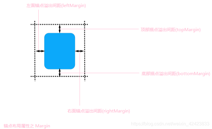
- 锚 anchors
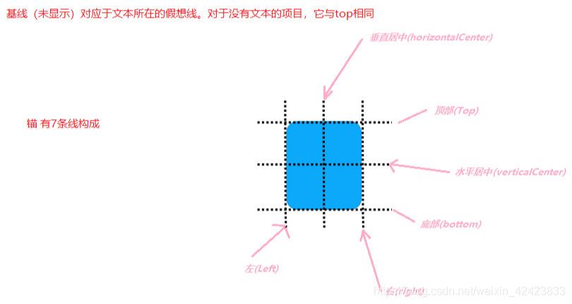
- 网格 Grid
-
Component QML全局的组件属性.它是相对的.即在那个组件内就用于设置那个组件
- 常用场景
-
Component.onCompleted:{ 处理 } //它在组件实列化的时候触发.
-
- 常用场景
-
SwipeView 可拖动页面容器
- 需要分页面显示时
-
interactive:false //禁止拖动
-
orientation:Qt.Vertical //设置页面拖动为垂直
-
- 需要分页面显示时
-
QLatin1String(str); 构造一个QString*
- 构造一个qlatin1string对象,该对象以长度(last-first)存储first. 范围[第一个,最后一个]必须在此Latin-1字符串对象的生存期内保持有效.如果last也是nullptr, 那么将nullptr作为first传递是安全的, 并且会产生一个空的拉丁-1字符串,如果last先于first,first是nullptr而last不是, 或者如果last-first>int_max, 则行为未定义.
-
MouseArea 鼠标进入指定区域的处理
- 同时使用 Pressed > Released > Clicked 大于表示先触发
- onPressed 按下就触发
- onReleased 抬起就触发kv
- onClicked 按下并抬起才触发
- onPressAndHold 长按鼠标触发,未测试
- hoverEnabled: true; 开启指针悬浮检测
- onEntered 鼠标进入指定区域就触发
- onExited 鼠标离开指定区域就触发
- 同时使用 Pressed > Released > Clicked 大于表示先触发
-
Rectangle 矩形
- Color 颜色
-
color : “transparent” //透明的
-
color : “red” //红
-
color : “#00FF00” //RGB表示
-
- Scale 比例.一般相对于父级
- 默认为1.0,即不变
- 小于1.0, 变小
- 大于1.0, 变大
- Color 颜色
-
checkBox 按钮样式
- checkBox 文档
-
  CheckBox {
      id: control
      text: qsTr("CheckBox")
      checked: true

      contentItem: Text {
          text: control.text
          font: control.font
          opacity: enabled ? 1.0 : 0.3
          color: control.down ? "#17a81a" : "#21be2b"
          verticalAlignment: Text.AlignVCenter
          leftPadding: control.indicator.width + control.spacing
      }

      indicator: Rectangle {
          implicitWidth: 26
          implicitHeight: 26
          x: control.leftPadding
          y: parent.height / 2 - height / 2
          radius: 3
          border.color: control.down ? "#17a81a" : "#21be2b"

          Rectangle {
              width: 14
              height: 14
              x: 6
              y: 6
              radius: 2
              color: control.down ? "#17a81a" : "#21be2b"
              visible: control.checked
          }
      }
  }
-
model
- model简介. 可以把他看作一个容器. 可以装任何数据
- model 相关博客
-
   //数据
  model:["K1","K2","K3","K4","K5","pad","K6","K7","K8","K9","K10"]

  //代理  循环处理每个数据
  delegate:  Item{
              keyName: modelData
  }
-
Diglog 对话框
-
qml与c++通信
keyName: modelData } -
Diglog 对话框
-
qml与c++通信
*


 769
769


 被折叠的 条评论
为什么被折叠?
被折叠的 条评论
为什么被折叠?
 到【灌水乐园】发言


