


文章目录
前言
BottomNavigationBar 底部导航栏
一、BottomNavigationBar是什么?
底部导航栏,如同微信,最下面的导航栏
二、使用步骤
1.简单使用
代码如下(示例):
      bottomNavigationBar: BottomNavigationBar(
        onTap: (index) {
          setState(() {
            _currentIndex = index;
          });
        },
        backgroundColor: Colors.white,
        elevation: 10,
        currentIndex: _currentIndex, //选中的index配合stack 使用
        items: const [
//这边可以设置,点击之后的icon 颜色等
          BottomNavigationBarItem(
              activeIcon: Icon(Icons.phone_in_talk, color: Colors.red),
              icon: Icon(Icons.phone_in_talk, color: Colors.black),
              label: '通讯录'),
          BottomNavigationBarItem(
              activeIcon: Icon(Icons.find_in_page, color: Colors.red),
              icon: Icon(Icons.find_in_page, color: Colors.black),
              label: '发现'),
          BottomNavigationBarItem(
              activeIcon: Icon(Icons.people, color: Colors.red),
              icon: Icon(Icons.people, color: Colors.black),
              label: '我'),
        ],
      ),
也可以统一设置风格,颜色和选中颜色等
      bottomNavigationBar: BottomNavigationBar(
        onTap: (index) {
          setState(() {
            _currentIndex = index;
          });
        },
        backgroundColor: Colors.white,
        elevation: 10,
        currentIndex: _currentIndex, //选中的index配合stack 使用
        selectedItemColor: Colors.red, //选中的文本的颜色

        //可以自己单独对应icon 进行设置,可以在这边统一的设置
        selectedIconTheme: IconThemeData(color: Colors.greenAccent),
        unselectedIconTheme: IconThemeData(color: Colors.black),
注意:BottomNavigationBarItem的数量要大于等于2,不然会报错

完整的代码如下:
type: BottomNavigationBarType.fixed,//shifting:选中才显示文本,fixed文本一直显示,两种不同的模式
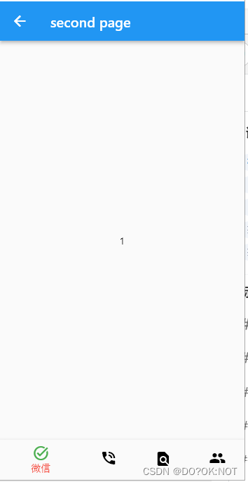
class SecondPage extends StatefulWidget {
const SecondPage({Key? key}) : super(key: key);
_SecondPageState createState() => _SecondPageState();
}
class _SecondPageState extends State<SecondPage> {
int _currentIndex = 0;
Widget build(BuildContext context) {
return Scaffold(
appBar: AppBar(
title: const Text('second page'),
),
body: IndexedStack(
index: _currentIndex,
children: [
Center(
child: Container(
child: Text('1'),
),
),
Center(
child: Container(
child: Text('2'),
),
),
Center(
child: Container(
child: Text('3'),
),
),
Center(
child: Container(
child: Text('4'),
),
),
],
),
bottomNavigationBar: BottomNavigationBar(
type: BottomNavigationBarType.fixed,//shifting:选中才显示文本,fixed文本一直显示
onTap: (index) {
setState(() {
_currentIndex = index;
});
},
backgroundColor: Colors.white,
elevation: 10,
currentIndex: _currentIndex, //选中的index配合stack 使用
selectedItemColor: Colors.red, //选中的文本的颜色
//可以自己单独对应icon 进行设置,可以在这边统一的设置
selectedIconTheme: const IconThemeData(color: Colors.green),
unselectedIconTheme: const IconThemeData(color: Colors.black),
items: const [
BottomNavigationBarItem(
icon: Icon(
Icons.task_alt_sharp,
// color: Colors.black,
),
label: '微信'),
BottomNavigationBarItem(
icon: Icon(Icons.phone_in_talk), label: '通讯录'),
BottomNavigationBarItem(icon: Icon(Icons.find_in_page), label: '发现'),
BottomNavigationBarItem(icon: Icon(Icons.people), label: '我'),
],
),
);
}
}
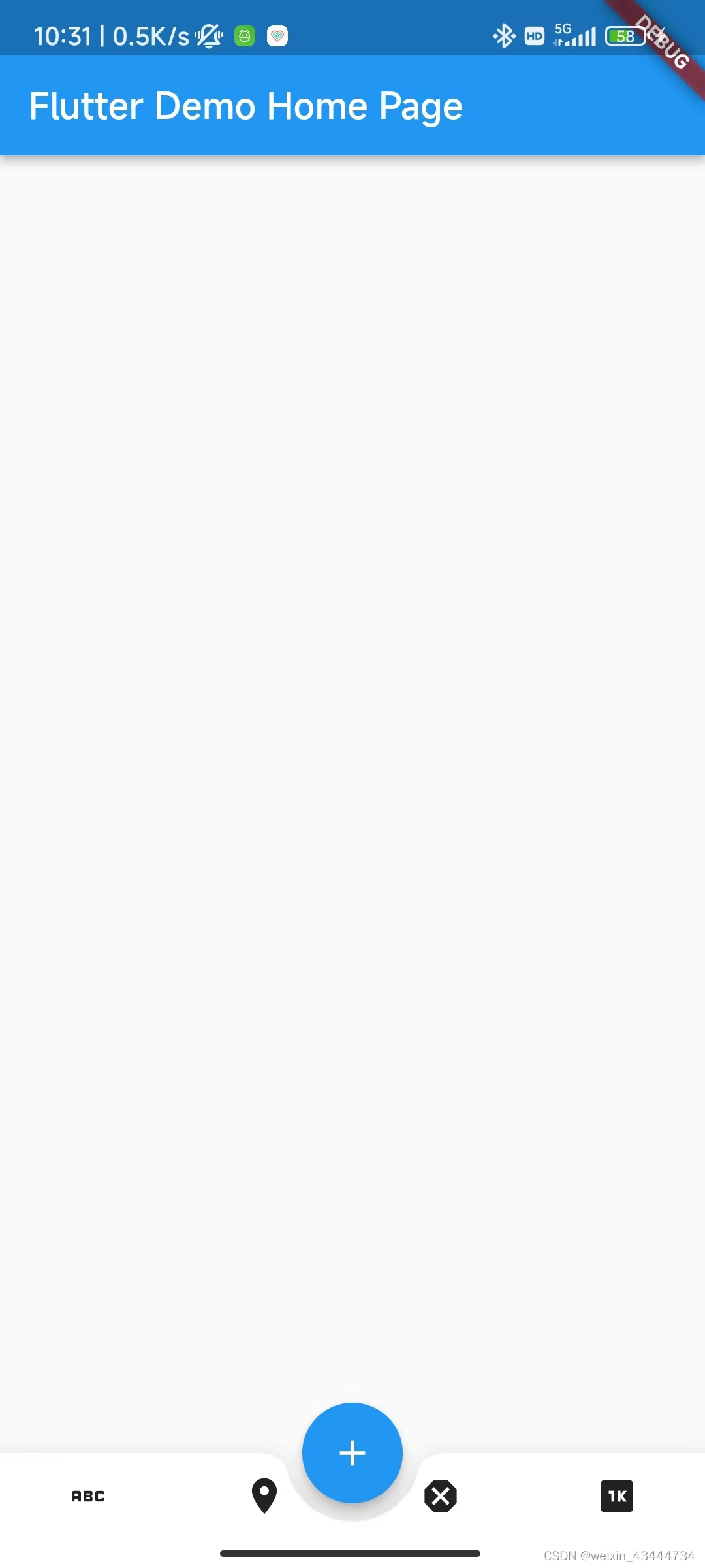
2.BottomAppBar
可以在BottomNavigationBar的按钮顶部留出一个控件给 floatbutton![
import 'package:flutter/material.dart';
void main() {
runApp(const MyApp());
}
class MyApp extends StatelessWidget {
const MyApp({super.key});
Widget build(BuildContext context) {
return MaterialApp(
title: 'Flutter Demo',
theme: ThemeData(
primarySwatch: Colors.blue,
),
home: const MyHomePage(title: 'Flutter Demo Home Page'),
);
}
}
class MyHomePage extends StatefulWidget {
const MyHomePage({super.key, required this.title});
final String title;
State<MyHomePage> createState() => _MyHomePageState();
}
class _MyHomePageState extends State<MyHomePage> {
int _counter = 0;
void _incrementCounter() {
setState(() {
_counter++;
});
}
Widget build(BuildContext context) {
return Scaffold(
bottomNavigationBar: BottomAppBar(
elevation: 20,
notchMargin: 10, //float button的外边距
shape: const CircularNotchedRectangle(), //形状,嵌入的感觉
child: Row(
mainAxisAlignment: MainAxisAlignment.spaceAround,
children: [
IconButton(onPressed: () {}, icon: const Icon(Icons.abc)),
IconButton(onPressed: () {}, icon: const Icon(Icons.place)),
IconButton(onPressed: () {}, icon: const Icon(Icons.dangerous)),
IconButton(onPressed: () {}, icon: const Icon(Icons.one_k)),
],
),
),
appBar: AppBar(
title: Text(widget.title),
),
floatingActionButtonLocation: FloatingActionButtonLocation.centerDocked,
floatingActionButton: FloatingActionButton(
onPressed: _incrementCounter,
tooltip: 'Increment',
child: const Icon(Icons.add),
), // This trailing comma makes auto-formatting nicer for build methods.
);
}
}
效果如图:
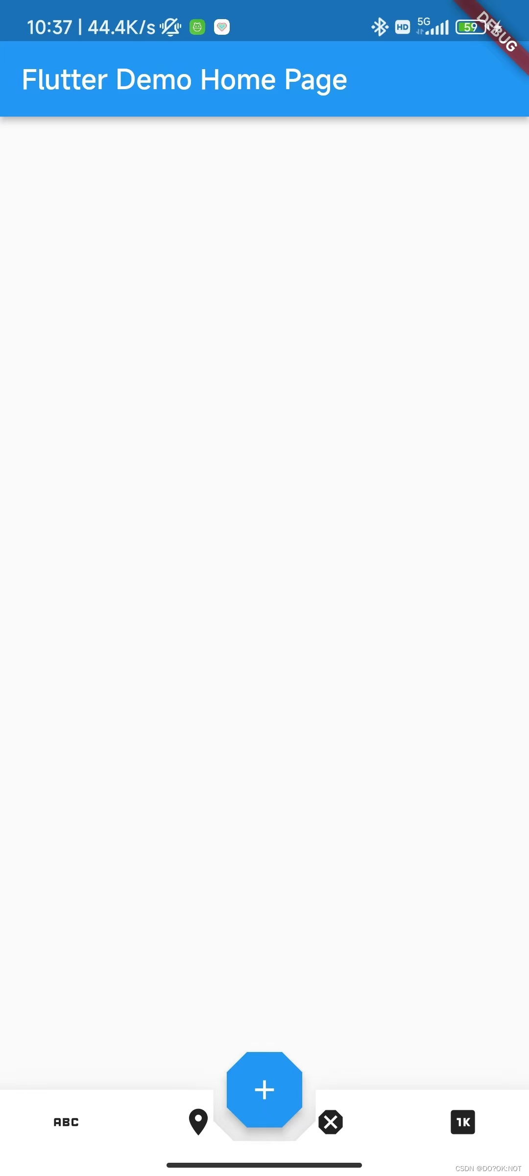
flotabutton 的位置,有很多的选择,你可以具体的参考:

flotabutton 的形状
import 'package:flutter/material.dart';
void main() {
runApp(const MyApp());
}
class MyApp extends StatelessWidget {
const MyApp({super.key});
Widget build(BuildContext context) {
return MaterialApp(
title: 'Flutter Demo',
theme: ThemeData(
primarySwatch: Colors.blue,
),
home: const MyHomePage(title: 'Flutter Demo Home Page'),
);
}
}
class MyHomePage extends StatefulWidget {
const MyHomePage({super.key, required this.title});
final String title;
State<MyHomePage> createState() => _MyHomePageState();
}
class _MyHomePageState extends State<MyHomePage> {
int _counter = 0;
void _incrementCounter() {
setState(() {
_counter++;
});
}
Widget build(BuildContext context) {
return Scaffold(
bottomNavigationBar: BottomAppBar(
elevation: 20,
notchMargin: 10, //float button的外边距
// CircularNotchedRectangle() //形状,嵌入的感觉,凹槽的形状
shape: const AutomaticNotchedShape(
RoundedRectangleBorder(),
BeveledRectangleBorder(
borderRadius: BorderRadius.all(Radius.circular(15)))),
child: Row(
mainAxisAlignment: MainAxisAlignment.spaceAround,
children: [
IconButton(onPressed: () {}, icon: const Icon(Icons.abc)),
IconButton(onPressed: () {}, icon: const Icon(Icons.place)),
IconButton(onPressed: () {}, icon: const Icon(Icons.dangerous)),
IconButton(onPressed: () {}, icon: const Icon(Icons.one_k)),
],
),
),
appBar: AppBar(
title: Text(widget.title),
),
floatingActionButtonLocation: FloatingActionButtonLocation.centerDocked,
floatingActionButton: FloatingActionButton(
shape: const BeveledRectangleBorder(
borderRadius:
BorderRadius.all(Radius.circular(15))), //float button 的形状,八边形
onPressed: _incrementCounter,
tooltip: 'Increment',
child: const Icon(Icons.add),
), // This trailing comma makes auto-formatting nicer for build methods.
);
}
}
总结
欢迎关注,留言,咨询,交流!


 902
902


 被折叠的 条评论
为什么被折叠?
被折叠的 条评论
为什么被折叠?
 到【灌水乐园】发言


