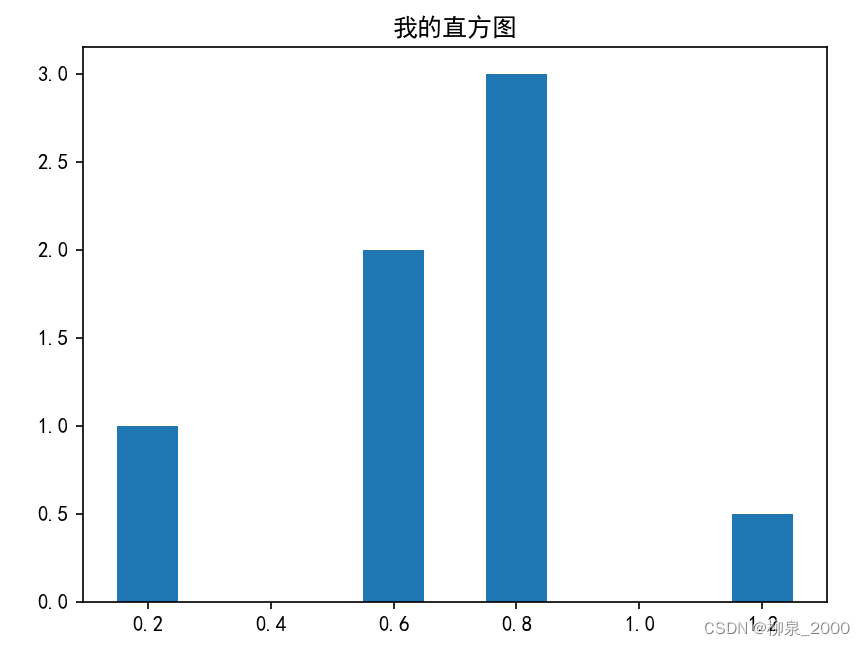
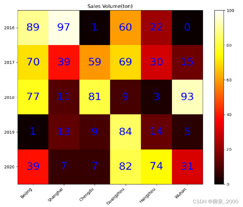
import numpy as np
from matplotlib import pyplot as plt
data = np.random.randint(0,100,30).reshape(5,6)#生成一个5行六列,元素[0,100]内的随机矩阵
xlabels =['Beijing','Shanghai','Chengdu','Guangzhou','Hangzhou','Wuhan']
ylabels =['2016','2017','2018','2019','2020']
ax = plt.figure(figsize=(10,8)).add_subplot()
ax.set_yticks(range(len(ylabels)))#y轴在坐标[0,len(ylabels)) 处加刻度
ax.set_yticklabels(ylabels)#设置y轴刻度文字
ax.set_xticks(range(len(xlabels)))
ax.set_xticklabels(xlabels)
heatMp = ax.imshow(data, cmap=plt.cm.hot, aspect='auto',
vmin =0,vmax =100)for i inrange(len(xlabels)):for j inrange(len(ylabels)):
ax.text(i,j,data[j][i],ha ="center",va ="center",
color ="blue",size=26)
plt.colorbar(heatMp)#绘制右边的颜色-数值对照柱
plt.xticks(rotation=45,ha="right")#将x轴刻度文字进行旋转,且水平方向右对齐
plt.title("Sales Volume(ton)")
plt.show()
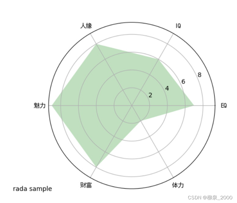
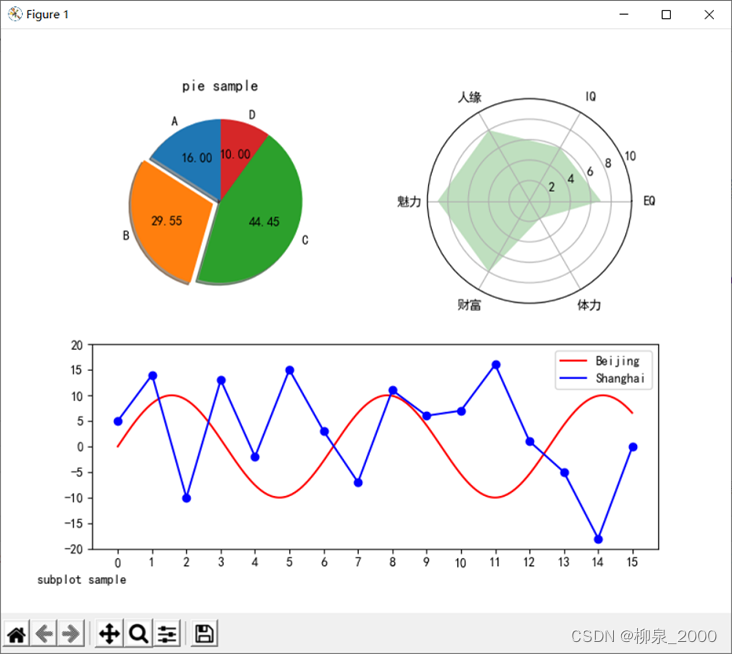
雷达图
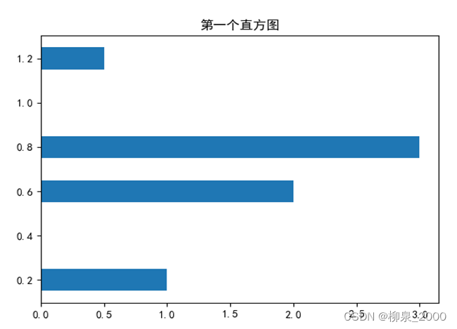
1 基本雷达图
import matplotlib.pyplot as plt
from matplotlib import rcParams #处理汉字用defdrawRadar(ax):
pi =3.1415926
labels =['EQ','IQ','人缘','魅力','财富','体力']#6个属性的名称
attrNum =len(labels)#attrNum是属性种类数,此处等于6
data =[7,6,8,9,8,2]#六个属性的值
angles =[2*pi*i/attrNum for i inrange(attrNum)]#angles是以弧度为单位的6个属性对应的6条半径线的角度
angles2 =[x *180/pi for x in angles]#angles2是以角度为单位的6个属性对应的半径线的角度
ax.set_ylim(0,10)#限定半径线上的坐标范围
ax.set_thetagrids(angles2,labels,fontproperties="SimHei")#绘制6个属性对应的6条半径
ax.fill(angles,data,facecolor='g',alpha=0.25)#填充,alpha:透明度
rcParams['font.family']= rcParams['font.sans-serif']='SimHei'#处理汉字
ax = plt.figure().add_subplot(projection ="polar")#生成极坐标形式子图
drawRadar(ax)
plt.show()
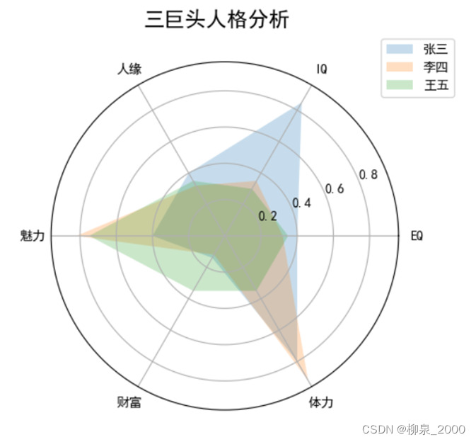
2 多层雷达图
import matplotlib.pyplot as plt
from matplotlib import rcParams
rcParams['font.family']= rcParams['font.sans-serif']='SimHei'
pi =3.1415926
labels =['EQ','IQ','人缘','魅力','财富','体力']#6个属性的名称
attrNum =len(labels)
names =('张三','李四','王五')
data =[[0.40,0.32,0.35],[0.85,0.35,0.30],[0.40,0.32,0.35],[0.40,0.82,0.75],[0.14,0.12,0.35],[0.80,0.92,0.35]]#三个人的数据
angles =[2*pi*i/attrNum for i inrange(attrNum)]
angles2 =[x *180/pi for x in angles]
ax = plt.figure().add_subplot(projection ="polar")
ax.fill(angles,data,alpha=0.25)
ax.set_thetagrids(angles2,labels)
ax.set_title('三巨头人格分析',y =1.05)#y指明标题垂直位置
ax.legend(names,loc=(0.95,0.9))#画出右上角不同人的颜色说明
plt.show()


 129
129


 被折叠的 条评论
为什么被折叠?
被折叠的 条评论
为什么被折叠?
 到【灌水乐园】发言


