


 本文详细介绍了如何在R中使用SHAPforxgboost包理解和解释XGBoost模型的结果,重点讲解了SHAP值的局部解释、全局特征重要性的一致性,以及SHAPplots的各种可视化方法,如Summaryplot、Dependenceplot和Interactioneffects等。
「写在前面」
学习一个软件最好的方法就是啃它的官方文档。本着自己学习、分享他人的态度,分享官方文档的中文教程。软件可能随时更新,建议配合官方文档一起阅读。推荐先按顺序阅读往期内容:
1.XGBoost R 教程 1:介绍 XGBoost 在 R 中的使用
2.XGBoost R 教程 2:使用 XGBoost 了解您的数据集
目录
-
1 SHAPforxgboost 包 -
2 为什么使用 SHAP 值 -
2.1 局部解释 -
2.2 全局特征重要性的一致性
-
-
3 SHAP plots -
3.1 Summary plot -
3.2 Dependence plot -
3.3 Interaction effects -
3.4 SHAP force plot
-
官网教程:
https://liuyanguu.github.io/post/2019/07/18/visualization-of-shap-for-xgboost/
1 SHAPforxgboost 包
作者编写了 R 包 SHAPforxgboost 来涵盖本文中介绍的所有绘图函数。这篇文章作为该包的 vignette。
请从 CRAN 或 Github 安装。
install.packages("SHAPforxgboost")
# or
devtools::install_github("liuyanguu/SHAPforxgboost")
2 为什么使用 SHAP 值
SHAP 的主要优点是「局部解释」和全局模型结构的「一致性」。
基于树的机器学习模型(random forest, gradient boosted trees, XGBoost)是当今最流行的非线性模型。SHAP (SHapley Additive exPlanations) 值被认为是解释基于树的模型结果的最先进方法。它基于博弈论中的 Shaply values,并通过对模型结果的边际贡献来表示特征重要性。
此 Github 页面介绍了 Scott Lundberg 开发的 Python 包。这里我们展示了 R 中的所有可视化。xgboost::xgb.shap.plot 函数还可以制作简单的依赖图。
2.1 局部解释
# run the model with built-in data
suppressPackageStartupMessages({
library("SHAPforxgboost"); library("ggplot2"); library("xgboost")
library("data.table"); library("here")
})

y_var <-  "diffcwv"
dataX <- as.matrix(dataXY_df[,-..y_var])
# hyperparameter tuning results
param_list <- list(objective = "reg:squarederror",  # For regression
                   eta = 0.02,
                   max_depth = 10,
                   gamma = 0.01,
                   subsample = 0.95
                   )
mod <- xgboost::xgboost(data = dataX,
                        label = as.matrix(dataXY_df[[y_var]]),
                        params = param_list, nrounds = 10,
                        verbose = FALSE, nthread = parallel::detectCores() - 2,
                        early_stopping_rounds = 8)

# To return the SHAP values and ranked features by mean|SHAP|
shap_values <- shap.values(xgb_model = mod, X_train = dataX)
# The ranked features by mean |SHAP|
shap_values$mean_shap_score

##          dayint       Column_WV AOT_Uncertainty   dist_water_km             aod
##    0.0165331533    0.0115615699    0.0073583570    0.0057172670    0.0039983764
##            elev     DevAll_P1km           RelAZ  forestProp_1km
##    0.0037026883    0.0025215052    0.0009489252    0.0003197501
计算 training dataset 中每个单元格的 SHAP 值。SHAP 值数据集 (shap_values$shap_score) 与适合 xgboost 模型的自变量数据集 (10148,9) 具有相同的维度 (10148,9)。
SHAP 值每行的总和(加上 BIAS 列,类似于截距)是预测的模型输出。如下表 SHAP 值所示,rowSum 等于输出预测(xgb_mod)。即,解释的归因值总计为模型输出(下表的最后一列)。本例就是这种情况,但如果您正在运行例如 5-fold 交叉验证,则情况并非如此。
# to show that `rowSum` is the output:
shap_data <- copy(shap_values$shap_score)
shap_data[, BIAS := shap_values$BIAS0]
pred_mod <- predict(mod, dataX, ntreelimit = 10)
shap_data[, `:=`(rowSum = round(rowSums(shap_data),6), pred_mod = round(pred_mod,6))]
rmarkdown::paged_table(shap_data[1:20,])
这为数据集中的每个观察提供了模型解释。在总结整个模型时提供了很大的灵活性。
2.2 全局特征重要性的一致性
为什么 Gain 的特征重要性不一致
一致性意味着比较不同模型之间的特征重要性是合法的。当我们修改模型以使某个特征更加重要时,该特征的重要性应该会增加。该论文使用了以下示例:
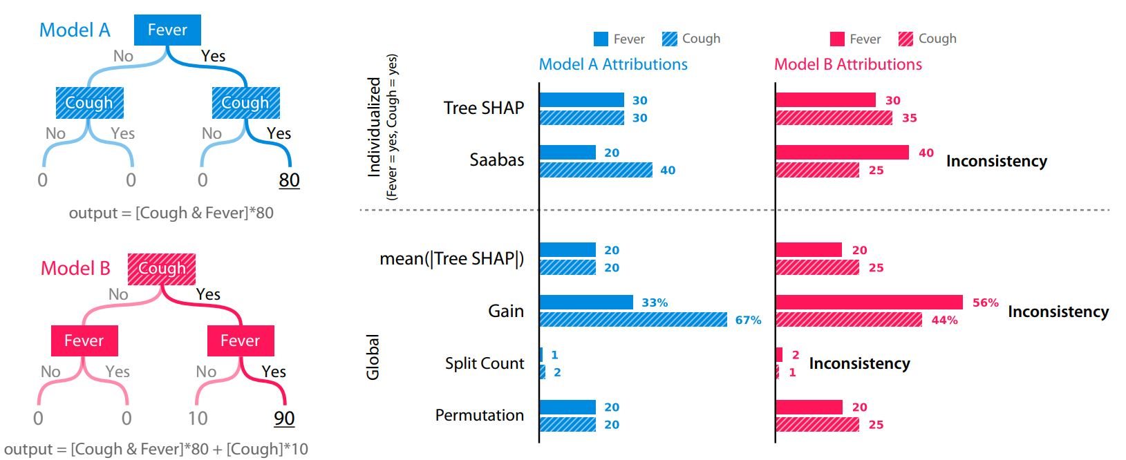
paper 2, S. Lundberg 2019 arXiv:1905.04610
使用上面模型 A 的数据集作为一个简单的示例,哪个特征首先进入数据集会通过 Gain 生成相反的特征重要性:无论哪个特征较晚(在树中较低的位置)都会获得更多的信用。请注意,下面 xgb.importance 中的功能重要性已翻转。
library(xgboost)
d <- data.table::as.data.table(cbind(Fever = c(0,0,1,1), Cough = c(0,1,0,1), y = c(0,0,0,80)))
knitr::kable(d)

## Fever	Cough	y
## 0	0	0
## 0	1	0
## 1	0	0
## 1	1	80
X1 = as.matrix(d[,.(Fever, Cough)])
X2 = as.matrix(d[,.(Cough, Fever)])
m1 = xgboost(
  data = X1, label = d$y,base_score = 0, gamma = 0, eta = 1, lambda = 0,nrounds = 1, verbose = F)
m2 = xgboost(
  data = X2, label = d$y,base_score = 0, gamma = 0, eta = 1, lambda = 0,nrounds = 1, verbose = F)
xgb.importance(model = m1)

##    Feature      Gain     Cover Frequency
## 1:   Cough 0.6666667 0.3333333       0.5
## 2:   Fever 0.3333333 0.6666667       0.5
xgb.importance(model = m2)

##    Feature      Gain     Cover Frequency
## 1:   Fever 0.6666667 0.3333333       0.5
## 2:   Cough 0.3333333 0.6666667       0.5
简而言之,树的构建顺序/结构对于 SHAP 并不重要,但对于 Gain 很重要,并且平均绝对 SHAP 是相同的(20 vs. 20)。
而且,比较上图中的模型 B 和模型 A,模型 B 的输出实际上被修改了,它更多地依赖于给定的特征(Cough,输出分数增加了 10),所以 Cough 应该是一个更重要的特征。虽然 Gain 仍然会出错,但 SHAP 反映了正确的特征重要性。
3 SHAP plots
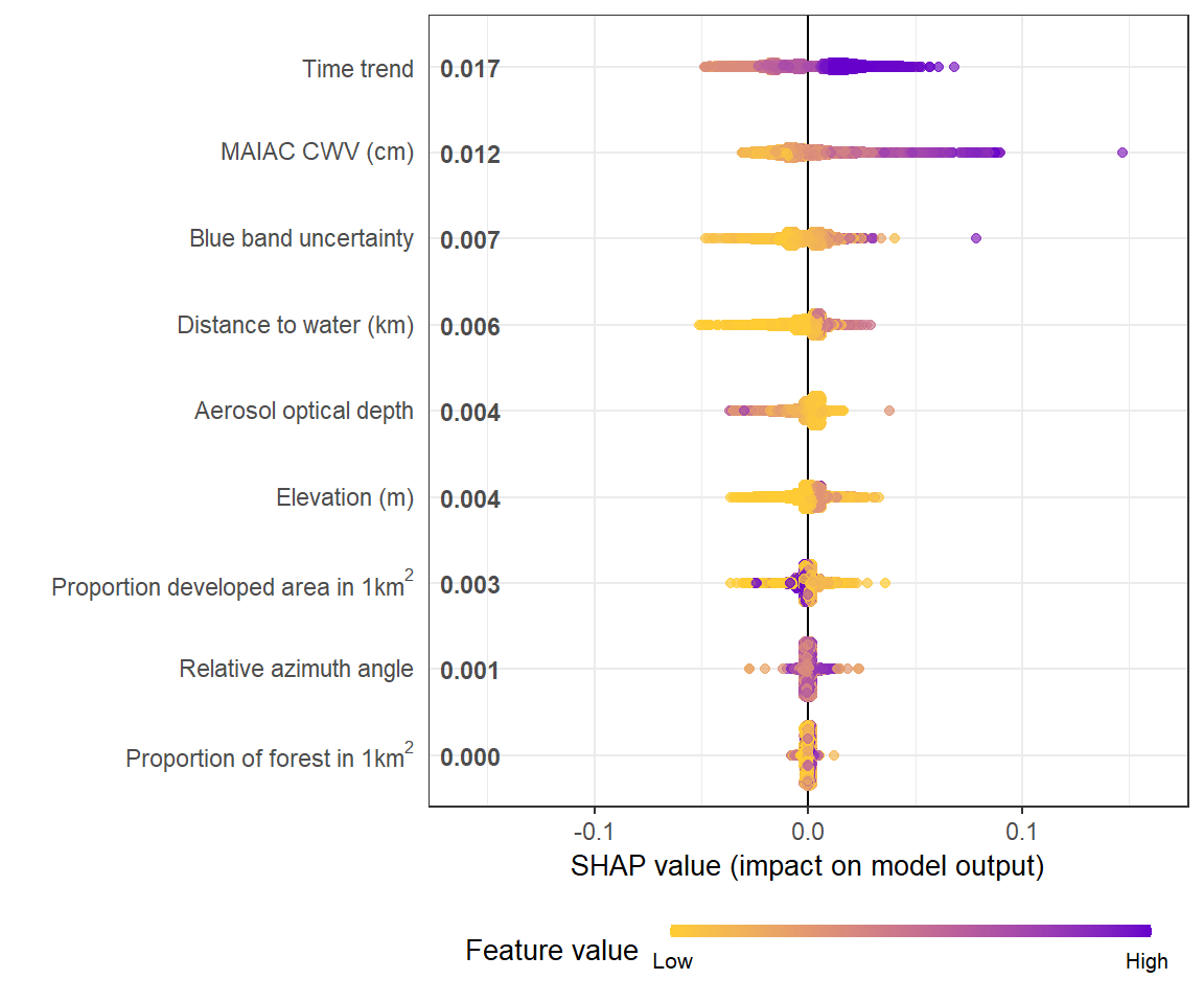
3.1 Summary plot
summary plot 显示了全局特征的重要性。sina plots 使用每个观测值的每个特征的 SHAP 值显示特征对模型输出的贡献分布(在本例中为 CWV 测量误差的预测)。每个点都是一个观察结果(station-day)。
# To prepare the long-format data:
shap_long <- shap.prep(xgb_model = mod, X_train = dataX)
# is the same as: using given shap_contrib
shap_long <- shap.prep(shap_contrib = shap_values$shap_score, X_train = dataX)
# **SHAP summary plot**
shap.plot.summary(shap_long)
制作相同图的其他方法:
# option 1: from the xgboost model
shap.plot.summary.wrap1(model = mod, X = dataX)

# option 2: supply a self-made SHAP values dataset (e.g. sometimes as output from cross-validation)
shap.plot.summary.wrap2(shap_score = shap_values$shap_score, X = dataX)
3.2 Dependence plot
它根据每个变量的特征值绘制 SHAP 值。同样,每个点都是一个 station-day 观察结果。
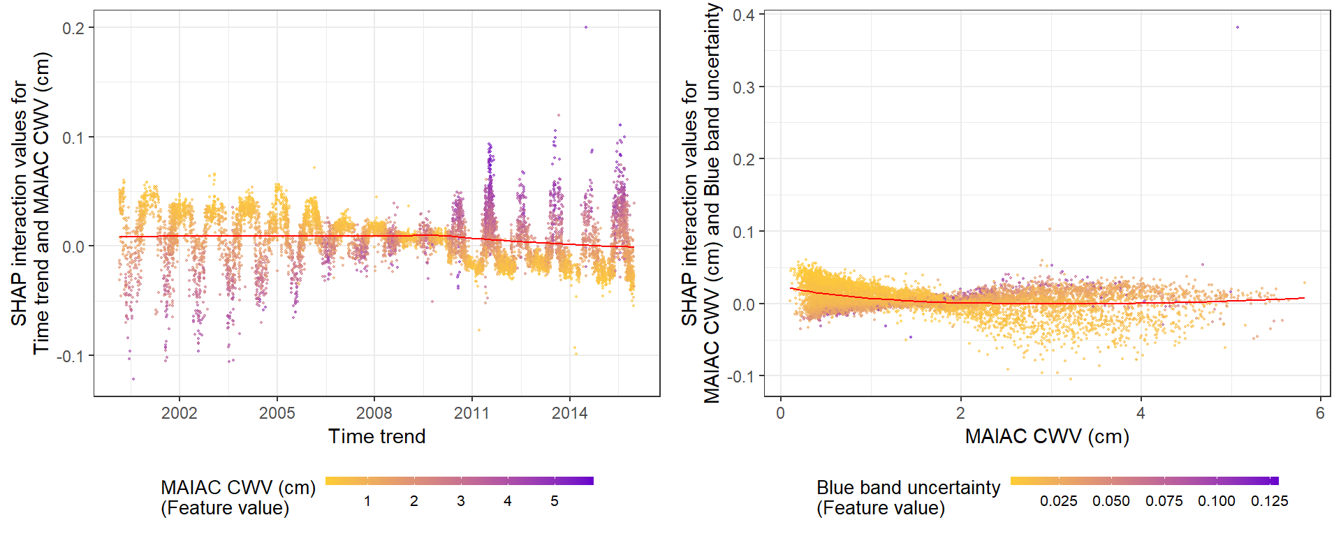
g1 <- shap.plot.dependence(data_long = shap_long, x = 'dayint', y = 'dayint', color_feature = 'Column_WV') + ggtitle("(A) SHAP values of Time trend vs. Time trend")
g2 <- shap.plot.dependence(data_long = shap_long, x = 'dayint', y = 'Column_WV', color_feature = 'Column_WV') +  ggtitle("(B) SHAP values of CWV vs. Time trend")

gridExtra::grid.arrange(g1, g2, ncol = 2)
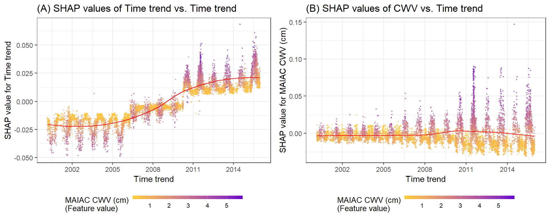
A. SHAP 值显示时间趋势对预测的贡献。颜色代表每次观察的 MAIAC CWV(紫色高,黄色低)。 LOESS(局部估计散点图平滑)曲线以红色覆盖。
B. SHAP 值显示了 MAIAC CWV 对研究期间显示的 CWV 测量误差预测的贡献。请注意 Terra 和 Aqua 数据集的不同 y 轴刻度。颜色代表每次观察的 MAIAC CWV(紫色高,黄色低)。
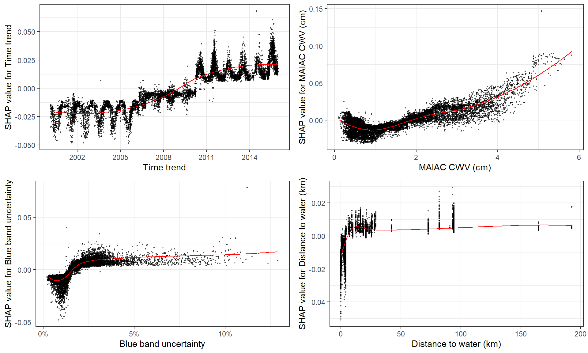
在这里,我选择使用函数 shap.plot.dependence 绘制前 4 个特征。
根据特征值绘制 SHAP 值,没有 color_feature 但具有边缘分布:
fig_list <- lapply(names(shap_values$mean_shap_score)[1:4],
                   shap.plot.dependence, data_long = shap_long)
gridExtra::grid.arrange(grobs = fig_list, ncol = 2)
3.3 Interaction effects
SHAP 交互值将变量的影响分为主效应和交互效应。它们粗略地加起来就构成了依赖图。
SHAP 交互值需要时间,因为它计算所有组合。
# prepare the data using either:
# (this step is slow since it calculates all the combinations of features.)
shap_int <- shap.prep.interaction(xgb_mod = mod, X_train = dataX)
# or:
shap_int <- predict(mod, dataX, predinteraction = TRUE) # (the same)
# **SHAP interaction effect plot **
# if `data_int` is supplied, the same function will plot the interaction effect:
g3 <- shap.plot.dependence(data_long = shap_long,
                           data_int = shap_int,
                           x= "dayint", y = "Column_WV",
                           color_feature = "Column_WV")
g4 <- shap.plot.dependence(data_long = shap_long,
                           data_int = shap_int,
                           x= "Column_WV", y = "AOT_Uncertainty",
                           color_feature = "AOT_Uncertainty")
gridExtra::grid.arrange(g3, g4, ncol=2)
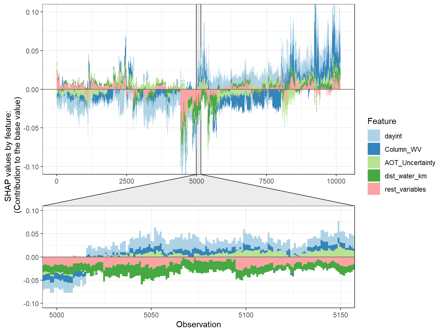
在这里,我展示了时间趋势和 CWV 之间的交互作用(左),以及蓝带不确定性和 CWV 之间的交互作用(右)。
3.4 SHAP force plot
SHAP force plot 基本上堆叠了每个观测的这些 SHAP 值,并显示了如何获得最终输出作为每个预测变量的属性的总和。
# choose to show top 4 features by setting `top_n = 4`,
# set 6 clustering groups of observations.
plot_data <- shap.prep.stack.data(shap_contrib = shap_values$shap_score, top_n = 4, n_groups = 6)
# you may choose to zoom in at a location, and set y-axis limit using `y_parent_limit`
shap.plot.force_plot(plot_data, zoom_in_location = 5000, y_parent_limit = c(-0.1,0.1))
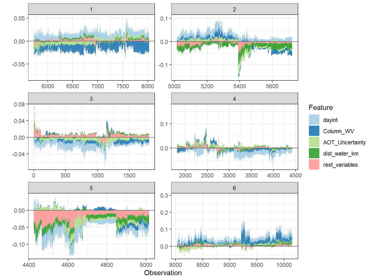
# plot the 6 clusters
shap.plot.force_plot_bygroup(plot_data)

本文由 mdnice 多平台发布


 609
609

 被折叠的 条评论
为什么被折叠?
被折叠的 条评论
为什么被折叠?
 到【灌水乐园】发言


