


目录
前情提要,本人为北理工本科生,近期苦于物理实验课的数据处理绘图之繁琐,故作此文章,为后人处理数据、绘制波形图减少一些不必要的时间,也勉励自己精研代码、多行善事。
所以,假如你恰好也是北理工的本科生,或者使用同一本物理实验教材英汉大学物理实验第二版 主编史庆藩,那你可以放心的使用我的代码,上面的原始数据都是我自己的实验结果。假如不是,也可以适当借鉴代码结构,挑选可用之处。
总之,希望我的成果对您有用!
一、前置条件
电脑端:python环境、IDE、matplotlib依赖(复制代码后会提示下载,点击即可)
实验端:对于正弦波信号,需要峰峰值、周期、频率;对于脉冲等特殊波形,需要准确的宽度。
二、李萨如图形
import numpy as np
import matplotlib.pyplot as plt

def lissajous_curve(A, B, a, b, delta, samples=1000):
    t = np.linspace(0, 2 * np.pi, samples)
    x = A * np.sin(a * t + delta)
    y = B * np.sin(b * t)

    return x, y


A = 1           # X轴的振幅
B = 1           # Y轴的振幅
a = 4        # X轴上波的频率
b = 2           # Y轴上波的频率
delta = np.pi  # 相位差

x, y = lissajous_curve(A, B, a, b, delta)

plt.figure(figsize=(8, 8))
plt.plot(x, y, label=f'a={a}, b={b}')
plt.title('Lissajous Curve')
plt.xlabel('X Axis')
plt.ylabel('Y Axis')
plt.legend()
plt.grid(True)
plt.axis('equal')
plt.show()
其中,A、B为X、Y轴的振幅,a、b为波的频率,delta为相位差。通过简单的改写即可获得你想要的图形。
更改振幅可以改变图形的尺寸和比例,更改频率可以改变生成的图像。
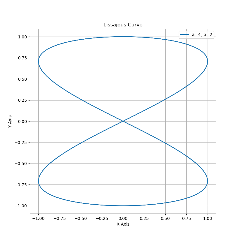
图1. 在频率2:1时,相位差为pi的李萨如图形
三、示波器波形图
1.未知正弦信号
# -*- coding: utf-8 -*-
import numpy as np
import matplotlib.pyplot as plt
import matplotlib as mpl
import platform

# 设置中文字体支持
system = platform.system()
if system == 'Windows':
    plt.rcParams['font.family'] = ['Microsoft YaHei', 'SimHei']
    plt.rcParams['font.sans-serif'] = ['Microsoft YaHei', 'SimHei']
elif system == 'Linux':
    plt.rcParams['font.family'] = ['WenQuanYi Micro Hei']
    plt.rcParams['font.sans-serif'] = ['WenQuanYi Micro Hei']
else:  # macOS
    plt.rcParams['font.family'] = ['Arial Unicode MS', 'PingFang SC', 'Heiti SC']
    plt.rcParams['font.sans-serif'] = ['Arial Unicode MS', 'PingFang SC', 'Heiti SC']

plt.rcParams['axes.unicode_minus'] = False

# 参数设置
frequency = 1.250  # 频率,单位kHz
period = 800      # 周期,单位μs
peak_to_peak = 4.16  # 峰峰值,单位V

amplitude = peak_to_peak / 2

# 显示5个完整周期
t = np.linspace(0, 5 * period, 1000)

angular_frequency = 2 * np.pi * frequency * 1000  # 角频率,单位为rad/s
y = amplitude * np.sin(angular_frequency * t / 1e6)  # 波形中心在y=0

plt.figure(figsize=(10, 6))
plt.plot(t, y, 'b-', linewidth=2)
plt.grid(True)

# 在y轴上标出峰峰值范围
plt.axhline(y=amplitude, color='r', linestyle='--', alpha=0.3)
plt.axhline(y=-amplitude, color='r', linestyle='--', alpha=0.3)

# 在x轴上标出周期
for i in range(5):
    plt.axvline(x=i*period, color='g', linestyle='--', alpha=0.3)

plt.xlabel('时间 (μs)')
plt.ylabel('电压 (V)')
plt.title('未知信号(频率 {}kHz, 周期 {}μs, 峰峰值 {}V)'.format(frequency, period, peak_to_peak))

plt.ylim(-amplitude*1.2, amplitude*1.2)
plt.tight_layout()
plt.show()
改写频率、周期、峰峰值,然后运行代码即可。
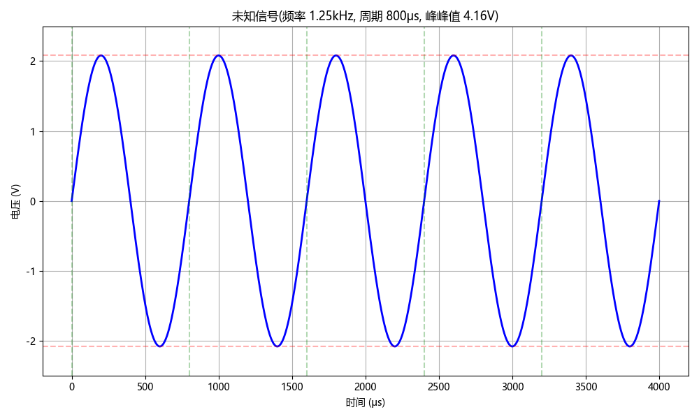
图1. 未知信号
2.鼠标左键脉冲
# -*- coding: utf-8 -*-
import numpy as np
import matplotlib.pyplot as plt
import matplotlib as mpl
import platform

# 设置中文字体支持
system = platform.system()
if system == 'Windows':
    plt.rcParams['font.family'] = ['Microsoft YaHei', 'SimHei']
    plt.rcParams['font.sans-serif'] = ['Microsoft YaHei', 'SimHei']
elif system == 'Linux':
    plt.rcParams['font.family'] = ['WenQuanYi Micro Hei']
    plt.rcParams['font.sans-serif'] = ['WenQuanYi Micro Hei']
else:  # macOS
    plt.rcParams['font.family'] = ['Arial Unicode MS', 'PingFang SC', 'Heiti SC']
    plt.rcParams['font.sans-serif'] = ['Arial Unicode MS', 'PingFang SC', 'Heiti SC']

plt.rcParams['axes.unicode_minus'] = False

# 参数设置
peak_to_peak = 9.60  # 峰峰值,单位V
pulse_widths = [4.8, 3.4, 6.6, 1.6, 6.6]  # 脉冲宽度,单位mm
amplitude = peak_to_peak / 2

padding_ms = 1

total_time_ms = sum(pulse_widths) + 2 * padding_ms

sample_rate = 100000
t = np.linspace(0, total_time_ms, int(sample_rate * total_time_ms / 1000))

y = np.ones_like(t) * (-amplitude)

# 设置交替的高低电平
current_time_ms = padding_ms
is_high = True

for width in pulse_widths:
    start_idx = np.searchsorted(t, current_time_ms)
    end_idx = np.searchsorted(t, current_time_ms + width)

    if is_high:
        y[start_idx:end_idx] = amplitude
    else:
        y[start_idx:end_idx] = -amplitude

    current_time_ms += width
    is_high = not is_high

plt.figure(figsize=(12, 6))
plt.plot(t, y, 'b-', linewidth=2)
plt.grid(True)

plt.axhline(y=amplitude, color='r', linestyle='--', alpha=0.3)
plt.axhline(y=-amplitude, color='r', linestyle='--', alpha=0.3)

current_time_ms = padding_ms
for i, width in enumerate(pulse_widths):
    mid_point = current_time_ms + width/2
    y_pos = amplitude/2 if i % 2 == 0 else -amplitude/2
    plt.text(mid_point, y_pos, f'{width}ms',
            ha='center', va='center',
            bbox=dict(facecolor='white', alpha=0.7))
    current_time_ms += width

plt.xlabel('时间 (毫秒)')
plt.ylabel('电压 (V)')
plt.title('鼠标左键波形图 (峰峰值: {}V)'.format(peak_to_peak))

plt.ylim(-amplitude*1.2, amplitude*1.2)
plt.tight_layout()
plt.show()
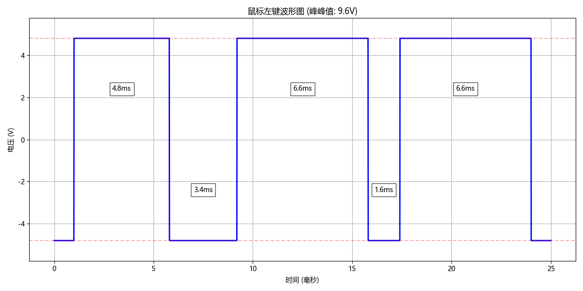
图2. 鼠标左键波形图
3.交流信号正弦波( )
)
# -*- coding: utf-8 -*-
import numpy as np
import matplotlib.pyplot as plt
import matplotlib as mpl
import platform

# 设置中文字体支持
system = platform.system()
if system == 'Windows':
    plt.rcParams['font.family'] = ['Microsoft YaHei', 'SimHei']
    plt.rcParams['font.sans-serif'] = ['Microsoft YaHei', 'SimHei']
elif system == 'Linux':
    plt.rcParams['font.family'] = ['WenQuanYi Micro Hei']
    plt.rcParams['font.sans-serif'] = ['WenQuanYi Micro Hei']
else:  # macOS
    plt.rcParams['font.family'] = ['Arial Unicode MS', 'PingFang SC', 'Heiti SC']
    plt.rcParams['font.sans-serif'] = ['Arial Unicode MS', 'PingFang SC', 'Heiti SC']

plt.rcParams['axes.unicode_minus'] = False

# 参数设置
frequency = 1.007  # 频率,单位kHz
period = 995  # 周期,单位μs
peak_to_peak = 10.2  # 峰峰值,单位V

amplitude = peak_to_peak / 2

# 显示2个完整周期
t = np.linspace(0, 2 * period, 1000)

angular_frequency = 2 * np.pi * frequency * 1000  # 角频率,单位为rad/s
y = amplitude * np.sin(angular_frequency * t / 1e6)  # 波形中心在y=0

plt.figure(figsize=(10, 6))
plt.plot(t, y, 'b-', linewidth=2)
plt.grid(True)

plt.xlabel('时间 (μs)')
plt.ylabel('电压 (V)')
plt.title('交流信号正弦波(频率 {}kHz, 周期 {}μs, 峰峰值 {}V)'.format(frequency, period, peak_to_peak))

plt.ylim(-amplitude, amplitude)
plt.tight_layout()
plt.show()
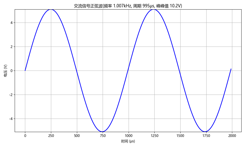
图3. 交流信号正弦波
4.窄脉冲信号
# -*- coding: utf-8 -*-
import numpy as np
import matplotlib.pyplot as plt
import matplotlib as mpl
import platform

# 设置中文字体支持
system = platform.system()
if system == 'Windows':
    plt.rcParams['font.family'] = ['Microsoft YaHei', 'SimHei']
    plt.rcParams['font.sans-serif'] = ['Microsoft YaHei', 'SimHei']
elif system == 'Linux':
    plt.rcParams['font.family'] = ['WenQuanYi Micro Hei']
    plt.rcParams['font.sans-serif'] = ['WenQuanYi Micro Hei']
else:  # macOS
    plt.rcParams['font.family'] = ['Arial Unicode MS', 'PingFang SC', 'Heiti SC']
    plt.rcParams['font.sans-serif'] = ['Arial Unicode MS', 'PingFang SC', 'Heiti SC']

plt.rcParams['axes.unicode_minus'] = False

# 参数设置
pulse_width = 180  # 脉冲宽度,单位μs
period = 1050      # 周期,单位μs
peak_to_peak = 10.4  # 峰峰值,单位V

amplitude = peak_to_peak / 2

# 显示3个完整周期
total_time = 3 * period
t = np.linspace(0, total_time, 10000)

# 生成窄脉冲信号(中心在x轴上)
signal = np.zeros_like(t)
for i in range(len(t)):
    # 计算在周期内的位置
    time_in_period = t[i] % period
    # 如果时间在脉冲宽度内,则为高电平;否则为低电平
    if time_in_period < pulse_width:
        signal[i] = amplitude  # 正脉冲部分
    else:
        signal[i] = -amplitude  # 负脉冲部分

plt.figure(figsize=(10, 6))
plt.plot(t, signal, 'b-', linewidth=2)
plt.grid(True)

# 在y轴上标出峰峰值范围
plt.axhline(y=amplitude, color='r', linestyle='--', alpha=0.3)
plt.axhline(y=-amplitude, color='r', linestyle='--', alpha=0.3)

# 在x轴上标出周期
for i in range(3):
    plt.axvline(x=i*period, color='g', linestyle='--', alpha=0.3)

# 添加标注
plt.annotate(f'脉冲宽度: {pulse_width}μs', xy=(pulse_width/2, amplitude/2),
             xytext=(pulse_width+50, amplitude/2),
             arrowprops=dict(arrowstyle='->'))
plt.annotate(f'周期: {period}μs', xy=(period/2, 0),
             xytext=(period/2, -2),
             arrowprops=dict(arrowstyle='->'))
plt.annotate(f'峰峰值: {peak_to_peak}V', xy=(pulse_width/4, amplitude),
             xytext=(pulse_width/4, amplitude*1.1),
             arrowprops=dict(arrowstyle='->'))

# 添加x轴线
plt.axhline(y=0, color='r', linestyle='-', alpha=0.3)

plt.xlabel('时间 (μs)')
plt.ylabel('电压 (V)')
plt.title('窄脉冲信号(脉宽 {}μs, 周期 {}μs, 峰峰值 {}V)'.format(pulse_width, period, peak_to_peak))

plt.ylim(-amplitude*1.2, amplitude*1.2)
plt.tight_layout()
plt.show()
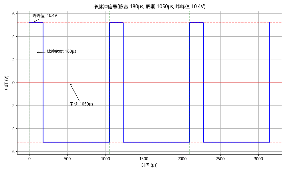
图4. 窄脉冲信号
5.锯齿波信号
# -*- coding: utf-8 -*-
import numpy as np
import matplotlib.pyplot as plt
import matplotlib as mpl
import platform

# 设置中文字体支持
system = platform.system()
if system == 'Windows':
    plt.rcParams['font.family'] = ['Microsoft YaHei', 'SimHei']
    plt.rcParams['font.sans-serif'] = ['Microsoft YaHei', 'SimHei']
elif system == 'Linux':
    plt.rcParams['font.family'] = ['WenQuanYi Micro Hei']
    plt.rcParams['font.sans-serif'] = ['WenQuanYi Micro Hei']
else:  # macOS
    plt.rcParams['font.family'] = ['Arial Unicode MS', 'PingFang SC', 'Heiti SC']
    plt.rcParams['font.sans-serif'] = ['Arial Unicode MS', 'PingFang SC', 'Heiti SC']

plt.rcParams['axes.unicode_minus'] = False

# 参数设置
rising_edge_width = 880  # 上升沿宽度,单位μs
period = 1060  # 周期,单位μs
peak_to_peak = 10  # 峰峰值,单位V

amplitude = peak_to_peak / 2

# 显示3个周期
total_time = 3 * period
t = np.linspace(0, total_time, 10000)

sawtooth = np.zeros_like(t)
for i, time in enumerate(t):
    time_in_period = time % period
    if time_in_period <= rising_edge_width:
        sawtooth[i] = (time_in_period / rising_edge_width) * peak_to_peak
    else:
        remaining_time = period - time_in_period
        falling_edge_width = period - rising_edge_width
        sawtooth[i] = (remaining_time / falling_edge_width) * peak_to_peak

plt.figure(figsize=(10, 6))
plt.plot(t, sawtooth, 'b-', linewidth=2)
plt.grid(True)

# 在y轴上标出峰峰值范围
plt.axhline(y=peak_to_peak, color='r', linestyle='--', alpha=0.3)
plt.axhline(y=0, color='r', linestyle='--', alpha=0.3)

# 在x轴上标出周期
for i in range(3):
    plt.axvline(x=i*period, color='g', linestyle='--', alpha=0.3)

# 添加标注
plt.annotate(f'上升沿宽度: {rising_edge_width}μs', xy=(rising_edge_width/2, peak_to_peak/2),
             xytext=(rising_edge_width/2-100, peak_to_peak/2-2),
             arrowprops=dict(arrowstyle='->'), fontsize=10)
plt.annotate(f'周期: {period}μs', xy=(period/2, peak_to_peak/4),
             xytext=(period/2, -peak_to_peak*0.1),
             arrowprops=dict(arrowstyle='->'), fontsize=10)
plt.annotate(f'峰峰值: {peak_to_peak}V', xy=(period*2.5, peak_to_peak/2),
             xytext=(period*2.5, peak_to_peak*1.1),
             arrowprops=dict(arrowstyle='->'), fontsize=10)

plt.xlabel('时间 (μs)')
plt.ylabel('电压 (V)')
plt.title('锯齿波信号(上升沿 {}μs, 周期 {}μs, 峰峰值 {}V)'.format(rising_edge_width, period, peak_to_peak))

plt.ylim(-peak_to_peak*0.1, peak_to_peak*1.2)
plt.tight_layout()
plt.show()
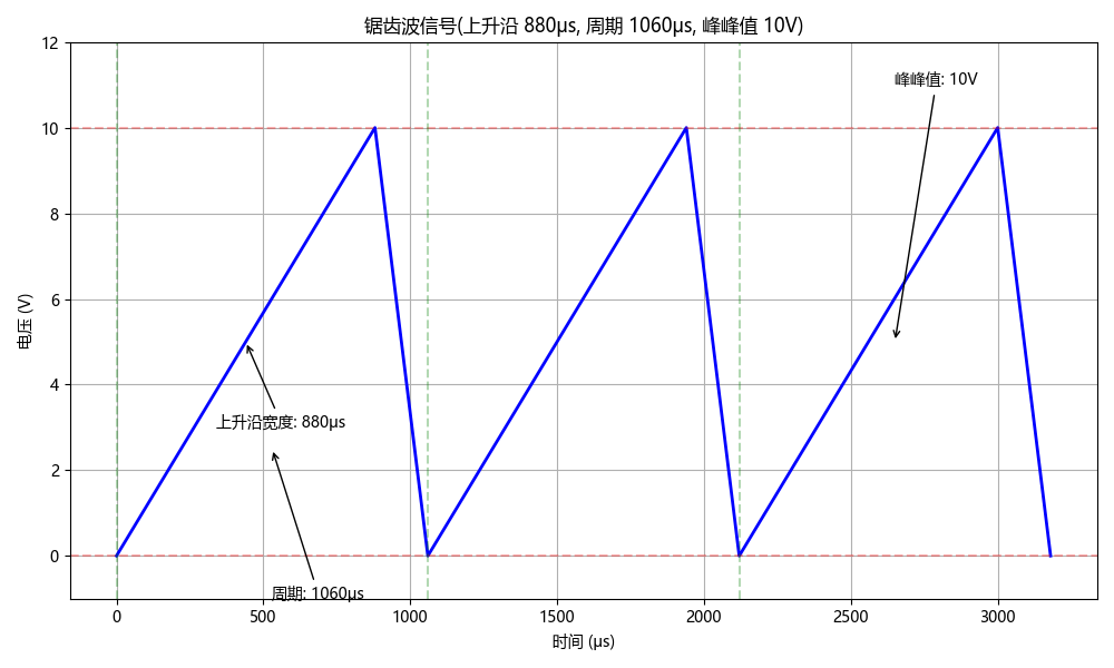
图5. 锯齿波信号
四、结语
大学生诸君,祝你们再也不会凌晨赶实验报告😭。假如绘图有什么问题,评论就行,我会尽力解答。希望从我代码中一滴一滴流出的廉价而无法称道的爱意能感动你们哦,再见,祝好😋。


 4万+
4万+

 被折叠的 条评论
为什么被折叠?
被折叠的 条评论
为什么被折叠?
 到【灌水乐园】发言


