


用R语言绘制研究区图和地图
引言
在地理信息系统和数据可视化领域,绘制研究区图和地图是非常重要的任务。R语言是一种功能强大的统计分析和可视化工具,也可以用于绘制各种类型的地图。本文将介绍如何使用R语言绘制研究区图和地图。
准备工作
在使用R语言进行地图绘制之前,我们需要安装一些必要的包。以下是一些常用的R包:
-
tidyverse:用于绘制数据图形、数据处理的基础包。 -
sf:用于处理空间数据的包。 -
rnaturalearth:提供全球地理数据的包。 -
raster:用于处理栅格数据的包。
我们可以加载这些包:
library(tidyverse)
library(rnaturalearth)
library(sf)
library(raster)
library(ggrepel)
library(showtext)
如果加载失败,请自行安装对应包:
install.packages('pkgname')
数据和变量定义
在开始绘制研究区图之前,我们需要准备好研究区的底图数据。这些数据可以是DEM,例如NASA提供的30mDEM,也可以是土地覆盖,卫星影像等等。在本例中,我们将使用一个矢量数据文件。
首先,定义全局变量,这是一个好习惯。先加载字体。
font_add_google(
  "Lato",
  regular.wt = 300,
  bold.wt = 700)
Google Fonts 存储库 ( https://fonts.google.com/ )中有数千种开源字体。此函数将尝试搜索参数指定的字体系列Lato,然后自动下载所有可能字体的字体文件(“常规”、“粗体”、“斜体”和“粗体斜体”,但没有“符号”) 。如果找到并成功下载字体,它们也将添加到具有给定系列名称的sysfonts中。
接下来,定义画图参数,这里只是给出一个例子,并非都设置为空,可根据自己需要。
这样操作有一个好处是,重复绘图时,ggplot的属性定义不会变得“冗长”,而是直接用theme_map()函数替代。
theme_map <- function(...) {
  theme_minimal() +
    theme(
      text = element_text(family = "Lato", color = "#22211d"),
      axis.line = element_blank(),
      axis.ticks = element_blank(),
      axis.title.x = element_blank(),
      axis.title.y = element_blank(),
      axis.text = element_blank(),
      panel.grid.major = element_blank(),
      panel.grid.minor = element_blank(),
      plot.background = element_rect(fill = "lightblue", color = NA),
      panel.background = element_rect(fill = "lightblue", color = NA),
      legend.background = element_rect(fill = "#ffffff", color = NA),
      strip.background=element_blank(),
      plot.margin = margin(0,0,0,0,"cm"),
      panel.border = element_blank(),
      ...
    )
}
接下来,在实际研究区图中,我们也许需要手动绘制一些点或面来突出某些区域,以点为例。这里定义一个数据框
# create dataframe with locations
df <- data.frame(
  site = c("A", "B"),
  lat = c(30, 40),
  lon = c(0, 0)
)
接下来读取土地覆盖数据
lc <- raster("data/modis_land_cover.tif")
根据MODIS土地覆盖分类,我们只截取森林即可:
# select only "tree" areas (classes 1 - 9)
# and convert to binary (1 == tree)
lc <- (lc > 0  & lc < 9)
# reassign the name of the variable "lc"
# see below
names(lc) <- "lc"
附MODIS土地覆盖分类体系表格,可自行查阅。
| 值 | 推荐颜色 | 描述 |
|---|---|---|
| 0 | 000000 | 水体 |
| 1 | 05450a | 常绿针叶林:由常绿针叶树(冠层>2m)占主导。树木覆盖度>60%。 |
| 2 | 086a10 | 常绿阔叶林:由常绿阔叶和棕榈树(冠层>2m)占主导。树木覆盖度>60%。 |
| 3 | 54a708 | 落叶针叶林:由落叶针叶(落叶松)树(冠层>2m)占主导。树木覆盖度>60%。 |
| 4 | 78d203 | 落叶阔叶林:由落叶阔叶树(冠层>2m)占主导。树木覆盖度>60%。 |
| 5 | 009900 | 混交林:既不是落叶也不是常绿(各占40-60%)的树种占主导(冠层>2m)。树木覆盖度>60%。 |
| 6 | c6b044 | 闭丛草原:由草本植物和灌木(高度<2m)占主导。树木覆盖度10-60%。 |
| 7 | dcd159 | 开丛草原:由草本植物和灌木(高度<2m)占主导。树木覆盖度<10%。 |
| 8 | dade48 | 永久湿地:土壤或植被表面长期或永久被淡水覆盖的区域。 |
| 9 | fbff13 | 草地:由草本植物占主导,有时也有少量灌木或树木(高度<2m)。 |
| 10 | b6ff05 | 干草地:由草本植物占主导,有时也有少量灌木或树木(高度<2m),但在干旱季节会枯萎或死亡。 |
| 11 | 27ff87 | 农田/自然植被复合体:人类活动对土地利用产生了重要影响,但仍有一定程度的自然植被存在,如农田、牧场、人工林等。 |
| 12 | c24f44 | 非灌溉耕地:人类活动对土地利用产生了重要影响,如耕作、收割等,但没有灌溉设施。 |
| 13 | a5a5a5 | 城市和建筑物:人类活动对土地利用产生了重要影响,如建筑、道路、桥 |
由于ggplot可视化栅格需要Dataframe,还需要把栅格转为Dataframe
# convert from matrix to long format
# 1 row per location
lc <- lc %>%
  rasterToPoints %>%
  as.data.frame() %>%
  filter(lc != 0) # only retain pixels with a value
绘制地图
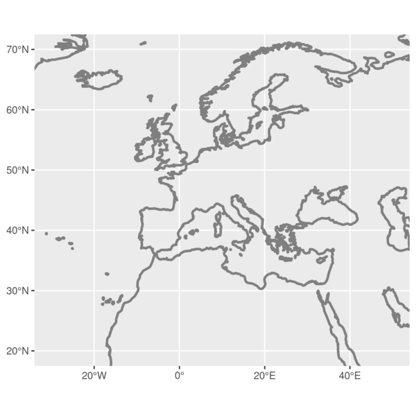
接下来,可以绘制地图。使用最大的land作为底图,结果如下
p <- ggplot() +
  # first layer is the land mass outline
  # as a grey border (fancy)
  geom_sf(data = land,
          fill = NA,
          color = "grey50",
          fill = "#dfdfdf",
          lwd = 1) +

  # crop the whole thing to size
  coord_sf(xlim = c(-30, 50),
           ylim = c(20, 70))
p
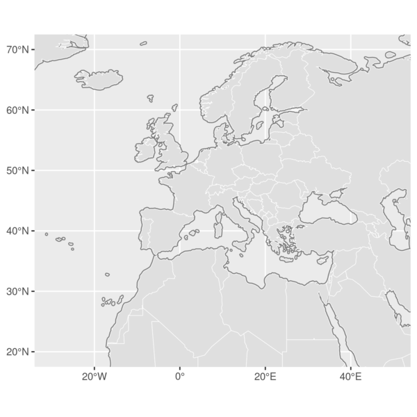
接下来,在底图上叠加countries:
p1 <- p +

  # second layer are the countries
  # with a white outline and and a
  # grey fill
  geom_sf(data = countries,
          color = "white",
          fill = "#dfdfdf",
          size = 0.2) +

  # crop the whole thing to size
  coord_sf(xlim = c(-30, 50),
           ylim = c(20, 70))

p1
矢量底图完成后,我们继续叠加土地覆盖数据:
p2 <- p1 +

  # then add the tree pixels
  # as tiles in green
  geom_tile(data = lc,
            aes(x = x,
                y = y),
            col = "darkolivegreen4") +

  # crop the whole thing to size
  coord_sf(xlim = c(-30, 50),
           ylim = c(20, 70))
p2
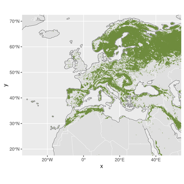
由于ggplot是图层语言,土地覆盖图层叠加后,一些国家边界被遮盖,所以再重新叠加国家数据。
p3 <- p2 +
  # overlay the country borders
  # to cover the tree pixels
  # fill = NA to not overplot
  geom_sf(data = countries,
          color = "white",
          fill = NA,
          size = 0.2) +

 # crop the whole thing to size
 coord_sf(xlim = c(-30, 50),
          ylim = c(20, 70))
p3
再叠加需要突出和标记的点或面:
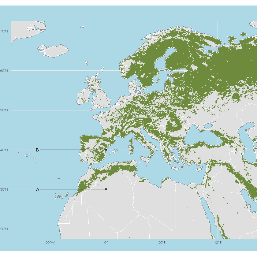
p4 <- p3 +

  # add the locations of the sites
  # as a point
  geom_point(data = df,
             aes(lon, lat),
             col = "grey20") +

  # use ggrepel to add fancy
  # labels nudged to a
  # longitude of -25
  geom_text_repel(
    data = df,
    aes(lon,
        lat,
        label = site),
    nudge_x      = -25 - df$lon,
    direction    = "y",
    hjust        = 0,
    segment.size = 0.2,
    seed = 1 # ensures the placing is consistent between renders
  ) +

  # crop the whole thing to size
  coord_sf(xlim = c(-30, 50),
           ylim = c(20, 70))

p4

图中有个x,y,影响美观,删掉:
p5 <- p4 +

  # add labels here if needed
  labs(x = NULL,
       y = NULL,
       title = "",
       subtitle = "",
       caption = "") +

  # crop the whole thing to size
  coord_sf(xlim = c(-30, 50),
           ylim = c(20, 70))

p5

接下来添加之前定制的图层属性theme_map()函数:
p6 <- p5 +

  # apply the map theme as created above
  theme_map()

p6
总结
本文介绍了如何使用R语言绘制研究区图地图。通过使用ggplot2包和其他相关的空间数据处理包,我们可以轻松地绘制各种类型的地图。无论是绘制土地覆盖栅格还是其他类型的矢量叠加,R语言提供了丰富的工具和函数,帮助我们更好地理解和可视化地理数据。希望本文对您在使用R语言进行地图绘制方面有所帮助!
最后附录一张操作汇总

示例的数据和代码可以后台回复【R研究区】
本文由 mdnice 多平台发布


 476
476


 被折叠的 条评论
为什么被折叠?
被折叠的 条评论
为什么被折叠?
 到【灌水乐园】发言


