


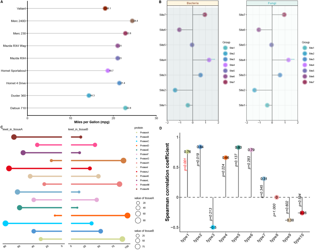
棒棒糖图简介
火柴图(棒棒糖图,Stick plot)是一种用于可视化分类变量之间的关系或比较的图表类型。它通常由一系列竖直排列的线段或棒棒糖组成,每个线段代表一个分类变量,并且线段的长度表示该分类变量的频数或比例。火柴图常用于显示多个分类变量之间的关系或比较,特别是在统计分析和数据可视化中。
标签:#微生物组数据分析 #MicrobiomeStatPlot #棒棒糖图 #R语言可视化 #Lollipop chart
作者:First draft(初稿):Defeng Bai(白德凤);Proofreading(校对):Ma Chuang(马闯) and Jiani Xun(荀佳妮);Text tutorial(文字教程):Defeng Bai(白德凤)
源代码及测试数据链接:
https://github.com/YongxinLiu/MicrobiomeStatPlot/项目中目录 3.Visualization_and_interpretation/Lollipop Chart
或公众号后台回复“MicrobiomeStatPlot”领取
棒棒糖图应用案例
参考文献:https://www.nature.com/articles/s41586-024-07291-6
中国科学院分子细胞科学卓越创新中心(分子细胞卓越中心)高栋团队联合北京大学白凡团队、分子细胞卓越中心陈洛南团队、深圳湾实验室于晨团队合作在Nature在线发表题为“Sex differences orchestrated by androgens at single-cell resolution”的研究论文。
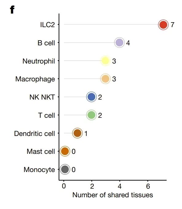
图 4 | 雄激素调节具有性别差异的免疫分区。
结果
在这些 AASB 免疫细胞类型中,我们注意到高表达 Gata3、Areg 和 Rora 的第 2组先天性淋巴细胞(ILC2s)(图 4e)于 2010 年代18-23 被发现,是心脏、泪腺、肝脏、胰腺、唾液腺、脾脏和胃这七个组织共有的 AASB 阴性免疫细胞类型(图 4f,g)。
棒棒糖图R语言实战
源代码及测试数据链接:
https://github.com/YongxinLiu/MicrobiomeStatPlot/
或公众号后台回复“MicrobiomeStatPlot”领取
软件包安装
# 基于CRAN安装R包,检测没有则安装 Installing R packages based on CRAN and installing them if they are not detected
p_list = c("ggplot2", "reshape2", "readxl", "patchwork", "dplyr", "grid",
           "cowplot", "gridExtra", "openxlsx")
for(p in p_list){if (!requireNamespace(p)){install.packages(p)}
    library(p, character.only = TRUE, quietly = TRUE, warn.conflicts = FALSE)}


# 加载R包 Loading R packages
suppressWarnings(suppressMessages(library(ggplot2)))
suppressWarnings(suppressMessages(library(reshape2)))
suppressWarnings(suppressMessages(library(readxl)))
suppressWarnings(suppressMessages(library(patchwork)))
suppressWarnings(suppressMessages(library(dplyr)))
suppressWarnings(suppressMessages(library(grid)))
suppressWarnings(suppressMessages(library(cowplot)))
suppressWarnings(suppressMessages(library(gridExtra)))
suppressWarnings(suppressMessages(library(openxlsx)))
实战1
参考:https://mp.weixin.qq.com/s/JNUmkkjFGbYyTtAxYIJOag
# 加载数据 Load the data
df <- data.frame(mtcars)
df1 <- df[c(1:9), c(1, 2)]
df1 <- cbind(Names = rownames(df1), df1)
rownames(df1) <- NULL


# 颜色方案 Colour schemes
optimized_colors <- c("#5ebcc2", "#46a9cb", "#5791c9", "#C77CFF", "#7a76b7", "#945893", "#9c3d62", "#946f5c", "#882100")


# 绘制棒棒糖图形 Drawing Lollipop Graphics
p1 <- ggplot(df1, aes(x = Names, y = mpg)) +
  geom_segment(aes(x = Names, xend = Names, y = 0, yend = mpg - 0.3), color = "gray70", size = 0.6) +
  geom_point(aes(color = Names), size = 8, shape = 1) +
  geom_point(aes(color= Names),size=6)+
  geom_text(aes(label = round(mpg, 1), y = mpg + 0.5), hjust = 0.2, size = 3.2, color = "black") +
  scale_color_manual(values = optimized_colors) +
  scale_y_continuous(expand = c(0, 0), limits = c(0, 30)) +
  coord_flip() +
  theme_classic(base_size = 14) +
  theme(
    axis.title.y = element_blank(),
    axis.title.x = element_text(size = 13, face = "bold
最低0.47元/天 解锁文章


 被折叠的 条评论
为什么被折叠?
被折叠的 条评论
为什么被折叠?
 到【灌水乐园】发言


