


在React Native开发中,所有需要显示的字符串文本都需要放置在Text或者Text的子组件中。虽然在之前的文章中多次使用了Text组件,但是Text组件还是值得专门学习的, 并没有想象中的那么简单。
任何一个组件,都有样式和属性,样式一般约束控件的样式和位置,定义在style属性中。属性就是直接声明在控件上。
Text样式
Text组件支持View的所有样式键。但是需要注意的是,Text内部的元素不再使用flexBox布局,而是采用文本布局。 这意味着Text组件内部的元素不再是一个个的矩形,组件内部元素排列出组件末端时会自动另起一行。
所以开发者可以不用设定Text控件的高度,一般情况也没有必要设定,Text组件的高度将由Text组件的宽度,需要显示的字符串长度,字体大小共同来决定。
Text组件中显示的字符串只有一行,并且我们设置了Text组件的高度,这个高度比字体大很多,字符串会贴着组件上边显示, 因为不支持flexBox布局, 无法让它调整到垂直方向居中显示. 我们只能通过在字符串前面 加{\r\n} 让字符串前加空行的形式凑到居中显示.
了解了上面的特性, 后面我们会介绍一些实际中的解决办法。 介绍之前我们先来看看Text常用的样式键.
| 样式键名 | 描述 |
|---|---|
| color | 字体颜色, 和其它位置的颜色类型一样 |
| fontFamily | 字体名称 |
| fontSize | 字体大小 |
| fontStyle | 字体风格, 可选值 ‘normal’,’italic’ ,分别代表正常和斜体。 |
| fontWeight | 字体粗细权重(“normal”, ‘bold’, ‘100’, ‘200’, ‘300’, ‘400’, ‘500’, ‘600’, ‘700’, ‘800’, ‘900’) normal和bold就是平时说的正常字体与粗体,后面的9个数字从最细(100) 到最粗(900) 每一个数字定义的都要比上一个等级粗一些. |
| textShadowOffset | 设置阴影效果{width: number, height: number} |
| textShadowRadius | 阴影效果圆角 |
| textShadowColor | 阴影效果的颜色 |
| letterSpacing | 字符间距 |
| lineHeight | 行高 |
| textAlign | 文本对其方式(“auto”, ‘left’, ‘right’, ‘center’, ‘justify’) , 默认是auto。justify只有ios支持。 |
| textDecorationLine | 横线位置 (“none”, ‘underline’, ‘line-through’, ‘underline line-through’) |
| textDecorationStyle | 线的风格(“solid”, ‘double’, ‘dotted’, ‘dashed’) |
| textDecorationColor | 线的颜色 |
| writingDirection | 文本方向(“auto”, ‘ltr’, ‘rtl’) 一般不需要更改 |
Text属性
- numberOfLines , 数值类型表示Text字符串可以显示多少行
- onLayout 与之前的一样,当布局改变的时候调用, 对应一个函数,参数为
{nativeEvent: {layout: {x, y, width, height}}} - onPress, onLongPress 按下事件和长按事件 , 因为没有触摸反馈效果, 不推荐使用
- ellipsizeMode , 最新版本推出的属性, 显示不完全省略的位置, 一般配合numberOfLines 使用。 可选值
'head', 'middle', 'tail', 'clip', clip 只能在ios中使用, tail是默认值, 省略尾巴 显示方式如:”abcd…”
Text组件嵌套
在iOS或Android当中,显示一个格式化文本的方法就是使用NSAttributedString(IOS)或者SpannableString(Android) ,并且使用范围标注来指定一些格式。这种用法非常繁琐。在React Native中,采用和Web一致的设计,这样你可以把相同格式的文本嵌套包裹起来:
import React, { Component } from 'react';
import {
    AppRegistry,
    Text,
} from 'react-native';
class AwesomeProject extends Component {
    render() {
        return (
            <Text style={{fontWeight: 'bold'}}>
                I am bold
                <Text style={{color: 'red'}}>
                    and red
                </Text>
            </Text>
        );
    }
}

AppRegistry.registerComponent('AwesomeProject', () => AwesomeProject);
运行结果:
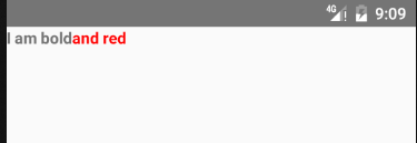
子Text组件将继承它父Text组件的样式。 当使用嵌套的Text组件时, 子Text组件不能覆盖从父Text组件继承而来的样式 ,只能增加父Text组件没有指定的样式.
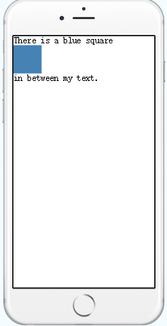
在IOS中, 你还可以在Text组件中嵌套View组件,
import React, { Component } from 'react';
import { AppRegistry, Text, View } from 'react-native';

class BlueIsCool extends Component {
  render() {
    return (
      <Text>
        There is a blue square
        <View style={{width: 50, height: 50, backgroundColor: 'steelblue'}} />
        in between my text.
      </Text>
    );
  }
}

AppRegistry.registerComponent('BlueIsCool', () => BlueIsCool);
运行结果:
Android端虽然暂时不能插入View组件, 但是Android和IOS都可以在Text组件中更方便的插入图像。
import React, { Component } from 'react';
import {
    AppRegistry,
    StyleSheet,
    Text,
    Image
} from 'react-native';
class AwesomeProject extends Component {
    render() {
        return (
            <Text style={{fontWeight: 'bold'}}>
                I am bold
                <Text style={{color: 'red'}}>
                    <Image source={require('./image/big_star.png') } style={styles.imageInTextStyle}/>and red
                </Text>
            </Text>
        );
    }
}
const styles = StyleSheet.create({
    imageInTextStyle:{
        width:30,
        height:30,
        resizeMode:'cover'
    }
});
AppRegistry.registerComponent('AwesomeProject', () => AwesomeProject);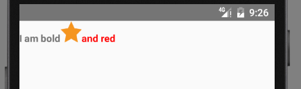
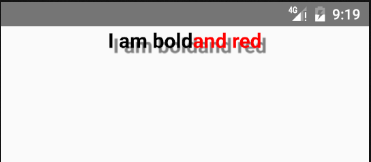
阴影效果
React Native 0.18版本开始, Text组件支持阴影效果.需要三个样式键: textShadowOffset,textShadowRadius,textShadowColor。参考下面代码:
import React, { Component } from 'react';
import {
    AppRegistry,
    StyleSheet,
    Text,
} from 'react-native';
//导入自定义组件
class AwesomeProject extends Component {
    render() {
        return (
            <Text style={styles.baseStyle}>
                I am bold
                <Text style={{color: 'red'}}>
                    and red
                </Text>
            </Text>
        );
    }
}
const styles = StyleSheet.create({
    baseStyle: {
        fontSize: 20,
        textAlign: 'center',
        color:'black',
        textShadowColor:'grey',  // 阴影颜色
        textShadowOffset:{width:5,height:5}, //阴影偏移量
        textShadowRadius:2,  // 阴影半径
        fontWeight:'bold'
    }
});
AppRegistry.registerComponent('AwesomeProject', () => AwesomeProject);
效果:
文本垂直居中
上面我们介绍了, Text内部不使用FlexBox布局,我们只能通过其它方式让Text垂直居中.
先来看看下面的例子,
import React, { Component } from 'react';
import {
    AppRegistry,
    StyleSheet,
    Text,
    View
} from 'react-native';
class AwesomeProject extends Component {
    render() {
        return (
            <View style={styles.container}>
                <Text style={styles.textStyle}>
                    让我垂直居中
                </Text>
            </View>
        );
    }
}
const styles = StyleSheet.create({
    container: {
        flex: 1,
        justifyContent: 'center',
        alignItems: 'center'
    },
    textStyle: {
        height: 100,
        width: 200,
        fontSize: 30,
        backgroundColor: 'grey',
        textAlign: 'center', //
        justifyContent: 'center',// 主轴(该位置为垂直方向)居中, 但是不生效
        margin: 5
    }
});
AppRegistry.registerComponent('AwesomeProject', () => AwesomeProject);
运行结果:

可以看到上面文字并没有垂直居中. 上面并不是正确的方式, 正确的做法就是让View组件包裹Text组件, 除了FontSize之外的样式全部定义在View组件中, 来看代码:
...
class AwesomeProject extends Component {
    render() {
        return (
            <View style={styles.container}>
                <View style={styles.viewStyle}>
                    <Text style={styles.textStyle}>
                        让我垂直居中
                    </Text>
                </View>
            </View>
        );
    }
}
const styles = StyleSheet.create({
    container: {
        flex: 1,
        justifyContent: 'center',
        alignItems: 'center'
    },
    textStyle: {
        fontSize: 30
    },
    viewStyle: {
        height: 100,
        width: 200,
        alignItems: 'center',
        justifyContent: 'center',
        backgroundColor: 'gray',
        margin: 5
    }
});
...
运行结果:

这样我们就做到了垂直居中了
两个平台不同的表现
Android和IOS 两个平台的Text表现略有区别, 如果字体需要加边框, Android端不生效, 需要在Android端的用View包裹Text, 让View实现边框。
Text组件在Android端高度大约为FontSize的1.35倍, IOS端为1.2倍
更多精彩请关注微信公众账号likeDev,公众账号名称:爱上Android。


 671
671

 被折叠的 条评论
为什么被折叠?
被折叠的 条评论
为什么被折叠?
 到【灌水乐园】发言


