


In ts10_Univariate TS模型_circle mark pAcf_ETS_unpack product_darts_bokeh band interval_ljungbox_AIC_BIC_LIQING LIN的博客-CSDN博客ts10_2Univariate TS模型_pAcf_bokeh_AIC_BIC_combine seasonal_decompose twinx ylabel_bold partial title_LIQING LIN的博客-CSDN博客, Building Univariate Time Series Models Using Statistical Methods, you were introduced to exponential smoothing, non-seasonal ARIMA, and Seasonal ARIMA for building forecasting models. These are popular techniques and are referred to as classical or statistical forecasting methods. They are fast, simple to implement, and easy to interforecast.valuespret.
In this chapter, you will dive head-first and learn about additional statistical methods that build on the foundation you gained from the previous chapter. This chapter will introduce a few libraries that can automate time series forecasting and model optimization—for example, auto_arima and Facebook's Prophet library. Additionally, you will explore statsmodels' Vector AutoRegressive (VAR) class for working with multivariate time series and the arch library, which supports GARCH for modeling volatility in financial data.
The main goal of this chapter is to introduce you to the Prophet library (which is also an algorithm) and the concept of multivariate time series modeling with VAR models.
In this chapter, we will cover the following recipes:
- • Forecasting time series data using auto_arima
- • Forecasting time series data using Facebook Prophet
- • Forecasting multivariate time series data using VAR
- • Evaluating Vector AutoRegressive (VAR) models
- • Forecasting volatility in financial time series data with GARCH
Forecasting time series data using auto_arima
For this recipe, you must install pmdarima , a Python library that includes auto_arima for automating ARIMA hyperparameter optimization and model fitting. The auto_arima implementation in Python is inspired by the popular auto.arima from the forecast package in R.
In Chapter 10, Building Univariate Time Series Models Using Statistical Methods, you learned that finding the proper orders for the AR and MA components is not simple. Although you explored useful techniques for estimating the orders, such as
- interpreting the Partial AutoCorrelation Function (PACF) and AutoCorrelation Function (ACF) plots,
- you may still need to train different models to find the optimal configurations (referred to as hyperparameter tuning).
This can be a time-consuming process and is where auto_arima shines.
Instead of the naive approach of training multiple models through grid search to cover every possible combination of parameter values, auto_arima automates the process for finding the optimal parameters. The auto_arima function uses a stepwise逐步 algorithm that is faster and more efficient than a full grid search or random search:
- • When stepwise=True, auto_arima performs a stepwise search (which is the default).
- • With stepwise=False, it performs a brute-force grid search (full search).
- • With random=True, it performs a random search.
The stepwise algorithm was proposed in 2008 by Rob Hyndman and Yeasmin Khandakar in the paper Automatic Time Series Forecasting: The forecast Package for R, which was published in the Journal of Statistical Sofware 27, no.3 (2008) ( https://www.jstatsoft.org/index.php/jss/article/view/v027i03/255 ). In a nutshell, stepwise is an optimization technique that
- utilizes grid search more efficiently.
- This is accomplished using unit root tests and minimizing information criteria (for example,
- Akaike Information Criterion (AIC) and
- Maximum Likelihood Estimation (MLE).
Additionally, auto_arima can handle Seasonal and non-seasonal ARIMA models. If seasonal ARIMA is desired, then you will need to set seasonal=True for auto_arima to optimize over the (P, D, Q) values.
create a new virtual Python environment for Prophet
It is recommended that you create a new virtual Python environment for Prophet to avoid issues with your current environment.
conda create -n prophet python=3.8 -y
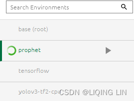
conda activate prophet![]()
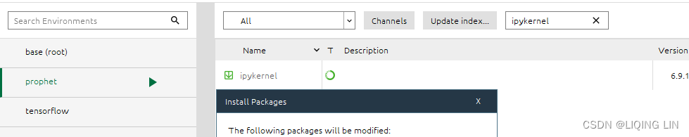
To make the new prophet environment visible within Jupyter, run the following code:
python -m ipykernel install --user --name prophet --display-name "fbProphet"I used
python -m ipykernel install --name prophet --display-name "fbProphet"![]()
To install Prophet using pip
To install Prophet using pip , you will need to install pystan first. Make sure you install the supported PyStan version. You can check the documentation at
https: //facebook.github.io/prophet/docs/installation.html#python for the latest instructions:
pip install pystan==2.19.1.1
Once installed, run the following command:
pip install prophet

install Prophet use Conda
To install Prophet use Conda, which takes care of all the necessary dependencies, use the following command:
conda install -c conda-forge prophet you have to wait a few minutes


Jupyter notebook(prophet)

conda install jupyter notebook

==>
You will need to install pmdarima before you can proceed with this recipe.
install pmdarima
To install it using pip, use the following command:
pip install pmdarima
OR To install it using conda , use the following command:
conda install -c conda-forge pmdarima
install hyplot
pip install hvplot
Note : restart kernel
install bokeh
pip install bokeh
install plotly
pip install plotly
install pandas_datareader
pip install pandas_datareader
Chapter 12 Advanced forecasting methods
12.1 Complex seasonality
So far, we have mostly considered relatively simple seasonal patterns such as quarterly and monthly data. However, higher frequency time series often exhibit more complicated seasonal patterns. For example,
- daily data may have a
- weekly pattern as well as an
- annual pattern.
- Hourly data usually has three types of seasonality:
- a daily pattern,
- a weekly pattern, and
- an annual pattern.
- Even weekly data can be challenging to forecast as there are not a whole number of weeks in a year, so the annual pattern has a seasonal period of 365.25/7≈52.179 on average.
Most of the methods we have considered so far are unable to deal with these seasonal complexities.
We don’t necessarily want to include all of the possible seasonal periods in our models — just the ones that are likely to be present in the data. For example, if we have only 180 days of data, we may ignore the annual seasonality. If the data are measurements of a natural phenomenon (e.g., temperature), we can probably safely ignore any weekly seasonality.

Figure 12.1: Five-minute call volume handled on weekdays between 7:00am and 9:05pm in a large North American commercial bank. Top panel: data from 3 March – 24 October 2003(weak weekly seasonal pattern). Bottom panel: first four weeks of data(strong daily seasonal pattern
.Call volumes on Mondays tend to be higher than the rest of the week.).
Figure 12.1 shows the number of calls to a North American commercial bank per 5-minute interval between 7:00am and 9:05pm each weekday over a 33 week period. The lower panel shows the first four weeks of the same time series. There is a strong daily seasonal pattern with period 169 (there are 169 5-minute intervals per day or 169(21.05-7)*60/5=168.6)(Call volumes on Mondays tend to be higher than the rest of the week.), and a weak weekly seasonal pattern with period 169×5=845. If a longer series of data were available, we may also have observed an annual seasonal pattern.
Apart from the multiple seasonal periods, this series has the additional complexity of missing values between the working periods.
STL with multiple seasonal periods
STL is an acronym/ ˈækrənɪm /首字母缩略词 for “Seasonal and Trend decomposition using Loess”, while Loess is a method for estimating nonlinear relationships.
The STL() function is designed to deal with multiple seasonality. It will return multiple seasonal components, as well as a trend and remainder component. In this case, we need to re-index the tsibble to avoid the missing values, and then explicitly give the seasonal periods.  Figure 12.2: STL decomposition with multiple seasonality for the call volume data.
There are two seasonal patterns shown, one for the time of day (the third panel: season_169), and one for the time of week (the fourth panel: season_845). To properly interpret this graph, it is important to notice the vertical scales. In this case, the trend and the weekly seasonality have wider bars (and therefore relatively narrower ranges) compared to the other components, because there is little trend seen in the data(the grey bar in trend panel is now much longer than either of the ones on the data or seasonal panel, indicating the variation attributed to the trend is much smaller than the seasonal component表明归因于趋势的变化比季节性成分小得多 and consequently only a small part of the variation in the data series.), and the weekly seasonality is weak.
The decomposition can also be used in forecasting, with
- each of the seasonal components forecast using a seasonal naïve method, and
- the seasonally adjusted data forecast using ETS.
The code is slightly more complicated than usual because we have to add back the time stamps that were lost when we re-indexed the tsibble to handle the periods of missing observations. The square root transformation used in the STL decomposition has ensured the forecasts remain positive.
Figure 12.3:
- Forecasts of the call volume data using an STL decomposition with
- the seasonal components forecast using a seasonal naïve method,
- and the seasonally adjusted data forecast using ETS.
# Forecasts from STL+ETS decomposition
my_dcmp_spec <- decomposition_model(
  STL(sqrt(Calls) ~ season(period = 169) +
                    season(period = 5*169),
      robust = TRUE),
  ETS(season_adjust ~ season("N"))
)
fc <- calls %>%
  model(my_dcmp_spec) %>%
  forecast(h = 5 * 169)

# Add correct time stamps to fable
fc_with_times <- bank_calls %>%
  new_data(n = 7 * 24 * 60 / 5) %>%
  mutate(time = format(DateTime, format = "%H:%M:%S")) %>%
  filter(
    time %in% format(bank_calls$DateTime, format = "%H:%M:%S"),
    wday(DateTime, week_start = 1) <= 5
  ) %>%
  mutate(t = row_number() + max(calls$t)) %>%
  left_join(fc, by = "t") %>%
  as_fable(response = "Calls", distribution = Calls)

# Plot results with last 3 weeks of data
fc_with_times %>%
  fill_gaps() %>%
  autoplot(bank_calls %>% tail(14 * 169) %>% fill_gaps()) +
  labs(y = "Calls",
       title = "Five-minute call volume to bank")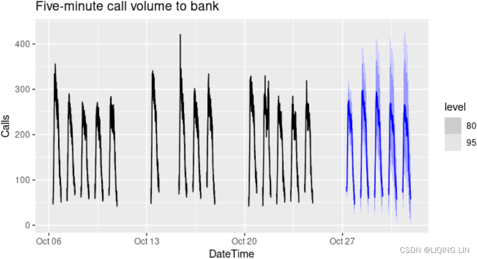
10.5 Dynamic harmonic regression
When there are long seasonal periods, a dynamic regression with Fourier terms is often better than other models we have considered in this book.
For example,
- daily data can have annual seasonality of length 365,
- weekly data has seasonal period of approximately 52,
- while half-hourly data can have several seasonal periods, the shortest of which is the daily pattern of period 48.
Seasonal versions of ARIMA and ETS models are designed for shorter periods such as 12 for monthly data or 4 for quarterly data. The ETS() model restricts seasonality to be a maximum period of 24 to allow hourly data but not data with a larger seasonal period. The problem is that there are m−1 parameters to be estimated for the initial seasonal states where m is the seasonal period. So for large m, the estimation becomes almost impossible.
The ARIMA() function will allow a seasonal period up to m=350, but in practice will usually run out of memory whenever the seasonal period is more than about 200. In any case, seasonal differencing of high order does not make a lot of sense — for daily data it involves comparing what happened today with what happened exactly a year ago and there is no constraint that the seasonal pattern is smooth.
So for such time series, we prefer a harmonic regression approach where the seasonal pattern is modelled using Fourier terms with short-term time series dynamics handled by an ARMA error.
The advantages of this approach are:
- it allows any length seasonality;
- for data with more than one seasonal period, Fourier terms of different frequencies can be included;
- the smoothness of the seasonal pattern can be controlled by K, the number of Fourier sin and cos pairs – the seasonal pattern is smoother for smaller values of K;
- the short-term dynamics are easily handled with a simple ARMA error.
The only real disadvantage (compared to a seasonal ARIMA model) is that the seasonality is assumed to be fixed — the seasonal pattern is not allowed to change over time(seasonal effect is additive:The seasonal magnitudes and variations over time seem to be steady). But in practice, seasonality is usually remarkably constant so this is not a big disadvantage except for long time series.
Example: Australian eating out expenditure
In this example we demonstrate combining Fourier terms for capturing seasonality with ARIMA errors capturing other dynamics in the data. For simplicity, we will use an example with monthly data. The same modelling approach using weekly data is discussed in Section13.1.
We use the total monthly expenditure on cafes, restaurants and takeaway food services in Australia ($billion) from 2004 up to 2016 and forecast 24 months ahead. We vary K, the number of Fourier sin and cos pairs, from K=1 to K=6 (which is equivalent to including seasonal dummies). Figure 10.11 shows the seasonal pattern projected forward as K increases. Notice that as K increases the Fourier terms capture and project a more “wiggly” seasonal pattern and simpler ARIMA models are required to capture other dynamics. The AICc value is minimised for K=5, with a significant jump going from K=4 to K=5, hence the forecasts generated from this model would be the ones used.
cafe04 <- window(auscafe, start=2004)
plots <- list()
for (i in seq(6)) {
fit <- auto.arima(cafe04, xreg = fourier(cafe04, K = i),
seasonal = FALSE, lambda = 0)
plots[[i]] <- autoplot(forecast(fit,
xreg=fourier(cafe04, K=i, h=24))) +
xlab(paste("K=",i," AICC=",round(fit[["aicc"]],2))) +
ylab("") + ylim(1.5,4.7)
}
gridExtra::grid.arrange(
plots[[1]],plots[[2]],plots[[3]],
plots[[4]],plots[[5]],plots[[6]], nrow=3)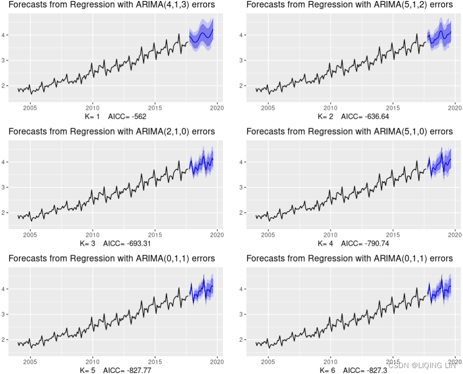 Figure 9.11: Using Fourier terms and ARIMA errors for forecasting monthly expenditure on eating out in Australia.
Dynamic harmonic regression with multiple seasonal periods
harmonic/ hɑːrˈmɑːnɪk /(有关)调和级数(或数列)的
With multiple seasonalities, we can use Fourier terms as we did in earlier chapters (see Sections 7.4 and 10.5). Because there are multiple seasonalities, we need to add Fourier terms for each seasonal period. In this case, the seasonal periods are 169 and 845, so the Fourier terms are of the form![]() for k=1,2,…. As usual, the
for k=1,2,…. As usual, the fourier() function can generate these for you.
We will fit a dynamic harmonic regression model with an ARIMA error structure. The total number of Fourier terms for each seasonal period could be selected to minimise the AICc. However, for high seasonal periods, this tends to over-estimate the number of terms required, so we will use a more subjective choice with 10 terms for the daily seasonality and 5 for the weekly seasonality. Again, we will use a square root transformation to ensure the forecasts and prediction intervals remain positive. We set D=d=0 in order to handle the non-stationarity through the regression terms, and P=Q=0 in order to handle the seasonality through the regression terms.
This is a large model, containing 33 parameters:
- 4(D=d=0 and P=Q=0) ARMA coefficients,
- 20(kx2=10x2) Fourier coefficients for period 169 (there are 169 5-minute intervals per day or 169
(21.05-7)*60/5=168.6), and
- 8(kx2=5x2=10 - 1x2 when k=5) Fourier coefficients for period 845=5*169. Not all of the Fourier terms for period 845 are used because there is some overlap with the terms of period 169 (since 845=5 weekdays ×169 for a week).
: is an ARIMA process.
fit <- calls %>%
  model(
    dhr = ARIMA(sqrt(Calls) ~ PDQ(0, 0, 0) + pdq(d = 0) +
                  fourier(period = 169, K = 10) +
                  fourier(period = 5*169, K = 5)))

fc <- fit %>% forecast(h = 5 * 169)

# Add correct time stamps to fable
fc_with_times <- bank_calls %>%
  new_data(n = 7 * 24 * 60 / 5) %>%
  mutate(time = format(DateTime, format = "%H:%M:%S")) %>%
  filter(
    time %in% format(bank_calls$DateTime, format = "%H:%M:%S"),
    wday(DateTime, week_start = 1) <= 5
  ) %>%
  mutate(t = row_number() + max(calls$t)) %>%
  left_join(fc, by = "t") %>%
  as_fable(response = "Calls", distribution = Calls)
# Plot results with last 3 weeks of data
fc_with_times %>%
  fill_gaps() %>%
  autoplot(bank_calls %>% tail(14 * 169) %>% fill_gaps()) +
  labs(y = "Calls",
       title = "Five-minute call volume to bank")
Figure 12.4: Forecasts from a dynamic harmonic regression applied to the call volume data.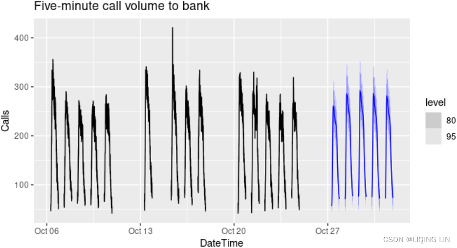
We will fit a dynamic harmonic regression model with an ARMA error structure. The total number of Fourier terms for each seasonal period have been chosen to minimise the AICc. We will use a log transformation (lambda=0) to ensure the forecasts and prediction intervals remain positive.
This is a large model, containing 40 parameters:
- 4(D=d=0 and P=Q=0) ARMA coefficients,
- 20(kx2=10x2) Fourier coefficients for period 169 (there are 169 5-minute intervals per day or 169
- 16(kx2=10x2=20 - 2x2 when k=5 and k=10) Fourier coefficients for period 845=5*169. Not all of the Fourier terms for period 845 are used because there is some overlap with the terms of period 169(when k=1, k=2) (since 845=5 weekdays ×169 for a week).
fit <- auto.arima(calls, seasonal=FALSE, lambda=0,
         xreg=fourier(calls, K=c(10,10)))
fit %>%
  forecast(xreg=fourier(calls, K=c(10,10), h=2*169)) %>%
  autoplot(include=5*169) +
    ylab("Call volume") + xlab("Weeks")
Figure 11.4: Forecasts from a dynamic harmonic regression applied to the call volume data.
You will use the milk_production.csv data used in 'https://raw.githubusercontent.com/PacktPublishing/Time-Series-Analysis-with-Python-Cookbook/main/datasets/Ch10/milk_production.csv', Building Univariate Time Series Models Using Statistical Methods. Recall that the data contains both trend and seasonality, so you will be training a SARIMA model.
The pmdarima library wraps over the statsmodels library, so you will see familiar methods and attributes as you proceed.
1. Start by importing the necessary libraries and load the Monthly Milk Production dataset from the milk_production.csv fle:
import pmdarima as pm
import pandas as pd

milk_file='https://raw.githubusercontent.com/PacktPublishing/Time-Series-Analysis-with-Python-Cookbook/main/datasets/Ch10/milk_production.csv'
milk = pd.read_csv( milk_file,
                    index_col='month',
                    parse_dates=True,
                  )

milk.index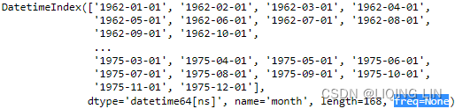
Change the DataFrame's frequency to month start ( MS ) to refect how the data is being stored:
milk=milk.asfreq('MS') # OR milk.index.freq = 'MS'
milk.index 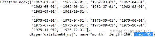
milk 
2. Split the data into train and test sets using the train_test_split function from pmdarima . Tis is a wrapper to scikit-learn's train_test_split function but without shuffling. The following code shows how to use both; they will produce the same results:
from sklearn.model_selection import train_test_split

train, test = train_test_split(milk, test_size=0.10, shuffle=False)

print( f'Train: {train.shape}' )
print( f'Test: {test.shape}' )![]()
# same results using pmdarima : not shuffle
# https://alkaline-ml.com/pmdarima/modules/generated/pmdarima.model_selection.train_test_split.html
train, test = pm.model_selection.train_test_split( milk, test_size=0.10 )

print( f'Train: {train.shape}' )
print( f'Test: {test.shape}' ) ![]() There are 151 months in the training set and 17 months in the test set. You will use the test set to evaluate the model using out-of-sample data.
There are 151 months in the training set and 17 months in the test set. You will use the test set to evaluate the model using out-of-sample data.
pip install hvplot
Note : restart kernel
pip install bokeh
pip install plotly
from bokeh.plotting import figure, show
from bokeh.models import ColumnDataSource, HoverTool
#from bokeh.layouts import column
import numpy as np
import hvplot.pandas
hvplot.extension("bokeh")
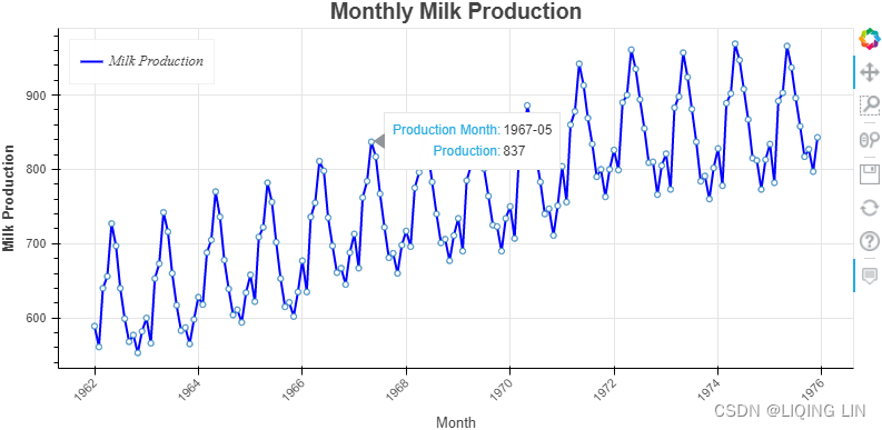
source = ColumnDataSource( data={'productionMonth':milk.index,
'production':milk['production'].values,
})
# def datetime(x):
# return np.array(x, dtype=datetime64)
p2 = figure( width=800, height=400,
title='Monthly Milk Production',
x_axis_type='datetime',
x_axis_label='Month', y_axis_label='Milk Production'
)
p2.xaxis.axis_label_text_font_style='normal'
p2.yaxis.axis_label_text_font_style='bold'
p2.xaxis.major_label_orientation=np.pi/4 # rotation
p2.title.align='center'
p2.title.text_font_size = '1.5em'
p2.line( x='productionMonth', y='production', source=source,
line_width=2, color='blue',
legend_label='Milk Production'
)
# https://docs.bokeh.org/en/latest/docs/first_steps/first_steps_3.html
p2.legend.location = "top_left"
p2.legend.label_text_font = "times"
p2.legend.label_text_font_style = "italic"
p2.circle(x='productionMonth', y='production', source=source,
fill_color='white', size=5
)
p2.add_tools( HoverTool( tooltips=[('Production Month', '@productionMonth{%Y-%m}'),
('Production', '@production{0}')
],
formatters={'@productionMonth':'datetime',
'@production':'numeral'
},
mode='vline'
)
)
show(p2)From Figure 10.1, we determined that both seasonality and trend exist(a positive (upward) trend and a repeating seasonality (every summer)). We could also see that the seasonal effect is additive(The seasonal magnitudes and variations over time seem to be steady).
import statsmodels.tsa.api as smt
from statsmodels.tsa.stattools import acf, pacf
from matplotlib.collections import PolyCollection
import numpy as np
import matplotlib.pyplot as plt

fig, axes = plt.subplots( 2,1, figsize=(14,13) )

lags=41 # including lag at 0: autocorrelation of the first observation on itself

acf_x=acf( milk, nlags=lags-1,alpha=0.05,
           fft=False, qstat=False,
           bartlett_confint=True,
           adjusted=False,
           missing='none',
         )
acf_x, confint =acf_x[:2]

smt.graphics.plot_acf( milk, zero=False, ax=axes[0],
                       auto_ylims=True, lags=lags-1 )
for lag in [1,12, 24]:
    axes[0].scatter( lag,  acf_x[lag] , s=500 ,  facecolors='none', edgecolors='red' )
    axes[0].text( lag-1.3, acf_x[lag]+0.1, 'Lag '+str(lag), color='red', fontsize='x-large')


pacf_x=pacf( milk, nlags=lags-1,alpha=0.05,
           )
pacf_x, pconfint =pacf_x[:2]

smt.graphics.plot_pacf( milk, zero=False, ax=axes[1],
                        auto_ylims=False, lags=lags-1 )
for lag in [1,13,25,37]:
    axes[1].scatter( lag,  pacf_x[lag] , s=500 ,  facecolors='none', edgecolors='red' )
    axes[1].text( lag-1.3, pacf_x[lag]-0.15, 'Lag '+str(lag), color='red', fontsize='large')

plt.show()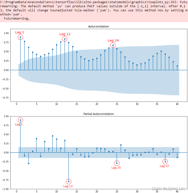
Figure 10.18 – ACF plot showing significant spikes at lags 1, 12, and 24, followed by a cut-off (no other significant lags afterward) + exponential decay in the following PACF plot==> MA
- [12,24] ==> S=12
- there is a significant spike at lag 1, followed by a cut-off, which represents the non-seasonal order for the MA process as q=1.
- The spike at lags 12 and 24 represents the seasonal order for the MA process as Q=1=12/S or Q=1=24/S.
The PACF plot :
- an exponential decay(which can be oscillating) at lags 13, 25, and 36 indicates an Seasonal MA model. So, the SARIMA model would be ARIMA (0, 0, 1) (0, 0, 1, 12) .
- SARIMA(p, d, q) (P, D, Q, S)
3. You will use the auto_arima function from pmdarima to optimize and find the best configuration for your SARIMA model. Prior knowledge about the milk data is key to obtaining the best results from auto_arima. You know the data has a seasonal pattern, so you will need to provide values for the two parameters: seasonal=True and m=12 (the number of periods in a season). If these values are not set, the model will only search for the non-seasonal orders (p, d, q).
###################ts9_annot_arrow_hvplot PyViz interacti_bokeh_STL_seasonal_decomp_HodrickP_KPSS_F-stati_Box-Cox_Ljung_LIQING LIN的博客-CSDN博客
You will explore two statistical tests, the Augmented Dickey-Fuller (ADF) test and the Kwiatkowski-Phillips-Schmidt-Shin (KPSS) test, using the statsmodels library. Both ADF and KPSS test for unit roots in a univariate time series process. Note that unit roots are just one cause for a time series to be non-stationary, but generally, the presence of unit roots indicates non-stationarity.
Both ADF and KPSS are based on linear regression and are a type of statistical hypothesis test. For example,
- the null hypothesis for ADF states that there is a unit root in the time series, and thus, it is non-stationary.
- On the other hand, KPSS has the opposite null hypothesis, which assumes the time series is stationary.
###################
The test parameter specifies the type of unit root test to use to detect stationarity to determine the differencing order ( d ). The default test is kpss . You will change the parameter to use adf instead (to be consistent with what you did in Chapter 10, Building Univariate Time Series Models Using Statistical Methods.) Similarly, seasonal_test is used to determine the order ( D ) for seasonal differencing. The default seasonal_test is OCSB (the Osborn-Chui-Smith-Birchenhall test), which you will keep as-is:
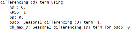
auto_model = pm.auto_arima( train,
seasonal=True, m=12,
test='adf',
stepwise=True # default: auto_arima performs a stepwise search
)
auto_model.summary()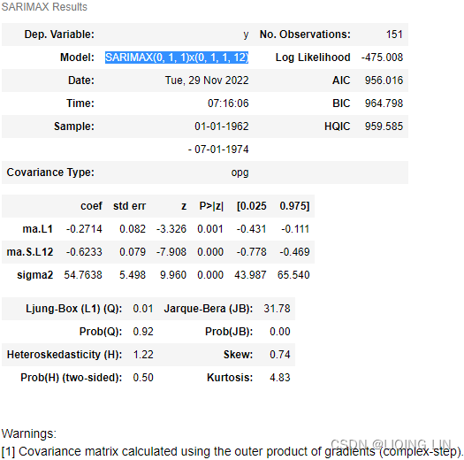 Figure 11.1 – Summary of the best SARIMA model selected using auto_arima.
Interestingly, the best model is a SARIMA(0,1,1)(0,1,1,12), which is the same model you obtained in the Forecasting univariate time series data with seasonal ARIMA recipe in the previous chapter https://blog.csdn.net/Linli522362242/article/details/128067340. You estimated the non-seasonal order (p, q) and seasonal orders (P, Q) using the ACF and PACF plots.
4. If you want to observe the score of the trained model at each iteration, you can use trace=True :
trace : bool or int, optional (default=False)
Whether to print status on the fits. A value of False will print no debugging information. A value of True will print some. Integer values exceeding 1 will print increasing amounts of debug information at each fit
auto_model = pm.auto_arima( train,
                            seasonal=True, m=12,
                            test='adf',
                            stepwise=True,
                            trace=True
                          )
This should print the AIC results for each model from the step-wise algorithm: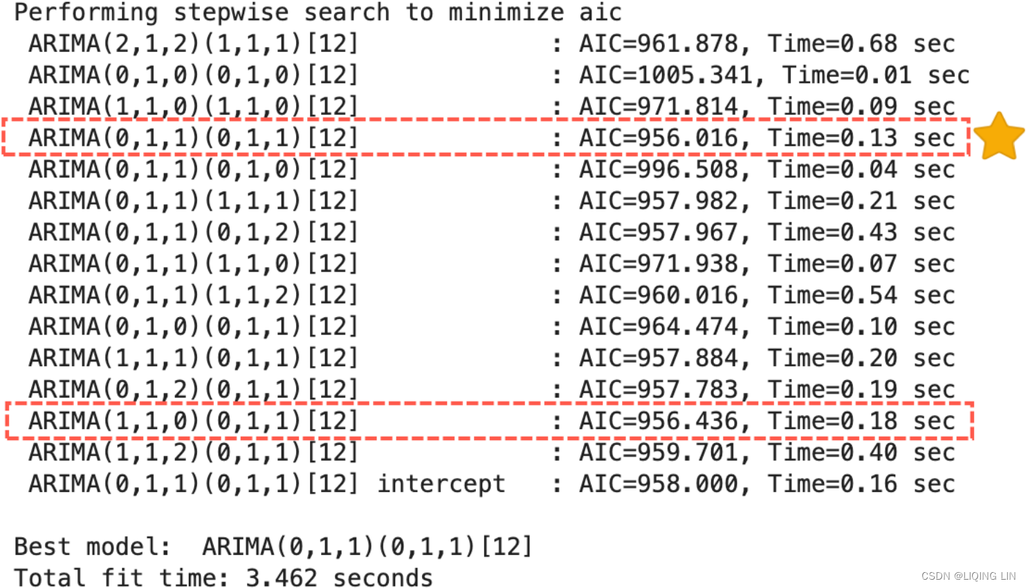 Figure 11.2 – auto_arima evaluating different SARIMA models
The best model was selected based on AIC, which is controlled by the information_criterion parameter. This can be changed to any of the four supported information criterias aic (default), bic , hqic(Hannan–Quinn information criterion) , and oob (“out of bag”https://blog.csdn.net/Linli522362242/article/details/104771157).
In Figure 11.2 two models are highlighted with similar (close enough) AIC scores but with drastically/ˈdræstɪkli/ different截然不同 non-seasonal (p, q) orders.
- The winning model (marked with a star Seasonal ARIMA(0,1,1)(0,1,1,12)) does not have a non-seasonal AutoRegressive AR(p) component; instead, it assumes a moving average MA(q) process.
- On the other hand, the second highlighted model(Seasonal ARIMA(1,1,1)(0,1,1,12)) shows only an AR(p) process, for the non-seasonal component.
This demonstrates that even the best auto_arima still require your best judgment and analysis to evaluate the results.
Choose BIC as the information criteria, as shown in the following code:
auto_model = pm.auto_arima( train,
seasonal=True, m=12,
test='adf',
information_criterion='bic',
stepwise=True,
trace=True
)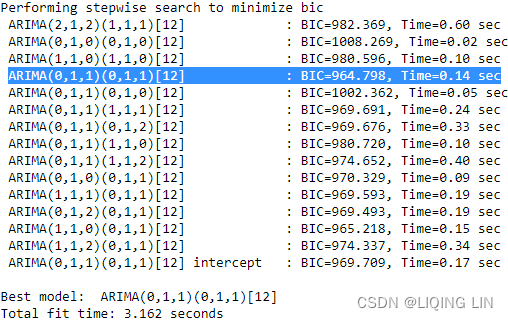 The output will display the BIC for each iteration. Interestingly, the winning model will be the same as the one shown in Figure 11.2.
5. Inspect the residuals to gauge/ ɡeɪdʒ /估计,判断,测量 the overall performance of the model by using the plot_diagnostics method. This should produce the same results that were shown in Figure 10.24 from Chapter 10, Building Univariate Time Series Models Using Statistical Methods.
auto_model.plot_diagnostics( figsize=(14, 8) )
plt.show()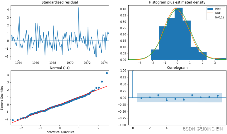
import matplotlib as mpl
mpl.rcParams['patch.force_edgecolor'] = True
mpl.rcParams['patch.edgecolor'] = 'white'

auto_model.plot_diagnostics( figsize=(12, 10) )

plt.show()
# https://alkaline-ml.com/pmdarima/modules/generated/pmdarima.arima.auto_arima.html
auto_model.scoring # return the default method ![]()
6. auto_model stored the winning SARIMA model.
auto_model![]()
New version:
To make a prediction, you can use the predict method. You need to provide the number of periods to forecast forward into the future. You can obtain the confidence intervals with the prediction by updating the return_conf_int parameter from False to True . This allows you to plot the lower and upper confidence intervals using matplotlib's fill_between function. The following code uses the predict method, returns the confidence intervals, and plots the predicted values against the test set:
import pandas as pd

n = test.shape[0]

forecast, conf_intervals = auto_model.predict( n_periods=n,
                                               return_conf_int=True
                                             )# default alpha=0.05 : 95% confidence interval
lower_ci, upper_ci = zip( *conf_intervals ) # * https://blog.csdn.net/Linli522362242/article/details/118891490

index = test.index
ax = test.plot( style='--', color='blue',
                alpha=0.6, figsize=(12,4)
              )
pd.Series( forecast,
           index=index
         ).plot( style='-', ax=ax, color='green' )
plt.fill_between( index, lower_ci, upper_ci, alpha=0.2 )
plt.legend( ['test', 'forecast'] )

plt.show()
The shaded area is based on the lower and upper bounds of the confidence intervals:
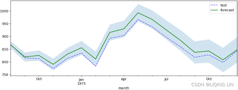 Figure 11.3 – Plotting the forecast from auto_arima against actual test data with the confidence intervals
The default confidence interval is set to 95% and can be controlled using the alpha parameter ( alpha=0.05 , which is 95% confidence interval) from the predict() method. The shaded area represents the likelihood that the real values would lie between this range. Ideally, you would prefer a narrower confidence interval range.
Notice that the forecast line lies in the middle of the shaded area. This represents the mean of the upper and lower bounds. The following code demonstrates this:
sum( forecast ) == sum( conf_intervals.mean(axis=1) )![]()
The auto_arima function from the pmdarima library is a wrapper for the statsmodels SARIMAX class. auto_arima intelligently attempts to automate the process of optimizing the training process to find the best model and parameters. There are three ways to do so:
- • When stepwise=True, auto_arima performs a stepwise search (which is the default).
- • With stepwise=False, it performs a brute-force grid search (full search).
- • With random=True, it performs a random search.
The pmdarima library offers a plethora/ˈpleθərə/过多,过剩 of useful functions to help you make informed decisions so that you can understand the data you are working with.
For example, the ndiff function performs stationarity tests to determine the differencing order, d , to make the time series stationary. The tests include
- the Augmented Dickey-Fuller ( ADF ) test,
In statistics and econometrics, an augmented Dickey–Fuller test (ADF) tests the null hypothesisof a unit root is present in a time series sample. The alternative hypothesis
is different depending on which version of the test is used, but is usually stationarity or trend-stationarity. It is an augmented version of the Dickey–Fuller test for a larger and more complicated set of time series models.t4_Trading Strategies(dual SMA_Naive_Turtle_pair_Pearson_z-scores_ARIMA_autoregressive_Dickey–Fuller_LIQING LIN的博客-CSDN博客
Here are some basic autoregression models for use in ADF testing:- No constant and no trend:

AR(1) :==>
the constant term c has been suppressed常数项已被抑制
Subtract from both sides==>
OR
- if -1<
 <1, the model would be stationary
 - ==1, the series
 is non-stationary,

- >1,
 , the series is divergent and the difference series is non-stationary
 - Therefore, judging whether a sequence is stable can be achieved by checking whether is strictly less than 1.
- A unit root is present if =1. The model would be non-stationary in this case.
 is the first difference operator and
 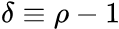 This model can be estimated and testing for a unit root is equivalent to testing
  Since the test is done over the residual term rather than raw data, it is not possible to use standard t-distribution to provide critical values. Therefore, this statistic t has a specific distribution simply known as the Dickey–Fuller table.
https://blog.csdn.net/Linli522362242/article/details/121721868
- if -1<
- A constant without a trend:

- With a constant and trend:


Here, is the first difference operator and is the drift constant漂移常数,
is the coefficient on a time trend,
is the coefficient of our hypothesis, judging whether a sequence is stable can be achieved by checking whether
is the lag order of the first-differences autoregressive process.
is white noise
- class
pmdarima.arima.ADFTest(alpha=0.05, k=None)
This test is generally used indirectly via the pmdarima.arima.ndiffs() function, which computes the differencing term,d.alpha : float, optional (default=0.05)
Level of the test
k : int, optional (default=None)
The drift parameter. Ifkis None, it will be set to:np.trunc( np.power(x.shape[0]-1, 1/3.0) )#The truncated value of the scalar x is the nearest integer i # which is closer to zero than x is. # In short, the fractional part of the signed number x is discarded. a = np.array([-1.7, -1.5, -0.2, 0.2, 1.5, 1.7, 2.0]) np.trunc(a) # array([-1., -1., -0., 0., 1., 1., 2.])
- No constant and no trend:
- the Kwiatkowski–Phillips–Schmidt–Shin ( kpss ) test,
In econometrics, Kwiatkowski–Phillips–Schmidt–Shin (KPSS) tests are used for testing a null hypothesis
This test is generally used indirectly via the pmdarima.arima.ndiffs() function, which computes the differencing term,d.alpha : float, optional (default=0.05)
Level of the test
null : str, optional (default=’level’)
Whether to fit the linear model on the one vector, or an arange. If
nullis ‘trend’, a linear model is fit on an arange, if ‘level’, it is fit on the one vector.lshort : bool, optional (default=True)
Whether or not to truncate the
lvalue in the C code. - and the Phillips-Perron
( pp : the Phillips-Perron test (named after Peter C. B. Phillips and Pierre Perron) is a unit root test. It is used in time series analysis to test the null hypothesisor
in
, where
is the first difference operator : ) test. pmdarima.arima.PPTest — pmdarima 2.0.2 documentation
This test is generally used indirectly via the pmdarima.arima.ndiffs() function, which computes the differencing term,d.
This will return a boolean value(1 or 0), indicating whether the series is stationary or not. - class
pmdarima.arima.CHTest(m)
The Canova-Hansen test for seasonal differences. Canova and Hansen (1995) proposed a test statistic for the null hypothesis that the seasonal pattern is stable. The test statistic can be formulated in terms of seasonal dummies or seasonal cycles.
The former allows us to identify seasons (e.g. months or quarters) that are not stable, while the latter tests the stability of seasonal cycles (e.g. cycles of period 2 and 4 quarters in quarterly data).m : int
The seasonal differencing term. For monthly data, e.g., this would be 12. For quarterly, 4, etc. For the Canova-Hansen test to work,
mmust exceed 1.estimate_seasonal_differencing_term(x)
Estimate the seasonal differencing term. D - class
pmdarima.arima.OCSBTest(m, lag_method='aic', max_lag=3)
Compute the Osborn, Chui, Smith, and Birchenhall (OCSB) test for an input time series to determine whether it needs seasonal differencing. The regression equation may include lags of the dependent variable.
Whenlag_method= “fixed”, the lag order is fixed tomax_lag;
otherwise,max_lagis the maximum number of lags considered in a lag selection procedure that minimizes thelag_methodcriterion, which can be “aic”, “bic” or corrected AIC, “aicc”.
Critical values for the test are based on simulations, which have been smoothed over to produce critical values for all seasonal periodsm : int
The seasonal differencing term. For monthly data, e.g., this would be 12. For quarterly, 4, etc. For the OCSB test to work,
mmust exceed 1.lag_method : str, optional (default=”aic”)
The lag method to use. One of (“fixed”, “aic”, “bic”, “aicc”). The metric for assessing model performance after fitting a linear model.
max_lag : int, optional (default=3)
The maximum lag order to be considered by
lag_method.estimate_seasonal_differencing_term(x)
Estimate the seasonal differencing term. D pmdarima.arima.ndiffs(x, alpha=0.05, test='kpss', max_d=2, **kwargs)
Estimate ARIMA differencing term,d.
Perform a test of stationarity for different levels ofdto estimate the number of differences required to make a given time series stationary. Will select the maximum value ofdfor which the time series is judged stationary by the statistical test.
return d:
The estimated differencing term. This is the maximum value ofdsuch thatd <= max_dand the time series is judged stationary. If the time series is constant, will return 0.6. Tips to using auto_arima — pmdarima 2.0.2 documentation
Similarly, the nsdiff function helps estimate the number of seasonal differencing orders ( D ) that are needed. The implementation covers two tests–the Osborn-Chui-Smith-Birchenhall ( ocsb ) and Canova-Hansen ( ch ) tests:
from pmdarima.arima.utils import ndiffs, nsdiffs

# ADF test:
n_adf = ndiffs( milk, test='adf' )

# KPSS test:
# unitroot_ndiffs gives 'the number of differences' required
# to lead to a 'stationary' series based on the KPSS test
n_kpss = ndiffs( milk, test='kpss' )

# PP test:
n_pp = ndiffs( milk, test='pp' )

# OCSB test
oscb_max_D = nsdiffs(milk, test='ocsb', m=12, max_D=12)

# Ch test
ch_max_D = nsdiffs(milk, test='ch', m=12, max_D=12)
print( f'''
differencing (d) term using:
ADF: {n_adf},
KPSS: {n_kpss},
pp: {n_pp},
oscb: Seasonal differencing (D) term: {oscb_max_D},
ch_max_D: Seasonal differencing (D) term for oscb: {ch_max_D}
''') This is the maximum value of
 d such that d<=max_d and the time series is judged stationary. If the time series is constant, will return 0.
auto_arima() gives you more control over the evaluation process by providing a min and max constraints. For example, you can provide min and max constraints for the non-seasonal autoregressive order, p , or the seasonal moving average, Q.
# https://alkaline-ml.com/pmdarima/modules/generated/pmdarima.arima.auto_arima.html
model = pm.auto_arima( train,
                       seasonal=True,
                       with_intercept = True, # If with_intercept is True, trend will be used.
                       d = 1, max_d=2,
                       start_p=0, max_p=2,
                       start_q=0, max_q=2,
                       m=12,
                       D = 1, max_D =2,
                       start_P=0, max_P=2,
                       start_Q=0, max_Q=2,
                       information_criterion='aic',
                       stepwise=False,
                       out_of_sample_size=25,
                       test='kpss',
                       score='mape', # Mean absolute percentage error
                       trace=True,
                    )
With trace=True, executing the preceding code will show the AIC score for each fitted model. The following code shows the seasonal ARIMA model and the AIC scores for the all models:

 Once completed, it should print out the best model.
If you run the preceding code, auto_arima will create different models for every combination of the parameter values based on the constraints you provided. Because stepwise is set to False , it becomes a brute-force grid search in which every permutation for the different variable combinations is tested one by one. Hence, this is generally a much slower process, but by providing these constraints, you can improve the search performance.
The approach that was taken here, with stepwise=False , should resemble the approach you took in Chapter 10, Building Univariate Time Series Models Using Statistical Methods, in the Forecasting univariate time series data with seasonal ARIMA recipe, in the There's more... section.
model.out_of_sample_size ![]()
The ARIMA class can fit only a portion of the data if specified, in order to retain an “out of bag”sample score. This is the number of examples from the tail of the time series to hold out and use as validation examples. The model will not be fit on these samples, but the observations will be added into the model’s endog and exog arrays so that future forecast values originate from the end of the endogenous vector.
model.summary()
model.plot_diagnostics( figsize=(12,7) )
plt.show()
Forecasting time series data using Facebook Prophet
The Prophet library is a popular open source project that was originally developed at Facebook (Meta) based on a 2017 paper that proposed an algorithm for time series forecasting titled Forecasting at Scale. The project soon gained popularity due to its simplicity, its ability to create compelling and performant forecasting models, and its ability to handle complex seasonality, holiday effects, missing data, and outliers. The Prophet library automates many aspects of designing a forecasting model while providing additional out-of-the-box visualizations开箱即用的可视化效果. The library offers additional capabilities, such as building growth models (saturated forecasts), working with uncertainty in trend and seasonality, and changepoint detection.
Overall, Prophet automated many aspects of building and optimizing the model. Building a complex model was straightforward with Prophet. However, you still had to provide some instructions initially to ensure the model was tuned properly. For example, you had to determine if the seasonal effect was additive or multiplicative when initializing the model. You also had to specify a monthly frequency when extending the periods into the future with freq=' MS'(Any valid frequency for pd.date_range,such as 'D' or 'M'.) in the make_future_dataframe method.
In this recipe, you will use the Milk Production dataset used in the previous recipe. This will help you understand the different forecasting approaches while using the same dataset for benchmarking.
The Prophet algorithm is an additive regression model that can handle non-linear trends and works well with strong seasonal effects. The algorithm decomposes a time series into three main components: trend, seasonality, and holidays. The model can be written as follows:
Here,
describes a piecewise-linear trend function, describes a piecewise-linear trend (or “growth term”)
represents the periodic seasonality function, describes the various seasonal patterns
- ℎ(
) captures the holiday effects, and
is the white noise error term (residual).
- The knots/nɑːts/ 结点 (or changepoints) for the piecewise-linear trend are automatically selected if not explicitly specified. Optionally, a logistic function can be used to set an upper bound on the trend.
- The seasonal component consists of Fourier terms傅立叶项 of the relevant periods. By default,
- order 10 is used for annual seasonality and
- order 3 is used for weekly seasonality.
-
Fourier terms are periodic and that makes them useful in describing a periodic pattern.
-
Fourier terms can be added linearly to describe more complex functions.
###############https://www.seas.upenn.edu/~kassam/tcom370/n99_2B.pdf
and:
assume:
assume:
##########https://sigproc.mit.edu/_static/fall19/lectures/lec02a.pdf
and:
assume:
assume:
if
:
###########################
We have for instance the following relationship with only two termsthe amplitude
and phase shift(相移)
.
The right side is not an easy function to work with. The phase shift θ makes the function non-linear and you can not use it in, for instance, linear regression.
With more Fourier terms you can describe more variations in the shape of function.
m : is the seasonal period,is an ARIMA process.
K : The total number of Fourier terms for each seasonal period could be selected to minimise the AICc.
If m is the seasonal period, then the first few Fourier terms are given by and so on. If we have monthly seasonality, and we use the first 11 of these predictor variables, then we will get exactly the same forecasts as using 11 dummy variables.
With Fourier terms, we often need fewer predictors than with dummy variables, especially when m is large. This makes them useful for weekly data, for example, where m≈52. For short seasonal periods (e.g., quarterly data, m=4), there is little advantage in using Fourier terms over seasonal dummy variables.
Trend
It is common for time series data to be trending. A linear trend can be modelled by simply usingas a predictor,
where t=1,…,T. A trend variable can be specified in theTSLM()function using thetrend()special. In Section 7.7 we discuss how we can also model nonlinear trends.
These Fourier terms are produced using thefourier()function. For example, the Australian beer quarterly data can be modelled like this.
TheKargument tofourier()specifies how many pairs of sin and cos terms to include. The maximum allowed is K=m/2 where m is the seasonal period. Because we have used the maximum here, the results are identical to those obtained when using seasonal dummy variables.fourier_beer <- recent_production %>% model(TSLM(Beer ~ trend() + fourier(K = 2))) report(fourier_beer) #> Series: Beer #> Model: TSLM #> #> Residuals: #> Min 1Q Median 3Q Max #> -42.90 -7.60 -0.46 7.99 21.79 #> #> Coefficients: #> Estimate Std. Error t value Pr(>|t|) #> (Intercept) 446.8792 2.8732 155.53 < 2e-16 *** #> trend() -0.3403 0.0666 -5.11 2.7e-06 *** #> fourier(K = 2)C1_4 8.9108 2.0112 4.43 3.4e-05 *** #> fourier(K = 2)S1_4 -53.7281 2.0112 -26.71 < 2e-16 *** #> fourier(K = 2)C2_4 -13.9896 1.4226 -9.83 9.3e-15 *** #> --- #> Signif. codes: 0 '***' 0.001 '**' 0.01 '*' 0.05 '.' 0.1 ' ' 1 #> #> Residual standard error: 12.2 on 69 degrees of freedom #> Multiple R-squared: 0.924, Adjusted R-squared: 0.92 #> F-statistic: 211 on 4 and 69 DF, p-value: <2e-16If only the first two Fourier terms(K=1) are used (
and
), the seasonal pattern will follow a simple sine wave.
A regression model containing Fourier terms is often called a harmonic regression because the successive Fourier terms represent harmonics of the first two Fourier terms.
-
- Holiday effects are added as simple dummy variables.
Dummy variables
when forecasting daily sales and you want to take account of whether the day is a public holiday or not. So the predictor takes value “yes” on a public holiday, and “no” otherwise.
This situation can still be handled within the framework of multiple regression models by creating a “dummy variable” which takes value 1 corresponding to “yes” and 0 corresponding to “no”. A dummy variable is also known as an “indicator variable”.
For example, based on the gender variable, we can create a new variable that takes the form (3.26)
and use this variable as a predictor in the regression equation. This results in the model (3.27)
Nowcan be interpreted as the average credit card balance among males,
as the average credit card balance among females, and
as the average difference in credit card balance between females and males.
Table 3.7 displays the coefficient estimates and other information associated with the model (3.27). The average credit card debt for males is estimated to be $509.80, whereas females are estimated to carry $19.73 in additional debt for a total of $509.80 + $19.73 = $529.53.
 - The model is estimated using a Bayesian approach to allow for automatic selection of the changepoints and other model characteristics.
The algorithm uses Bayesian inferencing to automate many aspects of tuning the model and finding the optimized values for each component. Behind the scenes, Prophet uses Stan, a library for Bayesian inferencing, through the PyStan library as the Python interface to Stan.
The Prophet library is very opinionated when it comes to column names. The Prophet class does not expect a DatetimeIndex but rather a datetime column called ds and a variable column (that you want to forecast) called y. Note that if you have more than two columns, Prophet will only pick the ds and y columns and ignore the rest. If these two columns do not exist, it will throw an error. Follow these steps:
1. Start by reading the milk_productions.csv fle and rename the columns ds and y
milk_file='https://raw.githubusercontent.com/PacktPublishing/Time-Series-Analysis-with-Python-Cookbook/main/datasets/Ch10/milk_production.csv'
# milk = pd.read_csv( milk_file,
#                     index_col='month',
#                     parse_dates=True,
#                   )
# milk=milk.reset_index()
# milk.columns=['ds','y']

# OR
milk = pd.read_csv( milk_file,
                    parse_dates=['month']
                  )
milk.columns = ['ds', 'y'] # rename the column
milk
Split the data into test and train sets. Let's go with a 90/10 split by using the following code:
idx = round( len(milk)*0.90 )
train, test = milk[:idx], milk[idx:]
print( f'Train: {train.shape}, Test: {test.shape}' ) ![]()
from bokeh.plotting import figure, show
from bokeh.models import ColumnDataSource, HoverTool
#from bokeh.layouts import column
import numpy as np

import hvplot.pandas
hvplot.extension("bokeh")

source = ColumnDataSource( data={'productionMonth':milk.ds.values,
                                 'production':milk.y.values,
                                })

# def datetime(x):
#     return np.array(x, dtype=datetime64)

p2 = figure( width=800, height=400,
             title='Monthly Milk Production',
             x_axis_type='datetime',
             x_axis_label='ds', y_axis_label='Milk Production'
           )
p2.xaxis.axis_label_text_font_style='normal'
p2.yaxis.axis_label_text_font_style='bold'
p2.xaxis.major_label_orientation=np.pi/4 # rotation
p2.title.align='center'
p2.title.text_font_size = '1.5em'

p2.line( x='productionMonth', y='production', source=source,
         line_width=2, color='blue',
         legend_label='y'
       )
# https://docs.bokeh.org/en/latest/docs/first_steps/first_steps_3.html
p2.legend.location = "top_left"
p2.legend.label_text_font = "times"
p2.legend.label_text_font_style = "italic"


p2.circle(x='productionMonth', y='production', source=source,
          fill_color='white', size=5
        )

p2.add_tools( HoverTool( tooltips=[('Production Month', '@productionMonth{%Y-%m}'),
                                   ('Production', '@production{0}')
                                  ],
                         formatters={'@productionMonth':'datetime',
                                     '@production':'numeral'
                                    },
                         mode='vline'
                       )
            )
show(p2)
Prophet
2. You can create an instance of the Prophet class and fit it on the train set in one line using the fit method. The milk production time series is monthly, with both trend and a steady seasonal fluctuation (additive: (The seasonal magnitudes and variations over time seem to be steady)).The default seasonality_mode in Prophet is additive, so leave it as-is:
from prophet import Prophet

model = Prophet().fit( train )![]() yearly_seasonality , weekly_seasonality , and daily_seasonality are set to auto by default, this allows Prophet to determine which ones to turn on or of based on the data.
yearly_seasonality , weekly_seasonality , and daily_seasonality are set to auto by default, this allows Prophet to determine which ones to turn on or of based on the data.
###########################
OR
from prophet.plot import plot_yearly

m = Prophet(yearly_seasonality=10).fit(train)
a = plot_yearly(m)
The default Fourier order for yearly seasonality is 10,
The default values are often appropriate, but they can be increased when the seasonality needs to fit higher-frequency changes, and generally be less smooth. The Fourier order can be specified for each built-in seasonality when instantiating the model, here it is increased to 20:
from prophet.plot import plot_yearly

m = Prophet(yearly_seasonality=20).fit(train)
a = plot_yearly(m)
###########################
model.seasonalities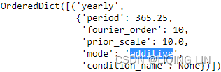
model.component_modes
3. Some setup needs to be done before you can use the model to make predictions. Use the make_future_dataframe method to extend the train DataFrame forward for a specific number of periods and at a specified frequency:
future = model.make_future_dataframe( len(test), #periods : number of periods to forecast forward
                                      freq='MS', #Any valid frequency for pd.date_range,such as 'D' or 'M'.
                                      include_history=True, # Boolean to include the historical
                                                             # dates in the data frame for predictions.
                                    )
future.shape![]()
This extends the training data by 17 months (the number of periods in the test set : len(test) ). In total, you should have the exact number of periods that are in the milk DataFrame (train and test). The frequency is set to month start with freq=' MS' . The future object only contains one column, ds, of the datetime64[ns] type, which is used to populate the predicted values:
future 
len( milk ) == len( future ) ![]()
4. Now, use the predict method to take the future DataFrame and make predictions. The result will be a DataFrame that's the same length as forecast but now with additional columns:
forecast = model.predict( future )
forecast.columns
As per Prophet's documentation, there are three components for the uncertainty intervals (for example, yhat_lower and yhat_upper ):
- • Observation noise
- • Parameter uncertainty
- • Future trend uncertainty
By default, the uncertainty_samples parameter is set to 1000 , which is the number of simulations to estimate the uncertainty using the Hamiltonian Monte Carlo (HMC) algorithm. You can always reduce the number of samples that are simulated or set it to 0 or False to speed up the performance. If you set uncertainty_samples=0 or uncertainty_samples=False, the forecast's output will not contain any uncertainty interval calculations. For example, you will not have yhat_lower or yhat_upper.
help(Prophet)class Prophet(builtins.object)
| Prophet(growth='linear', changepoints=None, n_changepoints=25, changepoint_range=0.8, yearly_seasonality='auto', weekly_seasonality='auto', daily_seasonality='auto', holidays=None, seasonality_mode='additive', seasonality_prior_scale=10.0, holidays_prior_scale=10.0, changepoint_prior_scale=0.05, mcmc_samples=0, interval_width=0.8, uncertainty_samples=1000, stan_backend=None)
|
| Prophet forecaster.
|
| Parameters
| ----------
| growth: String 'linear', 'logistic' or 'flat' to specify a linear, logistic or
| flat trend.
| changepoints: List of dates at which to include potential changepoints. If
| not specified, potential changepoints are selected automatically.
| n_changepoints: Number of potential changepoints to include. Not used
| if input `changepoints` is supplied. If `changepoints` is not supplied,
| then n_changepoints potential changepoints are selected uniformly from
| the first `changepoint_range` proportion of the history.
| changepoint_range: Proportion of history in which trend changepoints will
| be estimated. Defaults to 0.8 for the first 80%. Not used if
| `changepoints` is specified.
| yearly_seasonality: Fit yearly seasonality.
| Can be 'auto', True, False, or a number of Fourier terms to generate.
| weekly_seasonality: Fit weekly seasonality.
| Can be 'auto', True, False, or a number of Fourier terms to generate.
| daily_seasonality: Fit daily seasonality.
| Can be 'auto', True, False, or a number of Fourier terms to generate.
| holidays: pd.DataFrame with columns holiday (string) and ds (date type)
| and optionally columns lower_window and upper_window which specify a
| range of days around the date to be included as holidays.
| lower_window=-2 will include 2 days prior to the date as holidays. Also
| optionally can have a column prior_scale specifying the prior scale for
| that holiday.
| seasonality_mode: 'additive' (default) or 'multiplicative'.
| seasonality_prior_scale: Parameter modulating the strength of the
| seasonality model. Larger values allow the model to fit larger seasonal
| fluctuations, smaller values dampen the seasonality. Can be specified
| for individual seasonalities using add_seasonality.
| holidays_prior_scale: Parameter modulating the strength of the holiday
| components model, unless overridden in the holidays input.
| changepoint_prior_scale: Parameter modulating the flexibility of the
| automatic changepoint selection. Large values will allow many
| changepoints, small values will allow few changepoints.
| mcmc_samples: Integer, if greater than 0, will do full Bayesian inference
| with the specified number of MCMC samples. If 0, will do MAP
| estimation.
| interval_width: Float, width of the uncertainty intervals provided
| for the forecast. If mcmc_samples=0, this will be only the uncertainty
| in the trend using the MAP estimate of the extrapolated generative
| model. If mcmc.samples>0, this will be integrated over all model
| parameters, which will include uncertainty in seasonality.
| uncertainty_samples: Number of simulated draws used to estimate
| uncertainty intervals. Settings this value to 0 or False will disable
| uncertainty estimation and speed up the calculation.
| stan_backend: str as defined in StanBackendEnum default: None - will try to
| iterate over all available backends and find the working one
Notice that Prophet returned a lot of details to help you understand how the model performs. Of interest are ds and the predicted value, yhat . Both yhat_lower and yhat_upper represent the uncertainty intervals for the prediction ( yhat ).
forecast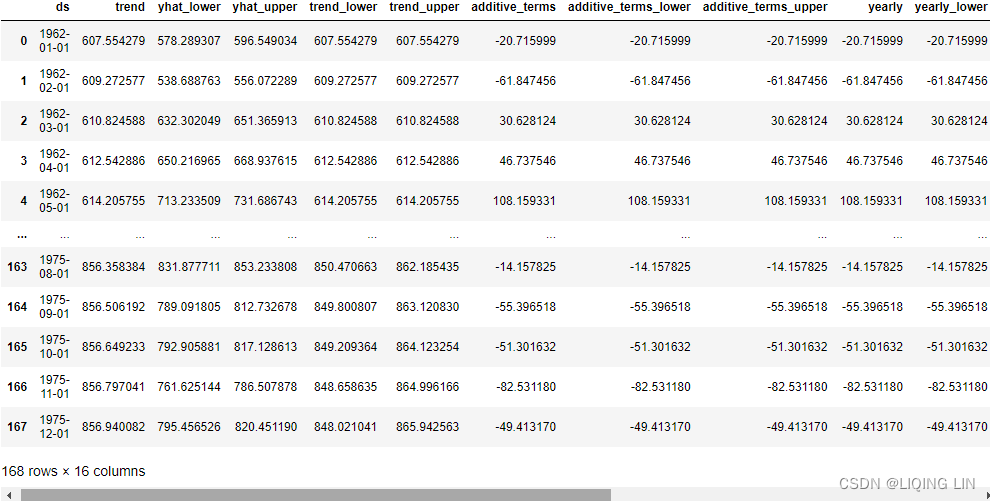

Create a cols object to store the columns of interest so that you can use them later:
cols = ['ds', 'yhat', 'yhat_lower', 'yhat_upper' ]visualize the datapoints, forecast and uncertainty interval
5. The model object provides two plotting methods: plot and plot_components . Start by using plot to visualize the forecast from Prophet:
fig, ax = plt.subplots(1,1, figsize=(10,6))

model.plot( forecast, ax=ax, ylabel='Milk Production in Pounds', include_legend=True )

plt.show()
This should produce a time series plot with two forecasts (predictions): the first segment can be distinguished by the dots (one for each training data point), while the line represents the estimated forecast for the historical data. This is followed by another segment that shows future predictions beyond the training data (no dots present): Figure 11.4 – Plotting the forecast (historical and future) using Prophet
The shaded area in Figure 11.4 represents the uncertainty intervals. This is represented by the yhat_lower and yhat_upper columns in the forecast DataFrame.
from prophet.plot import plot_plotly, plot_components_plotly

plot_plotly(model, forecast, figsize=(800,800))
Here, you can see the distinction between past and future estimates (forecast) more concretely by only plotting the future periods beyond the training set. You can accomplish this with the following code:
predicted = model.predict( test )

fig, ax = plt.subplots(1,1, figsize=(10,6))

model.plot( predicted, ax=ax, ylabel='Milk Production in Pounds', include_legend=True )

plt.show()
This should produce a plot that's similar to the one shown in Figure 11.4, but it will only show the forecast line for the second segment(test set) – that is, the future forecast.
plot_plotly( model, forecast[-len(test):],
             ylabel='Milk Production in Pounds',figsize=(800, 600) )
plot identifed components(trend and seasonality (annual) ) in forecast
6. The next important plot deals with the forecast components. Use the plot_components method to plot the components:
model.plot_components( forecast, figsize=(10,6) )

plt.show()
The number of subplots will depend on the number of components that have been identifed in the forecast. For example, if holiday was included, then it will show the holiday component. In our example, there will be two subplots: trend and yearly
The shaded area in the trend plot represents the uncertainty interval for estimating the trend. The data is stored in the trend_lower and trend_upper columns of the forecast DataFrame.
 Figure 11.5 – Plotting the components showing trend and seasonality (annual)
Figure 11.5 breaks down the trend and seasonality of the training data. If you look at Figure 11.4, you will see a positive upward trend that becomes steady (slows down) starting from 1972. The seasonal pattern shows an increase in production around summertime (this peaks in Figure 11.4).
from prophet.plot import plot_plotly, plot_components_plotly

plot_components_plotly(model, forecast, figsize=(800,400))
The shaded area in the trend plot represents the uncertainty interval for estimating the trend. The data is stored in the trend_lower and trend_upper columns of the forecast DataFrame.

Actual VS Forecast
7. Finally, compare with out-of-sample data (the test data) to see how well the model performs:
ax = test.plot( x='ds', y='y',
                label='Actual', style='-.', color='blue',
                figsize=(12,8)
              )
predicted.plot( x='ds', y='yhat',
                label='Predicted', style='-', color='green',
                ax=ax
              )
plt.title('Milk Production: Actual vs Forecast')
plt.show()
test 
import plotly.graph_objects as go
# predicted = model.predict( test )
# https://stackoverflow.com/questions/59953431/how-to-change-plotly-figure-size
layout=go.Layout(width=800, height=500,
title='Milk Production: Actual vs Forecast',
title_x=0.5, title_y=0.9,
xaxis=dict(title='ds', color='black', tickangle=30),
yaxis=dict(title='Milk Production in Pounds', color='blue')
)
fig = go.Figure(layout=layout)
# https://plotly.com/python/marker-style/#custom-marker-symbols
# circle-open-dot
# https://support.sisense.com/kb/en/article/changing-line-styling-plotly-python-and-r
fig.add_trace( go.Scatter( name='Actual',
mode ='lines', #marker_symbol='circle',
line=dict(shape = 'linear', color = 'rgb(100, 10, 100)',
width = 2, dash = 'dashdot'),
x=test['ds'], y=test['y'],
#title='Milk Production: Actual vs Forecast'
)
)
fig.add_trace( go.Scatter( name='Predicted',
mode ='lines',
marker_color='green', marker_line_color='green',
x=predicted['ds'], y=predicted['yhat'],
)
)
#fig.update_xaxes(showgrid=True, ticklabelmode="period")
fig.show()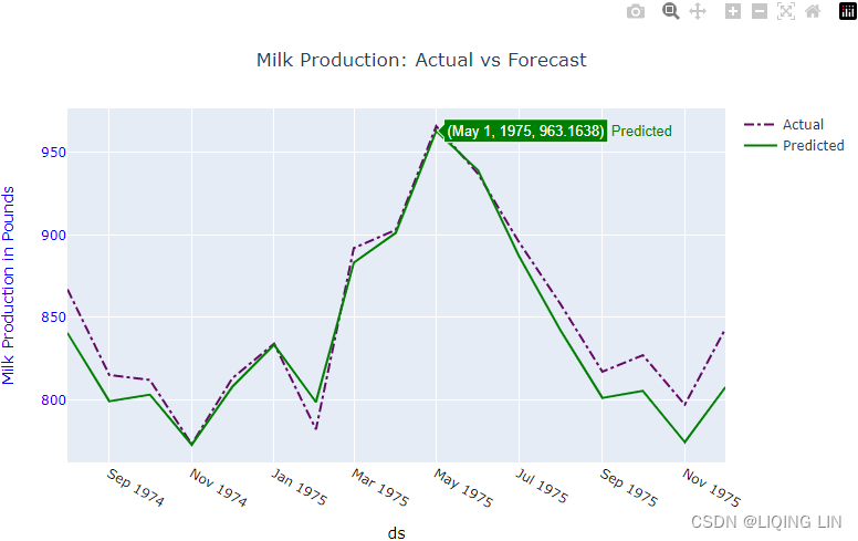 Figure 11.6 – Comparing Prophet's forecast against test data
Compare this plot with Figure 11.3 to see how Prophet compares to the SARIMA model that you obtained using auto_arima
Notice that for the highly seasonal milk production data, the model did a great job. Generally, Prophet shines when it's working with strong seasonal time series data一般来说, Prophet 在处理强季节性时间序列数据时表现出色.
Original data vs Changepoints
Prophet automatically detects changes or sudden fluctuations in the trend. Initially, it will place 25 points using the first 80% of the training data. You can change the number of changepoints with the n_changepoints parameter. Similarly, the proportion of past data to use to estimate the changepoints can be updated using changepoint_range , which defaults to 0.8 (or 80%). You can observe the 25 changepoints using the changepoints attribute from the model object. The following code shows the first five:
model.changepoint_range![]()
model.changepoints.shape![]()
model.changepoints 
You can plot these points as well, as shown in the following code:
ax = milk.set_index('ds').plot( figsize=(10,8) )
milk.set_index('ds').loc[model.changepoints].plot( style='o',
                                                   ax=ax
                                                 )
plt.legend( ['original data', 'changepoints'] )
plt.show()
This should produce a plot that contains the original time series data and the 25 potential changepoints that indicate changes in trend:
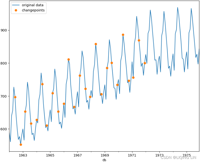 Figure 11.7 – The 25 potential changepoints, as identified by Prophet
These potential changepoints were estimated from the first 80% of the training data.
Did you mean "domain"?

    Valid properties:
        anchor
            If set to an opposite-letter axis id (e.g. `x2`, `y`),
            this axis is bound to the corresponding opposite-letter
            axis. If set to "free", this axis' position is
            determined by `position`.
        automargin
            Determines whether long tick labels automatically grow
            the figure margins.
        autorange
            Determines whether or not the range of this axis is
            computed in relation to the input data. See `rangemode`
            for more info. If `range` is provided, then `autorange`
            is set to False.
        autotypenumbers
            Using "strict" a numeric string in trace data is not
            converted to a number. Using *convert types* a numeric
            string in trace data may be treated as a number during
            automatic axis `type` detection. Defaults to
            layout.autotypenumbers.
        calendar
            Sets the calendar system to use for `range` and `tick0`
            if this is a date axis. This does not set the calendar
            for interpreting data on this axis, that's specified in
            the trace or via the global `layout.calendar`
        categoryarray
            Sets the order in which categories on this axis appear.
            Only has an effect if `categoryorder` is set to
            "array". Used with `categoryorder`.
        categoryarraysrc
            Sets the source reference on Chart Studio Cloud for
            `categoryarray`.
        categoryorder
            Specifies the ordering logic for the case of
            categorical variables. By default, plotly uses "trace",
            which specifies the order that is present in the data
            supplied. Set `categoryorder` to *category ascending*
            or *category descending* if order should be determined
            by the alphanumerical order of the category names. Set
            `categoryorder` to "array" to derive the ordering from
            the attribute `categoryarray`. If a category is not
            found in the `categoryarray` array, the sorting
            behavior for that attribute will be identical to the
            "trace" mode. The unspecified categories will follow
            the categories in `categoryarray`. Set `categoryorder`
            to *total ascending* or *total descending* if order
            should be determined by the numerical order of the
            values. Similarly, the order can be determined by the
            min, max, sum, mean or median of all the values.
        color
            Sets default for all colors associated with this axis
            all at once: line, font, tick, and grid colors. Grid
            color is lightened by blending this with the plot
            background Individual pieces can override this.
        constrain
            If this axis needs to be compressed (either due to its
            own `scaleanchor` and `scaleratio` or those of the
            other axis), determines how that happens: by increasing
            the "range", or by decreasing the "domain". Default is
            "domain" for axes containing image traces, "range"
            otherwise.
        constraintoward
            If this axis needs to be compressed (either due to its
            own `scaleanchor` and `scaleratio` or those of the
            other axis), determines which direction we push the
            originally specified plot area. Options are "left",
            "center" (default), and "right" for x axes, and "top",
            "middle" (default), and "bottom" for y axes.
        dividercolor
            Sets the color of the dividers Only has an effect on
            "multicategory" axes.
        dividerwidth
            Sets the width (in px) of the dividers Only has an
            effect on "multicategory" axes.
        domain
            Sets the domain of this axis (in plot fraction).
        dtick
            Sets the step in-between ticks on this axis. Use with
            `tick0`. Must be a positive number, or special strings
            available to "log" and "date" axes. If the axis `type`
            is "log", then ticks are set every 10^(n*dtick) where n
            is the tick number. For example, to set a tick mark at
            1, 10, 100, 1000, ... set dtick to 1. To set tick marks
            at 1, 100, 10000, ... set dtick to 2. To set tick marks
            at 1, 5, 25, 125, 625, 3125, ... set dtick to
            log_10(5), or 0.69897000433. "log" has several special
            values; "L<f>", where `f` is a positive number, gives
            ticks linearly spaced in value (but not position). For
            example `tick0` = 0.1, `dtick` = "L0.5" will put ticks
            at 0.1, 0.6, 1.1, 1.6 etc. To show powers of 10 plus
            small digits between, use "D1" (all digits) or "D2"
            (only 2 and 5). `tick0` is ignored for "D1" and "D2".
            If the axis `type` is "date", then you must convert the
            time to milliseconds. For example, to set the interval
            between ticks to one day, set `dtick` to 86400000.0.
            "date" also has special values "M<n>" gives ticks
            spaced by a number of months. `n` must be a positive
            integer. To set ticks on the 15th of every third month,
            set `tick0` to "2000-01-15" and `dtick` to "M3". To set
            ticks every 4 years, set `dtick` to "M48"
        exponentformat
            Determines a formatting rule for the tick exponents.
            For example, consider the number 1,000,000,000. If
            "none", it appears as 1,000,000,000. If "e", 1e+9. If
            "E", 1E+9. If "power", 1x10^9 (with 9 in a super
            script). If "SI", 1G. If "B", 1B.
        fixedrange
            Determines whether or not this axis is zoom-able. If
            true, then zoom is disabled.
        gridcolor
            Sets the color of the grid lines.
        griddash
            Sets the dash style of lines. Set to a dash type string
            ("solid", "dot", "dash", "longdash", "dashdot", or
            "longdashdot") or a dash length list in px (eg
            "5px,10px,2px,2px").
        gridwidth
            Sets the width (in px) of the grid lines.
        hoverformat
            Sets the hover text formatting rule using d3 formatting
            mini-languages which are very similar to those in
            Python. For numbers, see:
            https://github.com/d3/d3-format/tree/v1.4.5#d3-format.
            And for dates see: https://github.com/d3/d3-time-
            format/tree/v2.2.3#locale_format. We add two items to
            d3's date formatter: "%h" for half of the year as a
            decimal number as well as "%{n}f" for fractional
            seconds with n digits. For example, *2016-10-13
            09:15:23.456* with tickformat "%H~%M~%S.%2f" would
            display "09~15~23.46"
        layer
            Sets the layer on which this axis is displayed. If
            *above traces*, this axis is displayed above all the
            subplot's traces If *below traces*, this axis is
            displayed below all the subplot's traces, but above the
            grid lines. Useful when used together with scatter-like
            traces with `cliponaxis` set to False to show markers
            and/or text nodes above this axis.
        linecolor
            Sets the axis line color.
        linewidth
            Sets the width (in px) of the axis line.
        matches
            If set to another axis id (e.g. `x2`, `y`), the range
            of this axis will match the range of the corresponding
            axis in data-coordinates space. Moreover, matching axes
            share auto-range values, category lists and histogram
            auto-bins. Note that setting axes simultaneously in
            both a `scaleanchor` and a `matches` constraint is
            currently forbidden. Moreover, note that matching axes
            must have the same `type`.
        minexponent
            Hide SI prefix for 10^n if |n| is below this number.
            This only has an effect when `tickformat` is "SI" or
            "B".
        minor
            :class:`plotly.graph_objects.layout.xaxis.Minor`
            instance or dict with compatible properties
        mirror
            Determines if the axis lines or/and ticks are mirrored
            to the opposite side of the plotting area. If True, the
            axis lines are mirrored. If "ticks", the axis lines and
            ticks are mirrored. If False, mirroring is disable. If
            "all", axis lines are mirrored on all shared-axes
            subplots. If "allticks", axis lines and ticks are
            mirrored on all shared-axes subplots.
        nticks
            Specifies the maximum number of ticks for the
            particular axis. The actual number of ticks will be
            chosen automatically to be less than or equal to
            `nticks`. Has an effect only if `tickmode` is set to
            "auto".
        overlaying
            If set a same-letter axis id, this axis is overlaid on
            top of the corresponding same-letter axis, with traces
            and axes visible for both axes. If False, this axis
            does not overlay any same-letter axes. In this case,
            for axes with overlapping domains only the highest-
            numbered axis will be visible.
        position
            Sets the position of this axis in the plotting space
            (in normalized coordinates). Only has an effect if
            `anchor` is set to "free".
        range
            Sets the range of this axis. If the axis `type` is
            "log", then you must take the log of your desired range
            (e.g. to set the range from 1 to 100, set the range
            from 0 to 2). If the axis `type` is "date", it should
            be date strings, like date data, though Date objects
            and unix milliseconds will be accepted and converted to
            strings. If the axis `type` is "category", it should be
            numbers, using the scale where each category is
            assigned a serial number from zero in the order it
            appears.
        rangebreaks
            A tuple of
            :class:`plotly.graph_objects.layout.xaxis.Rangebreak`
            instances or dicts with compatible properties
        rangebreakdefaults
            When used in a template (as
            layout.template.layout.xaxis.rangebreakdefaults), sets
            the default property values to use for elements of
            layout.xaxis.rangebreaks
        rangemode
            If "normal", the range is computed in relation to the
            extrema of the input data. If *tozero*`, the range
            extends to 0, regardless of the input data If
            "nonnegative", the range is non-negative, regardless of
            the input data. Applies only to linear axes.
        rangeselector
            :class:`plotly.graph_objects.layout.xaxis.Rangeselector
            ` instance or dict with compatible properties
        rangeslider
            :class:`plotly.graph_objects.layout.xaxis.Rangeslider`
            instance or dict with compatible properties
        scaleanchor
            If set to another axis id (e.g. `x2`, `y`), the range
            of this axis changes together with the range of the
            corresponding axis such that the scale of pixels per
            unit is in a constant ratio. Both axes are still
            zoomable, but when you zoom one, the other will zoom
            the same amount, keeping a fixed midpoint. `constrain`
            and `constraintoward` determine how we enforce the
            constraint. You can chain these, ie `yaxis:
            {scaleanchor: *x*}, xaxis2: {scaleanchor: *y*}` but you
            can only link axes of the same `type`. The linked axis
            can have the opposite letter (to constrain the aspect
            ratio) or the same letter (to match scales across
            subplots). Loops (`yaxis: {scaleanchor: *x*}, xaxis:
            {scaleanchor: *y*}` or longer) are redundant and the
            last constraint encountered will be ignored to avoid
            possible inconsistent constraints via `scaleratio`.
            Note that setting axes simultaneously in both a
            `scaleanchor` and a `matches` constraint is currently
            forbidden.
        scaleratio
            If this axis is linked to another by `scaleanchor`,
            this determines the pixel to unit scale ratio. For
            example, if this value is 10, then every unit on this
            axis spans 10 times the number of pixels as a unit on
            the linked axis. Use this for example to create an
            elevation profile where the vertical scale is
            exaggerated a fixed amount with respect to the
            horizontal.
        separatethousands
            If "true", even 4-digit integers are separated
        showdividers
            Determines whether or not a dividers are drawn between
            the category levels of this axis. Only has an effect on
            "multicategory" axes.
        showexponent
            If "all", all exponents are shown besides their
            significands. If "first", only the exponent of the
            first tick is shown. If "last", only the exponent of
            the last tick is shown. If "none", no exponents appear.
        showgrid
            Determines whether or not grid lines are drawn. If
            True, the grid lines are drawn at every tick mark.
        showline
            Determines whether or not a line bounding this axis is
            drawn.
        showspikes
            Determines whether or not spikes (aka droplines) are
            drawn for this axis. Note: This only takes affect when
            hovermode = closest
        showticklabels
            Determines whether or not the tick labels are drawn.
        showtickprefix
            If "all", all tick labels are displayed with a prefix.
            If "first", only the first tick is displayed with a
            prefix. If "last", only the last tick is displayed with
            a suffix. If "none", tick prefixes are hidden.
        showticksuffix
            Same as `showtickprefix` but for tick suffixes.
        side
            Determines whether a x (y) axis is positioned at the
            "bottom" ("left") or "top" ("right") of the plotting
            area.
        spikecolor
            Sets the spike color. If undefined, will use the series
            color
        spikedash
            Sets the dash style of lines. Set to a dash type string
            ("solid", "dot", "dash", "longdash", "dashdot", or
            "longdashdot") or a dash length list in px (eg
            "5px,10px,2px,2px").
        spikemode
            Determines the drawing mode for the spike line If
            "toaxis", the line is drawn from the data point to the
            axis the  series is plotted on. If "across", the line
            is drawn across the entire plot area, and supercedes
            "toaxis". If "marker", then a marker dot is drawn on
            the axis the series is plotted on
        spikesnap
            Determines whether spikelines are stuck to the cursor
            or to the closest datapoints.
        spikethickness
            Sets the width (in px) of the zero line.
        tick0
            Sets the placement of the first tick on this axis. Use
            with `dtick`. If the axis `type` is "log", then you
            must take the log of your starting tick (e.g. to set
            the starting tick to 100, set the `tick0` to 2) except
            when `dtick`=*L<f>* (see `dtick` for more info). If the
            axis `type` is "date", it should be a date string, like
            date data. If the axis `type` is "category", it should
            be a number, using the scale where each category is
            assigned a serial number from zero in the order it
            appears.
        tickangle
            Sets the angle of the tick labels with respect to the
            horizontal. For example, a `tickangle` of -90 draws the
            tick labels vertically.
        tickcolor
            Sets the tick color.
        tickfont
            Sets the tick font.
        tickformat
            Sets the tick label formatting rule using d3 formatting
            mini-languages which are very similar to those in
            Python. For numbers, see:
            https://github.com/d3/d3-format/tree/v1.4.5#d3-format.
            And for dates see: https://github.com/d3/d3-time-
            format/tree/v2.2.3#locale_format. We add two items to
            d3's date formatter: "%h" for half of the year as a
            decimal number as well as "%{n}f" for fractional
            seconds with n digits. For example, *2016-10-13
            09:15:23.456* with tickformat "%H~%M~%S.%2f" would
            display "09~15~23.46"
        tickformatstops
            A tuple of :class:`plotly.graph_objects.layout.xaxis.Ti
            ckformatstop` instances or dicts with compatible
            properties
        tickformatstopdefaults
            When used in a template (as
            layout.template.layout.xaxis.tickformatstopdefaults),
            sets the default property values to use for elements of
            layout.xaxis.tickformatstops
        ticklabelmode
            Determines where tick labels are drawn with respect to
            their corresponding ticks and grid lines. Only has an
            effect for axes of `type` "date" When set to "period",
            tick labels are drawn in the middle of the period
            between ticks.
        ticklabeloverflow
            Determines how we handle tick labels that would
            overflow either the graph div or the domain of the
            axis. The default value for inside tick labels is *hide
            past domain*. Otherwise on "category" and
            "multicategory" axes the default is "allow". In other
            cases the default is *hide past div*.
        ticklabelposition
            Determines where tick labels are drawn with respect to
            the axis Please note that top or bottom has no effect
            on x axes or when `ticklabelmode` is set to "period".
            Similarly left or right has no effect on y axes or when
            `ticklabelmode` is set to "period". Has no effect on
            "multicategory" axes or when `tickson` is set to
            "boundaries". When used on axes linked by `matches` or
            `scaleanchor`, no extra padding for inside labels would
            be added by autorange, so that the scales could match.
        ticklabelstep
            Sets the spacing between tick labels as compared to the
            spacing between ticks. A value of 1 (default) means
            each tick gets a label. A value of 2 means shows every
            2nd label. A larger value n means only every nth tick
            is labeled. `tick0` determines which labels are shown.
            Not implemented for axes with `type` "log" or
            "multicategory", or when `tickmode` is "array".
        ticklen
            Sets the tick length (in px).
        tickmode
            Sets the tick mode for this axis. If "auto", the number
            of ticks is set via `nticks`. If "linear", the
            placement of the ticks is determined by a starting
            position `tick0` and a tick step `dtick` ("linear" is
            the default value if `tick0` and `dtick` are provided).
            If "array", the placement of the ticks is set via
            `tickvals` and the tick text is `ticktext`. ("array" is
            the default value if `tickvals` is provided).
        tickprefix
            Sets a tick label prefix.
        ticks
            Determines whether ticks are drawn or not. If "", this
            axis' ticks are not drawn. If "outside" ("inside"),
            this axis' are drawn outside (inside) the axis lines.
        tickson
            Determines where ticks and grid lines are drawn with
            respect to their corresponding tick labels. Only has an
            effect for axes of `type` "category" or
            "multicategory". When set to "boundaries", ticks and
            grid lines are drawn half a category to the left/bottom
            of labels.
        ticksuffix
            Sets a tick label suffix.
        ticktext
            Sets the text displayed at the ticks position via
            `tickvals`. Only has an effect if `tickmode` is set to
            "array". Used with `tickvals`.
        ticktextsrc
            Sets the source reference on Chart Studio Cloud for
            `ticktext`.
        tickvals
            Sets the values at which ticks on this axis appear.
            Only has an effect if `tickmode` is set to "array".
            Used with `ticktext`.
        tickvalssrc
            Sets the source reference on Chart Studio Cloud for
            `tickvals`.
        tickwidth
            Sets the tick width (in px).
        title
            :class:`plotly.graph_objects.layout.xaxis.Title`
            instance or dict with compatible properties
        titlefont
            Deprecated: Please use layout.xaxis.title.font instead.
            Sets this axis' title font. Note that the title's font
            used to be customized by the now deprecated `titlefont`
            attribute.
        type
            Sets the axis type. By default, plotly attempts to
            determined the axis type by looking into the data of
            the traces that referenced the axis in question.
        uirevision
            Controls persistence of user-driven changes in axis
            `range`, `autorange`, and `title` if in `editable:
            true` configuration. Defaults to `layout.uirevision`.
        visible
            A single toggle to hide the axis while preserving
            interaction like dragging. Default is true when a
            cheater plot is present on the axis, otherwise false
        zeroline
            Determines whether or not a line is drawn at along the
            0 value of this axis. If True, the zero line is drawn
            on top of the grid lines.
        zerolinecolor
            Sets the line color of the zero line.
        zerolinewidth
            Sets the width (in px) of the zero line.
import plotly.graph_objects as go

# predicted = model.predict( test )

# https://stackoverflow.com/questions/59953431/how-to-change-plotly-figure-size
layout=go.Layout(width=800, height=500,
                 title='Milk Production: Original data vs changepoints',
                 title_x=0.5, title_y=0.9,
                 xaxis=dict(title='ds', color='black', tickangle=30),
                 yaxis=dict(title='Milk Production in Pounds', color='black')
                )
fig = go.Figure(layout=layout)

# https://plotly.com/python/marker-style/#custom-marker-symbols
# circle-open-dot
# https://support.sisense.com/kb/en/article/changing-line-styling-plotly-python-and-r
fig.add_trace( go.Scatter( name='Original data',
                           mode ='lines', #marker_symbol='circle',
                           line=dict(shape = 'linear', color = 'blue',#'rgb(100, 10, 100)',
                                     width = 2, #dash = 'dashdot'
                                    ),
                           x=milk['ds'], y=milk['y'],
                           hovertemplate = 'Date: %{x|%Y-%m-%d}<br>Production: %{y:%.1f}<extra></extra>',
                           #title='Milk Production: Actual vs Forecast'
                         )
             )
fig.add_trace( go.Scatter( name='Change Points',
                           mode ='markers', marker_symbol='circle',
                           marker_color='red', #marker_line_color='yellow',
                           x=milk.set_index('ds').loc[model.changepoints].index,
                           y=milk.set_index('ds').loc[model.changepoints]['y'],
                           hovertemplate = 'Date: %{x|%Y-%m-%d}<br>Production: %{y:%.1f}<extra></extra>',
                           #showlegend=False,
                         )
             )
fig.update_xaxes(showgrid=True, ticklabelmode="period", gridcolor='grey', griddash='dash')
fig.update_yaxes(showgrid=True, ticklabelmode="period", gridcolor='grey', griddash='dash')
fig.update_layout( hoverlabel=dict( font_color='white',
                                    #bgcolor="black"
                                  ),
                   legend=dict( x=0,y=1,
                                bgcolor='rgba(0,0,0,0)',#None
                              ),
                   plot_bgcolor='rgba(0,0,0,0)',
                   #paper_bgcolor='rgba(0,0,0,0)',
                 )
fig.show()
In the next section, you will explore changepoint detection in more detail.
capture the impactful changepoints in trend
To plot the significant changepoints that capture the impactful changes in trend, you can use the add_changepoints_to_plot function, as shown in the following code:
from prophet.plot import add_changepoints_to_plot
# forecast = model.predict( future )
fig = model.plot( forecast, ylabel='Milk Production in Pounds')
add_changepoints_to_plot( fig.gca(), # axis on which to overlay changepoint markers
model, # Prophet model
forecast, # Forecast output from model.predict
cp_color='blue', # Color of changepoint markers
# cp_linestyle: Linestyle for changepoint markers.
# trend: If True, will also overlay the trend.
)
plt.show()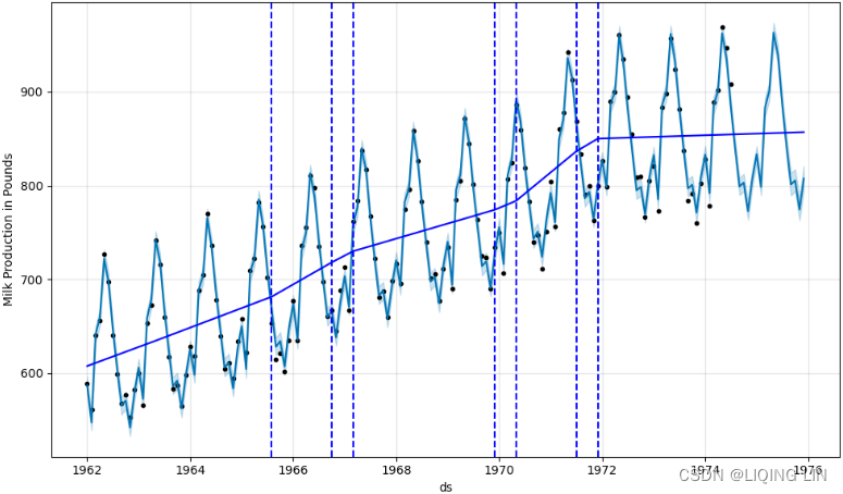 Figure 11.8 – Showing the 7 signifcant change points and the trend line
Notice how the trend line changes at the identified changepoints. This is how Prophet can detect changes in trends. Notice that the line is not an exact straight line since piecewise regression was used to build the trend model. When thinking about piecewise linear models, you can think of multiple linear regression lines between the significant changepoints (segments) that are then connected. This gives the model the flexibility to capture non-linear changes in trends and make future predictions.
from prophet.plot import plot_plotly, plot_components_plotly, add_changepoints_to_plot

# https://github.com/facebook/prophet/blob/v0.5/python/fbprophet/plot.py#L42
fig=plot_plotly( model, forecast,
             ylabel='Milk Production in Pounds',
             trend=True,
             changepoints=True,
             figsize=(800,800)
           )

fig.show()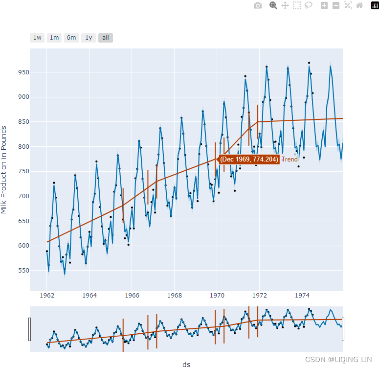
from prophet.plot import plot_plotly, plot_components_plotly, add_changepoints_to_plot

# https://github.com/facebook/prophet/blob/v0.5/python/fbprophet/plot.py#L42
fig=plot_plotly( model, forecast,
                 ylabel='Milk Production in Pounds',
                 trend=False,
                 changepoints=False,
                 figsize=(800,800)
               )

fig.add_trace( go.Scatter( name='Trend',
                           x=forecast['ds'],
                           y=forecast['trend'],
                           mode='lines',
                           line=dict(color='blue', width=2),
                         )
             )
# https://plotly.com/python/marker-style/#custom-marker-symbols
# https://github.com/facebook/prophet/blob/v0.5/python/fbprophet/plot.py
signif_changepoints = model.changepoints[  # the delta of change >= changepoints_threshold
            np.abs( np.nanmean(model.params['delta'], axis=0) ) >= 0.01 #changepoints_threshold
        ]

for cp in signif_changepoints:
    fig.add_vline( x=cp, line_width=1, line_dash='dash', line_color='green')

fig.add_trace( go.Scatter( name='Significant Change Point',
                           mode ='markers',
                           # marker_symbol='diamond-dot',marker_color='yellow', marker_size=8,
                           marker=dict(size=8, symbol="star-dot", line=dict(width=2, color="orange")),
                           x=signif_changepoints,
                           y=forecast.loc[ forecast['ds'].isin(signif_changepoints),
                                           'trend'
                                         ],

                           hovertemplate = 'Significant Change Point<br>Date: %{x|%Y-%m-%d}<br>Production: %{y:.1f}<br><extra></extra>',
                           #showlegend=False,
                           hoverlabel=dict( font_color='white',
                                            bgcolor="orange",
                                          ),
                           fillcolor='orange'
                         )
             )
fig.show()
from prophet.plot import plot_plotly, plot_components_plotly, add_changepoints_to_plot

# https://github.com/facebook/prophet/blob/v0.5/python/fbprophet/plot.py#L42
fig=plot_plotly( model, forecast,
                 ylabel='Milk Production in Pounds',
                 trend=False,
                 changepoints=False,
                 figsize=(800,800)
               )

fig.add_trace( go.Scatter( name='Trend',
                           x=forecast['ds'],
                           y=forecast['trend'],
                           mode='lines',
                           line=dict(color='blue', width=2),
                         )
             )
# https://plotly.com/python/marker-style/#custom-marker-symbols
# https://github.com/facebook/prophet/blob/v0.5/python/fbprophet/plot.py
signif_changepoints = model.changepoints[  # the delta of change >= changepoints_threshold
            np.abs( np.nanmean(model.params['delta'], axis=0) ) >= 0.01 #changepoints_threshold
        ]

for cp in signif_changepoints:
    fig.add_vline( x=cp, line_width=1, line_dash='dash', line_color='green')

fig.add_trace( go.Scatter( name='Significant Change Point',
                           mode ='markers',
                           # marker_symbol='diamond-dot',marker_color='yellow', marker_size=8,
                           marker=dict(size=8, symbol="star-dot", line=dict(width=1, color="orange")),
                           x=signif_changepoints,
                           y=forecast.loc[ forecast['ds'].isin(signif_changepoints),
                                           'trend'
                                         ],

                           hovertemplate = 'Significant Change Point<br>Date: %{x|%Y-%m-%d}<br>Production: %{y:.1f}<br><extra></extra>',
                           #showlegend=False,
                           hoverlabel=dict( font_color='white',
                                            bgcolor="orange",
                                          ),
                           #fillcolor='orange',

                         )
             )
fig.add_trace( go.Scatter( x=signif_changepoints,
                           y=forecast.loc[ forecast['ds'].isin(signif_changepoints),
                                           'trend'
                                         ],
                           marker=dict(size=50,#100, # line length
                                       symbol='line-ns-open', color='green',
                                       line=dict(width=1)
                                      ),
                           mode='markers',
                           hoverinfo='skip'
                         )
             )
fig.show()
from prophet.plot import plot_plotly, plot_components_plotly, add_changepoints_to_plot

# https://github.com/facebook/prophet/blob/v0.5/python/fbprophet/plot.py#L42
fig=plot_plotly( model, forecast,
                 ylabel='Milk Production in Pounds',
                 trend=False,
                 changepoints=False,
                 figsize=(800,800)
               )

fig.add_trace( go.Scatter( name='Trend',
                           x=forecast['ds'],
                           y=forecast['trend'],
                           mode='lines',
                           line=dict(color='blue', width=2),
                         )
             )
# https://plotly.com/python/marker-style/#custom-marker-symbols
# https://github.com/facebook/prophet/blob/v0.5/python/fbprophet/plot.py
signif_changepoints = model.changepoints[  # the delta of change >= changepoints_threshold
            np.abs( np.nanmean(model.params['delta'], axis=0) ) >= 0.01 #changepoints_threshold
        ]

for cp in signif_changepoints:
    fig.add_vline( x=cp, line_width=1, line_dash='dash', line_color='green')

fig.add_trace( go.Scatter( name='Significant Change Point',
                           mode ='markers',
                           # marker_symbol='diamond-dot',marker_color='yellow', marker_size=8,
                           marker=dict(size=8, symbol="star-dot", line=dict(width=1, color="orange")),
                           x=signif_changepoints,
                           y=forecast.loc[ forecast['ds'].isin(signif_changepoints),
                                           'trend'
                                         ],

                           hovertemplate = 'Significant Change Point<br>Date: %{x|%Y-%m-%d}<br>Production: %{y:.1f}<br><extra></extra>',
                           #showlegend=False,
                           hoverlabel=dict( font_color='white',
                                            bgcolor="orange",
                                          ),
                           #fillcolor='orange',

                         )
             )

# https://github.com/facebook/prophet/blob/v0.5/python/fbprophet/plot.py#L42
fig.update_layout( title='Showing the 7 significant change points and the trend line',
                   title_x=0.5, title_y=0.95,
                   xaxis=dict( rangeslider=dict(visible=False) )
                 )
fig.show()
Notice how the trend line changes at the identified changepoints. This is how Prophet can detect changes in trends. Notice that the line is not an exact straight line since piecewise regression was used to build the trend model. When thinking about piecewise linear models, you can think of multiple linear regression lines between the significant changepoints (segments) that are then connected. This gives the model the flexibility to capture non-linear changes in trends and make future predictions.
Prophet supports both Python and R. For more information on the Python API, please visit the following documentation: Quick Start | Prophet. ,
plot_plotly:
add_changepoints_to_plot:
If you are interested in reading the original paper behind the Prophet algorithm, which is publicly available, go to https: //peerj.com/preprints/3190/ .
Generally, Prophet shines when it's working with strong seasonal time series data一般来说, Prophet 在处理强季节性时间序列数据时表现出色.
So far, you have been working with univariate time series. In the next recipe, you will learn how to work with multivariate time series.
Logistic Growth
We must specify the carrying capacity in a column cap. Here we will assume a particular value, but this would usually be set using data or expertise about the market size.
The important things to note are that cap must be specified for every row in the dataframe, and that it does not have to be constant. If the market size is growing, then cap can be an increasing sequence.
The logistic growth model can also handle a saturating minimum, which is specified with a column floor in the same way as the cap column specifies the maximum:
max(train['y'])![]()
train['cap'] = 1000
train['floor'] = train['y'].min()
train 
model = ( Prophet(growth='logistic').fit(train) )

future = model.make_future_dataframe( len(test), #periods : number of periods to forecast forward
                                      freq='MS', #Any valid frequency for pd.date_range,such as 'D' or 'M'.
                                      include_history=True, # Boolean to include the historical
                                                             # dates in the data frame for predictions.
                                    )
future['cap'] = 1000
future['floor'] = train['y'].min()

forecast = model.predict( future )
fig=model.plot( forecast, ylabel='Milk Production in Pounds', include_legend=True )
add_changepoints_to_plot( fig.gca(), model, forecast, cp_color='green', )
plt.legend(loc='upper left', bbox_to_anchor=(0.01, 0.9))
plt.show()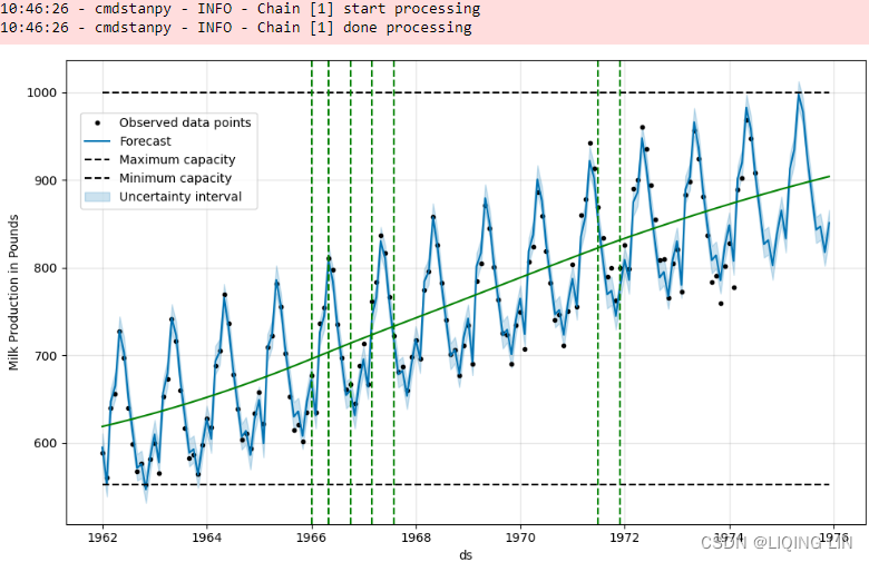
from prophet.plot import plot_plotly, plot_components_plotly, add_changepoints_to_plot

# https://github.com/facebook/prophet/blob/v0.5/python/fbprophet/plot.py#L42
fig=plot_plotly( model, forecast,
                 ylabel='Milk Production in Pounds',
                 trend=False,
                 changepoints=False,
                 figsize=(800,800)
               )

fig.add_trace( go.Scatter( name='Trend',
                           x=forecast['ds'],
                           y=forecast['trend'],
                           mode='lines',
                           line=dict(color='blue', width=2),
                         )
             )
# https://plotly.com/python/marker-style/#custom-marker-symbols
# https://github.com/facebook/prophet/blob/v0.5/python/fbprophet/plot.py
signif_changepoints = model.changepoints[  # the delta of change >= changepoints_threshold
            np.abs( np.nanmean(model.params['delta'], axis=0) ) >= 0.01 #changepoints_threshold
        ]

for cp in signif_changepoints:
    fig.add_vline( x=cp, line_width=1, line_dash='dash', line_color='green')

fig.add_trace( go.Scatter( name='Significant Change Point',
                           mode ='markers',
                           # marker_symbol='diamond-dot',marker_color='yellow', marker_size=8,
                           marker=dict(size=8, symbol="star-dot", line=dict(width=1, color="orange")),
                           x=signif_changepoints,
                           y=forecast.loc[ forecast['ds'].isin(signif_changepoints),
                                           'trend'
                                         ],

                           hovertemplate = 'Significant Change Point<br>Date: %{x|%Y-%m-%d}<br>Production: %{y:.1f}<br><extra></extra>',
                           #showlegend=False,
                           hoverlabel=dict( font_color='white',
                                            bgcolor="orange",
                                          ),
                           #fillcolor='orange',

                         )
             )

# https://github.com/facebook/prophet/blob/v0.5/python/fbprophet/plot.py#L42
fig.update_layout( title='Showing the 7 significant change points and the trend line',
                   title_x=0.5, title_y=0.95,
                   xaxis=dict( rangeslider=dict(visible=False) ),
                   showlegend=True,
                 )
fig.show()
Forecasting multivariate time series data using VAR
In this recipe, you will explore the Vector AutoRegressive (VAR) model for working with multivariate time series. In Chapter 10, Building Univariate Time Series Models Using Statistical Methods, we discussed AR, MA, ARIMA, and SARIMA as examples of univariate one-directional models. VAR, on the other hand, is bi-directional and multivariate.
VAR versus AR Models
You can think of a VAR of order p, or VAR(P), as a generalization of the univariate AR(p) mode for working with multiple time series. Multiple time series are represented as a vector, hence the name vector autoregression. A VAR of lag one can be written as VAR(1) across two or more variables.
The premise behind multivariate time series is that you can add more power to your forecast when leveraging multiple time series (or inputs variables) as opposed to a single time series (single variable). Simply put, VAR is used when you have two or more time series that have (or are assumed to have) an influence on each other's behavior当您有两个或多个时间序列对彼此的行为产生影响(或被认为具有影响)时. These are normally referred to as endogenous variables内生变量 and the relationship is bi-directional. If the variables or time series are not directly related, or we do not know if there is a direct influence within the same system, we refer to them as exogenous variables外生变量.
Exogenous versus Endogenous Variables
When you start researching more about VAR models, you will come across references to endogenous and exogenous variables. At a high level, the two are the opposite of each other and in statsmodels, you will see them referenced as endog and exog , respectively.
Endogenous variables are influenced by other variables within the system. In other words, we expect that a change in one's state affects the other. Sometimes, these can be referred to as dependent variables in machine learning literature. You can use the Granger causality tests格兰杰因果检验 to determine if there is such a relationship between multiple endogenous variables. For example, in statsmodels , you can use grangercausalitytests.
On the other hand, exogenous variables are outside the system and do not have a direct influence on the variables. They are external influencers. Sometimes, these can be referred to as independent variables in machine learning literature.
A VAR model, like an AR model, assumes the stationarity of the time series variables. This means that each endogenous variable (time series) needs to be stationary.
To illustrate how VAR works and the mathematical equation behind it, let's start with a simple VAR(1) with two endogenous variables, referred to as (,
). Recall from Chapter 10, Building Univariate Time Series Models Using Statistical Methods, that an AR(1) model would take the following form:
Generally, an AR(p) model is a linear model of past values of itself and the (p) parameter tells us how far back we should go. Now, assume you have two AR(1) models for two different time series data. This will look as follows:
However, these are two separate models that do not show any relationship or that influence each other. If we create a linear combination of the two models (the past values of itself and the past values of the other time series), we would get the following formula:
Figure 11.9 – Formula for a VAR model with lag one or VAR(1)
The preceding equation may seem complex, but in the end, like an AR model, it is still simply a linear function of past lags. In other words, in a VAR(1) model, you will have a linear function of lag 1 for each variable. When fitting a VAR model, as you shall see in this recipe, the Ordinary Least Squares (OLS) method is used for each equation to estimate the VAR model.
12.3 Vector autoregressions
One limitation of the models that we have considered so far is that they impose a unidirectional relationship — the forecast variable is influenced by the predictor variables, but not vice versa. However, there are many cases where the reverse should also be allowed for — where all variables affect each other. In Section 10.2, the changes in personal consumption expenditure个人消费支出 () were forecast based on the changes in personal disposable income个人可支配收入 (
). However, in this case a bi-directional relationship may be more suitable: an increase in
will lead to an increase in
and vice versa.
An example of such a situation occurred in Australia during the Global Financial Crisis of 2008–2009. The Australian government issued stimulus packages that included cash payments in December 2008, just in time for Christmas spending. As a result, retailers reported strong sales and the economy was stimulated. Consequently, incomes increased.
Such feedback relationships are allowed for in the Vector AutoRegressive (VAR) framework. In this framework, all variables are treated symmetrically. They are all modelled as if they all influence each other equally. In more formal terminology, all variables are now treated as “endogenous/enˈdɑːdʒənəs/内生的”. To signify this, we now change the notation and write all variables as :
denotes the
observation of variable
,
denotes the
, and so on.
A VAR model is a generalisation of the univariate autoregressive model for forecasting a vector of time series.23 It comprises one equation per variable in the system. The right hand side of each equation includes a constant and lags of all of the variables in the system. To keep it simple, we will consider a two variable VAR with one lag. We write a 2-dimensional VAR(1) model with two endogenous variables, referred to as (,
) as
(12.1)
(12.2)
where and
are white noise processes that may be contemporaneously
/kənˌtempəˈreɪniəsli/同时地,同时代地 correlated.
- The coefficient
 captures the influence of the ℓth lag of variable
 on itself(
- while the coefficient
 captures the influence of the ℓth lag of variable
 on
If the series are stationary, we forecast them by fitting a VAR to the data directly (known as a “VAR in levels”). If the series are non-stationary, we take differences of the data in order to make them stationary, then fit a VAR model (known as a “VAR in differences”). In both cases, the models are estimated equation by equation using the principle of least squares. For each equation, the parameters are estimated by minimising the sum of squared values.
The other possibility, which is beyond the scope of this book and therefore we do not explore here, is that the series may be non-stationary but cointegrated, which means that there exists a linear combination of them that is stationary(如果两组序列是非平稳的,但它们的线性组合可以得到一个平稳序列,那么我们就说这两组时间序列数据具有协整的性质,我们同样可以把统计性质用到这个组合的序列上来。但是需要指出的一点,协整关系并不是相关关系(correlation).mpf10_yfinan_Explained variance_R2_ols_cointegration_Gradient Boost_lbfgs_热力图sns ticklabel_SVM_confu_LIQING LIN的博客-CSDN博客). In this case, a VAR specification that includes an error correction mechanism (usually referred to as a vector error correction model通常称为向量误差校正模型) should be included, and alternative estimation methods to least squares estimation should be used应使用最小二乘估计的替代估计方法.
Forecasts are generated from a VAR in a recursive manner. The VAR generates forecasts for each variable included in the system. To illustrate the process, assume that we have fitted the 2-dimensional VAR(1) model described in Equations (12.1)–(12.2), for all observations up to time T. Then the one-step-ahead forecasts are generated by
This is the same form as (12.1)–(12.2), except that the errors have been set to zero and parameters have been replaced with their estimates. For h=2, the forecasts are given by
Again, this is the same form as (12.1)–(12.2), except that the errors have been set to zero, the parameters have been replaced with their estimates, and the unknown values of and
have been replaced with their forecasts. The process can be iterated in this manner for all future time periods.
There are two decisions one has to make when using a VAR to forecast, namely how many variables (denoted by K) and how many lags (denoted by p) should be included in the system. The number of coefficients to be estimated in a VAR is equal to (or
per equation). For example, for a VAR with K=5 variables and p=3 lags, there are 16 coefficients per equation, giving a total of 80 coefficients to be estimated. The more coefficients that need to be estimated, the larger the estimation error entering the forecast.
In practice, it is usual to keep K small and include only variables that are correlated with each other, and therefore useful in forecasting each other. Information criteria are commonly used to select the number of lags to be included. Care should be taken when using the AICc as it tends to choose large numbers of lags; instead, for VAR models, we often use the BIC(https://blog.csdn.net/Linli522362242/article/details/127932130 The Bayesian Information Criteria (BIC) is very similar to AIC but has a higher penalty term on the model's complexity. In general, the BIC penalty term is more significant, so it can encourage models with fewer parameters than AIC does.) instead. A more sophisticated version of the model is a “sparse VAR” (where many coefficients are set to zero); another approach is to use “shrinkage estimation” (where coefficients are smaller).
VAR models are implemented in the vars package in R. It contains a function VARselect() for selecting the number of lagspp using four different information criteria: AIC, HQ, SC and FPE. We have met the AIC before, and SC is simply another name for the BIC (SC stands for Schwarz Criterion, after Gideon Schwarz who proposed it). HQ is the Hannan-Quinn criterion, and FPE is the “Final Prediction Error” criterion.24
A criticism that VARs face is that they are atheoretical; that is, they are not built on some economic theory that imposes a theoretical structure on the equations. Every variable is assumed to influence every other variable in the system, which makes a direct interpretation of the estimated coefficients difficult. Despite this, VARs are useful in several contexts:
- forecasting a collection of related variables where no explicit interpretation is required;
- testing whether one variable is useful in forecasting another (the basis of Granger causality tests);
- impulse response analysis, where the response of one variable to a sudden but temporary change in another variable is analysed;
- forecast error variance decomposition, where the proportion of the forecast variance of each variable is attributed to the effects of the other variables.
Example1: A VAR model for forecasting US consumption
library(vars)

VARselect(uschange[,1:2], lag.max=8,
  type="const")[["selection"]]
#> AIC(n)  HQ(n)  SC(n) FPE(n)
#>      5      1      1      5
The R output shows the lag length selected by each of the information criteria available in the vars package. There is a large discrepancy/dɪˈskrepənsi/差异 between the VAR(5) selected by the AIC and the VAR(1) selected by the BIC(SC). This is not unusual. As a result we first fit a VAR(1), as selected by the BIC.
var1 <- VAR(uschange[,1:2], p=1, type="const")
serial.test(var1, lags.pt=10, type="PT.asymptotic")
var2 <- VAR(uschange[,1:2], p=2, type="const")
serial.test(var2, lags.pt=10, type="PT.asymptotic")
In similar fashion to the univariate ARIMA methodology, we test that the residuals are uncorrelated using a Portmanteau Test. Both a VAR(1) and a VAR(2) have some residual serial correlation, and therefore we fit a VAR(3).
var3 <- VAR(uschange[,1:2], p=3, type="const")
serial.test(var3, lags.pt=10, type="PT.asymptotic")
#>
#>  Portmanteau Test (asymptotic)
#>
#> data:  Residuals of VAR object var3
#> Chi-squared = 34, df = 28, p-value = 0.2
The residuals for this model pass the test for serial correlation. The forecasts generated by the VAR(3) are plotted in Figure 11.10.
forecast(var3) %>%
  autoplot() + xlab("Year")
Figure 11.10: Forecasts for US consumption and income generated from a VAR(3).
Example2: A VAR model for forecasting US consumption
fit <- us_change %>%
  model(
    aicc = VAR(vars(Consumption, Income)),
    bic = VAR(vars(Consumption, Income), ic = "bic")
  )
fit
#> # A mable: 1 x 2
#>               aicc              bic
#>            <model>          <model>
#> 1 <VAR(5) w/ mean> <VAR(1) w/ mean>
A VAR(5) model is selected using the AICc (the default), while a VAR(1) model is selected using the BIC. This is not unusual — the BIC will always select a model that has fewer parameters than the AICc model as it imposes a stronger penalty for the number of parameters.
glance(fit)
#> # A tibble: 2 × 6
#>   .model sigma2        log_lik   AIC  AICc   BIC
#>   <chr>  <list>          <dbl> <dbl> <dbl> <dbl>
#> 1 aicc   <dbl [2 × 2]>   -373.  798.  806.  883.
#> 2 bic    <dbl [2 × 2]>   -408.  836.  837.  869.
fit %>%
augment() %>%
ACF(.innov) %>%
autoplot()Figure 12.13: ACF of the residuals from the two VAR models.
- A VAR(5) model is selected by the AICc,
- a VAR(1) model is selected using the BIC.
We see that the residuals from the VAR(1) model (bic) have significant autocorrelation( spike ast lag=3) for Consumption, while the VAR(5) model has effectively captured all the information in the data(aicc).
The forecasts generated by the VAR(5) model are plotted in Figure 12.14.
fit %>%
  select(aicc) %>%
  forecast() %>%
  autoplot(us_change %>% filter(year(Quarter) > 2010))
Figure 12.14: Forecasts for US consumption and income generated from a VAR(5) model.
There are other forms of multivariate time series models, including Vector Moving Average (VMA), Vector AutoRegressive Moving Average (VARMA), and Vector AutoRegressive Integrated Moving Average (VARIMA), that generalize other univariate models. In practice, you will find that VAR is used the most due to its simplicity. VAR models are very popular in economics, but you will find them being used in other areas, such as social sciences, natural sciences, and engineering.
The premise behind multivariate time series is that you can add more power to your forecast when leveraging multiple time series (or inputs variables) as opposed to a single time series (single variable). Simply put, VAR is used when you have two or more time series that have (or are assumed to have) an influence on each other's behavior当您有两个或多个时间序列对彼此的行为产生影响(或被认为具有影响)时. These are normally referred to as endogenous variables内生变量 and the relationship is bi-directional. If the variables or time series are not directly related, or we do not know if there is a direct influence within the same system, we refer to them as exogenous variables外生变量.
In this recipe, you will use the .FredReader() class from the pandas_datareader library. You will request three different datasets by passing three symbols. As mentioned on FRED's website,
- the first symbol, FEDFUNDS, for the federal funds rate "is the interest rate at which depository institutions trade federal funds (balances held at Federal Reserve Banks) with each other overnight."
- Simply put, the federal funds rate influences the cost of borrowing. It is the target interest rate set by the Federal Open Market Committee (FOMC) for what banks can charge other institutions for lending excess cash from their reserve balances.
- The second symbol is unrate for the Unemployment Rate.
Citations
Board of Governors of the Federal Reserve System (US), Federal Funds Effective Rate [FEDFUNDS], retrieved from FRED, Federal Reserve Bank of St. Louis; Federal Funds Effective Rate (FEDFUNDS) | FRED | St. Louis Fed, April 6, 2022. 
U.S. Bureau of Labor Statistics, Unemployment Rate [UNRATE], retrieved from FRED, Federal Reserve Bank of St. Louis; Unemployment Rate (UNRATE) | FRED | St. Louis Fed, April 6, 2022.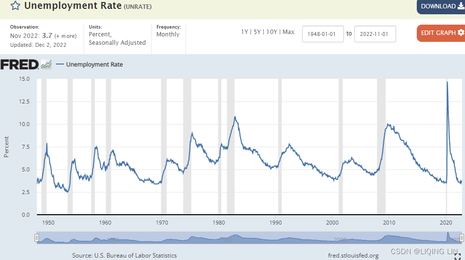
Follow these steps:
1. Start by loading the necessary libraries and pulling the data. Note that both FEDFUNDS and unrate are reported monthly:
import pandas_datareader.data as web
from statsmodels.tsa.api import VAR, adfuller, kpss
from statsmodels.tsa.stattools import grangercausalitytests

import statsmodels as sm
import matplotlib as mp
2. Pull the data using panda_datareader, which wraps over the FRED API and returns a pandas DataFrame. For the FEDFUNDS and unrate symbols, you will pull close to 32 years' worth of data:
start = '01-01-1990'
end = '04-01-2022'

economic_df = web.FredReader( symbols=['FEDFUNDS', 'unrate'],
                              start=start,
                              end=end
                            ).read()

economic_df
economic_df.info() 
make sure there are no null values
3. Inspect the data and make sure there are no null values:
economic_df.isna().sum()
Change the DataFrame's frequency (MS)
4. Change the DataFrame's frequency to month start ( MS ) to refect how the data is being stored:
economic_df.index
economic_df.index.freq='MS'
economic_df.index 
economic_df.shape![]()
relation plot between FEDFUND and unrate
5. Plot the datasets for visual inspection and understanding:
economic_df.plot( subplots=True, figsize=(10,8),
                  title='Figure 11.10 – Plotting both Federal Funds Effective Rate and Unemployment Rate'
                )
plt.show()
Since subplots is set to True, this will produce two subplots for each column: Figure 11.10 – Plotting both Federal Funds Effective Rate and Unemployment Rate
There is some sort of inverse relationship between FEDFUND and unrate – as FEDFUNDS increases, unrate decreases. There is interesting anomalous/əˈnɑːmələs/异常的;不规则的;不恰当的 behavior starting in 2020 due to the COVID-19 pandemic.
use check_stationarity to evaluate each endogenous variable
6. An important assumption in VAR is stationarity. Both variables (the two endogenous time series) need to be stationary. Create the check_stationarity() function, which returns the stationarity results from the Augmented Dickey-Fuller ( adfuller ) and Kwiatkowski-Phillips-Schmidt-Shin ( kpss ) tests. Start by creating the check_stationarity function:
Both ADF and KPSS are based on linear regression and are a type of statistical hypothesis test. For example,
- the null hypothesis
- On the other hand, KPSS has the opposite null hypothesis
def check_stationarity( df ):
    kps = kpss( df )
    adf = adfuller( df )

    kpss_pv, adf_pv = kps[1], adf[1]
    kpssh, adfh = 'Stationary', 'Non-stationary'
    print('ADF p-value:',adf_pv, ', KPSS p-value:',kpss_pv )
    if adf_pv < 0.05:
        # Reject ADF Null Hypothesis
        adfh = 'Stationary'
    if kpss_pv < 0.05:
        # Reject KPSS Null Hypothesis
        kpssh = 'Non-stationary'
    return (kpssh, adfh)
Use the check_stationarity function to evaluate each endogenous variable (column):
for c in economic_df.columns:
    kps, adf = check_stationarity( economic_df[c] )
    print( f'{c} adf: {adf}, kpss: {kps}\n' )
Overall, both seem to be stationary. We will stick with the ADF results here; there is no need to do any stationary-type transformation.
Next, examine the causality/kɔːˈzæləti/因果关系 to determine if one time series influences the other (can FEDFUNDS be used to forecast our time series of interest, which is unemp?).
GrangerCausalityTests : determine if past values from one variable influence the other variable
7. Granger causality tests are implemented in statsmodels with the grangercausalitytests function, which performs 4 tests across each past lag. You can control this using the maxlag parameter. Granger causality tests are used to determine if past values from one variable influence the other variable. In statsmodels, at each lag, it will show the tests that have been performed and their results:
- the test statistics score,
- the p-value, and
- the degrees of freedom.
Let's focus on the p-value to decide if you should reject or accept the null hypothesis.
The null hypothesis in the Granger causality tests is that the second variable or column (that is, FEDFUNDS ) does not Granger cause the first variable or column (that is, unrate ). In other words, it assumes there is no statistical significance in terms of influence or effect.
If you are trying to predict unrate and determine if FEDFUNDS influences unrate , you will need to switch the order of the columns before applying the test. This is because grangercausalitytests examines the second column against the first column这是因为 grangercausalitytests 根据第一列检查第二列:
economic_df[['unrate', 'FEDFUNDS']] The test is set for a maximum of 12 lags (12 months)
granger = grangercausalitytests( economic_df[['unrate', 'FEDFUNDS']],
                                 maxlag=12
) 
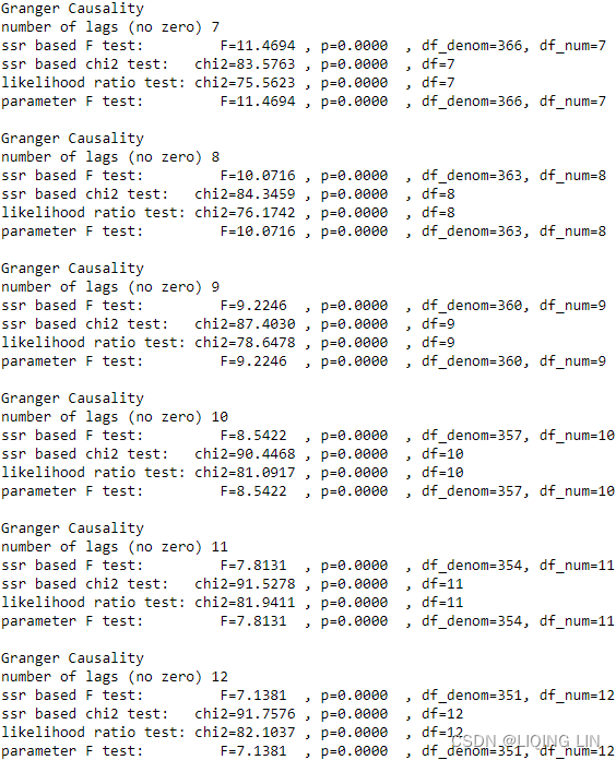 Here, all the lags (except for lag 1) have a p-value less than 0.05, which indicates that we can reject the null hypothesis. This means that the effect of FEDFUNDS is statistically significant. We can say that FEDFUNDS does Granger cause unrate .
ACF and PACF for FEDFUNDS and unrate
8. Plot both ACF and PACF to gain an intuition over each variable and which process they belong to – for example, an AR or MA process:
from statsmodels.graphics.tsaplots import plot_acf, plot_pacf
for col in economic_df.columns:
fig, ax = plt.subplots(1,2, figsize=(12,3) )
plot_acf( economic_df[col], zero=False, lags=30,
ax=ax[0], title=f'ACF - {col}'
)
plot_pacf( economic_df[col], zero=False, lags=30,
ax=ax[1], title=f'PACF - {col}'
)
plt.show()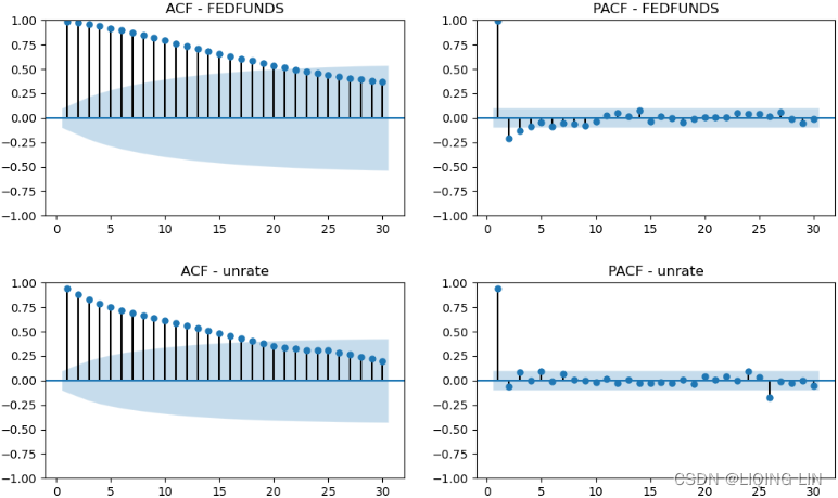 Figure 11.11 – ACF and PACF plots for FEDFUNDS and unrate
Notice that for FEDFUNDS and unrate , the plots indicate we are dealing with an autoregressive (AR) process. The ACF is gradually decaying, while both PACF plots show a sharp cutoff after lag 1. The PACF for FEDFUNDS shows slightly significant (above or below the shaded area) lags at 2 and 3, while the PACF for unrate shows some significance at lag 26. We can ignore those for now.
StandardScalar
9. There is often a debate if the variables need to be scaled (standardized) or not when implementing VAR. Generally, when it comes to VAR, the algorithm does not require the variables to be scaled (some algorithms, on the other hand, will require the data to be scaled). Since you will be working with multivariate time series (multiple variables) that may have different scales, it would be easier to interpret the residuals from each if the data is scaled. Similarly, the coefficients will become easier to compare since the units will be in standard deviation (for more insight, please refer to the Detecting outliers using Z-score recipe in Chapter 8, Outlier Detection Using Statistical Methods). In this step, you will perform scaling as a best practice. You will use the StandardScalar class from Scikit-Learn since it will provide you with the inverse_transform method so that you can return to the original scale. In Chapter 13, Deep Learning for Time Series Forecasting, in the Preparing time series data for deep learning recipe, you will implement a class to scale and inverse transform.
Before you use StandardScalar, split the data into train and test sets:
train = economic_df.loc[:'2019']
test = economic_df.loc['2020':]

print( f'Train: {len(train)}, Test: {len(test)}' )![]()
train 
test.index 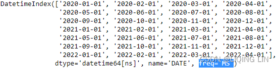
10. Scale the data using StandardScalar (uses ddof=0 (population standard deviation)
“Delta Degrees of Freedom”: the divisor used in the calculation is N - ddof, where N represents the number of elements. By default ddof is zero.https://blog.csdn.net/Linli522362242/article/details/108230328) by fitting the train set using the fit method. Then, apply the scaling transformation to both the train and test sets using the transform method. The transformation will return a NumPy ndarray, which you will then return as pandas DataFrames. This will make it easier for you to plot and examine the DataFrames further:
from sklearn.preprocessing import StandardScaler
scale = StandardScaler()
scale.fit( train )
train_sc = pd.DataFrame( scale.transform(train),
index=train.index,
columns=train.columns
)
test_sc = pd.DataFrame( scale.transform(test),
index=test.index,
columns=test.columns
)
test 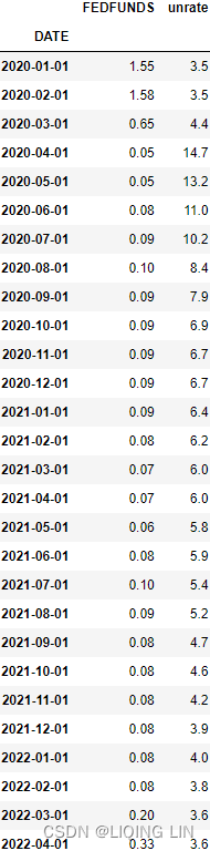 with the inverse_transform method so that you can return to the original scale
scale.inverse_transform( test_sc )[0:5] 
# train_sc.shape : (360, 2)
ax = train_sc.plot( style=['blue','green'],
                    #alpha=0.5,
                    label='train', figsize=(10,6)
                  )
test_sc.plot( ax=ax, style=['b--', 'g--'],
             label='test' )
plt.legend()
plt.show()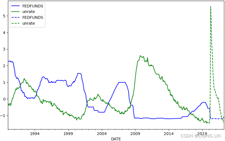
VAR.select_order() : the best VAR order P with information criterion
11. But how can you pick the VAR order P? Luckily, the VAR implementation in statsmodels will pick the best VAR order. You only need to define the maximum number of lags (threshold); the model will determine the best p values that minimize each of the four information criteria scores: AIC, BIC, FPE, and HQIC.
- The select_order method will compute the scores at each lag order, while
- the summary method will display the scores for each lag.
The results will help when you train (fit) the model to specify which information criteria the algorithm should use:
model = VAR( endog=train_sc, freq='MS' )
res = model.select_order( maxlags=10 )
res.summary()
This should show the results for all 10 lags. The lowest scores are marked with an * :

Figure 11.12 – The Var Order Selection summary
The res object is a LagOrderResults class. You can print the selected lag number for each score using the selected_orders attribute:
res.selected_orders ![]() At lag 7, both AIC and FPE were the lowest. On the other hand, both BIC and HQ were the lowest at lag 4.
At lag 7, both AIC and FPE were the lowest. On the other hand, both BIC and HQ were the lowest at lag 4.
12. To train the model, you must use the AIC score. You can always experiment with a different information criterion. Accomplish this by updating the ic parameter. The maxlags parameter is optional – for example, if you leave it blank, it will still pick the lag order at 7 because it is based on minimizing the ic parameter, which in this case is aic.
results = model.fit( # maxlags=7,
                    ic='aic')
results.summary()
Running results.summary() will print a long summary – one for each autoregressive process. Figure 11.9 showed a VAR(1) for two variables; in a VAR(7), this will equate to two functions (for each variable), each having 14 coefficients. Figure 11.13 and Figure 11.14 show the first portion of the summary:
Figure 11.13 – VAR model summary of the regression (OLS) results showing the AIC score
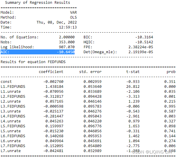
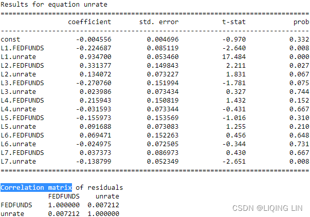
Toward the end of the summary, the correlation matrix for the residuals is displayed. It provides insight into whether all the information was captured by the model or not. The output does not show a correlation. Ideally, we want it to be as close to zero as possible.
results.params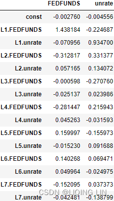
fittedvalues vs training data
13. Store the VAR lag order using the k_ar attribute so that we can use it later when we use the forecast method:
lag_order = results.k_ar
lag_order![]() fittedvalues : The predicted insample values of the response variables of the model.
fittedvalues : The predicted insample values of the response variables of the model.
results.fittedvalues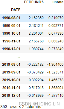 vs
vs
#             train_sc.shape : (360, 2)
# results.fittedvalues.shape : (353, 2) since lag_order = 7
results.fittedvalues.plot( figsize=(12,6), subplots=True )
plt.show()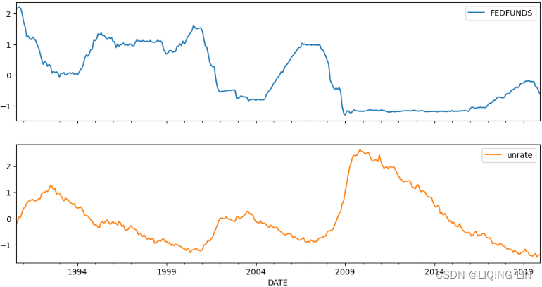
#results.fittedvalues.plot( figsize=(12,6), subplots=True )
axes=train_sc.plot( style=['blue','green'],
                    #alpha=0.5,
                    label='train', figsize=(10,6),
                    subplots=True
                  )
results.fittedvalues.plot( ax=axes,
                           style=['k--','k--'],
                           subplots=True,
                           label='fittedvalues'
                         )
plt.show()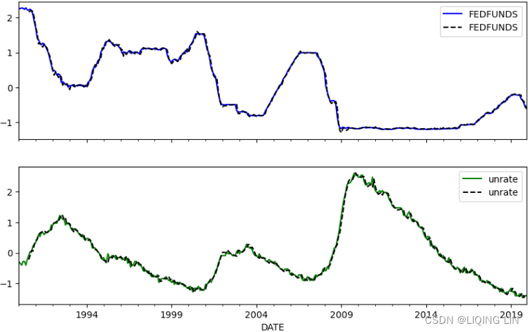
Plotting the forecast with confidence intervals
Finally, you can forecast using either the forecast or forecast_interval method. The latter will return the forecast, as well as the upper and lower confidence intervals. Both methods will require past values and the number of steps ahead. The prior values will be used as the initial values for the forecast:
# lag_order = 7
past_y = train_sc[-lag_order:].values
n = test_sc.shape[0] # 28
forecast, lower, upper = results.forecast_interval( past_y,
                                                    steps=n
                                                  )
forecast
idx = test.index
style = 'k--'
# or train_sc.iloc[:-lag_order, 1]
#    train_sc.iloc[:-lag_order]['unrate']
ax = train_sc['unrate'].plot( figsize=(10,4),
                              style='g',
                            )
# test_sc['unrate'].plot( ax=ax, style=['k--'],
#                         label='test'
#                       )
pred_forecast = pd.Series( forecast[:,1], # ['unrate']
                           index=idx
                         ).plot(ax=ax, style=style)
pred_lower = pd.Series( lower[:,1],
                        index=idx
                      ).plot(ax=ax, style=style)
pred_upper = pd.Series( upper[:,1],
                        index=idx
                      ).plot(ax=ax, style=style)
plt.fill_between( idx,
                  lower[:,1], upper[:,1],
                  alpha=0.15
                )
plt.title('Forecasting Unemployment Rate (unrate)')
plt.legend(['Train', 'Forecast'])
plt.show()
This should plot the training data and the forecast (middle dashed line) for unrate , along with the upper and lower confidence intervals:
 Figure 11.14 – Plotting the forecast with confidence intervals
Compare the results with Figure 11.10 for unrate.
idx = test.index
style = 'k--'

ax = test_sc['unrate'].plot( figsize=(10,4),
                              style='g',
                            )
pd.Series( forecast[:,1], # ['unrate']
           index=idx
         ).plot(ax=ax, style=style)
# pd.Series( lower[:,1],
#            index=idx
#          ).plot(ax=ax, style=style)
# pd.Series( upper[:,1],
#            index=idx
#          ).plot(ax=ax, style=style)
plt.fill_between( idx,
                  lower[:,1], upper[:,1],
                  alpha=0.15
                )
plt.title('Forecasting Unemployment Rate (unrate)')
plt.legend(['Actual', 'Forecast'])
plt.show()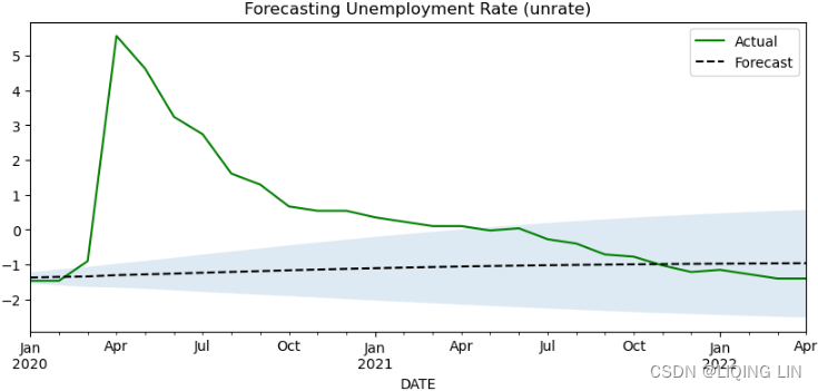
Recall that the training data was set up until the end of 2019(economic_df.loc[:'2019']) without any insight into the impact COVID-19 had in 2020. Thus, the results may not be as good as you would expect. You may need to adjust the train and test split to accommodate this fact and perform different experiments with the model. This is something you will be dealing with when a major event, maybe an anomaly, has a big economic impact and you need to determine if such an impact is truly an anomaly (a one-time unique event and its effects fade or if it's not一次性独特事件及其影响消退,或者是否不是) and whether you need to model for it. This is where domain knowledge is key when making such decisions.
Vector autoregressive models are very useful, especially in econometrics. When evaluating the performance of a VAR model, it is common to report the results from Granger causality tests, residual or error analysis, and the analysis of the impulse response脉冲响应. As shown in Figure 11.9, a VAR(1) for two variables results in two equations with four coefficients that we are solving for. Each equation is estimated using OLS, as shown in the results from Figure 11.13.
Figure 11.9 – Formula for a VAR model with lag one or VAR(1)
The two functions in Figure 11.9 show contributions from the variable's past values and the second (endogenous) variable. In a VAR model, unlike an AR model, there is a different dynamic between the multiple variables. Hence, in this recipe, once the model was built, a significant portion was spent plotting VAR-specifc plots – for example, the impulse responses (IRs) and the forecast error variance decomposition (FEVD) – to help us understand these contributions and the overall interaction between the variables.
VAR(7) VS AR(7)
Since we are focusing on comparing the forecasting results, it would be interesting to see if our VAR(7) model, with two endogenous variables, is better than a univariate AR(7) model.
Try using an AR(7) or ARIMA(7,0,0) model; you will use the same lag values for consistency. Recall that the unrate time series was stationary, so there is no need for differencing:
from statsmodels.tsa.arima.model import ARIMA

# lag_order = results.k_ar # 7
model = ARIMA( train_sc['unrate'],
               order=(lag_order, 0,0), # (7,0,0)
             ).fit()
model.summary()
You can review the ARIMA model's summary with model.summary() . Inspect the model's performance by placing diagnostic plots on the residuals:
fig = model.plot_diagnostics( figsize=(12,8) )
fig.tight_layout()
plt.show()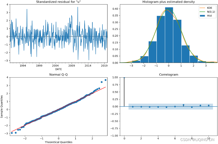 Figure 11.15 – AR(7) or ARIMA(7, 0, 0) diagnostic plots
Overall, the AR model captured the necessary information based on the autocorrelation plot(ACF residual plot).
# Plotting the results from an AR(7)
plt.title('AR(7) Model - Forecast vs Actual')
ax = test_sc['unrate'].plot( figsize=(10,4),
                             style='g',
                           )
# n = test_sc.shape[0] # 28
pd.Series( model.forecast(n),
           index=test_sc.index
         ).plot( ax=ax, style='k--')
plt.legend(['Actual', 'Forecast'])
plt.show()
idx = test.index
style = 'k--'

ax = test_sc['unrate'].plot( figsize=(10,4),
                              style='g',
                            )
pd.Series( forecast[:,1], # ['unrate']
           index=idx
         ).plot(ax=ax, style=style)

pd.Series( model.forecast(n),
           index=test_sc.index
         ).plot( ax=ax, style='b--')

plt.title('Forecasting Unemployment Rate (unrate)')
plt.legend(['Actual', 'Forecast-VAR(7)', 'Forecast-AR(7)'])
plt.show()
Create a forecast using the AR model and compare the root-mean-square error (RMSE)
scores for both models (VAR and AR):
from statsmodels.tools.eval_measures import mse

np.sqrt( mse( test['unrate'], forecast[:,1] ) ) # VAR(7)![]()
np.sqrt( mse( test['unrate'], model.forecast(n) ) ) # AR(7) ![]()
Both models performed similarly. An AR model would be preferred over a VAR model in this case since it's a much simpler model. In the Jupyter Notebook, we plotted the forecast against the actual data for both AR and VAR, and the overall forecasts look very similar as well.
To learn more about the VAR class in statsmodels, please visit the official documentation at statsmodels.tsa.vector_ar.var_model.VAR — statsmodels
Evaluating vector autoregressive (VAR) models
An important step when building a VAR model is to understand the model in terms of the interactions between the different endogenous variables. The statsmodels VAR implementation provides key plots to help you analyze the complex dynamic relationship between these endogenous variables (multiple time series).
In this recipe, you will continue where you left of from the previous recipe, Forecasting multivariate time series data using VAR, and explore different diagnostic plots, such as the Residual Autocorrelation Function (ACF), Impulse Response Function (IRF), and Forecast Error Variance Decomposition (FEVD).
1. The results object is of the VARResultsWrapper type, which is the same as the VARResults class and has access to the same methods and attributes. Start with the ACF plot of the residuals using the plot_acorr method:
type(results)![]() statsmodels.tsa.vector_ar.var_model — statsmodels
statsmodels.tsa.vector_ar.var_model — statsmodels
VARResults.plot_acorr(nlags=10, resid=True, linewidth=8)
Plot autocorrelation of sample (endog) or residuals
Sample (Y) or Residual autocorrelations are plotted together with the standard 2/ bounds.
Parameters:
nlags int
number of lags to display (excluding 0)
resid bool
If True, then the autocorrelation of the residuals is plotted If False, then the autocorrelation of endog is plotted.
linewidth int
width of vertical bars
Returns:
Figure instance containing the plot.
# model = VAR( endog=train_sc, freq='MS' )
# results = model.fit( # maxlags=7,
#                      ic='aic'
#                    )

fig=results.plot_acorr( resid=True )# bound = 2 / np.sqrt(self.nobs) # nobs: number of observation

plt.show()
This should produce four plots for autocorrelation and cross-correlation of the residuals due to the resid parameter, which is set to True by default – that is, results.plot_acorr(resid=True) :
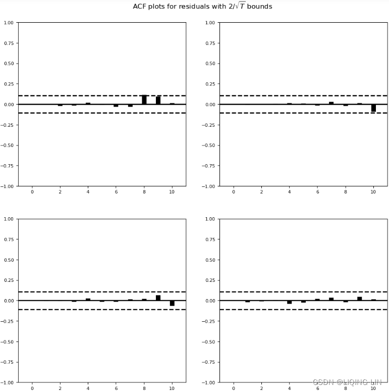
Figure 11.16 – Residual autocorrelation and cross-correlation plots
Unfortunately, the plots in Figure 11.16 do not have proper labels.
- The first row of plots is based on the first variable in the DataFrame ( FEDFUNDS ), while
- the second row is based on the second variable in the DataFrame ( unrate ).
- Recall from Figure 11.9
that for two variables, you will have two functions or models, and this translates into 2x2 residual subplots, as shown in Figure 11.16.
Figure 11.9 – Formula for a VAR model with lag one or VAR(1) - If you had three variables, you would have a 3x3 subplot.
You do not want the residuals to show any significance across the lags, which is the case in Figure 11.15. This indicates that the model captured all the necessary information. In other words, there are no signs of any autocorrelation, which is what we would hope for.
2. You can also extract the residuals with the resid attribute, which would return a DataFrame with the residuals for each variable. You can use the standard plot_acf function as well:
# You can plot your ACF on the resiuals as well using results.resid
plt.rcParams['lines.color'] = 'k'
for col in results.resid.columns:
    fig, ax = plt.subplots(1,1, figsize=(10,3) )
    plot_acf( results.resid[col], zero=False,
              lags=10, ax=ax, title=f'ACF - {col}'
            )
This should produce two ACF plots – one for FEDFUNDS and another for unrate . This will confirm the same finding – that there is no autocorrelation in the residuals.
3. Analyze the impulse response to shocks in the system using the irf method:
irf = results.irf()
fig = irf.plot( subplot_params={'fontsize':12}, figsize=(10,8) )
fig.tight_layout()
plt.show()
The irf object is of the IRAnalysis type and has access to the plot() function:
The IRF analysis computes the dynamic impulse responses and the approximated standard errors, and also displays the relevant plots. The idea here is that in VAR, all the variables influence each other, and the Impulse Response (IR) traces the effect of a change (impulse) in one variable and the response from another variable (for each variable available) over each lag. The default is the first 10 lags. This technique is used to understand the dynamics of the relationship.
 Figure 11.17 – Impulse response showing the effect of one unit change in one variable against another脉冲响应显示一个变量的一个单位变化对另一个变量的影响
For example, the plot that shows FEDFUNDS → unrate in Figure 11.17 illustrates how unrate responds to a one-point increase in FEDFUNDS across the 10 lags(unrate 如何响应 FEDFUNDS 在 10 个滞后中增加一个点). More specifically,
- at lag 1, as FEDFUNDS increases, a negative reaction in unrate occurs (lower unemployment).
- Then, between periods 1 and 2, it looks like it is steady while FEDFUNDS increases, indicating a delayed shock or reaction (response), which is expected.
- A similar reaction is seen in period 3 in which a negative reaction (drop) in unrate is seen
- but then a short delay between periods 3 and 4, which drops further in period 5, can also be seen.
- In other words, increasing the federal funds effective rate ( FEDFUNDS ) did lower the unemployment rate, but the response is slower in the early periods before the full effect is shown.
If you do not want to see all four subplots, you can specify which plot you want to see by providing an impulse variable and a response variable:
fig = irf.plot( impulse='FEDFUNDS', response='unrate',
                figsize=(4,4), subplot_params={'fontsize':12}
              )
fig.gca().set_title(fig.gca().get_title(),
                    x=0.45,y=1.3, pad=-30
                   )
fig.tight_layout()
plt.show()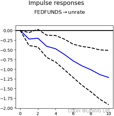
4. Plot the cumulative response effect:
irf.plot_cum_effects()
plt.show()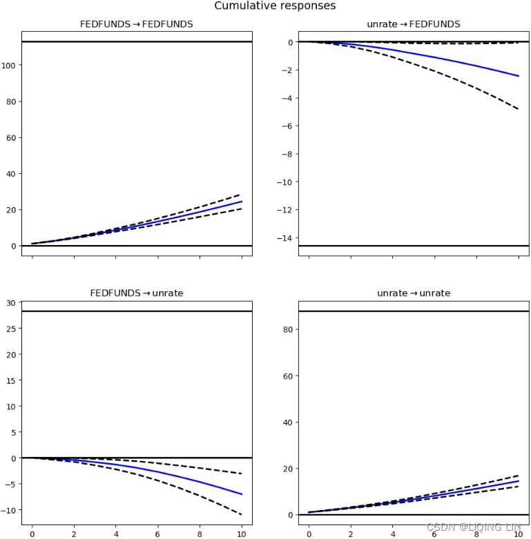
# Example changing lag value
irf = results.irf(30)
fig = irf.plot()
#fig.tight_layout()
plt.show()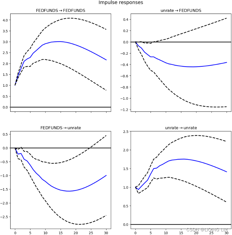
5. You can get the FEVD(the forecast error variance decomposition) using the fevd method:
fv = results.fevd()
fv.summary()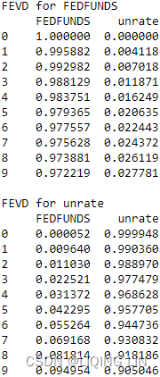
You can use two methods here: fv.summay() and fv.plot() . Both provide similar information:
fv.plot()
plt.show()
This will produce two FEVD plots – one for each variable.
- The x-axis will show the number of periods (0 to 9), while
- the y-axis will represent the percent (0 to 100%) that each shock contributed.
Visually, this is represented as a portion of the total bar at every period. This contribution is the error variance: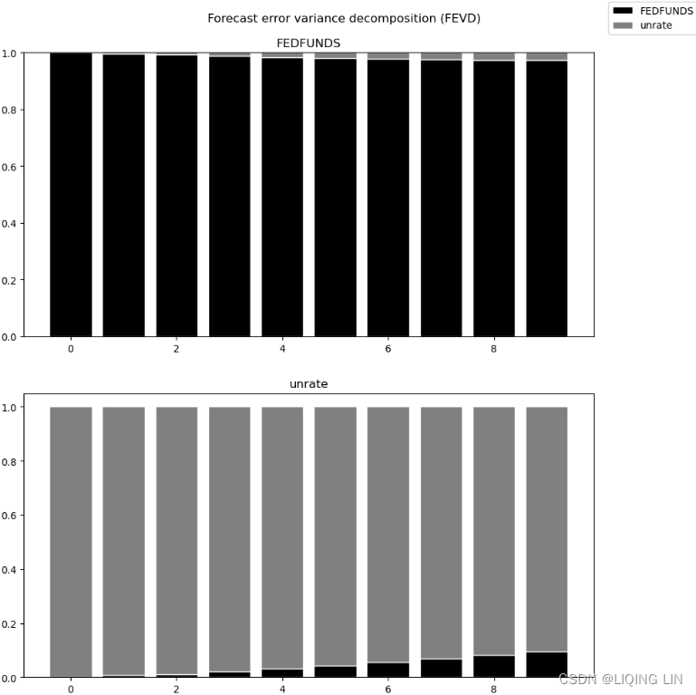 Figure 11.18 – FEVD plot for the FEDFUNDS and unrate variables
The second subplot shows the marginal contribution from FEDFUNFS in initial lags(FEDFUNFS 在初始滞后中的边际贡献). In other words, lags 0 to 1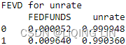 . 99% of the variation in unrate is from shocks from unrate itself. This is confirmed in the unrate -> unrate plot in Figure 11.17. The contribution of FEDFUNDs slowly increases but becomes more apparent around lags 8 and 9.
The Intuition Behind Impulse Response Functions and Forecast Error Variance Decomposition
The VAR implementation from statsmodels offers several options to help you understand the dynamics between the different time series (or endogenous variables). Similarly, it offers diagnostic tools to help you determine what adjustments need to be made to your original hypothesis.
Earlier, in the Forecasting multivariate time series data using VAR recipe, you created a forecast plot. The results object – that is, the VARResults class – ofers a convenient way for you to plot your forecasts quickly:
fig=results.plot_forecast( n, plot_stderr=True )
plt.show()
Here, n is the number of future steps. This should produce two subplots, with one forecast for each variable, as shown in the following diagram:
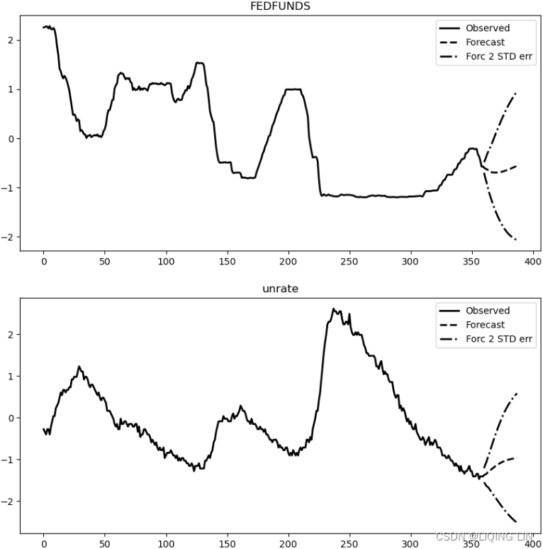 Figure 11.19 – Forecast plots for FEDFUNDS and unrate
Compare the second plot (unrate forecast) with the one shown in Figure 11.14. The results are the same.
To learn more about the VARResults class and all the available methods and attributes, visit the offcial documentation at statsmodels.tsa.vector_ar.var_model.VARResults — statsmodels.
Forecasting volatility in financial time series data with GARCH
When working with financial time series data, a common task is measuring volatility to represent uncertainty in future returns. Generally, volatility measures the spread of the probability distribution of returns and is calculated as the variance (or standard deviation) and used as a proxy for quantifying volatility or risk. In other words, it measures the dispersion of financial asset returns around an expected value. Higher volatility indicates higher risks. This helps investors, for example, understand the level of return they can expect to get and how ofen their returns will differ from an expected value of the return.
Most of the models we discussed previously (for example, ARIMA, SARIMA, and Prophet) focused on forecasting an observed variable based on past versions of itself. These models lack modeling changes in variance over time (heteroskedasticity:variance is not constant, changing over time, https://blog.csdn.net/Linli522362242/article/details/127737895).
In this recipe, you will work with a different kind of forecasting: forecasting and modeling
changes in variance over time. This is known as volatility. In general, volatility is an important measure of risk when there is uncertainty and it is an important concept when working with financial data.
For this reason, you will be introduced to a new family of algorithms related to AutoRegressive Conditional Heteroskedasticity (ARCH)自回归条件异方差性.
- The ARCH algorithm models the change in variance over time as a function of squared error terms (innovations) of a time series(ARCH 算法将方差随时间的变化建模为时间序列的平方误差项(创新)的函数)
- the autoregressive conditional heteroskedasticity (ARCH) model is a statistical model for time series data that describes the variance of the current error term or innovation as a function of the actual sizes of the previous time periods' error terms;
自回归条件异方差 (ARCH) 模型是时间序列数据的统计模型,它描述当前误差项的方差或创新作为先前时间段误差项的实际大小的函数; - The ARCH model is appropriate when the error variance in a time series follows an autoregressive (AR) model;
- the autoregressive conditional heteroskedasticity (ARCH) model is a statistical model for time series data that describes the variance of the current error term or innovation as a function of the actual sizes of the previous time periods' error terms;
- if an autoregressive moving average (ARMA) model is assumed for the error variance, the model is a generalized autoregressive conditional heteroskedasticity (GARCH) model.如果误差方差假设为自回归移动平均 (ARMA) 模型,则该模型是广义自回归条件异方差 (GARCH) 模型。
- An extension of ARCH is the GARCH model, which stands for Generalized AutoRegressive Conditional Heteroskedasticity. It extends ARCH by adding a moving average component.
GARCH is popular in econometrics and is used by financial institutes that assess investments and financial markets. Predicting turbulence/ˈtɜːrbjələns/骚乱,动荡 and volatility is as important as trying to predict a future price, and several trading strategies utilize volatility, such as the mean reversion strategy.
Before moving on, let's define the components of a general ARCH model:
- • AutoRegressive, a concept we explored in Chapter 10, Building Univariate Time Series Models Using Statistical Methodshttps://blog.csdn.net/Linli522362242/article/details/127932130, means that the current value of a variable is influenced by past values of itself at diferent periods.
- • Heteroskedasticity means that the model may have different magnitudes or variability at different time points (variance changes over time).
- • Conditional, since volatility is not fixed, the reference here is on the constant that we place in the model to limit heteroskedasticity and make it conditionally dependent on the previous value or values of the variable.
ARCH(p, q) model specification
https://en.wikipedia.org/wiki/Autoregressive_conditional_heteroskedasticity#cite_note-3
To model a time series using an ARCH process, let denote the error terms (return residuals, with respect to a mean process), i.e. the series terms. These
are split into a stochastic piece
(
and iid:a collection of random variables is independent and identically distributed if each random variable has the same probability distribution as the others and all are mutually independent
) and a time-dependent standard deviation characterizing the typical size of the terms so that
The random variable is a strong white noise process. The series
is modeled by
where
and
.
An ARCH(q) model can be estimated using ordinary least squares. A method for testing whether the residuals exhibit time-varying heteroskedasticity using the Lagrange multiplier test was proposed by Engle (1982). This procedure is as follows:11.1 ARCH/GARCH Models | STAT 510
- Estimate the best fitting autoregressive model AR(q)
.
- Obtain the squares of the error
and regress them on a constant and q lagged values:
where q is the length of ARCH lags.
- The null hypothesis
is that, in the absence of ARCH components, we have
for all
.
The alternative hypothesisis that, in the presence of ARCH components, at least one of the estimated
coefficients must be significant.
In a sample of T residuals under the null hypothesisdistribution with q degrees of freedom,
whereis the number of equations in the model which fits the residuals vs the lags (i.e.
).
- If T'R² is greater than the Chi-square table value, we reject the null hypothesis and conclude there is an ARCH effect in the ARMA model.
- If T'R² is smaller than the Chi-square table value, we do not reject the null hypothesis.
In this recipe, you will create a GARCH model of order (p,q), also known as lags.
- q is the number of past (lag) squared residual errors
, while
- p is the number of past (lag) variances
since variance is the square of standard deviation.
If an AutoRegressive Moving Average model (ARMA) model is assumed for the error variance, the model is a generalized autoregressive conditional heteroskedasticity (GARCH) model.
In that case, the GARCH (p, q) model (where p is the order of the GARCH terms and q is the order of the ARCH terms
), following the notation of the original paper, is given by
The simplest invocation of arch will return a model with a constant mean, GARCH(1,1) volatility process and normally distributed errors.
Generally, when testing for heteroskedasticity in econometric models, the best test is the White test. However, when dealing with time series data, this means to test for ARCH and GARCH errors.
Exponentially weighted moving average (EWMA) is an alternative model in a separate class of exponential smoothing models. As an alternative to GARCH modelling it has some attractive properties such as a greater weight upon more recent observations, but also drawbacks such as an arbitrary decay factor that introduces subjectivity into the estimation主观性引入估计的任意衰减因子.
GARCH(p, q) model specification
The lag length p of a GARCH(p, q) process is established in three steps:
- Estimate the best fitting AR(q) model
- Compute and plot the autocorrelations of
by
- The asymptotic, that is for large samples, standard deviation of
is
. Individual values that are larger than this indicate GARCH errors.大于此值的单个值表示 GARCH 错误 To estimate the total number of lags, use the Ljung–Box test until the value of these are less than, say, 10% significant. The Ljung–Box Q-statistic follows
distribution with n degrees of freedom if the squared residuals
are uncorrelated. It is recommended to consider up to T/4 values of n.
The null hypothesis
Innovations versus Errors in Time Series
In literature, and specifc to time series, you will come across the term innovations. For example, the ARCH order q may be referred to as lagged square innovations as opposed to lagged residual errors. To make things simple, you can think of innovations similar to how you may think of prediction errors, a common term that's used in machine learning. To learn more about innovations, please visit the following Wikipedia page:
https: //en.wikipedia.org/wiki/Innovation_(signal_processing).
GARCH Orders
It can sometimes be confusing when talking about the p and q orders.
- In literature,
- q is usually the ARCH order
,
- while p is the GARCH order
, as described earlier.
- q is usually the ARCH order
- In the arch Python library, they are switched. In the arch package,
- p is described as the lag order of the symmetric innovation,
- while q is described as the lag order of lagged volatility.
From arch, you will use the arch_model function. The parameters can be broken down into three main components based on the GARCH model's assumptions:
- a distribution that's controlled by the dist parameter that defaults to normal,
- a mean model that's controlled by the mean parameter that defaults to Constant, and
- a volatility process that's controlled by the vol parameter that defaults to GARCH.
To install arch using pip, use the following command:
pip install arch To install arch using conda , use the following command:
conda install arch-py -c conda-forgeWhen using the arch_model function from the arch library to build the GARCH model, there are a few parameters that need to be examined:
- whether the distribution is normal with dist=' normal' by default,
- whether the mean is constant with mean=' Constant' by default, and
- the volatility type with vol=' GARCH' by default.
You will be using the Microsoft daily closing price dataset for this recipe. Follow these steps:
import yfinance as yf

df = yf.download('msft', start='2010-01-01')
df
msft = df[['Adj Close']]
msft 
3. You will need to convert the daily stock price into a daily stock return. This can be calculated as , where
is the price at time
and
is the previous price (1 day prior). This can easily be done in pandas using the DataFrame.pct_change() function. .pct_change() has a periods parameter that defaults to 1. If you want to calculate a 30-day return, then you must change the value to 30 :
msft.loc[:,'returns'] = 100 * msft.pct_change()
msft.dropna( inplace=True, how='any' )
msft.head() 
Plot both the daily stock price and daily return:
msft.plot( subplots=True,
title='Microsoft Daily Closing Price and Daily Returns',
figsize=(10,8)
)
plt.show()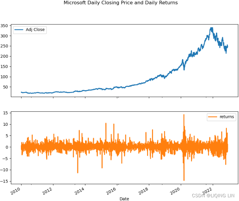 Figure 11.20 – Microsoft daily closing price and daily returns
4. Split the data into 90% train and 10% test sets:
idx = round( len(msft)*0.9 )
train = msft.returns[:idx]
test = msft.returns[idx:]

print( f'Train: {train.shape}' )
print( f'Test: {test.shape}' ) ![]()
5. Now, fit the GARCH(p, q) model. Start with the simple GARCH(1,1) model with all the default options – that is, mean=' Constant' , distribution as dist=' normal' , volatility as vol=' GARCH' , p=1 , and q=1 :
The simplest invocation of arch will return a model with a constant mean, GARCH(1,1) volatility process and normally distributed errors.
from arch import arch_model

model = arch_model( train,
                    p=1, q=1,
                    mean='Constant',
                    vol='GARCH',
                    dist='normal'
                  )
results = model.fit( update_freq=5 ) 
Parameters
    ----------
    y : {ndarray, Series, None}
        The dependent variable
    x : {np.array, DataFrame}, optional
        Exogenous regressors.  Ignored if model does not permit exogenous
        regressors.
    mean : str, optional
        Name of the mean model.  Currently supported options are: 'Constant',
        'Zero', 'LS', 'AR', 'ARX', 'HAR' and  'HARX'
    lags : int or list (int), optional
        Either a scalar integer value indicating lag length or a list of
        integers specifying lag locations.
    vol : str, optional
        Name of the volatility model.  Currently supported options are:
        'GARCH' (default), 'ARCH', 'EGARCH', 'FIGARCH', 'APARCH' and 'HARCH'
    p : int, optional
        Lag order of the symmetric innovation
    o : int, optional
        Lag order of the asymmetric innovation
    q : int, optional
        Lag order of lagged volatility or equivalent
    power : float, optional
        Power to use with GARCH and related models
    dist : int, optional
        Name of the error distribution.  Currently supported options are:

            * Normal: 'normal', 'gaussian' (default)
            * Students's t: 't', 'studentst'
            * Skewed Student's t: 'skewstudent', 'skewt'
            * Generalized Error Distribution: 'ged', 'generalized error"

    hold_back : int
        Number of observations at the start of the sample to exclude when
        estimating model parameters.  Used when comparing models with different
        lag lengths to estimate on the common sample.
    rescale : bool
        Flag indicating whether to automatically rescale data if the scale
        of the data is likely to produce convergence issues when estimating
        model parameters. If False, the model is estimated on the data without
        transformation.  If True, than y is rescaled and the new scale is
        reported in the estimation results.

    Returns
    -------
    model : ARCHModel
        Configured ARCH model
Using update_freq=5 affects the output's frequency. The default is 1 , which updates on every iteration. To print the summary, use the .summary() method:
results.summary() 
Figure 11.21 – GARCH model summary
The omega, alpha, and beta parameters (the ,
, and
symbols) of the GARCH model are estimated using the maximum likelihood method. Notice that the p-value for the coefficients indicates they are significant.
You can access several of the components that you can see in the summary table by calling the appropriate attribute from the results object – for example, results.pvalues , results.tvalues , results.std_err , or results.params .

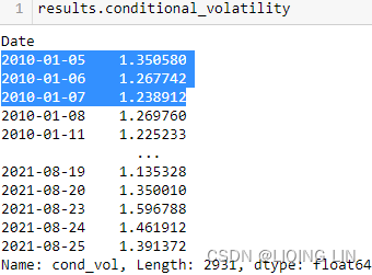
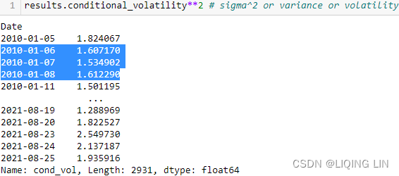 ==
==
results.params ==>
==>

(results.resid/results.conditional_volatility) == results.std_resid
results.std_err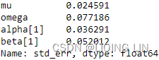 <==
<==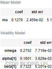
6. Next, you must evaluate the model's performance. Start by plotting the standardized residuals and conditional volatility using the plot method:
Conditional, since volatility is not fixed, the reference here is on the constant that we place in the model to limit heteroskedasticity and make it conditionally dependent on the previous value or values of the variable.
plt.rc("figure", figsize=(12, 5))

results.plot()
plt.show()
Help on method plot in module arch.univariate.base:
plot(annualize: 'Optional[str]' = None, scale: 'Optional[float]' = None) -> 'Figure' method of arch.univariate.base.ARCHModelResult instance Plot standardized residuals and conditional volatility Parameters ---------- annualize : str, optional String containing frequency of data that indicates plot should contain annualized volatility. Supported values are 'D' (daily), 'W' (weekly) and 'M' (monthly), which scale variance by 252, 52, and 12, respectively. scale : float, optional Value to use when scaling returns to annualize. If scale is provided, annualize is ignored and the value in scale is used.
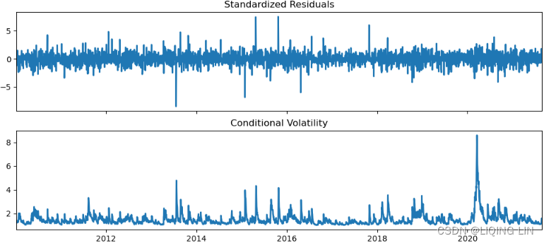 Figure 11.22 – Model diagnostics for the GARCH model
##################### arch/base.py at main · bashtage/arch · GitHub
resid : ndarray
Residuals from model. Residuals have same shape as original data and
contain nan-values in locations not used in estimation
volatility : ndarray
Conditional volatility from model
# (results.resid/results.conditional_volatility).plot()

fig, ax = plt.subplots(2,1, figsize=(12,5), sharex=True)
ax[0].plot( results.resid.index,
         (results.resid/results.conditional_volatility).values
       )
ax[0].set_title("Standardized Residuals")
ax[0].set_xlim(results.resid.index[0], results.resid.index[-1])

# scale=None and annualize = None
ax[1].plot( results.resid.index,
            results.conditional_volatility.values
          )
plt.show()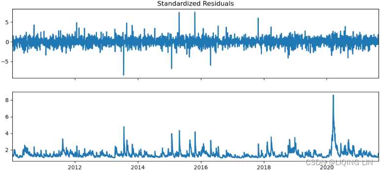 #####################
Plot a histogram for the standardized residuals. You can obtain this using the std_resid attribute:
(results.resid/results.conditional_volatility) == results.std_resid
results.std_resid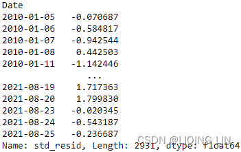
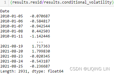
import matplotlib as mpl
mpl.rcParams['patch.force_edgecolor'] = False
# mpl.rcParams['patch.edgecolor'] = 'white'

results.std_resid.hist( bins=20 )
plt.title('Standardized Residuals')
plt.show()
Examine whether the standardized residuals are normally distributed:
 Figure 11.23 – Model diagnostics for the GARCH model
The histogram shows the standardized residuals being normal.
plot_acf( results.std_resid )
plt.show()
The ACF of the results.std_resid looks to be white noise or there is no autocorrelation in the results.std_resid.

Another test you can perform to check for the existence of autocorrelation is the Ljung-Box test. Test for autocorrelation for the first 10 lags by using accorr_ljungbox from the statsmodels library:
In this recipe, you will perform a Ljung-Box test to check for
- autocorrelations up to a specifed lag and
- whether they are significantly far of from 0.
- The null hypothesis
- When running the test using acorr_ljungbox from statsmodels, you need to provide a lag value. The test will run for all lags up to the specified lag (maximum lag).
For example, when testing for autocorrelation on the residuals, the expectation is that
- there should be no autocorrelation between the residuals.
- This ensures that the model has captured all the necessary information.
- The presence of autocorrelation in the residuals can indicate that the model missed an opportunity to capture critical information and will need to be evaluated.
from statsmodels.stats.diagnostic import acorr_ljungbox

acorr_ljungbox( results.std_resid,
                lags=10,
                return_df=True
)  acorr_ljungbox is a function that accumulates autocorrelation up until the lag specifed. Therefore, it is helpful to determine whether the structure is worth modeling in the first place.
- lb_stat - The Ljung-Box test statistic.
- lb_pvalue - The p-value based on chi-square distribution. The p-value is computed as 1 - chi2.cdf(lb_stat, dof) (cumulative distribution function)where dof is lag - model_df.
If lag - model_df <= 0, then NaN is returned for the pvalue.(model_df: Number of degrees of freedom consumed by the model. In an ARMA model, this value is usually p+q where p is the AR order and q is the MA order. This value is subtracted from the degrees-of-freedom used in the test so that the adjusted dof for the statistics are lags - model_df. If lags - model_df <= 0, then NaN is returned.) - bp_stat - The Box-Pierce test statistic.
- bp_pvalue - The p-value based for Box-Pierce test on chi-square distribution. The p-value is computed as 1 - chi2.cdf(bp_stat, dof) where dof is lag - model_df. If lag - model_df <= 0, then NaN is returned for the pvalue.
The null hypothesis assumes no autocorrelation. We reject the null hypothesis if the p-value is less than 0.05. At lags 1 to 5, we cannot reject the null hypothesis and there is no autocorrelation. Things change starting from lag 6 onward and we can reject the null hypothesis(The presence of autocorrelation in the residuals).
make a prediction
7. To make a prediction, use the .forecast() method. The default is to produce a 1 step ahead forecast. To get n number of steps ahead, you will need to update the horizon parameter:
msft_forecast = results.forecast( horizon=test.shape[0] )8. To access the predicted future variance (or volatility)预测的未来方差, use the .variance property from the msft_forecast object:
forecast = msft_forecast.variance[-1:]
forecast
You can also evaluate the predicted mean. Recall that when you fit the model, you indicated that the mean is Constant . This is further validated if you examine the mean:
msft_forecast.mean[-1:]
This will show a constant value of 0.127755 across all horizons.
pd.Series(forecast.values.ravel(), index=test.index).plot()
Previously, when implementing the GARCH model, the mean was set to Constant. Let's explore the impact of changing it to Zero .
from arch import arch_model

model = arch_model( train,
                    p=1, q=1,
                    mean='Zero',
                    vol='GARCH',
                    dist='normal'
                  )
results = model.fit( update_freq=5 )
results.params 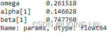
results.summary() 
Figure 11.24 – GARCH(1, 1) with a zero mean
Notice that in Figure 11.24, there is no mean model like the one shown in Figure 11.20. It is common to use a Zero Mean when you want to model the two separately: a Volatility Model and a Mean Model. 当您想要分别对两者建模时,通常使用零均值:波动率模型和均值模型。
msft_forecast = results.forecast(horizon=test.shape[0])
msft_forecast.mean[-1:]
msft_forecast.variance[-1:]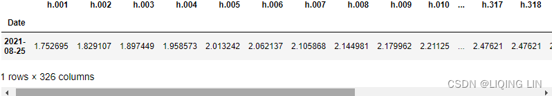
model = arch_model(train,
                   p=1, q=1,
                   mean='LS', lags=1,
                   vol='GARCH',
                   dist='normal')
results = model.fit(disp=False)
results.params 
results.summary() 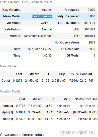
results.model![]()
To learn more about the arch library, please visit the ofcial documentation at Introduction to ARCH Models — arch 5.3.2.dev67+g00dbf506 documentation.


 8528
8528


 被折叠的 条评论
为什么被折叠?
被折叠的 条评论
为什么被折叠?
 到【灌水乐园】发言


