


重要提示:数据和代码获取:请查看主页个人信息!!!
载入R包
rm(list=ls())
pacman::p_load(tidyverse,assertthat,igraph,purrr,ggraph,ggmap)
网络节点和边数据
nodes <- read.csv('nodes.csv', row.names = 1)
edges <- read.csv('edges.csv', row.names = 1)
节点数据权重计算
g <- graph_from_data_frame(edges, directed = FALSE, vertices = nodes)
nodes_for_plot <- nodes %>%
  mutate(weight = degree(g))
网络边和地图经纬度数据整理
edges_for_plot <- edges %>%
  inner_join(nodes %>% select(id, lon, lat), by = c('from' = 'id')) %>%
  rename(x = lon, y = lat) %>%
  inner_join(nodes %>% select(id, lon, lat), by = c('to' = 'id')) %>%
  rename(xend = lon, yend = lat) %>%
  mutate(category = as.factor(category))
edges_for_plot <- edges %>%
这行代码开始了一个管道操作,将
edges数据框作为输入。edges数据框应该包含图中的边的信息,例如每条边的起点和终点。
inner_join(nodes %>% select(id, lon, lat), by = c('from' = 'id'))
nodes %>% select(id, lon, lat)首先从nodes数据框中选择id(节点标识符)、lon(经度)、lat(纬度)这三列。
inner_join函数将edges数据框与上述选择的节点数据进行内连接。连接的依据是edges中的from列与nodes中的id列相匹配,这样每条边的起点都会被赋予对应节点的经纬度信息。
rename(x = lon, y = lat)
这行代码将连接后得到的
lon和lat列重命名为x和y,这通常是为了绘图方便或符合后续处理的习惯。
inner_join(nodes %>% select(id, lon, lat), by = c('to' = 'id'))
类似于前面的操作,这次是将修改过的
edges数据框再次与节点的经纬度信息进行内连接,但这次连接依据是edges中的to列与nodes中的id列。这样每条边的终点也被赋予对应节点的经纬度信息。
rename(xend = lon, yend = lat)
将第二次连接后得到的
lon和lat列重命名为xend和yend,为绘制起点到终点的直线做准备。
mutate(category = as.factor(category))
这行代码使用
mutate函数将category列转换为因子(factor)类型。因子类型在 R 中用于表示分类变量,这可能是为了在绘图或分析时处理边的类别。
ggplot2出图
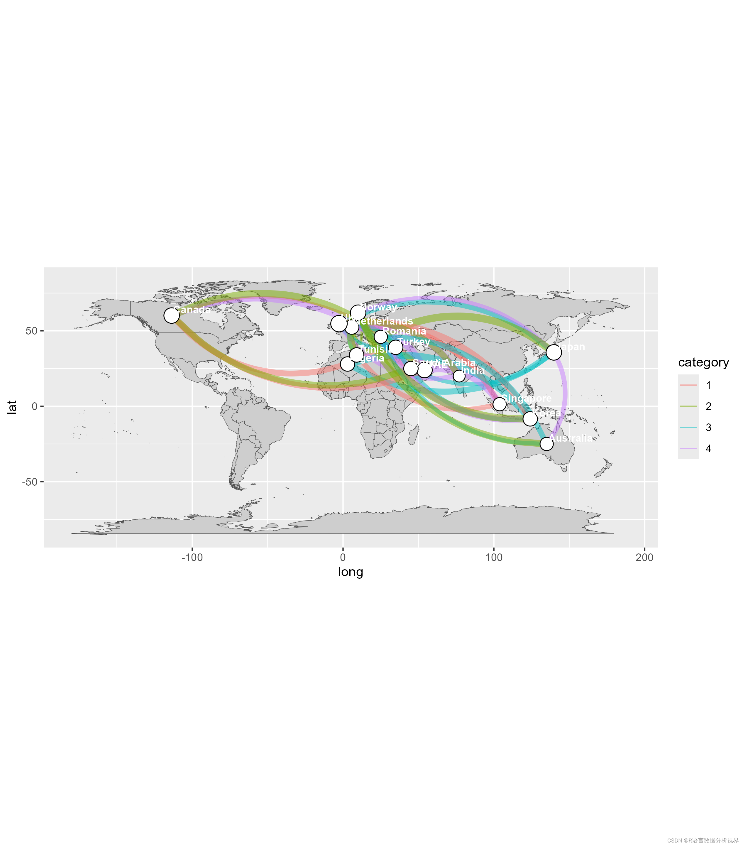
ggplot(nodes_for_plot) +
  geom_polygon(aes(x = long, y = lat, group = group),
               data = map_data('world'),
               fill = "#CECECE", color = "#515151",
               size = 0.15) +
  geom_curve(data = edges_for_plot, aes(x = x, y = y, xend = xend, yend = yend, # draw edges as arcs
                 color = category, size = weight),
             curvature = 0.33,
             alpha = 0.5) +
  scale_size_continuous(guide = FALSE, range = c(0.25, 2)) + # scale for edge widths
  geom_point(aes(x = lon, y = lat, size = weight),           # draw nodes
             shape = 21, fill = 'white',
             color = 'black', stroke = 0.5) +
  scale_size_continuous(guide = FALSE, range = c(1, 6)) +    # scale for node size
  geom_text(aes(x = lon, y = lat, label = name),             # draw text labels
            hjust = 0, nudge_x = 1, nudge_y = 4,
            size = 3, color = "white", fontface = "bold") +
  coord_fixed()
基础图层:
ggplot(nodes_for_plot): 初始化一个ggplot对象,可能包含一些特定点的节点数据。
geom_polygon(...): 添加一个多边形层,这里是使用了世界地图的数据。aes(x = long, y = lat, group = group)设置了多边形的坐标和分组。填充颜色设为灰色#CECECE,边界颜色设为深灰#515151,边界宽度为0.15。曲线层:
geom_curve(...): 添加曲线层,用于绘制边缘或连接线,具体数据来自edges_for_plot。这里曲线的颜色和宽度通过aes(...)映射到category和weight字段。曲线的弯曲度为0.33,透明度为0.5。边缘宽度的比例尺:
scale_size_continuous(guide = FALSE, range = c(0.25, 2)): 设置曲线宽度的连续比例尺,范围从0.25到2,不显示图例。点层:
geom_point(...): 添加点层,用于绘制节点。节点位置通过aes(x = lon, y = lat)设置,大小通过weight控制。点的形状设为21(带边框的圆形),填充颜色为白色,边框颜色为黑色,边框宽度为0.5。节点大小的比例尺:
scale_size_continuous(guide = FALSE, range = c(1, 6)): 设置节点大小的连续比例尺,范围从1到6,不显示图例。文本层:
geom_text(...): 添加文本层,用于绘制节点旁的文本标签。文本位置通过微调nudge_x和nudge_y设置,水平对齐hjust = 0(左对齐)。文本大小为3,颜色为白色,字体加粗。坐标系:
coord_fixed(): 设置一个固定比例的坐标系,确保纬度和经度的比例一致,通常用于地图数据以保持比例正确。这段代码的整体作用是在世界地图上绘制节点和节点间的连接线,并且附加文本标签,适用于展示网络、路径或者其他地理相关的数据。
映射颜色
ggplot(nodes_for_plot) +
  geom_polygon(aes(x = long, y = lat, group = group, fill = region), show.legend = F,
               data = map_data('world'),
               color = "black",
               size = 0.15) +
  geom_curve(data = edges_for_plot, aes(x = x, y = y, xend = xend, yend = yend, # draw edges as arcs
                                        size = weight),
             color = 'black',
             curvature = 0.33,
             alpha = 0.5) +
  scale_size_continuous(guide = FALSE, range = c(0.25, 2)) + # scale for edge widths
  geom_point(aes(x = lon, y = lat, size = weight),           # draw nodes
             shape = 21, fill = 'white',
             color = 'black', stroke = 0.5) +
  scale_size_continuous(guide = FALSE, range = c(1, 6)) +    # scale for node size
  geom_text(aes(x = lon, y = lat, label = name),             # draw text labels
            hjust = 0, nudge_x = 1, nudge_y = 4,
            size = 3, color = "white", fontface = "bold") +
  coord_fixed(xlim = c(-150, 180), ylim = c(-55, 80)) +
  theme(panel.grid = element_blank()) +
  theme(axis.text = element_blank()) +
  theme(axis.ticks = element_blank()) +
  theme(axis.title = element_blank()) +
  theme(legend.position = "right") +
  theme(panel.grid = element_blank()) +
  theme(panel.background = element_rect(fill = "#596673")) +
  theme(plot.margin = unit(c(0, 0, 0.5, 0), 'cm'))

这段代码相较于前一段代码有以下几个主要修改和增加:
多边形层 (
geom_polygon):
增加了
fill = region属性到aes函数中,这表示多边形的填充颜色现在是基于region字段动态变化的,而不是固定的灰色。修改了边框颜色为黑色。
增加了
show.legend = F,这表示不显示图例,之前的代码中默认可能显示图例。曲线层 (
geom_curve):
去除了曲线的颜色通过
aes动态映射,而是设置成了统一的黑色。去除了曲线宽度的动态映射,只保留了基于
weight的大小映射。坐标系 (
coord_fixed):
增加了
xlim和ylim参数,这用于设置X轴和Y轴的显示范围,可以用于聚焦到地图的特定部分。主题设置 (
theme):
新增多个
theme函数调用,用于定制图表的美观性和可读性:
panel.grid = element_blank():去除背景的网格线。
axis.text = element_blank()和其他相关axis设置:去除坐标轴的文本、刻度、标题等元素,使图表更为简洁。
legend.position = "right":设置图例位置在右侧。
panel.background = element_rect(fill = "#596673"):设置面板背景颜色为深灰蓝色。
plot.margin = unit(c(0, 0, 0.5, 0), 'cm'):调整图表的边缘空白。


 9862
9862

 被折叠的 条评论
为什么被折叠?
被折叠的 条评论
为什么被折叠?
 到【灌水乐园】发言


