


Mantel Test
1.什么是Mantel Test
Mantel test分析对两个矩阵相关关系进行检验。可以用在生态学上,用来检验群落距离矩阵(如 Bray-Curtis distance matrix)和环境变量距离矩阵(如 pH, 温度 或者地理位置的差异矩阵)之间的相关性(Spearman、Pearson)。Mantel test的相关性系数越大,p值越小,则说明环境因子对微生物群落的影响越大。同时,mantel test的偏分析(partial Mantel test等)可排除环境因子之间自相关的干扰。
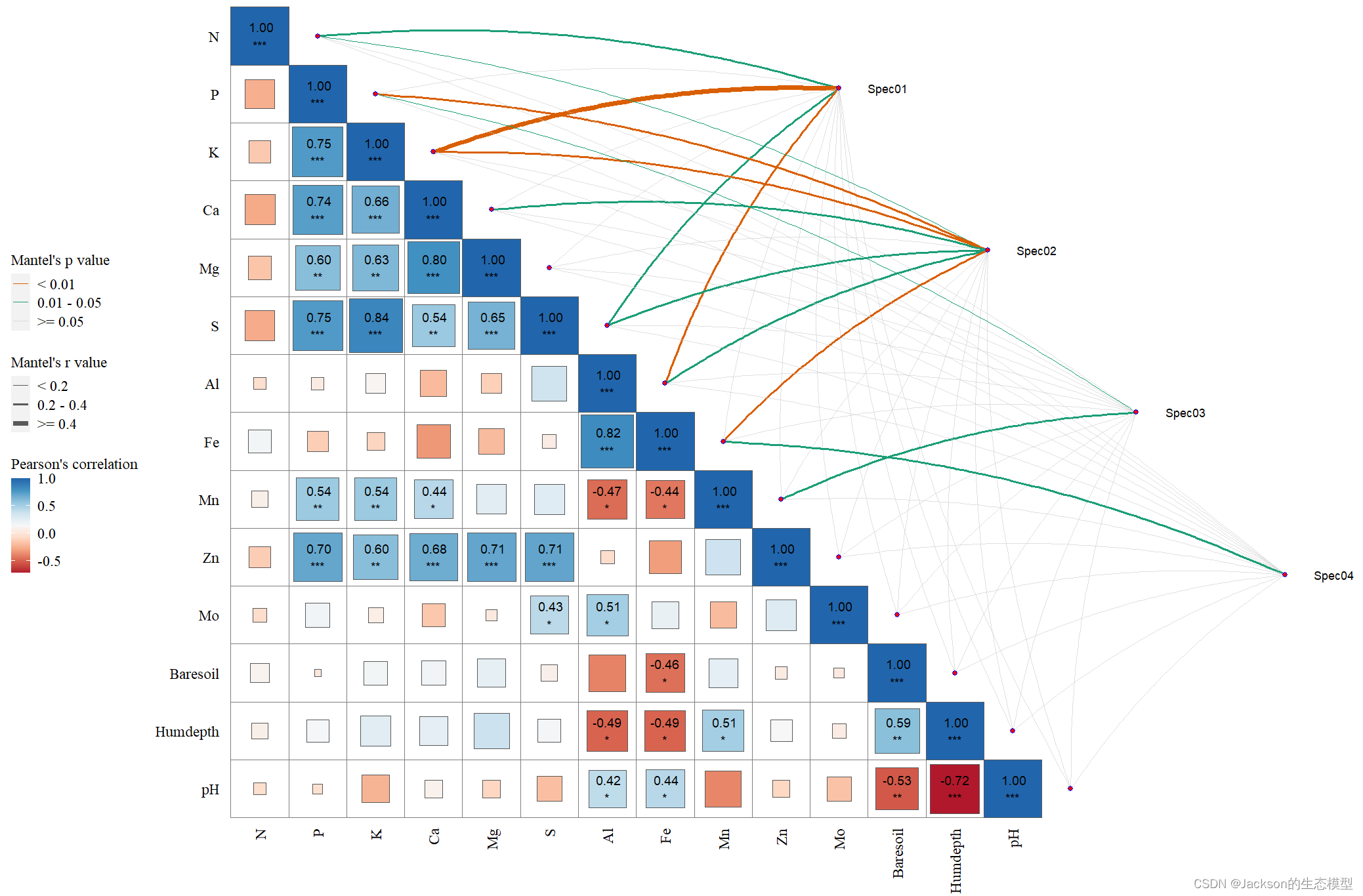
Mantel test分析结果:
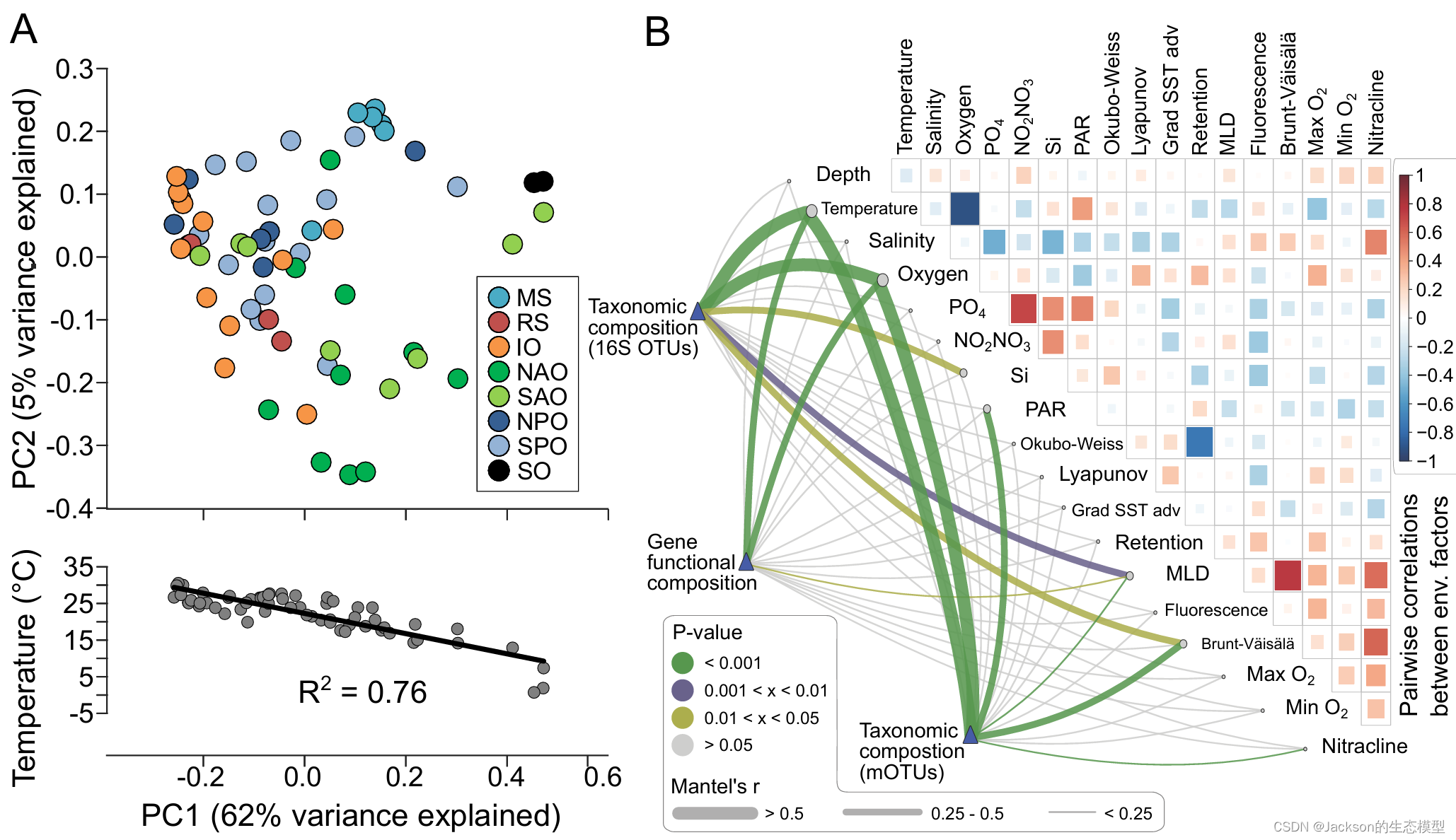
文献参考: Structure and function of the global ocean microbiome
2. R语言代码1
这里我使用了R内置的两个数据进行分析,并对图像进行了美化和调整。
在这里我使用的是linkET包,当然你也可以使用ggcor包,但是我不能安装这个包,所以就没有使用。
#热图+网络图展示mantel test相关性
# 加载包
# devtools::install_github("Hy4m/linkET", force = TRUE)
library(linkET)
library(tidyverse)
library(RColorBrewer)

data("varechem", package = "vegan")
data("varespec", package = "vegan")
head(varespec[,1:6])#rownames is samples
head(varechem[,1:6])#rownames is samples
dim(varespec)#24,44
dim(varechem)#24,14

mantel <- mantel_test(varespec, varechem,
                      spec_select = list(Spec01 = 1:7,
                                         Spec02 = 8:18,
                                         Spec03 = 19:37,
                                         Spec04 = 38:44)) %>%
  dplyr::mutate(rd = cut(r, breaks = c(-Inf, 0.2, 0.4, Inf),
                         labels = c("< 0.2", "0.2 - 0.4", ">= 0.4")),
                pd = cut(p, breaks = c(-Inf, 0.01, 0.05, Inf),
                         labels = c("< 0.01", "0.01 - 0.05", ">= 0.05")));
mantel

correlate(varechem) %>%
  qcorrplot(type = "lower", diag = T) +
  geom_square() +
  geom_couple(aes(colour = pd, size = rd), data = mantel, curvature = 0.1) +
  geom_mark(sep = '\n',size = 4, sig_level = c(0.05, 0.01, 0.001),
            sig_thres = 0.05, color = 'black',
            ) +
  scale_fill_gradientn(colours = RColorBrewer::brewer.pal(9, "RdBu")) +
  scale_size_manual(values = c(0.5, 1, 2)) +
  scale_colour_manual(values = color_pal(3)) +
  labs(fill = "Pearson's correlation",
       size = "Mantel's r value",
       colour = "Mantel's p value")+
  theme(
    text = element_text(size = 14, family = "serif"),
    plot.title = element_text(size = 14, colour = "black", hjust = 0.5),
    legend.title = element_text(color = "black", size = 14),
    legend.text = element_text(color = "black", size = 14),
    axis.text.y = element_text(size = 14, color = "black", vjust = 0.5, hjust = 1, angle = 0),
    axis.text.x = element_text(size = 14, color = "black", vjust = 0.5, hjust = 0.5, angle = 0)
  )
结果展示:
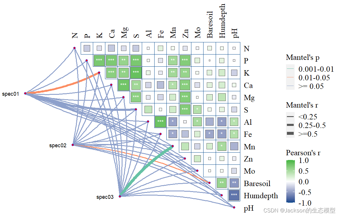
3. R语言代码2
rm(list=ls())#好习惯,确保有干净的 R 环境
# setwd("C:/Users/Desktop/take")
library(linkET)
library(ggplot2)
library(ggtext)
library(dplyr)
library(RColorBrewer)
library(cols4all)
library(tidyverse)

data("varechem", package = "vegan")
data("varespec", package = "vegan")

#计算环境因子相关性系数:
cor2 <- correlate(varechem)
corr2 <- cor2 %>% as_md_tbl()
write.csv(corr2, file = "pearson_correlate(env&env).csv", row.names = TRUE)

head(corr2)
#mantel test:
mantel <- mantel_test(varespec, varechem,
                      mantel_fun = 'mantel', #支持4种:"mantel"使用vegan::mantel();"mantel.randtest"使用ade4::mantel.randtest();"mantel.rtest"使用ade4::mantel.rtest();"mantel.partial"使用vegan::mantel.partial()
                      spec_select = list(spec01= 1:1,
                                         spec02=5:5,
                                         spec03 = 7:7
                      )) #这里分组为随机指定,具体实操需按自己的实际数据分组
head(mantel)
write.csv(mantel, file = "mantel_result(bio&env).csv", row.names = TRUE)

#对mantel的r和P值重新赋值(设置绘图标签):
mantel2 <- mantel %>%
  mutate(r = cut(r, breaks = c(-Inf, 0.25, 0.5, Inf),
                 labels = c("<0.25", "0.25-0.5", ">=0.5")),
         p = cut(p, breaks = c(-Inf, 0.001, 0.01, 0.05, Inf),
                 labels = c("<0.001", "0.001-0.01", "0.01-0.05", ">= 0.05")))
head(mantel2)
#首先,绘制相关性热图(和上文相同):


##############################
p4 <- qcorrplot(cor2,
                grid_col = "#00468BFF",
                "white","#42B540FF",
                grid_size = 0.2,
                type = "upper",
                diag = FALSE) +
  geom_square() +
  scale_fill_gradientn(colours = c("#00468BFF",
                                   "white","#42B540FF"),
                       limits = c(-1, 1))

# 打印出来看看

#添加显著性标签:
p5 <- p4 +
  geom_mark(size = 4,
            only_mark = T,
            sig_level = c(0.05, 0.01, 0.001),
            sig_thres = 0.05,
            colour = 'white')
p5
#在相关性热图上添加mantel连线:
p6 <- p5 +
  geom_couple(data = mantel2,
              aes(colour = p, size = r),
              curvature = nice_curvature())
p6
#继续美化连线:
p7 <- p6 +
  scale_size_manual(values = c(1, 2, 3)) + #连线粗细
  scale_colour_manual(values = c4a('brewer.set2',4)) + #连线配色
  #修改图例:
  guides(size = guide_legend(title = "Mantel's r",
                             override.aes = list(colour = "grey35"),
                             order = 2),
         colour = guide_legend(title = "Mantel's p",
                               override.aes = list(size = 5),
                               order = 1),
         fill = guide_colorbar(title = "Pearson's r", order = 3))+
  theme(
    text = element_text(size = 16, family = "serif"),
    plot.title = element_text(size = 16, colour = "black", hjust = 0.5),
    legend.title = element_text(color = "black", size = 16),
    legend.text = element_text(color = "black", size = 16),
    axis.text.y = element_text(size = 16, color = "black", vjust = 0.5, hjust = 1, angle = 0),
    axis.text.x = element_text(size = 16, color = "black", vjust = 0.5, hjust = 0.5, angle = 0)
  )

p7
结果展示:


 2282
2282

 被折叠的 条评论
为什么被折叠?
被折叠的 条评论
为什么被折叠?
 到【灌水乐园】发言


