


本节内容介绍了无模型的时间序列分析方法,包括时间序列作趋势图、逐年分解、时间序列分解、直方图、ACF与PACF图,主要是作图。
首先导入数据和对应的库:
import pandas as pd
import numpy as np
import matplotlib.pyplot as plt
import seaborn as sns
%matplotlib inline
import warnings
warnings.filterwarnings('ignore')
from statsmodels.graphics.tsaplots import plot_acf, plot_pacf
from statsmodels.tsa.seasonal import seasonal_decompose
from statsmodels.tsa.stattools import adfuller
df = pd.read_csv("SARIMA数据.csv")
在对时间序列进行分析前,务必将数据df的时间列转化为时间序列数据,并设置为索引:
import datetime as dt
tt = []
for i in df["时间"]:
    a = dt.datetime.strptime(i,'%Y/%m/%d')
    b = dt.datetime.strftime(a,'%Y-%m-%d')
    tt.append(b)
df['date'] = tt
df['date'] = pd.to_datetime(df['date'])  # 将指定列转换为日期时间格式
df.set_index('date', inplace=True)
一、时间序列趋势图
plt.figure(figsize=(10, 4))
plt.plot(df.index, df['患病人数'])
plt.title('Time Series Data')
plt.xticks(range(1,len(data),25),rotation=45)
plt.xlabel('Date')
plt.ylabel('Value')
plt.show()
二、逐年分解图
plt.figure(figsize=(16,8))
plt.grid(which='both')
years = int(np.round(len(data)/12))
for i in range(years):
    index = data.index[i*12:(i+1)*12]
    plt.plot(data.index[:12].month_name(),data.loc[index].values);
    plt.text(y=data.loc[index].values[11], x=11, s=data.index.year.unique()[i]);
plt.legend(data.index.year.unique(), loc=0);
plt.title('Monthly Home Sales per Year');
如图所示,就将不同年份的数据投射在相同的月份坐标轴上,可以看出不同年份之间的变化趋势有着相似的变化趋势,可以提出时间序列数据存在月份效应的假设,然后进一步进入模型研究,直到最终确定(日历和月历效应的研究可以参考博主的其他文章)
三、时间序列分解为长期趋势、季节性/周期性部分、残差
result1 = seasonal_decompose(data, model='additive')
# 绘制分解后的系列
plt.figure(figsize=(12, 10))
# 原始数据
plt.subplot(4, 1, 1)
plt.plot(result.index, result['bitcoin_price'], label='open', color='b')
plt.title('Data')
plt.xlabel('Date')
plt.ylabel('Data Value')
plt.grid(False)
plt.legend()
# 趋势分量
plt.subplot(4, 1, 2)
plt.plot(result.index, result1.trend, label='Trend', color='b')
plt.title('Trend Component')
plt.xlabel('Date')
plt.ylabel('Trend Value')
plt.grid(False)
plt.legend()
# 季节效应
plt.subplot(4, 1, 3)
plt.plot(result.index, result1.seasonal, label='Seasonal', color='b')
plt.title('Seasonal Component')
plt.xlabel('Date')
plt.ylabel('Seasonal Value')
plt.grid(False)
plt.legend()
# 残差
plt.subplot(4, 1, 4)
plt.plot(result.index, result1.resid, label='Residual', color='b')
plt.title('Residual Component')
plt.xlabel('Date')
plt.ylabel('Residual Value')
plt.grid(False)
plt.legend()
plt.tight_layout()
plt.show()


四、直方图和ACF、PACF图
def plot_data_properties(data, ts_plot_name="Time Series plot"):
    '''
    Summary:
    -------
    Plots various plots, including time series, autocorrelation,
    partial autocorrelation and distribution plots of data.

    Parameters:
    ----------
    ts_plot_name(String): The name of the time series plot
    data(pd.Dataframe, pd.Series, array): Time Series Data

    Returns:
    --------
    None

    '''
    plt.figure(figsize=(16,4))
    plt.plot(data)
    plt.title(ts_plot_name)
    plt.xticks(range(1,len(data),25),rotation=45)
    plt.ylabel('Sales')
    plt.xlabel('Year')
    fig, axes = plt.subplots(1,3,squeeze=False)
    fig.set_size_inches(16,4)
    plot_acf(data, ax=axes[0,0], lags=48);
    plot_pacf(data, ax=axes[0,1], lags=48);
    sns.distplot(data, ax=axes[0,2])
    axes[0,2].set_title("Probability Distribution")

plot_data_properties(data);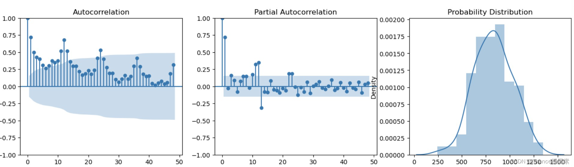
关注gzh‘finance褪黑素’,还有很多金融、大数据相关的文章、代码、数据推送~


 7万+
7万+


 被折叠的 条评论
为什么被折叠?
被折叠的 条评论
为什么被折叠?
 到【灌水乐园】发言


