


极简主义的价值观是什么
Design trends come and go. But some trends are eternal. Minimalism is one such trend.
设计趋势来来往往。 但是一些趋势是永恒的。 极简主义就是这样一种趋势。
HTML5, CSS3 and all the other technology behind websites has grown dramatically over the last decade, making it possible to have more complex webpages today than ever before in history.
HTML5,CSS3和网站背后的所有其他技术在过去十年中得到了飞速发展,使得如今拥有比以往任何时候都更加复杂的网页成为可能。
And yet, I think minimalist designs still rock.
但是,我认为极简主义设计仍然会动摇。
“… your scientists were so preoccupied with whether or not they could that they didn’t stop to think if they should“
“……您的科学家对他们能否做到如此着迷,以至于他们不停地思考是否应该这样做 ”
Dr. Ian Malcolm – Jurassic Park (1993)
Ian Malcolm博士–侏罗纪公园(1993)
Early in the first Jurassic Park film, Jeff Goldblum’s mumbly, hipster scientist questions the park’s creators with the line above. Similarly in web design, just because technology enables you to add fancy bells and whistles and the kitchen sink to your website, doesn't mean you should.
在侏罗纪公园拍摄的第一部电影的早期, 杰夫·戈德布鲁姆(Jeff Goldblum)的笨拙的时髦科学家以上面的文字质疑公园的创造者。 同样在网页设计中,仅仅因为技术使您能够在网站上添加花哨的钟声和厨房水槽,并不意味着您应该这样做。
In fact, here’s what happens when you go all out embracing the latest technology and add every possible bit of it onto your home page:
实际上,当您全力以赴拥抱最新技术并将其尽可能多地添加到主页上时,会发生以下情况:
Yes. That’s the real deal – the home page over at Possible which includes sliders, animation, parallax. Go take a look. Perhaps you’ll spot your favorite there too.
是。 那才是真正的交易- 可能的主页,其中包括滑块,动画,视差。 快去看看 也许您也会在那里找到自己喜欢的东西。
It’s very difficult to find the core theme. On the other hand, it still comfortably beats getting shredded by a velociraptor. So there’s that.
很难找到核心主题。 另一方面,它仍然可以轻而易举地被迅猛龙撕碎。 就是这样。
Bad designs aside, here are some concrete reasons why a minimalist website may actually be good for business.
除了不良的设计外,以下是一些可能导致简约网站实际上对企业有利的具体原因。
商业和营销原因 (Business and Marketing Reasons)
1.它迫使您完善您的信息。 (1. It forces you to polish your message.)
What's the purpose of your website? What are you trying to convey to your users? Focus on that. Don't let it get lost in the clutter on your site.
您的网站的目的是什么? 您想传达给用户什么? 集中精力。 不要让它迷失在您网站的混乱中。
With a minimalist design, you don't have room to play loose. Every element on the page is deliberate. Every element serves a purpose. You can't be wishy washy about your message. You can't write a thousand words and hope that viewers will get the message. You can't use generic stock photos and graphic fillers. You're forced to consciously choose only what's absolutely required and reinforces your message.
采用简约的设计,您没有空间玩。 页面上的每个元素都是故意的。 每个元素都有目的。 您不能对您的信息感到沮丧。 您不能写一千个单词,并希望观众能收到消息。 您不能使用普通的库存照片和图形填充。 您不得不自觉地只选择绝对需要的内容,从而增强了您的信息。
2.更好地传达您的USP (2. Convey your USP Better)
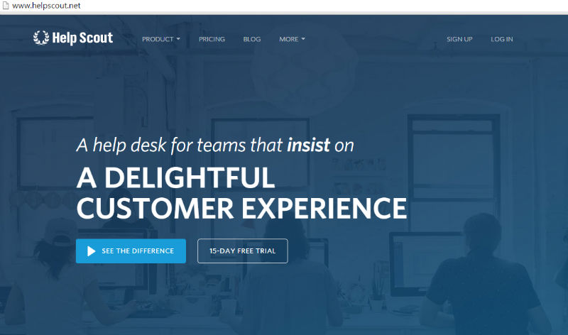
Since there's less clutter on the page, you have a chance to make your USP (Unique Sales Proposition) stand out and shine. Take a look at HelpScout. Their home page has a very clean, elegant design. There are a total of about 10 words above the fold (other than the menu), and a single clean background image that subtly shows people diligently working – perhaps the support team that's going to man your helpdesk.
由于页面上的杂物较少,因此您有机会使您的USP(独特销售主张)脱颖而出并大放异彩。 看一下HelpScout 。 他们的主页具有非常干净,优雅的设计。 折页上方(菜单以外)总共大约有10个字,并且一张清晰的背景图像巧妙地显示了人们勤奋工作的人–也许是支持团队来帮助您的服务台。
Check out some other great examples of good and bad USP over here. Notice a common thread among the 'good' USP examples? They're mostly clean, minimal designs.
在这里查看有关USP优劣的其他一些很好的例子 。 注意“好的” USP示例中的共同点吗? 它们大多是干净的,最小的设计。
3.更少的杂波=更好的转换 (3. Less Clutter = Better Conversion)
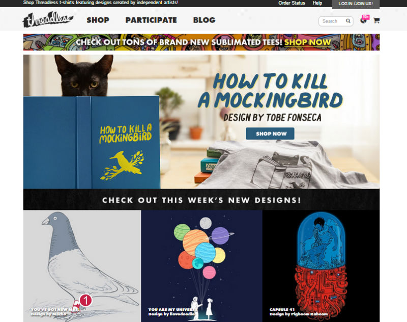
Yes, this should be obvious. But it isn't. Just check this screenshot of the Threadless website just a few weeks ago. Can you find the subscribe button?
是的,这应该很明显。 但事实并非如此。 只需查看几周前Threadless网站的此屏幕截图。 可以找到订阅按钮吗?
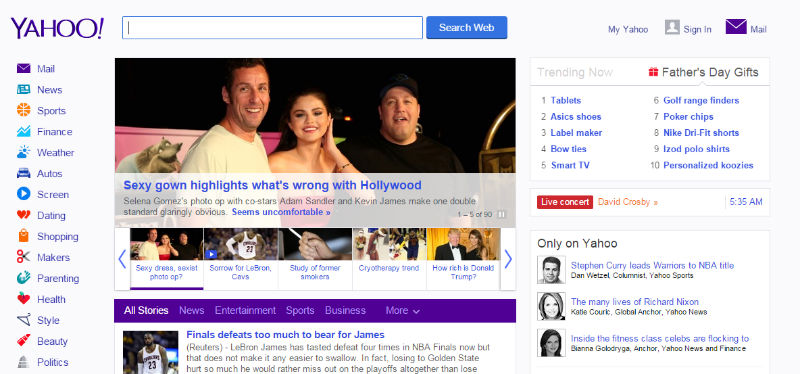
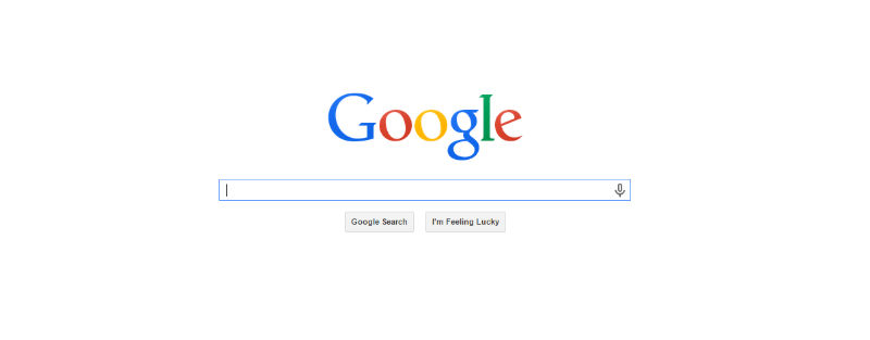
Or better, look at the contrast between Yahoo and Google. Can you guess which of these users are more likely to find and use that search button on?
或者更好,看看雅虎和谷歌之间的对比。 您能猜出其中哪些用户更可能找到并使用该搜索按钮?
or…
要么…
A clean minimalist design helps highlight your CTA in clear, non ambiguous manner.
简洁的设计有助于清晰,清晰地突出您的CTA。
4.响应变得更容易 (4. Responsive is just waay easier)
Mobile highlights the whole 'less is more' experience much better than any thing else. Those who've been designing mobile first, understand the crunch that the smaller screen enforces, and are already used to somewhat minimalist designs. You just can't afford clutter on a 3 inch screen.
移动广告强调,“少即是多”的整体体验要比其他任何事情都要好得多。 那些一直在首先设计移动设备的人了解小屏幕所带来的紧缩,并且已经习惯了一些极简主义的设计。 您只是无法承受3英寸屏幕上的混乱情况。
But it also works the other way around. It's so much easier to make minimalist sites responsive, or even port them for mobile. Simply because the layout is simpler, there are fewer elements, and on the whole, lesser, more meaningful content.
但这也反过来起作用。 使最低限度的网站具有响应能力,甚至将其移植到移动设备上,都非常容易。 仅仅是因为布局更简单,所以元素更少,并且总体上来说,内容更少,更有意义。
用户体验 (User Experience)
5.空间。 空格。 喘息空间。 (5. Space. Whitespace. Breathing space.)
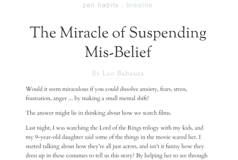
I don't know if it's just me, but there's this sense of calm whitespaces bring. Like it's ok. I don't have to rush. A site that uses whitespace effectively conveys that sense of calm and authority. They know what they're about. They know what matters. They're not going to bury you with stuff. You have the space to be yourself. The ZenHabits blog captures this beautifully, radiating zen.
我不知道是否只有我一个人,但是却带来了这种平静的空白感。 没关系。 我不必着急。 使用空白的网站可以有效地传达这种平静和权威感。 他们知道自己的意思。 他们知道重要的事情。 他们不会用东西埋葬你。 您有空间做自己。 ZenHabits博客记录了精美, 散发出光芒的禅意。
6.导航更容易 (6. Navigation is Easier)
The minimalist agenda to reduce the clutter also holds for navigation menus. Like everything else, the menu is forced to have only as much as absolutely necessary. Again HelpScout got it right. Their top menu has just four elements. They highlight the most important thing visitors would like to know – Product, Pricing, Blog.
减少混乱的简约议程也适用于导航菜单。 像其他所有内容一样,菜单被迫仅包含绝对必要的内容。 再次,HelpScout正确了。 他们的顶级菜单只有四个元素。 它们突出显示了访客想知道的最重要的内容–产品,定价,博客。
Everything else, like the About page, the legal stuff and the help docs are tucked away under "More". No cluttering the top header space. No 3 and 4 level deep menus. This just makes it easier for users to find the right page.
其他所有内容,例如“关于”页面,法律资料和帮助文档,都隐藏在“更多”下。 不会弄乱顶部标题空间。 没有3级和4级深度菜单。 这只是使用户更容易找到正确的页面。
7.优雅,精致 (7. Elegant, sophistication)
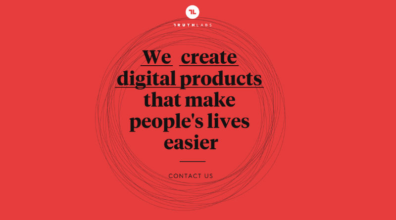
Somehow, a minimalist website exudes an elegance and sophistication. That you're confident enough. That the business is sure of itself. That you're not afraid to stand for what you believe in. Look back at ZenHabits. Or take a look at TruthLabs.
极简主义网站以某种方式散发出优雅和精致。 你有足够的信心。 业务本身就是确定的。 您不怕代表自己的信念。回头看看ZenHabits。 或看看TruthLabs 。
意外的副作用 (Unintentional Side Effects)
8.资源减少。 更少的服务器空间。 更快的下载 (8. Fewer resources. Less server space. Faster downloads)
One of the perhaps unintentional side effects of a minimal site, is that you have less resources. That means less storage space required on your server. That means no overloading your server with large videos, flash or other jazzy content. No slowing it down with a hundred plugins, and overall faster page loads.
最小站点可能造成的意外副作用之一是您拥有较少的资源。 这意味着服务器上所需的存储空间更少。 这意味着,大型视频,Flash或其他爵士内容不会使服务器超载。 百个插件不会降低速度,并且页面加载速度更快。
47% of consumers expect a page to load in 2 seconds or less.
47%的消费者期望页面在2秒或更短的时间内加载。
Kissmetrics has a good infographic showing the impact of page load times on business revenues. Even Google penalizes slow websites.
Kissmetrics的图表很好,显示了页面加载时间对业务收入的影响。 甚至谷歌也对慢速网站进行惩罚 。
9.减少维护工作量 (9. Less Maintenance Effort)
Cleaner designs not only result in fewer resources to save and download, but also fewer resources to maintain. Just updating all the plugins, libraries, frameworks that go into making your website can be a nightmare. And then you have to make sure all the updates haven't caused any compatibility issues.
较干净的设计不仅会减少保存和下载的资源,而且会减少维护的资源。 仅仅更新使您的网站进入的所有插件,库,框架可能是一场噩梦。 然后,您必须确保所有更新都没有引起任何兼容性问题。
With minimal designs, chances are you've skipped the bells and whistles. You don't have as many plugins etc to update.
只需极少的设计,您就有可能跳过风铃。 您没有太多要更新的插件等。
结论 (Conclusion)
Some of the points I've written about would fall under good design principles anyways, but often get skipped in favor of convenience, or a time/price crunch. Minimalist designing forces you to make conscious design decisions. It makes you question each element, each resource on the page – many that we would normally just take for granted. Each resource has to earn it's place. Each element that is not absolutely required, is dropped.
我写过的一些观点无论如何都属于良好的设计原则,但常常由于方便或时间/价格紧缩而被忽略。 极简主义的设计迫使您做出有意识的设计决策。 它使您对页面上的每个元素和每个资源都产生了疑问–许多通常我们认为是理所当然的事情。 每种资源都必须赢得它的位置。 删除不是绝对必需的每个元素。
Note that a minimal design may not work for all scenarios and businesses. You need to take a call about how basic or minimal you want to go with a particular design.
请注意,最小的设计可能不适用于所有方案和业务。 您需要打一个电话,询问您对特定设计的基本要求或最低要求。
At the same time, do remember that just because we can do fancy designs doesn't mean we should. Just because new features, elements, queries have been added to CSS, doesn't mean we need to use them all.
同时,请记住,仅仅因为我们可以进行精美的设计并不意味着我们应该这样做。 仅仅因为CSS已添加了新功能,元素和查询,并不意味着我们需要全部使用它们。
At the end of the day, it's important not to loose focus of the real purpose of the design. Minimalism ensures that you focus on the customer, on the message.
归根结底,重要的是不要失去对设计真正目的的关注。 极简主义确保您专注于客户和消息。
Staying minimal can give a huge ROI.
保持最低水平可以带来巨大的投资回报率。
翻译自: https://www.sitepoint.com/less-minimalist-websites-still-rule/
极简主义的价值观是什么


 3145
3145

 被折叠的 条评论
为什么被折叠?
被折叠的 条评论
为什么被折叠?
 到【灌水乐园】发言


