


蒙特卡罗模拟是一种广泛应用于各个领域的计算技术,它通过从概率分布中随机抽取大量样本,并对结果进行统计分析,从而模拟复杂系统的行为。这种技术具有很强的适用性,在金融建模、工程设计、物理模拟、运筹优化以及风险管理等领域都有广泛的应用。
蒙特卡罗模拟这个名称源自于摩纳哥王国的蒙特卡罗城市,这里曾经是世界著名的赌博天堂。在20世纪40年代,著名科学家乌拉姆和冯·诺依曼参与了曼哈顿计划,他们需要解决与核反应堆中子行为相关的复杂数学问题。他们受到了赌场中掷骰子的启发,设想用随机数来模拟中子在反应堆中的扩散过程,并将这种基于随机抽样的计算方法命名为"蒙特卡罗模拟"(Monte Carlo simulation)。
蒙特卡罗模拟的核心思想是通过大量重复随机试验,从而近似求解分析解难以获得的复杂问题。它克服了传统数值计算方法的局限性,能够处理非线性、高维、随机等复杂情况。随着计算机性能的飞速发展,蒙特卡罗模拟的应用范围也在不断扩展。
在金融领域,蒙特卡罗模拟被广泛用于定价衍生品、管理投资组合风险、预测市场波动等。在工程设计中,它可以模拟材料力学性能、流体动力学等复杂物理过程。在物理学研究中,从粒子物理到天体物理,都可以借助蒙特卡罗模拟进行探索。此外,蒙特卡罗模拟还在机器学习、计算生物学、运筹优化等领域发挥着重要作用。
蒙特卡罗模拟的过程基本上是这样的:
定义模型:首先,需要定义要模拟的系统或过程,包括方程和参数。
生成随机样本:然后根据拟合的概率分布生成随机样本。
进行模拟:针对每一组随机样本,运行模型模拟系统的行为。
分析结果:运行大量模拟后,分析结果以了解系统行为。
当我们演示它的工作原理时,我将演示使用它来模拟未来股票价格的两种分布:高斯分布和学生 t 分布。这两种分布通常被量化分析人员用于股票市场数据。
在这里,我们已经加载了苹果公司从2020年到2024年每日股票价格的数据。
import yfinance as yf
orig = yf.download(["AAPL"], start="2020-01-01", end="2024-12-31")
orig = orig[('Adj Close')]
orig.tail()
[*********************100%%**********************] 1 of 1 completed
Date
2024-03-08 170.729996
2024-03-11 172.750000
2024-03-12 173.229996
2024-03-13 171.130005
2024-03-14 173.000000
Name: Adj Close, dtype: float64可以通过价格序列来计算简单的日收益率,并将其呈现为柱状图。
import pandas as pd
import numpy as np
import matplotlib.pyplot as plt
returns = orig.pct_change()
last_price = orig[-1]
returns.hist(bins=100)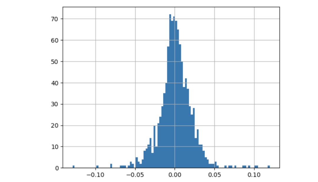
标准正态分布拟合收益率
股票的历史波动率通常是通过计算股票每日收益率的标准差来进行。我们假设未来的波动率与历史波动率相似。而直方图则呈现了以0.0为中心的正态分布的形状。为简单起见,我们将该分布假定为均值为0,标准差为0的高斯分布。接下来,我们会计算出标准差(也称为日波动率)。因此,预计明天的日收益率将会是高斯分布中的一个随机值。
daily_volatility = returns.std()
rtn = np.random.normal(0, daily_volatility)
第二天的价格是今天的价格乘以 (1+return %):
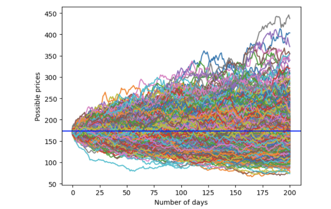
price = last_price * (1 + rtn)以上是股票价格和收益的基本财务公式。我们将使用蒙特卡洛模拟。为了预测明天的价格,我们可以随机抽取另一个收益率,从而推算后天的价格。通过这个过程,我们可以得出未来 200 天可能的价格走势之一。当然,这只是一种可能的价格路径。我们可以重复这个过程,得出另一条价格路径。我们将重复这个过程 1,000 次,得出 1,000 条价格路径。
import warnings
warnings.simplefilter(action='ignore', category=pd.errors.PerformanceWarning)

num_simulations = 1000
num_days = 200
simulation_df = pd.DataFrame()
for x in range(num_simulations):
    count = 0
    # The first price point
    price_series = []
    rtn = np.random.normal(0, daily_volatility)
    price = last_price * (1  + rtn)
    price_series.append(price)
    # Create each price path
    for g in range(num_days):
        rtn = np.random.normal(0, daily_volatility)
        price = price_series[g] * (1  + rtn)
        price_series.append(price)
    # Save all the possible price paths
    simulation_df[x] = price_series
fig = plt.figure()
plt.plot(simulation_df)
plt.xlabel('Number of days')
plt.ylabel('Possible prices')
plt.axhline(y = last_price, color = 'b', linestyle = '-')
plt.show()
分析结果如下: 价格起始于179.66美元。大部分价格路径相互交叠。模拟价格范围为100美元至500美元。
假设我们想知道90%情况下(5%到95%)出现的"正常"价格范围,可以使用量化方法得到上限和下限,从而评估超出这些极端价格。
upper = simulation_df.quantile(.95, axis=1)
lower = simulation_df.quantile(.05, axis=1)
stock_range = pd.concat([upper, lower], axis=1)

fig = plt.figure()
plt.plot(stock_range)
plt.xlabel('Number of days')
plt.ylabel('Possible prices')
plt.axhline(y = last_price, color = 'b', linestyle = '-')
plt.show()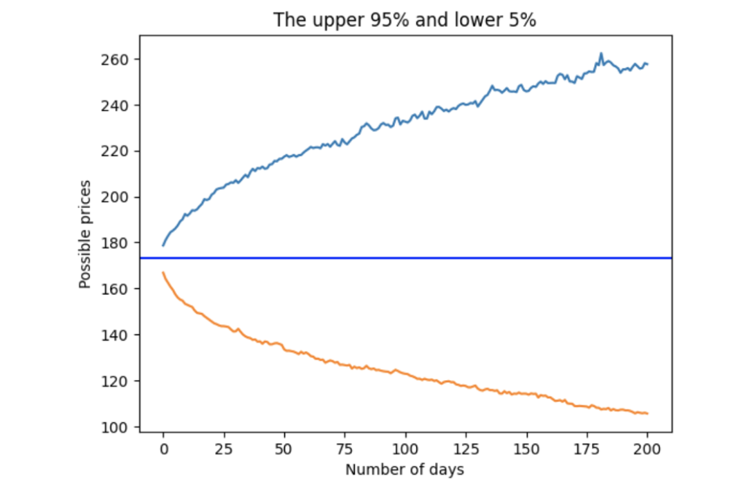
学生t分布拟合收益率
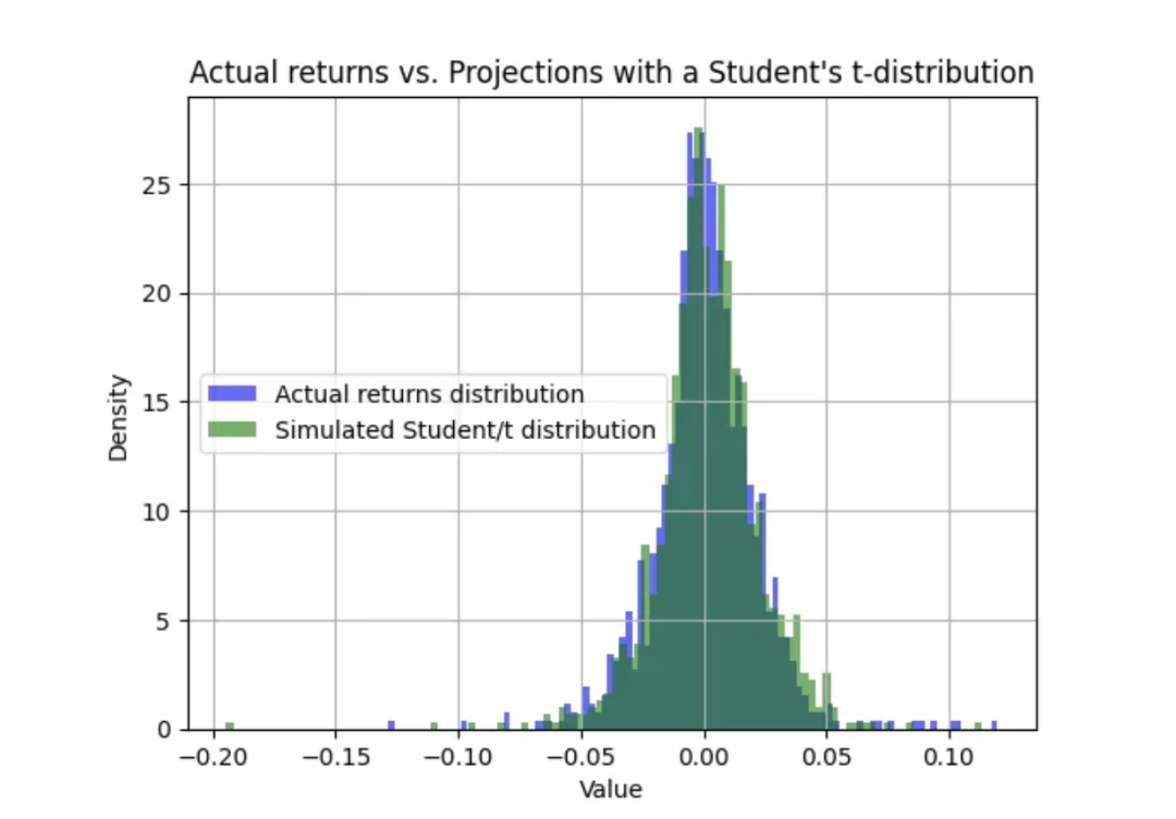
股票价格回报偶尔会出现极端事件,位于分布两端。标准正态分布预计 95% 的收益率发生在两个标准差之内,5% 的收益率发生在两个标准差之外。如果极端事件发生的频率超过 5%,分布看起来就会 "变胖"。这就是统计学家所说的肥尾,定量分析人员通常使用学生 t 分布来模拟股价收益率。
学生 t 分布有三个参数:自由度参数、标度和位置。
自由度:自由度参数表示用于估计群体参数的样本中独立观测值的数量。自由度越大,t 分布的形状越接近标准正态分布。在 t 分布中,自由度范围是大于 0 的任何正实数。
标度:标度参数代表分布的扩散性或变异性,通常是采样群体的标准差。
位置:位置参数表示分布的位置或中心,即采样群体的平均值。当自由度较小时,t 分布的尾部较重,类似于胖尾分布。
用学生 t 分布来拟合实际股票收益率。
import numpy as np
import matplotlib.pyplot as plt
from scipy.stats import t

returns = orig.pct_change()

# Number of samples per simulation
num_samples = 100

# distribution fitting
returns = returns[1::] # Drop the first element, which is "NA"
params = t.fit(returns[1::]) # fit with a student-t

# Generate random numbers from Student's t-distribution
results = t.rvs(df=params[0], loc=params[1], scale=params[2], size=1000)
# Generate random numbers from Student's t-distribution
results = t.rvs(df=params[0], loc=params[1], scale=params[2], size=1000)
print('degree of freedom = ', params[0])
print('loc = ', params[1])
print('scale = ', params[2])
参数如下
自由度 = 3.735
位置 = 0.001
标度 = 0.014
我们将使用这些参数来预测 Student-t 分布。然后,我们将用 Student-t 分布绘制实际股票收益分布图。
returns.hist(bins=100,density=True, alpha=0.6, color='b', label='Actual returns distribution')

# Plot histogram of results
plt.hist(results, bins=100, density=True, alpha=0.6, color='g', label='Simulated Student/t distribution')

plt.xlabel('Value')
plt.ylabel('Density')
plt.title('Actual returns vs. Projections with a Student\'s t-distribution')
plt.legend(loc='center left')
plt.grid(True)
plt.show()
实际回报与预测相当接近:
与之前一样,我们将模拟未来 200 天的价格走势。
import warnings
warnings.simplefilter(action='ignore', category=pd.errors.PerformanceWarning)

num_simulations = 1000
num_days = 200
simulation_student_t = pd.DataFrame()
for x in range(num_simulations):
    count = 0
    # The first price point
    price_series = []
    rtn = t.rvs(df=params[0], loc=params[1], scale=params[2], size=1)[0]
    price = last_price * (1  + rtn)
    price_series.append(price)
    # Create each price path
    for g in range(num_days):
        rtn = t.rvs(df=params[0], loc=params[1], scale=params[2], size=1)[0]
        price = price_series[g] * (1  + rtn)
        price_series.append(price)
    # Save all the possible price paths
    simulation_student_t[x] = price_series
fig = plt.figure()
plt.plot(simulation_student_t)
plt.xlabel('Number of days')
plt.ylabel('Possible prices')
plt.axhline(y = last_price, color = 'b', linestyle = '-')
plt.show()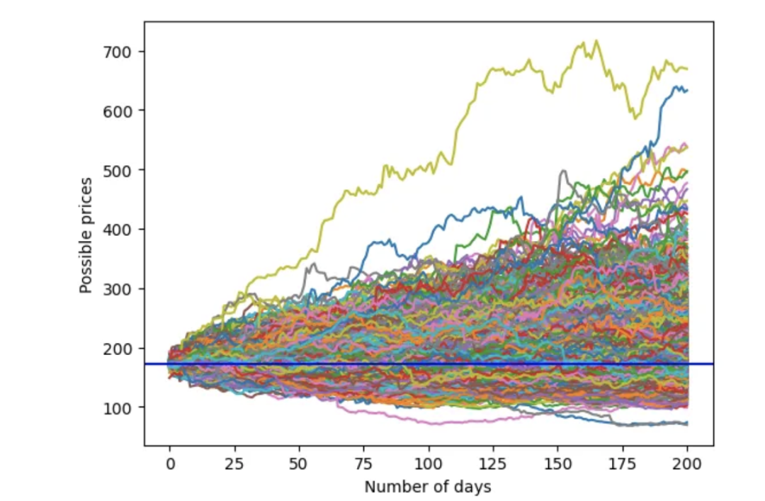
可以绘制出学生 t 的蒙特卡罗模拟置信区间上下限(95%、5%):
upper = simulation_student_t.quantile(.95, axis=1)
lower = simulation_student_t.quantile(.05, axis=1)
stock_range = pd.concat([upper, lower], axis=1)

fig = plt.figure()
plt.plot(stock_range)
plt.xlabel('Number of days')
plt.ylabel('Possible prices')
plt.title('The upper 95% and lower 5%')
plt.axhline(y = last_price, color = 'b', linestyle = '-')
plt.show()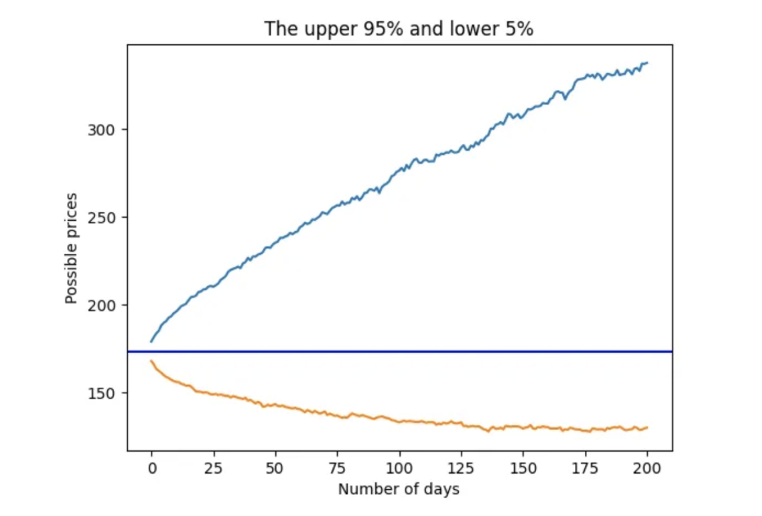

往期精彩回顾


适合初学者入门人工智能的路线及资料下载(图文+视频)机器学习入门系列下载机器学习及深度学习笔记等资料打印《统计学习方法》的代码复现专辑
交流群
欢迎加入机器学习爱好者微信群一起和同行交流,目前有机器学习交流群、博士群、博士申报交流、CV、NLP等微信群,请扫描下面的微信号加群,备注:”昵称-学校/公司-研究方向“,例如:”张小明-浙大-CV“。请按照格式备注,否则不予通过。添加成功后会根据研究方向邀请进入相关微信群。请勿在群内发送广告,否则会请出群,谢谢理解~(也可以加入机器学习交流qq群772479961)


 677
677

 被折叠的 条评论
为什么被折叠?
被折叠的 条评论
为什么被折叠?
 到【灌水乐园】发言


