


柱状图又叫条形图,是数据展示最重要的一类统计图,数据分析结果展示中使用频率非常高,各类统计软件均能绘制。在R语言中,有很多包可绘制柱状图,比如graphics包barplot()函数和ggplot2包geom_bar()函数。 本文介绍graphics包的barplot()函数绘制柱状图。
barplot()函数的基本用法:
barplot(height,              # 柱子的高度
        names.arg = NULL,    # 柱子的名称
        col = NULL,          # 柱子的填充颜色
        border = par("fg"),  # 柱子的轮廓颜色
        main = NULL,         # 柱状图主标题
        xlab = NULL,         # X轴标签
        ylab = NULL,         # Y轴标签
        xlim = NULL,         # X轴取值范围
        ylim = NULL,         # Y轴取值范围
        horiz = FALSE,       # 柱子是否为水平
        legend.text = NULL,  # 图例文本
        beside = FALSE,      # 柱子是否为平行放置,用的频率低,本文不介绍
       )
柱子的高度是必须要的参数,数据类型为数值型向量或者矩阵。如果是一个数值型向量,那么向量中的每个数字即为每个柱子的高度,适用于绘制单个变量的柱状图;如果传入一个矩阵,那么矩阵的每一列都对应一个柱子,柱子的高度为每一列的数字之和,每个柱子内部根据每一行数字的不同进行了划分,适用于两个变量交叉的柱状图。
#同一界面显示多张图
par(mfcol=c(1,2))
# 传入数值型向量
vector = c(6, 4, 8) # 绘图数据(数值型向量)
barplot(height = vector)  # 绘制条形图
# 传入矩阵
matrix = matrix(1:4, ncol = 2, nrow = 2)  # 绘图数据(矩阵)
barplot(height = matrix)  # 绘制条形图
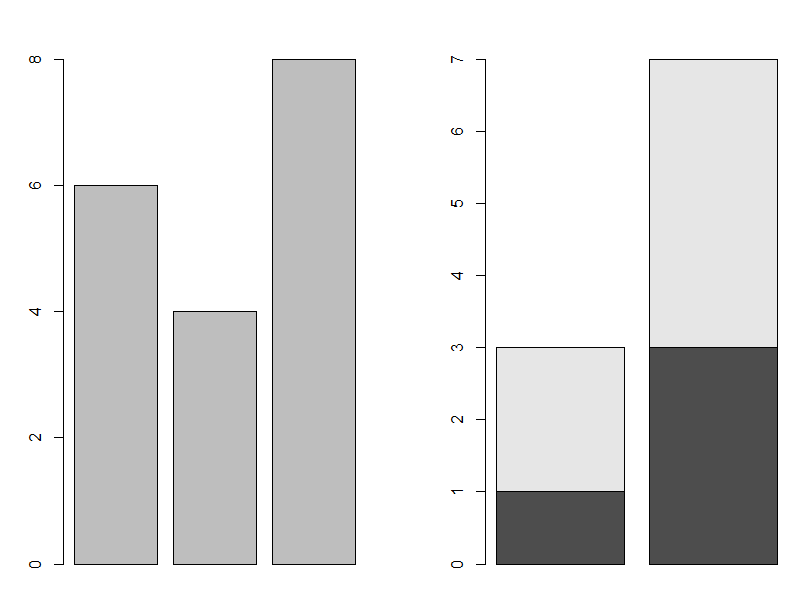
数值型向量图(左)和矩阵图(右)
#修改柱子的名称
barplot(height = c(20, 48),  # 绘图数据(数值型向量)
        names.arg = c('A', 'B'),  # 柱子名称
)
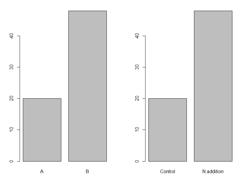
添加柱子名称的柱状图
#修改柱子的颜色(填充和轮廓)
barplot(height = c(20, 48),  # 绘图数据(数值型向量)
        names.arg = c('Control', 'N addition'),  # 柱子名称
        col = "white", #柱子颜色为白色
        border = "black" #柱子边框为黑色
)
barplot(height = c(20, 48),  # 绘图数据(数值型向量)
        names.arg = c('Control', 'N addition'),  # 柱子名称
        col = "green", #柱子颜色为绿色
        border = "black" #柱子边框为黑
)


##修改堆积图的颜色(填充和轮廓
#修改柱子的颜色(填充和轮廓)
barplot(height = matrix(1:4, ncol = 2, nrow = 2),  # 绘图数据(矩阵)
        names.arg = c('Control', 'N addition'),  # 柱子名称
        col = c('red', 'green'),  # 填充颜色
        border = 'black')  # 轮廓颜色

barplot(height = matrix(1:4, ncol = 2, nrow = 2),  # 绘图数据(矩阵)
        names.arg = c('Control', 'N addition'),  # 柱子名称
        col = c('white', 'green'),  # 填充颜色
        border = 'black')  # 轮廓颜色
白色和绿色填充的柱状图
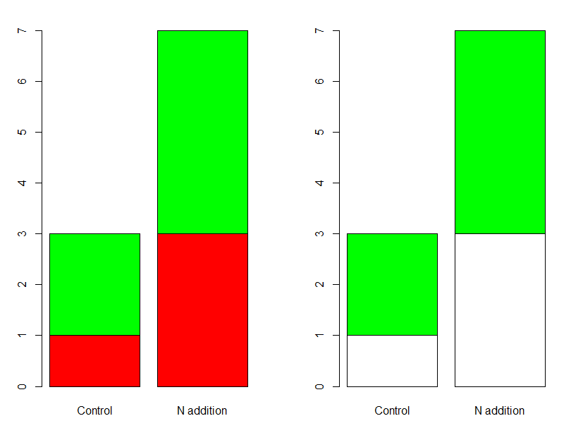
颜色填充的堆积柱状图
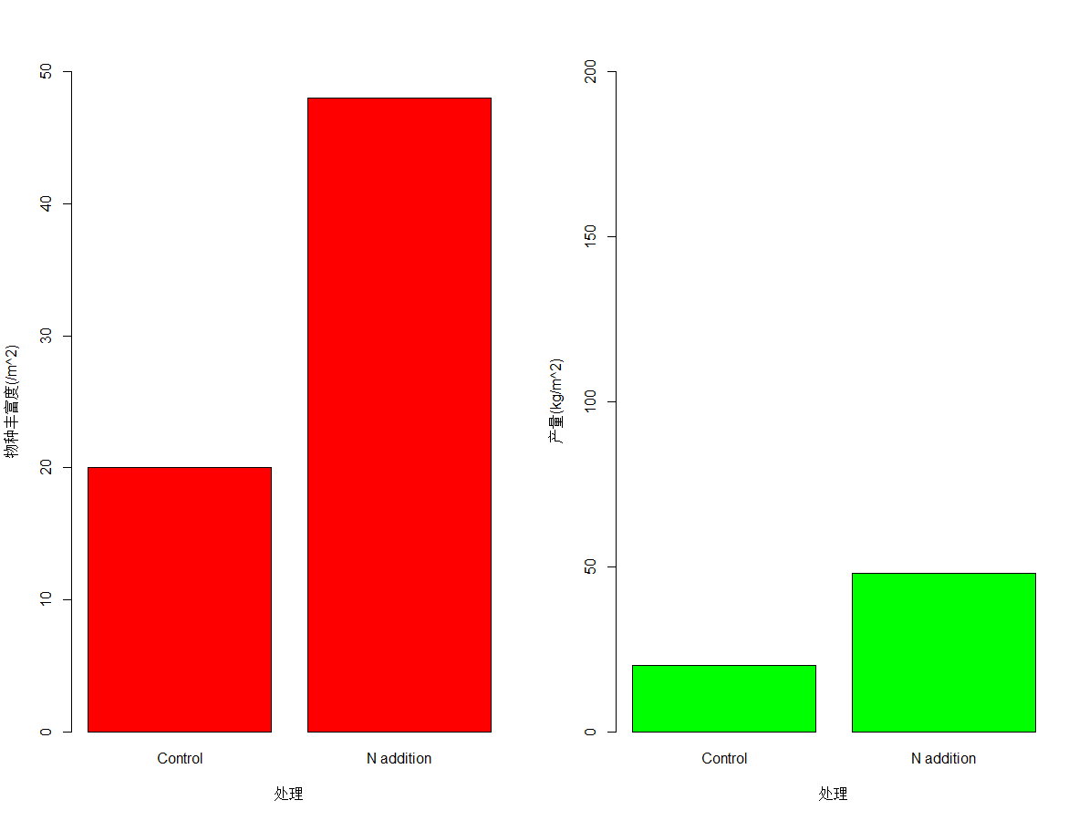
barplot(height = c(20, 48),  # 绘图数据(数值型向量)
        names.arg = c('Control', 'N addition'),  # 柱子名称
        col = 'red',  # 填充颜色
        border = 'black', # 轮廓颜色
        xlab = '处理',  # X轴标题
        ylab = '物种丰富度(/m^2)')  # Y轴标题
barplot(height = c(20, 48),  # 绘图数据(数值型向量)
        names.arg = c('Control', 'N addition'),  # 柱子名称
        col = 'green',  # 填充颜色
        border = 'black', # 轮廓颜色
        xlab = '处理',  # X轴标题
        ylab = '产量(kg/m^2)')  # Y轴标题
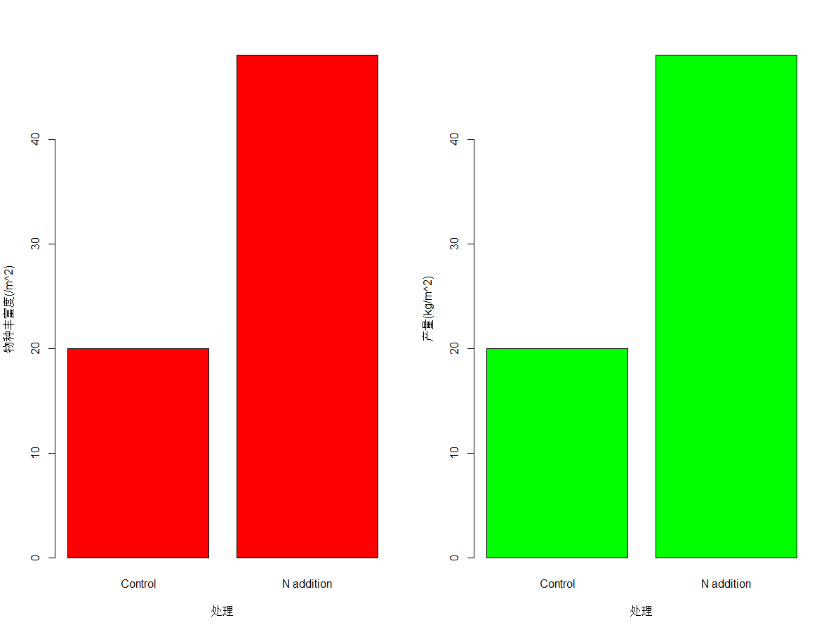
物种丰富度和产量柱状图
#修改X和Y轴坐标轴取值范围
barplot(height = c(20, 48),  # 绘图数据(数值型向量)
        names.arg = c('Control', 'N addition'),  # 柱子名称
        col = 'red',  # 填充颜色
        border = 'black', # 轮廓颜色
        xlab = '处理',  # X轴标题
        ylab = '物种丰富度(/m^2)', # Y轴标题
        ylim = c(0, 50))  # Y轴范围

barplot(height = c(20, 48),  # 绘图数据(数值型向量)
        names.arg = c('Control', 'N addition'),  # 柱子名称
        col = 'green',  # 填充颜色
        border = 'black', # 轮廓颜色
        xlab = '处理',  # X轴标题
        ylab = '产量(kg/m^2)', # Y轴标题
        ylim = c(0, 200))  # Y轴范围)
修改X和Y轴坐标轴的柱状图
#设置图例的内容和位置
barplot(height = c(50, 30),  # 绘图数据(数值型向量)
        names.arg = c('Control', 'N addition'),  # 柱子名称
        col = c('white','black'),  # 填充颜色
        border = 'black', # 轮廓颜色
        xlab = '处理',  # X轴标题
        ylab = '物种丰富度(/m^2)', # Y轴标题
        ylim = c(0, 50), # Y轴范围
        legend.text = c('Control','N addition'),#设置图例的内容
        args.legend = list(x = "topright")) #修改图例的位置
添加图例的柱状图
barplot()函数绘制柱状图较为美观,但是存在一定的缺陷,比如图例的位置只有固定的几个参数(如下图),无法自定义设置位置:

图例位置参数
附官方示例代码:
Examples
# Formula method
barplot(GNP ~ Year, data = longley)
barplot(cbind(Employed, Unemployed) ~ Year, data = longley)

## 3rd form of formula - 2 categories :
op <- par(mfrow = 2:1, mgp = c(3,1,0)/2, mar = .1+c(3,3:1))
summary(d.Titanic <- as.data.frame(Titanic))
barplot(Freq ~ Class + Survived, data = d.Titanic,
        subset = Age == "Adult" & Sex == "Male",
        main = "barplot(Freq ~ Class + Survived, *)", ylab = "# {passengers}", legend = TRUE)
# Corresponding table :
(xt <- xtabs(Freq ~ Survived + Class + Sex, d.Titanic, subset = Age=="Adult"))
# Alternatively, a mosaic plot :
mosaicplot(xt[,,"Male"], main = "mosaicplot(Freq ~ Class + Survived, *)", color=TRUE)
par(op)


# Default method
require(grDevices) # for colours
tN <- table(Ni <- stats::rpois(100, lambda = 5))
r <- barplot(tN, col = rainbow(20))
#- type = "h" plotting *is* 'bar'plot
lines(r, tN, type = "h", col = "red", lwd = 2)

barplot(tN, space = 1.5, axisnames = FALSE,
        sub = "barplot(..., space= 1.5, axisnames = FALSE)")

barplot(VADeaths, plot = FALSE)
barplot(VADeaths, plot = FALSE, beside = TRUE)

mp <- barplot(VADeaths) # default
tot <- colMeans(VADeaths)
text(mp, tot + 3, format(tot), xpd = TRUE, col = "blue")
barplot(VADeaths, beside = TRUE,
        col = c("lightblue", "mistyrose", "lightcyan",
                "lavender", "cornsilk"),
        legend = rownames(VADeaths), ylim = c(0, 100))
title(main = "Death Rates in Virginia", font.main = 4)

hh <- t(VADeaths)[, 5:1]
mybarcol <- "gray20"
mp <- barplot(hh, beside = TRUE,
        col = c("lightblue", "mistyrose",
                "lightcyan", "lavender"),
        legend = colnames(VADeaths), ylim = c(0,100),
        main = "Death Rates in Virginia", font.main = 4,
        sub = "Faked upper 2*sigma error bars", col.sub = mybarcol,
        cex.names = 1.5)
segments(mp, hh, mp, hh + 2*sqrt(1000*hh/100), col = mybarcol, lwd = 1.5)
stopifnot(dim(mp) == dim(hh))  # corresponding matrices
mtext(side = 1, at = colMeans(mp), line = -2,
      text = paste("Mean", formatC(colMeans(hh))), col = "red")

# Bar shading example
barplot(VADeaths, angle = 15+10*1:5, density = 20, col = "black",
        legend = rownames(VADeaths))
title(main = list("Death Rates in Virginia", font = 4))

# Border color
barplot(VADeaths, border = "dark blue")


# Log scales (not much sense here)
barplot(tN, col = heat.colors(12), log = "y")
barplot(tN, col = gray.colors(20), log = "xy")

# Legend location
barplot(height = cbind(x = c(465, 91) / 465 * 100,
                       y = c(840, 200) / 840 * 100,
                       z = c(37, 17) / 37 * 100),
        beside = FALSE,
        width = c(465, 840, 37),
        col = c(1, 2),
        legend.text = c("A", "B"),
        args.legend = list(x = "topleft"))
本文介绍graphics包barplot()函数绘制柱状图,下篇文章介绍ggplot2包geom_bar()函数绘制柱状图。
参考文献
[1] https://zhuanlan.zhihu.com/p/107027448.
[2] Becker, R. A., Chambers, J. M. and Wilks, A. R. (1988) The New S Language. Wadsworth & Brooks/Cole.
[3] Murrell, P. (2005) R Graphics. Chapman & Hall/CRC Press.


 924
924


 被折叠的 条评论
为什么被折叠?
被折叠的 条评论
为什么被折叠?
 到【灌水乐园】发言


