


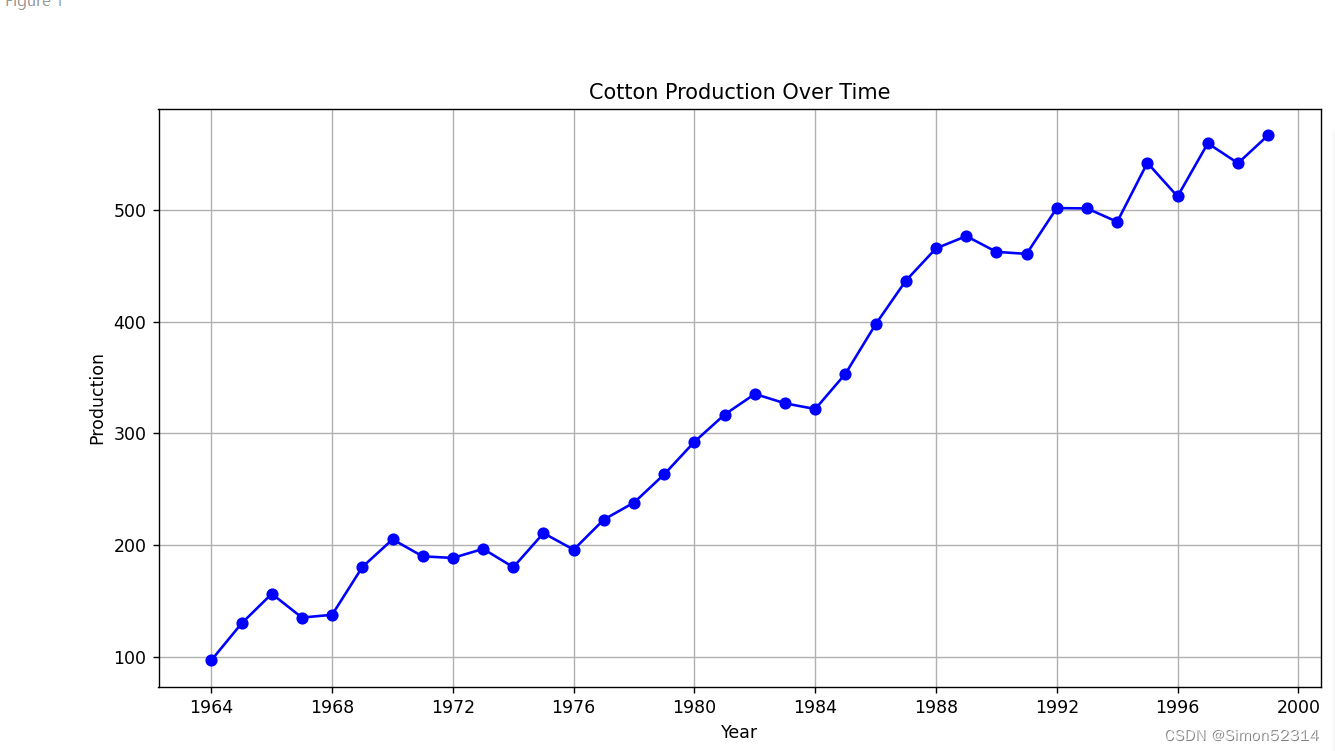
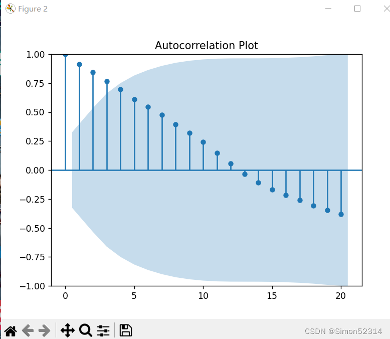
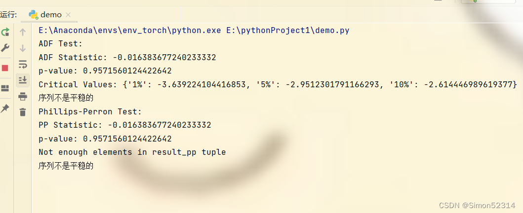
 该篇文章介绍了对中国纱产量从1964年到1999年的数据分析,通过图示、自相关系数计算、随机性检验以及ADF和PP平稳性检验来确定生产数据的时间序列特征,评估其是否平稳。
1、实验内容:
分析1964年到1999年中国纱产量的时间序列,主要内容包括:
(1)、通过图分析时间序列的平稳性,这个方法很直观,但比较粗糙;
(2)、通过计算序列的自相关和偏自相关系数,绘出自相关图,根据平稳时间序列的性质分析其平稳性;
(3)、进行纯随机性检验,并分析其随机性;
(4)、平稳性的ADF检验,并分析其平稳性;
(5)、平稳性的pp检验,并分析其平稳性。
实验代码
import pandas as pd
import matplotlib.pyplot as plt
from statsmodels.graphics.tsaplots import plot_acf, plot_pacf
from statsmodels.tsa.stattools import adfuller
# 创建一个包含数据的DataFrame
data = {
    'Year': [1964, 1965, 1966, 1967, 1968, 1969, 1970, 1971, 1972, 1973, 1974, 1975, 1976, 1977, 1978, 1979, 1980, 1981, 1982, 1983, 1984, 1985, 1986, 1987, 1988, 1989, 1990, 1991, 1992, 1993, 1994, 1995, 1996, 1997, 1998, 1999],
    'Production': [97.0, 130.0, 156.5, 135.2, 137.7, 180.5, 205.2, 190.0, 188.6, 196.7, 180.3, 210.8, 196.0, 223.0, 238.2, 263.5, 292.6, 317.0, 335.4, 327.0, 321.9, 353.5, 397.8, 436.8, 465.7, 476.7, 462.6, 460.8, 501.8, 501.5, 489.5, 542.3, 512.2, 559.8, 542.0, 567.0]
}

df = pd.DataFrame(data)

# 将年份列转换为日期时间格式
df['Year'] = pd.to_datetime(df['Year'], format='%Y')

# 设置年份列为索引
df.set_index('Year', inplace=True)
# ADF检验
result_adf = adfuller(df['Production'])
print('ADF Test:')
print('ADF Statistic:', result_adf[0])
print('p-value:', result_adf[1])
print('Critical Values:', result_adf[4])

# 判断序列是否平稳
if result_adf[1] < 0.05:
    print('序列是平稳的')
else:
    print('序列不是平稳的')
#  PP检验
result_pp = adfuller(df['Production'], autolag='AIC', regression='c', regresults=True)
print('Phillips-Perron Test:')
print('PP Statistic:', result_pp[0])
print('p-value:', result_pp[1])

# 检查元组长度以避免 IndexError
if len(result_pp) > 4:
    print('Critical Values:', result_pp[4])
else:
    print('Not enough elements in result_pp tuple')

# 分析平稳性
if result_pp[1] < 0.05:
    print('序列是平稳的')
else:
    print('序列不是平稳的')
# 绘制折线图
plt.figure(figsize=(12, 6))
plt.plot(df.index, df['Production'], marker='o', color='b', linestyle='-')
plt.title('Cotton Production Over Time')
plt.xlabel('Year')
plt.ylabel('Production')
plt.grid(True)
plt.show()

# 绘制自相关图
plt.figure(figsize=(12, 6))
plot_acf(df['Production'], lags=20, title='Autocorrelation Plot')
plt.show()
实验结果


 3万+
3万+


 被折叠的 条评论
为什么被折叠?
被折叠的 条评论
为什么被折叠?
 到【灌水乐园】发言


