


package needed:
library(gmodels)
library(ggplot2)
总结数据的基本特征
CrossTable(Survey_GE_class_choice_1$Followed_GEC,prop.t=TRUE)这行代码使用了 CrossTable 函数,来自 gmodels 包,用于创建一个交叉表(或列联表)。这个函数非常适合用于查看两个分类变量之间的关系。在这个例子中,它被用来查看 Survey_GE_class_choice_1$Followed_GEC 这一列的数据分布。
> CrossTable(Survey_GE_class_choice_1$Followed_GEC,prop.t=TRUE)


   Cell Contents
|-------------------------|
|                       N |
|         N / Table Total |
|-------------------------|


Total Observations in Table:  59


                       |       History of China | Societies inequalities | Western economic & Law |
                       |------------------------|------------------------|------------------------|
                       |                     20 |                     19 |                     20 |
                       |                  0.339 |                  0.322 |                  0.339 |
                       |------------------------|------------------------|------------------------|
Survey_GE_class_choice_1$Followed_GEC: 指定了数据集Survey_GE_class_choice_1中的Followed_GEC列,这可能是一个表示学生跟随的一般教育课程(GEC)的分类变量。prop.t=TRUE: 这个参数表示在交叉表中显示列百分比。这有助于理解每个类别在总体中所占的比例。
总的来说,这行代码用于生成一个交叉表,显示 Followed_GEC 类别的分布情况,并计算每个类别的百分比。这对于快速了解数据的分布情况非常有用。
根据刚才获得的数据特征创建一个dataframe来处理饼图所需要的数据:
df_piechart <- data.frame(GEC=c("History of China", "Societies inequalities", "Western economic and law"),
                          n=c(20, 19, 20),
                          prop=c(33.9, 32.2, 33.9))
使用 ggplot2 包绘制了一个饼图
ggplot(df_piechart, aes(x="", y=prop, fill=GEC)) +
  geom_bar(width=1, stat="identity", color="white") +
  coord_polar("y", start=0) +
  geom_text(aes(label=paste0(round(prop), "%")), position=position_stack(vjust=0.5)) +
  theme(panel.background = element_blank(), axis.text = element_blank(), axis.line = element_blank(),
        axis.ticks = element_blank(), axis.title = element_blank(), plot.title = element_blank())
分割不同子集来获取部分数据
Survey_GE_class_choice_1_women<-subset(Survey_GE_class_choice_1,Gender=="Female")
Survey_GE_class_choice_1_men<-subset(Survey_GE_class_choice_1,Gender=="Male")
代码解释:
Survey_GE_class_choice_1_women <- subset(Survey_GE_class_choice_1, Gender == "Female"): 这行代码创建了一个新的数据框Survey_GE_class_choice_1_women,它只包含Survey_GE_class_choice_1中性别为女性(Female)的记录。Survey_GE_class_choice_1_men <- subset(Survey_GE_class_choice_1, Gender == "Male"): 这行代码创建了一个新的数据框Survey_GE_class_choice_1_men,它只包含Survey_GE_class_choice_1中性别为男性(Male)的记录。
通过这种方式,可以分别对男性和女性的数据进行分析和可视化。
注意:
> CrossTable(Survey_GE_class_choice_1_women)
Error in marginSums(x, margin) : 'x'不是陈列
CrossTable(Survey_GE_class_choice_1_women) 出现错误是因为 CrossTable 函数需要至少两个参数来创建交叉表,通常是两个变量或数据框的两列。在你的例子中,Survey_GE_class_choice_1_women 是一个数据框,而不是单个变量。
如果你想要创建一个关于女性参与者选择的通识教育课程(GEC)的交叉表,你需要指定两个变量,例如 Gender 和 Followed_GEC。但由于 Survey_GE_class_choice_1_women 已经被过滤为只包含女性,你可以直接使用 Followed_GEC 列来创建交叉表:
CrossTable(Survey_GE_class_choice_1_women$Followed_GEC, prop.t = TRUE)
在 CrossTable 函数中,prop.t = TRUE 参数的作用是显示列联表(交叉表)中每个单元格的比例(百分比)。这些比例是基于表中的总数计算的,使得你可以更容易地比较不同类别之间的相对频率。
df_piechart_women<-data.frame(GEC=c("History of China","Societies inequalities","Western economic and law"),n=c(17,9,4),prop=c(56.7,30.0,13.3))
ggplot(df_piechart_women,aes(x="",y=prop,fill=GEC))+geom_bar(width=1,stat="identity",color="white")+coord_polar("y",start=0)+geom_text(aes(label=paste0(round(prop),"%")),position=position_stack(vjust=0.5))+theme(panel.background = element_blank(),axis.text = element_blank(),axis.line = element_blank(),axis.ticks = element_blank(),axis.title = element_blank(),plot.title = element_blank())

df_piechart_men<-data.frame(GEC=c("History of China","Societies inequalities","Western economic and law"),n=c(3,10,16),prop=c(10.3,34.4,55.17))
ggplot(df_piechart_men,aes(x="",y=prop,fill=GEC))+geom_bar(width=1,stat="identity",color="white")+coord_polar("y",start=0)+geom_text(aes(label=paste0(round(prop),"%")),position=position_stack(vjust=0.5))+theme(panel.background = element_blank(),axis.text = element_blank(),axis.line = element_blank(),axis.ticks = element_blank(),axis.title = element_blank(),plot.title = element_blank())
并排画出男女生在毕业后的去向fill柱状图
ggplot(Survey_GE_class_choice_1,aes(x=Major,fill=Project_after_graduate))+geom_bar(position="fill")+facet_wrap(~Gender)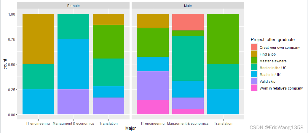
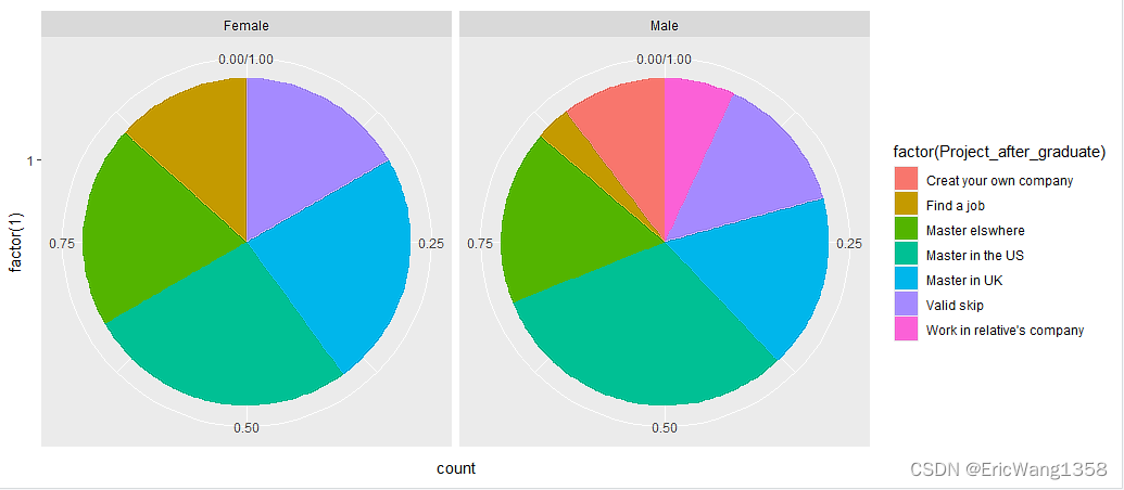
并排画出两个饼图:
ggplot(Survey_GE_class_choice_1,aes(x = factor(1),fill=factor(Project_after_graduate))) + facet_wrap(~Gender) + geom_bar(width = 1,position = "fill") + coord_polar(theta="y")-
ggplot(Survey_GE_class_choice_1, aes(x = factor(1), fill = factor(Project_after_graduate))):- 设置数据源为
Survey_GE_class_choice_1。 aes设置美学映射,其中x = factor(1)将所有数据映射到同一个位置(因为饼图不需要 x 轴的实际值),fill = factor(Project_after_graduate)表示用不同的颜色填充饼图的扇形,颜色根据毕业后计划的不同类别来区分。
- 设置数据源为
-
facet_wrap(~Gender):- 按性别分面展示,即为每个性别创建一个单独的饼图。
-
geom_bar(width = 1, position = "fill"):- 使用条形图几何对象创建饼图,
width = 1表示条形图的宽度为 1,这在转换为饼图时会占满整个圆。 position = "fill"确保每个条形图的高度都被标准化,使得每个扇形的大小代表在该性别组中的比例。
- 使用条形图几何对象创建饼图,
-
coord_polar(theta = "y"):- 将坐标系转换为极坐标系,
theta = "y"表示使用y轴的值(即条形图的高度)作为极坐标的角度,从而将条形图转换为饼图。
- 将坐标系转换为极坐标系,
总的来说,这行代码创建了一个按性别分面展示的饼图,展示了不同性别的学生在毕业后计划方面的分布情况。每个饼图的扇形大小表示在该性别组中选择特定计划的学生所占的比例。
ggplot(Survey_GE_class_choice_1,aes(x = factor(1),fill=factor(Project_after_graduate))) + facet_wrap(~Rank) + geom_bar(width = 1,position = "fill") + coord_polar(theta="y")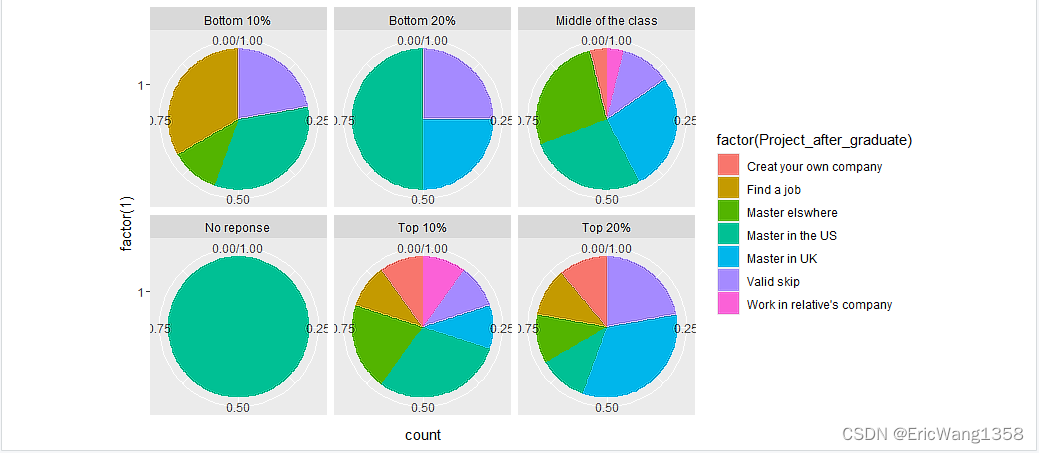


 3501
3501


 被折叠的 条评论
为什么被折叠?
被折叠的 条评论
为什么被折叠?
 到【灌水乐园】发言


