


Matplotlib 能够创建多数类型的图表,如条形图,散点图,条形图,饼图,堆叠图,盒图和小提琴图等。
第一.图例、标题和标签
import matplotlib.pyplot as plt
%matplotlib inline
x = [1,2,3]
y = [5,7,4]

x2 = [1,2,3]
y2 = [10,14,12]
plt.plot(x, y, label='First Line')
plt.plot(x2, y2, label='Second Line')
plt.legend()#显示上面两个线标
plt.xlabel('Plot Number')
plt.ylabel('Important var')
plt.title('Interesting Graph\nCheck it out')#\n是表示分行显示
plt.show()#显示纯图形,注释掉的话,会在图形上方多显示一行字“Text(0.5,1,'Interesting Graph\nCheck it out')”
第二.条形图和直方图
条形图:显示的是每个数据
import matplotlib.pyplot as plt
%matplotlib inline
plt.bar([1,3,5,7,9],[5,2,7,8,2], label="Example one",color='b')
plt.bar([2,4,6,8,10],[8,6,2,5,6], label="Example two", color='g')
plt.legend()
plt.xlabel('bar number')
plt.ylabel('bar height')
plt.title('Bar Graph')
plt.show()
直方图:统计每个分组段数据的个数
import matplotlib.pyplot as plt
%matplotlib inline
population_ages = [22,55,62,45,21,22,34,42,42,4,99,102,110,120,121,122,130,111,115,112,80,75,65,54,44,43,42,48]

bins = [0,10,20,30,40,50,60,70,80,90,100,110,120,130]

plt.hist(population_ages, bins, histtype='bar',label='p_ages count', rwidth=0.8)
plt.xlabel('x')
plt.ylabel('y')
plt.title('Interesting Graph\nCheck it out')
plt.legend()
plt.show()
第三.散点图
散点图:显示的是每个数据
import matplotlib.pyplot as plt
%matplotlib inline
x = [1,2,3,4,5,6,7,8]
y = [5,2,4,2,1,4,5,2]
plt.scatter(x,y, label='skitscat', color='r', s=25, marker="o")
plt.xlabel('x')
plt.ylabel('y')
plt.title('Interesting Graph\nCheck it out')
plt.legend(loc='best')
plt.show()
第四.堆叠图和饼图
堆叠图:用于显示『部分对整体』随时间的关系。
例如:我们一天有 24 小时,我们想看看我们如何花费时间。 我们将我们的活动分为:睡觉,吃饭,工作和玩耍。我们假设我们要在 5 天的时间内跟踪它。
import matplotlib.pyplot as plt
%matplotlib inline
days = [1,2,3,4,5]

sleeping = [7,8,6,11,7]
eating =   [2,3,4,3,2]
working =  [7,8,7,2,2]
playing =  [8,5,7,8,13]

plt.plot([],[],color='m', label='Sleeping', linewidth=5)
plt.plot([],[],color='c', label='Eating', linewidth=5)
plt.plot([],[],color='r', label='Working', linewidth=5)
plt.plot([],[],color='k', label='Playing', linewidth=5)

plt.stackplot(days, sleeping,eating,working,playing, colors=['m','c','r','k'])

plt.xlabel('x')
plt.ylabel('y')
plt.title('Interesting Graph\nCheck it out')
plt.legend()
plt.show()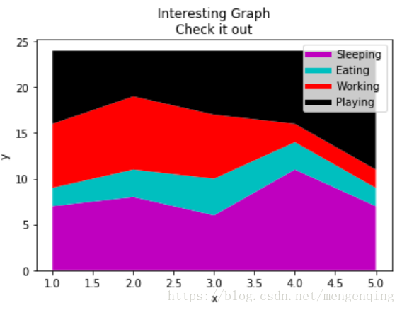
饼图:用于显示部分对于整体的情况,通常以%为单位。很像堆叠图,只是它们位于某个时间点。
import matplotlib.pyplot as plt
%matplotlib inline
slices = [7,2,2,13]
activities = ['sleeping','eating','working','playing']
cols = ['c','m','r','b']

plt.pie(slices,
        labels=activities,
        colors=cols,
        startangle=90,#为饼图选择了 90 度角,这意味着第一个部分是一个竖直线条
        shadow= True,
        explode=(0,0.1,0,0),#如果我们不想拉出任何切片,我们传入0,0,0,0
        autopct='%1.1f%%')

plt.title('Interesting Graph\nCheck it out')
plt.show()
第五.盒图和小提琴图
盒图(Box Plot)用于显示一组数据分散情况的统计图,它能显示出一组数据的最大值、最小值、中位数、及上下四分位数。
小提琴图 (Violin Plot) 用于显示数据分布及其概率密度。

import matplotlib.pyplot as plt
import numpy as np
%matplotlib inline
fig,axes = plt.subplots(nrows=1,ncols=2,figsize=(12,5))
tang_data = [np.random.normal(0,std,100) for std in range(6,10)]
axes[0].violinplot(tang_data,showmeans=False,showmedians=True)
axes[0].set_title('violin plot')

bplot=axes[1].boxplot(tang_data,patch_artist=True)
axes[1].set_title('box plot')

colors = ['pink','lightblue','lightgreen','yellow']
for pathch,color in zip(bplot['boxes'],colors):
    pathch.set_facecolor(color)

for ax in axes:
    ax.yaxis.grid(True)
    ax.set_xticks([y+1 for y in range(len(tang_data))])
plt.setp(axes,xticks=[y+1 for y in range(len(tang_data))],xticklabels=['x1','x2','x3','x4'])
plt.show()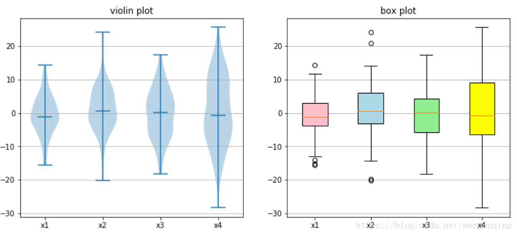


 332
332

 被折叠的 条评论
为什么被折叠?
被折叠的 条评论
为什么被折叠?
 到【灌水乐园】发言


