


往期鸿蒙全套实战文章必看:(附带鸿蒙全栈学习资料)
input开发指南
input是交互式组件,用于接收用户数据。其类型可设置为日期、多选框和按钮等。
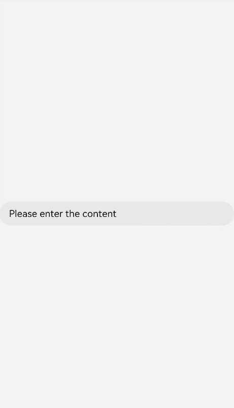
创建input组件
在pages/index目录下的hml文件中创建一个input组件。
<!-- xxx.hml -->
<div class="container">
  <input type="text">
     Please enter the content
  </input>
</div>
/* xxx.css */
.container {
width: 100%;
height: 100%;
flex-direction: column;
justify-content: center;
align-items: center;
background-color: #F1F3F5;
}
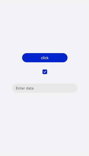
设置input类型
通过设置type属性来定义input类型,如将input设置为button、date等。
<!-- xxx.hml -->
<div class="container">
  <div class="div-button">
    <dialog class="dialogClass" id="dialogId">
      <div class="content">
        <text>this is a dialog</text>
      </div>
    </dialog>
    <input class="button" type="button" value="click" onclick="btnclick"></input>
  </div>
  <div class="content">
    <input onchange="checkboxOnChange" checked="true" type="checkbox"></input>
  </div>
  <div class="content">
    <input type="date" class="flex" placeholder="Enter data"></input>
  </div>
</div>
/* xxx.css */
.container {
width: 100%;
height: 100%;
align-items: center;
flex-direction: column;
justify-content: center;
background-color: #F1F3F5 ;
}
.div-button {
flex-direction: column;
align-items: center;
}
.dialogClass{
width:80%;
height: 200px;
}
.button {
margin-top: 30px;
width: 50%;
}
.content{
width: 90%;
height: 150px;
align-items: center;
justify-content: center;
}
.flex {
width: 80%;
margin-bottom:40px;
}// xxx.js
export default {
btnclick(){
this.$element('dialogId').show()
},
}
说明
仅当input类型为checkbox和radio时,当前组件选中的属性是checked才生效,默认值为false。
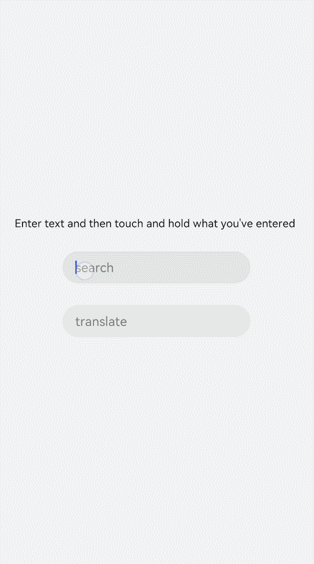
事件绑定
向input组件添加search和translate事件。
<!-- xxx.hml -->
<div class="content">
  <text style="margin-left: -7px;">
    <span>Enter text and then touch and hold what you've entered</span>
  </text>
  <input class="input" type="text" onsearch="search" placeholder="search"> </input>
  <input class="input" type="text" ontranslate="translate" placeholder="translate"> </input>
</div>
/* xxx.css */
.content {
width: 100%;
height: 100%;
flex-direction: column;
align-items: center;
justify-content: center;
background-color: #F1F3F5;
}
.input {
margin-top: 50px;
width: 60%;
placeholder-color: gray;
}
text{
width:100%;
font-size:25px;
text-align:center;
}// xxx.js
import promptAction from '@ohos.promptAction'
export default {
search(e){
promptAction.showToast({
message: e.value,
duration: 3000,
});
},
translate(e){
promptAction.showToast({
message: e.value,
duration: 3000,
});
}
}
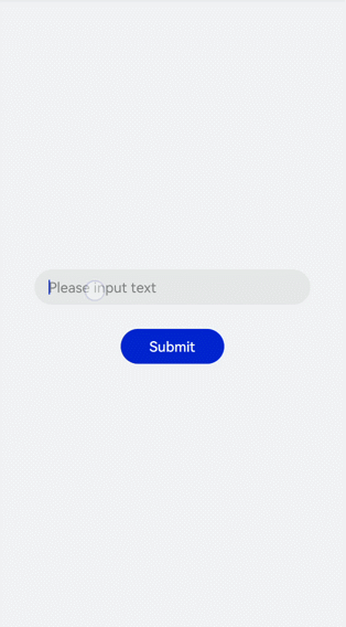
设置输入提示
通过对input组件添加showError方法来提示输入的错误原因。
<!-- xxx.hml -->
<div class="content">
  <input id="input" class="input" type="text"  maxlength="20" placeholder="Please input text" onchange="change">
  </input>
  <input class="button" type="button" value="Submit" onclick="buttonClick"></input>
</div>
/* xxx.css */
.content {
width: 100%;
height: 100%;
flex-direction: column;
align-items: center;
justify-content: center;
background-color: #F1F3F5;
}
.input {
width: 80%;
placeholder-color: gray;
}
.button {
width: 30%;
margin-top: 50px;
}// xxx.js
import promptAction from '@ohos.promptAction'
export default {
data:{
value:'',
},
change(e){
this.value = e.value;
promptAction.showToast({
message: "value: " + this.value,
duration: 3000,
});
},
buttonClick(e){
if(this.value.length > 6){
this.$element("input").showError({
error: 'Up to 6 characters are allowed.'
});
}else if(this.value.length == 0){
this.$element("input").showError({
error:this.value + 'This field cannot be left empty.'
});
}else{
promptAction.showToast({
message: "success "
});
}
},
}
说明
该方法在input类型为text、email、date、time、number和password时生效。
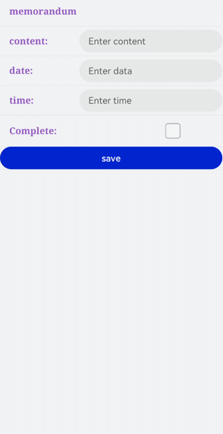
场景示例
根据场景选择不同类型的input输入框,完成信息录入。
<!-- xxx.hml -->
<div class="container">
  <div class="label-item">
    <label>memorandum</label>
  </div>
  <div class="label-item">
    <label class="lab" target="input1">content:</label>
    <input class="flex" id="input1" placeholder="Enter content" />
  </div>
  <div class="label-item">
    <label class="lab" target="input3">date:</label>
    <input class="flex" id="input3" type="date" placeholder="Enter data" />
  </div>
  <div class="label-item">
    <label class="lab" target="input4">time:</label>
    <input class="flex" id="input4" type="time" placeholder="Enter time" />
  </div>
  <div class="label-item">
    <label class="lab" target="checkbox1">Complete:</label>
    <input class="flex" type="checkbox" id="checkbox1" style="width: 100px;height: 100px;" />
  </div>
  <div class="label-item">
    <input class="flex" type="button" id="button" value="save" onclick="btnclick"/>
  </div>
</div>
/* xxx.css */
.container {
flex-direction: column;
background-color: #F1F3F5;
}
.label-item {
align-items: center;
border-bottom-width: 1px;border-color: #dddddd;
}
.lab {
width: 400px;}
label {
padding: 30px;
font-size: 30px;
width: 320px;
font-family: serif;
color: #9370d8;
font-weight: bold;
}
.flex {
flex: 1;
}
.textareaPadding {
padding-left: 100px;
}// xxx.js
import promptAction from '@ohos.promptAction';
export default {
data: {
},
onInit() {
},
btnclick(e) {
promptAction.showToast({
message:'Saved successfully!'
})
}
} 


 扫一扫
扫一扫


 1256
1256

 被折叠的 条评论
为什么被折叠?
被折叠的 条评论
为什么被折叠?
 到【灌水乐园】发言


