


1、首先将根布局设置为:androidx.drawerlayout.widget.DrawerLayout,假如你想你的抽屉布局是在预览图中显示出来的话,可以设置属性 tools:openDrawer="start",start这个可以修改为left、right等,就取决于你的抽屉布局是设置在哪边
<androidx.drawerlayout.widget.DrawerLayout xmlns:android="http://schemas.android.com/apk/res/android"
    xmlns:app="http://schemas.android.com/apk/res-auto"
    xmlns:tools="http://schemas.android.com/tools"
    android:layout_width="match_parent"
    android:layout_height="match_parent"
    android:id="@+id/drawer_layout"
    tools:openDrawer="start">


</androidx.drawerlayout.widget.DrawerLayout>
2、设置内容布局与抽屉布局,只要不设置layout_gravity的布局就属于内容布局,而设置了layout_gravity的布局就是抽屉布局,layout_gravity里面的值决定了抽屉是在哪边,比如, android:layout_gravity = "start"或者 android:layout_gravity = "left",那么抽屉在左边,而 android:layout_gravity = "right"或者android:layout_gravity = "end",那么抽屉在右边
<?xml version="1.0" encoding="utf-8"?>
<androidx.drawerlayout.widget.DrawerLayout xmlns:android="http://schemas.android.com/apk/res/android"
xmlns:app="http://schemas.android.com/apk/res-auto"
xmlns:tools="http://schemas.android.com/tools"
android:layout_width="match_parent"
android:layout_height="match_parent"
android:id="@+id/drawer_layout"
tools:openDrawer="start">
<!-- 内容区域 -->
<include layout="@layout/activity_show_code" />
<!-- 抽屉布局 -->
<LinearLayout
android:layout_width="wrap_content"
android:layout_height="match_parent"
android:background="@color/com_sswl_gray_efeff3"
android:orientation="vertical"
android:layout_gravity = "bottom"
android:clickable="true">
<include
layout="@layout/drawlayout_header" />
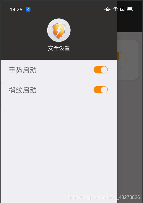
<RelativeLayout
android:id="@+id/rl_gesture"
android:layout_width="match_parent"
android:layout_height="50dp">
<TextView
android:layout_width="wrap_content"
android:layout_height="wrap_content"
android:textColor="@color/com_sswl_gray_5d6063"
android:textSize="18sp"
android:layout_centerVertical="true"
android:layout_marginLeft="20dp"
android:text="@string/com_sswl_gestrue_launch"
/>
<CheckBox
android:id="@+id/cb_gesture"
android:layout_width="wrap_content"
android:layout_height="wrap_content"
android:layout_marginEnd="20dp"
android:padding="2dp"
android:layout_alignParentRight="true"
android:layout_centerVertical="true"
android:button="@drawable/open_close_selector"/>
</RelativeLayout>
<View
android:layout_width="match_parent"
android:layout_height="0.5dp"
android:background="@color/com_sswl_gray_efeff3"
android:layout_marginLeft="10dp"
android:layout_marginRight="10dp"
/>
<RelativeLayout
android:id="@+id/rl_fingerprint"
android:layout_width="match_parent"
android:layout_height="50dp">
<TextView
android:layout_width="wrap_content"
android:layout_height="wrap_content"
android:textColor="@color/com_sswl_gray_5d6063"
android:textSize="18sp"
android:layout_centerVertical="true"
android:layout_marginLeft="20dp"
android:text="@string/com_sswl_fingerprint_launch"
/>
<CheckBox
android:id="@+id/cb_fingerprint"
android:layout_width="wrap_content"
android:layout_height="wrap_content"
android:layout_marginEnd="20dp"
android:padding="2dp"
android:layout_alignParentRight="true"
android:layout_centerVertical="true"
android:button="@drawable/open_close_selector"/>
</RelativeLayout>
</LinearLayout>
OK,咱们先来预览一下效果
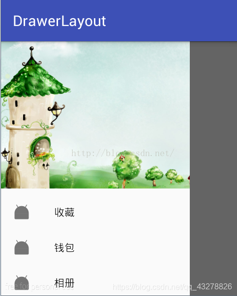
3、像上面,是设置了一个左边的抽屉布局,其实也还可以同时设置右边的抽屉布局的,这里就不演示了,上面的抽屉布局是自己写的一个LinearLayout包裹的布局,其实,Android官方还为我们封装了一个快速设置抽屉布局的类:com.google.android.material.navigation.NavigationView,借助NavigationView类可以快速设置菜单与头部的显示
比如上述的抽屉布局也可以写成:
<android.support.design.widget.NavigationView
        android:id="@+id/navigation_view"
        android:layout_width="wrap_content"
        android:layout_height="match_parent"
        android:layout_gravity="left"
        android:fitsSystemWindows="true"
        app:headerLayout="@layout/header_layout"
        app:menu="@menu/main">
</android.support.design.widget.NavigationView>
其中,app:headerLayout设置头部的布局样式文件,app:menu是设置点击菜单
menu/mian.xml如下:
<menu xmlns:android="http://schemas.android.com/apk/res/android">

    <item
        android:id="@+id/favorite"
        android:icon="@mipmap/ic_launcher"
        android:title="收藏" />

    <item
        android:id="@+id/wallet"
        android:icon="@mipmap/ic_launcher"
        android:title="钱包" />

    <item
        android:id="@+id/photo"
        android:icon="@mipmap/ic_launcher"
        android:title="相册" />

    <item
        android:id="@+id/file"
        android:icon="@mipmap/ic_launcher"
        android:title="文件" />
</menu>
效果大致如下:
更详细的做法,可以参照这篇文章
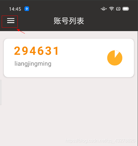
4、接下来,在ToolBar上设置一个点击显示抽屉布局的按钮,这个实现是借助官方封装的androidx.appcompat.app.ActionBarDrawerToggle,设置代码大致如下:
mActionBarDrawerToggle = new ActionBarDrawerToggle(this, drawerLayout, toolbar, R.string.com_sswl_open_drawer, R.string.com_sswl_close_drawer);
drawerLayout.addDrawerListener(mActionBarDrawerToggle);
mActionBarDrawerToggle.syncState();
上面设置完毕之后,就会在你的ToolBar上多了一个按钮,大致效果如下:
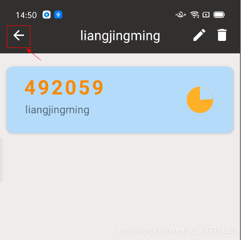
5、上面设置之后,点击是可以显示隐藏抽屉布局,不过,假如你在某些页面希望最左边不是三条杠图标,而是你自己设置的图标呢?那么,你可以这样设置:
 mActionBarDrawerToggle.setDrawerIndicatorEnabled(false);
 mActionBarDrawerToggle.setHomeAsUpIndicator(R.drawable.ic_back_24dp);
 //这个方法只有在 mActionBarDrawerToggle.setDrawerIndicatorEnabled(false);时候才生效,是点击toolBar返回箭头的监听函数
mActionBarDrawerToggle.setToolbarNavigationClickListener(new View.OnClickListener() {
            @Override
            public void onClick(View v) {
                if (editIv.getVisibility() == View.VISIBLE) {
                    refreshTitleBarState(View.GONE, "账号列表");
                    recyclerView.getChildAt(currentPos).setBackground(getDrawable(R.drawable.item_select_bg));
                    //设置为true的时候显示出来的就是那个三条杠,而且这时点击才会显示抽屉布局
                    mActionBarDrawerToggle.setDrawerIndicatorEnabled(true);
                }
            }
        });
效果预览一下:
6、完成上述设置,基本就能正常使用,不过细心的小伙伴可能会发现,在抽屉布局显示的时候,你们依然是可以点击到抽屉布局下面遮挡的控件,这个显然不是我们想要的,那么我们可以在抽屉布局的上添加属性android:clickable="true"来解决这个问题


 9413
9413


 被折叠的 条评论
为什么被折叠?
被折叠的 条评论
为什么被折叠?
 到【灌水乐园】发言


