


pyecharts绘制天气热力图
前言
基于爬取中国气象局数据后,生成的透视表不够美观,采用excel生成报表操作重复。可以考虑使用pyecharts进行热力图生成,挂载服务器后每周生成,为其他业务预测提供参考依据。
本文主要讲解如何使用pyecharts构建并生成最终的热力图。
一、数据源
数据源:爬取中国气象局中各省份城市天气(链接)。其中101010100 为城市天气查询编码,可在网页中寻找到全部城市天气查询编码。
数据格式:需要温度带、城市、日期、最高(低)气温℃字段。日期包括去年乃至今年(即每日对应的气温都有一条去年对应的气温)。数据表格式如下:
| 温度带 | 城市编码 | 城市 | 日期 | 星期 | 最高气温℃ | 最低气温℃ | 降雨概率% | 历史 | |
|---|---|---|---|---|---|---|---|---|---|
| 0 | 寒带 | 101050101 | 哈尔滨 | 20211111 | NaN | 5 | -4 | 17.0 | 1 |
| 1 | 寒带 | 101050101 | 哈尔滨 | 20211112 | NaN | 4 | -4 | 20.0 | 1 |
| 2 | 寒带 | 101050101 | 哈尔滨 | 20211113 | NaN | 1 | -7 | 23.0 | 1 |
| ... | ... | ... | ... | ... | ... | ... | ... | ... | ... |
| 2911 | 热带 | 101310101 | 海口 | 20221225 | 日 | 22 | 16 | NaN | 0 |
| 2912 | 热带 | 101310101 | 海口 | 20221226 | 一 | 21 | 16 | NaN | 0 |
| 2913 | 热带 | 101310101 | 海口 | 20221227 | 二 | 21 | 15 | NaN | 0 |
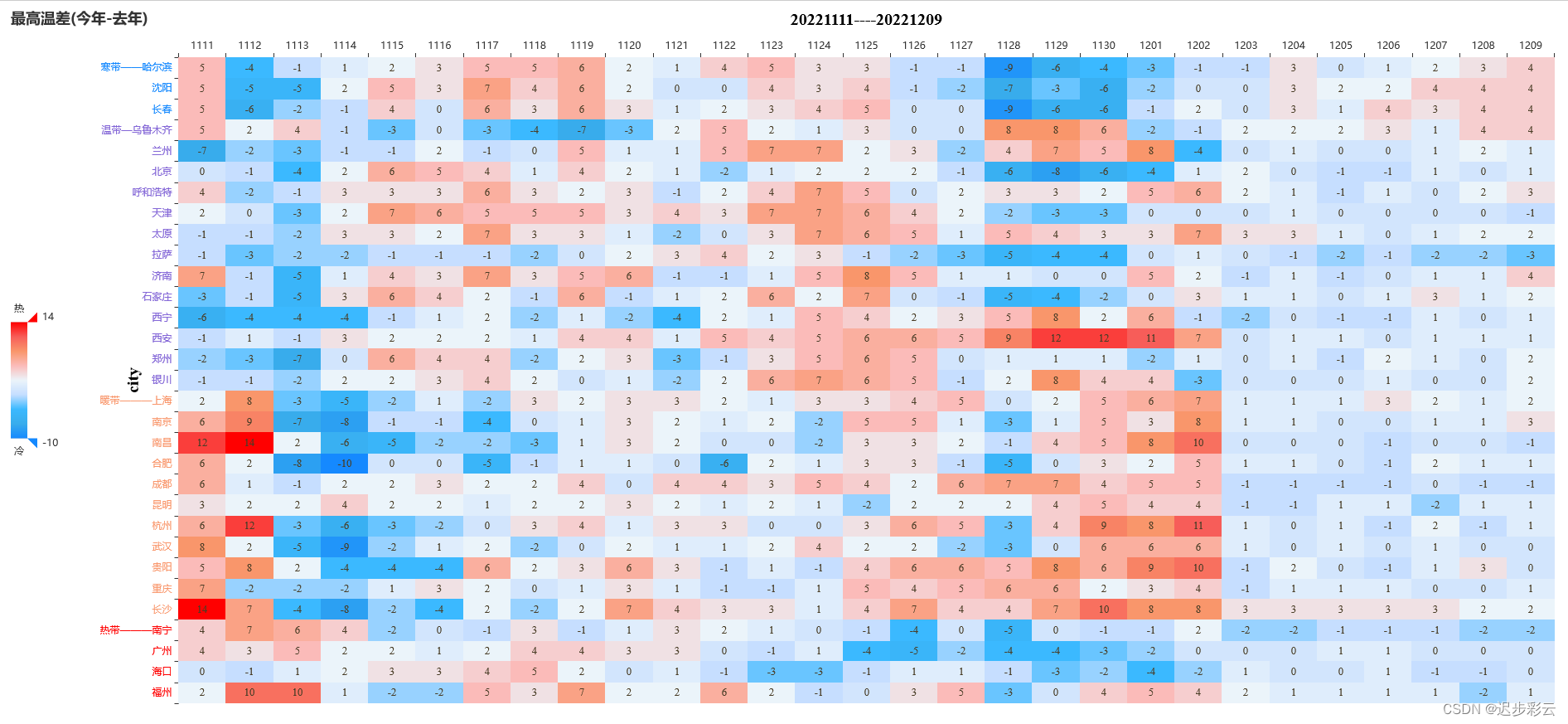
二、成果图
计算绘制当天前7天与后21天范围内的数据。
三、绘制步骤
1.引入库
import pandas as pd
import os,re,time,random
from pyecharts import options as opts
from pyecharts.charts import HeatMap
from pyecharts.commons.utils import JsCode
2.数据处理
path为天气数据路径。handle_data(path):读入数据后选取数据框范围,计算数值。
代码如下:
def handle_data(path):
    df=pd.read_excel(path)
    #写入时间
    d1 = 7*24*60*60
    d2 = 21*24*60*60
    t = time.time()
    date1 = int(time.strftime("%Y%m%d",time.gmtime(t-d1)))
    date2 = int(time.strftime("%Y%m%d",time.gmtime(t+d2)))
    date3 = date1 - 10000
    date4 = date2 - 10000
    df_new = df.loc[(df['日期']>=date1) & (df['日期'] <= date2),:]
    df_old = df.loc[(df['日期']>=date3) & (df['日期'] <= date4),:]
    df_new['去年最高气温℃'] = list(df_old['最高气温℃'])
    df_new['最高温差(今年-去年)'] = df_new['最高气温℃'] - df_new['去年最高气温℃']
    df_new['去年最低气温℃'] = list(df_old['最低气温℃'])
    df_new['最低温差(今年-去年)'] = df_new['最低气温℃'] - df_new['去年最低气温℃']
    return df_new
3.绘制函数
df_为计算后天气数据框,types为类型,例如绘制最高温差图,则types为数据框中的'最高温差(今年-去年)'。thermodynamic(df_,types):读入数据后,对数据进行处理。
读入后的data数据格式如下:[['1111', '哈尔滨', 5], ['1112', '哈尔滨', -4], ['1113', '哈尔滨', -1], ['1114', '哈尔滨', 1], ['1115', '哈尔滨', 2], ..., ['1206', '海口', 1], ['1207', '海口', -1], ['1208', '海口', -1], ['1209', '海口', 0]]。city列表如下:
| 城市 | 温度带 | |
|---|---|---|
| 2 | 福州 | 热带 |
| 6 | 海口 | 热带 |
| ... | ... | ... |
| 27 | 长春 | 寒带 |
| 18 | 沈阳 | 寒带 |
| 5 | 哈尔滨 | 寒带 |
data列表中每一个元素为['日期','城市名称','温差'],city为城市,温度带,作用是对y轴按照温度带对城市进行排序。构建两个字典,对data中的数据进行映射,日期对应于x轴(0-(len(date)-1),城市对应于y轴(0-(len(c)-1),即构建(x,y,z)。接着将温度带首次出现与城市名字相连接,并对齐,随后反转列表。
采用pyecharts开始绘制热力图即可。.add_xaxis()为x轴坐标,.add_yaxis()为设置y轴坐标,具体参数详见下文代码。
代码如下:
def thermodynamic(df_,types):
    #数据处理,为了下文中标签名字范围
    date1 = min(df_['日期'])
    date2 = max(df_['日期'])
    data = [[str(df_.iloc[i]['日期'])[4:], df_.iloc[i]['城市'], df_.iloc[i][types]] for i in range(len(df_))]
    date = [str(i)[4:] for i in list(df_.loc[df_['城市']=='北京',:]['日期'])]
    city = pd.read_excel('./city_weather.xlsx')
    l= ['寒带','温带','暖带','热带']
    city['温度带'] = city['温度带'].astype('category')
    city['温度带'].cat.reorder_categories(l, inplace=True)
    city.sort_values(['温度带','城市'], ascending=False, inplace=True)
    c = list(city['城市'])
    te = list(city['温度带'])

    #构建字典
    dict_date = {}
    for i in range(len(date)):
        dict_date[date[i]] = i

    dict_city = {}
    for i in range(len(c)):
        dict_city[c[i]] = i

    #将data中的数据转换
    df = [[dict_date[i], dict_city[j], int(z)] for i,j,z in data]

    #将列表中首次出现的温度带与城市相连接,并对齐四个城市。
    tep = []
    ci = []
    for i in range(len(te)-1,-1,-1):
        if te[i] not in tep:
            tep.append(te[i])
            ci.append(f'{te[i]}{(5-len(c[i]))*"—"}{c[i]}')
        else:
            ci.append(c[i])
    ci.reverse()

    im = (
        HeatMap(init_opts=opts.InitOpts(width="2075px", height="899px"))
        .add_xaxis(xaxis_data=date)
        .add_yaxis(
            series_name=types,
            #ci:y轴城市名称
            yaxis_data=ci,
            value=df,
            # 图中列表的字体设置等
            label_opts=opts.LabelOpts(
                font_size=13,
                is_show=True,
                font_style = 'normal',
                font_family = 'Times New Roman',
                color="#493D26",
                position="inside",
                horizontal_align = 'center',
                #horizontal_align="50%"
                vertical_align = 'middle'
            ),
        )
        .set_series_opts()
        .set_global_opts(
            title_opts=opts.TitleOpts(title=types),
            #工具栏,使用后不美观
            #toolbox_opts=opts.ToolboxOpts(),
            legend_opts=opts.LegendOpts(is_show=False),
            xaxis_opts=opts.AxisOpts(
                #x轴坐标倾斜,可自主设置。
                #axislabel_opts=opts.LabelOpts(rotate=-30),
                #x轴上方名称
                name=f'{date1}----{date2}',
                name_location='middle',
                #间距
                name_gap=35,
                name_textstyle_opts=opts.TextStyleOpts(
                    font_family= 'Times New Roman',
                    font_size=20,
                    color='black',
                    font_weight='bolder',
                ),
                #类目数据
                type_="category",
                position='top',
                #is_scale=True,
                splitarea_opts=opts.SplitAreaOpts(
                    is_show=True, areastyle_opts=opts.AreaStyleOpts(opacity=1)
                ),
            ),
            yaxis_opts=opts.AxisOpts(
                name='city',
                name_location='middle',
                name_gap=45,
                name_textstyle_opts=opts.TextStyleOpts(
                    font_family= 'Times New Roman',
                    font_size=20,
                    color='black',
                    font_weight='bolder',
                ),
                type_="category",
                #type_="value",
                #修改y轴标签颜色
                axislabel_opts=opts.LabelOpts(
                    is_show=True,
                    position="top",
                    color='pink',
                ),
                splitarea_opts=opts.SplitAreaOpts(
                    is_show=True, areastyle_opts=opts.AreaStyleOpts(opacity=1)
                ),
            ),
            visualmap_opts=opts.VisualMapOpts(
                range_text = [ '热','冷'],
                range_color = ['#1589FF','#38ACEC','#3BB9FF','#C6DEFF','#EBF4FA','#FBBBB9','#F9966B','#F75D59','#FF0000'],
                #range_color = ['#FF0000','#F75D59','#F9966B','#FBBBB9','#EBF4FA','#C6DEFF','#3BB9FF','#38ACEC','#1589FF'],
                type_='color',
                #颜色取值范围
                min_=min(df_[types]),
                max_=max(df_[types]),
                is_calculable=True,
                #orient="horizontal",
                orient = 'vertical',
                #pos_left="center"
                #pos_right = "right"
                pos_top = "center"
            ),
        )
    )

    '''
    # 标记线条,穿过温度带城市,使用后不美观。可在其他类型图表中使用,例如标记最高、最低,平均等。
    lst = [i for i in filter(lambda x: '带' in x, ci)]
    im.set_series_opts(
         markline_opts=opts.MarkLineOpts(
                # 标记线数据
                data=[
                    # MarkLineItem:标记线数据项
                    opts.MarkLineItem(
                        name=lst[0],
                        y = lst[0],
                        symbol_size = None,
                        ),
                    opts.MarkLineItem(
                        name=lst[1],
                        y = lst[1],
                        symbol_size = None,
                        ),
                    opts.MarkLineItem(
                        name=lst[2],
                        y = lst[2],
                        symbol_size = None,
                        ),
                    opts.MarkLineItem(
                        name=lst[3],
                        y = lst[3],
                        symbol_size = None,
                        )],
             symbol ='circle',
        label_opts=opts.LabelOpts(color="#493D26"),
        linestyle_opts=opts.LineStyleOpts(
                    color = 'red',
                    opacity = 0.6,
                    # 'solid', 'dashed', 'dotted'
                    type_ = 'dashed',
                    width = 0.5,
                )

            ),
        )
    '''
    return im
4.保存
保存为图片需要使用chromedriver,并安装snapshot-selenium。运行方法、保存图片代码如下:
#path:数据文件路径
df = handle_data(path)
im = thermodynamic(df,'最高温差(今年-去年)')
#输出
im.render_notebook()
#保存
im.render(f"路径.html")

#保存为图片
from snapshot_selenium import snapshot
from pyecharts.render import make_snapshot
make_snapshot(snapshot, im.render(), "test.jpeg")
总结
由于y轴为类目数据,标记线划分将会穿过数据中间,对温度带划分较不美观。可采用JsCode对y轴城市进行操作。


 4万+
4万+

 被折叠的 条评论
为什么被折叠?
被折叠的 条评论
为什么被折叠?
 到【灌水乐园】发言


