


file_cnr_test <- "data/cnv/result/test_result.02.cnr"
library(data.table)
cnr_data <- fread(file_cnr_test)
### 注释染色体区带
source("R/my_functions/common_functions.R")
cnr_data$cytoband <- position2band(cnr_data$chromosome,
cnr_data$start,
cnr_data$start, genome="hg19")
cnr_data_clean <- cnr_data[cnr_data$gene != "Antitarget" &
cnr_data$chromosome %in% c(1:22, "X"),]
#### 整理染色体列的值
cnr_data_clean$chromosome <- factor(cnr_data_clean$chromosome,
c(1:22, "X"))
library(dplyr)
############################# 作图
## 横坐标
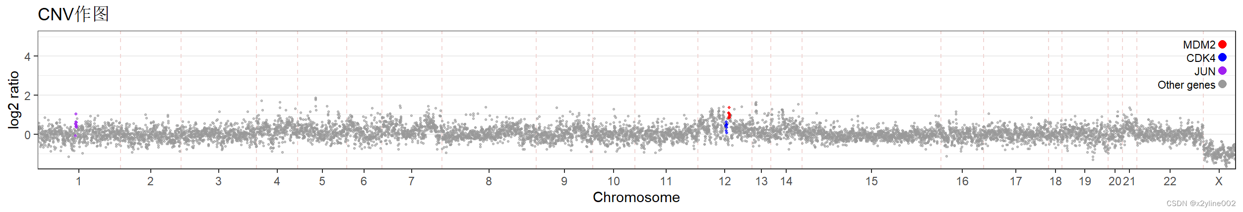
title <- "CNV作图"
data_plot <- cnr_data_clean
unique(cnr_data$chromosome)
data_plot$plot_x <- seq_along(data_plot[[1]])
data_plot$plot_y <- as.numeric(data_plot[["log2"]])
gene1 <- "CDK4"
gene2 <- "MDM2"
gene3 <- "JUN"
# 设置不同点的颜色
data_plot$color <- rep("other", nrow(data_plot))
data_plot$color[!is.na(stringr::str_match(data_plot$gene, gene1))] <- gene1
data_plot$color[!is.na(stringr::str_match(data_plot$gene, gene2))] <- gene2
data_plot$color[!is.na(stringr::str_match(data_plot$gene, gene3))] <- gene3
data_plot$cytoband_plot <- factor(stringr::str_extract(data_plot$cytoband,
"chr[0-9][0-9]{0,1}[pq]"),
levels=paste0("chr", rep(c(1:22, "X"), each = 2), c("p", "q")))
# 设定每个染色体的标签位置和名称
chromosome_labels <- data.frame(
label_x = c(factor(unique(data_plot$chromosome))),
chromosome = c(cumsum(table(data_plot$chromosome)) - table(data_plot$chromosome)/2),
boundary_chromsome = c(cumsum(table(data_plot$chromosome))+0.5)
)
cytoband_labels <- data.frame(
boundary_cytoband= c(cumsum(table(data_plot$cytoband_plot))+0.5)[seq_along(
cumsum(table(data_plot$cytoband_plot))) %% 2 == 1])
# 设置x轴和y轴的范围
x_min <- 0.5
x_max <- nrow(data_plot) + 0.5
y_min <- -1.8 # min(data_plot$plot_y)-0.5
y_max <- 5.3 # max(data_plot$plot_y)+0.5
library(ggplot2)
# Cairo::CairoPDF(file=file.path("results/3个病例作图", paste0(title, ".pdf", collapse = "")), width=12, height=2)
p <- ggplot(data = data_plot, aes(x = plot_x, y = plot_y)) +
labs(title = title,
x = "Chromosome",
y = "log2 ratio") +
theme_bw() +
# 做染色体的分界线
geom_vline(data = chromosome_labels,
aes(xintercept = boundary_chromsome), color = "#F1D5D3",
linetype = "dashed") +
geom_point(data = subset(data_plot, color %in% c("other")), color = "grey60", alpha = 0.6, size=0.5) +
geom_point(data = subset(data_plot, color == gene1), color = "blue", alpha = 0.7, size=0.7) +
geom_point(data = subset(data_plot, color == gene2), color = "red", alpha = 0.7, size=0.7) +
geom_point(data = subset(data_plot, color == gene3), color = "purple", alpha = 0.7, size=0.7) +
scale_x_continuous(limits = c(x_min, x_max), expand = c(0, 0),
breaks = chromosome_labels$chromosome,
labels = chromosome_labels$label_x) +
# scale_x_continuous(limits = c(x_min, x_max), expand = c(0, 0)) +
scale_y_continuous(limits = c(y_min, y_max), expand = c(0, 0)) +
theme(
panel.grid.major.x = element_blank(), # 隐藏 x 轴主要网格线
panel.grid.minor.x = element_blank() # Hide minor grid lines
)
# Create custom legend
library(grid)
legend <- grobTree(
pointsGrob(x = unit(1, "npc") - unit(1, "lines"),
y = unit(1, "npc") - unit(1, "lines"),
pch = 16, gp = gpar(col = "red", cex = 0.7)),
textGrob("MDM2", x = unit(1, "npc") - unit(1.5, "lines"),
y = unit(1, "npc") - unit(1, "lines"),
hjust = 1, gp = gpar(col = "black", cex = 0.7)),
pointsGrob(x = unit(1, "npc") - unit(1, "lines"),
y = unit(1, "npc") - unit(2, "lines"),
pch = 16, gp = gpar(col = "blue", cex = 0.7)),
textGrob("CDK4", x = unit(1, "npc") - unit(1.5, "lines"),
y = unit(1, "npc") - unit(2, "lines"),
hjust = 1, gp = gpar(col = "black", cex = 0.7)),
pointsGrob(x = unit(1, "npc") - unit(1, "lines"),
y = unit(1, "npc") - unit(3, "lines"),
pch = 16, gp = gpar(col = "purple", cex = 0.7)),
textGrob("JUN", x = unit(1, "npc") - unit(1.5, "lines"),
y = unit(1, "npc") - unit(3, "lines"),
hjust = 1, gp = gpar(col = "black", cex = 0.7)),
pointsGrob(x = unit(1, "npc") - unit(1, "lines"),
y = unit(1, "npc") - unit(4, "lines"),
pch = 16, gp = gpar(col = "grey60", cex = 0.7)),
textGrob("Other genes", x = unit(1, "npc") - unit(1.5, "lines"),
y = unit(1, "npc") - unit(4, "lines"),
hjust = 1, gp = gpar(col = "black", cex = 0.7))
)
# Add custom legend to the plot
p <- p + annotation_custom(legend)
p
## 导出PPT
# library(export)
# graph2ppt(file=file.path("results/3个病例作图", paste0(title, ".pptx", collapse = "")),
# width=12, height=2)
## 导出PDF
# pdf(file=file.path("results/3个病例作图", paste0(title, ".pdf", collapse = "")), width=12, height=2)
# p
# dev.off()
################################################### 交互式绘图方案1:直接将ggplot2图片转为交互式作图
library(plotly)
p_plotly1 <- ggplotly(p)
# Add hover text customization
p_plotly1 <- p_plotly1 %>% layout(
hovermode = "closest",
autosize = F,
width = 1000,
height = 300
)
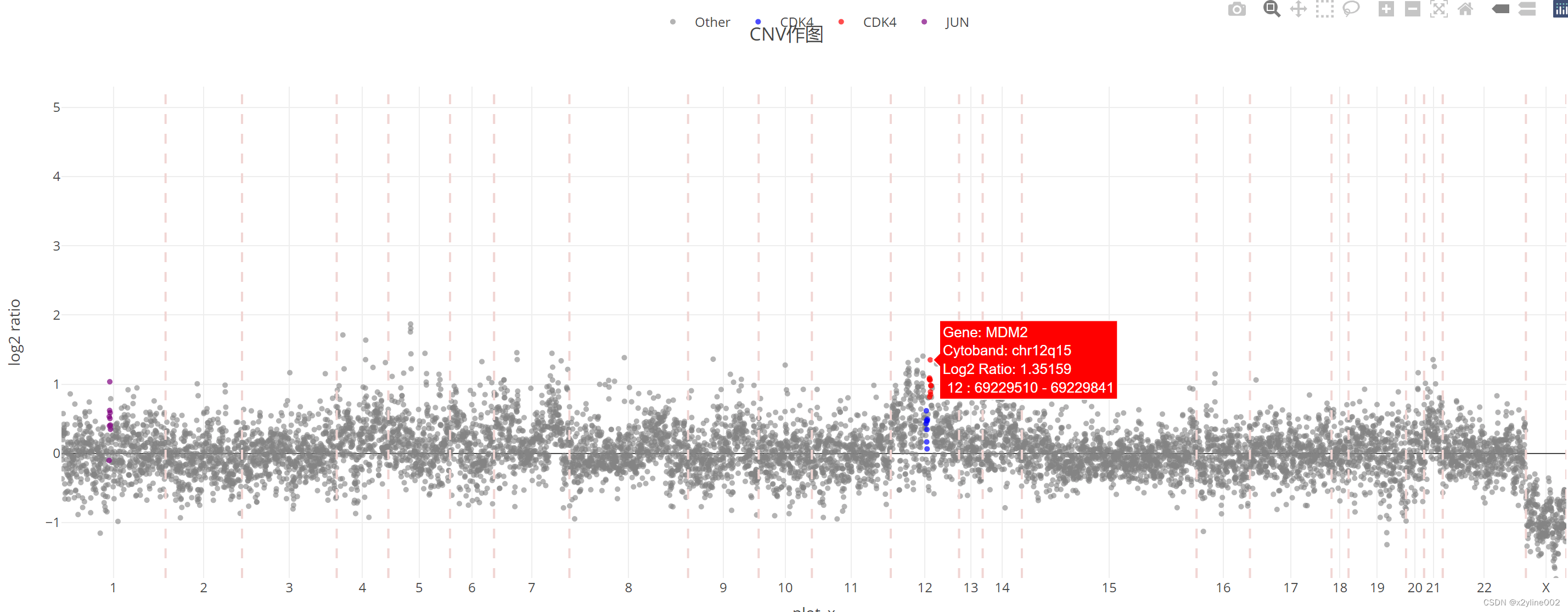
print(p_plotly1)
################################################### 交互式绘图方案2:从头绘制,可自定义hover text
library(plotly)
# Split data into subsets
data_other <- subset(data_plot, color == "other")
data_gene1 <- subset(data_plot, color == gene1)
data_gene2 <- subset(data_plot, color == gene2)
data_gene3 <- subset(data_plot, color == gene3)
# Create plotly plot for each subset and combine
p_plotly2 <- plot_ly() %>%
add_trace(data = data_other, x = ~plot_x, y = ~plot_y, type = 'scatter', mode = 'markers',
marker = list(color = 'rgba(128, 128, 128, 1)', size = 5, opacity = 0.6),
text = paste("Gene:", data_other$gene, "<br>Cytoband:", data_other$cytoband,
"<br>Log2 Ratio:", data_other$log2,
"<br>", data_other$chromosome, ":", data_other$start, "-", data_other$end),
hoverinfo = "text",
name = 'Other') %>%
add_trace(data = data_gene1, x = ~plot_x, y = ~plot_y, type = 'scatter', mode = 'markers',
marker = list(color = 'blue', size = 5, opacity = 0.7),
text = paste("Gene:", data_gene1$gene, "<br>Cytoband:", data_gene1$cytoband,
"<br>Log2 Ratio:", data_gene1$log2,
"<br>", data_gene1$chromosome, ":", data_gene1$start, "-", data_gene1$end),
hoverinfo = "text",
name = gene1) %>%
add_trace(data = data_gene2, x = ~plot_x, y = ~plot_y, type = 'scatter', mode = 'markers',
marker = list(color = 'red', size = 5, opacity = 0.7),
text = paste("Gene:", data_gene2$gene, "<br>Cytoband:", data_gene2$cytoband,
"<br>Log2 Ratio:", data_gene2$log2,
"<br>", data_gene2$chromosome, ":", data_gene2$start, "-", data_gene2$end),
hoverinfo = "text",
name = gene1) %>%
add_trace(data = data_gene3, x = ~plot_x, y = ~plot_y, type = 'scatter', mode = 'markers',
marker = list(color = 'purple', size = 5, opacity = 0.7),
text = paste("Gene:", data_gene3$gene, "<br>Cytoband:", data_gene3$cytoband,
"<br>Log2 Ratio:", data_gene3$log2,
"<br>", data_gene3$chromosome, ":", data_gene3$start, "-", data_gene3$end),
hoverinfo = "text",
name = gene3)
#################### 加入染色体分隔标志
line_chr_list <- list()
for (i in 1:length(chromosome_labels$boundary_chromsome)){
line_chr_list_i <- list(type = 'line', x0 = chromosome_labels$boundary_chromsome[i],
x1 = chromosome_labels$boundary_chromsome[i],
y0 = y_min,
y1 = y_max,
line = list(color = '#F1D5D3', dash = 'dash'))
line_chr_list_i_1 <- list(type = 'line', x0 = chromosome_labels$boundary_chromsome[i+1],
x1 = chromosome_labels$boundary_chromsome[i+1],
y0 = y_min,
y1 = y_max,
line = list(color = '#F1D5D3', dash = 'dash'))
list(line_chr_list_i, line_chr_list_i_1)
line_chr_list <- append(line_chr_list, list(line_chr_list_i))
}
p_plotly2 <- p_plotly2 %>% layout(
title = title,
# xaxis = list(title = "Chromosome", range = c(x_min, x_max)),
xaxis = list(
range = c(x_min, x_max), # 设置 x 轴范围
tickmode = "array", # 刻度模式为数组
tickvals = chromosome_labels$chromosome, # 设置刻度位置为染色体位置
ticktext = chromosome_labels$label_x # 设置刻度标签为染色体标签
),
yaxis = list(title = "log2 ratio", range = c(y_min, y_max)),
shapes = line_chr_list,
legend = list(orientation = 'h', x = 0.5, y = 1.1, xanchor = 'center', yanchor = 'bottom')
)
print(p_plotly2)
output_html1 <- file.path("results/",
paste0(title, "_interactive_plot.html", collapse = ""))
### 导出交互式网页
# library(htmlwidgets)
# saveWidget(p_plotly2,
# file=output_html1)
# Create a grid layout with fixed height and width for each plot
# 固定交互式图片的长和高
combined_plots <- subplot(p_plotly2, nrows = 1, shareX = TRUE, shareY = TRUE) %>%
layout(
height = 400, # Fixed height for the entire grid
width = 1500 # Fixed width for the entire grid
# title = "CNV Data for Three Patients"
)
### 导出交互式网页
# library(htmlwidgets)
# output_html2 <- file.path("results/",
# paste0(title, "_interactive_plot2.html", collapse = ""))
# saveWidget(p_plotly2,
# file=output_html2)其中注释染色体区带
source("R/my_functions/common_functions.R")文件中的position2band函数代码为:
######################## 染色体位置转为染色体条带
position2band <- function(chromosomes, start_positions, end_positions, genome="hg19") {
  library(RCircos)
  if (genome == "hg19") {
    data(UCSC.HG19.Human.CytoBandIdeogram)
    cytoband_data <- UCSC.HG19.Human.CytoBandIdeogram
  }
  if (genome == "hg38") {
    data("UCSC.HG38.Human.CytoBandIdeogram")
    cytoband_data <- UCSC.HG38.Human.CytoBandIdeogram
  }
  if (!(startsWith(chromosomes[1], "chr"))) {
    chromosomes <- paste0("chr", chromosomes)
  }

  # Convert positions to numeric outside the subset operation
  start_positions <- as.numeric(start_positions)
  end_positions <- as.numeric(end_positions)
  # Initialize vector to store results
  bands <- vector("character", length = length(chromosomes))

  # Loop through each input
  for (i in seq_along(chromosomes)) {
    chromosome <- chromosomes[i]
    start_pos <- start_positions[i]
    end_pos <- end_positions[i]
    # print(chromosome)
    # print(as.character(start_pos))
    # print(as.character(end_pos))
    # Subset to rows where chromosome matches and position is within the specified range
    band_rows <- cytoband_data[
      cytoband_data[[1]] == chromosome &
        (
          (as.numeric(cytoband_data[[2]]) <= start_pos &
             as.numeric(cytoband_data[[3]]) >= start_pos) |
            (as.numeric(cytoband_data[[2]]) <= end_pos &
               as.numeric(cytoband_data[[3]]) >= end_pos)
        ), ]
    # print(band_rows)
    # Extract Band if matches are found
    if (nrow(band_rows) == 1) {
      # print(band_rows[[4]])
      bands[i] <- paste0(c(chromosome, as.character(band_rows[[4]])), collapse="")
    } else {
      bands[i] <- NA
    }
  }
  return(bands)
}
cnr文件的格式为:
| chromosome | start | end | gene | log2 | depth | weight |
| 1 | 227917 | 267219 | Antitarget | -0.739081 | 0.0542212 | 0.219727 |
| 1 | 819689 | 968600 | Antitarget | -0.358351 | 0.0634003 | 0.939552 |
| 1 | 968600 | 1117511 | Antitarget | -0.844601 | 0.0470885 | 0.89864 |
| 1 | 1117511 | 1266422 | Antitarget | -0.327751 | 0.0477869 | 0.828598 |
| 1 | 1266422 | 1415332 | Antitarget | -0.109426 | 0.0701498 | 0.97136 |
| 1 | 1415332 | 1564243 | Antitarget | 0.0574888 | 0.097199 | 0.740546 |
| 1 | 1564243 | 1713154 | Antitarget | 0.533704 | 0.125545 | 0.838885 |
| 1 | 1713154 | 1862065 | Antitarget | 0.602424 | 0.123644 | 0.925967 |
| 1 | 1862065 | 2010976 | Antitarget | 0.0966637 | 0.0570341 | 0.580689 |
| 1 | 2010976 | 2159887 | Antitarget | -0.317756 | 0.0681347 | 0.88505 |
| 1 | 2160629 | 2160871 | SKI | 0.0230887 | 708.376 | 0.953518 |
| 1 | 2161371 | 2324366 | Antitarget | -0.146021 | 0.0543268 | 0.838852 |
最后出图的效果为:


 94
94


 被折叠的 条评论
为什么被折叠?
被折叠的 条评论
为什么被折叠?
 到【灌水乐园】发言


