逻辑回顾
Having focused on learning the development aspect of web development over the past year, I find it refreshing to revisit the design portion of the field.
在过去一年专注于学习Web开发的开发方面之后,我发现重新访问该领域的设计部分令人耳目一新。
The enlightenment came from a recent chance conversation with a senior engineer, who was looking for a developer with a keen eye for visual consistency.
启发来自最近与一位高级工程师的偶然对话,他正在寻找对视觉一致性敏锐的开发人员。
Here are some takeaways from the Color Design course I just completed on Codecademy.
这是我刚刚在Codecademy完成的色彩设计课程的一些总结。
色彩理论 (Color Theory)
Assuming that we’ve already forgotten about the color wheel in art classes, it is composed of three color groups:
假设我们已经在美术课中忘记了色轮 ,它由三个颜色组组成:
Primary colors: red, blue and yellow
主要颜色:红色,蓝色和黄色
Secondary colors (mixing two primary colors): green, orange and purple
第二色(混合两种原色):绿色,橙色和紫色
Tertiary colors (mixing primary and secondary colors):
第三色(混合原色和第二色):
Red-orange (Vermillion)
橘红色(朱红色)
Yellow-orange (Amber)
橘黄色(琥珀色)
Yellow-green (Chartreuse)
黄绿色(Chartreuse)
Blue-green (Teal)
蓝绿色(蓝绿色)
Blue-purple (Violet)
蓝紫色(紫罗兰色)
Red-purple (Magenta)
红紫色(洋红色)
All colors on the color wheel have warmth values, namely warm (ranging between red and yellow) and cool (range between blue, purple and green).
色轮上的所有颜色均具有暖色值,即暖色 (介于红色和黄色之间)和冷色 (介于蓝色,紫色和绿色之间)。
To create a wider range of colors, we can also use tints (adding white) and shades (adding black) to our color palette.
要创建更广泛的颜色,我们还可以在调色板中使用色调 (添加白色)和阴影 (添加黑色)。
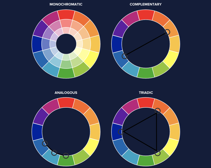
Speaking of color palettes, there are generally four color schemes we can use to achieve harmony on the website:
说到调色板,通常可以使用四种配色方案来实现网站上的和谐:

Monochromatic: Using the same base color
单色 :使用相同的基色
Complementary: Showing high contrast in color-pairing
互补性 :在色彩配对中显示高对比度
Analogous: Apply three or more colors that are adjacent to each other on the color wheel
类似的 :在色轮上应用彼此相邻的三种或更多颜色
Triadic: Creating a triangle of colors within the color wheel
Triadic :在色轮中创建颜色的三角形
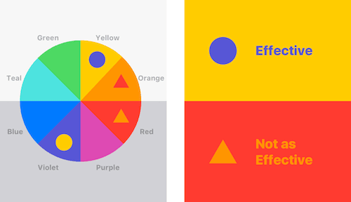
Last but not least, we should also account for color psychology, which refers to how colors trigger a user’s emotional responses. For instance, the color red evokes passion and danger, while the color blue is often associated with calmness.
最后但并非最不重要的一点是,我们还应考虑颜色心理学 ,这是指颜色如何触发用户的情感React。 例如,红色唤起了激情和危险,而蓝色常常伴随着平静。
UI状态 (UI States)

When applying colors to UI design, we need to take into account different states, or user actions, on the targeted component of the website.
在将颜色应用于UI设计时,我们需要考虑网站目标组件上的不同状态或用户操作。
For instance, the two common states of user interaction on a button are the hover state and the disabled state.
例如, 按钮上用户交互的两个常见状态是悬停状态和禁用状态。
Similarly, form inputs also have several states:
同样, 表单输入也有几种状态:
default: when the page loads, before user interaction
default :页面加载时,用户交互之前
active, or selected: when the user highlights a field (usually achieved by changing border color)
active或selected :当用户突出显示字段时(通常通过更改边框颜色来实现)
disabled: indicates the field cannot be edited (grayed out)
禁用 :表示该字段无法编辑(显示为灰色)
口音与语义颜色 (Accent vs. Semantic Colors)
While it’s important to have a clear, dominant brand color for our website, we can also use different visual signals in our color palette to reflect the content hierarchy or any special indicator.
为网站提供清晰,主导的品牌色彩很重要,但我们也可以在调色板中使用不同的视觉信号来反映内容层次结构或任何特殊的指标。
Accent colors are used when we want to draw the user’s attention. For instance, a call-to-action button or form inputs.
当我们想引起用户注意时,会使用强调颜色 。 例如,号召性用语按钮或表单输入。
Semantic colors provide additional indications to the user when something goes right or wrong. Some common designs for such indicators are red alerts, green submission success, and yellow warnings.
当某些事情是对还是错时, 语义颜色会向用户提供其他指示。 此类指标的一些常见设计是红色警报, 绿色提交成功和黄色警告。
辅助功能 (Accessibility)

Finally, to make sure our UI components are accessible, we should provide additional indicators other than colors to convey information.
最后,为了确保我们的UI组件可访问,我们应该提供颜色以外的其他指示器来传达信息。
For example, in addition to using the color green to indicate submission success, we should add a text label (“success!”) or checkmark icon.
例如,除了使用绿色表示提交成功之外,我们还应该添加文本标签(“成功!”)或选中标记图标。
There are also plenty of accessibility checking tools we can leverage, such as Color Safe, Adobe Color Accessibility, and Cloudflare.
我们还可以利用许多辅助功能检查工具,例如Color Safe , Adobe Color Accessibility和Cloudflare 。
I hope this post gives you a brief overview or quick refresher on color design. In terms of determining color schemes, my personal favorite has been Colormind.io. Is there any resource you use regularly for color selections or references? Let me know in the comments!
希望本文能为您简要概述或快速复习色彩设计。 在确定配色方案方面,我个人最喜欢的是Colormind.io 。 您是否定期使用任何资源进行颜色选择或参考? 在评论中让我知道!
翻译自: https://uxdesign.cc/revisiting-color-design-53d5b139d1b1
逻辑回顾


 540
540

 被折叠的 条评论
为什么被折叠?


