


 本文介绍了一种在Figma中实现锚链接的方法,利用滚动溢出技术,并详细讲解了如何准备页面内容、创建视图窗口及使锚链接正常工作等步骤。
figma button
Anchor Links aren’t the most exciting interaction to design, but they are a crucial design element for validating long form content and larger websites. It’s not intuitive to create Anchor Links but it’s possible with the Scroll Overflow technique, if you’re careful with layer management. I’ll show you how to create one, how you can organise your layers to keep it manageable, and a couple of limitations you may encounter.
锚链接并不是设计中最令人兴奋的交互,但它们是验证长格式内容和较大网站的关键设计元素。 创建锚链接并不是很直观,但是如果您对图层管理很谨慎的话,可以使用滚动溢出技术。 我将向您展示如何创建一个图层,如何组织图层以使其易于管理以及可能遇到的一些限制。
Here’s the Figma preview link if you just want to see a proof-of-concept:
如果您只是想查看概念验证,请点击这里,查看Figma预览链接:
什么是滚动溢出 (What is Scroll Overflow)
If you’ve been designing functional prototypes for mobile devices within Figma then this is a concept you’ll have encountered. In many apps you’ll want some elements such as the app bar to remain in a fixed position, whilst letting the rest of the elements and content be scrollable. It’s often talked about with the ‘Fix position when scrolling’ checkbox feature, since it’s only possible once you’ve activated an Overflow Behavior.
如果您一直在为Figma设计移动设备的功能原型,那么您将遇到这个概念。 在许多应用程序中,您希望某些元素(如应用程序栏)保持在固定位置,同时让其余元素和内容可滚动。 它经常与“滚动时固定位置”复选框功能有关,因为只有在激活“溢出行为”后才有可能。
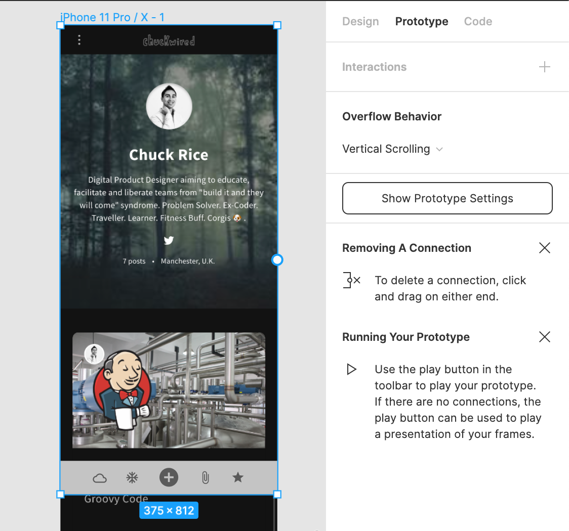
As you can see in the screenshot above, I have a parent Frame called ‘iPhone 11 Pro / X — 1’ with layers inside that are larger than the parent Frame. When this happens I can set the Overflow Behavior to ‘Vertical Scrolling’, and I’ve also ticked the ‘Fix position when scrolling’ checkbox for my app bar at the bottom. This allows a viewer to scroll the page up and down in Figma’s Presentation View more realistically.
如您在上面的屏幕快照中所见,我有一个名为“ iPhone 11 Pro / X — 1”的父框架,其内部层大于父框架。 发生这种情况时,我可以将“溢出行为”设置为“垂直滚动”,并在底部的应用栏上勾选“滚动时固定位置”复选框。 这使查看者可以更实际地在Figma的Presentation View中向上和向下滚动页面。
You can read more about it in the Figma documentation for prototype scrolling with overflow behaviour.
您可以在Figma文档中阅读有关它的更多信息,以进行带有溢出行为的原型滚动 。
锚链接解剖 (Anchor Link anatomy)
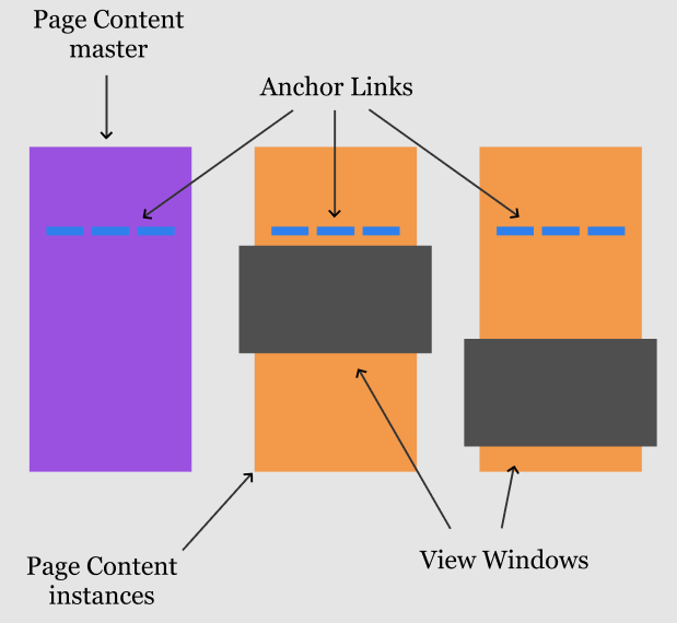
There are three key parts required to create an Anchor Link:
创建锚链接需要三个关键部分:
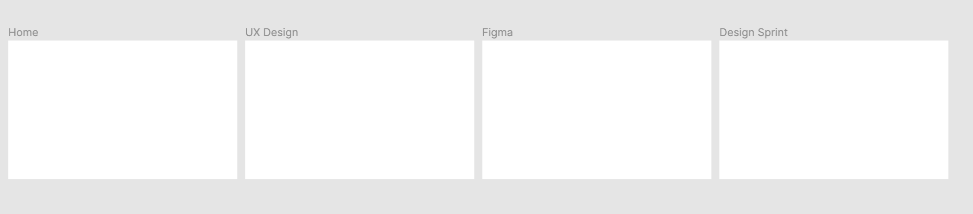
- Page Content 页面内容
- View Windows 查看视窗
- Anchor Links 锚链接
准备页面内容 (Prepare the Page Content)
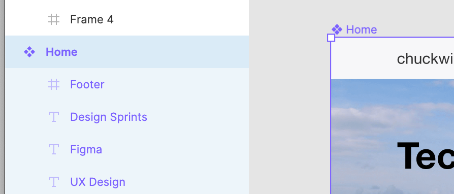
First we need to prepare the Page Content. I’m going to assume in your editor you already have a page in a Frame or a Group. You’ll need to select your page and turn it into a Component by right-clicking and selecting ‘Create Component’ or press Cmd + Option + K on Mac. We’ll be using instances of this component to create our Anchor Links. This is a key step to avoid excess design overhead if you need to make changes later.
首先,我们需要准备页面内容。 我假设您的编辑器中已经有一个框架或组中的页面。 您需要选择页面并将其变成一个组件,方法是右键单击并选择“创建组件”,或者在Mac上按Cmd + Option + K 。 我们将使用该组件的实例来创建我们的锚链接。 如果您以后需要进行更改,这是避免过多设计开销的关键步骤。
创建视图窗口 (Creating the View Windows)
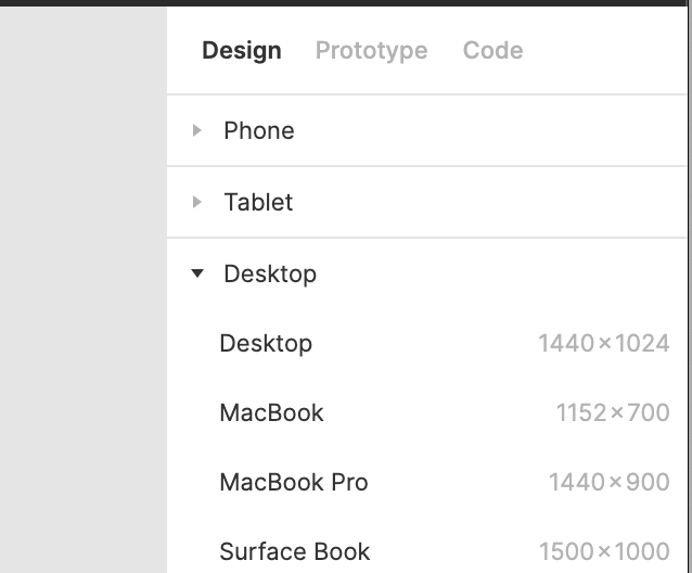
Next we need to create the view windows for each Anchor Link. Count the number of Anchor Links you want to create, and then make that many Frames in your editor. You’ll typically want one more to act as the ‘home’ or default Anchor to the top. I like to use the built-in defaults Figma supplies in the Design tab on the right when you change to the Frame tool in the top left, or use the shortcut by pressing F.
接下来,我们需要为每个“锚链接”创建视图窗口。 计算您要创建的锚链接的数量,然后在编辑器中创建这么多的框架。 您通常会希望再有一个充当“家”或顶部的默认锚点。 当您更改为左上方的Frame工具时,我喜欢在右侧的Design选项卡中使用Figma提供的内置默认值,或者通过按F使用快捷方式。
You can freehand your viewing Frame as long as the width is the same as your page content, and the height is shorter. Ideally you’ll match the aspect ratio of the screen you’re designing for such as 3:2 for classic screens, 16:9 for modern HD screens, or 19.5:9 of the iPhone X. Name each view with the Anchor Link names so that they’re easier to find later.
只要宽度与页面内容相同,并且高度较短,就可以徒手查看框架。 理想情况下,您要匹配要设计的屏幕的长宽比,例如经典屏幕为3:2,现代高清屏幕为16:9或iPhone X的19.5:9。使用Anchor Link名称为每个视图命名以便日后更容易找到它们。
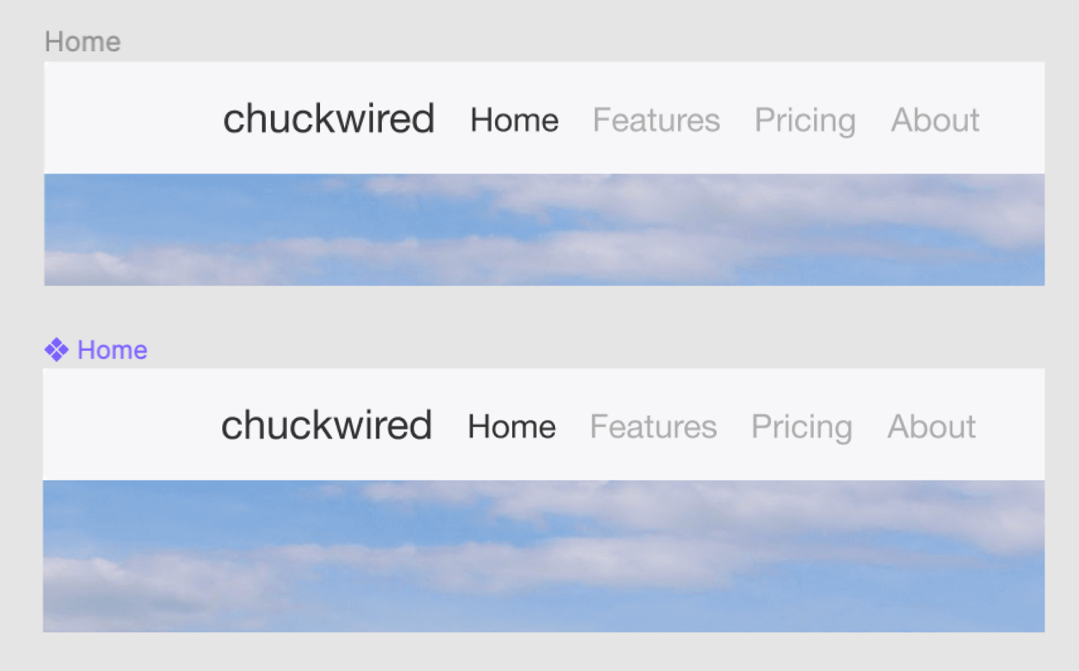
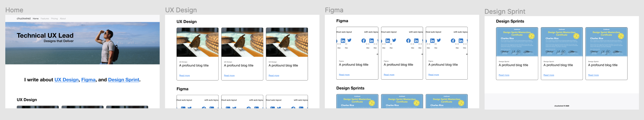
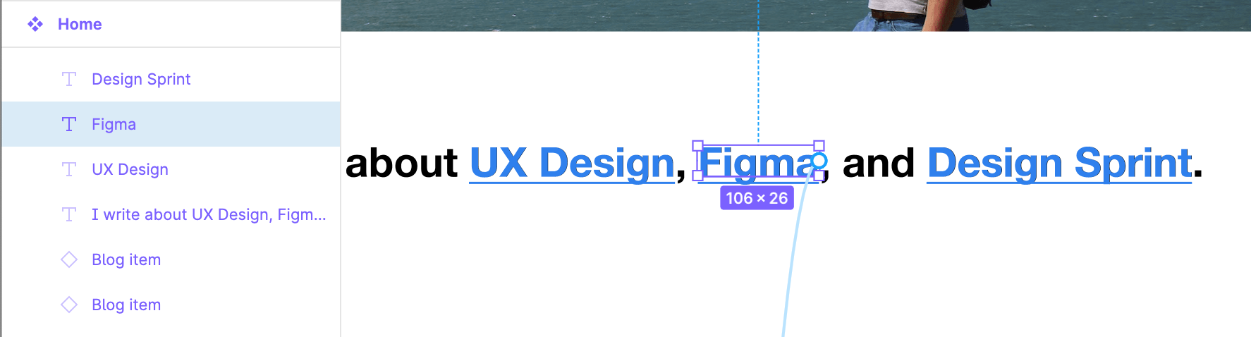
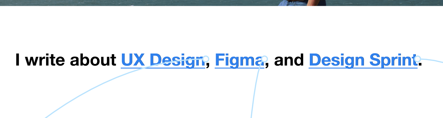
Next, you’ll want to place instances of your Page Content within each Frame. Instead of placing the page content with the top aligned to the top, you need to stagger it so the top of the View Window lines up to where you want the Anchor Link to appear. In my example I have an Anchor Link for the ‘Figma’ category, so on the View Window I’ve aligned that heading item on the page content towards the top. If ‘Clip content’ isn’t ticked it should look something like the below.
接下来,您需要在每个框架内放置页面内容的实例。 您无需将页面内容的顶部与顶部对齐,而是将其错开排列,以使“视图窗口”的顶部与希望锚点链接出现的位置对齐。 在我的示例中,我具有“ Figma”类别的“锚链接”,因此在“查看窗口”中,我已将页面内容上的标题项朝顶部对齐。 如果未选中“剪辑内容”,则其外观应类似于以下内容。
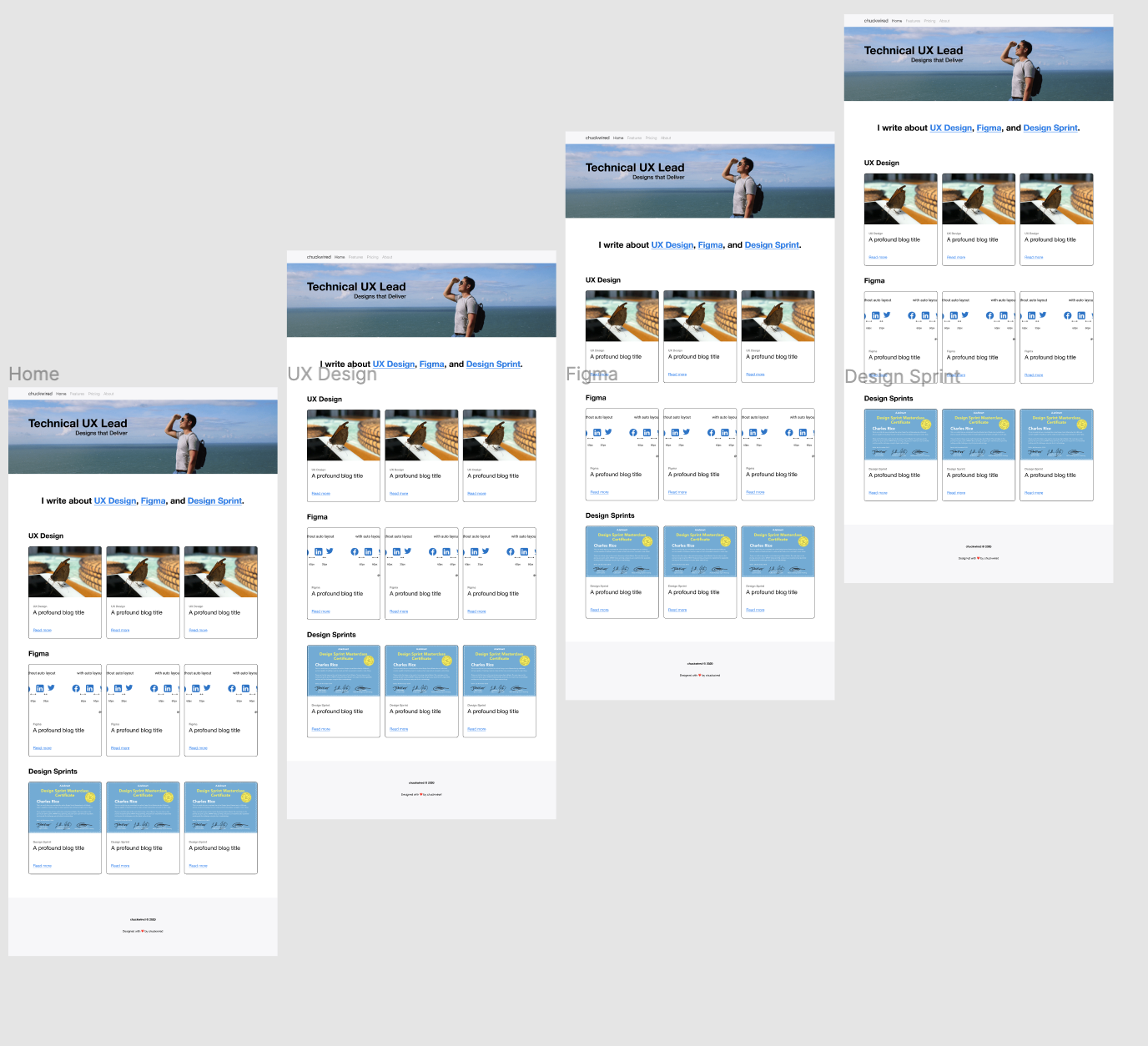
To make sure that you’ve lined up the page content correctly in each of the view windows you can tick the ‘Clip content’ checkbox. When your View Window is selected, it’ll be in the Design tab on the right underneath the dimensions and positioning information. In the example I’ve used, I can use the blog cards as a guide to line up the Anchors to look more natural.
为确保已在每个视图窗口中正确排列页面内容,可以选中“剪辑内容”复选框。 选择“查看窗口”后,它将位于尺寸和位置信息下方右侧的“设计”选项卡中。 在我使用的示例中,我可以使用博客卡作为指导来排列锚点,使其看起来更加自然。
Finally you’ll want to ensure that the Overflow Behavior is set to ‘Vertical Scrolling’ in the Prototype tab of each view window before you move on.
最后,您需要确保在继续操作之前,在每个视图窗口的“原型”选项卡中将“溢出行为”设置为“垂直滚动”。
使锚工作 (Making the Anchors work)
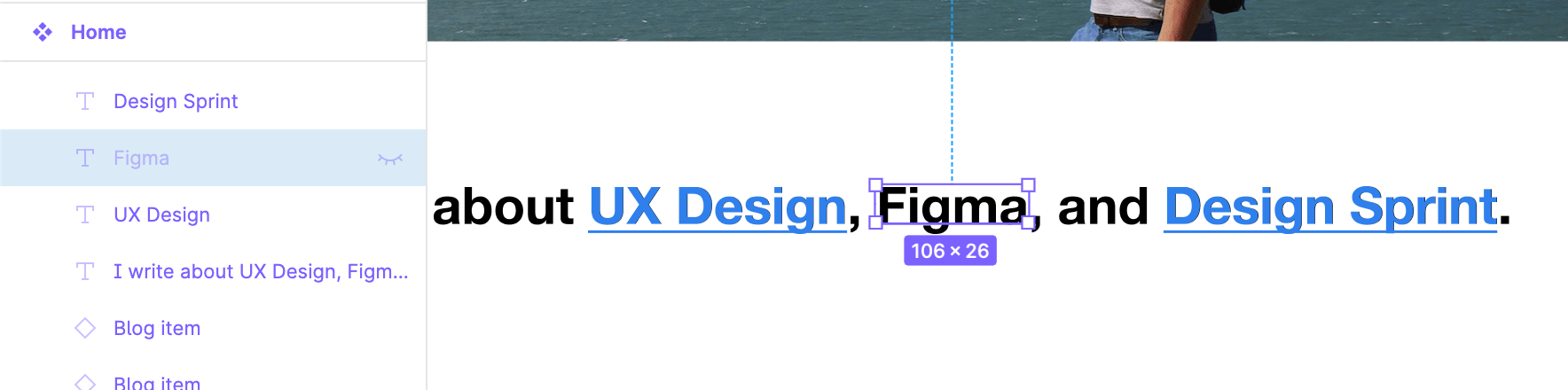
Finally, the last piece of the puzzle you’ll need to make working Anchor Links. On the master component of your Page Content you’ll want to ensure each of the buttons, hyperlinks or images you’re using are individual items. This allows you to attach a new prototype interaction to each. If you’re using hyperlinks as is with my example you can use master text underneath as a guide, then hide the guide text layer or use the same colour as the background to hide it in Presentation View.
最后,制作工作锚链接需要完成拼图的最后一部分。 在页面内容的主组件上,您需要确保所使用的每个按钮,超链接或图像都是单独的项。 这使您可以将新的原型交互附加到每个交互。 如果像我的示例一样使用超链接,则可以使用下面的主文本作为参考,然后隐藏参考文本层或使用与背景相同的颜色将其隐藏在Presentation View中。
Once you’re done setting it up, all you need to do is insert an ‘On Click’ interaction to each of your Anchor Links pointing to the corresponding View Window. Make sure you haven’t selected any layers by clicking the empty space on the editor, double check that the ‘Home’ page is the Starting Frame in the Prototype tab settings in the top right, then click the play button in the top right to check out your new Anchor Link prototype.
设置完成后,您需要做的就是向指向相应视图窗口的每个锚链接插入“单击”交互。 单击编辑器上的空白区域,确保没有选择任何图层,再次检查“主页”页面是否为右上角“原型”选项卡设置中的“起始帧”,然后单击右上角的“播放”按钮以查看新的Anchor Link原型。
更新页面内容 (Updating your Page Content)
If you aren’t fluent in using Figma’s Components feature, it’s worth mentioning that any changes you make to your Page Content should be done on the master component. Any changes made on the Page Content instances inside the View Window Frames will be unique to each and break the Anchor Link illusion. You can make sure you’re editing the master component by checking that it’s purple, and that it has the master component symbol ❖.
如果您不熟练使用Figma的“组件”功能,则值得一提的是,您对“页面内容”所做的任何更改都应在主组件上进行。 在“视图窗口框架”内的“页面内容”实例上进行的任何更改都是唯一的,并打破了“锚链接”的幻觉。 您可以通过检查它是否为紫色以及是否带有主组件符号❖来确保正在编辑主组件。
You can see a demo of this tutorial using the link below.
您可以使用下面的链接查看本教程的演示。
局限性 (Limitations)
There’s a couple of things that are either limitations of what’s possible in Figma, things that require too much overhead to manage, or I simply wasn’t able to achieve.
有几件事要么限制了Figma的功能,要么需要过多的管理开销,或者我根本无法实现。
平滑滚动 (Smooth scrolling)
I’ve experimented using the ‘Smart Animate’ feature a little bit, but couldn’t get the Anchor Links to work predictably. It might be good option for pages you only expect your users to smoothly be Anchored down once such as with a Product home page.
我已经尝试过使用“智能动画”功能,但无法使锚链接可预期地工作。 对于仅希望用户一次顺利锚定用户的页面(例如产品主页),这可能是一个不错的选择。
滚动到顶部 (Scroll to top)
I’ve tried it by adding ‘scroll to top’ hyperlinks going to the ‘Home’ view window. With the method and layout I’ve used here it doesn’t work if you simply scroll down, but it does after clicking one of the Anchor Links at the top. This happens because Figma is clever enough to deactivate interactions that point to itself, but it makes more complex Anchor Link illusions a little more difficult to accomplish.
我已经尝试通过将“滚动到顶部”超链接添加到“主页”视图窗口来进行尝试。 使用我在这里使用的方法和布局,如果您简单地向下滚动,则无法使用,但是在单击顶部的“锚链接”之一后,它可以使用。 发生这种情况是因为Figma足够聪明,可以停用指向自身的交互,但是这会使更复杂的Anchor Link幻觉变得更加难以实现。
Whilst Anchor Links are quite simple to implement in code, it’s a little more complex to set it up in a prototype in Figma. Even so, it’s important to have a robust and immersive solution to get as close to realistic behaviours as possible when using your prototype in your UX Research. Setting up your Page Content as a master component, inserting them into prepared View Windows and then creating your Anchor Links in the master component make managing your design clean and minimal.
尽管Anchor Links在代码中实现起来非常简单,但在Figma的原型中进行设置却要复杂一些。 即使如此,在UX Research中使用原型时,拥有一个健壮且身临其境的解决方案以尽可能接近现实行为也很重要。 将页面内容设置为主组件,将其插入到准备好的View Windows中,然后在主组件中创建锚链接,使设计的管理变得简洁而最少。
翻译自: https://uxdesign.cc/how-to-create-anchor-links-in-figma-393f0259981a
figma button


 289
289

 被折叠的 条评论
为什么被折叠?
被折叠的 条评论
为什么被折叠?
 到【灌水乐园】发言


