


 本文介绍了如何使用KMeans算法对购物中心客户数据进行聚类分析,以根据收入和支出进行客户细分。作者首先进行了探索性数据分析(EDA),展示了收入和支出得分的分布,并通过散点图观察数据分布。接着,选择了K=5进行KMeans聚类,结果显示数据点可以分为5个不同的簇。最后,讨论了如何解释这些簇,并提到了确定K最佳值的肘部方法,验证了K=5的合理性。
KMeans — that was the first unsupervised learning algorithm that I learned back when I started to get deeper into the world of machine learning. At that moment I thought there’s nothing so special with the algorithm since what’s essentially done is no more than just a data points clustering in a simple cartesian plane. But well, now I realize that it can be very helpful especially when it is applied to dataset which has high dimensionality.
KMeans —这是我开始更深入地学习机器学习世界时所学的第一个无监督学习算法。 那时,我认为该算法没有什么特别之处,因为本质上要做的不只是在简单笛卡尔平面中聚类的数据点。 但是,好了,现在我意识到,它特别有用,特别是将其应用于具有高维的数据集时。
Today, in this article, I would like to do another simple project: implementing KMeans algorithm on mall customers dataset. The main objective of this project is to perform customers segmentation based on their income and spending. Such task is also commonly called as market basket analysis. The dataset used in this project can be downloaded from this Kaggle link. Before getting into the algorithm, I wanna do a little bit of data analysis first.
今天,在本文中,我想做一个简单的项目:在购物中心客户数据集上实现KMeans算法。 该项目的主要目标是根据客户的收入和支出进行客户细分。 这种任务通常也被称为市场篮分析。 可以从该Kaggle链接下载此项目中使用的数据集。 在开始算法之前,我想先做一点数据分析。
Note: I share the entire code used in this project at the end of this article.
注意:在本文结尾处,我共享该项目中使用的全部代码。
探索性数据分析(EDA) (Exploratory Data Analysis (EDA))
Below is all the modules used in this project. Instead of creating KMeans function manually, here I use Scikit-Learn module to make things simpler. I will probably write about KMeans from scratch someday in separate article.
以下是此项目中使用的所有模块。 在这里,我使用Scikit-Learn模块来简化事情,而不是手动创建KMeans函数。 也许有一天我会在另一篇文章中从零开始写KMeans。
import numpy as np
import pandas as pd
import matplotlib.pyplot as plt
import seaborn as sns; sns.set()
from sklearn.cluster import KMeans
Anyway, after the csv file has been downloaded, we can just load it using read_csv() function and display the first several data.
无论如何,在下载csv文件之后,我们可以使用read_csv()函数加载它并显示前几个数据。
df = pd.read_csv('Mall_Customers.csv')
df.head()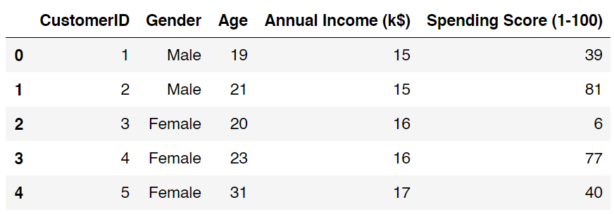
As I have mentioned earlier, in this project we will only use the values of annual income and spending score column. According to the dataset details, the value of spending score column ranges between 1 to 100 (inclusive), where higher value means more spending. Now I wanna show you the values distribution of both columns in form of boxplot. Below is the code to do that.
正如我之前提到的,在此项目中,我们将仅使用“年收入和支出分数”列的值。 根据数据集的详细信息,支出得分列的值在1到100(含)之间,其中较高的值表示更多的支出。 现在,我想以箱线图的形式向您展示两列的值分布。 下面是执行此操作的代码。
plt.figure(figsize=(15,2))
plt.boxplot(df['Annual Income (k$)'], vert=False)
plt.title('Income distribution')
plt.yticks([])
plt.xticks(range(0,150,10))
plt.xlabel('Annual Income (k$)')
plt.show()plt.figure(figsize=(15,2))
plt.boxplot(df['Spending Score (1-100)'], vert=False)
plt.title('Spending score distribution')
plt.yticks([])
plt.xticks(range(0,100,10))
plt.xlabel('Spending Score (1-100)')
plt.show()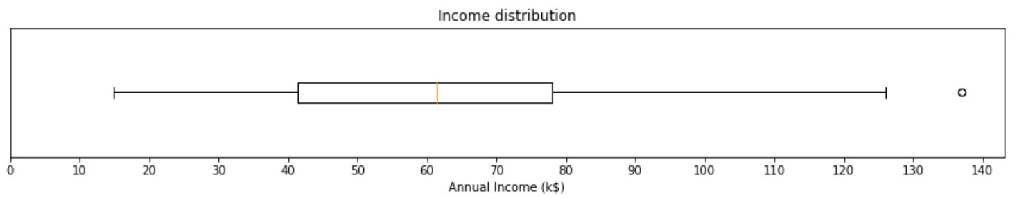
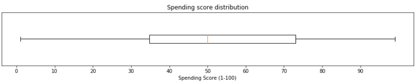
I think both plots are self-explanatory — especially if you’ve taken statistics class. But here I wanna highlight several things about the two plots above. First, most people in our dataset make around $43,000 to $78,000 within a year. And there’s a super-rich person whose income almost reaches $140,000 a year. In the field of statistics, such person is usually called as an outlier. Next, the second figure says that the average spending score lies almost exactly at 50. In fact, there’s no outlier in this distribution which is known due to the fact that we got no little circle appears in the second boxplot.
我认为这两个图都是不言而喻的-特别是如果您上过统计学课。 但是在这里,我想重点介绍上述两个情节的几件事。 首先,我们数据集中的大多数人在一年内赚取约$ 43,000到$ 78,000。 还有一个超级富豪,他的年收入几乎达到14万美元。 在统计领域,这种人通常被称为离群值。 接下来,第二个数字表示平均支出得分几乎恰好在50。实际上,由于我们在第二个箱形图中没有出现任何小圆圈,因此该分布中没有异常值。
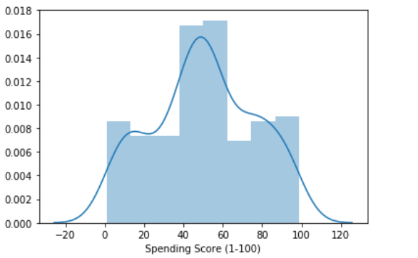
If you want, you can also display both distributions using distplot() function coming with Seaborn module.
如果需要,还可以使用Seaborn模块附带的distplot()函数显示两个分布。
sns.distplot(df['Annual Income (k$)'])
plt.show()sns.distplot(df['Spending Score (1-100)'])
plt.show()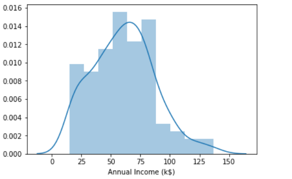
KMeans聚类 (KMeans clustering)
As the income and spending score distribution have been analyzed, we are gonna separate the values of the two columns into different array. After running the code below, we should now have a 2-dimensional array X.
分析收入和支出得分分布后,我们将把两列的值分成不同的数组。 运行下面的代码后,我们现在应该具有一个二维数组X。
X = df[['Annual Income (k$)', 'Spending Score (1-100)']].values
X[:5]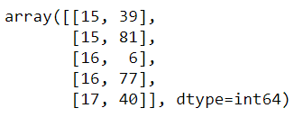
Now we are going to use scatter plot to see customer distribution based on the two features. Here I decided to use x-axis and y-axis to represent income and spending respectively.
现在,我们将使用散点图查看基于这两个功能的客户分布。 在这里,我决定使用x轴和y轴分别表示收入和支出。
plt.figure(figsize=(7,7))
plt.scatter(X[:,0], X[:,1], s=7)
plt.title('Annual income vs spending score distribution')
plt.xlabel('Annual income (k$)')
plt.ylabel('Spending score (1-100)')
plt.show()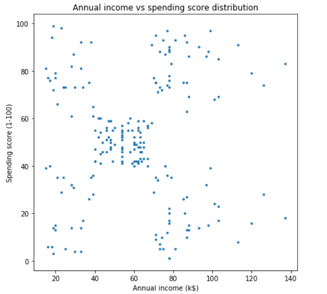
By looking at the data distribution above, we can guess that probably those data points can be put into 5 different clusters — upper left, upper right, lower left, lower right and center. Therefore, here I am going to choose 5 as the value of K. By the way, in the case of KMeans, the letter K is essentially a variable which denotes the number of clusters that the algorithm is going to create. What’s the drawback of this algorithm is that we need to choose the value of K by ourselves, which sometimes might be difficult especially when we are working with data that has more than 2 dimensions. But fortunately, we got a trick to figure out the optimum number of K, which we are going to discuss it later. By the way, if you need more explanation about the details of KMeans algorithm I suggest you to visit this article.
通过查看上面的数据分布,我们可以猜测可能是那些数据点可以放入5个不同的群集中-左上,右上,左下,右下和中心。 因此,这里我将选择5作为K的值。 顺便说一下,在KMeans的情况下,字母K本质上是一个变量,它表示算法将要创建的簇的数量。 该算法的缺点是我们需要自己选择K的值,这有时可能会很困难,尤其是当我们处理的二维数据以上时。 但是幸运的是,我们获得了一个技巧,可以找出K的最佳数,我们将在以后进行讨论。 顺便说一下,如果您需要有关KMeans算法细节的更多解释,建议您访问本文。
Anyway, we will start to do the clustering by initializing KMeans() object. Notice here that I pass the number of 5 as the argument.
无论如何,我们将通过初始化KMeans()对象开始进行聚类。 请注意,我将数字5作为参数传递。
kmeans = KMeans(n_clusters=5, random_state=44)Next, we are going to actually cluster the data points stored in X array using fit() method. The process should not take long since our dataset only consists of 200 samples.
接下来,我们将使用fit()方法对存储在X数组中的数据点进行实际聚类。 由于我们的数据集仅包含200个样本,因此该过程不会花很长时间。
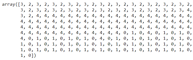
kmeans.fit(X)Now, I wanna show the final result of this clustering by doing prediction on our X data itself. I put the prediction result in y_kmeans array, which stores the class of every single sample in X data.
现在,我想通过对我们的X数据本身进行预测来显示此聚类的最终结果。 我将预测结果放在y_kmeans数组中,该数组将每个样本的类存储在X数据中。
y_kmeans = kmeans.predict(X)
y_kmeans
We should obtain the following output after running the code above.
运行上面的代码后,我们应该获得以下输出。
As the class of each samples have been obtained, we can now display those clusters using plt.scatter() function again, but this one is using the values of y_kmeans to do the color-code. Furthermore, I will also display the centers of those clusters where the values can be taken from cluster_centers_ attribute.
获得了每个样本的类别后,我们现在可以再次使用plt.scatter()函数显示这些聚类,但这是使用y_kmeans的值进行颜色编码的。 此外,我还将显示可以从cluster_centers_属性获取值的那些集群的中心。
centroids = kmeans.cluster_centers_plt.figure(figsize=(7,7))
plt.scatter(X[:,0], X[:,1], s=20, c=y_kmeans, cmap='gist_rainbow')
plt.scatter(centroids[:,0], centroids[:,1], s=75, c='black')plt.title('Annual income vs spending score distribution')
plt.xlabel('Annual income (k$)')
plt.ylabel('Spending score (1-100)')
plt.show()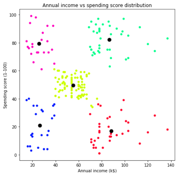
预测新数据 (Predict new data)
Now let’s assume that we got new customers with the following details, where the first column (from the left) denotes annual incomes and the second one shows the spending scores:
现在,假设我们获得了具有以下详细信息的新客户,其中第一列(左列)表示年收入,第二列显示支出得分:
pred_data = np.array([[30,10],[70,50],[20,80],[100,80],[100,20],[20,20],[60,60]])
pred_data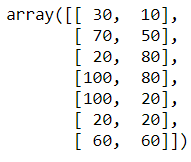
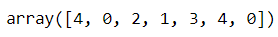
Then we can just predict those data points using predict() method — exactly the same as what we’ve done in the previous step.
然后,我们可以使用predict()方法预测这些数据点,这与我们在上一步中所做的完全相同。
predictions = kmeans.predict(pred_data)
predictions
And here’s the content of predictions array:
这是预测数组的内容:
To make the predictions look clearer, we are going to display it on another scatter plot, which can be seen in the following figure.
为了使预测更清晰,我们将其显示在另一个散点图上,如下图所示。
plt.figure(figsize=(7,7))plt.scatter(X[:,0], X[:,1], s=20, c=y_kmeans, cmap='gist_rainbow')
plt.scatter(pred_data[:,0], pred_data[:,1], s=250, c=predictions, cmap='gist_rainbow', marker='+')
plt.scatter(centroids[:,0], centroids[:,1], s=75, c='black')plt.title('Annual income vs spending score distribution')
plt.xlabel('Annual income (k$)')
plt.ylabel('Spending score (1-100)')
plt.show()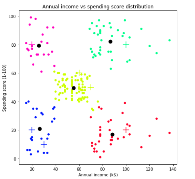
Here I decided to display all important points in our dataset. We can see the figure above that our new customers data are drawn using “+” sign, while the training samples and centroids are displayed in small and large circles respectively. According to our prediction results on new data, we can say that this KMeans model is pretty good thanks to the fact that all new data are successfully grouped into the cluster where they should be. These new data grouping process is simple as what’s basically done is just calculating its distance towards all centroids and take the closest centroid as its cluster group.
在这里,我决定在我们的数据集中显示所有重要点。 我们可以看到上图,我们的新客户数据使用“ +”号绘制,而训练样本和质心分别以小圆圈和大圆圈显示。 根据我们对新数据的预测结果,可以说该KMeans模型非常好,这是由于所有新数据均已成功分组到应有的集群中。 这些新的数据分组过程非常简单,因为基本完成的工作只是计算其到所有质心的距离,并以最接近的质心作为其聚类组。
如何解释集群 (How to interpret clusters)
The previous discussion was more related to technical stuff about KMeans. But in fact, there’s another important thing that we need to be able to explain: how to interpret those clusters. What’s the point of doing customer segmentation yet we don’t understand what kind of segments that we obtained? So now let’s get into what we just got.
先前的讨论与KMeans的技术内容更为相关。 但是实际上,我们还需要解释另一件重要的事情:如何解释这些簇。 进行客户细分的目的是什么,但我们不了解我们获得了哪种细分? 现在,让我们进入我们刚刚得到的内容。
Red cluster (bottom right) — All customers who fall into this group have relatively high income. However they probably prefer to save their money instead of purchasing stuff in the mall.
红色集群(右下)—属于该组的所有客户的收入都相对较高。 但是,他们可能更愿意省钱,而不是在购物中心购买东西。
Lime cluster (middle) — People in this cluster are average in terms of earning and spending.
石灰集群(中)–该集群中的人在收入和支出方面是平均水平。
Blue cluster (bottom left) — Tome, this customer group behavior pretty makes sense. They tend to spend less due to the fact that they don’t really got much money.
蓝色集群(左下方)—多美,这种客户群体的行为很有意义。 由于他们实际上没有多少钱,他们倾向于减少支出。
Pink cluster (upper left)— This cluster is kinda strange to me since they don’t really have much income yet their spending are pretty high.
粉红群集(左上方)—我觉得这有点奇怪,因为他们的收入并不高,但支出却很高。
Green(?) cluster (upper right) — I got no idea what color is this , lol :). Anyway, this cluster belongs to those who make much money and at the same time spend much as well. In fact, people in this cluster might be our actual target market. For example, the marketing division of this mall should send advertisements through email or chat more often to this group compared to those in other clusters. This is because the people of lime class are relatively easy to spend money.
绿色(?)簇(右上)-我不知道这是什么颜色,哈哈:)。 无论如何,这个集群属于那些赚很多钱,同时也花很多钱的人。 实际上,这个集群中的人可能是我们的实际目标市场。 例如,与其他集群相比,该购物中心的市场营销部门应更频繁地通过电子邮件或聊天向该组发送广告。 这是因为石灰阶层的人相对容易花钱。
找出K的最佳值(弯头法) (Finding out the best value for K (elbow method))
What we did in the previous step was choosing the value of K by directly looking at the scatter plot. And as a human, we can easily figure out how to roughly cluster these data. Now, what if we got more than 2 attributes to compare? Like, for example, what if we also take the values of Age and Gender column into account? There will be 4 features in total, which is completely unimaginable how the data distribution is going to look like. Therefore, we can not guess the optimum number of cluster as the K value. And here’s where elbow method comes in.
在上一步中,我们通过直接查看散点图来选择K的值。 作为人类,我们可以轻松地弄清楚如何粗略地对这些数据进行聚类。 现在,如果我们要比较两个以上的属性,该怎么办? 例如,如果我们也考虑“年龄”和“性别”列的值怎么办? 一共有4个功能,这完全是无法想象的,数据分布将是什么样子。 因此,我们不能将最佳的簇数猜测为K值。 这是肘部方法出现的地方。
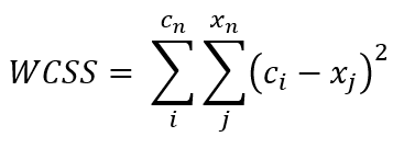
The point of elbow method itself is essentially as simple as calculating the distance value of each centroid towards all its cluster members. The distance value itself is commonly called as WCSS (Within Cluster Sum of Squares), where the formula looks something like the following figure:
肘点法本身本质上很简单,就是计算每个质心到其所有簇成员的距离值。 距离值本身通常被称为WCSS(在平方和内),其中的公式如下图所示:
Fortunately, we don’t really need to do the calculation from scratch since its value is already stored in inertia_ (yes with that underscore) attribute of our KMeans object every time we train a model. So the idea of this elbow method is to train a KMeans model several times with increasing K value and store the WCSS of each iteration. Remember that we still use X array to do this — which contains only the annual incomes and spending scores.
幸运的是,由于每次训练模型时,它的值已经存储在我们的KMeans对象的惯性_ (带有下划线的属性)属性中,因此我们实际上不需要从头开始进行计算。 因此,此弯头方法的想法是随着K值的增加多次训练KMeans模型,并存储每次迭代的WCSS。 请记住,我们仍然使用X数组来执行此操作-仅包含年收入和支出得分。
wcss = []for i in range(1, 11):
    kmeans = KMeans(n_clusters=i, random_state=44)
    kmeans.fit(X)
    wcss.append(kmeans.inertia_)
Now as the WCSS values have been stored in wcss list, we can just plot it using the following code.
现在,由于WCSS值已存储在wcss列表中,我们可以使用以下代码对其进行绘制。
plt.figure(figsize=(6,6))
plt.title('WCSS (Within Cluster Sum of Squares)')
plt.plot(range(1,11), wcss)
plt.xticks(range(1,11))
plt.show()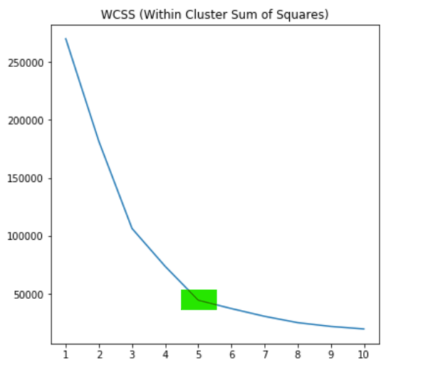
An article about elbow method in Geeks for Geeks says that:
Geeks for Geeks中有关肘部方法的文章说:
To determine the optimal number of clusters, we have to select the value of K at the “elbow” i.e. the point after which the distortion/inertia start decreasing in a linear fashion. — Geeks for Geeks, 2019
为了确定最佳的簇数,我们必须选择“弯头”处的K值,即失真/惯性开始以线性方式减小之后的点。 —极客,2019年
According to the graph above, we can conclude that indeed the optimal value for K in our case is 5. This means that our initial guess was correct. And well, such guessing method may not work in all cases since there are plenty of problems out there where the dataset contains more than 2 features.
根据上图,我们可以得出结论,在这种情况下, K的最佳值确实为5。这意味着我们最初的猜测是正确的。 而且,由于存在大量数据集包含两个以上特征的问题,因此这种猜测方法可能无法在所有情况下都有效。
That’s all of today’s project. Hopefully this article makes you learn something new. See you in the next one!
这就是今天的所有项目。 希望本文能使您学到新东西。 下一个见!
Note: here’s the code :)
注意:这是代码:)
import numpy as np
import pandas as pd
import matplotlib.pyplot as plt
import seaborn as sns
from sklearn.cluster import KMeans


print("Loading data ...")
df = pd.read_csv('Mall_Customers.csv')
df.head()


print("Displaying annual income distribution ...")
plt.figure(figsize=(15,5))
plt.boxplot(df['Annual Income (k$)'], vert=False)
plt.title('Income distribution')
plt.yticks([])
plt.xticks(range(0,150,10))
plt.xlabel('Annual Income (k$)')
plt.show()


print("Displaying spending score distribution ...")
plt.figure(figsize=(15,5))
plt.boxplot(df['Spending Score (1-100)'], vert=False)
plt.title('Spending score distribution')
plt.yticks([])
plt.xticks(range(0,100,10))
plt.xlabel('Spending Score (1-100)')
plt.show()


print("Displaying annual income and score distribution with distplot ...")
sns.distplot(df['Annual Income (k$)'])
plt.show()
sns.distplot(df['Spending Score (1-100)'])
plt.show()


print("Selecting 2 features (income and spending) ...")
X = df[['Annual Income (k$)', 'Spending Score (1-100)']].values
print(X[:5])


print("Displaying annual income vs spending distribution ...")
plt.figure(figsize=(7,7))
plt.scatter(X[:,0], X[:,1], s=7)
plt.title('Annual income vs spending score distribution')
plt.xlabel('Annual income (k$)')
plt.ylabel('Spending score (1-100)')
plt.show()


print("Initializing KMeans object ...")
kmeans = KMeans(n_clusters=5, random_state=41)


print("Training KMeans model ...")
kmeans.fit(X)


print("Predicting train data ...")
y_kmeans = kmeans.predict(X)
print(y_kmeans)


print("Displaying cluster centers ...")
centroids = kmeans.cluster_centers_
print(centroids)


plt.figure(figsize=(7,7))
plt.scatter(X[:,0], X[:,1], s=20, c=y_kmeans, cmap='gist_rainbow')
plt.scatter(centroids[:,0], centroids[:,1], s=75, c='black')
plt.title('Annual income vs spending score distribution')
plt.xlabel('Annual income (k$)')
plt.ylabel('Spending score (1-100)')
plt.show()


print("Creating new data ...")
pred_data = np.array([[30,10],[70,50],[20,80],[100,80],[100,20],[20,20],[60,60]])
print(pred_data)


print("Predicting new data ...")
predictions = kmeans.predict(pred_data)
print(predictions)


print("Displaying clusters of new data ...")
plt.figure(figsize=(7,7))
plt.scatter(X[:,0], X[:,1], s=20, c=y_kmeans, cmap='gist_rainbow')
plt.scatter(pred_data[:,0], pred_data[:,1], s=250, c=predictions, cmap='gist_rainbow', marker='+')
plt.scatter(centroids[:,0], centroids[:,1], s=75, c='black')
plt.title('Annual income vs spending score distribution')
plt.xlabel('Annual income (k$)')
plt.ylabel('Spending score (1-100)')
plt.show()


print("Calculating WCSS ...")
wcss = []
for i in range(1, 11):
    kmeans = KMeans(n_clusters=i, random_state=41)
    kmeans.fit(X)
    wcss.append(kmeans.inertia_)


print("Displaying WCSS plot for elbow method ...")
plt.figure(figsize=(6,6))
plt.title('WCSS (Within Cluster Sum of Squares)')
plt.plot(range(1,11), wcss)
plt.xticks(range(1,11))
plt.show()
翻译自: https://medium.com/analytics-vidhya/kmeans-for-customer-segmentation-4db67b4bf6d5


 451
451

 被折叠的 条评论
为什么被折叠?
被折叠的 条评论
为什么被折叠?
 到【灌水乐园】发言


