


unity 完美像素
从Kidpix到设计系统 (From Kidpix to design systems)
Did you ever create stamps in KidPix? Kidpix is bitmap drawing software that’s been around since the nineties, and I remember many happy — more like maddening — hours creating tiny pixelated images to reuse in my pictures. I was continually amazed to see how different the stamp looked at rendered size than in the zoomed-in view I was working on. Will these stark grey blocks really look like shadows? Magic.
您是否曾经在KidPix中创建图章? Kidpix是一种位图绘图软件,自90年代以来一直存在,我记得许多小时(更像是发疯)花费了几个小时来创建微小的像素化图像以在我的图片中重复使用。 我一直惊奇地发现,图章在渲染尺寸上与我正在处理的放大视图有何不同。 这些明显的灰色块真的看起来像阴影吗? 魔法。
For the past four years, I’ve been a caretaker of system icons. I’m currently helping to cultivate Garden, the design system for Zendesk. That includes agonizing over lots of pixels, so, I guess I’ve achieved all of my childhood dreams. I enjoy the challenging tension between small details and big user experience questions.
在过去的四年中,我一直是系统图标的管理员。 我目前正在帮助培育Zendesk的设计系统Garden 。 这包括困扰很多像素,所以,我想我已经实现了我所有的童年梦想。 我喜欢小细节和大用户体验问题之间的挑战性张力。
为什么我在这里 (Why I’m here)
I’m passionate about providing quality icons to users. I know when I use a product frequently, I build a connection with the icons that influences my experience for better or worse.
我热衷于为用户提供优质的图标。 我知道当我经常使用产品时,我会与图标建立联系,无论好坏,都会影响我的体验。
I want to focus on the craft of icons. Tools will come and go. Technology will change. Already, icons are viewed at increasingly high resolutions.
我想专注于图标的Craft.io。 工具会来来去去。 技术将发生变化。 已经可以以越来越高的分辨率查看图标。
Designing icons may seem like a purely visual exercise, but much more is involved. I think of icon design as a microcosm of the overall UX design process, challenging me in terms of visual design, communicating concepts, and defining problems. Icons follow the principle of things being interconnected. When I try to consider any icon in isolation, I find it hitched to everything else in the universe. I start by looking at an icon, and I end up helping a team consider a whole user flow.
设计图标可能看起来像是纯粹的视觉练习,但涉及的内容更多。 我认为图标设计是整个UX设计过程的缩影,在视觉设计,沟通概念和确定问题方面给我带来挑战。 图标遵循事物相互连接的原理。 当我尝试孤立地考虑任何图标时,我发现它与宇宙中的其他所有事物都息息相关 。 我首先查看一个图标,然后最终帮助团队考虑整个用户流程。
制作实用的图标 (Crafting practical icons)
So what kind of icons am I talking about here? Icon design is a broad topic. Icons can be many things:
那么我在这里谈论什么样的图标呢? 图标设计是一个广泛的主题。 图标可以是很多东西:
Mini illustrations for brands (check out Nick Levesque’s post Shaping an icon for more on this)
品牌的迷你插图(有关更多信息,请查看Nick Levesque的文章“ 塑造图标 ”)
- Pictograms for navigating the world 导航世界的象形图
- Anything on the broad spectrum in between 介于两者之间的任何范围
The icons I’m talking about are design system icons. These are on the practical pictogram side of things, in the digital world. In Garden, I’ve defined icons as visual symbols of simple concepts. They aim to:
我正在谈论的图标是设计系统图标。 在数字世界中,这些都属于实际的象形图方面。 在花园中,我已将图标定义为简单概念的视觉符号。 他们的目标是:
- Visually support a text string 视觉上支持文本字符串
- Make content more scannable by differentiating items at a glance 一目了然地区分项目,使内容更易于扫描
- Simplify repeating or persistent actions 简化重复动作或持续动作
Garden icons are treated like any user interface component in our system.
花园图标被视为与我们系统中的任何用户界面组件一样。
一致且标准化 (Consistent and standardized)
Meeting strict style and quality guidelines
符合严格的样式和质量准则
功利主义者 (Utilitarian)
Helping the user understand and take action
帮助用户理解并采取行动
模块化的 (Modular)
Ready to plug into any Zendesk interface
准备插入任何Zendesk界面
可重用 (Reusable)
Useful for multiple situations, though usually precipitated by a product’s specific need
在多种情况下很有用,尽管通常是由产品的特定需求引起的
灵活而强大 (Flexible and robust)
Sized at 12px and 16px, allowing scaling to many multiples of 4 to fit our base grid. Styled in two ways: stroke style is the default; fill is used for greater visual weight. Each icon comes in 4 versions.
大小分别为12px和16px,可以缩放到4的许多倍以适合我们的基本网格。 有两种样式:笔画样式是默认样式; 填充用于更大的视觉重量。 每个图标都有4个版本。
国际化 (International)
Using universal metaphors and avoiding words, which won’t be translated. Can be flipped for use with languages that are read right-to-left.
使用通用隐喻并避免使用不会翻译的单词。 可以翻转以用于从右到左阅读的语言。
爱像素 (Love the pixels)
像素很重要 (Pixels matter)
The first UI icon I ever designed was a cursor. I drew it as a vector, thought, “great,” and gave it to the design director. She asked me if I knew what a pixel was. I had placed the vector without consideration of pixels, so the aliasing was completely arbitrary.
我设计的第一个UI图标是光标。 我将其绘制为矢量,认为“很棒”,并将其交给了设计总监。 她问我是否知道像素是什么。 我放置矢量时不考虑像素,因此混叠完全是任意的。
That fateful day, I learned that vector graphics are translated into rasterized images on a display. I went back to my KidPix roots and began the practice of aligning icons to the pixel grid so that they will be sharp when they’re rasterized. As usual, knowing was 7% of the battle. Pixel-wrangling is a unique challenge for each icon. What a thrill. 😏
命运的那一天,我了解到矢量图形被转换为显示器上的光栅图像。 我回到了KidPix的根源,开始了将图标与像素网格对齐的练习,以便在对其进行栅格化时变得清晰。 像往常一样,知道是战斗的7%。 像素争夺是每个图标的独特挑战。 太刺激了。 😏
绘制图标的实用技巧 (Practical tips for drawing icons)
Because icons’ limited number of pixels have such an impact on what I can draw, I move to digital quickly. I may sketch on paper as I think through metaphors, but once I know what I’m drawing, I work out the visual design in pixels. Only in the final medium do I know what will be possible.
由于图标的像素数量有限,因此对我可以绘制的图像产生如此大的影响,因此我很快转向了数字技术。 我可能会通过隐喻思考在纸上画草图,但是一旦知道要绘制的内容,便会以像素为单位进行视觉设计。 只有在最终的媒介中,我才知道可能会发生什么。
When I draw an icon, I set anchor points to snap to half pixels. That’s because I’m drawing 1px borders, so the shape of them will fill a whole pixel.
绘制图标时,我将锚点设置为捕捉到半像素。 那是因为我要绘制1px的边框,所以它们的形状将填充整个像素。
I preview the pixels constantly, and shift anchor points to see how the elements are going to alias.
我不断预览像素,并移动锚点以查看元素的别名。
I also zoom out to 100% constantly. Sometimes I am agonizing over how a curve is going to alias but find it doesn’t matter at actual size.
我也不断缩小到100%。 有时我会为曲线如何混淆而感到烦恼,但发现实际大小并不重要。
Sometimes, pixel perfection means offsetting a whole icon. For example, Garden has a set of icons with a symbol sitting inside a circle. If the circle size is an even number, the 1px symbol inside will land on a half pixel and be blurry. Because of this, my colleague Nicolette designed the whole set of icons to be smaller and offset within their 16px viewboxes, so the shapes inside are sharp and they align to one another. This principle has been a helpful precedent to reference when I’ve come across similar situations.
有时,像素完美意味着偏移整个图标。 例如,Garden有一组带有圆圈内符号的图标。 如果圆圈大小是偶数,则内部的1px符号将落在半个像素上并且模糊。 因此,我的同事Nicolette将整个图标设计得更小,并且在其16px视图框中偏移了,因此内部的形状很清晰,并且彼此对齐。 当我遇到类似情况时,该原则已成为参考的有用先例。

Pixel-perfect icons look great on any display. Plus, they have a subtle underlying logic holding them together. Relationships between shapes will be rational, based on the grid of the pixels. Even in a high-resolution world, paying attention to pixels helps make good icons into great icons.
像素完美的图标在任何显示器上看起来都很棒。 另外,它们具有将它们组合在一起的微妙的底层逻辑。 基于像素的网格,形状之间的关系将是合理的。 即使在高分辨率世界中,关注像素也有助于将好的图标变成出色的图标。
在极端尺寸限制下工作 (Working with extreme size constraints)
Twelve pixels, squared. I appreciate this icon size, since it allows clean scaling to 24px, 36px, and so on. It fills those crannies the 16px icons can’t. But, 12 × 12 is a challenging space to work in. I respond to this challenge in a couple of ways.
十二个像素,平方。 我非常喜欢此图标的大小,因为它允许将像素缩放到24px,36px等。 它填补了16px图标无法显示的缝隙。 但是,12×12是一个充满挑战的工作空间。我以多种方式应对这一挑战。
First, I keep the icon as simple as possible.
首先,我使图标尽可能简单。
Second, I use the pixels as a grid to structure the space and manage it effectively. If I align to the grid, clear constraints emerge that I can use to make decisions. Which pixels should each element occupy? Every pixel, whether it is filled or left empty, impacts the clarity of the icon.
其次,我使用像素作为网格来构造空间并有效地对其进行管理。 如果我与网格对齐,则会出现明确的约束条件,可以用来制定决策。 每个元素应占据哪些像素? 每个像素(无论是填充还是留空)都会影响图标的清晰度。
Every icon is like a puzzle, and the details matter. I feel really jazzed when I find a combination of pixels that gets the idea across.
每个图标都像一个难题,而细节很重要。 当我发现将想法传达给我的像素组合时,我感到非常激动。
As I zoom out and compare the iterations, there are usually only a few options that will make sense.
当我缩小并比较迭代时,通常只有几个选项才有意义。
使其令人难忘,而不是字面意思 (Make it memorable, not literal)
How can I communicate “API” in a 12px ✕ 12px icon? I don’t; it is a trap. Size may feel like the problem, but even if there were space to include many complex elements, the icon would be too confusing to parse at a glance within a product interface. Not being able to fit everything into an icon is a red flag that something else may be wrong and clarity is needed through another method. I could try to depict everything about the concept, but I would end up with an illustration instead of a practical interface icon — valid, just not my goal.
如何在12px✕12px图标中传达“ API”? 我不; 这是一个陷阱。 尺寸可能感觉像是一个问题,但是即使有足够的空间包含许多复杂的元素,该图标也太混乱了,无法在产品界面中一目了然地进行解析。 不能将所有内容都放入图标中是一个危险信号,表明可能有其他问题,需要通过另一种方法进行澄清。 我可以尝试描述有关该概念的所有内容,但最终会得到一个插图,而不是一个实用的界面图标-有效,但这并不是我的目标。
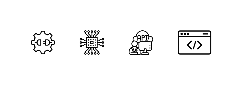
Instead of illustrating a concept, the most successful icons have become universally recognized by associating a tangible object with words, over and over, until the users learn what it means. For example, a gear icon is generally recognized as “settings.” However, this is a learned association, not an intuitive one. As users, we have seen a gear with the word “settings” so many times that now the gear triggers that concept in our minds.
通过将有形物体与单词相关联,一遍又一遍,直到用户了解到它的含义为止,最成功的图标已被普遍认可,而不是说明概念。 例如,齿轮图标通常被认为是“设置”。 但是,这是一种博学的关联,而不是直观的关联。 作为用户,我们已经多次看到带有“设置”一词的齿轮,以至于现在齿轮在我们的脑海中触发了这一概念。
Nothing is truly intuitive in UX design, and icon design is the same — everything is learned. My goal is to help the user learn, quickly and easily.
在UX设计中,没有什么是真正直观的,并且图标设计是相同的-一切都学到了。 我的目标是帮助用户快速轻松地学习。
For example, for “API,” I drew a plug because it’s tangible and recognizable. If it were just another slightly different combination of arrows, it would be harder to remember.
例如,对于“ API”,我画了一个插头,因为它是有形且可识别的。 如果只是箭头的另一个稍有不同的组合,将很难记住。
首先定义问题 (Define the problem first)
看大图 (Look at the big picture)
Icon design may seem self-contained, but it takes some big-picture thinking to get it right. And because it is so detailed, the stakes are pretty high to make sure I am drawing the right thing before I start focusing on whether this anchor point should be one or two pixels from the edge.
图标设计似乎是独立的,但是需要一些大的思考才能正确。 而且因为它是如此详细,所以在开始关注此锚点距边缘一或两个像素之前,要确保画正确的东西的风险很大。
Too many times, I have jumped into the detailed work of drawing an icon only to find I am making the wrong thing. I have ended up in an inefficient trial-and-error cycle where I don’t really know the use case well enough, so I take a best guess at what the icon should be. Then, the team tells me it doesn’t really fit, and I have to rework the metaphor.
太多次,我跳入了绘制图标的详细工作,却发现自己做错了事。 我最终陷入了一个效率低下的反复试验中,在那个阶段我真的不太了解用例,因此我最好猜测一下图标应该是什么。 然后,团队告诉我这真的不合适,我必须重新设计这个比喻。
验证概念 (Validate the concept)
The designer working on the feature knows better than I do what metaphor is needed. They know where the icon will appear, and what the user and business needs are. So before I get into the nitty-gritty of drawing the icon precisely, I lean on them to figure out what is needed. With so many free icon libraries out there, the icon concept can easily be shown along with the rest of the feature, at design critique and in user testing.
从事此功能的设计师比我更了解需要什么隐喻。 他们知道图标将出现在哪里,以及用户和业务需求是什么。 因此,在我进入精确绘制图标的实质之前,我先依靠它们来确定需要什么。 有了如此多的免费图标库,可以在设计评论和用户测试中轻松显示图标概念以及其余功能。
Now that I know this, it seems so obvious! But I used to try to figure out the metaphor myself.
现在我知道了,这看起来是如此明显! 但是我曾经试图自己弄清楚这个比喻。
找到单词 (Find the words)
It’s important to work with the UX Content Strategy team right away to figure out the words that go along with an icon. What is it communicating? What is the associated description?
立即与UX内容策略团队合作,弄清楚带有图标的单词很重要。 它在传达什么? 相关描述是什么?
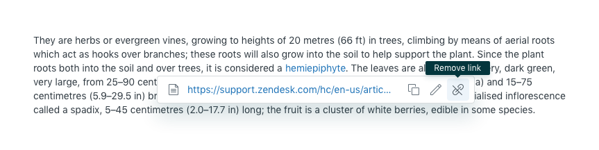
This informs the icon’s metaphor. We might think we need a trash can icon to represent “delete,” then find that “remove link” is the real issue at play and so we need a different icon.
这通知了图标的隐喻。 我们可能认为我们需要一个垃圾桶图标来表示“删除”,然后发现“删除链接”才是真正的问题,因此我们需要一个不同的图标。
请享用 (Enjoy)
Now that I understand the goals and constraints for icons, I can talk and think about them objectively. I hope you can too.
现在,我了解了图标的目标和限制,可以客观地讨论它们。 我希望你也能。
This has freed me up to enjoy the delightful part about icons. Tangible icons can be adorable. Heck, the other day the Garden team and I were using wine tasting notes. “This shopping cart flaunts Target flavors, with subtle notes of Whole Foods.” “It has an assertive Walmart finish.”
这使我腾出时间来享受有关图标的令人愉快的部分。 有形图标可能很可爱。 哎呀,前几天我和花园团队正在品尝葡萄酒。 “此购物车标榜目标口味,并带有“全食”的微妙风味。” “它具有自信的沃尔玛饰面。”
Anyone can enjoy wine. Anyone can enjoy icons. But the more you know, the more you can appreciate.
任何人都可以品尝美酒。 任何人都可以享受图标。 但是您了解得越多,您就会越欣赏。
Let icons do what they do best and don’t put too much pressure on them. Love the icons and they will love you. ❤️
让图标做他们最擅长的事情,不要对它们施加太大的压力。 爱图标,他们会爱你。 ❤️
Check out design.zendesk.com for more thought leadership, design process, and other creative musings.
请访问design.zendesk.com,以获取更多的思想领导力,设计过程和其他创意灵感。
翻译自: https://medium.com/zendesk-creative-blog/pixel-perfect-f6b256fa5d5a
unity 完美像素


 扫一扫
扫一扫
 1362
1362

 被折叠的 条评论
为什么被折叠?
被折叠的 条评论
为什么被折叠?
 到【灌水乐园】发言


