如何了解自己的认知偏差
Let me introduce you the attractiveness bias theory known as cognitive bias.
让我向您介绍称为认知偏差的吸引力偏差理论。
Think about a person with outstanding fashion. It will draw our attention, and maybe encourage us to interact with that person, however, if there will be no other values, such a great personality, we will lose the interest and eventually move on to interact with someone else. It is the same with websites. If the website’s aesthetics are nice but the structure is poor or content unrelated, then we will move to another website. Therefore, attractiveness bias theory proves that a well-designed product will drawn an attention but may not hold it for long.
想想一个拥有杰出时尚的人。 它会引起我们的注意,并可能鼓励我们与该人互动,但是,如果没有其他价值,例如如此出色的个性,我们将失去兴趣并最终继续与他人互动。 网站也是如此。 如果该网站的美观度不错,但结构较差或与内容无关,那么我们将转到另一个网站。 因此,吸引力偏差理论证明设计良好的产品会引起人们的注意,但可能不会持续很长时间。
A badly designed website or any product, in contrast, will not attract user’s attention even if it is an excellent product.
相反,设计不良的网站或任何产品,即使是优秀的产品,也不会吸引用户的注意。
At this point I would like to cite one of my favourite quotes used by Steve Job to a designer working at NeXT:
在这一点上,我想引用史蒂夫·乔布斯(Steve Job)在NeXT工作的一位设计师最喜欢的报价:
“You’ve baked a really lovely cake, but then you’ve used dog shit for frosting.” —Steve Job
“您已经烤了一个非常可爱的蛋糕,但是后来您用狗屎来结霜。” —史蒂夫·乔布斯
Websites need to be designed well, they need to look well, be pleasing and simple. Today no one likes to interact with a badly design website, and that results with very low traffic which eventually can lead to the collapse of a business.
网站必须设计得好,外观要好,取悦和简单。 如今,没有人喜欢与设计不佳的网站进行交互,结果导致流量非常低,最终可能导致企业倒闭。
The idea of judging the book by its cover is harsh — but it follows us everywhere, despite if we like it or not.
用书的封面来判断这本书的想法很苛刻,但不管我们是否喜欢,它随处可见。
Let’s take an academic background for example. You would think, that in such an environment the attractiveness would be your last concern — wrong. According to Sean N. Talamas’ studies, physically attractive students are in favour of receiving better grades than their less-attractive peers, partly because perceived as more intelligent, which is not always the case. More than that—the more attractive students are, the more chances they have to get the place into the university, eliminating less attractive candidates during interviews.
让我们以一个学术背景为例。 您会认为,在这样的环境中,吸引力将是您的最后关注点-错误。 根据肖恩·N·塔拉马斯(Sean N. Talamas)的研究 ,具有身体吸引力的学生会比不那么吸引同龄人的学生获得更好的成绩,部分原因是因为人们认为自己更聪明,但并非总是如此。 不仅如此,学生越有吸引力,他们进入大学的机会就越大,从而消除了面试中不那么有吸引力的候选人。
This is because attractive people are perceived as healthier, more sociable, talented and successful.
这是因为有吸引力的人被认为更健康,更善于交往,有才华和成功。
There is an interesting experiment named Predicting Elections: Child’s Play! suggesting how brutal the attractiveness bias can be, even among children. The group of researchers asked kids to choose their imaginary boat captain from several photographs of actual politicians, which were unknown to children. In most of the cases, children picked up the most attractive candidate. The choices of 5-years old kids predicted the result of past political elections with an accuracy of almost 80%.
有一个有趣的实验名为 预测选举:儿童游戏! 这表明即使在儿童中,吸引力偏差也可能是多么残酷。 研究人员小组要求孩子们从几张实际的政治人物照片中选择他们想象中的船长,而这些照片对于孩子们来说是未知的。 在大多数情况下,孩子会选出最有魅力的候选人。 5岁孩子的选择可以预测过去政治选举的结果,其准确性几乎达到80%。
As I already mentioned before, a good design will catch the attention, but it will not sustain it. Therefore, if we compare the use of attractiveness bias in political, academic and even workplace environment, we can predict the results of choices driven by visual preferences. A pretty politician, student and a work colleague, despite being attractive may fail in the longer run, showing very little skills needed for their position.
正如我之前已经提到的那样,好的设计会引起人们的注意,但并不能持续下去。 因此,如果我们比较在政治,学术甚至工作场所环境中使用吸引力偏差的情况,我们可以预测视觉偏好驱动的选择结果。 一个长相不错的政治家,学生和工作同事,尽管很有吸引力,但从长远来看可能会失败,他们的职位所需技能很少。
We may not be able to control our attractiveness bias but we can learn from them — especially in website design.
我们可能无法控制吸引力偏向,但我们可以从中吸取教训-特别是在网站设计中。
As an example of bad design, I would like to use Power City website. For those of you who doesn’t know, Power City is an electronic retailer in Ireland. The chain company is quite popular across the country, however, struggles with nearly non-functional and unattractive website resulting in very low online traffic.
作为不良设计的一个例子,我想使用Power City网站。 对于不认识的人,Power City是爱尔兰的电子零售商。 这家连锁公司在全国颇受欢迎,但是,它与几乎没有功能且缺乏吸引力的网站作斗争,导致在线流量非常低。


As you can see, the website had sustained its aesthetics probably since the early 2000s. It has no hierarchy of information, no colour theory, very confusing structure, and outdating style. Now, if you would actually spend some time on the website, you would learn that they offer great deals comparing to their competitors. However, with very little clarity and consistency on the website people seem to bounce off quickly, and why wouldn’t they? There is plenty of such retailers to choose from, which seem more trustful when it comes to online purchasing.
如您所见,该网站自2000年代初以来就一直保持其美学风格。 它没有信息的层次结构,没有色彩理论,非常混乱的结构和过时的风格。 现在,如果您实际上在网站上花费了一些时间,您就会发现他们与竞争对手相比提供了很多优惠。 但是,由于网站的清晰度和一致性很少,人们似乎很快反弹了,为什么不呢? 有很多这样的零售商可供选择,它们在在线购买时似乎更加可靠。
Now let’s compare Power City with another website, similarly complex.
现在,让我们将Power City与另一个复杂的网站进行比较。


MediaMarkt is also an international electric retailer. For some of us, it may not be attractive but their navigation and layout systems are clear and understandable for a user and to catch the attention, MediaMarkt is using hierarchy and bright colours.
MediaMarkt还是国际电商。 对于我们中的某些人来说,它可能并不吸引人,但它们的导航和布局系统对用户来说是清晰易懂的,并且吸引了人们的注意,MediaMarkt正在使用层次结构和鲜艳的色彩。
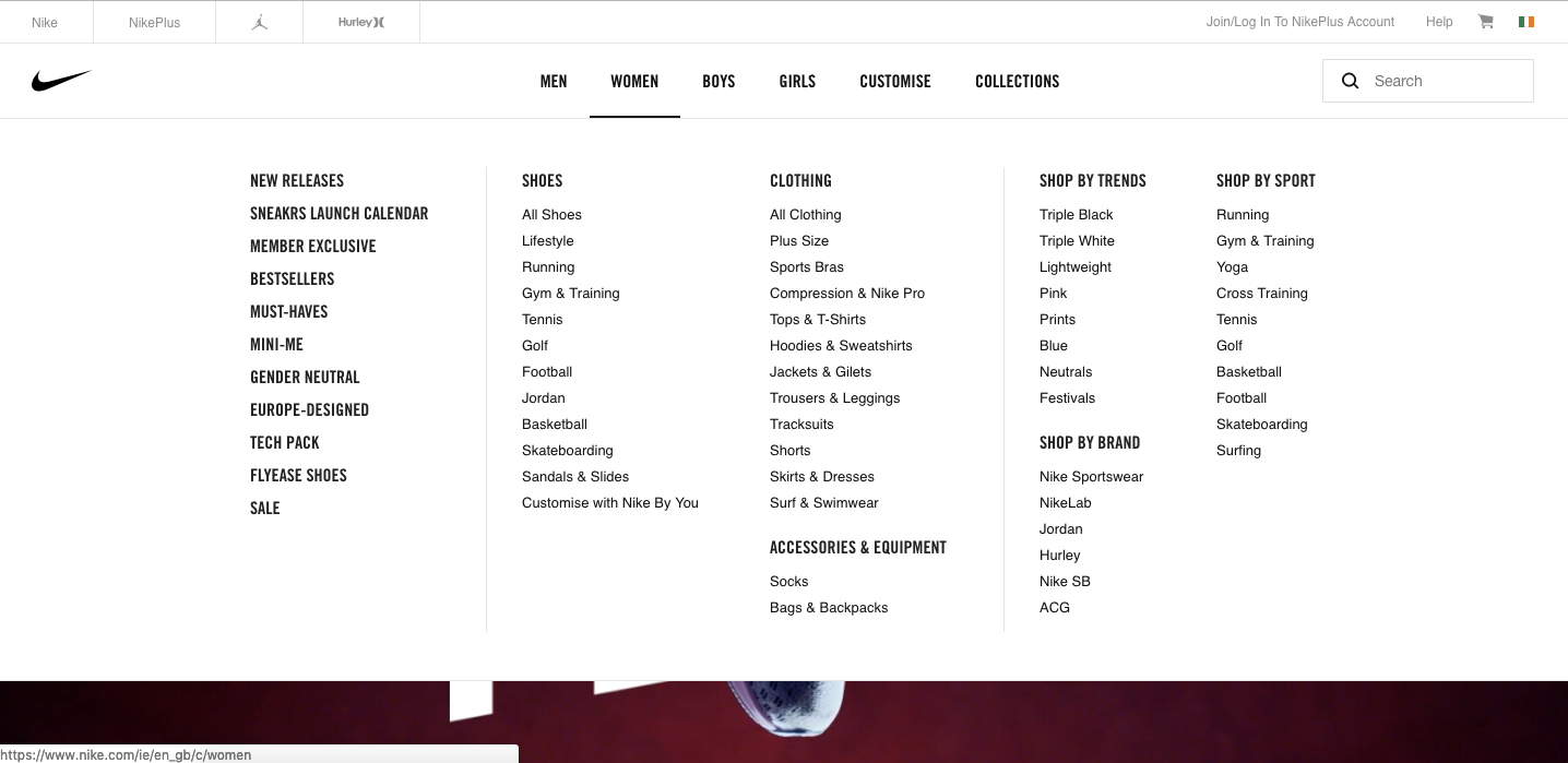
We don’t need to stop on electric retailers. A lot of fashion websites also maintain a huge number of products and display them in a very simple, yet, attractive way just like Nike.ie
我们不需要停止电动零售商。 许多时尚网站还维护着大量产品,并像Nike.ie一样以非常简单但有吸引力的方式展示它们。


What Nike does to sustain the interest is introducing a lot of white space around the content. This way, the user can focus on the important information without any distractions. They don’t use any colour in their design, except colourful pictures — which automatically catch the user’s attention on the product.
耐克为了维持兴趣所做的就是在内容周围引入许多空白。 这样,用户可以专注于重要信息而不会分心。 除了彩色图片(彩色图片会自动引起用户对产品的关注)之外,他们在设计中不使用任何颜色。
We live in the times of great consumption, often buying non-essential products—and there are tons of them. That is why retailers had to learn how they can catch our attention referring to our instinctive attractiveness bias, and websites are nothing more than a visual representation of their products.
我们生活在消费旺盛的时代,经常购买非必需品,其中有很多。 这就是为什么零售商必须参考我们的本能吸引力偏差来学习如何吸引我们的注意力,而网站不过是其产品的视觉表示。
Therefore, as a designer, your role is to first catch the attention witch pleasant visual solution, but also sustain it with clear and understandable structure and content for more than just a few seconds.
因此,作为设计师,您的任务是首先吸引注意力,并提供愉悦的视觉解决方案,而且还要以清晰易懂的结构和内容将其维持超过几秒钟。
We may not like judging something on its appearance, but it doesn’t mean we should avoid our inner bias and pretend they don’t exist. That is why we should all use the opportunity of hearing feedback, especially when it comes to the structure of a website and its UX, to make it better for users and eventually products themselves.
我们可能不喜欢从外观上判断某些东西,但这并不意味着我们应该避免内在的偏见并假装它们不存在。 这就是为什么我们大家都应该利用听取反馈的机会,尤其是在涉及网站及其UX的结构时,使之对用户和最终产品本身更好。
翻译自: https://uxdesign.cc/lets-talk-about-attractiveness-bias-6edf7c691148
如何了解自己的认知偏差


 357
357

 被折叠的 条评论
为什么被折叠?


