


ux pm
AskRose.com is a site devoted to the Rose mental health platform, which is still in trials at the time of this story. It is intended to be an AI-based program used between patients, with anxiety and mood disorders, and their providers to help make up for inefficiencies in current healthcare. A combination of phone application for patients and a portal system for providers leaves this with being a straightforward system.
AskRose.com是致力于Rose精神健康平台的网站,在撰写本文时,它仍在试用中。 它旨在成为患有焦虑和情绪障碍的患者及其提供者之间使用的基于AI的程序,以帮助弥补当前医疗保健中的低效率。 用于患者的电话应用程序和用于提供者的门户系统的结合,使之成为一个简单的系统。
My context this time. I was asked to redesign the landing page to be a more enjoyable experience. No worrying about functionality, no accessibility assessments, just visual design. So I assumed the role of Visual Designer, and began my research into landing page styles and designs.
这次我的情况。 有人要求我重新设计目标网页,以提供更愉快的体验。 不用担心功能,不用担心可访问性评估,只需视觉设计即可。 因此,我担任了Visual Designer的角色,并开始对着陆页样式和设计进行研究。
My time limit was 7 days and my tools this time were pen, paper, my MacBook and a new copy of Adobe Xd. Some upfront challenges was, it was my first hi-fidelity webpage, and I was currently moving to San Francisco from Maryland and crammed into a Jeep.
我的时间限制为7天,这次的工具是笔,纸,MacBook和Adobe Xd的新副本。 前期的挑战是,这是我的第一个高保真网页,我目前正从马里兰州搬到旧金山,挤进一辆吉普车。
I began with researching different landing pages using dribbble.com as well as some design blogs I follow on tumblr and other social sites. I had settled among 3 styles; the current style the website had, a more minimalist route, or going with a light industrial theme. Ultimately I decided on going with something in-between the current site and minimalist inspirations, while adding elements from mental healthy and anti-anxiety blogs. Organic shapes, no true black, brighter colours and clear direction.
我首先使用dribbble.com以及我在tumblr和其他社交网站上关注的一些设计博客来研究不同的登录页面。 我已经定居了3种风格。 网站目前的风格,更简约的路线或以轻工业主题为准。 最终,我决定在当前网站和极简主义灵感之间进行尝试,同时添加来自心理健康和抗焦虑博客的元素。 有机形状,没有真正的黑色,明亮的色彩和清晰的方向。
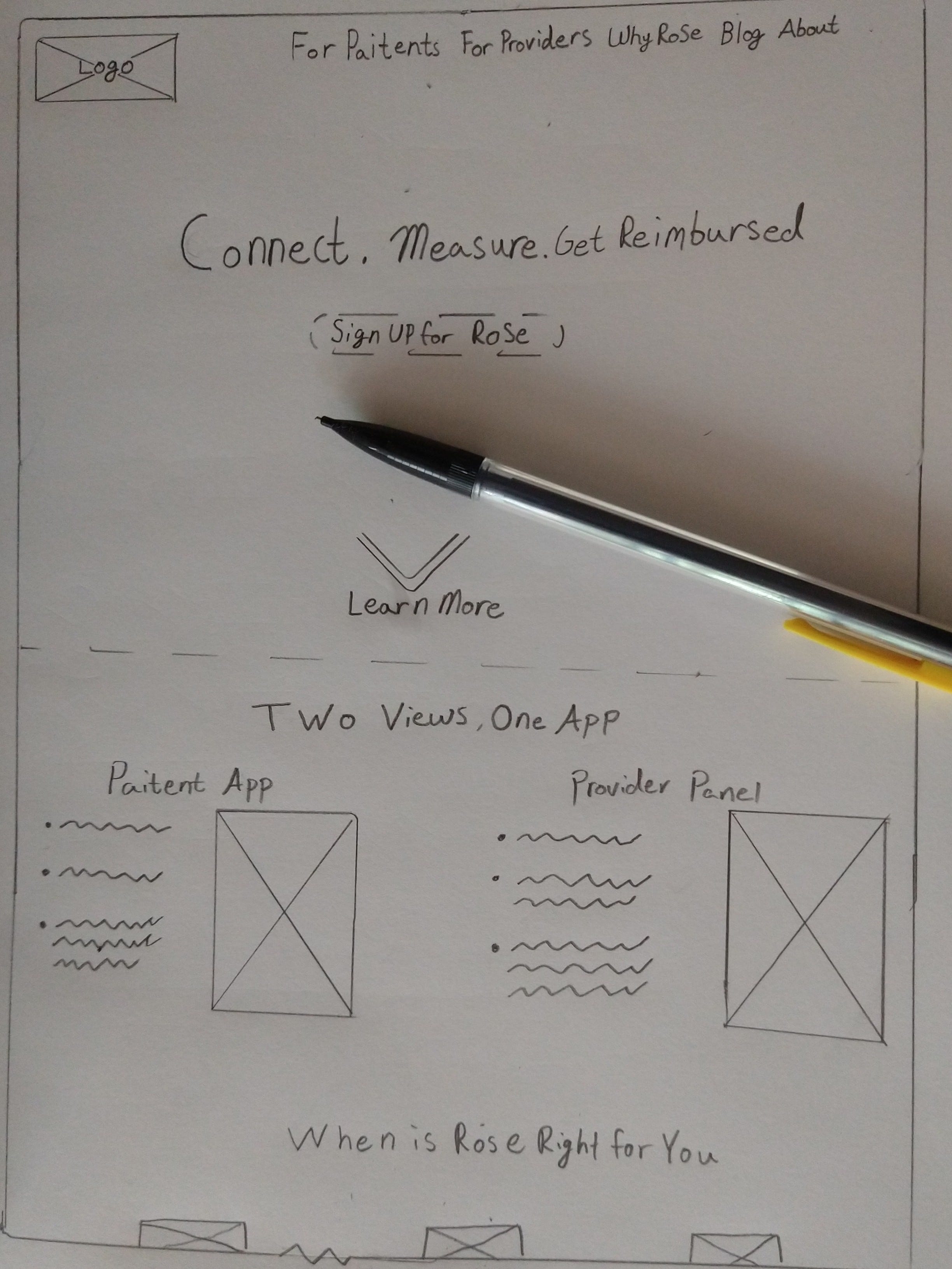
I started sketching as soon as I got settled in at a hotel, and didn’t stop sketching until it was roughly how I wanted it to be before moving on to wireframes in Xd. Having never used Adobe Xd before, the wireframes were a good chance to get to know the software.
我一住进旅馆就开始素描,直到进入Xd线框之前,我才停止素描。 线框从未使用过Adobe Xd,是了解该软件的好机会。

Wireframes took much less time than expected and I was able to move on to fleshing them out after consulting with some associates. The task of compiling colours and fonts was the first step on getting it up and running. I liked the blue colour scheme they had on the website, but I felt that it needed to be refined and have a contrasting colour for CTAs and defining elements. That colour is FF0080, Rose. Missed opportunity, no more.
线框花费的时间比预期的要少得多,在咨询了一些同事之后,我得以继续进行充实。 编译颜色和字体的任务是使其启动并运行的第一步。 我喜欢他们在网站上使用的蓝色配色方案,但我认为它需要改进,并且对于CTA和定义元素要有对比色。 那个颜色是FF0080,罗斯。 错失良机,再也没有。

Font was trial and error but was settled upon Futura for bolded areas and Nadeem for standard text. Both were easy to read, softer, and held up well to resizing. With theme, font, and colours picked out, I was ready to start working towards the final product.
字体是经过反复试验的,但是被Futura设为粗体,将Nadeem设为标准文本。 两者都易于阅读,较柔和,并且可以很好地调整大小。 选择了主题,字体和颜色后,我就可以着手开发最终产品了。


The design was given basic shape and layout with room to tinker. I had initially went with this bright blue for the header and a semi-organic shape. The thought was to have enough on the page to get the content needed in, in actuality I wasn’t detracting as much this first draft. Somethings were left floating, and the blue really hurts your eyes after a few hours. My CTAs were a little small, but the contrast was a right call.
该设计具有基本的形状和布局,还可以进行修改。 我最初使用的是明亮的蓝色作为标题和半有机形状。 想法是在页面上有足够的空间来获取所需的内容,实际上我并没有那么多地去关注这份初稿。 东西漂浮了,几个小时后,蓝色真的伤害了您的眼睛。 我的CTA有点小,但对比是正确的选择。
Second iteration was much the same, except experimenting with a different blue. A few spacing tweaks but nothing major.
第二次迭代几乎相同,除了尝试使用不同的蓝色。 调整了一些间距,但没有什么大的变化。

This was ultimately the blue I kept moving forward. But other problems still needed to be addressed. Which is where the third and final iteration came in, after more feedback of course.
最终,这就是我不断前进的蓝调。 但是仍然需要解决其他问题。 当然,在获得更多反馈之后,第三次也是最后一次迭代才出现。


Changes were both drastic and subtle. Graphics were deleted and size of CTAs was increased as well as rounding out the edges on the footer and switching a CTA from a light blue to reverse-white on the shape it was over. Padding was added in places to make the design less claustraphobic. This was the final design submitted with a mobile version created out of need for consistency and ultimately proudest work so far.
变化既剧烈又微妙。 删除了图形,并增加了CTA的大小,同时修整了页脚的边缘,并将CTA从结束的形状从浅蓝色切换为反白。 在某些地方添加了填充物,以减少设计的恐惧恐怖感。 这是最终版本提交的版本,其移动版本是出于对一致性的需求而创建的,这是迄今为止迄今为止最值得骄傲的工作。
翻译自: https://uxdesign.cc/askrose-tales-from-a-ux-student-19661d5c5ba7
ux pm


 1588
1588

 被折叠的 条评论
为什么被折叠?
被折叠的 条评论
为什么被折叠?
 到【灌水乐园】发言


