


数据eda
This banking data was retrieved from Kaggle and there will be a breakdown on how the dataset will be handled from EDA (Exploratory Data Analysis) to Machine Learning algorithms.
该银行数据是从Kaggle检索的,将详细介绍如何将数据集从EDA(探索性数据分析)转换为机器学习算法。
脚步: (Steps:)
- Identification of variables and data types 识别变量和数据类型
- Analyzing the basic metrics 分析基本指标
- Non-Graphical Univariate Analysis 非图形单变量分析
- Graphical Univariate Analysis 图形单变量分析
- Bivariate Analysis 双变量分析
- Correlation Analysis 相关分析
资料集: (Dataset:)
The dataset that will be used is from Kaggle. The dataset is a bank loan dataset, making the goal to be able to detect if someone will fully pay or charge off their loan.
将使用的数据集来自Kaggle 。 该数据集是银行贷款数据集,其目标是能够检测某人是否将完全偿还或偿还其贷款。
The dataset consist of 100,000 rows and 19 columns. The predictor (dependent variable) will be “Loan Status,” and the features (independent variables) will be the remaining columns.
数据集包含100,000行和19列。 预测变量(因变量)将为“贷款状态”,要素(因变量)将为剩余的列。
变量识别: (Variable Identification:)
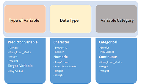
The very first step is to determine what type of variables we’re dealing with in the dataset.
第一步是确定数据集中要处理的变量类型。
df.head()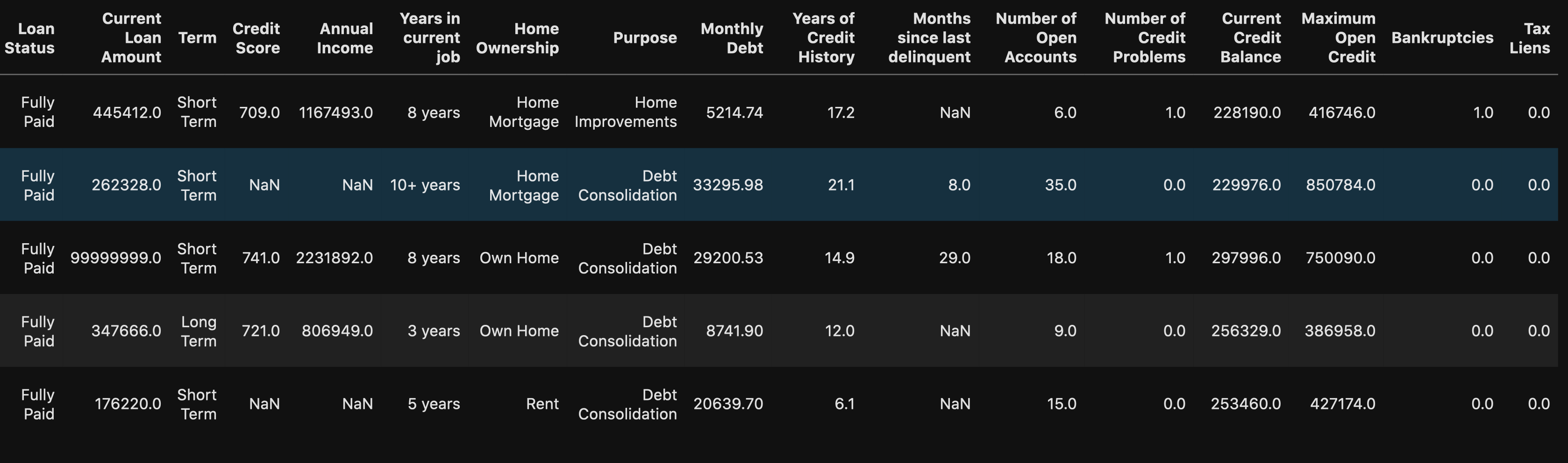
We can see that there are some numeric and string (object) data types in our dataset. But to be certain, you can use:
我们可以看到我们的数据集中有一些数字和字符串(对象)数据类型。 但可以肯定的是,您可以使用:
df.info() # Shows data types for each column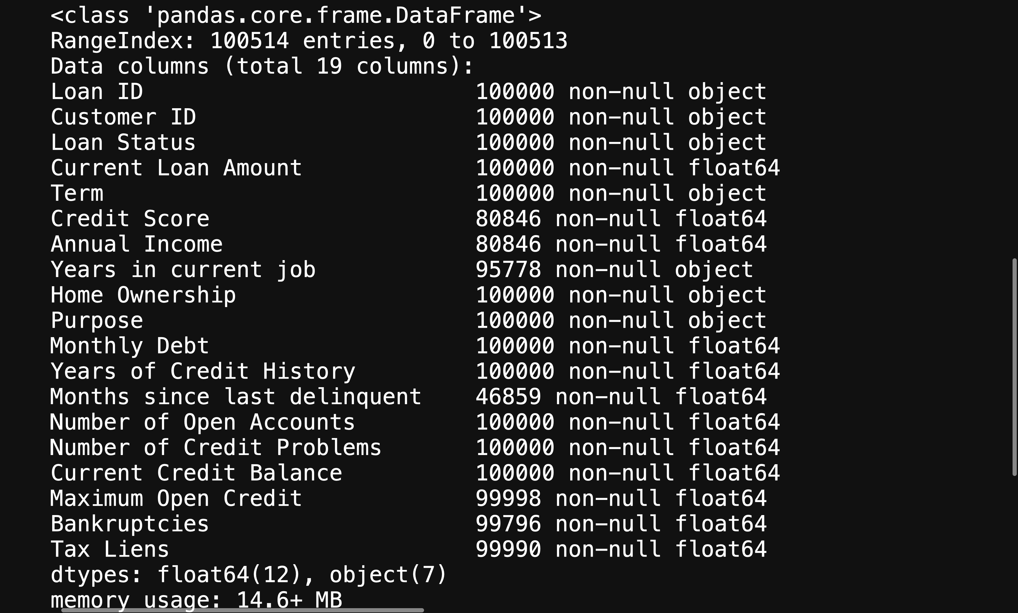
This will give you further information about your variables, helping you figure out what will need to be changed in order to help your machine learning algorithm be able to interpret your data.
这将为您提供有关变量的更多信息,帮助您确定需要更改哪些内容,以帮助您的机器学习算法能够解释您的数据。
分析基本指标 (Analyzing Basic Metrics)
This will be as simple as using:
这就像使用以下命令一样简单:
df.describe().T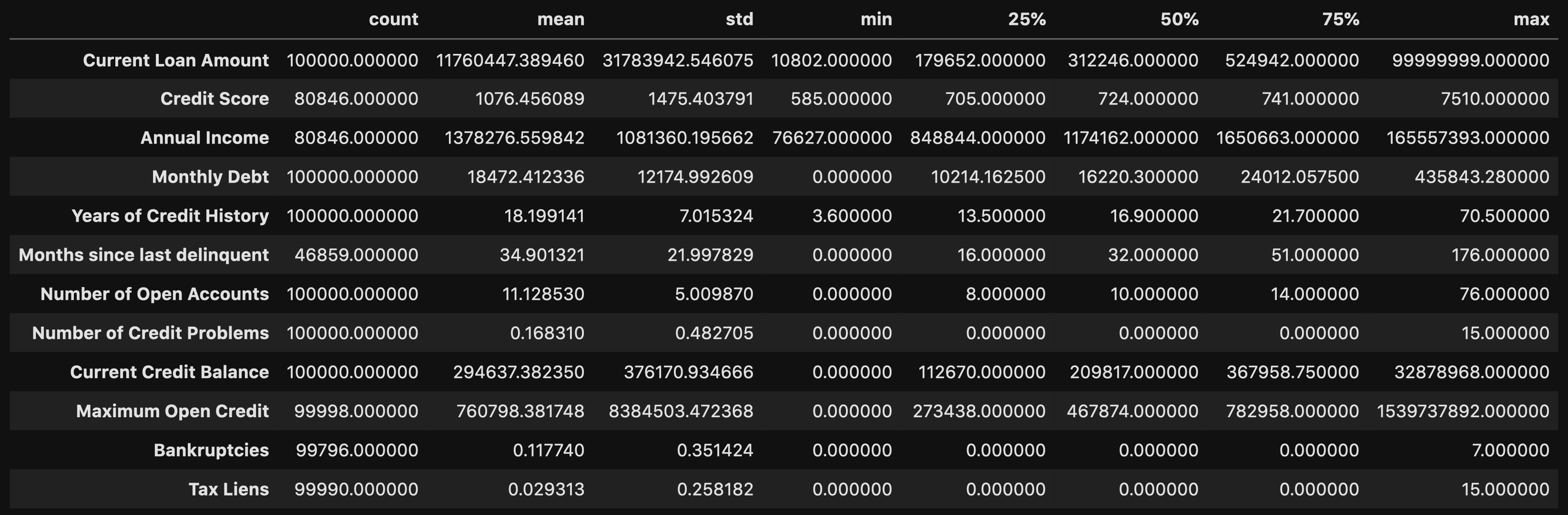
This allows you to look at certain metrics, such as:
这使您可以查看某些指标,例如:
- Count — Amount of values in that column 计数-该列中的值数量
- Mean — Avg. value in that column 均值-平均 该列中的值
- STD(Standard Deviation) — How spread out your values are STD(标准偏差)—您的价值观分布如何
- Min — The lowest value in that column 最小值-该列中的最小值
- 25% 50% 70%— Percentile 25%50%70%—百分位数
- Max — The highest value in that column 最大值-该列中的最大值
From here you can identify what your values look like, and you can detect if there are any outliers.
在这里,您可以确定值的外观,并可以检测是否存在异常值。
From doing the .describe() method, you can see that there are some concerning outliers in Current Loan Amount, Credit Score, Annual Income, and Maximum Open Credit.
通过执行.describe()方法,您可以看到在当前贷款额,信用评分,年收入和最大未结信贷中存在一些与异常有关的问题。
非图形单变量分析 (Non-Graphical Univariate Analysis)
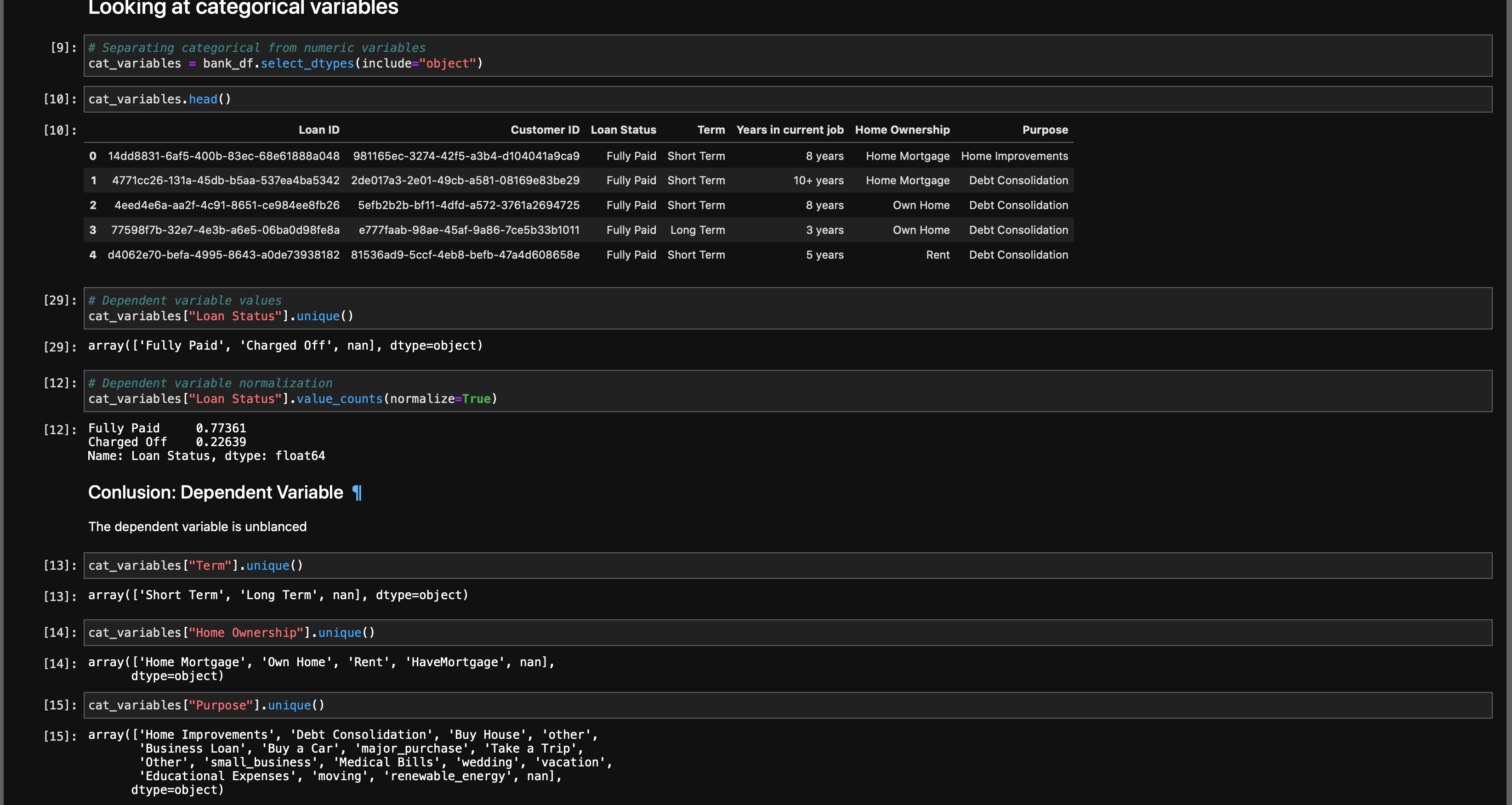
Univariate Analysis is when you look at statistical data in your columns.
单变量分析是当您查看列中的统计数据时。
This can be as simple as doing df[column].unique() or df[column].value_counts(). You’re trying to get as much information from your variables as possible.
这可以像执行df [column] .unique()或df [column] .value_counts()一样简单。 您正在尝试从变量中获取尽可能多的信息。
You also want to find your null values
您还想找到空值
df.isna().sum()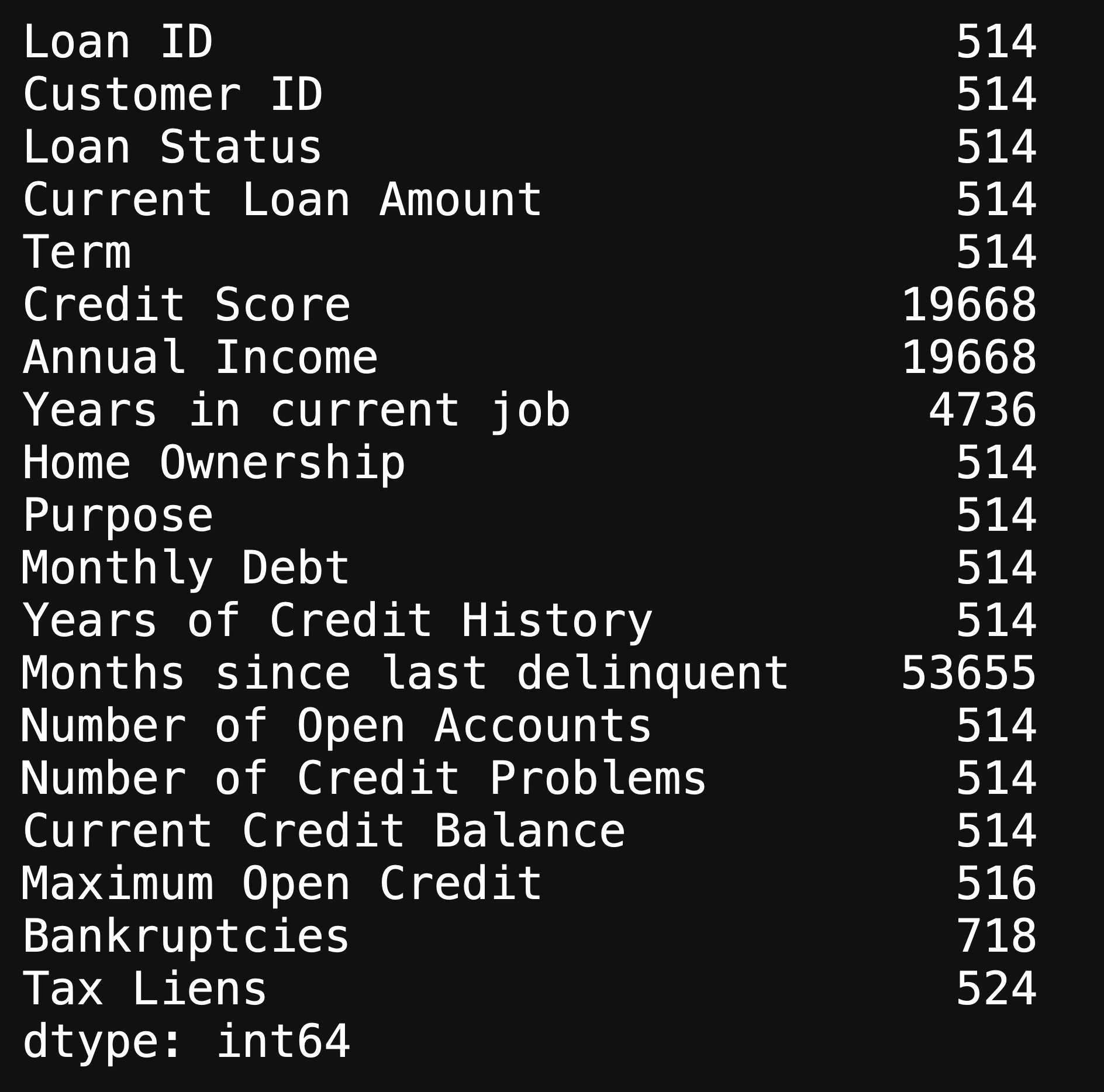
This will show you the amount of null values in each column, and there are an immense amount of missing values in our dataset. We will look further into the missing values when doing Graphical Univariate Analysis.
这将向您显示每列中的空值数量,并且我们的数据集中有大量的缺失值。 在进行图形单变量分析时,我们将进一步研究缺失值。
图形单变量分析 (Graphical Univariate Analysis)
Here is when we look at our variables using graphs.
这是我们使用图形查看变量的时候。
We can use a bar plot in order to look at our missing values:
我们可以使用条形图来查看缺失值:
fig, ax = plt.subplots(figsize=(15, 5))x = df.isna().sum().index
y = df.isna().sum()
ax.bar(x=x, height=y)
ax.set_xticklabels(x, rotation = 45)
plt.tight_layout();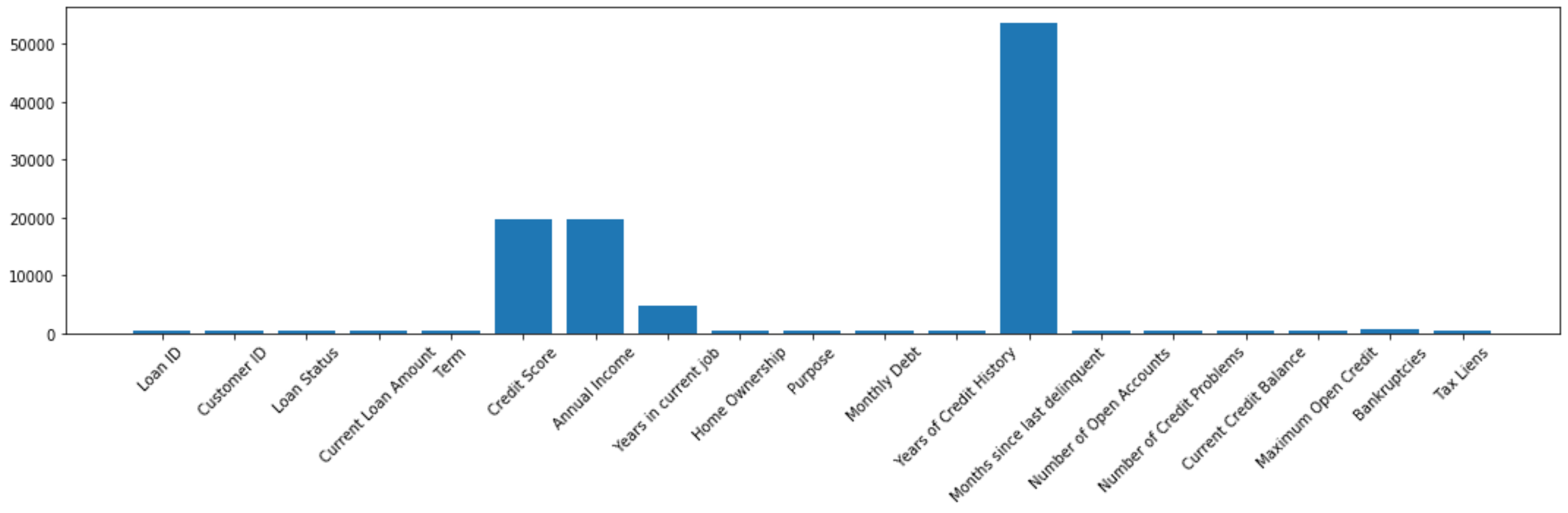
Moving past missing values, we can also use histograms to look at the distribution of our features.
超越缺失值后,我们还可以使用直方图查看特征的分布。
df["Years of Credit History"].hist(bins=200)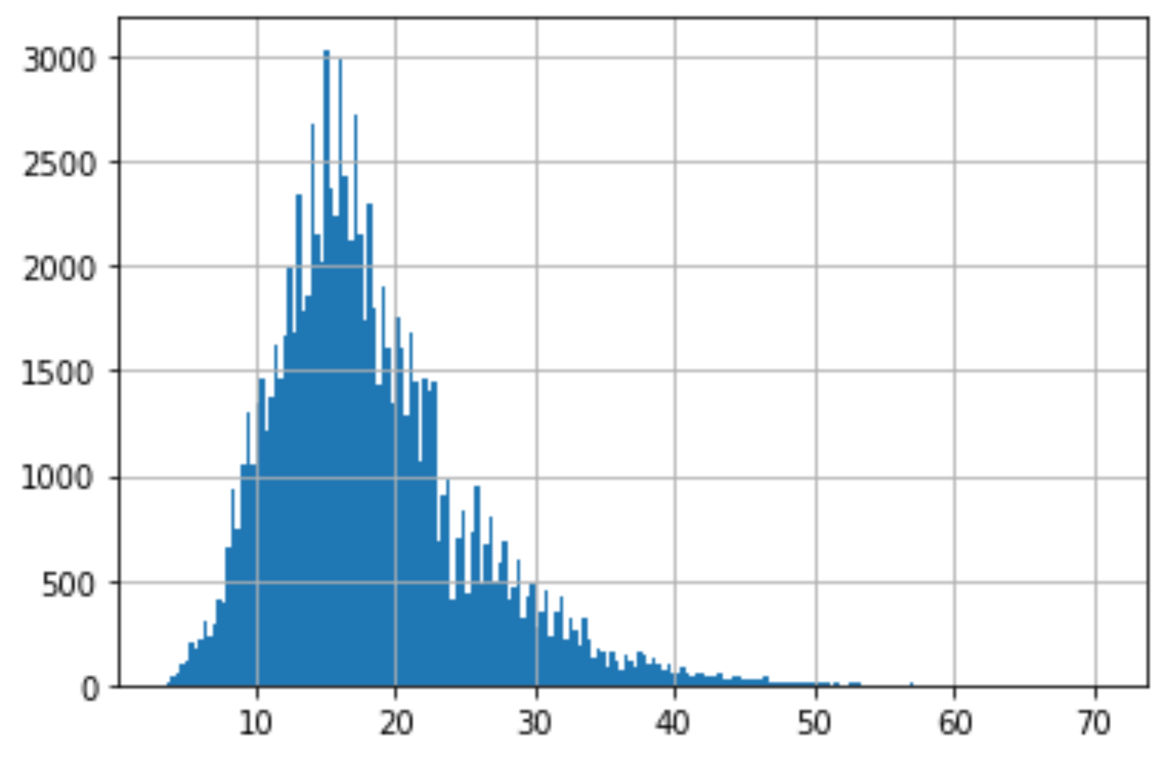
From this histogram you are able to detect if there are any outliers by seeing if it is left or right skew, and the one that we are looking at is a slight right skew.
从此直方图中,您可以通过查看它是否是左偏斜或右偏斜来检测是否存在异常值,而我们正在查看的是一个稍微偏斜的偏斜。
We ideally want our histograms for each feature to be close to a normal distribution as possible.
理想情况下,我们希望每个功能的直方图尽可能接近正态分布。
# Checking credit score
df["Credit Score"].hist(bins=30)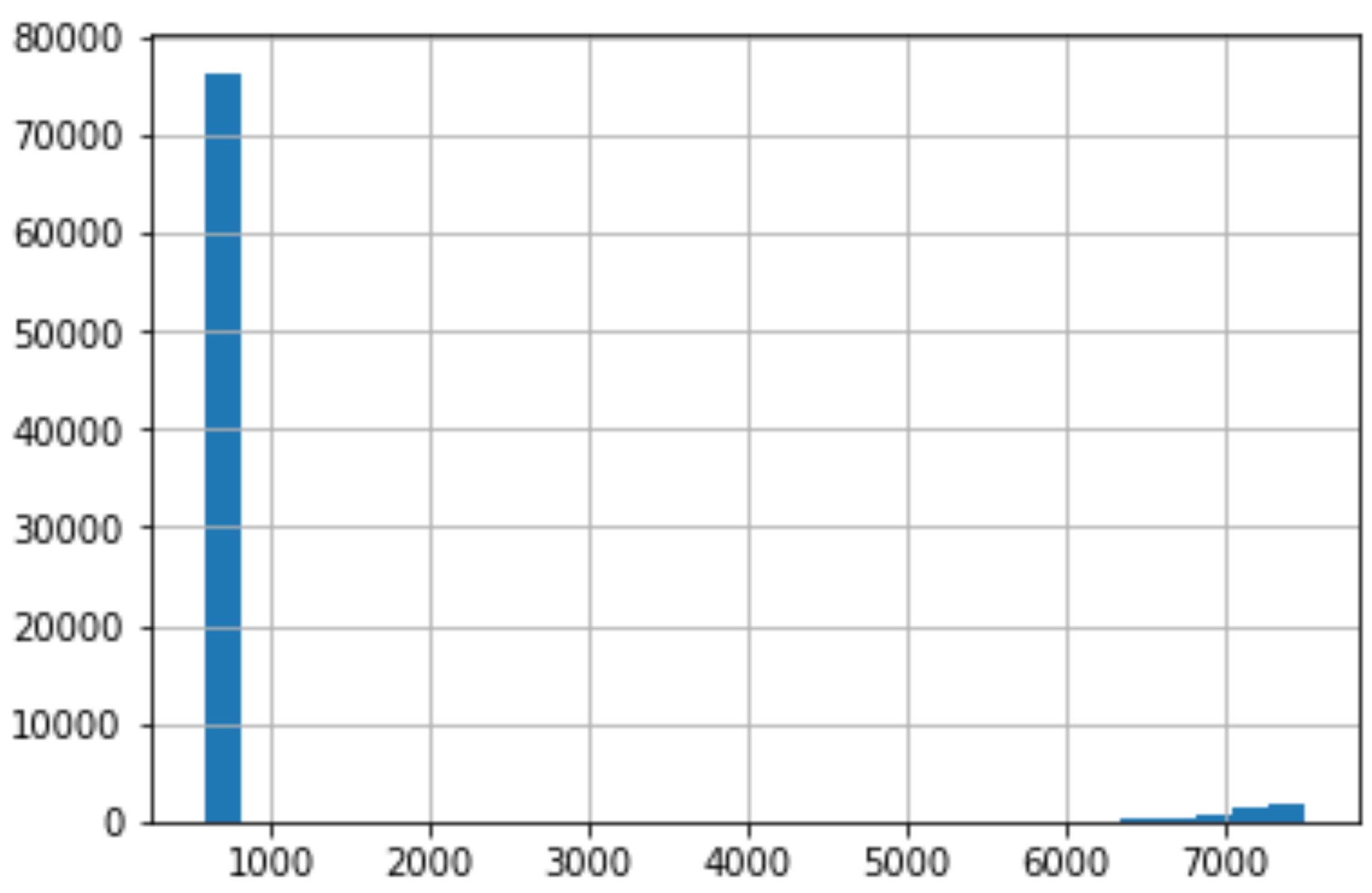
As we do the same thing for Credit Score, we can see that there is an immense right skew that rest in the thousands. This is very concerning because for our dataset, Credit Score is supposed to be at a 850 cap.
当我们对信用评分执行相同的操作时,我们可以看到存在成千上万的巨大右偏。 这非常令人担忧,因为对于我们的数据集而言,信用评分应设置为850上限。
Lets take a closer look:
让我们仔细看看:
# Rows with a credit score greater than 850, U.S. highest credit score.
df.loc[df["Credit Score"] > 850]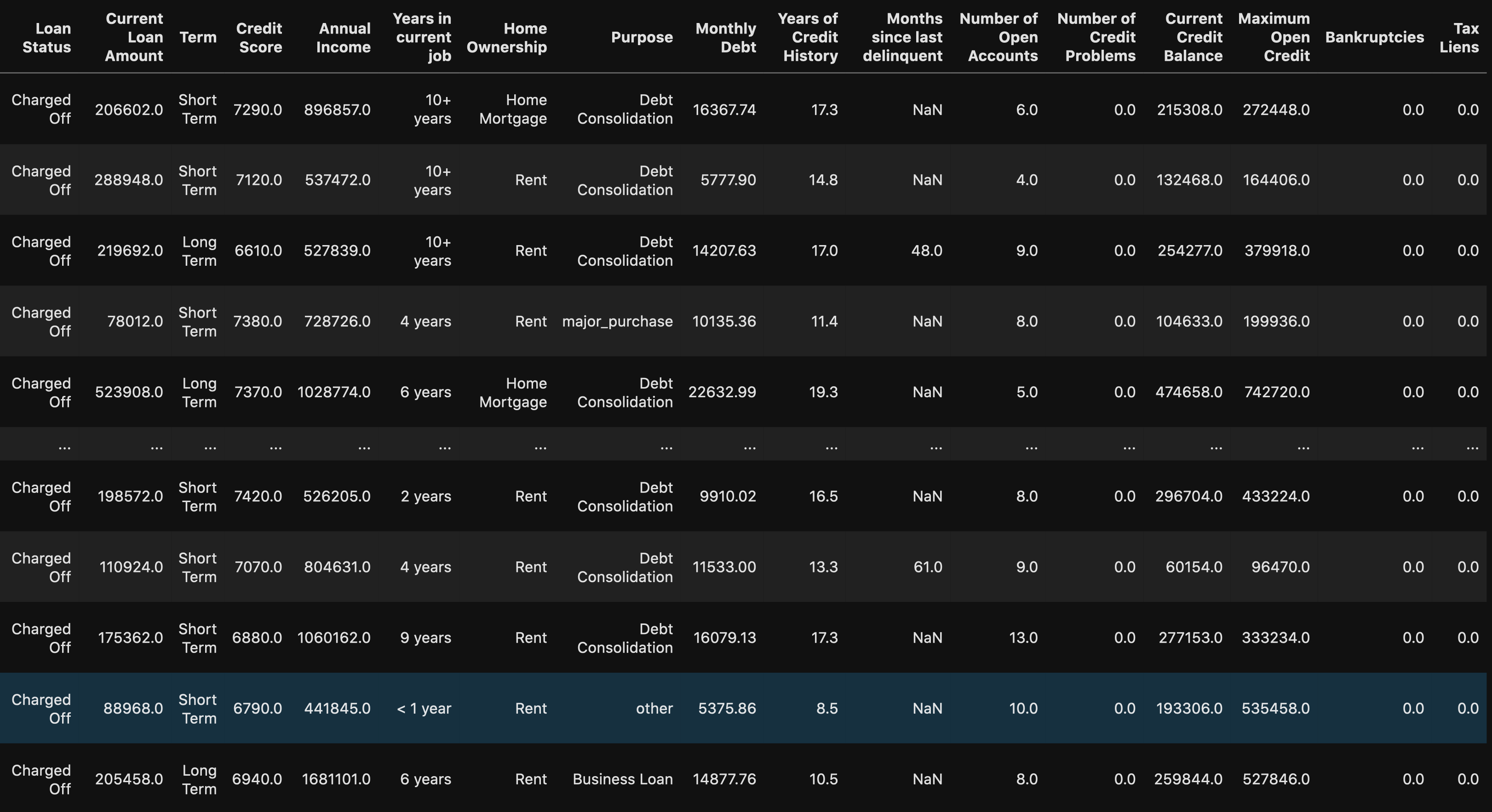
When using the loc method you are able to see all of the rows with a credit score greater than 850. We can see that this might be a human error because there are 0’s added on to the end of the values. This will be an easy fix once we get to processing the data.
使用loc方法时,您可以看到所有信用评分大于850的行。我们可以看到这可能是人为错误,因为在值的末尾添加了0。 一旦我们开始处理数据,这将是一个简单的修复。
Another way to detect outliers are to use box plots and scatter plots.
检测离群值的另一种方法是使用箱形图和散点图。
fig, ax = plt.subplots(4, 3)# Setting height and width of subplots
fig.set_figheight(15)
fig.set_figwidth(30)# Adding spacing between boxes
fig.tight_layout(h_pad=True, w_pad=True)sns.boxplot(bank_df["Number of Open Accounts"], ax=ax[0, 0])
sns.boxplot(bank_df["Current Loan Amount"], ax=ax[0, 1])
sns.boxplot(bank_df["Monthly Debt"], ax=ax[0, 2])
sns.boxplot(bank_df["Years of Credit History"], ax=ax[1, 0])
sns.boxplot(bank_df["Months since last delinquent"], ax=ax[1, 1])
sns.boxplot(bank_df["Number of Credit Problems"], ax=ax[1, 2])
sns.boxplot(bank_df["Current Credit Balance"], ax=ax[2, 0])
sns.boxplot(bank_df["Maximum Open Credit"], ax=ax[2, 1])
sns.boxplot(bank_df["Bankruptcies"], ax=ax[2, 2])
sns.boxplot(bank_df["Tax Liens"], ax=ax[3, 0])plt.show()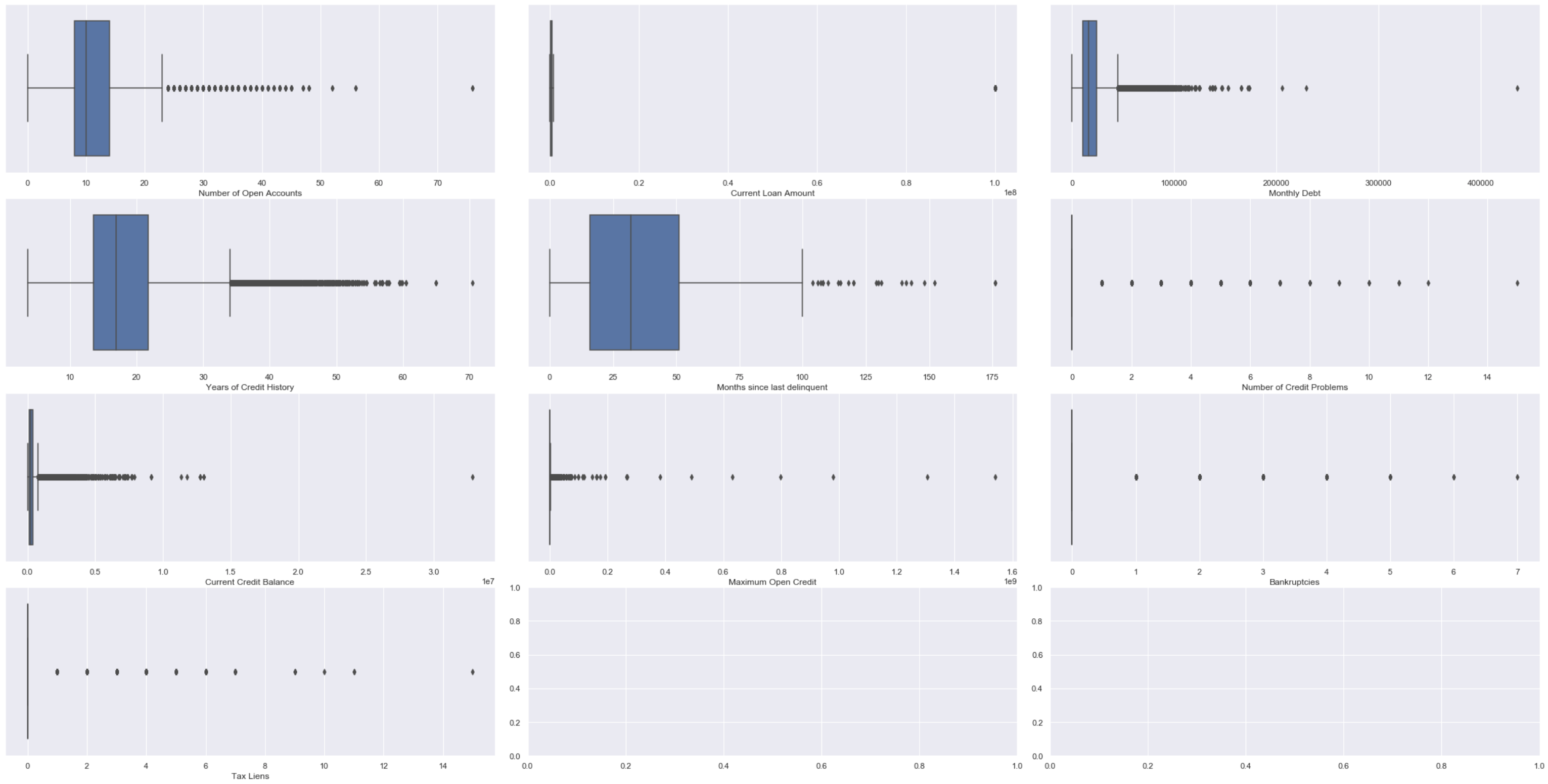
fig, ax = plt.subplots(4, 3)# Setting height and width of subplots
fig.set_figheight(15)
fig.set_figwidth(30)# Adding spacing between boxes
fig.tight_layout(h_pad=True, w_pad=True)sns.scatterplot(data=bank_df["Number of Open Accounts"], ax=ax[0, 0])
sns.scatterplot(data=bank_df["Current Loan Amount"], ax=ax[0, 1])
sns.scatterplot(data=bank_df["Monthly Debt"], ax=ax[0, 2])
sns.scatterplot(data=bank_df["Years of Credit History"], ax=ax[1, 0])
sns.scatterplot(data=bank_df["Months since last delinquent"], ax=ax[1, 1])
sns.scatterplot(data=bank_df["Number of Credit Problems"], ax=ax[1, 2])
sns.scatterplot(data=bank_df["Current Credit Balance"], ax=ax[2, 0])
sns.scatterplot(data=bank_df["Maximum Open Credit"], ax=ax[2, 1])
sns.scatterplot(data=bank_df["Bankruptcies"], ax=ax[2, 2])
sns.scatterplot(data=bank_df["Tax Liens"], ax=ax[3, 0])plt.show()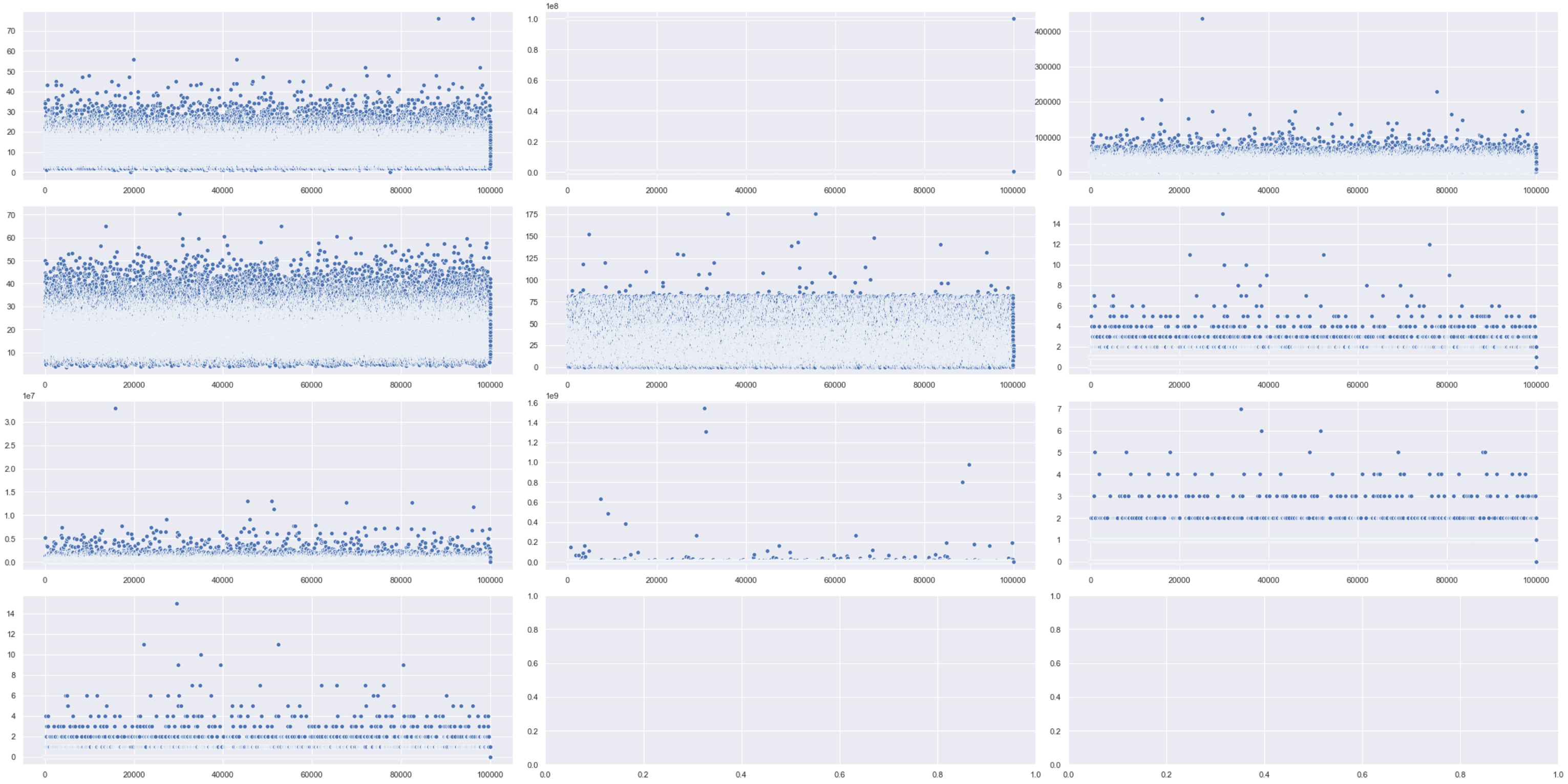
相关分析 (Correlation Analysis)
Correlation is when you want to detect how one variable reacts to another. What you don’t want is multicollinearity and to check for that you can use:
关联是当您要检测一个变量对另一个变量的React时。 您不想要的是多重共线性,并且可以使用以下方法进行检查:
# Looking at mulitcollinearity
sns.heatmap(df.corr())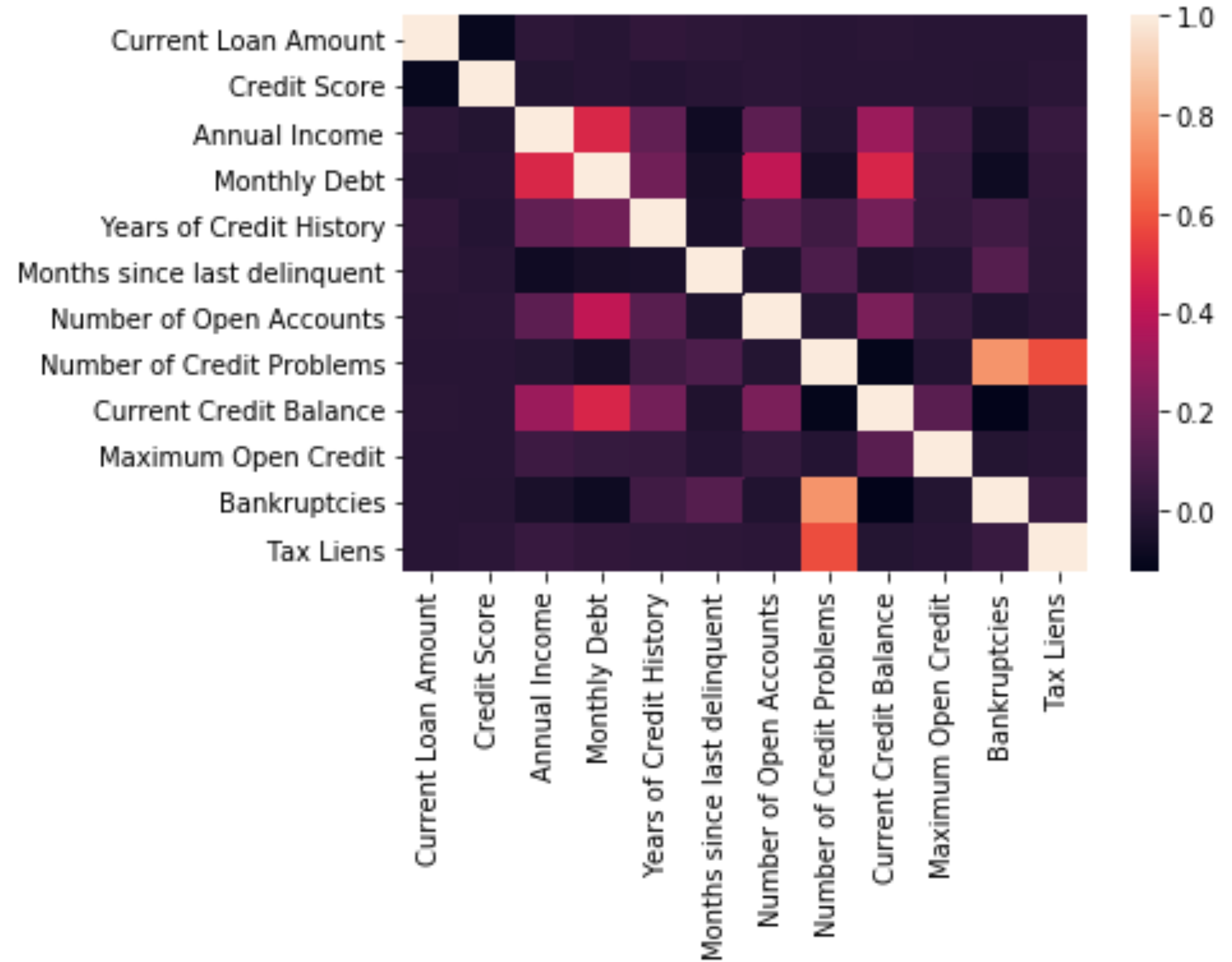
翻译自: https://medium.com/analytics-vidhya/bank-data-eda-step-by-step-67a61a7f1122
数据eda


 1995
1995

 被折叠的 条评论
为什么被折叠?
被折叠的 条评论
为什么被折叠?
 到【灌水乐园】发言


