


 文章聚焦探索性数据分析(EDA),介绍其通过可视化等方法对数据集进行初步分析,为后续处理和建模打基础。还详细阐述了从导入类库、数据,到查看数据类型、缺失情况,再到分析目标变量与定量、定性变量的分布、关系及相关性等一系列操作。
目录
文章导航
一、EDA:
EDA(Exploratory Data Analysis)即探索性数据分析,EDA通过可视化、统计和图形化的方法,对数据集进行全面的、非形式化的初步分析,帮助分析人员了解数据的基本特征,发现数据中的规律和模式。这有助于获取对数据的直观感受和深刻理解,为后续的数据处理和建模提供基础。
二、导入类库
# 导入类库
import numpy as np
import pandas as pd
import scipy.stats as stats

import matplotlib.pyplot as plt
import seaborn as sns
import plotly.express as px

import warnings
warnings.filterwarnings('ignore')
from sklearn.preprocessing import LabelEncoder
from sklearn.preprocessing import RobustScaler

from sklearn.decomposition import PCA
from sklearn.model_selection import cross_val_score, GridSearchCV, KFold

from sklearn.base import BaseEstimator, TransformerMixin, RegressorMixin
from sklearn.base import clone
from sklearn.linear_model import Lasso
from sklearn.linear_model import LinearRegression
from sklearn.linear_model import Ridge
from sklearn.ensemble import RandomForestRegressor, GradientBoostingRegressor, ExtraTreesRegressor
from sklearn.svm import SVR, LinearSVR
from sklearn.linear_model import ElasticNet, SGDRegressor, BayesianRidge
from sklearn.kernel_ridge import KernelRidge
from xgboost import XGBRegressor
# 显示中文
plt.rcParams['font.sans-serif'] = ['SimHei']
plt.rcParams['axes.unicode_minus'] = False

# pandas显示所有行和列
pd.set_option('display.max_columns', None)
pd.set_option('display.max_rows', None)
三、导入数据
train = pd.read_csv('./train.csv')
test = pd.read_csv('./test.csv')

train.head()
四、查看数据类型和缺失情况
train.info()
<class 'pandas.core.frame.DataFrame'>
RangeIndex: 90615 entries, 0 to 90614
Data columns (total 10 columns):
 #   Column          Non-Null Count  Dtype
---  ------          --------------  -----
 0   id              90615 non-null  int64
 1   Sex             90615 non-null  object
 2   Length          90615 non-null  float64
 3   Diameter        90615 non-null  float64
 4   Height          90615 non-null  float64
 5   Whole weight    90615 non-null  float64
 6   Whole weight.1  90615 non-null  float64
 7   Whole weight.2  90615 non-null  float64
 8   Shell weight    90615 non-null  float64
 9   Rings           90615 non-null  int64
dtypes: float64(7), int64(2), object(1)
memory usage: 6.9+ MB
五、确认目标变量和ID
Target_features = ['Rings'] #目标变量
ID_features = ['id'] #id
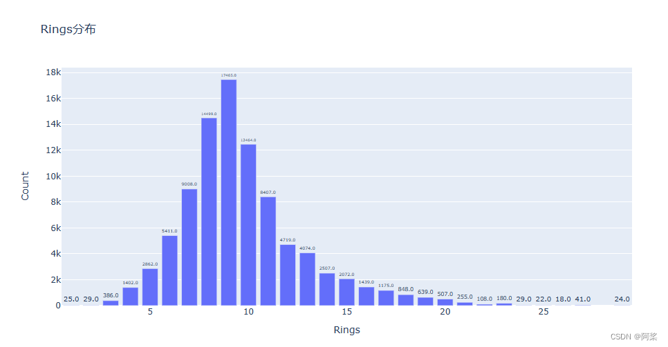
六、查看目标变量分布情况
Target_counts = train[Target_features].value_counts().reset_index()
Target_counts.columns = [Target_features[0], 'Count']


# 绘制条形图
fig = px.bar(Target_counts,x=Target_features[0], y='Count', title=Target_features[0]+'分布')

# 遍历每个轨迹并设置文本
def set_text(trace):
    trace.text = [f"{val:.1f}" for val in trace.y]
    trace.textposition = 'outside'

fig.for_each_trace(set_text)

# 显示图表
fig.show()
七、特征变量按照数据类型分成定量变量和定性变量
# 移除ID和目标变量
train_columns = list(train.columns)
train_columns.remove(Target_features[0])
train_columns.remove(ID_features[0])

# 特征变量按照数据类型分成定量变量和定性变量
quantitative = [feature for feature in train_columns if train.dtypes[feature] != 'object'] # 定量变量
print('定量变量')
print(quantitative)
qualitative = [feature for feature in train_columns if train.dtypes[feature] == 'object'] # 定性变量
print('定性变量')
print(qualitative)
定量变量
['Length', 'Diameter', 'Height', 'Whole weight', 'Whole weight.1', 'Whole weight.2', 'Shell weight']
定性变量
['Sex']
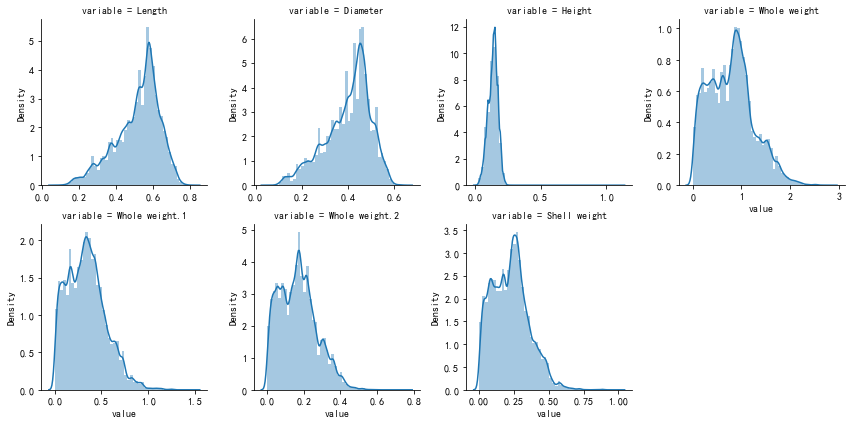
八、查看定量变量分布情况
# 查看定量变量分布情况
m_cont = pd.melt(train, value_vars=quantitative)
g = sns.FacetGrid(m_cont, col='variable', col_wrap=4, sharex=False, sharey=False)
g.map(sns.distplot, 'value')
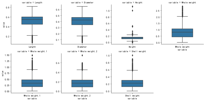
九、查看定量变量的离散程度
# 查看定量变量的离散程度
def plot_boxplots(df):
    m_disc = pd.melt(df)
    g = sns.FacetGrid(m_disc, col='variable', col_wrap=4, sharex=False, sharey=False)
    g.map(sns.boxplot, 'variable', 'value', width=0.5)
    plt.show()

plot_boxplots(train[quantitative])
十、查看定量变量与目标变量关系
# 定量变量与目标变量关系图
m_cont = pd.melt(train, id_vars=Target_features[0], value_vars=quantitative)
g = sns.FacetGrid(m_cont, col='variable', col_wrap=4, sharex=False, sharey=True)
g.map(plt.scatter, 'value', Target_features[0])

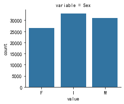
十一、查看定性变量分布情况
# 定性变量频数统计图
m_disc = pd.melt(train, value_vars=qualitative)
g = sns.FacetGrid(m_disc, col='variable', col_wrap=4, sharex=False, sharey=False)
g.map(sns.countplot, 'value')
十二、查看定性变量与目标变量关系
# 定性变量与目标变量关系图
m_disc = pd.melt(train, id_vars=Target_features[0], value_vars=qualitative)
g = sns.FacetGrid(m_disc, col='variable', col_wrap=4, sharex=False, sharey=False)
g.map(sns.boxplot, 'value', Target_features[0])

十三、查看定性变量对目标变量的显著性影响
# 查看定性变量对目标变量的显著性影响
def anova(frame, qualitative):
    anv = pd.DataFrame()
    anv['feature'] = qualitative
    p_vals = []
    for fea in qualitative:
        samples = []
        cls = frame[fea].unique() # 变量的类别值
        for c in cls:
            c_array = frame[frame[fea]==c][Target_features[0]].values
            samples.append(c_array)
        p_val = stats.f_oneway(*samples)[1] # 获得p值,p值越小,对SalePrice的显著性影响越大
        p_vals.append(p_val)
    anv['pval'] = p_vals
    return anv.sort_values('pval')
a = anova(train, qualitative)
a['disparity'] = np.log(1./a['pval'].values) # 对SalePrice的影响悬殊度
plt.figure(figsize=(8, 6))
sns.barplot(x='feature', y='disparity', data=a)
plt.xticks(rotation=90)
plt.show()

十四、查看定性变量和目标变量的spearman相关系数
# 查看定性变量和目标变量的spearman相关系数
# 需要先把定性变量处理为数值类型
def encode(frame, feature):
    ordering = pd.DataFrame()
    ordering['val'] = frame[feature].unique()
    ordering.index = ordering['val']
    ordering['spmean'] = frame[[feature, Target_features[0]]].groupby(feature)[Target_features[0]].mean()
    ordering = ordering.sort_values('spmean')
    ordering['ordering'] = np.arange(1, ordering.shape[0]+1)
    ordering = ordering['ordering'].to_dict() # 返回的数据样例{category1:1, category2:2, ...}

    # 对frame[feature]编码
    for category, code_value in ordering.items():
        frame.loc[frame[feature]==category, feature+'_E'] = code_value
qual_encoded = []
for qual in qualitative:
    encode(train, qual)
    qual_encoded.append(qual+'_E')
# print(qual_encoded)

def spearman(frame, features):
    spr =  pd.DataFrame()
    spr['feature'] = features
    spr['spearman'] = [frame[f].corr(frame[Target_features[0]], 'spearman') for f in features]
    spr = spr.sort_values('spearman')

    plt.figure(figsize=(6, 0.25*len(features)))
    sns.barplot(x='spearman', y='feature', data=spr)
spearman(train, quantitative+qual_encoded)

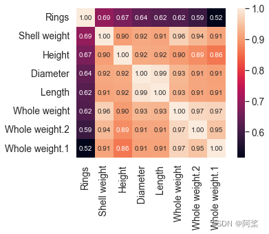
十五、查看定量变量与目标变量相关性
# 定量变量与目标变量相关性
# plt.figure(1, figsize=(12,9))
corrmat = train[quantitative+[Target_features[0]]].corr()
k = 10 #number of variables for heatmap
cols = corrmat.nlargest(k, Target_features[0])[Target_features[0]].index
corr = train[list(cols)].corr()
sns.set(font_scale=1.25)
sns.heatmap(corr, cbar=True, annot=True, square=True, fmt='.2f', annot_kws={'size': 10}, yticklabels=cols.values, xticklabels=cols.values)
plt.show()
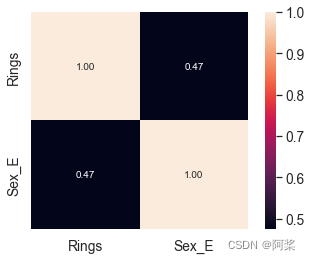
十六、查看定性变量与目标变量相关性
# 定性变量与目标变量相关性

# plt.figure(1, figsize=(12,9))
corrmat = train[qual_encoded+[Target_features[0]]].corr()
k = 10 #number of variables for heatmap
cols = corrmat.nlargest(k, Target_features[0])[Target_features[0]].index
corr = train[list(cols)].corr()
sns.set(font_scale=1.25)
sns.heatmap(corr, cbar=True, annot=True, square=True, fmt='.2f', annot_kws={'size': 10}, yticklabels=cols.values, xticklabels=cols.values)
plt.show()


 5308
5308

 被折叠的 条评论
为什么被折叠?
被折叠的 条评论
为什么被折叠?
 到【灌水乐园】发言


