


时序分析(1) – 分布特征
如无特殊说明,本系列文章中的数据将使用2012~2017年,分别代表国内股票、香港股票、国内债卷和国内货币的四个指数数据。
开篇中我们曾经讲过,时序数据分析技术种类繁多,但究其根本最核心的需求是为了预测数据。所以在开始阶段,我们需要来判断数据的可预测特性是怎么样的。在探讨数据的可预测性之前,首先让我们看看时序数据是什么样的
1. 导入必要的python包
import warnings
warnings.simplefilter('ignore')
import pandas as pd
import numpy as np
%matplotlib inline
from fintechtools.backtest import *
from fintechtools.datasource import *
from fintechtools.SimuMultiTest import *
import matplotlib
import matplotlib as mpl
from matplotlib.ticker import FuncFormatter
mpl.style.use('classic')
plt.rcParams['font.sans-serif'] = ['SimHei']
plt.rcParams['font.serif'] = ['SimHei']
plt.rcParams['axes.unicode_minus'] = False
import seaborn as sns
sns.set_style("whitegrid",{"font.sans-serif":['simhei', 'Arial']})
sns.set_context("talk")
%load_ext autoreload
%autoreload 2
2. 读入数据
start = '2012-01-01'
end = '2016-03-01'
indexs = pd.read_excel('./data/华夏指数.xlsx')
indexs_pv = indexs.pivot_table(index='日期', columns= '简称', values= '收盘价(元)')
indexs_pv.index = pd.to_datetime(indexs_pv.index, unit='d')
indexs_pv.columns = ['国内债券', '国内股票', '香港股票', '国内货币']
indexs_pv = indexs_pv[['国内债券', '国内股票', '国内货币', '香港股票']]
indexs_pv.fillna(axis=0,method='bfill',inplace=True)
indexs_sub = indexs_pv.loc[start:end,]
国内债卷:中债综合财富(总值)指数
国内股票:中证全指
香港股票:恒生指数
国内货币:货币基金
indexs_sub.head()
国内债券 国内股票 国内货币 香港股票
日期
2012-01-04 141.5160 2571.951 1166.7726 18727.31
2012-01-05 141.5501 2513.699 1166.9696 18813.41
2012-01-06 141.7277 2527.247 1167.1185 18593.06
2012-01-09 141.8669 2619.638 1167.5058 18865.72
2012-01-10 142.0118 2713.529 1167.6330 19004.28
时序散点图
_ = indexs_sub.plot(figsize=(16,8),subplots=True,layout=(2,2))

从上图中我们可以看出,国内货币呈现较为平稳的上升趋势,国内债卷呈现有波动的上升趋势,而国内股票和香港股票的趋势不明显。
在金融时序序列中我们经常关心其收益,下面我们看一下其收益时序图
indexs_logret = indexs_sub.apply(log_return).dropna()
_ = indexs_logret.plot(figsize=(16,8),subplots=True,layout=(2,2))

从上面的日收益率的时序图上我们很难得出有价值的结论。我们需要进一步观察其收益特性,首先让我们看一下其收益分布直方图。
收益率分布直方图
_ = indexs_logret.hist(bins=50,figsize=(12,6),color='steelblue')

好像可以看出什么,是吗?似乎有些像钟形曲线,让我们看一下其统计特性:均值和标准差
indexs_logret.mean()
国内债券 0.000211
国内股票 0.000473
国内货币 0.000161
香港股票 0.000035
dtype: float64
indexs_logret.std()
国内债券 0.000876
国内股票 0.017880
国内货币 0.000123
香港股票 0.011125
dtype: float64
pd.concat([indexs_logret.mean(),indexs_logret.std()],axis=1,keys=['mean','std'])
mean std
国内债券 0.000211 0.000876
国内股票 0.000473 0.017880
国内货币 0.000161 0.000123
香港股票 0.000035 0.011125
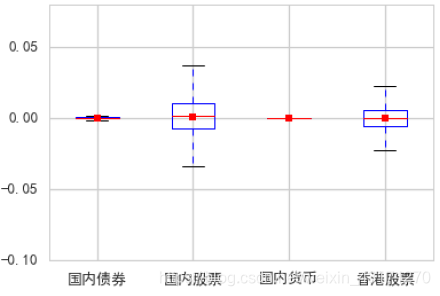
看一下其对应箱型图
收益箱型图
_ = indexs_logret.boxplot(showmeans=True)
Confidence Interval
收益率的均值是我们比较关心的技术指标,所以下面我们将计算其均值的分布并确定置信区间。从整个数据集中做200此抽样,每次取500个点
point_estimates = []
for x in range(200):
    sample = indexs_logret.sample(n=500)
    point_estimates.append(sample.mean())
- 四个指数的均值的KDE分布图
_ = pd.DataFrame(point_estimates).plot(kind="density",subplots=True,layout=(2,2),figsize=(12,8))

样本均值为
pd.DataFrame(point_estimates).mean()
国内债券 0.000210
国内股票 0.000435
国内货币 0.000161
香港股票 0.000002
dtype: float64
根据中心极限定律,margin error = z ∗ σ/√n
import scipy.stats as stats
z_critical = stats.norm.ppf(q = 0.975) # Get the z-critical value*
print("z-critical value:") # Check the z-critical value
print(z_critical)
z-critical value:
1.959963984540054
import math
pop_stdev = indexs_logret.std() # Get the population standard deviation
sample_mean = pd.DataFrame(point_estimates).mean()
margin_of_error = z_critical * (pop_stdev/math.sqrt(500))
confidence_interval = (sample_mean - margin_of_error,
sample_mean + margin_of_error)
result = pd.concat([sample_mean,margin_of_error],axis=1,keys=['mean','me'])
result['CI_lower'] = result['mean']-result['me']
result['CI_higher'] = result['mean'] + result['me']
mean me CI_lower CI_higher
国内债券 0.000210 0.000077 0.000133 0.000287
国内股票 0.000435 0.001567 -0.001132 0.002003
国内货币 0.000161 0.000011 0.000150 0.000172
香港股票 0.000002 0.000975 -0.000973 0.000977
OK,我们得到了置信区间。在本系列后续文章中我们还会介绍更为精确的方法来估算收益率期望值。
现在我们对这四个指数的时序数据有了一定了解。我们观察到其收益率直方图类似钟形曲线,那么收益率是否符合正态分布呢?首先,我们先采用QQ-plot观察一下。
QQ Plot
QQ plot即Quantile-Quantil plot, 是用来判断两个数据集是否来自同一分布的图形技术。它类似于Probability Plot,后者是用来检验一个数据集的分布是否符合一个已知分布,如正态分布或威布尔分布。现在让我们来详细了解其背后的逻辑。
假如一个数据集符合正态分布,那么它的累积分布函数也应该符合正态分布的累积分布函数,也就是说这里, 是累积分布函数中所对应的点的值,换句话说,就是点的分位数。 对上式两边取反函数,得到
y
i
=
Φ
(
x
i
−
μ
σ
)
y_i=\Phi( \frac {x_i-\mu}{\sigma} )
yi=Φ(σxi−μ)
这里,
y
i
y_i
yi 是累积分布函数中
x
i
x_i
xi所对应的点的值,换句话说,就是点的分位数。 对上式两边取反函数,得到
Φ
−
1
(
y
i
)
=
x
i
−
μ
σ
\Phi^{-1}(y_i)=\frac {x_i-\mu}{\sigma}
Φ−1(yi)=σxi−μ
x
i
=
μ
+
σ
Φ
−
1
(
y
i
)
x_i=\mu+\sigma \Phi^{-1}(y_i)
xi=μ+σΦ−1(yi)
可以推知,如果我们画出对应的
x
i
x_i
xi和
Φ
−
1
(
y
i
)
\Phi^{-1}(y_i)
Φ−1(yi),将会得到以
μ
\mu
μ为截距,以
σ
\sigma
σ为斜率的一条直线。进一步讲,如果是标准正态分布的化,将会得到一个与横轴夹角为45度的直线。
layout = (2,2)
fig = plt.figure(figsize=(12,8))
for index_name,pos in zip(indexs_logret.columns,[(0,0),(0,1),(1,0),(1,1)]):
    y=indexs_logret[index_name]
    qq_ax = plt.subplot2grid(layout,pos)
    plt.tight_layout()
    sm.qqplot(y, line='s',ax=qq_ax)
    qq_ax.set_title(index_name)
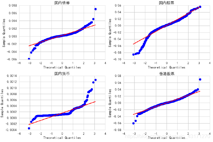
从上图中我们可以观察到,香港股票相对来说最接近正态分布,且两边存在厚尾;而国内股票只在左边出现厚尾。
从QQ-plot上我们并不能确定和正态分布的接近程度,需要更要精确的方法:统计检验法。
正态分布检验
- KS-检验(Kolmogorov-Smirnov test)
KS检验是一种非参数检验法,其原假设 H0:两个数据分布一致或者数据符合理论分布。D=max| f(x)- g(x)|,当实际观测值D>D(n,α)则拒绝H0,否则则接受H0假设。
from scipy.stats import kstest
kstest(indexs_logret['香港股票'],'norm')
KstestResult(statistic=0.48409004182660204, pvalue=0.0)
很不幸,pvalue明显小于显著性水平,只能拒绝原假设。结论是:香港股票的收益率分布不是正态分布。
- 偏度峰度检验
现在我们引用高阶统计量:偏度和峰度
from scipy.stats import skew,kurtosistest,kurtosis,stats
sw = indexs_logret.apply(skew)
kt = indexs_logret.apply(kurtosis)
pd.DataFrame([sw,kt],index=['偏度','峰度'])
国内债券 国内股票 国内货币 香港股票
偏度 0.268642 -1.000288 3.342568 -0.000757
峰度 8.620768 3.921901 18.750525 3.305865
标准正态分布的偏度为0,峰度为3.观察上面的数据,可以得到与前面类似的结论。
k2, p = stats.normaltest(indexs_logret['香港股票'])
print("p = {:g}".format(p))
p = 7.98892e-19
p-value非常小,所以可以判断不是正态分布。
总结
本文展示了采用Python语言为四个指数时序数据做了基本的描述性分析和推断性分析,并介绍qq-plot、置信区间等概念和原理,可以看到这四个指数的收益率时序都不符合正态分布。


 422
422


 被折叠的 条评论
为什么被折叠?
被折叠的 条评论
为什么被折叠?
 到【灌水乐园】发言


