


In my thesis, I need to show three activation functions’ figures in one row. There are 4 points that should be considered:
- show subplots
- move the axis to the center of the figure, like a normal coordinate system
- put the title at the bottom of the figure (default is at the top)
- only specific ticks showed on the axis
The one big figure also can be used in this way with similar functions.
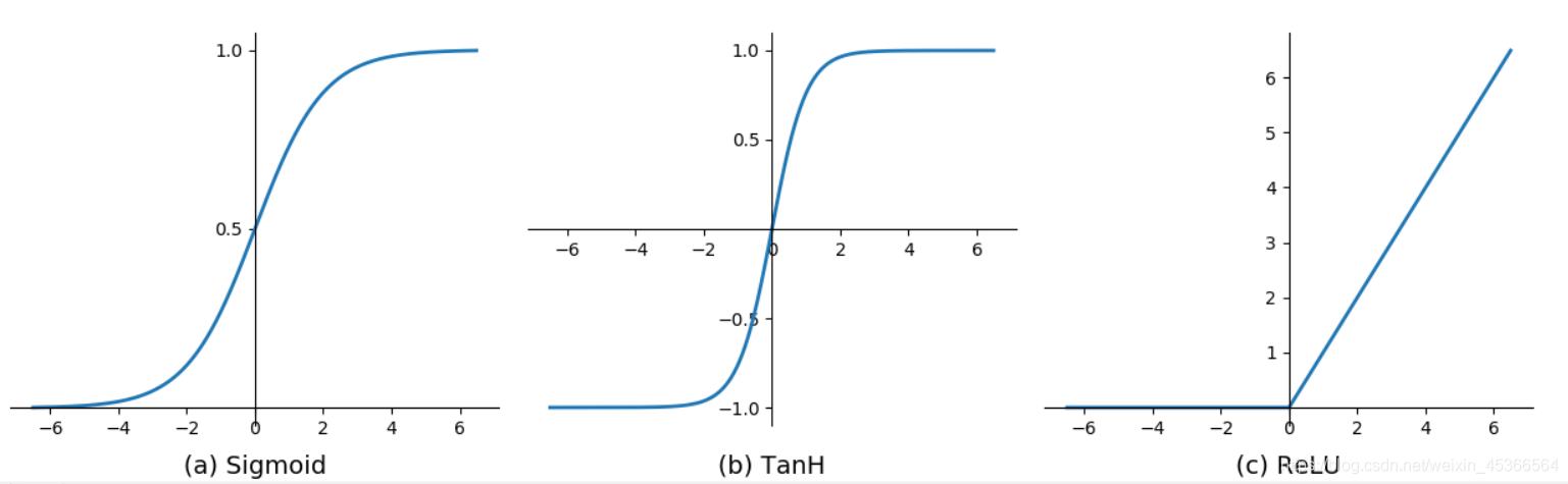
Take a quick preview first on the final result:)
Let’s do it!
subplots
fig = plt.figure(figsize=(16, 4))
ax = fig.add_subplot(1, 3, i+1)
move the position of the axis to center
ax.spines['top'].set_color('none')
ax.spines['right'].set_color('none')
ax.xaxis.set_ticks_position('bottom')
ax.spines['bottom'].set_position(('data', 0))
ax.yaxis.set_ticks_position('left')
ax.spines['left'].set_position(('data', 0))
set title at the bottom
The parameter y in ax.set_title means “Set the y position of the text” (same as x).
1: top0: bottom of graphic part<0: lower than graphic part (too low will be out of the fig.)>1: higher than the top (too high will be out of the fig.)
ax.set_title('('+letter[i]+') '+functions[i].__name__, y=-0.15, fontsize=14)
show the specific ticks on the axis
Only show [-1, -0.5, 0.5, 1] of y-aixs.
ax.set_yticks([-1, -0.5, 0.5, 1])
complete code and figure
import numpy as np
import decimal
import matplotlib.pyplot as plt

from scipy import signal


def Sigmoid(x):	return 1.0/(1+np.exp(-1.0*x))
def Sigmoid2(x):return 1.0/(1+np.exp(-1.0*x))-0.5
def TanH(x):	return 2.0/(1+np.exp(-2.0*x))-1
def ReLU(x):	return np.maximum(0, x)

functions = [Sigmoid, TanH, ReLU]
x = np.arange(-6.5, 6.5, 0.01)
letter = list(map(chr, range(ord('a'), ord('z') + 1)))

fig = plt.figure(figsize=(16, 4))
plt.subplots_adjust(wspace=0.06)#, hspace =0.1)
for i in range(0, len(functions)):
	ax = fig.add_subplot(1,3,i+1)
	ax.spines['top'].set_color('none')
	ax.spines['right'].set_color('none')
	ax.xaxis.set_ticks_position('bottom')
	ax.spines['bottom'].set_position(('data', 0))
	ax.yaxis.set_ticks_position('left')
	ax.spines['left'].set_position(('data', 0))

	# set the title and move it to the bottom
	ax.set_title('('+letter[i]+') '+functions[i].__name__, y=-0.15, fontsize=14)

	if i != 2: ax.set_yticks([-1, -0.5, 0.5, 1]) # change axis ticks
	elif i == 2: ax.set_yticks(list(np.arange(1,7,1)))
	plt.plot(x, functions[i](x),  linestyle="-", linewidth=2)

plt.show()

Reference
matplotlib.axes.Axes.set_title


 1227
1227

 被折叠的 条评论
为什么被折叠?
被折叠的 条评论
为什么被折叠?
 到【灌水乐园】发言


