


 本文详细介绍了使用R语言的ggplot2库绘制散点图的各种方法,包括基本散点图、分组点形和颜色、自定义点形、映射连续变量、处理图形重叠、添加模型拟合线、添加模型系数、绘制边际地毯、添加标签、绘制气泡图、散点图矩阵等。通过实例展示了如何通过ggplot2的函数实现各种复杂效果,以更好地展示和理解两个连续变量之间的关系。
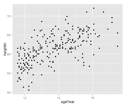
3.1 绘制基本散点图
3.2 使用点形和颜色属性进行分组
3.3 使用不同于默认设置的点形
3.4 将连续型变量映射到点的颜色或大小属性上
3.5 处理图形重叠
3.6 添加回归模型拟合线
3.7 根据已有模型向散点图添加拟合线
3.8 添加来自多个模型的拟合线
3.9 向散点图添加模型系数
3.10 向散点图添加边际地毯
3.11 向散点图添加标签
3.12 绘制气泡图
3.13 绘制散点图矩阵
往期文章
参考书籍
散点图通常用于刻画两个连续型变量之间的关系。绘制散点图时,数据集中的每一个观测值都由每个点表示。
3.1 绘制基本散点图
library(gcookbook)
library(ggplot2)
# 列出我们用到的列
head(heightweight[, c("ageYear", "heightIn")])
> head(heightweight[, c("ageYear", "heightIn")])
  ageYear heightIn
1   11.92     56.3
2   12.92     62.3
3   12.75     63.3
4   13.42     59.0
5   15.92     62.5
6   14.25     62.5
ggplot(heightweight, aes(x=ageYear, y=heightIn)) + geom_point()
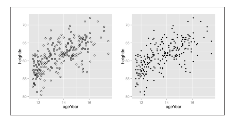
# shape参数设置点型 size设置点的大小
ggplot(heightweight, aes(x=ageYear, y=heightIn)) +
  geom_point(shape=21)
ggplot(heightweight, aes(x=ageYear, y=heightIn)) +
  geom_point(size=1.5)
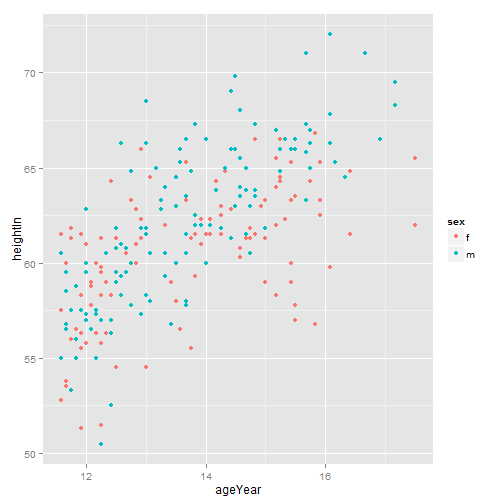
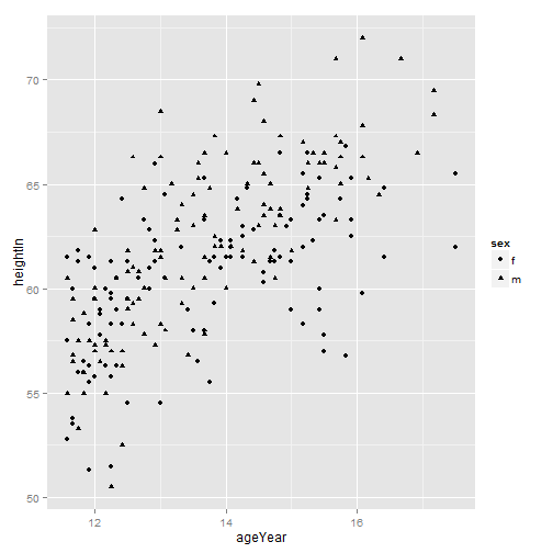
3.2 使用点形和颜色属性进行分组
head(heightweight[, c("sex", "ageYear", "heightIn")])
> head(heightweight[, c("sex", "ageYear", "heightIn")])
  sex ageYear heightIn
1   f   11.92     56.3
2   f   12.92     62.3
3   f   12.75     63.3
4   f   13.42     59.0
5   f   15.92     62.5
6   f   14.25     62.5
ggplot(heightweight, aes(x=ageYear, y=heightIn, colour=sex)) +
  geom_point()
ggplot(heightweight, aes(x=ageYear, y=heightIn, shape=sex)) +
  geom_point()
# scale_shape_manual()使用其它点形状
#scale_colour_brewer()使用其它颜色
ggplot(heightweight, aes(x=ageYear, y=heightIn, shape=sex, colour=sex)) +
  geom_point() +
  scale_shape_manual(values=c(1,2)) +
  scale_colour_brewer(palette="Set1")

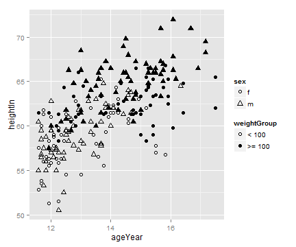
3.3 使用不同于默认设置的点形
# 使用点形和填充色属性分别表示不同变量
hw <- heightweight
# 分组 Categorize into <100 and >=100 groups
hw$weightGroup <- cut(hw$weightLb, breaks=c(-Inf, 100, Inf),
                      labels=c("< 100", ">= 100"))

# 使用具有颜色和填充色的点形及对应于空值(NA)和填充色的颜色
ggplot(hw, aes(x=ageYear, y=heightIn, shape=sex, fill=weightGroup)) +
  geom_point(size=2.5) +
  scale_shape_manual(values=c(21, 24)) +
  scale_fill_manual(values=c(NA, "black"),
                    guide=guide_legend(override.aes=list(shape=21)))
3.4 将连续型变量映射到点的颜色或大小属性上
ggplot(heightweight, aes(x=ageYear, y=heightIn, colour=weightLb)) +
  geom_point()

ggplot(heightweight, aes(x=ageYear, y=heightIn, size=weightLb)) +
  geom_point()
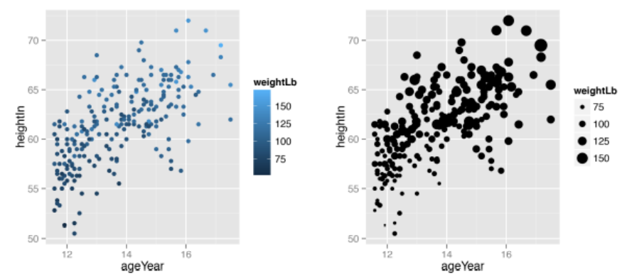
# 默认点的大小范围为1-6mm
# scale_size_continuous(range=c(2, 5))修改点的大小范围
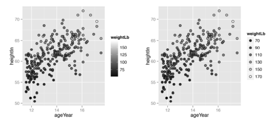
# 将色阶设定为由黑至白
ggplot(heightweight, aes(x=weightLb, y=heightIn, fill=ageYear)) +
  geom_point(shape=21, size=2.5) +
  scale_fill_gradient(low="black", high="white")

# 使用 guide_legend() 函数以离散的图例代替色阶
ggplot(heightweight, aes(x=weightLb, y=heightIn, fill=ageYear)) +
  geom_point(shape=21, size=2.5) +
  scale_fill_gradient(low="black", high="white", breaks=12:17,
                      guide=guide_legend())
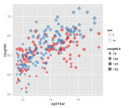
# 调用scale_size_area()函数使数据点的面积正比于变量值。
ggplot(heightweight, aes(x=ageYear, y=heightIn, size=weightLb, colour=sex)) +
  geom_point(alpha=.5) +
  scale_size_area() +
  scale_colour_brewer(palette="Set1")
3.5 处理图形重叠
方法:
使用半透明的点
将数据分箱(bin),并用矩形表示
将数据分箱(bin),并用六边形表示
使用箱线图
sp <- ggplot(diamonds, aes(x=carat, y=price))
sp + geom_point()
# 透明度
sp + geom_point(alpha=.1)
sp + geom_point(alpha=.01)

# stat_bin2d()函数默认分别在x轴和y轴方向上将数据分割为30各组
sp + stat_bin2d()

# bin=50设置箱数,limits参数设定图例范围
sp + stat_bin2d(bins=50) +
  scale_fill_gradient(low="lightblue", high="red", limits=c(0, 6000))
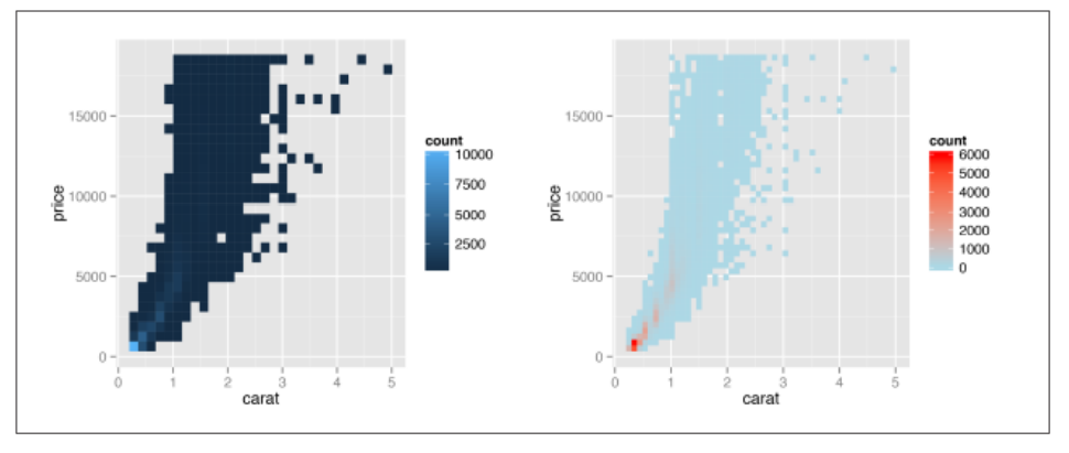
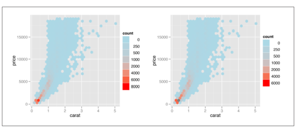
# stat_binhex()函数使用六边形分箱
library(hexbin)
sp + stat_binhex() +
  scale_fill_gradient(low="lightblue", high="red",
                      limits=c(0, 8000))

sp + stat_binhex() +
  scale_fill_gradient(low="lightblue", high="red",
                      breaks=c(0, 250, 500, 1000, 2000, 4000, 6000),
                      limits=c(0, 6000))
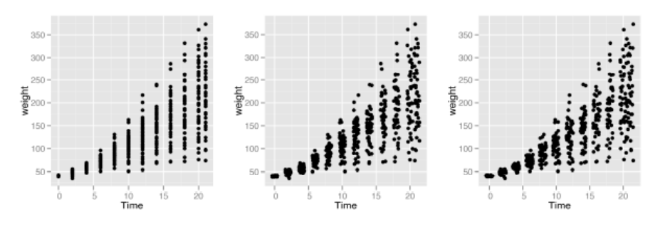
sp1 <- ggplot(ChickWeight, aes(x=Time, y=weight))

sp1 + geom_point()
# 调用position_jitter()函数给数据点增加随机扰动,通过width,height参数调节
sp1 + geom_point(position="jitter")
# 也可以调用 geom_jitter()
sp1 + geom_point(position=position_jitter(width=.5, height=0))
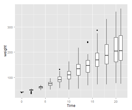
# 箱线图
sp1 + geom_boxplot(aes(group=Time))
3.6 添加回归模型拟合线
#  运行stat_smooth()函数并设定 method=lm 即可向散点图中添加线性回归拟合线
# 默认情况下 stat_smooth() 函数会为回归拟合线自动添加95% 的置信域,可以设置 level 参数对置信水平进行调整。设置 se = FALSE, 则不添加置信域
library(gcookbook) # For the data set
sp <- ggplot(heightweight, aes(x=ageYear, y=heightIn))

sp + geom_point() + stat_smooth(method=lm)
# 99% 置信域
sp + geom_point() + stat_smooth(method=lm, level=0.99)
# 没有置信域
sp + geom_point() + stat_smooth(method=lm, se=FALSE)
# 设置拟合线的颜色
sp + geom_point(colour="grey60") +
  stat_smooth(method=lm, se=FALSE, colour="black")
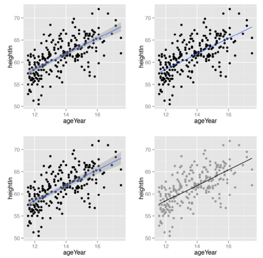
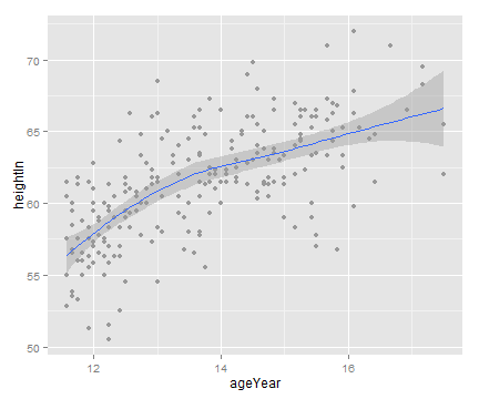
# stat_smooth()函数默认的模型为 loess 曲线
sp + geom_point(colour="grey60") + stat_smooth()
sp + geom_point(colour="grey60") + stat_smooth(method=loess)
# 分组绘制模型拟合线
sps <- ggplot(heightweight, aes(x=ageYear, y=heightIn, colour=sex)) +
  geom_point() +
  scale_colour_brewer(palette="Set1")

sps + geom_smooth()
sps + geom_smooth(method=lm, se=FALSE, fullrange=TRUE)
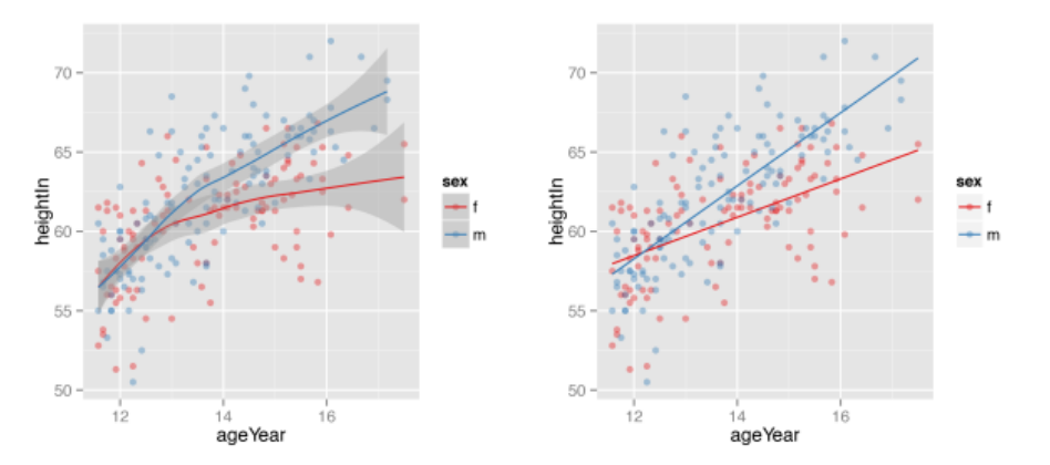
值得注意的是:loess()函数只能根据数据对应的x轴的范围进行预测。如果想基于数据集对拟合线进行外推,必须使用支持外推的函数,比如lm(),并将fullrange=TRUE参数传递给 stat_smooth() 函数。
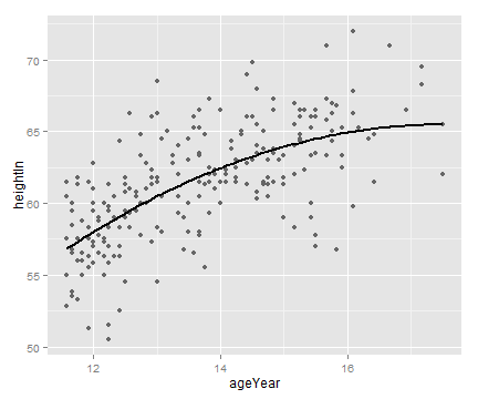
3.7 根据已有模型向散点图添加拟合线
使用 lm() 函数建立一个以 ageYear 为预测变量对 heightIn 进行预测的模型。然后,调用 predict() 函数对 heightIn 进行预测。
model <- lm(heightIn ~ ageYear + I(ageYear^2), heightweight)
model
> model

Call:
lm(formula = heightIn ~ ageYear + I(ageYear^2), data = heightweight)

Coefficients:
 (Intercept)       ageYear  I(ageYear^2)
    -10.3136        8.6673       -0.2478
# 创建一个 ageYear 列,并对其进行插值。
xmin <- min(heightweight$ageYear)
xmax <- max(heightweight$ageYear)
predicted <- data.frame(ageYear=seq(xmin, xmax, length.out=100))

# 计算 heightIn 的预测值
predicted$heightIn <- predict(model, predicted)
head(predicted)
> head(predicted)
   ageYear heightIn
1 11.58000 56.82624
2 11.63980 57.00047
3 11.69960 57.17294
4 11.75939 57.34363
5 11.81919 57.51255
6 11.87899 57.67969
# 将预测曲线绘制的数据点散点图上
sp <- ggplot(heightweight, aes(x=ageYear, y=heightIn)) +
  geom_point(colour="grey40")

sp + geom_line(data=predicted, size=1)
# 应用定义的 predictvals() 函数可以简化向散点图添加模型拟合线的过程
predictvals <- function(model, xvar, yvar, xrange=NULL, samples=100, ...) {
  if (is.null(xrange)) {
    if (any(class(model) %in% c("lm", "glm")))
      xrange <- range(model$model[[xvar]])
    else if (any(class(model) %in% "loess"))
      xrange <- range(model$x)
  }

  newdata <- data.frame(x = seq(xrange[1], xrange[2], length.out = samples))
  names(newdata) <- xvar
  newdata[[yvar]] <- predict(model, newdata = newdata, ...)
  newdata
}

# 调用lm() 函数和 loess() 函数对数据集建立线性和LOESS模型
modlinear <- lm(heightIn ~ ageYear, heightweight)

modloess  <- loess(heightIn ~ ageYear, heightweight)


lm_predicted    <- predictvals(modlinear, "ageYear", "heightIn")
loess_predicted <- predictvals(modloess, "ageYear", "heightIn")

ggplot(heightweight, aes(x=ageYear, y=heightIn)) +
  geom_point(colour="grey40") +
  geom_line(data=lm_predicted, colour="red", size=.8) +
  geom_line(data=loess_predicted, colour="blue", size=.8)
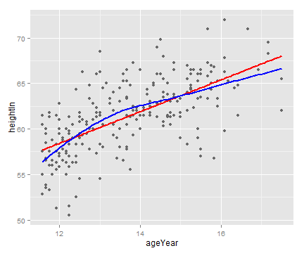
3.8 添加来自多个模型的拟合线
根据变量 sex 的水平对 heightweight 数据集进行分组,调用 lm() 函数对每组数据分别建立线性模型,并将模型结果放在一个列表内。随后,通过下面定义的 make_model() 函数建立模型。
make_model <- function(data) {
  lm(heightIn ~ ageYear, data)
}
# 将heighweight 数据集分别切分为男性和女性组并建立模型
ibrary(gcookbook)
library(plyr)
models <- dlply(heightweight, "sex", .fun = make_model)

# 查看两个lm对象f和m组成的列表
models
> models
$f

Call:
lm(formula = heightIn ~ ageYear, data = data)

Coefficients:
(Intercept)      ageYear
     43.963        1.209


$m

Call:
lm(formula = heightIn ~ ageYear, data = data)

Coefficients:
(Intercept)      ageYear
     30.658        2.301


attr(,"split_type")
[1] "data.frame"
attr(,"split_labels")
  sex
1   f
2   m
predvals <- ldply(models, .fun=predictvals, xvar="ageYear", yvar="heightIn")
head(predvals)
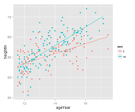
ggplot(heightweight, aes(x=ageYear, y=heightIn, colour=sex)) +
geom_point() + geom_line(data=predvals)
# 设置 xrange 参数使两组预测线对应的xz轴范围与整个数据集对应的x轴范围详谈
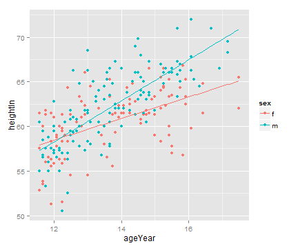
predvals <- ldply(models, .fun=predictvals, xvar="ageYear", yvar="heightIn",
xrange=range(heightweight$ageYear))
ggplot(heightweight, aes(x=ageYear, y=heightIn, colour=sex)) +
geom_point() + geom_line(data=predvals)
3.9 向散点图添加模型系数
调用 annotate() 函数在图形中添加文本。
model <- lm(heightIn ~ ageYear, heightweight)
# 查看模型参数
summary(model)
> summary(model)

Call:
lm(formula = heightIn ~ ageYear, data = heightweight)

Residuals:
    Min      1Q  Median      3Q     Max
-8.3517 -1.9006  0.1378  1.9071  8.3371

Coefficients:
            Estimate Std. Error t value Pr(>|t|)
(Intercept)  37.4356     1.8281   20.48   <2e-16 ***
ageYear       1.7483     0.1329   13.15   <2e-16 ***
---
Signif. codes:  0 ‘***’ 0.001 ‘**’ 0.01 ‘*’ 0.05 ‘.’ 0.1 ‘ ’ 1

Residual standard error: 2.989 on 234 degrees of freedom
Multiple R-squared:  0.4249, Adjusted R-squared:  0.4225
F-statistic: 172.9 on 1 and 234 DF,  p-value: < 2.2e-16
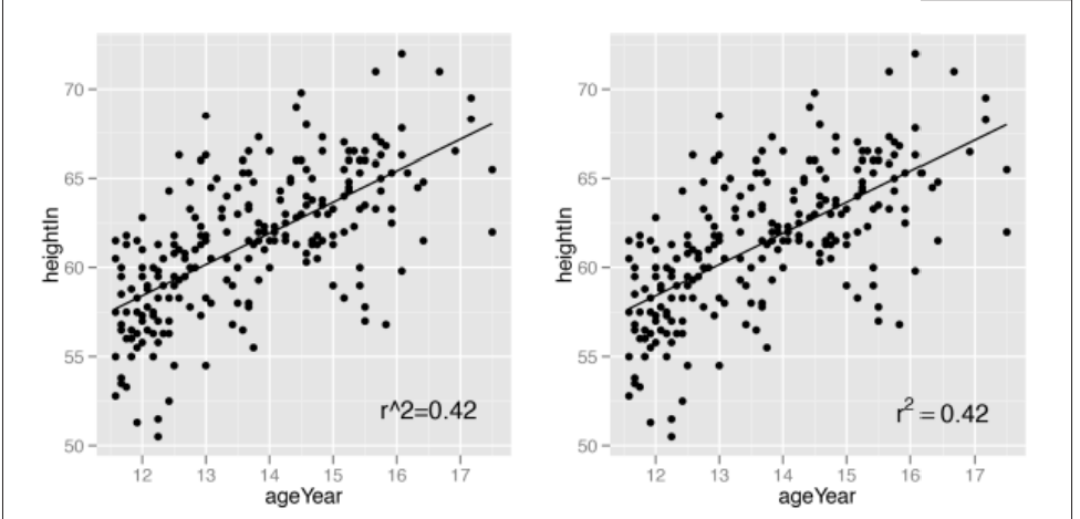
pred <- predictvals(model, "ageYear", "heightIn")
sp <- ggplot(heightweight, aes(x=ageYear, y=heightIn)) + geom_point() +
geom_line(data=pred)
# x,y参数设置标签位置
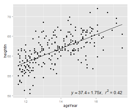
sp + annotate("text", label="r^2=0.42", x=16.5, y=52)
# parse = TRUE 调用R的数学表达式语法
sp + annotate("text", label="r^2 == 0.42", parse = TRUE, x=16.5, y=52)
# 自动生成公式
eqn <- as.character(as.expression(
  substitute(italic(y) == a + b * italic(x) * "," ~~ italic(r)^2 ~ "=" ~ r2,
             list(a = format(coef(model)[1], digits=3),
                  b = format(coef(model)[2], digits=3),
                  r2 = format(summary(model)$r.squared, digits=2)
             ))))
eqn

parse(text=eqn)  # Parsing turns it into an expression

sp + annotate("text", label=eqn, parse=TRUE, x=Inf, y=-Inf, hjust=1.1, vjust=-.5)
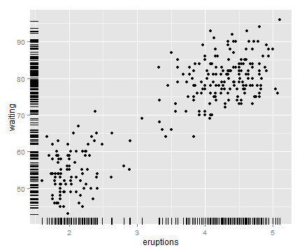
3.10 向散点图添加边际地毯
# 使用 geom_rug() 函数添加边际地毯
ggplot(faithful, aes(x=eruptions, y=waiting)) +
  geom_point() +
  geom_rug()
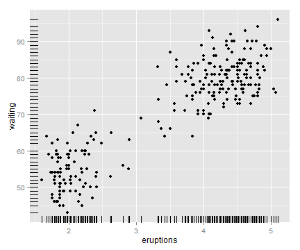
# 通过向边际地毯线的位置坐标添加扰动并设定size减小线宽可以减轻边际地毯线的重叠程度
ggplot(faithful, aes(x=eruptions, y=waiting)) +
  geom_point() +
  geom_rug(position="jitter", size=.2)
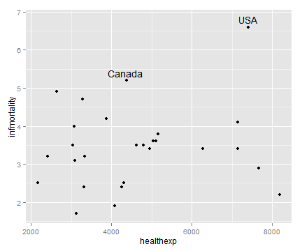
3.11 向散点图添加标签
library(gcookbook)
# 以countries数据集为例,对各国医疗保健支出与婴儿死亡率之间的关系进行可视化
# 选取人均支出大于2000美元的国家的数据子集进行分析
subset(countries, Year==2009 & healthexp>2000)

sp <- ggplot(subset(countries, Year==2009 & healthexp>2000),
             aes(x=healthexp, y=infmortality)) +
  geom_point()
# annotate()函数指定标签坐标和标签文本
sp + annotate("text", x=4350, y=5.4, label="Canada") +
  annotate("text", x=7400, y=6.8, label="USA")
# geom_text()函数自动添加数据标签
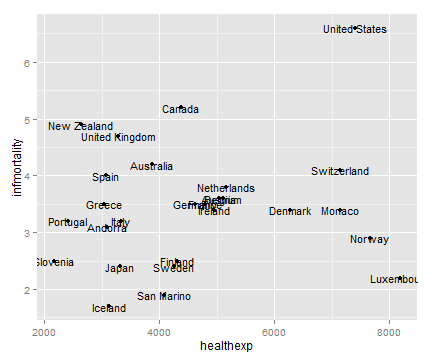
sp + geom_text(aes(label=Name), size=4)
调整标签位置,大家自行尝试。
# 对标签的位置进行调整
sp + geom_text(aes(label=Name), size=4, vjust=0)
sp + geom_text(aes(y=infmortality+.1, label=Name), size=4, vjust=0)

sp + geom_text(aes(label=Name), size=4, hjust=0)
sp + geom_text(aes(x=healthexp+100, label=Name), size=4, hjust=0)
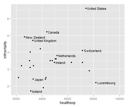
如何只对自己想要的数据点添加标签。
注:有很多人在后台问我如何在火山图里给自己想要的基因添加注释。这里提供了一个思路。
# 新建一个数据
cdat <- subset(countries, Year==2009 & healthexp>2000)
cdat$Name1 <- cdat$Name
# 用%in%运算符找出绘图时希望抱怨的标签
idx <- cdat$Name1 %in% c("Canada", "Ireland", "United Kingdom", "United States",
                         "New Zealand", "Iceland", "Japan", "Luxembourg",
                         "Netherlands", "Switzerland")
idx
# 根据上面的逻辑向量用 NA 重写变量 Name1 中的其它取值
cdat$Name1[!idx] <- NA
cdat
ggplot(cdat, aes(x=healthexp, y=infmortality)) +
  geom_point() +
  geom_text(aes(x=healthexp+100, label=Name1), size=4, hjust=0) +
  xlim(2000, 10000)
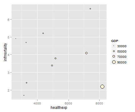
3.12 绘制气泡图
调用 geom_point() 和 scale_size_area() 函数即可绘制气泡图。
# 示例数据
library(gcookbook) # For the data set
cdat <- subset(countries, Year==2009 &
                 Name %in% c("Canada", "Ireland", "United Kingdom", "United States",
                             "New Zealand", "Iceland", "Japan", "Luxembourg",
                             "Netherlands", "Switzerland"))

cdat
> cdat
                Name Code Year       GDP laborrate healthexp infmortality
1733          Canada  CAN 2009  39599.04      67.8  4379.761          5.2
4436         Iceland  ISL 2009  37972.24      77.5  3130.391          1.7
4691         Ireland  IRL 2009  49737.93      63.6  4951.845          3.4
4946           Japan  JPN 2009  39456.44      59.5  3321.466          2.4
5864      Luxembourg  LUX 2009 106252.24      55.5  8182.855          2.2
7088     Netherlands  NLD 2009  48068.35      66.1  5163.740          3.8
7190     New Zealand  NZL 2009  29352.45      68.6  2633.625          4.9
9587     Switzerland  CHE 2009  63524.65      66.9  7140.729          4.1
10454 United Kingdom  GBR 2009  35163.41      62.2  3285.050          4.7
10505  United States  USA 2009  45744.56      65.0  7410.163          6.6
p <- ggplot(cdat, aes(x=healthexp, y=infmortality, size=GDP)) +
  geom_point(shape=21, colour="black", fill="cornsilk")

# 将GDP 映射给半径 (scale_size_continuous)
p
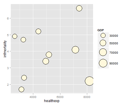
# 将GDP 映射给面积
p + scale_size_area(max_size=15)
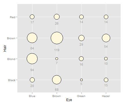
如果x轴,y轴皆是分类变量,气泡图可以用来表示网格上的变量值。
# 对男性组和女性组求和
hec <- HairEyeColor[,,"Male"] + HairEyeColor[,,"Female"]

# 转化为长格式(long format)
library(reshape2)
hec <- melt(hec, value.name="count")

ggplot(hec, aes(x=Eye, y=Hair)) +
  geom_point(aes(size=count), shape=21, colour="black", fill="cornsilk") +
  scale_size_area(max_size=20, guide=FALSE) +
  geom_text(aes(y=as.numeric(Hair)-sqrt(count)/22, label=count), vjust=1,
            colour="grey60", size=4)
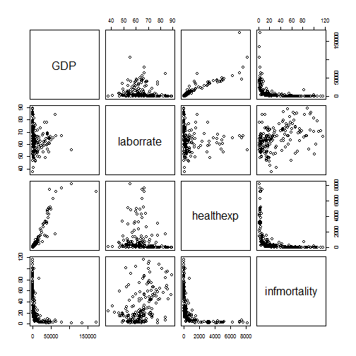
3.13 绘制散点图矩阵
散点图矩阵是一种对多个变量两两之间关系进行可视化的有效方法。pairs()函数可以绘制散点图矩阵。
注:现在散点图矩阵有现成的R包(如
GGally_ggpairs)。以下内容仅供了解。
# 示例数据
library(gcookbook) # For the data set
c2009 <- subset(countries, Year==2009,
                select=c(Name, GDP, laborrate, healthexp, infmortality))

head(c2009
> head(c2009)
              Name      GDP laborrate  healthexp infmortality
50     Afghanistan       NA      59.8   50.88597        103.2
101        Albania 3772.605      59.5  264.60406         17.2
152        Algeria 4022.199      58.5  267.94653         32.0
203 American Samoa       NA        NA         NA           NA
254        Andorra       NA        NA 3089.63589          3.1
305         Angola 4068.576      81.3  203.80787         99.9
pairs(c2009[,2:5])
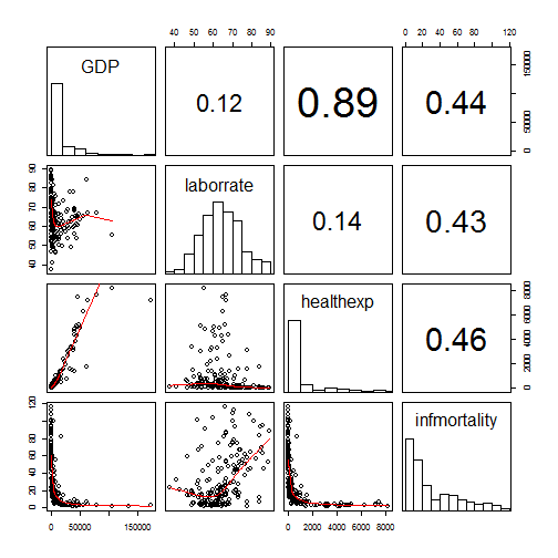
# 定义一个panel.cor函数来展示变量两两之间的相关系数以代替默认的散点图
panel.cor <- function(x, y, digits=2, prefix="", cex.cor, ...) {
  usr <- par("usr")
  on.exit(par(usr))
  par(usr = c(0, 1, 0, 1))
  r <- abs(cor(x, y, use="complete.obs"))
  txt <- format(c(r, 0.123456789), digits=digits)[1]
  txt <- paste(prefix, txt, sep="")
  if(missing(cex.cor)) cex.cor <- 0.8/strwidth(txt)
  text(0.5, 0.5, txt, cex =  cex.cor * (1 + r) / 2)
}
# 定义 panel.hist 函数展示各个变量的直方图
panel.hist <- function(x, ...) {
  usr <- par("usr")
  on.exit(par(usr))
  par(usr = c(usr[1:2], 0, 1.5) )
  h <- hist(x, plot = FALSE)
  breaks <- h$breaks
  nB <- length(breaks)
  y <- h$counts
  y <- y/max(y)
  rect(breaks[-nB], 0, breaks[-1], y, col="white", ...)
}
pairs(c2009[,2:5], upper.panel = panel.cor,
      diag.panel  = panel.hist,
      lower.panel = panel.smooth)
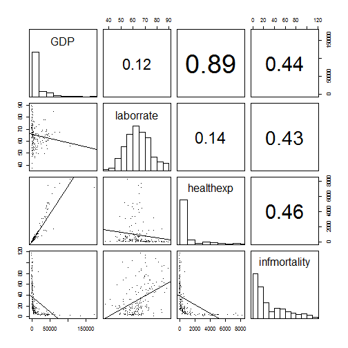
# 线性模型替代lowess 模型
panel.lm <- function (x, y, col = par("col"), bg = NA, pch = par("pch"),
                      cex = 1, col.smooth = "black", ...) {
  points(x, y, pch = pch, col = col, bg = bg, cex = cex)
  abline(stats::lm(y ~ x),  col = col.smooth, ...)
}


pairs(c2009[,2:5], pch=".",
      upper.panel = panel.cor,
      diag.panel  = panel.hist,
      lower.panel = panel.lm)
往期文章
参考书籍
R Graphics Cookbook, 2nd edition.


 2018
2018

 被折叠的 条评论
为什么被折叠?
被折叠的 条评论
为什么被折叠?
 到【灌水乐园】发言


