import numpy as np
import pandas as pd
import matplotlib. pyplot as plt
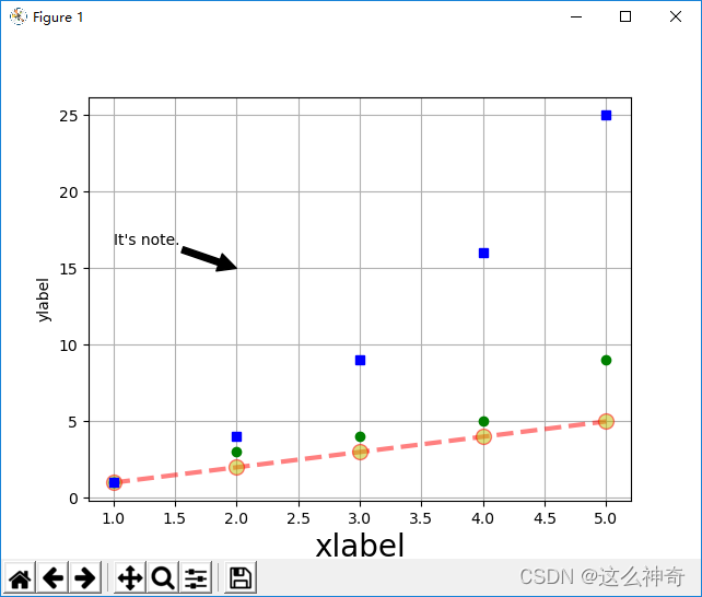
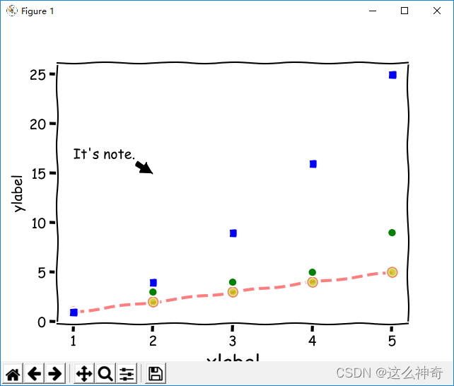
plt. plot( [ 1 , 2 , 3 , 4 , 5 ] , [ 1 , 2 , 3 , 4 , 5 ] , linestyle = '--' , color= 'r' , linewidth= 3 , marker = 'o' , markerfacecolor = 'y' , markersize = 10 , alpha = 0.5 )
plt. plot( [ 1 , 2 , 3 , 4 , 5 ] , [ 1 , 3 , 4 , 5 , 9 ] , 'o' , color= 'g' )
plt. plot( [ 1 , 2 , 3 , 4 , 5 ] , [ 1 , 4 , 9 , 16 , 25 ] , 'rs' , color= 'b' )
plt. xlabel( 'xlabel' , fontsize= 20 )
plt. ylabel( 'ylabel' )
xtext = 2
ytext = 15
plt. annotate( "It's note." , xy= ( xtext, ytext) , xytext= ( xtext- 1 , 1.1 * ytext) , arrowprops = dict ( facecolor = 'black' , shrink = 1 ) )
plt. grid( )
plt. show( )
print ( plt. style. available)
import numpy as np
import pandas as pd
import matplotlib. pyplot as plt
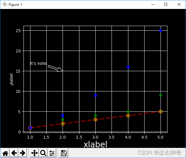
plt. style. use( 'dark_background' )
plt. plot( [ 1 , 2 , 3 , 4 , 5 ] , [ 1 , 2 , 3 , 4 , 5 ] , linestyle = '--' , color= 'r' , linewidth= 3 , marker = 'o' , markerfacecolor = 'y' , markersize = 10 , alpha = 0.5 )
plt. plot( [ 1 , 2 , 3 , 4 , 5 ] , [ 1 , 3 , 4 , 5 , 9 ] , 'o' , color= 'g' )
plt. plot( [ 1 , 2 , 3 , 4 , 5 ] , [ 1 , 4 , 9 , 16 , 25 ] , 'rs' , color= 'b' )
plt. xlabel( 'xlabel' , fontsize= 20 )
plt. ylabel( 'ylabel' )
xtext = 2
ytext = 15
plt. annotate( "It's note." , xy= ( xtext, ytext) , xytext= ( xtext- 1 , 1.1 * ytext) , arrowprops = dict ( facecolor = 'black' , shrink = 1 ) )
plt. grid( )
plt. show( )
plt. xkcd( )
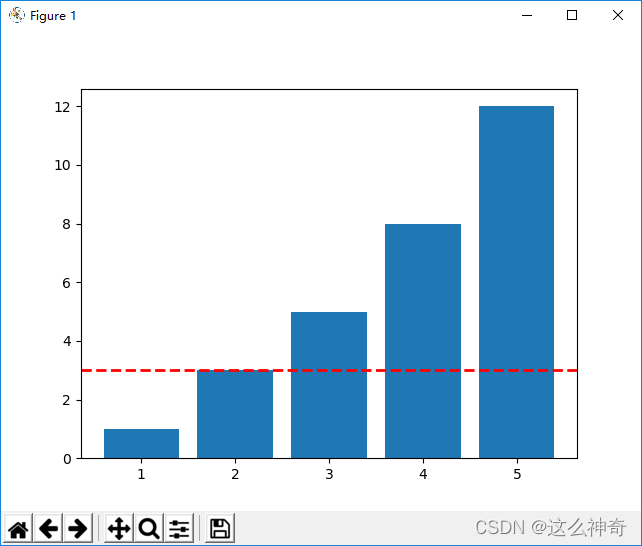
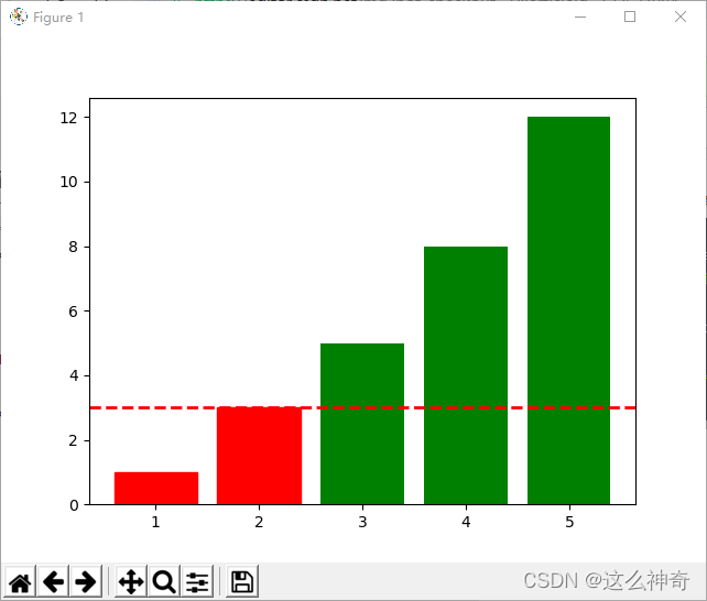
xdata = [ 1 , 2 , 3 , 4 , 5 ]
ydata = [ 1 , 3 , 5 , 8 , 12 ]
plt. bar( xdata, ydata)
plt. axhline( 3 , color = 'r' , linewidth= 2 , linestyle = '--' )
plt. show( )
xdata = [ 1 , 2 , 3 , 4 , 5 ]
ydata = [ 1 , 3 , 5 , 8 , 12 ]
plot1 = plt. bar( xdata, ydata, color = 'g' )
for plot, height in zip ( plot1, ydata) :
if height < 5 :
plot. set ( color = 'red' )
plt. axhline( 3 , color = 'r' , linewidth= 2 , linestyle = '--' )
plt. show( )
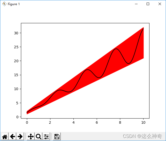
x = np. linspace( 0 , 10 , 200 )
y1 = 2 * x + 1
y2 = 3 * x + 2
y_mean = 0.5 * x * np. cos( 2.5 * x) + 2.5 * x + 1.5
plt. fill_between( x, y1, y2, color = 'red' )
plt. plot( x, y_mean, color = 'black' )
plt. show( )
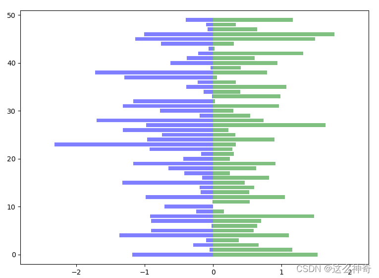
x1 = np. array( np. abs ( np. random. randn( 50 ) ) )
x2 = np. array( np. abs ( np. random. randn( 50 ) ) )
bar_labels = [ 'label_%s' % i for i in np. arange( 50 ) ]
fig = plt. figure( figsize= ( 10 , 8 ) )
y_pos = np. arange( len ( x1) )
y_pos = [ x for x in y_pos]
plt. barh( y_pos, x1, color = 'g' , alpha= 0.5 )
plt. barh( y_pos, - x2, color = 'b' , alpha = 0.5 )
plt. xlim( - max ( x2) - 0.5 , max ( x1) + 0.5 )
plt. ylim( min ( y_pos) - 2 , max ( y_pos) + 2 )
plt. show( )
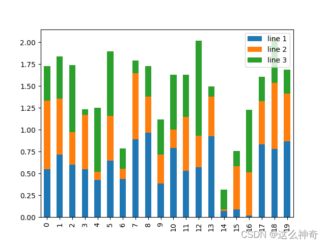
np. random. seed( 0 )
df = pd. DataFrame( { 'line 1' : np. random. rand( 20 ) ,
'line 2' : np. random. rand( 20 ) * 0.8 ,
'line 3' : np. random. rand( 20 ) * 1.1 } )
print ( df)
fig, ax = plt. subplots( )
df. plot. bar( ax = ax, stacked = True )
plt. show( )
data = [ np. random. normal( 0 , std, 100 ) for std in range ( 1 , 5 ) ]
print ( data)
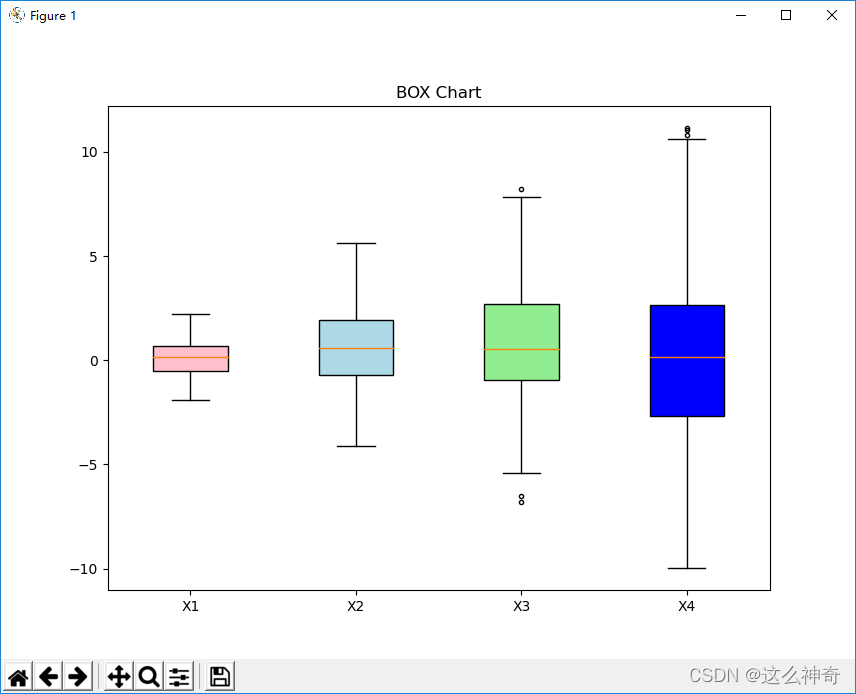
fig = plt. figure( figsize= ( 10 , 8 ) )
box_chart = plt. boxplot( data, notch= False , sym= '.' , vert= True , patch_artist= True )
plt. title( 'BOX Chart' )
plt. xticks( [ y+ 1 for y in range ( len ( data) ) ] , [ 'X1' , 'X2' , 'X3' , 'X4' ] )
colors = [ 'pink' , 'lightblue' , 'lightgreen' , 'blue' ]
for pathch , color in zip ( box_chart[ 'boxes' ] , colors) :
pathch. set_facecolor( color)
plt. show( )
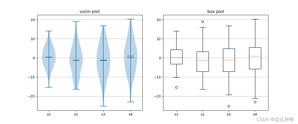
fig, axes = plt. subplots( nrows= 1 , ncols= 2 , figsize = ( 12 , 5 ) )
data = [ np. random. normal( 0 , std, 100 ) for std in range ( 6 , 10 ) ]
axes[ 0 ] . violinplot( data, showmeans = True , showmedians = True )
axes[ 0 ] . set_title( 'violin plot' )
axes[ 1 ] . boxplot( data)
axes[ 1 ] . set_title( 'box plot' )
for ax in axes:
ax. yaxis. grid( True )
ax. set_xticks( [ y+ 1 for y in range ( len ( data) ) ] )
plt. setp( axes, xticks = [ y+ 1 for y in range ( len ( data) ) ] , xticklabels= [ 'x1' , 'x2' , 'x3' , 'x4' ] )
plt. show( )
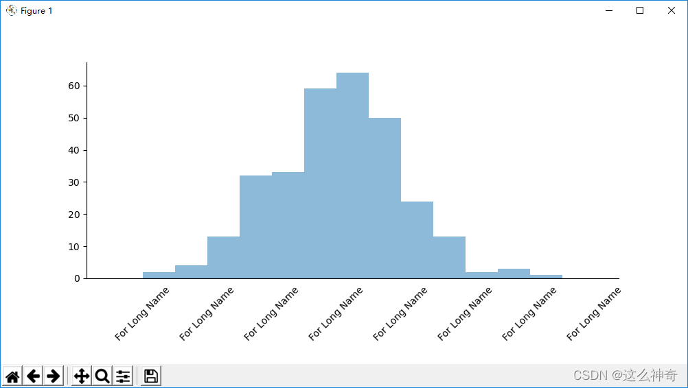
import math
x = np. random. normal( loc = 0.0 , scale= 1.0 , size = 300 )
width = 0.5
bins = np. arange( math. floor( x. min ( ) ) - width, math. ceil( x. max ( ) ) + width, width)
fig = plt. figure( figsize= ( 10 , 5 ) )
ax = plt. subplot( 111 )
plt. gcf( ) . subplots_adjust( bottom= 0.25 )
ax. spines[ 'top' ] . set_visible( False )
ax. spines[ 'right' ] . set_visible( False )
labels = [ 'For Long Name' for i in range ( 10 ) ]
ax. set_xticklabels( labels, rotation = 45 , )
plt. tick_params( bottom = False , top = False , left= True , right = False )
plt. hist( x, alpha = 0.5 , bins= bins)
plt. show( )
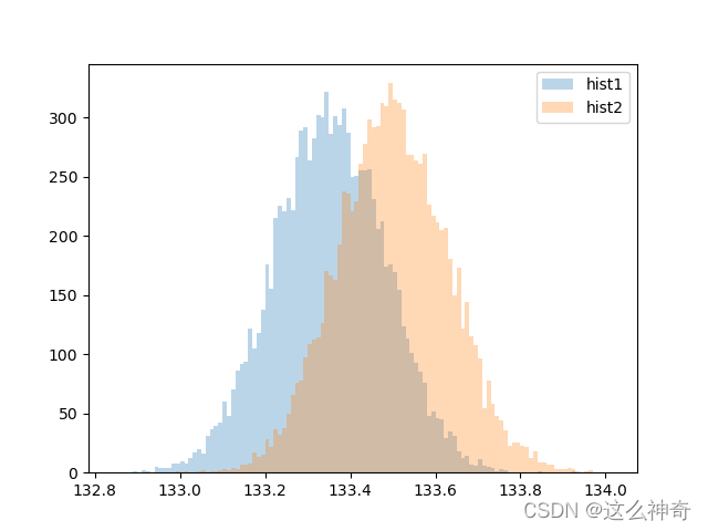
data1 = np. random. normal( 133.35 , 0.13 , 10000 )
data2 = np. random. normal( 133.5 , 0.13 , 10000 )
bins = np. arange( 132 , 134 , 0.01 )
plt. xlim( [ min ( data1) - 0.1 * ( max ( data2) - min ( data1) ) , max ( data2) + 0.1 * ( max ( data2) - min ( data1) ) ] )
plt. hist( data1, bins= bins, label= 'hist1' , alpha= 0.3 )
plt. hist( data2, bins= bins, label= 'hist2' , alpha= 0.3 )
plt. legend( )
plt. show( )
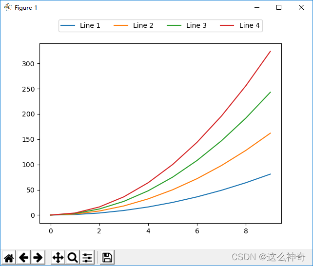
fig = plt. figure( )
ax = plt. subplot( 111 )
x = np. arange( 10 )
for i in range ( 1 , 5 ) :
plt. plot( x, i* x** 2 , label = 'Line %s' % i)
plt. legend( loc= 'best' )
ax. legend( loc= 'upper center' , bbox_to_anchor = ( 0.5 , 1.15 ) , ncol = 4 )
plt. show( )
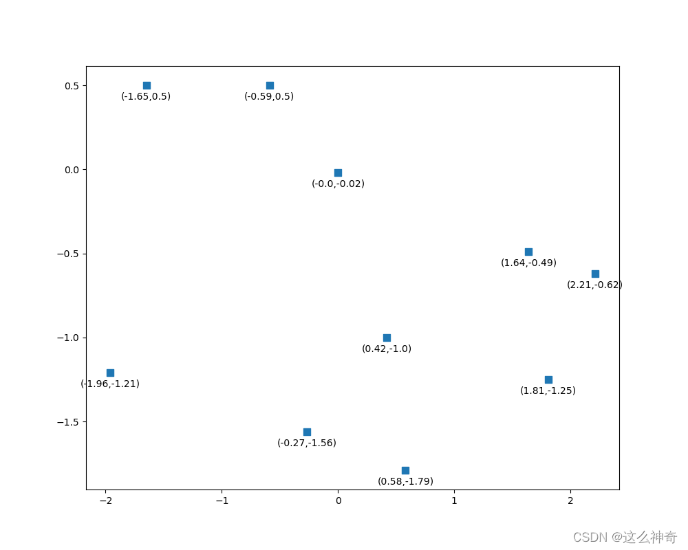
x_coords = np. round ( np. random. randn( 10 ) , 2 )
y_coords = np. round ( np. random. randn( 10 ) , 2 )
plt. figure( figsize= ( 10 , 8 ) )
plt. scatter( x_coords, y_coords, marker= 's' , s= 50 )
for x, y in zip ( x_coords, y_coords) :
plt. annotate( '(%s,%s)' % ( x, y) , xy= ( x, y) , xytext= ( 0 , - 15 ) , textcoords = 'offset points' , ha = 'center' )
plt. show( )


 被折叠的 条评论
为什么被折叠?
被折叠的 条评论
为什么被折叠?
 到【灌水乐园】发言


