


近期,小编找到一篇基于 Seurat 分析框架的 scRNA-seq 工作流程示例,从转录本计数表到细胞类型注释进行了丰富的图表可视化,示例分析具体使用的是健康骨髓捐赠者公共数据集 GSE120221 中的三个样本。
这篇推文只是做一个分享,铁子们感兴趣话可以自取哈,链接如下:
https://romanhaa.github.io/projects/scrnaseq_workflow/#snn-graph
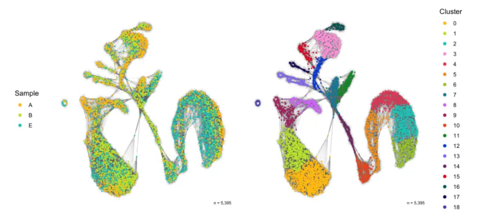
KNN图
library(ggnetwork)

SCT_snn <- seurat@graphs$SCT_snn %>%
  as.matrix() %>%
  ggnetwork() %>%
  left_join(seurat@meta.data %>% mutate(vertex.names = rownames(.)), by = 'vertex.names')

p1 <- ggplot(SCT_snn, aes(x = x, y = y, xend = xend, yend = yend)) +
  geom_edges(color = 'grey50', alpha = 0.05) +
  geom_nodes(aes(color = sample), size = 0.5) +
  scale_color_manual(
    name = 'Sample', values = custom_colors$discrete,
    guide = guide_legend(ncol = 1, override.aes = list(size = 2))
  ) +
  theme_blank() +
  theme(legend.position = 'left') +
  annotate(
    geom = 'text', x = Inf, y = -Inf,
    label = paste0('n = ', format(nrow(seurat@meta.data), big.mark = ',', trim = TRUE)),
    vjust = -1.5, hjust = 1.25, color = 'black', size = 2.5
  )

p2 <- ggplot(SCT_snn, aes(x = x, y = y, xend = xend, yend = yend)) +
  geom_edges(color = 'grey50', alpha = 0.05) +
  geom_nodes(aes(color = seurat_clusters), size = 0.5) +
  scale_color_manual(
    name = 'Cluster', values = custom_colors$discrete,
    guide = guide_legend(ncol = 1, override.aes = list(size = 2))
  ) +
  theme_blank() +
  theme(legend.position = 'right') +
  annotate(
    geom = 'text', x = Inf, y = -Inf,
    label = paste0('n = ', format(nrow(seurat@meta.data), big.mark = ',', trim = TRUE)),
    vjust = -1.5, hjust = 1.25, color = 'black', size = 2.5
  )

ggsave(
  'plots/snn_graph_by_sample_cluster.png',
  p1 + p2 + plot_layout(ncol = 2),
  height = 5, width = 11
)
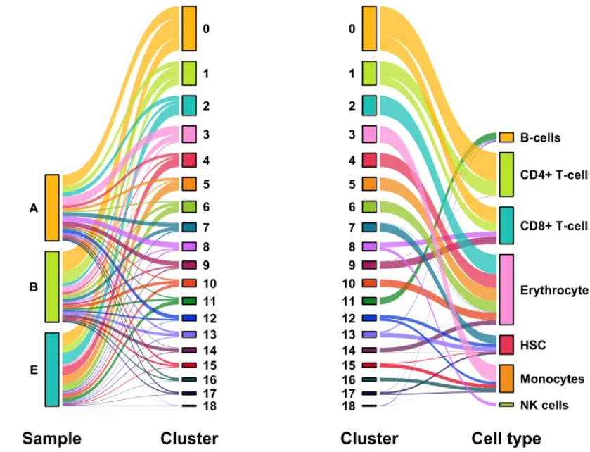
细胞注释桑基图可视化
p1 <- ggplot(data, aes(x, id = id, split = y, value = n)) +
  geom_parallel_sets(aes(fill = seurat_clusters), alpha = 0.75, axis.width = 0.15) +
  geom_parallel_sets_axes(aes(fill = y), color = 'black', axis.width = 0.1) +
  geom_text(
    aes(y = n, split = y), stat = 'parallel_sets_axes', fontface = 'bold',
    hjust = data_labels$hjust, nudge_x = data_labels$nudge_x
  ) +
  scale_x_discrete(labels = c('Sample','Cluster')) +
  scale_fill_manual(values = color_assignments) +
  theme_bw() +
  theme(
    legend.position = 'none',
    axis.title = element_blank(),
    axis.text.x = element_text(face = 'bold', colour = 'black', size = 15),
    axis.text.y = element_blank(),
    axis.ticks = element_blank(),
    panel.grid.major = element_blank(),
    panel.grid.minor = element_blank(),
    panel.border = element_blank()
  )

clusters <- levels(seurat@meta.data$seurat_clusters)
cell_types <- sort(unique(seurat@meta.data$cell_type_singler_blueprintencode_main))

color_assignments <- setNames(
  c(custom_colors$discrete[1:length(clusters)], custom_colors$discrete[1:length(cell_types)]),
  c(clusters,cell_types)
)

data <- seurat@meta.data %>%
  dplyr::rename(cell_type = cell_type_singler_blueprintencode_main) %>%
  dplyr::mutate(cell_type = factor(cell_type, levels = cell_types)) %>%
  group_by(seurat_clusters, cell_type) %>%
  tally() %>%
  ungroup() %>%
  gather_set_data(1:2) %>%
  dplyr::mutate(
    x = factor(x, levels = unique(x)),
    y = factor(y, levels = c(clusters,cell_types))
  )

data_labels <- tibble(
    group = c(
      rep('seurat_clusters', length(clusters)),
      rep('cell_type', length(cell_types))
    )
 ) %>%
  mutate(
    hjust = ifelse(group == 'seurat_clusters', 1, 0),
    nudge_x = ifelse(group == 'seurat_clusters', -0.1, 0.1)
  )

p2 <- ggplot(data, aes(x, id = id, split = y, value = n)) +
  geom_parallel_sets(aes(fill = seurat_clusters), alpha = 0.75, axis.width = 0.15) +
  geom_parallel_sets_axes(aes(fill = y), color = 'black', axis.width = 0.1) +
  geom_text(
    aes(y = n, split = y), stat = 'parallel_sets_axes', fontface = 'bold',
    hjust = data_labels$hjust, nudge_x = data_labels$nudge_x
  ) +
  scale_x_discrete(labels = c('Cluster','Cell type')) +
  scale_fill_manual(values = color_assignments) +
  theme_bw() +
  theme(
    legend.position = 'none',
    axis.title = element_blank(),
    axis.text.x = element_text(face = 'bold', colour = 'black', size = 15),
    axis.text.y = element_blank(),
    axis.ticks = element_blank(),
    panel.grid.major = element_blank(),
    panel.grid.minor = element_blank(),
    panel.border = element_blank()
  )
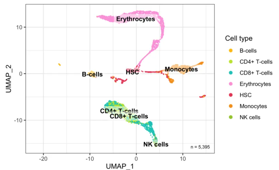
细胞降维图
UMAP_centers_cell_type <- tibble(
    UMAP_1 = as.data.frame(seurat@reductions$UMAP@cell.embeddings)$UMAP_1,
    UMAP_2 = as.data.frame(seurat@reductions$UMAP@cell.embeddings)$UMAP_2,
    cell_type = seurat@meta.data$cell_type_singler_blueprintencode_main
  ) %>%
  group_by(cell_type) %>%
  summarize(x = median(UMAP_1), y = median(UMAP_2))

p <- bind_cols(seurat@meta.data, as.data.frame(seurat@reductions$UMAP@cell.embeddings)) %>%
  ggplot(aes(UMAP_1, UMAP_2, color = cell_type_singler_blueprintencode_main)) +
  geom_point(size = 0.2) +
  geom_label(
    data = UMAP_centers_cell_type,
    mapping = aes(x, y, label = cell_type),
    size = 3.5,
    fill = 'white',
    color = 'black',
    fontface = 'bold',
    alpha = 0.5,
    label.size = 0,
    show.legend = FALSE
  ) +
  theme_bw() +
  expand_limits(x = c(-22,15)) +
  scale_color_manual(values = custom_colors$discrete) +
  labs(color = 'Cell type') +
  guides(colour = guide_legend(override.aes = list(size = 2))) +
  theme(legend.position = 'right') +
  coord_fixed() +
  annotate(
    geom = 'text', x = Inf, y = -Inf,
    label = paste0('n = ', format(nrow(seurat@meta.data), big.mark = ',', trim = TRUE)),
    vjust = -1.5, hjust = 1.25, color = 'black', size = 2.5
  )

ggsave(
  'plots/umap_by_cell_type_singler_blueprintencode_main.png',
  p,
  height = 4,
  width = 6
)
简单分享到这


 7952
7952


 被折叠的 条评论
为什么被折叠?
被折叠的 条评论
为什么被折叠?
 到【灌水乐园】发言


