<!DOCTYPE html>
<html lang="en">
<head>
<meta charset="UTF-8" />
<meta name="viewport" content="width=device-width, initial-scale=1.0" />
<title>3D立方体图册</title>
<style>
* {
padding: 0;
margin: 0;
box-sizing: border-box;
}
body {
display: flex;
align-items: center;
justify-content: center;
min-height: 100vh;
background: #f5f5f5;
}
.box {
position: relative;
width: 240px;
height: 300px;
transform-style: preserve-3d;
transform: perspective(1000px) rotateY(180deg);
transition: 1.5s;
}
.box::before {
content: "";
position: absolute;
width: 240px;
height: 240px;
background: #2225;
transform: translateY(240px) rotateX(90deg) scale(1.1);
filter: blur(40px);
}
.card {
position: absolute;
top: 0;
left: 0;
width: 100%;
height: 300px;
background: linear-gradient(90deg, #ddd, #eee);
transform-origin: center;
transform: rotateY(calc(var(--i) * 90deg)) translateZ(120px);
}
.img-box {
width: 100%;
height: 240px;
text-align: center;
}
img {
width: 100%;
height: 100%;
object-fit: cover;
}
.img-box h2 {
color: red;
}
.img-box span {
color: purple;
}
</style>
</head>
<body>
<div class="container">
<div class="box">
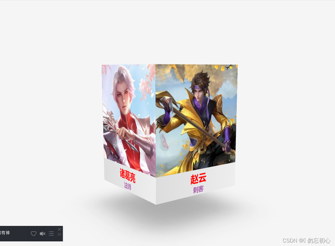
<div class="card" style="--i: 1">
<div class="img-box">
<img src="../assets/img/公孙离.jpg" alt="" srcset="" />
<h2>公孙离</h2>
<span>射手</span>
</div>
</div>
<div class="card" style="--i: 2">
<div class="img-box">
<img src="../assets/img/宫本武藏.jpg" alt="" srcset="" />
<h2>宫本武藏</h2>
<span>战士</span>
</div>
</div>
<div class="card" style="--i: 3">
<div class="img-box">
<img src="../assets/img/诸葛亮.jpg" alt="" srcset="" />
<h2>诸葛亮</h2>
<span>法师</span>
</div>
</div>
<div class="card" style="--i: 4">
<div class="img-box">
<img src="../assets/img/赵云.jpg" alt="" srcset="" />
<h2>赵云</h2>
<span>刺客</span>
</div>
</div>
</div>
</div>
</body>
<script>
const box = document.querySelector(".box");
let isMoving = false;
function handleMouseMove(event) {
if (!isMoving) {
isMoving = true;
requestAnimationFrame(() => {
const boxWidth = box.offsetWidth;
const boxHeight = box.offsetHeight;
const mouseX = event.clientX - box.getBoundingClientRect().left;
const mouseY = event.clientY - box.getBoundingClientRect().top;
const rotateY = (mouseX / boxWidth - 0.5) * 60;
const rotateX = (0.5 - mouseY / boxHeight) * 60;
box.style.transform = `perspective(1000px) rotateX(${rotateX}deg) rotateY(${rotateY}deg)`;
isMoving = false;
});
}
}
box.addEventListener("mousemove", handleMouseMove);
</script>
</html>
在这里插入代码片


 258
258


 被折叠的 条评论
为什么被折叠?
被折叠的 条评论
为什么被折叠?
 到【灌水乐园】发言


