


1. 关联规则算法原理
1.1 什么是关联规则
关联规则 (Association Rule) 是数据挖掘中的一种重要方法,主要用于发现数据项之间的 频繁共现关系。它通常用于 市场篮子分析 (Market Basket Analysis)、推荐系统 等领域。
例如:
- “如果用户购买了牛奶和面包,他们更有可能购买黄油”
- “高峰时段、低温环境下,交通事故的严重程度更高”
一个 关联规则 通常表示为:
X
⇒
Y
\text{X} \Rightarrow \text{Y}
X⇒Y
其中:
- X ( A n t e c e d e n t ) X (Antecedent) X(Antecedent):前件(先发生的事件)
- Y ( C o n s e q u e n t ) Y (Consequent) Y(Consequent):后件(可能的结果)
1.2 Apriori 算法的核心思想
Apriori 算法是一种基于 频繁模式挖掘 (Frequent Pattern Mining) 的方法,主要包括以下步骤:
-
计算频繁项集 (Frequent Itemsets)
通过设定 最小支持度 (Minimum Support),筛选出 频繁出现的项集。 -
生成关联规则
基于 置信度 (Confidence) 和 提升度 (Lift),筛选出有价值的规则。
核心优化策略:
Apriori 采用 “Apriori 性质” 进行剪枝,即:
“一个项集的所有子集必须也是频繁项集,否则该项集不可能是频繁项集”
这使得算法在计算时能够 减少不必要的搜索,提高效率。
2. 关联规则的影响强弱
关联规则的影响强弱通常由以下 五个核心指标 进行衡量:
2.1 Antecedent Support(前件支持度)
定义:
Support ( X ) = 包含 X 的事务数 总事务数 \text{Support}(X) = \frac{\text{包含 X 的事务数}}{\text{总事务数}} Support(X)=总事务数包含 X 的事务数
表示在 所有事务中,X 出现的概率。
2.2 Consequent Support(后件支持度)
Support ( Y ) = 包含 Y 的事务数 总事务数 \text{Support}(Y) = \frac{\text{包含 Y 的事务数}}{\text{总事务数}} Support(Y)=总事务数包含 Y 的事务数
表示在 所有事务中,Y 出现的概率。
2.3 Support(支持度)
Support ( X ⇒ Y ) = 包含 X 和 Y 的事务数 总事务数 \text{Support}(X \Rightarrow Y) = \frac{\text{包含 X 和 Y 的事务数}}{\text{总事务数}} Support(X⇒Y)=总事务数包含 X 和 Y 的事务数
表示 X 和 Y 同时发生的概率,衡量该规则在整个数据集中的 重要性。
2.4 Confidence(置信度)
Confidence ( X ⇒ Y ) = Support ( X ⇒ Y ) Support ( X ) \text{Confidence}(X \Rightarrow Y) = \frac{\text{Support}(X \Rightarrow Y)}{\text{Support}(X)} Confidence(X⇒Y)=Support(X)Support(X⇒Y)
表示在 X 发生的情况下,Y 发生的概率,衡量该规则的 可靠性。
2.5 Lift(提升度)
Lift ( X ⇒ Y ) = Confidence ( X ⇒ Y ) Support ( Y ) \text{Lift}(X \Rightarrow Y) = \frac{\text{Confidence}(X \Rightarrow Y)}{\text{Support}(Y)} Lift(X⇒Y)=Support(Y)Confidence(X⇒Y)
- Lift > 1:X 的发生 提升 了 Y 发生的可能性
- Lift = 1:X 和 Y 独立发生
- Lift < 1:X 的发生 抑制 了 Y 的发生
3. 代码实战:Apriori 关联规则挖掘
本章将使用 USAccident 交通事故数据集 进行 Apriori 关联规则分析,挖掘 影响事故严重程度的关键因素,并最终筛选出 最具影响力的规则。数据获取链接:https://pan.baidu.com/s/141oQRHVwZE_45R09hPH0ow?pwd=umbr
3.1载入数据并进行预处理
激活必要工具包
import pandas as pd
import seaborn as sns
import networkx as nx
import numpy as np
import matplotlib.pyplot as plt
from mlxtend.preprocessing import TransactionEncoder
from mlxtend.frequent_patterns import apriori, association_rules
我们首先读取 USAccident 数据(已进行离散化),并使用 pandas 进行数据加载:
# 读取数据
df = pd.read_csv('离散数据1.csv', encoding='gbk',
                 dtype={
                     '严重程度': 'category',
                     '温度': 'category',
                     '能见度': 'category',
                     '季节': 'category',
                     '节假/通勤': 'category',
                     '高峰区间': 'category'
                 })
在这里,我们的 数据集字段 主要包括:
- 严重程度(因变量):轻微、中等、严重
- 温度、能见度、季节、节假/通勤、高峰区间(自变量)
3.2语义化转换
由于 Apriori 算法处理的是分类数据,因此我们需要对字段值进行 语义化转换:
# 2. 语义化转换(前缀映射)
prefix_map = {
    '严重程度': '严重程度',
    '温度': '温度',
    '能见度': '能见度',
    '季节': '季节',
    '节假/通勤': '节假',
    '高峰区间': '高峰'
}

processed_df = df.copy()
for col in processed_df.columns:
    processed_df[col] = processed_df[col].apply(lambda x: f"{prefix_map[col]}_{x}")
转换后示例数据:
| 严重程度 | 温度 | 能见度 | 季节 | 节假/通勤 | 高峰区间 |
|---|---|---|---|---|---|
| 严重程度_1/2/3 | 温度_1/2/3 | 能见度_1/2 | 季节_1/2/3/4 | 节假_1/2 | 高峰_1/2 |
转换为事务格式
Apriori 需要事务格式的数据(即,每个记录是一组物品的集合):
# 转换为事务数据
transactions = processed_df.apply(lambda row: row.tolist(), axis=1).tolist()
示例:
[['严重程度_高', '温度_低', '能见度_差', '季节_冬', '节假_否', '高峰_是'],
 ['严重程度_中', '温度_中', '能见度_好', '季节_春', '节假_是', '高峰_否']]
事务数据编码
Apriori 需要 布尔型数据,因此我们使用 TransactionEncoder 进行 One-Hot 编码:
from mlxtend.preprocessing import TransactionEncoder

# 事务编码
te = TransactionEncoder()
te_ary = te.fit(transactions).transform(transactions)
df_encoded = pd.DataFrame(te_ary, columns=te.columns_)
转换后的 One-Hot 编码数据示例:
| 严重程度_高 | 温度_低 | 能见度_差 | 季节_冬 | 节假_否 | 高峰_是 |
|---|---|---|---|---|---|
| 1 | 1 | 1 | 1 | 1 | 1 |
| 0 | 0 | 0 | 0 | 0 | 0 |
计算频繁项集
我们使用 Apriori 算法 计算 频繁项集:
# 5. 动态设置支持度
min_support_map = {
    30000: 0.01,
    50000: 0.005,
    100000: 0.001
}
n = len(df)
min_support = next(
    (v for k, v in sorted(min_support_map.items(), reverse=True) if n >= k),
    0.01  # 默认值
)

# 6. 生成频繁项集
frequent_itemsets = apriori(df_encoded,
                            min_support=min_support,
                            use_colnames=True,
                            max_len=4,
                            low_memory=True)
解读:
min_support是 支持度阈值,这里根据数据量动态调整。max_len=4限制最大项集长度,避免组合过多。
3.3生成关联规则
我们使用 association_rules() 生成 关联规则:
# 7. 生成关联规则
rules = association_rules(frequent_itemsets,
                          metric="lift",
                          min_threshold=1.2)
参数解释:
metric="lift"选择 提升度 (Lift) 作为筛选标准min_threshold=1.2设定 最小提升度阈值,排除无意义的规则
过滤 & 选择有效规则
由于我们关注的是 “严重程度” 的影响因素,需要 筛选出“严重程度” 仅作为后件的规则:
# 8. 规则过滤函数(确保“严重程度” 只能出现在 consequents)
def is_severity_rule(row):
    consequent = row.consequents
    antecedent = row.antecedents

    # consequents 只能包含 "严重程度_" 相关项
    is_consequent_valid = all(item.startswith("严重程度_") for item in consequent)

    # antecedents 不能包含 "严重程度_" 相关项
    is_antecedent_valid = all(not item.startswith("严重程度_") for item in antecedent)

    return is_consequent_valid and is_antecedent_valid


# 筛选符合条件的规则
severity_rules = rules[rules.apply(is_severity_rule, axis=1)]
3.4结果生成
结果排序 & 保存
我们按照 提升度 (Lift)、置信度 (Confidence)、支持度 (Support) 进行排序:
# 9. 结果排序
sorted_rules = severity_rules.sort_values(
    ['lift', 'confidence', 'support'],
    ascending=[False, False, False]
).reset_index(drop=True)

# 10. 结果输出优化
print(f"\n发现有效规则 {len(sorted_rules)} 条")
print("Top10 关联规则:")
print(sorted_rules[['antecedents', 'consequents', 'support', 'confidence', 'lift']].head(10))

# 11. 结果保存到 CSV 文件
output_file = "严重程度关联规则.csv"
sorted_rules.to_csv(output_file, index=False, encoding="gbk")

print(f"\n关联规则已保存至 {output_file}")
结果解读
# 12. 添加解读示例
if not sorted_rules.empty:
    sample_rule = sorted_rules.iloc[0]
    print(f"\n示例解读:")
    print(f"当出现组合 {list(sample_rule.antecedents)} 时")
    print(f"会导致 {list(sample_rule.consequents)} 的发生概率提升 {sample_rule.lift:.1f} 倍")
    print(f"置信度达到 {sample_rule.confidence:.1%},出现频率为 {sample_rule.support:.1%}")
else:
    print("未发现符合条件的规则。")
如
| antecedents | consequents | support | confidence | lift |
|---|---|---|---|---|
| (节假_1, 温度_2, 季节_1) | (严重程度_3) | 0.039475 | 0.513735 | 2.067315 |
表示:当出现组合 [‘节假_1’, ‘温度_2’, ‘季节_1’] 时会导致 [‘严重程度_3’] 的发生概率提升 2.1 倍
置信度达到 51.4%,出现频率为 3.9%
** 4. 关联规则可视化**
# 设置 Matplotlib 支持中文
plt.rcParams['font.sans-serif'] = ['SimHei']  # 解决中文显示问题
plt.rcParams['axes.unicode_minus'] = False  # 解决负号显示问题

# 选取前 n 条规则进行可视化
analysis_df = sorted_rules.head(30).copy()
analysis_df['规则'] = analysis_df.apply(
    lambda x: f"{list(x.antecedents)} => {list(x.consequents)}", axis=1
)
在 Apriori 关联规则挖掘 结果的可视化方面,我们可以使用 多种可视化方法 来揭示数据的模式。下面是一些 适用于关联规则分析的可视化方法:
不同可视化方法的选择
| 可视化方法 | 适用场景 | 关键变量 |
|---|---|---|
| 散点图 (Scatter Plot) | 观察支持度、置信度、提升度的关系 | X: Support, Y: Confidence, Size: Lift |
| 热力图 (Heatmap) | 分析 Antecedents 和 Consequents 之间的关系 | Lift 值的强度 |
| 知识图谱 | 研究变量之间的连接关系 | 规则的结构 |
| 气泡矩阵 (Bubble Matrix) | 可视化 Antecedents 和 Consequents 的 Lift | X-Y 变量的关系 |
最佳实践
- 如果规则较少(< 20):知识图谱 + 散点图
- 如果规则较多(> 50):热力图 (Heatmap) + 气泡图 (Bubble Matrix)
- 想要展示规则的影响力:散点图 (Scatter Plot)
- 想要展示变量间的联系:知识图谱
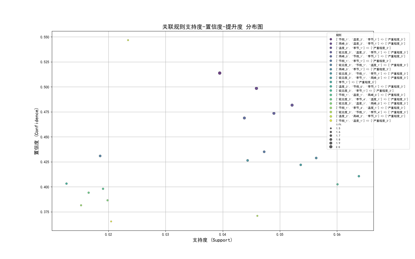
4.1 关联规则散点图
- X轴:支持度
- Y轴:置信度
- 点的大小:提升度
# 13.1 关联规则散点图 支持度(Support) - 置信度(Confidence) - 提升度(Lift) 散点图
plt.figure(figsize=(16, 10))  # 进一步调整图像大小
sns.scatterplot(data=analysis_df, x='support', y='confidence', size='lift', hue='规则', palette='viridis', edgecolor='black', alpha=0.8)
plt.title('关联规则支持度-置信度-提升度 分布图', fontsize=16)
plt.xlabel('支持度 (Support)', fontsize=14)
plt.ylabel('置信度 (Confidence)', fontsize=14)
plt.legend(loc='upper left', bbox_to_anchor=(0.85, 1), fontsize=8, frameon=True)  #调整图例大小
plt.grid(True)
plt.show()
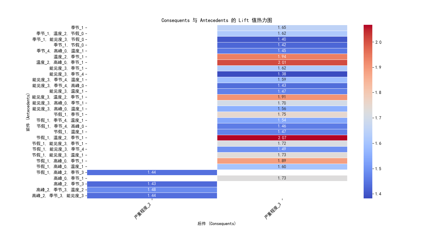
4.2 关联规则热力图
# 13.2 关联规则热力图
heatmap_data = pd.DataFrame({
    '前件': [', '.join(x) for x in analysis_df['antecedents']],
    '后件': [', '.join(x) for x in analysis_df['consequents']],
    '提升度': analysis_df['lift']
})
heatmap_matrix = heatmap_data.pivot(index='前件', columns='后件', values='提升度')
plt.figure(figsize=(14, 8))
ax = sns.heatmap(heatmap_matrix, annot=True, cmap="coolwarm", fmt=".2f", linewidths=0.5)
plt.title('Consequents 与 Antecedents 的 Lift 值热力图')
plt.xlabel('后件 (Consequents)')
plt.ylabel('前件 (Antecedents)')
plt.xticks(rotation=45, ha='right')
plt.yticks(rotation=0)
plt.subplots_adjust(left=0.2, right=0.95, top=0.9, bottom=0.2)  # 调整图像布局,让横坐标完全显示
plt.show()
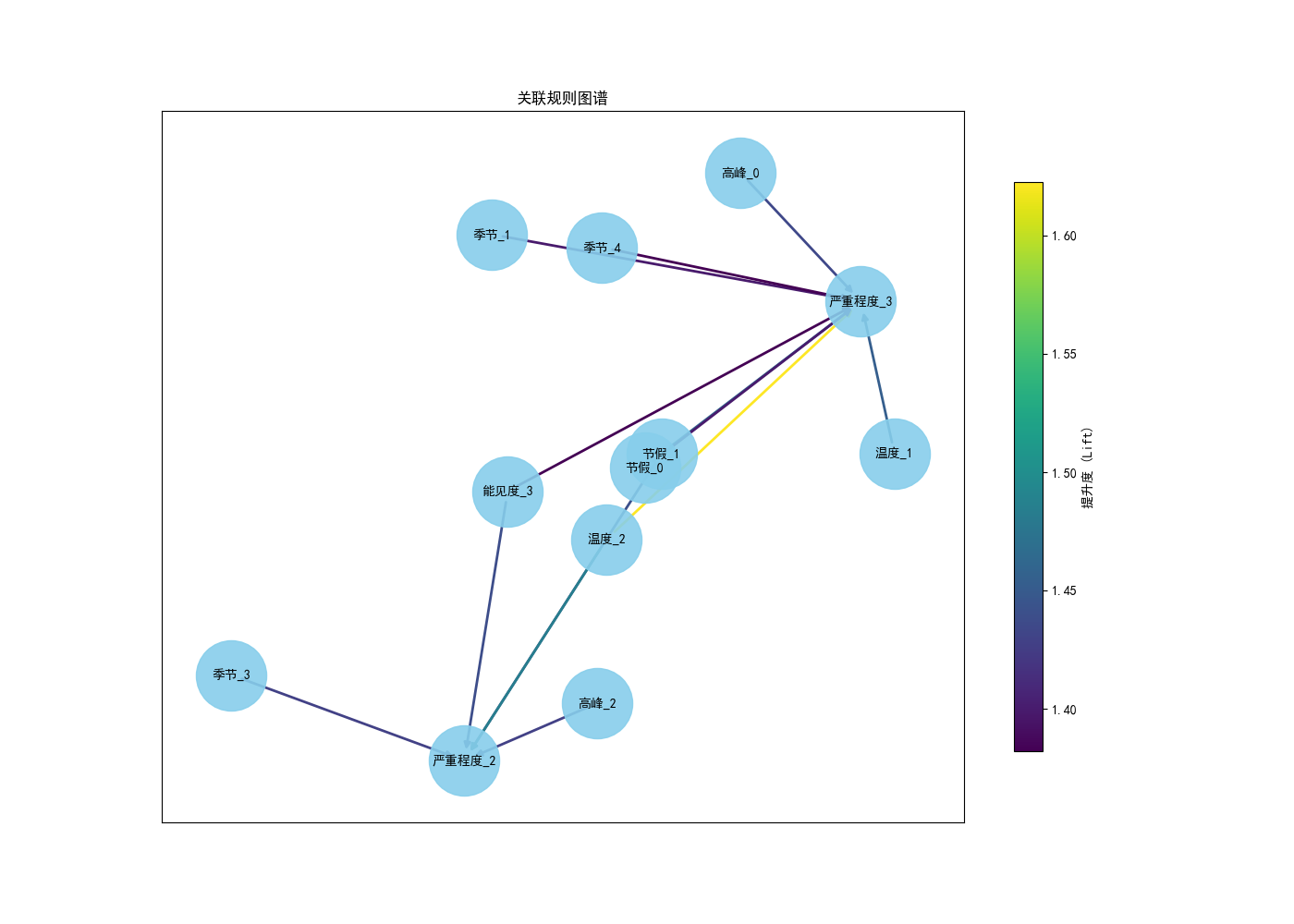
4.3 关联规则知识图谱
# 13.3 知识图谱
G = nx.DiGraph()
for idx, row in analysis_df.iterrows():
    for antecedent in row["antecedents"]:
        for consequent in row["consequents"]:
            G.add_edge(antecedent, consequent, weight=row["lift"])

plt.figure(figsize=(14, 10))  # 增加图像大小
pos = nx.spring_layout(G, seed=42, k=0.8)  # 进一步调整布局,增加节点间距
edges = G.edges(data=True)
weights = [d["weight"] for (u, v, d) in edges]

# 归一化权重以增强颜色对比
norm_weights = [(w - min(weights)) / (max(weights) - min(weights) + 1e-6) for w in weights]
edge_colors = [plt.cm.viridis(w) for w in norm_weights]

# 绘制节点
nx.draw_networkx_nodes(G, pos, node_color="skyblue", node_size=3000, alpha=0.9)

# 绘制边,增强颜色对比
nx.draw_networkx_edges(G, pos, edge_color=edge_colors, width=2)

# 绘制标签
nx.draw_networkx_labels(G, pos, font_size=10)

# 添加图例
sm = plt.cm.ScalarMappable(cmap=plt.cm.viridis, norm=plt.Normalize(vmin=min(weights), vmax=max(weights)))
sm.set_array([])
cbar = plt.colorbar(sm, shrink=0.8)
cbar.set_label("提升度 (Lift)")

plt.title("关联规则图谱")
plt.show()
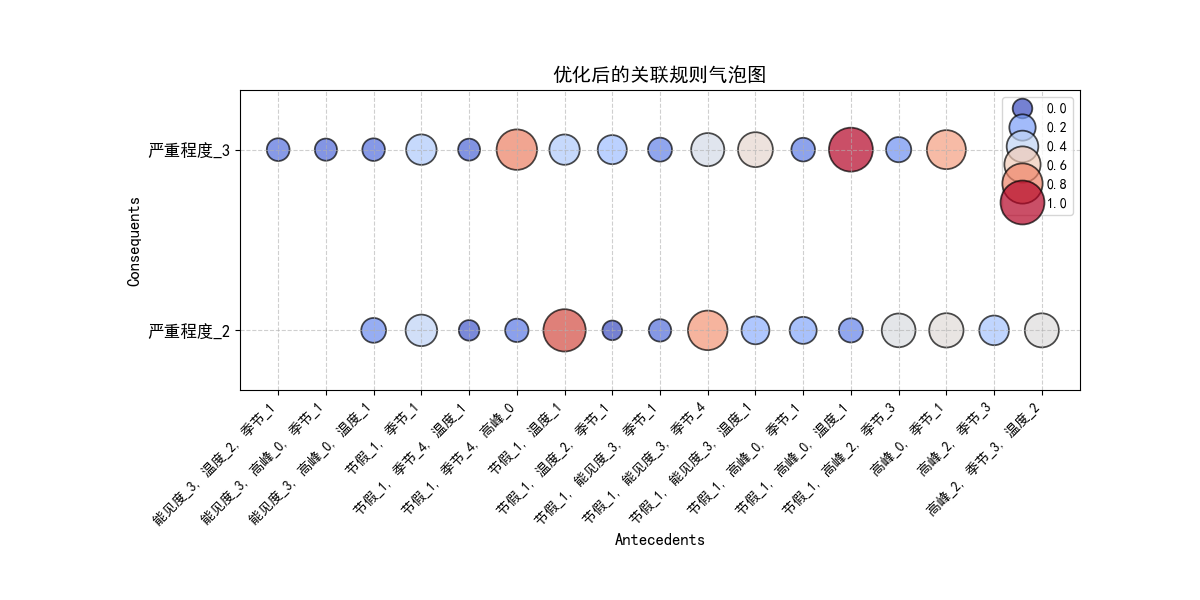
4.4 关联规则气泡图
# 13.4 关联规则气泡图
bubble_data = pd.DataFrame({
    '前件': [', '.join(x) for x in analysis_df['antecedents']],
    '后件': [', '.join(x) for x in analysis_df['consequents']],
    '提升度': analysis_df['lift']
})
bubble_matrix = bubble_data.pivot(index='后件', columns='前件', values='提升度')

# 归一化 `提升度 (Lift)` 确保大小和颜色一致
norm_lift = (bubble_matrix - bubble_matrix.min().min()) / (bubble_matrix.max().max() - bubble_matrix.min().min())

# 调整图像大小,确保清晰度
plt.figure(figsize=(12, 6))

# 使用映射颜色增强可视化
scatter = sns.scatterplot(
    x=np.repeat(bubble_matrix.columns.values, len(bubble_matrix.index)),
    y=np.tile(bubble_matrix.index.values, len(bubble_matrix.columns)),
    size=norm_lift.values.flatten(),  # 确保 size 和 hue 都是归一化后的 lift
    hue=norm_lift.values.flatten(),
    sizes=(200, 1000),
    alpha=0.7,
    palette="coolwarm",
    edgecolor="black"
)

# 调整横纵坐标
plt.xticks(rotation=45, ha='right', fontsize=10)  # 旋转横轴刻度,提高可读性
plt.yticks(fontsize=12)  # 增大纵轴字体
plt.ylim(-0.33, 1.33)  # 适当调整范围,让刻度均匀分布
plt.yticks([0, 1], bubble_matrix.index)  # 只显示两个刻度,分布在上下 1/3 位置

# 设置标题 & 轴标签
plt.title("优化后的关联规则气泡图", fontsize=14)
plt.xlabel("Antecedents", fontsize=12)
plt.ylabel("Consequents", fontsize=12)

# 适当调整边距,防止文本溢出
plt.subplots_adjust(left=0.2, right=0.9, top=0.85, bottom=0.35)

# 显示图像
plt.grid(True, linestyle="--", alpha=0.6)
plt.show()
原创声明:本教程由课题组内部教学使用,利用CSDN平台记录,不进行任何商业盈利。


 10万+
10万+

 被折叠的 条评论
为什么被折叠?
被折叠的 条评论
为什么被折叠?
 到【灌水乐园】发言


