


1.文本相关样式
行高 :line-height
单行文本垂直居中 行高=元素高度
宽度:width
/文本水平对齐方式 (em是字体的单位长度)
text-indent: 2em
2.元素显示模式转换(行内元素,块元素,行内块元素)
行内元素无法设置宽、高 转换为行内块元素
display: inline-block;行内块元素
display: inline; 行内元素
display: block; 块元素
display: none;隐藏元素,位置不保留
visibility: hidden; 元素隐藏,位置保留
3.背景(background)
background-color
background-image: url()
background-repeat
background-attachment
background-position
4.边框
border-radius; 边框弧度
border-width;边框宽度
border-style 边框线
border-color边框颜色
合并相邻边框
border-collapse
box-shadow(阴影)
text-shadow(文字阴影)
outline(轮廓线)
防止文本拖拽 :resize: none;
vertical-align:改变与文字的对齐方式
position: absolute; 绝对定位:不保留原来位置 子绝父相 父亲没有相对定位,继续向上找,谁有相对定位,以谁作为参考移动,如果都没找到,则相对于浏览器进行定位
position: relative;相对定位
固定定位:相对于可视区域进行定位
position: fixed;固定定位
position: sticky;粘性定位
z-index 定位中显示的优先级
4.盒子模型
页面上的每个元素都看作一个矩形的盒子,该盒子有四个边框(border)、内边距(padding)、外边距(margin)和内容区域(content)。在最新的CSS3标准中,又增加了一些盒子模型的新属性
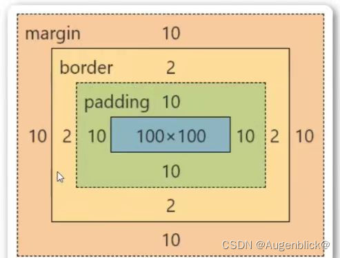
内边距(padding)
padding-top: 上内边距
padding-left: 左内边距
padding-right: 右内边距
padding-bottom: 下内边距
padding简写顺序是上右下左
padding会撑大容器,也就是盒子
margin
margin:0 auto表示上下距离为0,左右距离自动选择(居中,将剩余部分平分)。
display: flex;排列方式
flex-direction: row-reverse;
flex-direction: column;
flex-direction: column-reverse;
flex-direction: row;
让flex布局变为多行
flex-wrap: wrap;
主轴上的布局
justify-content: center;
justify-content: end;
justify-content: space-around;
justify-content: space-evenly;
justify-content: space-between;
侧轴
align-items 单行的
align-content:多行的
align-items: center;
align-items: end;
align-items: start;
align-content: start;
align-content: end;
align-content: center;
align-content: space-between;
align-content: space-around;
align-content: space-evenly;
浮动(float)
浮动,会脱离文档流 不再保留原来位置 会造成在其下方的兄弟元素位置发生变化
当子元素发生浮动时,其父元素的高度发生塌陷
linear-gradient(渐变)


 341
341


 被折叠的 条评论
为什么被折叠?
被折叠的 条评论
为什么被折叠?
 到【灌水乐园】发言


