


1. Multiple Regression
1.1 Exercise: Features: Must We Pick Just One?
# Import necessary libraries
import numpy as np
import pandas as pd
import matplotlib.pyplot as plt
from helper import fit_and_plot_linear, fit_and_plot_multi
%matplotlib inline

# Read the file "Advertising.csv"
df = pd.read_csv('Advertising.csv')

# Take a quick look at the dataframe
df.head()

# Define an empty Pandas dataframe to store the R-squared value associated with each
# predictor for both the train and test split
df_results = pd.DataFrame(columns=['Predictor', 'R2 Train', 'R2 Test'])

# For each predictor in the dataframe, call the function "fit_and_plot_linear()"
# from the helper file with the predictor as a parameter to the function

# This function will split the data into train and test split, fit a linear model
# on the train data and compute the R-squared value on both the train and test data

# **Your code here**
fit_and_plot_linear(df[['Newspaper']])

# Call the function "fit_and_plot_multi()" from the helper to fit a multilinear model
# on the train data and compute the R-squared value on both the train and test data

# **Your code here**
fit_and_plot_multi()

### edTest(test_dataframe) ###

# Store the R-squared values for all models
# in the dataframe intialized above
# **Your code here**
df_results.loc[0]=['TV',0.5884742462828709,0.676315157793972]
df_results.loc[1]=['Radio',0.35671845263128477,0.22981692241915952]
df_results.loc[2]=['Newspaper',0.06441636735498679,-0.021217489521373478]
df_results.loc[3]=['Multi',0.9067114990146383,0.8601145185017867]

# Take a quick look at the dataframe
df_results.head()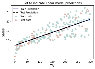 | 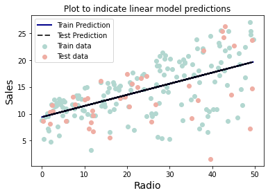 | 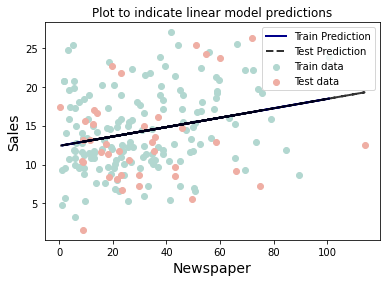 |
1.2 Multiple Linear Regression
If you have to guess someone's height, which set of data would you rather have?
- Their weight
- Their weight and gender
- Their weight, gender, and income
- Their weight, gender, income, and favorite number
Of course, you'd always want as much data about a person as possible. Even though height and favorite number may not be strongly related, at worst you could just ignore the information on favorite number. We want our models to be able to take in lots of data as they make their predictions.
1.3 Predictors vs Response
In the above example, weight, gender, income, and favorite number are our predictors. You may also hear them referred to as "features," or "covariates." The predictors are denoted .
We use these values to predict height which we call the response, sometimes called the "dependent variable." The response is denoted .
Tabular Data
We represent our data in a table with the predictors and response as columns and each row representing one data point or observation.
The example below is from the advertising data set. The predictors are the advertising budgets for a given product across different media: TV, radio, and newspaper. The response is the sales of that product. Each row represents a different market where the product is being advertised and sold.
TV, Radio, and Newspaper values in this table are predictors, also called features, independent variables, or covariates. They're our usual X value. The Sales column is our response variable, also known as an outcome or dependent variable. It's typically shown as a Y value. Each row is an observation.
| TV | Radio | Newspaper | Sales |
| 230.1 | 37.8 | 69.2 | 22.1 |
| 44.5 | 39.3 | 45.1 | 10.4 |
| 17.2 | 45.9 | 69.3 | 9.3 |
| 151.5 | 41.3 | 58.5 | 18.5 |
| 180.8 | 10.8 | 58.4 | 12.9 |
In practice, it is unlikely that any response variable depends solely on one predictor
.
Rather, we expect that is a function of multiple predictors:
Using the table above as an example we have:
Because we are dealing with multiple observations (i.e., rows), the variables in the above notation actually represent vectors. We can give their components an index to represent which observation they belong to.
For example, if we have observations, the response
can be written as:
Note that in the case that we have predictors,
is an
×
matrix. This can be written in terms of its columns as:
Where each is a vector with
elements, corresponding to the value of the
th predictor for each of the
observations.
In this notation, refers to the th predictor's value in the
th observation.
We can still assume a simple, multilinear form for :
Here represents the irreducible error, a random variable with mean 0 which is independent of .
And so our estimate, has the form:
The little mark or "hat" above ,
, and the betas is used to make it clear that these are estimates.
Now, given a set of observations:
The data and the model can be expressed in vector notation:
Let's apply this multilinear form to the example of advertising data above:
And in linear algebra notation the data and model would be:
To find our model's estimated sales for the first observation, we take the dot product of the first row vector of predictor values with our column vector of betas.
Taking full advantage of the compactness afforded by linear algebra notation, our model takes on a simple algebraic form:
We will again choose the mean squared error (MSE) as our loss function, which can be expressed in vector notation as:
Minimizing the MSE using vector calculus yields the optimal betas for our model:
1.4 Multiple Linear Regression
In Multiple Linear Regression, the model takes a simple algebraic form:
We will again choose the MSE as our loss function, which can be expressed in vector notation as:
Taking the derivative of the loss i.e. MSE with respect to the model parameter gives:
For optimization, we set the values of the partial derivative to zero, i.e.
Optimization of the previous equation gives:
Multiplying both sides with , we get:
Thus, we get
Backtracking this equation to fit the model optimization problem, we have
1.5 Exercise: Fitting a Multi-Regression Model
# Import necessary libraries
import numpy as np
import pandas as pd
import matplotlib.pyplot as plt
from sklearn import preprocessing
from prettytable import PrettyTable
from sklearn.metrics import mean_squared_error
from sklearn.linear_model import LinearRegression
from sklearn.model_selection import train_test_split
%matplotlib inline

# Read the file "Advertising.csv"
df = pd.read_csv('Advertising.csv')

# Take a quick look at the data to list all the predictors
df.head()

### edTest(test_mse) ###

# Initialize a list to store the MSE values
mse_list = list()

# Create a list of lists of all unique predictor combinations
# For example, if you have 2 predictors,  A and B, you would
# end up with [['A'],['B'],['A','B']]
cols = [['TV'],['Radio'],['Newspaper'],['TV','Radio'],['TV','Newspaper'],['Radio','Newspaper'],['TV','Radio','Newspaper']]

# Loop over all the predictor combinations
for i in cols:

    # Set each of the predictors from the previous list as x
    x = df[i]

    # Set the "Sales" column as the reponse variable
    y = df['Sales']

    # Split the data into train-test sets with 80% training data and 20% testing data.
    # Set random_state as 0
    x_train, x_test, y_train, y_test = train_test_split(x,y,test_size=0.2,random_state=0)

    # Initialize a Linear Regression model
    lreg = LinearRegression()

    # Fit the linear model on the train data
    lreg = lreg.fit(x_train,y_train)

    # Predict the response variable for the test set using the trained model
    y_pred = lreg.predict(X=x_test)

    # Compute the MSE for the test data
    MSE = ((y_pred-y_test)**2).sum()/y_pred.shape[0]

    # Append the computed MSE to the initialized list
    mse_list.append(MSE)

# Helper code to display the MSE for each predictor combination
t = PrettyTable(['Predictors', 'MSE'])

for i in range(len(mse_list)):
    t.add_row([cols[i],round(mse_list[i],3)])

print(t)
2. Techniques for Multilinear Modeling
2.1 Interpreting Coefficients & Feature Importance
With a KNN model it is difficult to understand exactly what the relationship is between a feature and the response. But for linear models we can begin to understand this relationship by interpreting the model parameters!
Recall that these model parameters are the beta coefficients we learn when we fit our model.
When we have a large number of predictors: , there will be a large number of model parameters,
.
Looking at all values of as a list of numbers is impractical, so we visualize these values in a feature importance graph.

The feature importance graph above shows which predictors have the most impact on the model’s prediction. Not only does it tell use about the magnitude of their impact but the sign on the parameter also tells us the direction of the relationship. We'll see in later sections however that such a naïve approach to coefficient interpretation may not be giving us the whole story. But this is a good place to start!
2.2 Qualitative Predictors
So far, we have assumed that all variables are quantitative. But in practice, often some predictors are qualitative. For example, this credit data set contains information about balance, age, cards, education, income, limit , and rating for a number of potential customers.
| Income | Limit | Rating | Cards | Age | Education | Sex | Student | Married | Ethnic | Balance |
| 14.890 | 3606 | 283 | 2 | 34 | 11 | Male | No | Yes | Caucasian | 333 |
| 106.02 | 6645 | 483 | 3 | 82 | 15 | Female | Yes | Yes | Asian | 903 |
| 104.59 | 7075 | 514 | 4 | 71 | 11 | Male | No | No | Asian | 580 |
| 148.92 | 9504 | 681 | 3 | 36 | 11 | Female | No | No | Asian | 964 |
| 55.882 | 4897 | 357 | 2 | 68 | 16 | Male | No | Yes | Caucasian | 331 |
2.3 Binary Variables
If the predictor takes only two values, then we create an indicator or dummy variable that takes on two possible numerical values. For example, for gender, we create a new variable: We then use this variable as a predictor in the regression equation.
We then use this variable as a predictor in the regression equation.
Question: What is interpretation of and
?
is the average credit card balance among those who are not female,
, is the average credit card balance among those who are female, and is the average difference in credit card balance between the two categories.
Example: Calculate and
for the Credit data. you should find
and
.
2.4 More than two values (one-hot encoding)
Often, the qualitative predictor takes more than two values (e.g. ethnicity in the credit data).
In this situation, a single dummy variable cannot represent all possible values. We create additional dummy variable as:
We then use these variables as predictors, the regression equation becomes:
2.5 Exercise: Creating Dummy/Indicator Variables
import numpy as np
import pandas as pd
import seaborn as sns
import matplotlib.pyplot as plt
from sklearn.metrics import mean_squared_error
from sklearn.linear_model import LinearRegression
from sklearn.model_selection import train_test_split

# Load the credit data.
df = pd.read_csv('credit.csv')
df.head()

# The response variable will be 'Balance.'
x = df.drop('Balance', axis=1)
y = df['Balance']
x_train, x_test, y_train, y_test = train_test_split(x, y, test_size=0.2, random_state=42)

# Trying to fit on all features in their current representation throws an error.
try:
    test_model = LinearRegression().fit(x_train, y_train)
except Exception as e:
    print('Error!:', e)

# Inspect the data types of the DataFrame's columns.
df.dtypes

### edTest(test_model1) ###
# Fit a linear model using only the numeric features in the dataframe.
numeric_features = ['Income','Limit','Rating','Cards','Age','Education']
model1 = LinearRegression().fit(x_train[numeric_features], y_train)

# Report train and test R2 scores.
train_score = model1.score(x_train[numeric_features], y_train)
test_score = model1.score(x_test[numeric_features], y_test)
print('Train R2:', train_score)
print('Test R2:', test_score)

# Look at unique values of Ethnicity feature.
print('In the train data, Ethnicity takes on the values:', list(x_train['Ethnicity'].unique()))

### edTest(test_design) ###
# Create x train and test design matrices creating dummy variables for the categorical.
# hint: use pd.get_dummies() with the drop_first hyperparameter for this
x_train_design = pd.get_dummies(x_train,drop_first=True)
x_test_design = pd.get_dummies(x_test,drop_first=True)
x_train_design.head()

# Confirm that all data types are now numeric.
x_train_design.dtypes

### edTest(test_model2) ###
# Fit model2 on design matrix
model2 = LinearRegression().fit(x_train_design, y_train)

# Report train and test R2 scores
train_score = model2.score(x_train_design, y_train)
test_score = model2.score(x_test_design, y_test)
print('Train R2:', train_score)
print('Test R2:', test_score)

# Note that the intercept is not a part of .coef_ but is instead stored in .intercept_.
coefs = pd.DataFrame(model2.coef_, index=x_train_design.columns, columns=['beta_value'])
coefs

# Visualize crude measure of feature importance.
sns.barplot(data=coefs.T, orient='h').set(title='Model Coefficients')

### edTest(test_model3) ###
# Specify best categorical feature
best_cat_feature = 'Student_Yes'

# Define the model.
features = ['Income', best_cat_feature]
model3 = LinearRegression()
model3.fit(x_train_design[features], y_train)

# Collect betas from fitted model.
beta0 = model3.intercept_
beta1 = model3.coef_[features.index('Income')]
beta2 = model3.coef_[features.index(best_cat_feature)]

# Display betas in a DataFrame.
coefs = pd.DataFrame([beta0, beta1, beta2], index=['Intercept']+features, columns=['beta_value'])
coefs

# Visualize crude measure of feature importance.
sns.barplot(data=coefs.T, orient='h').set(title='Model Coefficients')
### edTest(test_prediction_lines) ###
# Create space of x values to predict on.
x_space = np.linspace(x['Income'].min(), x['Income'].max(), 1000)

# Generate 2 sets of predictions based on best categorical feature value.
# When categorical feature is true/present (1)
y_hat_yes = 177.658909 + 6.773090 * x_space + 371.895694 * 1
# When categorical feature is false/absent (0)
y_hat_no = 177.658909 + 6.773090 * x_space + 371.895694 * 0

# Plot the 2 prediction lines for students and non-students.
ax = sns.scatterplot(data=pd.concat([x_train_design, y_train], axis=1), x='Income', y='Balance', hue=best_cat_feature, alpha=0.8)
ax.plot(x_space, y_hat_no)
ax.plot(x_space, y_hat_yes)
2.6 Exercise: Features on Different Scales
import pandas as pd
import matplotlib.pyplot as plt
from sklearn.linear_model import LinearRegression

df = pd.read_csv('Advertising.csv', index_col=0)
df.head()

X = df.drop('Sales', axis=1)
y = df.Sales.values

lm = LinearRegression().fit(X,y)

# you can learn more about Python format strings here:
# https://docs.python.org/3/tutorial/inputoutput.html
print(f'{"Model Coefficients":>9}')
for col, coef in zip(X.columns, lm.coef_):
    print(f'{col:>9}: {coef:>6.3f}')
print(f'\nR^2: {lm.score(X,y):.4}')

# From info on this kind of assignment statement see:
# https://python-reference.readthedocs.io/en/latest/docs/operators/multiplication_assignment.html
df *= 1000
df.head()

# refit a new regression model on the scaled data
X = df.drop('Sales', axis=1)
y = df.Sales.values
lm = LinearRegression().fit(X,y)

print(f'{"Model Coefficients":>9}')
for col, coef in zip(X.columns, lm.coef_):
    print(f'{col:>9}: {coef:>6.3f}')
print(f'\nR^2: {lm.score(X,y):.4}')

plt.figure(figsize=(8,3))
# column names to be displayed on the y-axis
cols = X.columns
# coeffient values from our fitted model (the intercept is not included)
coefs = lm.coef_
# create the horizontal barplot
plt.barh(cols, coefs)
# dotted, semi-transparent, black vertical line at zero
plt.axvline(0, c='k', ls='--', alpha=0.5)
# always label your axes
plt.ylabel('Predictor')
plt.xlabel('Coefficient Values')
# and create an informative title
plt.title('Coefficients of Linear Model Predicting Sales\n from Newspaper, '\
            'Radio, and TV Advertising Budgets (in Dollars)')

# create a new DataFrame to store the converted budgets
X2 = pd.DataFrame()
X2['TV (Rupee)'] = 200 * df['TV'] # convert to Sri Lankan Rupee
X2['Radio (Won)'] = 1175 * df['Radio'] # convert to South Korean Won
X2['Newspaper (Cedi)'] = 6 * df['Newspaper'] # Convert to Ghanaian Cedi

# we can use our original y as we have not converted the units for Sales
lm2 = LinearRegression().fit(X2,y)

print(f'{"Model Coefficients":>16}')
for col, coef in zip(X2.columns, lm2.coef_):
    print(f'{col:>16}: {coef:>8.5f}')
print(f'\nR^2: {lm2.score(X2,y):.4}')

plt.figure(figsize=(8,3))
plt.barh(X2.columns, lm2.coef_)
plt.axvline(0, c='k', ls='--', alpha=0.5)
plt.ylabel('Predictor')
plt.xlabel('Coefficient Values')
plt.title('Coefficients of Linear Model Predicting Sales\n from Newspaper, '\
            'Radio, and TV Advertising Budgets (Different Currencies)')

fig, axes = plt.subplots(2,1, figsize=(8,6), sharex=True)

axes[0].barh(X.columns, lm.coef_)
axes[0].set_title('Dollars');
axes[1].barh(X2.columns, lm2.coef_)
axes[1].set_title('Different Currencies')
for ax in axes:
    ax.axvline(0, c='k', ls='--', alpha=0.5)
axes[0].set_ylabel('Predictor')
axes[1].set_xlabel('Coefficient Values')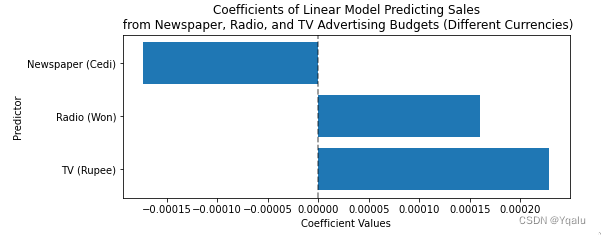
2.7 Normalization
Normalization, sometimes called Min-Max scaling, transforms the features to a predefined range. Typically, we normalize to between 0 and 1. This sets 0 for the lowest value in our data for that variable, sets 1 for the highest, and all other values to be a proportional float between 0 and 1. The formula for normalization is as follows:
2.8 Standardization
Standardization transforms the features by subtracting the mean and dividing by the standard deviation. This sets the new mean to 0 with a standard deviation of 1.
2.9 Multicollinearity
Collinearity and multicollinearity refer to the case in which two or more predictors are correlated. As one predictor increases or decreases, the other one always follows it.
One question we may have is, "how are these predictors related to one another?" This is an important to know as high multicolinearity can complicate the interpretation of our model's parameters as we'll see
In this example we're looking at the credit data set. This data set contains many features which may or may not be useful in predicting the risk of extending credit to an individual, though any of the predictors could serve as our response variable. Here we are only looking at the quantitative predictors.
Below we have an example of a pairplot, a common visualization method for exploring possible correlations between our predictors.
The off-diagonal subplots contain scatter plots showing how pairs of predictors are related. On the diagonal we have histograms displaying the distribution of values in our data for each predictor.
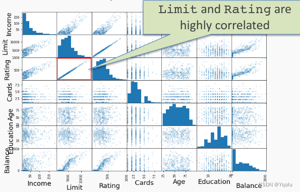
We can see that Limit and Rating are highly correlated. As Limit increases Rating also increases.
If we fit a regression model to predict Balance from the other predictors we will see why this is a problem. The regression coefficients we get from the fit are not uniquely determined! As a result it hurts the interpretability of the model.
Consider the coefficient values from two different regression fits below. The model on the left included both Limit and Rating. In the model on the right, Limit was removed.
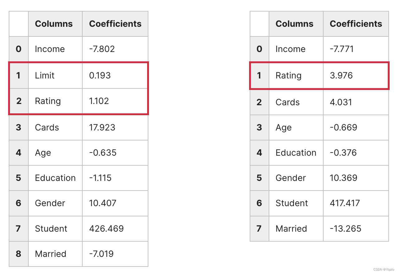
On the left we see that both Limit and Rating have positive coefficients. But if we remove Limit and refit, then our coefficients change even though both models have roughly the same performance as judged by MSE. As a result it's hard to know if a balance is higher because of an individual's Rating or Limit.
One way to think about this problem is that several coefficients contain the same information. Diagnostic methods like the pairplot can help us identity multicolinearity and remove redundant predictors, giving us a more interpretable model.
2.10 Exercise: Multi-collinearity vs Model Predictions
# Import necessary libraries
import numpy as np
import pandas as pd
import seaborn as sns
from pprint import pprint
import matplotlib.pyplot as plt
from sklearn.linear_model import LinearRegression
%matplotlib inline

# Read the file named "colinearity.csv" into a Pandas dataframe
df = pd.read_csv('colinearity.csv')

# Take a quick look at the dataset
df.head()

# Choose all the predictors as the variable 'X' (note capitalization of X for multiple features)
X = df.drop(['y'],axis=1)

# Choose the response variable 'y'
y = df['y']

### edTest(test_coeff) ###

# Initialize a list to store the beta values for each linear regression model
linear_coef = []

# Loop over all the predictors
# In each loop "i" holds the name of the predictor
for i in X:

    # Set the current predictor as the variable x
    x = df[[i]]

    # Create a linear regression object
    linreg = LinearRegression()

    # Fit the model with training data
    # Remember to choose only one column at a time i.e. given by x (not X)
    linreg.fit(x,y)

    # Add the coefficient value of the model to the list
    linear_coef.append(linreg.coef_)

### edTest(test_multi_coeff) ###

# Perform multi-linear regression with all predictors
multi_linear = LinearRegression()

# Fit the multi-linear regression on all features of the entire data
multi_linear.fit(X,y)

# Get the coefficients (plural) of the model
multi_coef = multi_linear.coef_

# Helper code to see the beta values of the linear regression models

print('By simple(one variable) linear regression for each variable:', sep = '\n')

for i in range(4):
    pprint(f'Value of beta{i+1} = {linear_coef[i][0]:.2f}')

# Helper code to compare with the values from the multi-linear regression
print('By multi-Linear regression on all variables')
for i in range(4):
    pprint(f'Value of beta{i+1} = {round(multi_coef[i],2)}')

# Helper code to visualize the heatmap of the covariance matrix
corrMatrix = df[['x1','x2','x3','x4']].corr()
sns.heatmap(corrMatrix, annot=True)
plt.show()
3. Polynomial Regression
3.1 Exercise: A Line Won't Cut It
# Import necessary libraries
import numpy as np
import pandas as pd
import matplotlib.pyplot as plt
from helper import get_poly_pred
from sklearn.linear_model import LinearRegression
from sklearn.model_selection import train_test_split
from sklearn.preprocessing import PolynomialFeatures
%matplotlib inline
# Read the data from 'poly.csv' into a Pandas dataframe
df = pd.read_csv('poly.csv')
# Take a quick look at the dataframe
df.head()
# Get the column values for x & y as numpy arrays
x = df[['x']].values
y = df['y'].values
# Helper code to plot x & y to visually inspect the data
fig, ax = plt.subplots()
ax.plot(x,y,'x')
ax.set_xlabel('$x$ values')
ax.set_ylabel('$y$ values')
ax.set_title('$y$ vs $x$')
plt.show();
# Split the data into train and test sets
# Set the train size to 0.8 and random seed to 22
x_train, x_test, y_train, y_test = train_test_split(x, y, train_size=0.8, random_state = 22 )
# Initialize a linear model
model = LinearRegression()
# Fit the model on the train data
model.fit(x_train, y_train)
# Get the predictions on the test data using the trained model
y_lin_pred = model.predict(x_test)
# Helper code to plot x & y to visually inspect the data
fig, ax = plt.subplots()
ax.plot(x,y,'x', label='data')
ax.set_xlabel('$x$ values')
ax.set_ylabel('$y$ values')
ax.plot(x_test, y_lin_pred, label='linear model predictions')
plt.legend();
### edTest(test_deg) ###
# Guess the correct polynomial degree based on the above graph
guess_degree = 3
# Predict on the entire polynomial transformed test data using helper function.
y_poly_pred = get_poly_pred(x_train, x_test, y_train, degree=guess_degree)
# Helper code to visualise the results
idx = np.argsort(x_test[:,0])
x_test = x_test[idx]
# Use the above index to get the appropriate predicted values for y
# y values corresponding to sorted test data
y_test = y_test[idx]
# Linear predicted values
y_lin_pred = y_lin_pred[idx]
# Non-linear predicted values
y_poly_pred= y_poly_pred[idx]
# First plot x & y values using plt.scatter
plt.scatter(x, y, s=10, label="Test Data")
# Plot the linear regression fit curve
plt.plot(x_test,y_lin_pred,label="Linear fit", color='k')
# Plot the polynomial regression fit curve
plt.plot(x_test, y_poly_pred, label="Polynomial fit",color='red', alpha=0.6)
# Assigning labels to the axes
plt.xlabel("x values")
plt.ylabel("y values")
plt.legend()
plt.show()
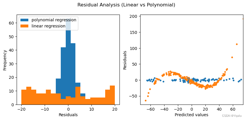
### edTest(test_poly_predictions) ###
# Calculate the residual values for the polynomial model
poly_residuals = y_test - y_poly_pred
### edTest(test_linear_predictions) ###
# Calculate the residual values for the linear model
lin_residuals = y_test - y_lin_pred
# Helper code to plot the residual values
# Plot the histograms of the residuals for the two cases
# Distribution of residuals
fig, ax = plt.subplots(1,2, figsize = (10,4))
bins = np.linspace(-20,20,20)
ax[0].set_xlabel('Residuals')
ax[0].set_ylabel('Frequency')
# Plot the histograms for the polynomial regression
ax[0].hist(poly_residuals, bins, label = 'poly residuals', color='#B2D7D0', alpha=0.6)
# Plot the histograms for the linear regression
ax[0].hist(lin_residuals, bins, label = 'linear residuals', color='#EFAEA4', alpha=0.6)
ax[0].legend(loc = 'upper left')
# Distribution of predicted values with the residuals
ax[1].hlines(0,-75,75, color='k', ls='--', alpha=0.3, label='Zero residual')
ax[1].scatter(y_poly_pred, poly_residuals, s=10, color='#B2D7D0', label='Polynomial predictions')
ax[1].scatter(y_lin_pred, lin_residuals, s = 10, color='#EFAEA4', label='Linear predictions' )
ax[1].set_xlim(-75,75)
ax[1].set_xlabel('Predicted values')
ax[1].set_ylabel('Residuals')
ax[1].legend(loc = 'upper left')
fig.suptitle('Residual Analysis (Linear vs Polynomial)')
plt.show();
3.2 Fitting non-linear data
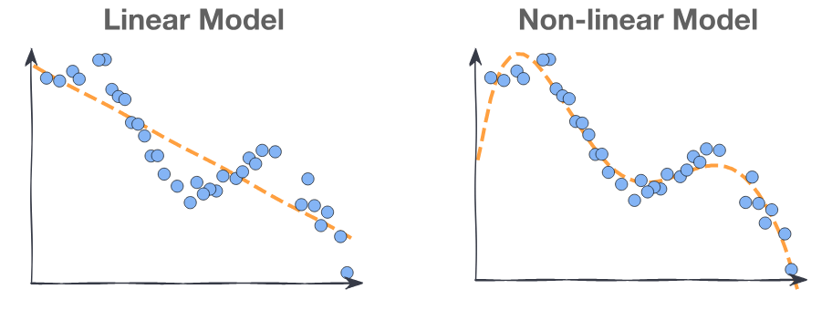
Multi-linear models can fit large datasets with many predictors. However the relationship between predictor and target isn't always linear.
We want a model: where
is a non-linear function and
is a vector of the parameters of
.
3.3 Polynomial Regression
The simplest non-linear model we can consider, for a response Y and a predictor X, is a polynomial model of degree M,
Just as in the case of linear regression [with cross terms], polynomial regression is a special case of linear regression - we treat each as a separate predictor. Thus, we can write the design matrix as:
This looks a lot like multi-linear regression, where the predictors are powers of x!
3.4 Model Training
Given a dataset , to find the optimal polynomial model:
1. We transform the data by adding new predictors:
2. We find the parameters by minimizing the
using vector calculus as in multi-linear regression:
Polynomial Regression Example
Fitting a polynomial model requires choosing a degree. We want to use a degree high enough to be able to fit to the complexities of our data. However, if we use a polynomial degree too high we will overfit to our training data. This means that the model has fit to the noise in the training data and predictions will not generalize to new data. Consider the following plots:
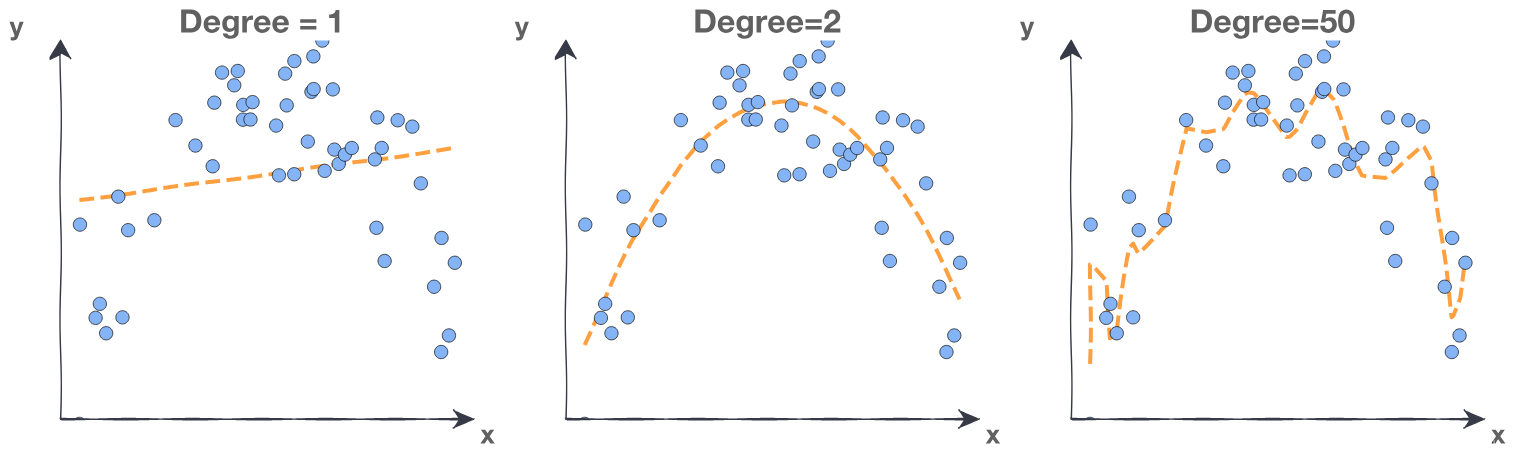
Degree 1 is underfitting. The degree is too low, the model cannot fit the trend. The line cuts directly through the center of the data without following the curve at all. Note that using a polynomial degree of 1 is equivalent to just using simple linear regression without polynomials.
Degree 50 is overfitting. The degree is too high, the model fits all the noisy data points. The line is jagged as the model predictions overcompensate for small changes in the data.
Degree 2 is a good fit for this data. We want a model that fits the trend and ignores the noise. The line flows smoothly through the approximate center of the data points.
3.5 Feature Scaling
Do we need to scale out features for polynomial regression?
Linear regression, , is invariant under scaling. If
is multiplied by some number , then will be scaled by
and the
will be identical.
However, if the range of is small or large, then we run into troubles. Consider a polynomial degree of 20 and the maximum or minimum value of any predictor is large or small. Those numbers to the 20th power will be problematic. They may even be bigger than the biggest number Python can handle.
It is always a good idea to scale when considering a polynomial regression:
For standardization, note that we can use sklearn's StandardScaler() External link to do this.
For normalization, note that we can use sklearn's MinMaxScaler() External link to do this.
3.6 Evaluation: Training Error
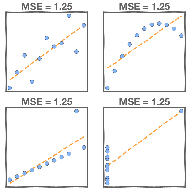
Just because we found the model that minimizes the squared error it doesn't mean that it's a good model. We investigate the , but we also need to look at the data. For instance, in this first graph the MSE is high due to noise in the data.

In these next graphs the MSE is high in all four models, but the models are not equal! Examining the data directly will tell us as much about our model's fit as the MSE.
3.6 Evaluation: Test Error
We need to evaluate the fitted model on our new data, data that the model did not train on. This is the test data.
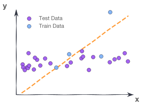
The training MSE here is 2.0 where the test MSE is 12.3. The training data contains a strange point – an outlier – which confuses the model.
Fitting to meaningless patterns in the training is called overfitting.
3.7 Evaluation: Model Interpretation
For linear models it’s important to interpret the parameters
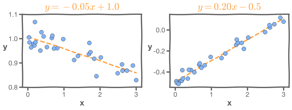
In the left-hand graph, the MSE of the model is very small. But the slope is -0.05. That means the larger the budget the less the sales, which seems unlikely.
In the right-hand graph, the MSE is very small, but the intercept is -0.5, which means that for very small budget we will have negative sales, which is impossible.
3.8 Exercise: Polynomial Modeling
#import the required libraries
import numpy as np
import pandas as pd
import matplotlib.pyplot as plt
from sklearn.linear_model import LinearRegression
from sklearn.preprocessing import PolynomialFeatures
%matplotlib inline

# Read the data from 'poly.csv' to a dataframe
df = pd.read_csv('poly.csv')
# Get the column values for x & y in numpy arrays
x = df[['x']].values
y = df['y'].values

# Take a quick look at the dataframe
df.head()

# Plot x & y to visually inspect the data

fig, ax = plt.subplots()
ax.plot(x,y,'x')
ax.set_xlabel('$x$ values')
ax.set_ylabel('$y$ values')
ax.set_title('$y$ vs $x$');

# Fit a linear model on the data
model = LinearRegression()
model.fit(x,y)

# Get the predictions on the entire data using the .predict() function
y_lin_pred = model.predict(x)

### edTest(test_deg) ###
# Now, we try polynomial regression
# GUESS the correct polynomial degree based on the above graph

guess_degree = 3

# Generate polynomial features on the entire data
x_poly= PolynomialFeatures(degree=guess_degree).fit_transform(x)

#Fit a polynomial model on the data, using x_poly as features
# Note: since PolynomialFeatures adds an intercept by default
# we will set fit_intercept to False to avoid having 2 intercepts
polymodel = LinearRegression(fit_intercept=False)
polymodel.fit(x_poly,y)

y_poly_pred = polymodel.predict(x_poly)

# To visualise the results, we create a linspace of evenly spaced values
# This ensures that there are no gaps in our prediction line as well as
# avoiding the need to create a sorted set of our data.
# Worth examining and understand the code

# create an array of evenly spaced values
x_l = np.linspace(np.min(x),np.max(x),100).reshape(-1, 1)

# Prediction on the linspace values
y_lin_pred_l = model.predict(x_l)

# PolynomialFeatures on the linspace values
x_poly_l= PolynomialFeatures(degree=guess_degree).fit_transform(x_l)

# Prediction on the polynomial linspace values
y_poly_pred_l = polymodel.predict(x_poly_l)

# First plot x & y values using plt.scatter
plt.scatter(x, y, s=10, label="Data")

# Now, plot the linear regression fit curve (using linspace)
plt.plot(x_l,y_lin_pred_l,label="Linear fit")

# Also plot the polynomial regression fit curve (using linspace)
plt.plot(x_l,y_poly_pred_l,label="Polynomial fit")

#Assigning labels to the axes
plt.xlabel("x values")
plt.ylabel("y values")
plt.legend()
plt.show()

### edTest(test_poly_predictions) ###
#Calculate the residual values for the polynomial model
poly_residuals = y-y_poly_pred

### edTest(test_linear_predictions) ###
#Calculate the residual values for the linear model
lin_residuals = y-y_lin_pred

#Use the below helper code to plot residual values
#Plot the histograms of the residuals for the two cases

#Distribution of residuals
fig, ax = plt.subplots(1,2, figsize = (10,4))
bins = np.linspace(-20,20,20)
ax[0].set_xlabel('Residuals')
ax[0].set_ylabel('Frequency')

#Plot the histograms for the polynomial regression
ax[0].hist(poly_residuals, bins,label = 'polynomial regression')

#Plot the histograms for the linear regression
ax[0].hist(lin_residuals, bins, label = 'linear regression')

ax[0].legend(loc = 'upper left')

# Distribution of predicted values with the residuals
ax[1].scatter(y_poly_pred, poly_residuals, s=10)
ax[1].scatter(y_lin_pred, lin_residuals, s = 10 )
ax[1].set_xlim(-75,75)
ax[1].set_xlabel('Predicted values')
ax[1].set_ylabel('Residuals')

fig.suptitle('Residual Analysis (Linear vs Polynomial)');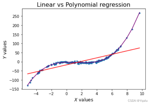


 1438
1438


 被折叠的 条评论
为什么被折叠?
被折叠的 条评论
为什么被折叠?
 到【灌水乐园】发言


